Home Blog Page 371

Best Comic Book Single Issues Of 2019

BEST OF 2019 comic books

With just a little over two weeks left in the year, we are rounding up our favorite comic book issues of 2019!

2019 was a great year for comics big and small, and narrowing our favorites down to those below was a near impossible task. These are simply our picks, but we want to know yours too, so be sure to comment and let us know what YOUR favorite covers of the year were!

Nominations were collected by publishers, creators, and the Monkeys Fighting Robots team, and were then voted on by the MFR team. Thank you to all the publishers and creators who contributed nominations; we can’t wait to see what new goodies you have coming in 2020!!

Honorable Mentions:

Undiscovered Country #1
Image Comics
Scott Snyder, Charles Soule, Guiseppe Camuncoli, Daniele Orlandini, Matt Wilson, CRANK!

best comic books of 2019 undiscovered country image comics

Undiscovered Country was one of 2019’s most anticipated books, and it sure delivered. It’s topical and exciting, with a top-tier team behind it.

As MFR critic Cody Walker put it, “Undiscovered Country is immediately poised for success.”

Little Bird #1
Image Comics
Darcy Van Poelgeest, Ian Bertram, Matt Hollingsworth, Aditya Bidikar

best comic books of 2019 little bird

One of the most visually striking books of 2019, Little Bird is like East of West meets Saga. MFR critic Darryll Robson called it a “must read.”

Friendly Neighborhood Spider-Man #6
Marvel Comics
Tom Taylor, Juann Cabal, Nolan Woodard, Federico Blee, Travis Lanham

best comic books of 2019 marvel comics friendly neighborhood spider-man

Tom Taylor ruined Spider-Man for me, because now I know how good his Spider-Man is, and no other writer will be able to compare. Every issue of Friendly Neighborhood was incredible, but this is the one that will go down in the annals of Webhead History.

The Walking Dead #193
Image Comics/Skybound
Robert Kirkman, Charlie Adlard, Cliff Rathburn, Rus Wooton

the waking dead 193 cover

One of the biggest comics of the last twenty years came to an end this year, and somehow managed to keep it a surprise. Congrats to Robert Kirkman, Charlie Adlard, and the whole Walking Dead team. This was a beautiful sendoff.

Mary Shelley Monster Hunter #1
AfterShock Comics
Adam Glass, Olivia Cuartero-Briggs, Hayden Sherman, Sal Cipriano

best comic books of 2019 mary shelley monster hunter aftershock comics

I mean, it’s right there in the title: Mary Shelley. Monster hunter. With a premise like that, how could you go wrong?

Our Favorites From 2019 (in no particular order):

Goon #1
Albatross Funnybooks
Eric Powell, Rachael Cohen

best comic books of 2019 the goon albatross comics

The Goon is back in all his glory! Eric Powell brought back his signature book at his own publishing company, and this series hasn’t missed a beat. Everything you loved about classic Goon stories is here: it’s funny, it’s exciting, and Powell’s art is about the best you can find.

Lois Lane #1
DC Comics
Greg Rucka, Mike Perkins, Paul Mounts, Simon Bowland

best comic books of 2019 lois lane dc comics

A hard-boiled investigative journalism comic starring Lois Lane is EXACTLY what 2019 needed. If you’re looking for a smart, topical story, like All The President’s Men set in the DC Universe, this one’s for you.

Murder Falcon #8
Image Comics/Skybound
Daniel Warren Johnson, Mike Spicer, Rus Wooton

best comic books of 2019 murder falcon image comics

Murder Falcon was one of our most celebrated books on MFR this year, and issue #8 closed out the story in tremendous fashion. Daniel Warren Johnson is an absolute pro, and he embodies the concept of “metal” in comics.

Darryll Robson gave the series a 5/5, calling it “heart wrenching, demon fighting, metal inspired greatness.”

Black Hammer Age of Doom #12
Dark Horse Comics
Jeff Lemire, Dean Ormston, Dave Stewart, Todd Klein

best comic books of 2019 dark horse black hammer

The best superhero comic of the decade came to an end this yearBlack Hammer is a celebration of superhero comics, while also elevating the genre to new heights. And yea, Jeff Lemire is one of the best writers working today, but Dean Ormston’s art is chilling and packed with emotion.

Something Is Killing The Children #1
BOOM! Studios
James Tynion IV, Werther Dell’Edera, Miquel Muerto, AndWorld Design

best comic books of 2019 boom studios something is killing the children

BOOM! Studios had some major hits in 2019, and Something Is Killing The Children was one of our favorites. Cody Walker said the book is “full of intrigue and with plenty of blood and gore to satisfy any horror lover,” and he ain’t lying. This instantly became a must-read for horror fans, and much of that has to do with Werther Dell’Edera’s art and monster designs. Read it with the lights on!
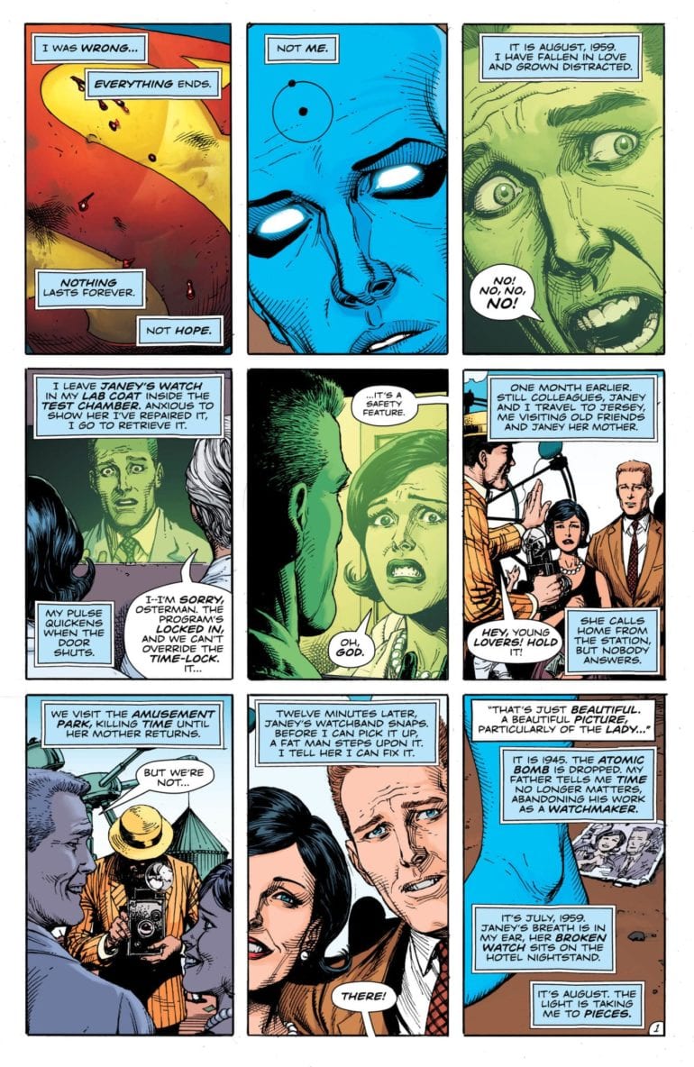
Doomsday Clock #10
DC Comics
Geoff Johns, Gray Frank, Brad Anderson, Rob Leigh

best comic books of 2019 dc comics doomsday clock

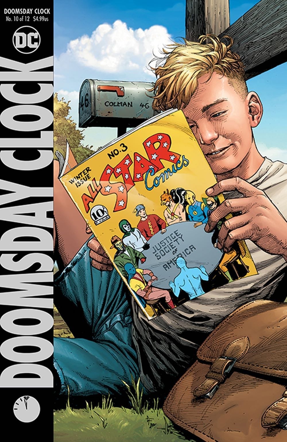
Doomsday Clock was a series plagued with delays, but the fact that readers stuck around is a testament to how good it is. Issue #10 is where everything starts to click into place; Doctor Manhattan’s story is revealed, and it leaves you begging for more.

Especially more of Gary Frank’s art — his work has been worth the wait.

Faithless #1
BOOM! Studios
Brian Azzarello, Maria Llovet, Deron Bennett

best comic books of 2019 boom studios faithless

Another bit hit from BOOM! this year, “Faithless is an erotic love story with strong ties to centuries old stories. The artwork is seductive and beautiful and will entrap you just as the central character is entrapped. A must read, but definitely Not Safe For Work.”

House of X #2
Marvel Comics
Jonathan Hickman, Pepe Larraz, Marte Gracia, Clayton Cowles

best comic books of 2019 marvel comics house of x

We all knew Hickman’s X-Men was going to be a game-changer, but House of X #2 is the one that showed us just how big a game-changer it was. This is the “Moira issue” everyone at your local comic shop was talking about, and Pepe Larraz along with Marte Gracia supplied some of the best X-artwork we’ve seen in a long time.

The Plot #1
Vault Comics
Michael Moreci, Tim Daniel, Joshua Hixson, Jordan Boyd, Jim Campbell

best comic books of 2019 vault comics the plot

By now, you’ve probably heard the hype surrounding Vault Comics. 2019 belonged to Vault. The indie comics publisher extraordinaire just pumped out hit after hit after hit, but The Plot was the cream of the crop. If you like horror stories rooted in family drama, a la Locke & Key or The Haunting of Hill House, this series does it like no other.

Die #1
Image Comics
Kieron Gillen, Stephanie Hans, Clayton Cowles

best comic books of 2019 image comics die

And that brings us to Die! Kieron Gillen and Stephanie Hans’ Image series takes everything fans love about RPGs and the fantasy genre and dilutes it into a near-perfect comic. It’s gorgeous, it’s gut-wrenching, and it’s full of twists and turns that will make you scream… and that’s just this first issue!!


What were your favorite comic books from 2019? Let us know in the comments!

Monkeys Fighting Robots Youtube

Review: The End is Finally Here in DOOMSDAY CLOCK #12

The Doomsday Clock hits Midnight

It’s November 22nd, 2017, and the first issue of Doomsday Clock hits shelves. The world met it with critical acclaim and counted the days until the next issue. As time began to pass, the delays start as Gary Frank and Geoff Johns work to get the story perfect.

 It’s December 18th, 2019, the final issue of the story is finally here. We have learned Manhattan has changed the DC Universe, which has been revealed to be affected by a Metaverse, and that Superman is connected to this larger universe. As conflict builds and the clock gets closer to midnight, Superman finally faces Manhattan. How will this two-year-long tale come to a close?

Doomsday Clock 12 cover

**Some Spoilers Below**

Story:

Superman finds Dr. Manhattan in Washington, DC, and begins questioning his intent. As the omniscient god explains, he can’t see past the attack from the Man of Steel, Russia, and Khandaq’s Meta forces attack. With the town in chaos, Superman struggles to protect the people and face the Metahumans. All the while, Manhattan reminisces about his journey to this very moment as the Doomsday Clock hits midnight.

Meanwhile, across Gotham, Reggie Long is walking alone, still shaken by the revelation of his Father’s mental abuse from Rorschach. He ends up watching the news about Superman, only to get attacked by a store owner. Alfred and Batman arrive to protect him, and the Caped Crusader convinces him to wear the mask as a symbol of heroics once more.

Doomsday Clock 12 p1

This is a hard review to write without giving too much away. It is a fantastic ending to this two-year-long tale along with providing the end cap for the mystery of Rebirth, the New 52, and even the Watchmen universe. The action is excellent and had this reader on the edge of his seat with every page. The best part, however, comes in the form of Superman and Manhattan talking. That single moment of Jon understanding Clark’s importance was a culmination of not just the story but of the character of Superman. It brought a massive smile to my face and had me looking towards the future of DC.

This praise isn’t to say there aren’t any problems with the story. While it was fantastic to see the Manhattan Superman story come to a close, the other character’s endings felt rushed. There is no more prominent example than Mime and Marionette, who, after leaving them four issues ago, finally make their reappearance. It’s not enough to ruin the issue as a whole, but it will bother quite a few readers.

Doomsday Clock 12 p2

Art:

Gary Frank’s art has been one of the most significant selling points to Doomsday Clock. He brings his A-game for this finale with fantastic looking action, grim scenes of violence, and a brighter tomorrow. The best-looking part comes in the form of a two-page reveal of back up for Superman. While I won’t spoil who this epic spread is such a badass reveal, it will go down as one of the best comic moments in 2019.

Doomsday Clock 12 p3

Conclusion:

This issue really should have come sooner. Doomsday Clock will be known for its constant delays and attempts at being a sequel to Watchmen. It should be remembered for being a fantastic story, and this issue hammers that home. It has great action and brings this grand ending to the series. Gary Frank’s art continues to be top form and will get praise for years to come. The problems that the story has are minuscule in comparison to the story as a whole. I highly recommend this conclusion and series for anyone who has been wanting to read this. Pick it up now and see how the DC universe changes for the better.

Monkeys Fighting Robots Youtube

Review: A Jumbled, Yet Mostly Satisfying Conclusion in BATMAN #85

This is it. Tom King’s epic story reaches its culmination with Batman #85, out this week from DC Comics. Here’s the critical question, though: does this final issue live up to the stakes set by the last three-and-a-half years of buildup?

As a storyteller, King is probably one of the most controversial creators in the game right now. 2017’s Mister Miracle was a universally-acclaimed masterpiece, while opinions on last year’s Heroes in Crisis event proved to be rather mixed. While his run on Batman has been strong overall, it has definite ups-and-downs, with those moments sometimes coexisting even within a single issue.

Batman #85

The Writing

In typical King fashion, Batman #85 eschews linear storytelling, instead jumping from chronological point to point with nearly every page. We see Bruce duking it out with Thomas, then cut to him watching a football game, then to Alfred’s grave, then to jumping from rooftop to rooftop across the Gotham skyline, and so on.

There are plenty of highpoints throughout the book. For instance, we see King use the bar sequence as a kind of direct address, injecting some broader commentary on the character. As Bruce tells a fellow patron, “Stories change. People change.” Over eighty years of stories and continuity, Batman is not a character stuck in time; he evolves as his readers evolve. Over the years, we’ve seen Bruce Wayne continue to grow in complexity and develop as a character. He’s not a fixed entity, but rather one who changes with us.

That said, the book does suffer more than a bit from its jumbled presentation. There doesn’t seem to be any explicit intent behind the nonlinear motif from a storytelling perspective. Many of these scenes seem unnecessary, and only serve to obscure the story itself. The narrative in Batman #85 feels somewhat rushed and undercooked as a result.

For instance, King directly states his thesis by book’s end, answering resoundingly the question behind his entire run: can Batman be happy? It’s indeed a cathartic moment, but once again, pivoting to another scene somewhat undercuts the moment. Using an unorthodox story structure isn’t a bad thing…if it’s motivated. Here, however, it doesn’t really seem to be, and only gets in the way of an otherwise satisfying conclusion.

Batman #85 ends with an epilogue penned by incoming writer James Tynnion IV. The writer suggests, with ominous foreshadowing, that big things are on the horizon. Based on previous works, I’m confident that Tynnion is up to the challenge. Plus, it will be interesting to see how the tone of the series pivots following this issue.

Batman #85

Batman #85

Batman #85

The Artwork

As Tom King bows out with this issue, we also say ‘goodbye’ to artist Mikel Janin, who will be replaced by artists Tony S. Daniel, Guillem March, and Jorge Jimenez beginning with our next issue. Janin’s artwork has been a consistent visual delight in Batman, and this issue is no exception.

The team clenly divide most of the pages in Batman #85 into horizontally-stacked panels of four to six per page. This offers some visual coherence, despite the constant temporal shifts. We also have the visual repetition–a hallmark of this creative team’s run–which adds to the effect. Despite the choppiness of the narrative, the artwork manages to nail the story beats. From one scene to the next, King and Janin tightly sync the pacing of the images and dialogue.

Perhaps Janin’s greatest asset as an artist, though, lies in his character designs. They’re consistently expressive and compelling, while simultaneously possessing a sleek and somewhat angular look. As many of the illustrations in Batman #85 are closely cropped-in on the characters, we really get to appreciate this visual element.

Jordie Bellaire, as always, comes through with the colors here. She employs several palettes for the different settings, with each really bringing the visuals to life.

Batman #85

Final Thoughts

Love it or hate it, Tom King’s run on Batman was certainly one of the most novel takes on the character. Batman #85 condenses many of the themes and motifs that defined this series over the last three-plus years, so make of that what you will.

Monkeys Fighting Robots Youtube

Review: GOING TO THE CHAPEL Gets One Hell of a Reception In Issue #4

On February 5th, the wildest ride in indie comics comes to a close as Going to the Chapel releases it’s fourth and final chapter. If you haven’t already been following the saga of Emily Anderson, nervous bride and impromptu hostage negotiator, now is the time to jump in to the story. It’s a blast of a read with a story that moves at an action-movie pace, and the finale is more than worth the cover price.

Emily’s special day came to a head last issue when she told her fiancé, Jesse, that she wasn’t sure she could marry him. As if that didn’t make the situation tense enough, the police had finally moved to bust into the Chapel and end the hostage situation going on there. Plus, the wedding guests had turned against the Bad Elvis gang, using their own wedding gifts as makeshift weapons of revolution. Now, time is running out, and Emily’s got to figure out a way of saving everyone not just from heartbreak, but from a disastrous end.

The Writing

From issue one of this book, Emily has made choices based on impulse, adrenaline, and high-running emotions. What’s cool about issue four is that writer David Pepose begins it in a quiet moment for the uncertain bride. She gets the chance to think over everything that’s happened, and we get a rewarding window into her character. Now, more than ever, we the readers are with Emily Anderson in her precarious situation. We feel the stakes, the physical danger and the romantic hardships, bring about satisfying close to this emotional story. Still, Pepose doesn’t forget about the action. This is a rom-com with guns, after all. And there’s a whole team of SWAT agents just waiting to use them.

The Art

We’ve previously said that Gavin Guidry’s art provides the humor in this series, that he could make one hell of an Office episode in the comic medium. Well, issue four would be the Jim and Pam’s wedding. Throughout this run, you’ve been laughing at the goofiness of these characters and their hilarious reactions to extreme circumstances. What you forgot was that, at the same time, you were falling in love with them. With the same soul and genuineness he used to make you laugh, Guidry makes you feel in this issue. He produces some of the most heart-felt character one-on-ones to come out in 2019 comics, and an ending sequence that’s both warm and hilarious. Like all the other issues of Going to the Chapel, you’ll laugh your way through issue four. And once you close it, the smile will stay.

The Coloring

We’ve mentioned before that colorist Liz Kramer’s work makes the comic feel like its lit by a never-ending sunset. Now that we’re actually riding into one, it’s never felt more appropriate. In just four issues, Going to the Chapel has covered a lot of ground. It’s been a comedy, an action story, and a romance. Now that it’s ending, you realize that Kramer has not just provided the tone, but the consistency necessary to tell this tale. The colors she uses set a solid backdrop to the series. This means that even when even when the story is hopping genres, you as the reader never get taken out of it. Though her run on Going to the Chapel is over, we can’t wait to see more from Kramer.

The Lettering

Something that we haven’t mentioned yet about Ariana Maher is just how exciting she can make sound effects. They have a tendency to become part of the action in a scene, exploding outward with a bomb or following the path of a jaw-cracking sucker-punch. Maher takes this talent all the way to the end in Going to the Chapel, providing an immersive layer of sound effects to heighten the reader’s experience right up until the last scene.

Overall Thoughts

If there was one thing to critique about issue four, it’s just that the ending happened very quickly. This speaks to just how well Going to the Chapel landed as a story. We’ve gotten so emotionally invested in these relatable characters that it feels like there could have been more to their adventure. Still, the final chapter of this comic is an ending that suits the readers needs. It makes total sense but is still unexpected. Our characters get satisfying endings to their arcs. The consequences of their actions come to a pulse-pounding end note. For all the fictional stress that this book put the attendees through, this comic actually had everything that a great wedding ceremony does. That means a ton of laughter, memorable guests, and a hell of a lot of love.

If you’ve been following the series so far, make sure not to miss the finale. But even if you haven’t, all the issues will be available very soon on ComiXology and by order at your local comic shop. Plus, it was just announced that the Going to the Chapel trade paperback would be coming out, appropriately, this coming Valentine’s Day week. However you do it, make sure to get this book. Going to the Chapel was one of the best indie comic experiences of the last year. You’d be missing out if you didn’t try it for yourself.

For more reviews like this one follow us on Twitter. And for all the best comic book reviews, news, and discussion, say tuned to Monkeys Fighting Robots.

Monkeys Fighting Robots Youtube

Review: Extreme Malpractice in WITCHFINDER: REIGN OF DARKNESS #2

The Hellboy universe is driven by such consistent quality that the unusually “meh” debut issue of “Witchfinder: Reign of Darkness” was seen as an anomaly. Unfortunately, not much has improved here in the second issue. “Reign of Darkness” #2 is a directionless chapter. The “mystery” is explained in blobs of dialogue, and the pacing is distractingly cluttered. The character art is once again strangely off-putting. The momentum that was built on the final pages of issue #1 goes to waste in this follow-up.

Sir Edward Grey (a.k.a. The Witchfinder) continues his tumultuous investigation into the identity of Jack the Ripper. As soon as his most likely suspect is just out of reach, he receives an unlikely suggestion from an outside source. An American woman by the name of Sarah Jewell believes she knows the true culprit. Grey will have to withstand criticism from the law, the covering of the truth, and even desperate brigands to track down this monstrous villain.

Writing & Plot

One of the most effective aspects of Mignola’s work and the Hellboy universe as a whole is the use of art to tell a story. Dialogue and narrative are obviously key, but letting the panels talk bolsters the atmosphere. Moments of introspection and suspense are created in these quiet moments. Unfortunately, this book offers none of those strengths. While some solid dialogue is to be had, the writing here is bloated with needless exposition. Any and all “investigation” is given away by characters just reciting facts or speculation. There is no investigating to be had. While the dialogue exchanges are well-written from a language standpoint, they too are often a bloated bore to read.

The appearance of a key Hellboy universe character (no spoilers) is a treat, but it isn’t enough to offset the strange pacing this comic has. It doesn’t feel like a steady flow of events leading to a climactic conclusion. It just feels like a series of scattered related occurrences. The first issue had similar problems, but it at least had a definite direction and a promising final page. This issue neither capitalizes on the prior nor builds toward the next in any exciting way. There’s a fight scene that occurs roughly midway through the issue that feels very much out of place. The scene itself is cool in that is demonstrates some of Grey’s paranormal knowledge, but it doesn’t do anything for the plot. Hopefully this actually proves to be more important in forthcoming issues. With two issues down in this five-issue mini-series, it’s more than a little worrying that the writing feels so cobbled together.

Art Direction

The pencils and inks on this Witchfinder series thus far have been a mixed bag. The environmental details of 19th century London are well-executed and properly atmospheric. The brick buildings and dingy crime scenes in “Reign of Darkness” make for a stellar setting for a paranormal Jack The Ripper tale. If only the character art could match the quality of the setting. Once again, the work on the characters themselves looks as if it’s unfinished. There’s still this partially-rendered look to their facial features and clothing. It’s reminiscent of when a game engine is still loading all the textures, so the character faces are blurry and featureless. It’s a shame that this still isn’t working, especially in a series that’s part of a universe full of wonderfully unsettling horror artwork.

The colors are mostly a bit of a saving grace. The grayed palette is reminiscent of foggy industrial England and adds considerably to the authenticity of the era being replicated. However, they also come in a little underwhelming on close-up detail work. The entirety of a piece of clothing, for example, will sometimes be colored in a single shade regardless of the lighting from the environment. This may sound like an absurd nitpick, but when in tandem with the pencils and inks, it becomes a noticeable distraction.

“Witchfinder: Reign of Darkness” #2 is an even more disappointing follow-up to an already lukewarm debut issue. Blocky exposition and a poorly paced plot overtake any clever dialogue that is there to be had. The art direction looks as if it were unfinished and is mostly distracting in a series that needs to be engrossing. Any elements of mystery and suspense are squashed by loads of explanations in dialogue. With this being the second of only a five-issue mini-series, it’s a bit disconcerting that this comic has failed to impress thus far.

Monkeys Fighting Robots Youtube

Review: COUNT CROWLEY: RELUCTANT MIDNIGHT MONSTER HUNTER #3

This second-to-last issue of “Count Crowley” takes some time away from the monsters to focus on Jerri’s familial struggles and a strange conspiracy. The emotional beats may be a bit derivative, but they’re certainly effective and make Jerri an even more engaging protagonist. With consistent art and fun but emotionally charged plot, “Count Crowley” continues to be a worthwhile read.

After escaping an undead attacker, Jerri Bartman attempts to get some help from friends and family after her altercations. When they all dismiss her claims as delusions of a disturbed alcoholic however, she continues her investigation on her own. Upon finding the original Count Crowley Vincent Frights (er, Freis), she discovers that this whole horror story she’s uncovered has been hundreds of years in the making.

Writing & Plot

Writer David Dastmalchian continues to effectively mix goofy monster horror with compelling character drama. Sequences of fighting off creatures from golden-age horror films are intercut with gutting interactions between Bartman and the locals who know her. The tale of the alcoholic in need of redemption is not a new one, but it’s still effective when done right. Jerri is an easy character to root for as she roots around for answers and dodges werewolves, skeptics and sexist old men. The dialogue is as always sharp and naturalistic in this third issue. The plot itself is a compelling mix of Scooby-Doo for adults and a compelling turn-around for a struggling human being. Dastmalchian is proving himself to be a highly competent writer who knows how to weave great character stories with charming concepts.

Art Direction

The duo of Lukas Ketner’s pencils with Lauren Affe‘s colors continues to provide stellar and fitting artwork for “Count Crowley.” Keter’s realistically drawn people and classically-minded monsters exist perfectly in the comic’s environmental detail. Jerri’s desperation as she fights back welling emotions in visually deeply compelling. The book’s atmosphere is reinforced by Affe’s 60’s horror-inspired color choices. The influences “Count Crowley” displays are made most evident by the art team’s fantastic work here. Dastmalchain’s engaging and campy scripts are sold by Ketner and Affe’s combined efforts.

“Count Crowley: Reluctant Midnight Monster Hunter” #3 is an emotionally gripping and world-opening third chapter. Dastmalchian’s sharp ear for natural dialogue and compelling character storytelling pays off in spades in this issue, increasing the stakes of the series going forward. The consistently top-notch art from Lukas Keter and Lauren Affe nails fulfills this comic’s aesthetic from month-to-month, and issue #3 is no different. Be sure to keep this series in your pull list at your local comic shop until the final issue drops next month.

Monkeys Fighting Robots Youtube

Review: JOHN CONSTANTINE HELLBLAZER #2 Urban Horror That Doesn’t Hold Back

John Constantine Hellblazer #2
John Constantine Hellblazer #2 Credit: DC Comics

Continuing the expansion of the Sandman Universe from DC Comics, the second issue of John Constantine Hellblazer barges onto the shelves this week, pushing the other titles around and generally making a nuisance itself. The 17+ age limit is justly earned and not just because of the use of excessive language; within these pages, horror awaits.

Those of a nervous disposition or are easily offended have been warned. John Constantine doesn’t pull his punches and neither does writer Simon Spurrier. If you want an easy read, you’d best look else where.

John Constantine Hellblazer #2
John Constantine Hellblazer #2 Credit: DC Comics

Great Things Are Done..

On the Streets of London, the gangs fight over territory and peddle their drugs but something worse is taking the gang members. A supernatural force is tearing apart anyone who wanders haplessly into the wrong park at the wrong time. Only one man can help; but John Constantine isn’t easily persuaded and threats don’t really work on him.

In this second issue of the Hellblazer relaunch, Simon Spurrier throws the central character into the middle of a supernatural nightmare while building a team of new characters around him. This issue continues to expand the cast that was introduced last month, filling out the roles and cementing Constantine’s character in the process.

Spurrier does two things exceptionally well this month. The first is that ‘A Green and Pleasant Land’ is a suburb urban horror story. It includes tropes from a selection of modern horrors and moulds them into something truly unnerving. K-Mag is a modern witch, gruesome to the bone and forms the body-horror element of the story. The ‘Angels’ in the park account for a large part of the supernatural but also provide the religious link that horrors tend to favour. There is even a mysterious old man and a sceptic to complete the assembly.

Naturally linking all of these elements is Spurrier’s take on Constantine who is, as noted in previous reviews, a return to the good old English Bastard of the late 80’s. And this is where Spurrier’s second success is evident: the narrative is brimming with subtle, and some not so subtle, social commentary. Like King Arthur of old, Constantine is a representation of England. He is a manifestation of the country in human form. The hopelessness, anger, and occasionally bitterness on display comes from a growing mood within a certain section of the population; a section who will probably be reading this comic.

Despite the grim outlook, the central characters are all fighters, desperate to survive. Constantine collects like minded souls both in the narrative and in the readership. Spurrier understands this and aims the social commentary directly at us, showing us the seedy truth but also reminding us that not all is lost. 

John Constantine Hellblazer #2
John Constantine Hellblazer #2 Credit: DC Comics

Hell in Art

Aaron Campbell’s art captures the grimness of the violent horror and the disheartened mood of the country. His harsh inking style and use of heavy shadows creates an uncomfortable feeling. There is a lack of safety within the panels for either the characters or the reader. This disjointedness is partly a reaction to Constantine’s own displacement in time. He has yet to find a place in this modern day world and the art illustrates this at every turn.

Jordie Bellaire picks up this motif with her coloring. The panels are brought to life with expressionistic colors rather than realistic ones. Sicking greens and unnatural bright oranges carry the tone throughout. The colors even pick up elements of the narrative that might not immediately be apparent. There is an obsession with the poetry of William Blake in this issue of Hellblazer and Bellaire’s coloring reflects the artwork of the 18th century poet and artist. The flashback sequences especially conjure up images of the Romantic Age.

Creating a poetic flow to the narrative is achieved through the placement of the speech balloons and the breaks in the conversations. Aditya Bidikar breaks up the sentences so that he can space them out within the panels creating natural pauses. There is also some clever use of coloured speech balloons to represent supernatural elements of the story.


John Constantine Hellblazer #2 Credit: DC Comics

Conclusion

Constantine as a character has always represented the world outside the pages of the comic. He is a funnel through which real life passes so that it can be examined in fantastical tales of horror and magic. Spurrier’s take on the character is daring and exciting. He draws the horror out of the world and yet, it is the stark realities of our world that have the most disturbing effect on the reading experience. 

Visually it’s a delight, if a touch grotesque, but it is hard hitting and Spurrier does not hold back. There is a lot within these pages that can cause offence and it’s mostly offence that needs to be caused. Unfortunately the real world is a tough place right now, and Constantine is feeling it all too well. But like any hero, anti or otherwise, the modern day wizard brings out the best in those around him and it is these sidekicks who are proving to be the most interesting element of this comic.


Monkeys Fighting Robots Youtube

YOU ARE DEADPOOL: A Narrative Comic Book Store

You Are Deadpool, so raise havoc.

You Are Deadpool is several things: it’s Deadpool at his most meta, another masterpiece by “Al Ewing,” and a comic book mashed with a tabletop game. By using issues of the series as campaign scenarios along with two (or more) dice, the player embarks on a trial and error based time travel campaign. But perhaps most of all, it’s a comic about comic book store culture. Yes, it’s a thing. Now to understand anything about this culture, there are some important subjects to go over, because this stuff can get comprehensive and overwhelming for first-timers. Below is the research from the gutters.

What Is You Are Deadpool?

Gerry Duggan style or Rob Liefeld?
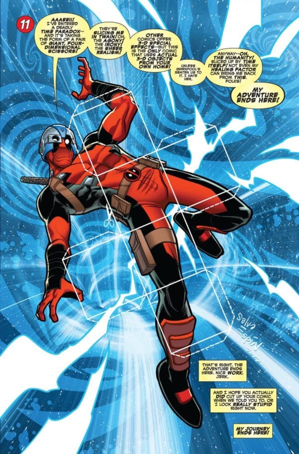
Deadpool requires little introduction for even non-comic fans. Whether it’s Ryan Reynolds’ portrayal on the big screen or the comics written after Rob Liefeld, Deadpool is a snarky fourth-wall-breaking mercenary with a healing factor that makes him close to immortal. His entire history revolves around being a funny meme or a sad clown. Some of the best Deadpool attributes, however, come from his resourcefulness in reaction to comics’ absurdity. All of which makes Deadpool an entertaining character to play as in games. But while video games like Marvel vs. Capcom 3 and the Deadpool video game keep to the memes, tabletop games offer more variety.

Kieron Gillen in You Are DeadpoolYou Are Deadpool, written by Ewing with art by Salva Espin, is the concept of Deadpool in a Dungeons & Dragons-esque situation. But instead of game masters and absurdly named weapons, it’s a game of resource management and morality, each of which plays into the scenarios where Deadpool is sent through time to different comic eras. At the suggestion of Kieron Gillen, players make use of two dice in combat against a usually higher number of dice. Given the stakes, resource management and memorization is a necessity to progress through. Meaning much like with Deadpool, the reader/player will either feel accomplished or too frustrated to finish and just get another comic from the store.

The Culture of a Comic Book Store

Comic book stores themselves have a semi-unique culture to them aside from putting overpriced monthlies on shelves. It’s a place of community for pop culture lovers to share their passions. On their best days, they’re like less expensive conventions complete with guest appearances from comic artists. And for those who wanna do something other than stick noses in inked paper, there’s often a space to play tabletop games. From Magic the Gathering to Dungeons & Dragons, there’s something for everyone.

You Are Deadpool (His Other Voice Anyway)

Deadpool appeals to everyone despite being strictly advertised for more mature teens. It’s through that very popularity that readers get a first look into how comic stores work.

Some people get intimidated by comic stores because of how overwhelming they can be from intimidating book organization to staff uninterested in newcomers. People like Eric Ravenscraft recommends going with the flow instead of starting from the beginning. Because like meeting people for the first time, it’s best to follow from a fresh start. You Are Deadpool follows that same logic by giving readers minimal background and the choice to play Deadpool the way writers like Daniel Way depict him. Who knew tabletops had so much in common with comics?

Comics Are The Game

You Are Deapool lets you make your own dice.

While readers get to know Deadpool through gameplay, they also get an introduction to another part of comic shops. As stated previously, the stores include both a space to play and get the means necessary to play tabletop games. Unlike video games (which tend to support manga more than western comics), tabletop games offer a more hands-on approach. As such, games like D&D and Magic offer more social, cognitive, and innovative play styles.

Because why go one way when you make a visit memorable. Some of the best comics feel like you are living in the comic’s world. Some of the best comic shops meanwhile feel like being in a comic. “Jay and Silent Bob’s Secret Stash” have the aesthetics while “Vault of Midnight” goes out of its way to make the medium accessible. From podcasts to exhibits, people can see comics in all of their glory. Somebody has to make decades of history accessible.

You Are Deadpool (The Comic Historian)

One of Deadpool’s notable tools is his use of Marvel Comics history. The time travel plot helps reinforce this by reintroducing concepts from all around Marvel’s history. From the most obscure characters like Master of Kung-Fu‘s Super-Midnight to ridiculous tropes through the Grasshoppers. Even A-Listers get their time in the limelight for a short while, like the Fantastic Four, Daredevil, and Captain America (as Grasshopper). While this seems paradoxical from the getting into comics intro, generating interest in the past is what can get more people to comic shops. Because let’s face it, tabletop comics can get boring alone.

(Insert Marketing Trick)

Thankfully, playing You Are Deadpool doesn’t just amount to fans of the character but anyone interested in visiting a comic shop. Aside from getting a few monthlies, maybe people will have an interest in staying for more. Maybe they can even bond with fans over a story or play a game or two. Marvel UK even released a You Are Deadpool RPG set to go along with the comic. Who knows, maybe somebody will even have an event dedicated to the concept. Too bad it can’t do something about comic stores problems with age gaps.

But what about the rest of you? Still, find comic shops to be a little overwhelming, or are you willing to try something a little different? Leave your thoughts in the comments.

Monkeys Fighting Robots Youtube

SUICIDE SQUAD #1 Is Undiluted Fun

Suicide Squad #1, written by Tom Taylor, with art by Bruno Redondo, colors by Adriano Lucas and letters by Wes Abbott, is a promising beginning to a new era for the titular team. With the creative team behind Injustice on this, it’s clear this series will be no-holds-barred. The first issue does not disappoint.

Writing

Taylor’s writing manages to establish the characters without rushing into creating a “team dynamic.” Instead of trying to create a “rapport,” he lets the characters be driven together by circumstances. It’s also very clear that this is not the same team we’ve seen in many other iterations. Taylor has already established loads of new characters that look to be taking huge roles in the series. He’s wiping the board clean, creating the kind of reboot that means anything can happen. If his track record tells us anything, this is going to be a wild ride.

Drawing

Redondo’s art is gorgeous. Throughout, he constantly shifts perspectives to give a sense of movement and chaos. When Magpie is being stalked down a dark hallway, he continually alternates how we see her. We sense her panic as we go from close up to zoom out, from behind her to in front of her. It’s like listening to her raised heartbeat. And when someone jumps out of the dark at her, their pupils are minuscule. It goes to show Redondo’s mastery that he can make a page fit for a horror comic in the pages of Suicide Squad.

Coloring

Lucas’s colors help give even the most brutal moments a sense of levity. When one character’s skull explodes in another character’s hand, the neon yellow background offsets the gore. It almost has the feel of a Tarantino movie. Lucas is egging the reader on to find a kind of beauty in the violence. With all the bright yellows and reds surrounding each moment of explosive blood, it’s like watching a light show, not an execution.

Lettering

Abbott’s lettering is a huge player in what makes this comic so fun. Screams follow characters down to their deaths, and the lettering is constantly changed up. Even when writing various explosions, Abbott gives us the sense that a head and a ship blowing up make different noises. Abbott’s lettering is clear and precise and is evolving as the issue progresses. If he’s experimenting with lettering this much in issue 1, I can’t wait to see his work in issues to come.

Suicide Squad #1 is exactly the riot it should be. It’s undiluted fun that actively chooses not to hold back in each moment. Read this series while you still can, it’s bound to be changing drastically as each month goes by. Pick Suicide Squad #1 up at your local comic book store on Dec 18th.

Monkeys Fighting Robots Youtube

WONDER WOMAN: DEAD EARTH #1 Rushes Past Its Own Brilliance

Written and drawn by Daniel Warren Johnson, with colors by Mike Spicer and letters by Rus Wooton, Wonder Woman: Dead Earth #1 rushes to be the story it wants to be. The overloaded pages draw away from the brilliant concept and artwork. While it’s off to a rocky start, this series still has great potential.

Writing

Johnson’s concepts for the series are brilliant. Setting Diana in a post-apocalyptic wasteland feels like a match made in heaven. Yet Johnson seems to be pushing his characters to get to know one another artificially. As soon as Wonder Woman breaks out of her cryogenic chamber, she’s met with constant oversharing and clumsy exposition. It’s one of those cases where half of the dialogue could be cut out. Sometimes it’s better to know when not to answer a question. The very idea of having Wonder Woman out of her element is what makes this story so compelling. If every question she has is met with an immediate answer, the mystery dwindles. Johnson’s concepts truly are brilliant, but he needs to trust them more.

Art

It’s interesting that Johnson pencils and inks his own work here. Interesting because he kind of steps on his own work throughout. Johnson sets the scene so beautifully with his art; the exposition provided by the characters is excessive. We can see there was a nuclear holocaust. We can see the pain of their existence in their faces. They don’t need to cry on one another’s shoulders. They don’t need to have deep conversations upon meeting each other. The silences speak louder than words, and Johnson’s art is proof of that.

Colors

Spicer’s coloring opens the door to this dark world. With dark greys and blacks, Spicer gives a feeling of death and stagnation. With yellows and purples, he creates a sense of danger and evil. We see abominations wandering the wasteland, cast in a reddish-purple tone. A horde of monsters try and break into the camp, and they are colored the same way. Wonder Woman looks flushed throughout, giving her a similar look. Will Diana be dangerous in the future of this series, perhaps?

Lettering

Wooton’s lettering stands out amongst other works for having a more handwritten feel. Wooton adds to the gruff atmosphere in this way. Nothing on this dead earth is easily won. Many of the sound effects have a graffiti type feel to them. Like Wooton spray-painted over Johnson’s work. It truly helps create a sense that this world is run-down.

The concepts behind Wonder Woman: Dead Earth #1 are brilliant. The execution is underwhelming. This series clearly has more places it’s planning to go. Once Johnson sets the stage, he might be able to trust his own ideas more. Pick up Wonder Woman: Dead Earth #1 at your local comic book store on December 18th.


Monkeys Fighting Robots Youtube