Home Blog Page 367

Review: THE FLASH #85 Sees Preparation for the Battle against Cold

The Flash slows down to build characters

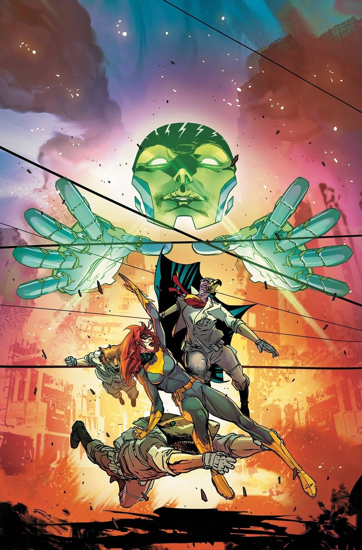
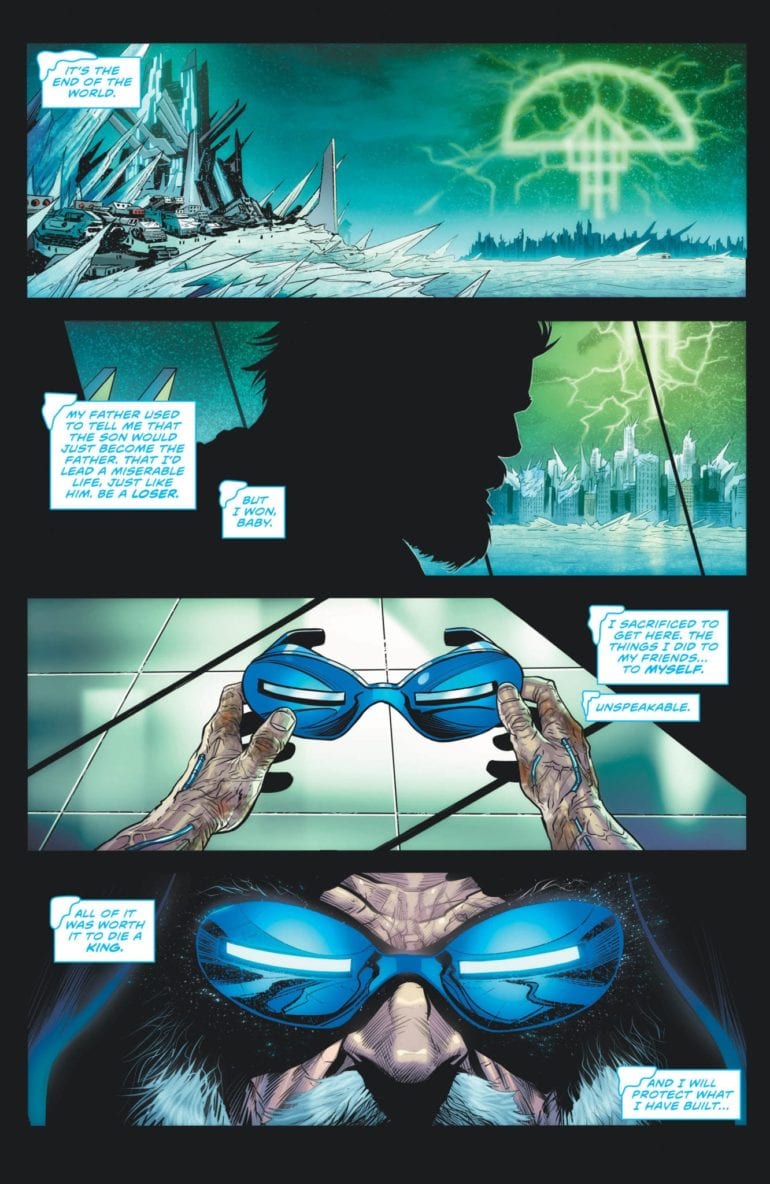
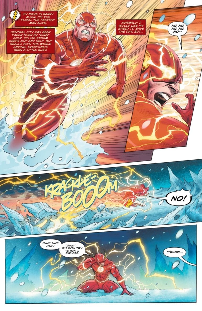
The Rogues have won. As the Legion of Doom has begun their assault on the world, newly empowered Rogues have taken Central City. The Flash Family is overcharged after the Death of the Speed Force arc, rendering them useless. Despite the valiant efforts of Commander Cold, most resistance has been crushed by Snart’s rule. This control continues for months until a surprising ally steps forward.

Led by Golden Glider, the other members of the Rogues have freed the Flash and his sidekicks. They now hide and prepare to defeat the frozen tyrant. Will Central City return to normal?

The Flash 85 cover

**Some Spoilers Below**

Story: 

As the grip of “King” Cold tightens, the Rogues continue to train the speedsters. With their powers out control, Kid Flash and Avery Rely on the training and power dampening collars to keep them under control. Barry, on the other hand, has been struggling to maintain control without it. Golden Glider comes out to talk to him, explaining how the Rogues have been in the same shoes as him.

 After a brief ice skating lesson, which helps understand how the speed force can be controlled, the teams come up with a new plan. To change the City back to normal, the speedsters and Rogues have to get the last pieces of Mirror Master’s Mirror.

The Flash 85 p1

So while this has some action, the highlight of this issue is the humanization of the Rogues. The Villainous team has always been fan favorites to their blue-collared, more grounded view on the world. When they joined the Legion of Doom, I was worried they threw away this outlook. But this issue proves that it continues to be their defining trait. By the end of this issue, readers will see more connections between the villains and Flash than ever, learning to cherish them more.

The only problem I have with this issue is that Captain Cold has wholly left his character behind. With the other villains, they have these moments of redemption that allow readers to connect to them and hope they become heroes. In this arc, Cold has done nothing to make us root for his change. It’s a bad sign when the man who set his family home on fire gets more sympathy than Leonard Snart. There’s no doubt that he’ll change back before the end, but right now, he’s insufferable.

The Flash 85 p2

Art:

Christian Duce continues to bring his best work to the Flash series. Every page is an imaginative and sometimes epic feast for the eyes. With every character design and every cool action piece, Duce gives us more grounded, emotional moments. One of the best looking moments doesn’t come from an action sequence but with the ice skating lesson between Flash and Golden Glider. It’s very smooth and emotional for the pair, and you can tell through not just the dialogue but the illustrations. Luis Guerrero takes this great work even further with masterful, vibrant colorwork. Together, these two continue to deliver the best looking arc the Flash series has had.

Flash 85 p3

Conclusion:

Overall, this issue does a fantastic job of setting up the final conflict against Cold. Not just in terms of action, but also giving us a slower chapter to attach to the characters. The Flash Series has always been known to have a more grounded set of villains, but by the end of this issue, you will hope they can get out of this fight on the right side of the law. As the weeks countdown for the end of this arc, it’s clear that this will go down as one of the more memorable issues in the current arc. With a promise of an action-packed battle to come, go pick up this issue today and see the preparations take place.


Monkeys Fighting Robots Youtube

Review: The Reign of Beasts in THE BUTCHER OF PARIS #2

“The Butcher of Paris” #2 is a more quiet and contemplative chapter than its predecessor. However, the successfully confident prose of writer Stephanie Phillips works in tandem with a consistently great art team to create another engrossing comic issue.

In Nazi occupied Paris, the death toll mounts, but the killer’s motive and whereabouts remain unknown. The investigation uncovers a name–a doctor, whose skill and expertise match that of the meticulous crimes. But is this doctor the sadistic killer operating in the shadows, or just another victim of the Gestapo?

Writing/Plot

Phillips approaches this issue with more of an investigative script than the first. There are discoveries, speculations and conversations abound here. This admittedly makes for a less exciting issue than the first. However, the dialogue among these characters is written with an immense attention to detail and character that this is still a highly engaging read. This is a chapter with the genre additions of crime procedural and political thriller tossed in. Different groups, namely the Gestapo and the French detective, have their own motives for stopping this serial killer. The struggle of a city under the occupation of a hostile force while also having to deal with a monstrous murderer is never lost. The tension feels like a pressure cooker with too many items on boil – and this is meant in the best way possible.

Art Direction

Once again artist Dean Kotz is on hand to deliver is easily identifiable atmospheric penciling to “Butcher of Paris.” His character drawings are distinct from one another and the facial expressions of individuals are believably natural. The beauty of comic art like this is how tonally perfect it is. It’s reminiscent of a French graphic novel of sorts in its artistic personality. An element that assists this is the washed watercolors of Jason Wordie that give the world life. The art makes for distinctly memorable sequences, such as a conversation in a morgue and the lush interior of a French cabaret. The art team does stellar work bringing this historical horror to life.

“The Butcher of Paris” #2 is a stirring issue that takes its time to increase the tension of the overall plot. Stephanie Phillips’ script is filled with fascinating and naturalistic conversations. Kotz and Wordie’s art brings a unique, almost European graphic novel style and atmosphere to the story that works brilliantly. The atmosphere continues to feel oppressive as the whereabouts of this monstrous butcher becomes more unclear. If you were a fan of the first, be sure to come back for this follow up at your local comic shop on 1/8.


Monkeys Fighting Robots Youtube

LOIS LANE #7, Another Brilliant Chapter in the LOIS LANE Series

Lois Lane #7, written by Greg Rucka, art by Mike Perkins, colors by Gabe Eltaeb and letters by Simon Bowland, is just another chapter in the awesomeness that is Lois Lane. Following the quiet and tempered previous issue, this issue sets up big things in small ways. Never overstepping their mark, this creative team holds back just enough to keep us wanting more.

Writing

Rucka manages to set a tone in the first panel of anything he’s writing. Where other dynamics feel forced, Lois Lane establishes a rapport among characters that shouldn’t work. Yet it does. Lois and the Question don’t seem to have significant ties beyond this series, but their chemistry works. But best of all, Ruck shows us how Lois sees Clark. Their quiet intensity and why they work so well is never clearer than in these pages. And while this issue ends on a cliffhanger, Rucka’s windup has been so gradual; the cliche feels earned.

Art

The art by Perkins feels like something out of a hardboiled detective story. A fitting tone for the woman behind the Planet’s great successes. But as mysterious as Perkins’ work may feel, it is also curiously personal. Rarely overdoing the action, Perkins continually comes back to the characters’ faces. The action is secondary to how it affects Lois or Renee. He is forever interested in the human element. He wants to give this story a face, even if The Question doesn’t have one…

Coloring

The colors by Eltaeb are downright manipulative, in the best way. Eltaeb establishes a lot of the dangerous scenes in bleak colors. When a peeping cameraman is found on a rooftop taking pictures of Lois, the scene is set at night. It’s blues and greys and whites that make each scene have an edge. But then Eltaeb lulls us into a sense of security. Lois’ room is bright; the colors are warm. It makes it twice as jarring when we realize that Lois and Renee might not be as safe as we’d hope.

Lettering

Bowland’s lettering is simple and to the point. It serves its purpose and doesn’t tend to push boundaries by being experimental. The clear and concise format that Bowland takes mirrors Lois’ no-nonsense attitude.

Lois Lane #7 is everything that you would want from a comic like this. The characters are familiar yet mysterious; the events have quiet builds to loud crescendos. This creative team is at their best, and the story their telling is full of intrigue. Pick up Lois Lane #7 at a local comic shop near you!

Monkeys Fighting Robots Youtube

ODD TALES FROM THE CURIO SHOP is a Fun Throwback to Indie Horror Comics

ODD TALES FROM THE CURIO SHOP is a Fun Throwback to Indie Horror Comics

My Kickstarter binge is at Mach 5 as of late. I participated in the recent Monkeys Fighting Robots fundraiser because, of course, I did. Another one I gave some money to and just recently got in the mail was Odd Tales From the Curio Shop from Rocket Ink Studios. The story focuses on the Shopkeeper, portrayed by Brian O’Halloran, who brought Dante to life in Kevin Smith’s Clerks, as well as Mallrats, Clerks 2, and the recent Clerks reboot.

The black & white graphic novel is written in the style of the old EC Comics like Tales From the Crypt and The Vault of Horror with O’Halloran drawn as the Shopkeeper. You, as the reader, are looking through the wares at his curio shop. Each time “you” motion towards an object, the Shopkeeper provides its back story.

(He wasn’t even–You know what? No. I’m not doing it.)

There are six stories with a prologue/introduction and an epilogue. Each tale either has a moral attached to it (think “Monkey’s Paw”) or has a twist at the end in true horror comic fashion. The stories range from that of a ghostly janitor to a graphic tale regarding the Spanish Inquisition. The Shopkeeper provides the prologue and epilogue to each, and a good time is had by all.

Story list:

“Shopkeeper’s Introductions”

Written/Penciled by Tony Miello

Inked by Mikey Babinski


“Family Connections”

Written by Bruce Gerlach

Penciled by Bill Maus

Inked by Mikey Babinski


“Unconditional”

Written by Kasey Pierce

Penciled/Inked by Jay Jacot


“The Box”

Written by Tony Miello

Penciled/Inked by John Marroquin


“The Birdhouse”

Written by Dan Daugherty

Penciled by Bruce Gerlach

Inked by Mike Babinski


“The Black Friar”

Written by Gary Reed

Penciled by Tony Miello

Inked by Mike Babinski


“Big Spoon”

Written by Dirk Manning

Penciled by Tony Miello

Inked by Mike Babinski


“Epilogue”

Written by Dirk Manning

Penciled by Tony Miello

Inked by Mikey Babinski

There are some issues with the book. There are typos, there are odd quotation marks in some of the word balloons, and a couple of the storylines fall a little flat. That being said, it’s a great read in the spirit of genuinely independent comic books. These are creators who are building on their craft and have produced something they can use to showcase their talent.

Hands down, the best art in the book belongs to Bill Maus & “Family Connections.” All the artists included in this edition are talented, but Maus has the combination of clean lines and a unique appearance that should have him working on a Big 2 book. Story-wise my favorite is “Unconditional” by Kasey Pierce, which takes a couple of reasonably familiar tropes, but makes them horrifying as a new tale.

(Someone should hire Bill Maus right now.)

Odd Tales from the Curio Shop is worth the money I paid for it, the measuring stick for art. I’ve read better comics, but for a Kickstarter project from a small publisher, it’s a fun read and worth the time. Plus, any time creativity and art can be funded and supported by the public, everyone wins.

Have you read Odd Tales from the Curio Shop? If so, let us know what you thought in the comments below!

Monkeys Fighting Robots Youtube

ACTION COMICS #1018 Treads Water to Set Up Big Things for Superman

Superman on cover of Action Comics

Action Comics #1018, written by Brian Michael Bendis, with pencils by John Romita Jr, inks by Klaus Janson, colors by Brad Anderson, and letters by David Sharpe, slows down the pace in order to set up big things in the coming months for Superman. While the issue itself is somewhat lackluster, you can be sure the next issues won’t be.

Writing

Bendis doesn’t offer up many “aha” moments in this chapter of his run with Superman. We see the origin of the Red Cloud. Ultimately, the answers are a little less interesting than the mystery. Though we get a glimpse at why Red Cloud has some anger issues, it happens at the expense of the believability of many of the other characters in her origin. Elsewhere, we see the Man of Steel prepping for the big reveal that happened in the latest Superman. And finally, we get another glimpse at the fight between justice and doom. Perhaps it’s DC that’s dragging their heels to get to the climax of their Year of the Villain, not ready to end their arc.

Art

The art by Romita Jr. and Janson delves into a “looser” style in this issue. We see the art that both of these artists have become known for. The etchings on the sides of faces, the lamp posts that look like quick sketches. The art becomes more noticeable with this style. We are more aware that these are drawings. This can have a dual effect. At times we are marveling at the beauty of the rendition of a character; at other times, it feels we’ve been drawn out of the story.

While much of Romita Jr. and Janson’s work leads to marveling, a few moments are noticeably confusing. When the Legion of Doom headquarters hovers over Superman, we lose all sense of perspective and size. Some fights scenes feel too cluttered to stand out. But in the end, Romita Jr. and Janson are making us keenly aware of the actual format that we are intaking this story. We get to admire these comics like we’re reading comics for the first time.

Coloring

Anderson’s coloring follows his themes in previous issues. We see reds and blues dominating a lot of the pages. Previously, I’d mentioned it felt like Superman was off his center, and Anderson’s coloring was showing his sense of identity was leaking out. Now that we’ve seen what happened in the latest Superman, the colors in the latter half of this issue have a more contained feel. It creates a sense of safety, as each color is bordered in completely. But with the final page, we see reds and blues streaking all over the place. The time of safety has passed.

Lettering

Sharpe gives this issue its pacing. During Red Cloud’s origin story, Sharpe’s placement of the speech bubbles provides us with a sense of fear and panic in everyone’s voices. We see people trying to interrupt each other, yet everyone is still speaking loud enough to be heard. Sharpe shows this by stacking the speech bubbles on top of one another while never overlapping. It’s also in the lettering we see Clark coming to terms with his recent decision. He speaks calmly and succinctly, even when met by panicked smaller bites in response.

Action Comics #1018 is an entertaining issue, but it acts more as a placeholder than anything else. It seems as though the creative team pulled back a little here as a wind up for the coming event. It’s worth the read, especially to know what might be coming in the near future. Pick up Action Comics #1018 at a local comic shop near you!

Monkeys Fighting Robots Youtube

JOKER/HARLEY: CRIMINAL SANITY #2- The Hunt is On

Ouch

Joker leaves another crime scene for Harley and the police to ponder over in Joker/Harley: Criminal Sanity #2, out this week from DC Black Label.

Cover
Cover

Creative Team

Kami Garcia writes this beautifully paced and haunting story, and presents it in a way almost opposite of anything similar. Generally when dealing with flashbacks to tell a story, the flashbacks will be done in black and white or a different style. This story uses color for the past and black and white for the present.

Mico Suayan is handling the black and white pages, and Mike Mayhew is drawing the colored flashbacks. Jason Badower is assisting as well, I’m assuming he’s the inker since the book does not specify.

Richard Starkings is the letterer and while there is not much action in this issue, the lettering is easy on the eyes. Any noises are small and slight to show the eerie silence and to highlight those footsteps approaching behind you.

Variant
Clown boy

Story

This could very well be my favorite book from the black label so far. Turning the Joker into a more realistic serial killer comparable to shows like Dexter and Hannibal, almost makes the Joker more terrifying. His desire for spectacle and attention usually steers him into the grasp of Batman over and over again, but just imagine if he wasn’t trying to get caught. Just imagine if the Joker was a predator camouflaged into society with everyone else.

With his intelligence and ability to out maneuver the Batman, a sneaky and stalking Joker sounds like someone who could go around killing for years and years without leaving one single shred of evidence that he didn’t want you to find.

I absolutely LOVE this book, and I don’t feel that way about many other books right now. Immortal Hulk, DIE, Saga (whenever it finally comes back), Gideon Falls, and anything Black Hammer are among my favorites, but I can’t get enough of everything in this book.

Ouch
What’s the time?

Comparisons

People have always been fascinated by the minds of serial killers and how they could possibly do the things that they do. I believe the fanaticism increased exponentially when the show Dexter came around. I have a Dexter portrait tattoo on my right rib-cage, just so you know where I’m coming from. Before that I don’t remember any other shows or movies that told the story from the killer’s point of view.

Dexter gave us stories of sociopathic killers playing games with each other and crime scenes that felt more like artwork. Then came Hannibal with some of the best tableau crime scenes I’ve ever seen. Joker/Harley: Criminal Sanity taps into that same methodical, artistic type of murderer that loves being admired.

Harley even teaches classes just like Will did in Hannibal. Hannibal was one of my favorite TV shows ever made so every comparison between the two is the highest of praises. I believe Hannibal suffered from being on Fridays at 9 pm when most people are going out and having fun. I still haven’t even watched the 3rd season because I don’t want it to really be over.

fatty candles
I’m melting

Hot for Killers?

If you love watching serial killer documentaries, Dexter, Hannibal, YOU on Netflix, this book is perfection for you. At first I wasn’t thrilled about all these new Joker stories coming out around the movie, but they have all been completely original in their own ways and extremely entertaining. Harleen, Joker: Killer Smile, and now Criminal Sanity are all stand alone stories that don’t feel like a DC money grab at any point, which is what I was afraid of.

These are all great stories with phenomenal artwork in each of them. I will admit I also hated that most of the Black Label books were magazine size. Now I’m thinking about thanking them for giving us larger pages to enjoy such beautiful work.

What did you thin of Joker/Harley: Criminal Sanity #2? Do you know of any similar movies or TV shows that may have preceded Dexter? Let us know in the comments below.

Monkeys Fighting Robots Youtube

Review: TRANSFORMERS #15 Reintroduces The Best Parts Of IDW’s Megatron

Transformers

With Transformers #15 by Brian Ruckley, Anna Malkova, Bethany McGuire-Smith, Joanna LaFuente, and Josh Burcham the series feels like it is capturing what it has been missing. What is the element does this issue bring to the table? A familiar side of a character.

Summary

A conspiracy unravels. The Autobots race to restore order. Megatron reaches his breaking point and Shockwave finds himself broken. There are no more Ascenticons. There is no more Rise. There are only… The Decepticons.

Transformers

Writing

This issue helps to establish the backstory of a very popular character. With this new series, there has been a lot of re-introductions of familiar characters. Here, the origin of Megatron is put on full display for the audience to see. Again the origin featuring Megatron and his journey from a miner to a gladiator, and finally as the leader of the Decepticons is put on display. It comes as a comfort to see the detailed origin of the character has survived in this new series.

Brian Ruckley also makes sure to cement one of the most distinguishing aspects of Megatron by putting his rage on display. To showcase to Shockwave who is in control of the situation, Megatron is quick to show he is without a doubt the leader of this new movement. It’s impressive to see and showcases the side of Megatron which made him so interesting to read in the previous IDW series.

Transformers

Artwork

This issue uses a mixture of two different art teams in a very artistically pleasing manner. With Anna Malkova on art and Joanna LeFuente on colors, the modern moments of the story play out. The pair bring a very powerful moment forward as Megatron realizes the only way to get his point across is with his fists.

Meanwhile, with art by Bethany McGuire-Smith and colors by Josh Burcham, some very powerful flashbacks are put on display. Megatron and his intense struggle to prove his worth is played out with some images. Though simple at times, these panels showcase the ever-changing world Megatron has to conquer.

Transformers

With the letters by Jake M. Wood the issue has a great sound to it. From helping with the transitions between two time periods and aiding with a delivering of powerful blows with a fight scene the lettering is in peak performance.

Conclusion

Though the initial plot introduced of the murder of Brainstorm has yet to be solved, it is good to see the series still has potential. Transformers #15 finds a way to revitalize the interest in the comic and make the reader want to read more. Hopefully, this newfound potential will be squandered in the next issue.

Monkeys Fighting Robots Youtube

STRANGER THINGS: INTO THE FIRE #1

STRANGER THINGS: INTO THE FIRE #1, out January 8th from Dark Horse comics, is a dramatic start to yet another tale from the Stranger Things universe. If you felt like the story of the original test subjects wasn’t over, you won’t be disappointed with what is about to begin here.

A shining and mysterious cover to this new series.

***SPOILER WARNING***

Stranger Things: Into the Fire is the perfect series for fans who enjoyed the last series (Stranger Things: SIX). Set several years after those events, we’re following the lives of the text subjects that were around before Eleven was born.

After the conclusion of SIX fans might have found themselves wondering what happened to the two subjects who escaped: Ricky and Marcie. Well, you need not wonder anymore, for Into the Fire is about to explore their ensuing adventures.

Take a look at who’s on this alternate cover of Stranger Things: Into the Fire #1!

The Plot

Stranger Things: Into the Fire has what is perhaps one of the best openings of any of the Stranger Things graphic novels to date. It’s interesting and dramatic, and more than a little bit disturbing and somber. In short, it’s perfect. And it did its job well; readers will be immediately pulled into the plot, wondering what is going on with this strange and lonely girl.

This latest series was written by Jody Houser, who clearly has been enjoying the world of Stranger Things. No complaints here. We personally love the journeys she’s been taking us on. We have no doubt that this story will be just as fascinating.

Stranger Things: Into the Fire #1 has a lot happening within the pages. There are so many reveals, alongside surprising cameos and appearances. It’s a lot to take in. The best thing about this issue is how Houser has connected characters from past comics with characters from the Netflix series (you’ll see who we mean). It’s just the right balance – while also providing us with an opportunity we’ve been hoping for.

The thematic ties to Alice in Wonderland are strong on this alternate cover.

The Art

Stranger Things: Into the Fire #1 will feel right at home with the rest of the franchise. The retro style and tones are the perfect touch. But that didn’t stop the creative team from experimenting a bit, here and there.

There are so many different scenes portrayed within these pages. There’s that introduction, which all alone is compelling enough to get us to read more. Then we have to consider the other settings, such as time (at least two different points, shown in this single issue) and location (again, several different areas are shown).

Given the large creative team involved, it’s really no surprise that they were able to pull off so much in such a short period of time. Ryan Kelly (pencils), Le Beau Underwood (ink), Triona Farrell (colors), and Nate Piekos of Blambot (letterer) all worked together to bring Houser’s story to life.

Talk about an introduction! This is captivating to the extreme.

In Conclusion

Stranger Things: Into the Fire #1 was a dramatic beginning to this series. Already we’re invested in what will happen next, while also being just a little bit curious and unsure. It’s the perfect balance for this franchise when you think about it. Fans of the world will want to make a point of checking out this series – though they should probably only do so if they’re up to date with the last graphic novel series as well.

Monkeys Fighting Robots Youtube

WEB OF BLACK WIDOW #5

WEB OF BLACK WIDOW #5, out this Wednesday from Marvel comics, concludes Black Widow’s latest tale. It’s a story of revenge and scheming in all the best ways. It is very much a story befitting the infamous Natasha Romanoff.

Natasha is looking sassy and smug on this final cover.

***SPOILER WARNING***

Web of Black Widow has been the tale of Natasha Romanoff, and how an enemy of her past was desperately seeking revenge. This was an enemy who knew the Black Widow well and knew exactly who to target to make the heroine look guilty.

This fifth issue concludes this miniseries, and it is a dramatic and compelling story right up to the end. This series is ideal for long-standing fans of Black Widow, but don’t let that statement intimidate any newer fans from giving it a go.

Never stop to monologue.

The Plot

Web of Black Widow has been a series that constantly compares the past to the present. For in this instance, Black Widow cannot escape her past. Thankfully, Natasha has always been the type to face her issues head-on, so running was never really an option for her.

Jody Houser’s writing in Web of Black Widow #5 was careful and intricate. This is the issue that wraps up the entire plot, after having already revealed who the antagonist is. Looking back on the rest of the series, you can clearly see the groundwork that was laid for the dramatic revelation that is about to occur.

Laying groundwork is something that is always easier said than done. Houser did an excellent job here. The elements were so clear as to almost be telegraphing what was about to happen – but not quite. Instead, they simply jumped to the forefront the moment it was all explained. It was quite clever.

There was something highly satisfying in seeing the resolution in this issue. Perhaps it’s because we were given a chance to see Natasha think outside of her normal bound box. Or perhaps it’s because we simply got a chance to see Black Widow in action once again. No matter the reason, it sure is good to see her up and fighting once again.

All the steps Black Widow took to get here.

The Art

Web of Black Widow #5 is a vibrant piece of art. The whole issue is highly stylized, with heavy shading and bold colors strewn about. It’s honestly the perfect fit for Black Widow, suiting both her darker past and her general nature.

This issue called for, unsurprisingly, a lot of flashbacks and scene changes. Yet each and every different scenario was distinct and immediately clear for what it was. That is yet another thing that is easier said than done. But it was vital for this particular plot.

Stephen Mooney was the lead artist on this project, with Triona Farrell providing those bold colors, and VC’s Cory Petit lending a hand for the lettering. Together they made this tale a memorable one.

And suddenly it all makes sense.

In Conclusion

It is actually sort of sad to see this plot conclude. But at least Web of Black Widow #5 did the series justice with its ending. This was an intricate tale, one that forced the Black Widow to face her past, while also acknowledging when she needed a little extra help. It was beautifully done and has once again raised our hopes for seeing her get a longer running series. Fingers crossed!

Monkeys Fighting Robots Youtube

The Enemy of Your Enemy in BATGIRL #42

BATGIRL #43, out this Wednesday from DC Comics, concludes the dramatic plot involving the Oracle. This entire plot has been a unique solution to the dilemma of tie-ins, and the end result has been a fascinating and alarmingly intelligent read.

Batgirl #42 features the impending showdown of Batgirl vs the Oracle (and Oracle’s minions).

***SPOILER WARNING***

Oracle Rising has been a brilliant and intense read. Stemming from the Year of the Villain, this plot pits two of Barbara’s mantles up against one another. Barbara is Batgirl, and Batgirl is Barbara. But where does that leave Oracle?

As it turns out, Oracle herself (itself?) would like to know. And she’s feeling rather bitter and abandoned about the whole situation. This issue, Batgirl #42 concludes the plot, resolving the tension and so much more. But how far will Batgirl have to go in order to win this mirror match battle of the minds? Fans will be fascinated and curious to see how Barbara thinks her way of this mess.

And here’s a slightly better view of the battle, thanks to the virgin cover of Batgirl #42.

The Plot

Cecil Castellucci has done it again. Here is a compelling story of Batgirl, where she’s been forced to think outside of the box. That is to say, she has to think outside of her normal way of thinking. She’s already quite talented at seeing solutions that most others would overlook.

Batgirl #42 brought with it several changes alongside the conclusion. That’s to be expected, of course. But these changes, while surprising, also fit in nicely with where the series has been building up to for a while. We don’t yet know where it will go – but there’s no doubt that we’ll be finding out soon enough.

There were a lot of interesting elements to this issue. For starters, there was that delightful twist on the ‘enemy of my enemy’ concept. It worked brilliantly here and added some extra tension since none of us really knew how it was going to play out from there.

Then there’s Batgirl and her clever way of thinking. That was something we needed to see here. It was the perfect comparison to the way Oracle was thinking and acting. That made it the ideal way to conclude this plot, even though there is a lingering concern that the battle is not yet over (that whole rule about characters having to die graphically on screen before it’s truly over).

As far as tie-in plots go, this is one of the best ones to come out in recent times. It was clever, it was compelling, and it really shined a light on everything that makes Batgirl an ideal leading character. So if you’re looking for an example on how to merge two plots together, take notes.

This variant cover of Batgirl #42 isn’t afraid to take a breather and celebrate the holidays.

The Art

The artwork inside Batgirl #42 was vibrant and so alive. That probably had a little bit of something to do with the color palette – there was a lot of fire and explosions to be found in this issue. But it was also more than that as well.

Unsurprisingly, it’s the fight scenes and way Batgirl moves around the scene that really takes the show in this issue. Everything about her looks quick and decisive, which is fairly on point for her style. The creative team did an excellent job of showing all of that off.

Carmine Di Giandomenico was the lead artist for this issue, with Jordie Bellaire providing the colors, and Andworld Design doing the lettering. These artists work very well together, and we’re looking forward to seeing more from them in the future.

In Conclusion

Batgirl #42 was a fun and intense conclusion to an intriguing plot. It’s hard to believe that Batgirl and Oracle would ever be pitted against one another like this, but this whole plot arc has proven that it was both inevitable and exciting (to read).

Monkeys Fighting Robots Youtube