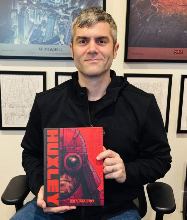
From acclaimed concept artist Ben Mauro (Elysium, Halo: Infinite) comes an ambitious piece of illustrated science fiction storytelling in Huxley: The Oracle. Featuring The additional artistic talents of Steve Chinhsuan Wang (Gears of War 5) and Nikolas Gekko (Destiny 2, Halo: Infinite), The Oracle throws its readers headfirst into a distant future full of cloned super soldiers and A.I. overlords, made enticing thanks to an incredible presentation. With sharp prose writing and absolute top-tier digital art, Huxley: The Oracle is a wondrous piece of modern sci-fi.
“Discover FURY-7, a scorching desert planet, abandoned by humanity in the aftermath of a devastating nuclear holocaust. The Oracles―an empire of powerful, sacred machines―now control the planet’s resources, with genetically engineered human clones to serve their needs. The most advanced of these clones are the Ronins; elite enforcers tasked with maintaining order in Machine City. Among them, Max―a hero from the original HUXLEY graphic novels―discovers a conspiracy that threatens to upend the empire and his own understanding of the world.”
Writing & Plot
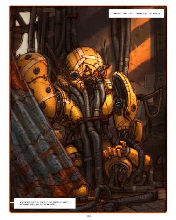
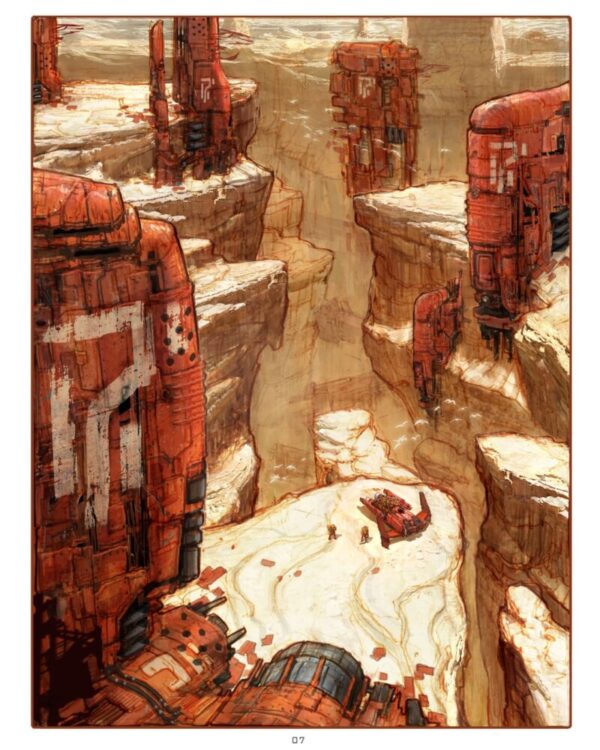
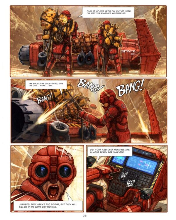
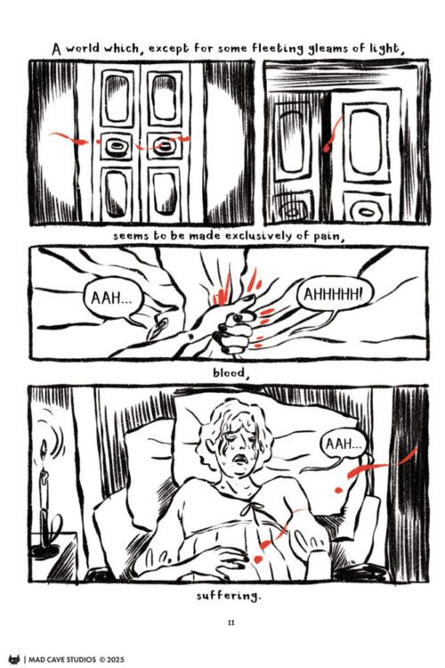
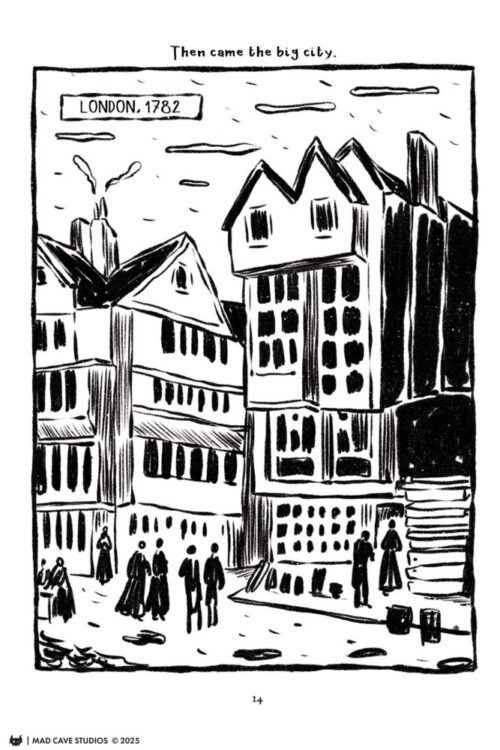
Huxley: The Oracle takes place before the events of the original Huxley story, and follows Max and his team of genetically modified clone soldiers called Ronin as they go on a mission into the bowels of the planet Fury-7. In the process they encounter strange machine beings and discover a mind-altering secret even their A.I. overlords may be unaware of. This book is a pretty different beast than what we usually talk about over here at MFR. Where the first Huxley story was a pretty standard comic series/graphic novel, The Oracle is effectively an illustrated narrative. Whereas a comic uses sequential art and words intertwined to form a story, this book uses straight images accompanied by prose to convey its tale. Think of this as a high caliber illustrated storybook, only filled with robots and lasers rather than simple fables. Ben Mauro’s universe he has created in Huxley has its DNA written all over it, with nods to other great science fiction stories in almost every facet of its storytelling. Ultimately, it’s Mauro’s method of storytelling that helps make the book feel so new and alien. His prose writing here is intentionally minimalist and sparse, but there are flashes of genuine style to his words. His environmental and action descriptors perfectly accompany the imagery we see on the page, making the book feel much more organic. The overall events of The Oracle are relatively bog-standard in terms of science fiction storytelling. What Mauro does to make this story feel so special specifically with his approach to the story is how much this book feels like a puzzle piece. There’s so much promise and mystery within the pages of The Oracle that it helps make the entire experience feel so singularly alien. Granted, some of these mysteries are explained in the original Huxley graphic novel, but this still feels distinct. Within this book, Mauro’s writing is the perfect complement to the stunning visual work.
Art Direction
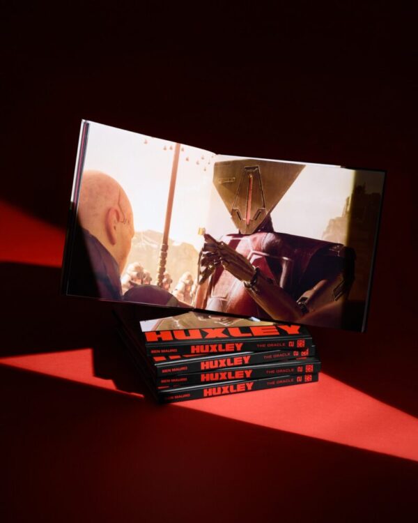
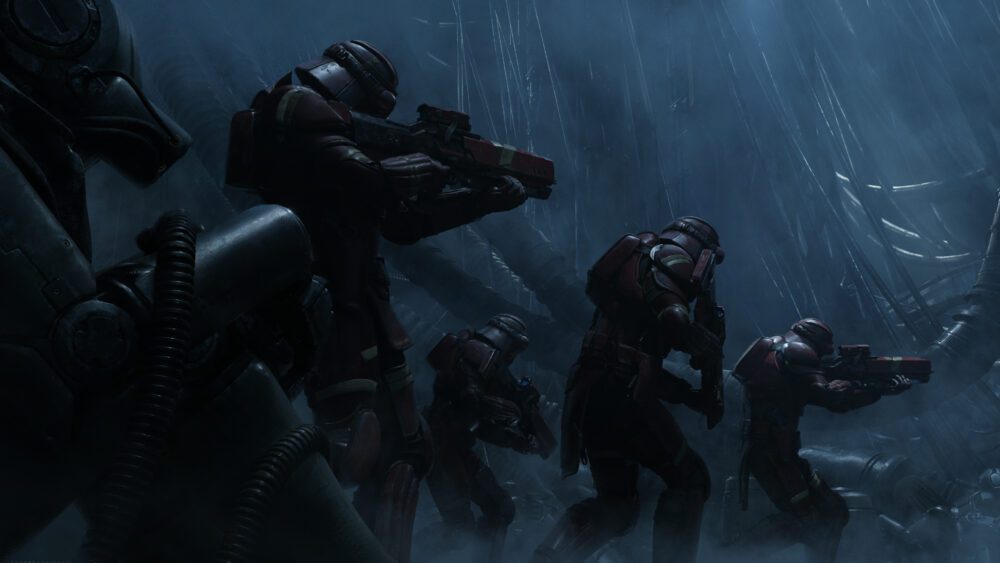
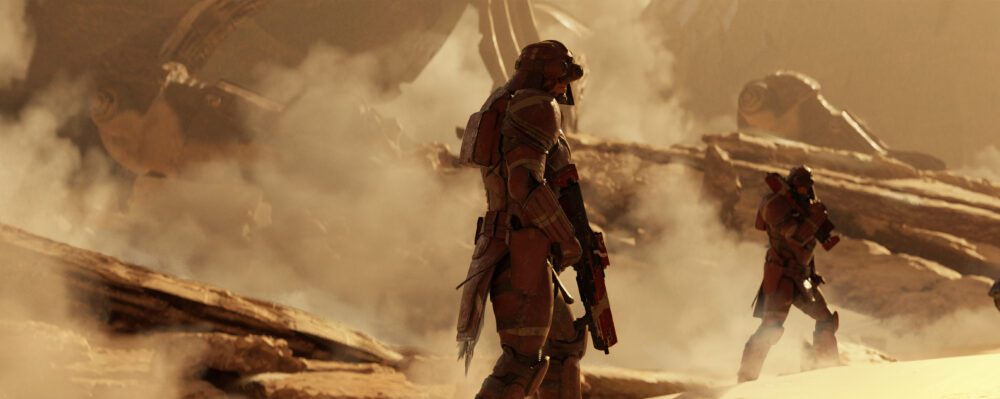
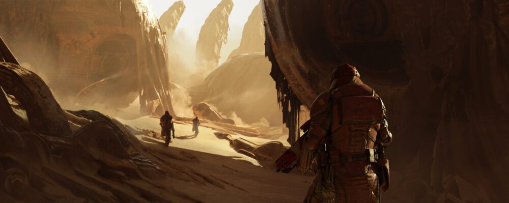
Speaking of visual direction, Mauro is joined by artists Steve Chinhsuan Wang and Nikolas Gekko to craft the impeccable art of Huxley: The Oracle. This is yet another new landscape for MFR, as no one involved in this book is a part of the traditional comic book industry. All of these creators come from the concept art side of the film and video game industry, with resumes including franchises like Gears of War, Halo, and Destiny (which incidentally are all games I have a lot of time in). As such, The Oracle looks more like a book of digital screenshots rather than a sequential storybook. The quality of the art in this volume is staggering, with the digital rendering being of the absolute utmost quality. Every armored surface is pitted with age and combat wear, every piece of machinery wildly complex and detailed. The color range of this book is pretty limited, mostly revolving around desert sands and dimly illuminated labyrinthian corridors. This works in the book’s favor though, as every page pulls readers into the inescapable mysteries of this worn future. It’s easy to see the sort of visual elements that are borrowed from other universes in The Oracle, and they make sense given the backgrounds that each artist comes from. There are elements of Dune, The Matrix, Warhammer 40,000, and other science fiction universe to be found here. It’s a specific feeling that many modern sci-fi fans will feel right at home in. Another factor that has to be considered when looking at this book’s visuals is its actual physical presentation. The Oracle comes as a 10.5 x 11.5 artist edition style hardcover, with a wide style that specifically focuses on the landscape-styles focus on the large visual pieces. It’s rare that the physical copy of the book is actually a factor when examining a story like this, but with The Oracle the dimensions and presentation of this hardcover are a huge boon in its favor.
Verdict
Huxley: The Oracle is a fascinating and stunning addition to Ben Mauro’s growing science fiction universe. His prose work that accompanies the visuals adds a flavor and context to the events in the story that is interesting to read without ever bogging down the experience. The art by Steve Chinhsuan Wang and Nikolas Gekko is jaw-droppingly impressive, and is some of the coolest visual work done in an illustrated sci-fi book in recent memory. Be sure to check out Ben Mauro’s Huxley universe and The Oracle, available now!