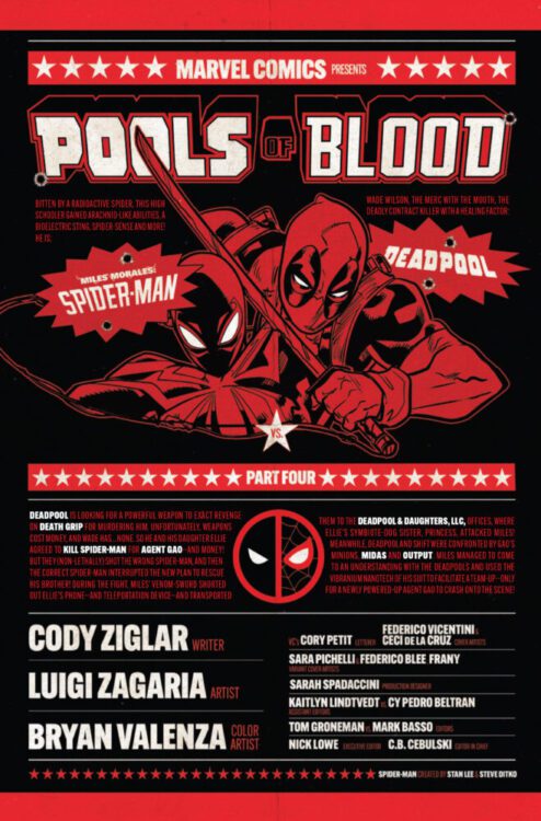
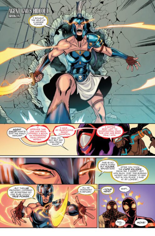
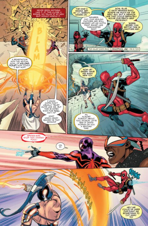
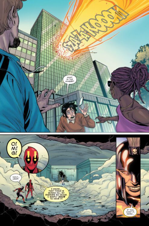
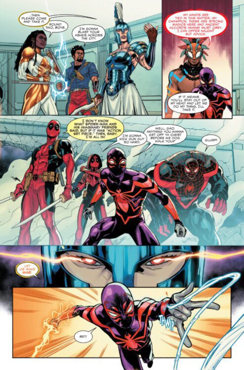
MILES MORALES: SPIDER-MAN #31 hits your local comic book store on March 19th, but thanks to Marvel Comics, Monkeys Fighting Robots has an exclusive four-page preview for you!
About the issue: “POOLS OF BLOOD” – PART FOUR!
The enemy of Spider-Man’s enemy is…DEADPOOL? But first, Spidey and the Deadpools have a score to settle. Should Miles Morales survive THIS fight…he’ll have to face the terrifying threat pulling all these strings!
The issue is by writer Cody Ziglar and artist Luigi Zagaria, with colors by Bryan Valenza, and Cory Petit. The main cover is by Federico Vicentini and Ceci de la Cruz.
Check out our MILES MORALES: SPIDER-MAN #31 preview below:
Are you reading MILES MORALES: SPIDER-MAN? Sound off in the comments!
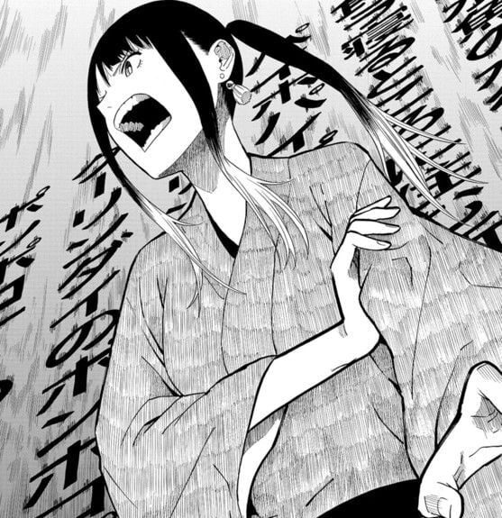
If one unfamiliar with manga, or even comics in general, were asked to describe them, it wouldn’t be surprising to hear them say the stories are to be action-forward, perhaps a thriller, or based entirely on fiction. As avid readers of the medium know, while this doesn’t encapsulate the whole identity of comics and manga, there is truth to the generalizations. While there are a few exceptions, when looking at Shonen Jump’s slate for the past few years, you’ll find action, sports, and horror dominating the scene. However, regardless of genre, there is occasionally a story that combines all its elements superbly and proceeds to deliver something that anyone can pick up and just go, “Damn… that’s good.” Right now, that’s Akane-Banashi.
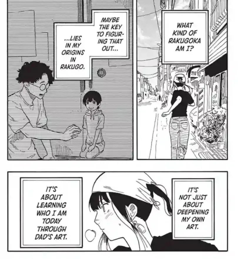
Akane-Banashi, by author Yuki Suenaga and illustrator Takamasa Moue, follows 17-year-old Akane Osaki as she learns Rakugo, a traditional form of Japanese storytelling, and aims to become a shin’uchi, the highest rank a ‘rakugoka’ can achieve. Akane’s journey is initially set up as a revenge story of sorts. Her father, who had been a practicing rakugoka for over a decade, finally gets a shot at the shin’uchi rank. However, he and every other rakugoka who perform for the title are abruptly and unceremoniously expelled from the practice by master Issho, who is seen as the patriarch of his school, and widely accepted as the current cultural leader of his art.
The then 11-year-old Akane sees that everyone outside the rakugo community seems excited and happy for her father, who now works an “honest” job selling concrete, earning more money, and generally having a better quality of life. Akane is infuriated by this; she loves her father’s art and the joy it brings them both. So she vows to learn rakugo and earn the title that escaped her father’s grasp.
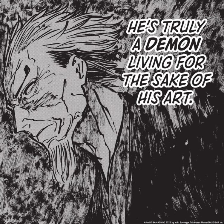
Akane-Banashi quickly identifies itself as more than a simple revenge story. Akane and the reader are shown the harsh realities of being a great artist early on: not everyone can or will make it to the top. Her father, while dedicated to his art, failed at it due to his lack of confidence and his split focus. He had fears he could not swallow and expectations he hoped to achieve, and in this faltering, he could no longer deliver his best art. Akane is indeed her father’s daughter, but where he had fear, she does not. She is quickly and defiantly portrayed as a living and breathing rakugo machine. She shows no signs of faltering and makes no plans to pick other careers or colleges, with a single-minded focus on making it to the top. This is not to say she is infallible or not riddled with mistakes to fix, however, her drive and overwhelming love for the art make it impossible not to root for her. If this were the film Whiplash, she would be Andrew and Master Issho would be her Fletcher, both locked in a struggle to master an art and create a master of it.
Within the portrayal of rakugo itself, each story shown is given deep respect, as if a master is performing it for you. As a reader, you can’t skim past, or gloss over any aspect of the performance. You find yourself glued to every minute detail. Not only is the history of each rakugo story given as background, but they always tend to fit narratively to either Akane’s journey or another performer, even serving as foreshadowing or red herrings to later reveals. Although delivered in this written form, the performances don’t lose any impact on their emotional delivery.
The art and the coloring by Moue is also deserving of high praise. It is detailed and intense at times, but as rakugo is a comedy art, it is not above getting silly and over the top. The everyday musings of the story are mostly portrayed the same way, but when rakugo is being performed, Moue lets loose with imagination and boldness. Depending on the story, the lines are sharp and pointed, akin to traditional Japanese styles, while some are sillier and closer to a Ghibli movie in presentation. Moue creates these wildly detailed landscapes that allow the reader to dive into the world of the story that the Rakugoka is describing. The lettering, while remaining mostly consistent in terms of speech, is also used widely in impact text that seem to radiate from the characters. The speech bubbles and shading are used very effectively to show independent characters, but also showcase one character portraying multiple voices simultaneously without confusion.
The series, now approaching its third birthday and what is assumed to be its midway point, portrays much more than just a legendary rakugoka in the making. It is a love letter to the arts themselves. It showcases how compelling and exciting learning and mastering an art is. Characters of different backgrounds and motivations are all shown to be dragging themselves through the mud to master their craft. Some are young prodigies, while others are starting on the art form as a mid-life career change. Some are relentless in pursuing history, performing rakugo in a way a scholar would. Others dedicate themselves to the performance, by portraying other characters extremely well or adapting voices, maybe even modernizing their art for those unfamiliar with the history. Each character has a different way of learning and developing their form of performing. Regardless of how they do it, the similarity is that they love it. They are willing to struggle, learn, and suffer and bring themselves completely out of their comfort zones for their art.
This is what makes Akane-Banashi such a splendid story. It draws you into its world and forces you to fall in love with it, its characters, and its history, and you can’t do anything about it. It’s a piece of art that shows the importance of chasing your dreams, but it does not pretend those dreams can’t become nightmares. It’s got comedy, drama, and so much heart. This series is a masterwork, and you should be reading it.
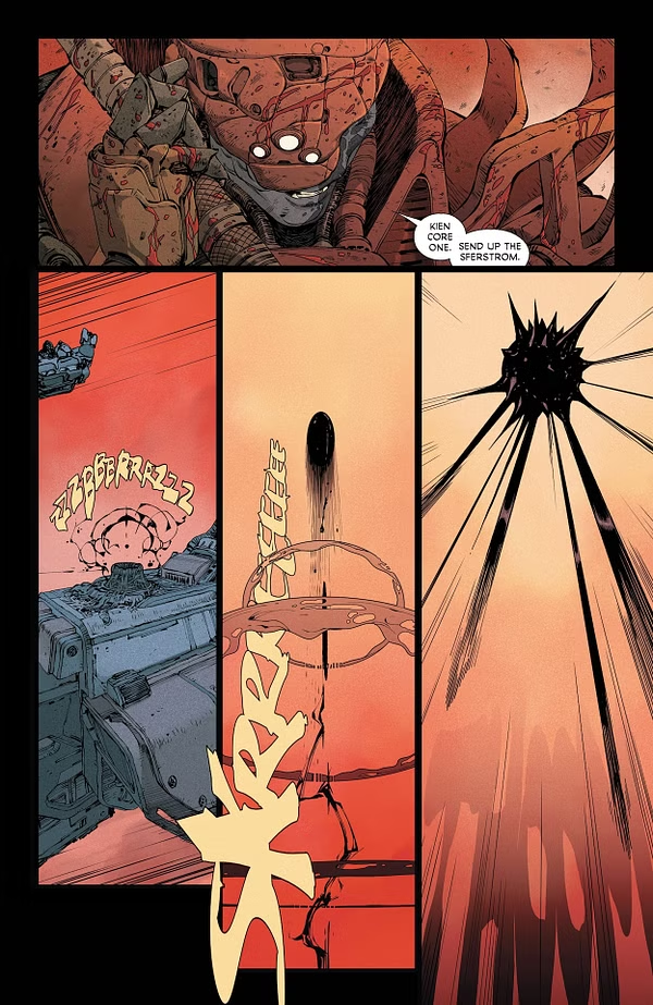
The New Gods #3 tells a story that feels almost like legend. It succeeds wholeheartedly in deepening the lore of the world these powerful characters inhabit. Writer Ram V, artists Riccardo Federici and Evan Cagle, colorist Francesco Segala, and letterer Tom Napolitano all work together to add weight to this story of gods.
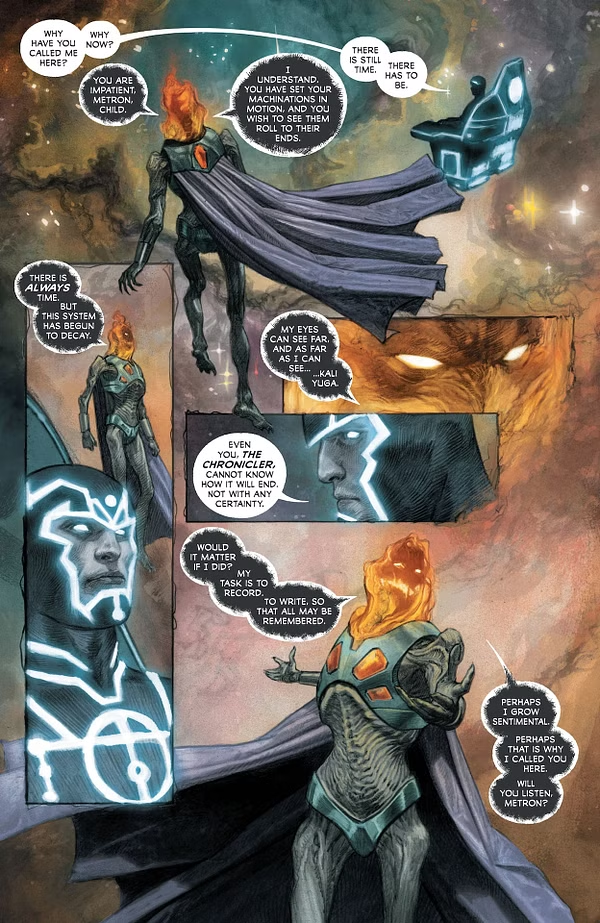
The issue starts with a war raging on Apokolips. It then immediately cuts to Metron and a more mysterious character named The Chronicler. The Chronicler has summoned Metron, but Metron doesn’t know for what. Chronicler explains the story of how this new, young god on Earth came to be. While he does that, Mister Miracle and Big Barda set out to find this new god and protect them. They meet up with Oberon, Mister Miracle’s friend, and leave their child with him while they set out on their mission.
A weapon is launched towards Apokolips.
WRITING
Ram V once again delivers on the new entry of this team’s godly epic. Character work takes a step back here in order for V to do a bit of housekeeping. He explains the origins of this new god on Earth, and why they’re so young. The story is told by The Chronicler to Metron, and right there you already have an incredibly interesting dynamic. A mysterious character giving new information to the man who should know everything is a really fun situation V sets up. The character that should know everything and strives to paired with the character that does makes for some great dialogue and V uses that to his advantage.
The story the Chronicler tells feels like legend. V writes it like it’s a new entry in a book of myth that will be read thousands of years from now, and that really works. Something really special about telling the story this way is how it deals with the things not even the gods could account for. At one point, Chronicler’s story takes an unexpected turn. He expected the child to be met with violence and confusion, but instead a human treated them with love and care, and a will to understand. Compassion was not accounted for in the tale of the gods, and that’s an exciting theme for V to explore moving forward through Mister Miracle and Barda especially on this quest of theirs to find the child.
War on Apokolips.
ART
The start of the first two issues each featured a few prologue pages helmed by different artists. After those, Cagle would take the reins for the majority of the issue. That wasn’t the case this time around. Cagle did the beginning and a few interlude portions, but Federici took on half the workload this time around as well. Both do amazing work, and the work of each flows nicely into the work of the other. While Cagle covers the art in the present, Federici handles the art of the Chronicler’s story. Federici’s style really lends itself to recounting myths and fables. His art is dreamlike, like pages out of a storybook. He does this really special thing in a page with Chronicler and Metron where Chronicler’s face fills the panel that it’s in, but then breaks free of it as he just blends into the beautiful starry background. It helps in showing his control over stories, how he’s the storyteller and that everything serves him. Federici helps Chronicler’s story feel like history through these mostly static images of godlike characters and locations. It’s as much showing as it is telling, the reader sometimes even gaining more context through what they’re seeing rather than what they’re reading.
Cagle covers the present day portions of the issue, and it feels like he’s found a really great rhythm with Scott and Barda. He perfectly captures their endearment for one another through facial expressions and body language. He draws Scott wearing his mask in a really fun way. Certain facial features on it are prominent, but it’s really just an incredible expressive set of eyes and his mouth. There’s this one specific panel where Scott is standing on top of a car with his cape flowing with the wind. a rocket is shot at him with the smoke of it breaking through the panel, hitting the rocks behind him as he and his beautifully designed suit remain unscathed. There’s so much impressive detail to both him and Barda. It’s just consistent quality.
Chronicler and Metron meet.
COLORS
This issue’s coloring really lends itself to both art styles present. Segala fully displays his range here. The colors present in Federici’s part of the book are mostly muted. There’s a prominent beige that fills the background like smoke, telling us that the background details of the story don’t matter. The main objects in the story are bright and prominent though. The bodies of gods as well as the cosmos itself are shining blue with stars. Green eyes pierce through the page, watching. The ship that escapes a planet with the child has a strong bright trail behind it. With Cagle, Segala’s chunk of the story is much more grounded. Not everything is blended to resemble myth, a lot of stuff is flat and much cleaner. We’re in reality now, and on Earth. Things need to seem real and tangible, and Segala really excels at that switch. It’s seamless.
Chronicler tells his story
LETTERS
The lettering in this issue is especially creative. Large, text-filled boxes are present when the Chronicler tells his story of the new god. They’re placed carefully around the beautiful art, and there are very little text bubbles. The bubbles help to immerse us in the tale, but the large boxes fill the page, they’re the real focus and are incredibly prominent. Napolitano also does this really fun thing with Scott. He can be sassy at times, and Napolitano really stretches out the letters on a few words to make him come off as a snarky schoolboy. The repeated letter alternates different sizes to make it read a certain way, and it’s just really fun and clever.
CONCLUSION
This issue was incredible. We were told a story hidden from the New Gods themselves in a masterful way, everyone involved should be found. It felt like myth being etched into the walls of a cave with the story in the present contrasting that, showing that we’re in this situation. We’re here, experiencing the aftermath of the fight of the gods. It’s unimaginable how much more powerful they’ll seem in the issues to come.
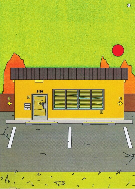
2120 by George Wylesol Cover Art
Credit: Avery Hill Publishing
The easiest way to describe 2120, written and illustrated by George Wylesol, is that it is a modern “Choose Your Own Adventure” comic book, but it is also so much more.
For those who don’t know, a Choose Your Own Adventure book is what kids used to do before sandbox computer games. You would enter a magical or science fiction world and go on an adventure where you got to decide what you did, and when you did it. All of this was held within the tight constraints of an orchestrated plot and meticulous narrative planning. With very few rules, you would start at page one and decide how the story unfolded by picking one of the few options you were given. Each option led to a different page within the book, and once you had flicked forward, there was no going back. That is, unless you placed a bookmark at the previous page, or made a note of the route you had taken. But that was cheating, and you were only cheating yourself.
The most famous series of Choose Your Own Adventures are probably the Fighting Fantasy series created by Steve Jackson and Ian Livingston. The first title, The Warlock of Firetop Mountain, was released in 1983 and spawned a magnificent, long running series. But other options were available, and over the years I personally have owned and played books based on Asterix the Gaul, Transformers, Indiana Jones, and a collection of non-franchise related titles.
2120 by George Wylesol Office Exterior Credit: Avery Hill Publishing
Jump forward to 2022, and Avery Hill Publishing released George Wylesol’s 2120, a new kind of Choose Your Own Adventure that incorporates the Escape Room culture that has grown in recent years, and the booming graphic novel market.
The book was released in English and Italian within the same year, but as you go through the book, you will realise that its themes and uncomfortable fears are almost universal. If you’ve ever worked in or been to a small company’s office in a nondescript town or city, you will instantly recognise the setting. But even if you haven’t been to such a place, the creepy, unnerving, desolate atmosphere that Wylesol brings to his illustrations will definitely hit a spot, and not one you’d necessarily want hit.
Wylesol’s art is linear in form, almost clinical, especially for the office and its internal corridors of the book. The world that he puts you in is created from delicate straight lines, with forced perspective and flat, unassuming colour fields. The spaces are very well designed and fit on each page to give the impression of a first person shooter vido game, but without the dread of alien creatures or blood thirsty gangsters hiding behind every corner. No, in 2120 there is a different type of dread, one of oppressive blandness, a claustrophobic nightmare where the endless, featureless, corridors stretch out before you in a never-ending labyrinth of inactivity. The initial suggestion that you have a choice over what you do and where you go seems to dissipate within the first few choices, as the banality of an empty office becomes apparent. If you’ve ever had to work late as an administrator, then this early part of the book will claw out those nightmares of being alone in corporate blandness.
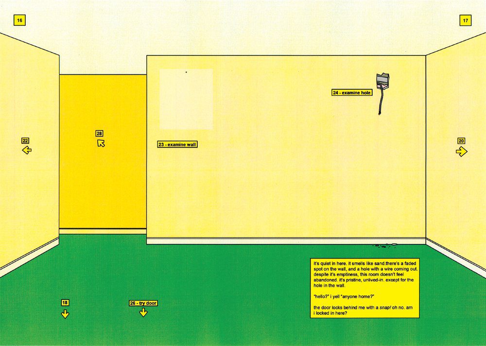
2120 by George Wylesol Office Interior Credit: Avery Hill Publishing
The colouring throughout 2120 is important to the atmosphere that Wylesol is creating. The walls are bleached peach or faded beige, and the floor has a distinctive dark green that is the very definition of flat. There is no depth or texture to most of the setting, making it sterile and uncomfortable, like being in the waiting room of an old hospital building. Wylesol doesn’t want the reader to feel comfortable within this “adventure,” but the cliche of dark uninviting spaces is completely reversed here. Each corridor and adjoining room appears well lit to emphasize the lack of fixtures, fitting, and—above all—characters. There is so much emptiness in this book that whenever you turn to a page with something that isn’t a wall or a door, you find yourself examining it very closely. It must be a clue, must be important in some way to explaining what is going on. If you are the type of person who makes notes while reading, you’ll be making many notes. And that is something that I would encourage as you read/play this book. It’s not often that you would recommend note making while reading a comic, but in this instance it will prove useful.
One of the things that you will discover quite quickly is that you have to go everywhere and not just blindly keep going forward. I found myself constantly moving backwards through corridors I’d just walked up, just to check on that vent in the previous room in case it held something important. In some Choose Your Own Adventure books, you can miss huge sections of the adventure and still reach a satisfying conclusion. This makes the book re-playable, and the handfuls of pages that you skip past as you play acts as an invitation to re-read. With 2120, almost the opposite is true. As this has much more of an Escape Room feel to it, every single aspect is important, and as a reader you don’t want to miss anything. It acts as a standard graphic novel, forcing you to read all of the pages, but they just happen not to be in the correct order. There is a mind numbing puzzle hidden beneath the pages and pages of numbered doors and almost empty rooms.
2120 by George Wylesol interior artwork Credit: Avery Hill Publishing
I could speak of the narrative that you form as you work through this book but, to be honest, that’s for you to discover. I will say that a number of the page turns were terrifying and I began to get a Shining feel as I ventured further into the depths of the office. Wylesol matches the narrative to his visual design which creates a paradoxically engaging graphic novel where, for the most part, nothing happens. It will suck you in and steal your time.
Touching on philosophical experiences, the banality of corporate architectural design, and modern agnosiophobia, 2120 is a superbly constructed modern take on the interactive novel. George Wylesol’s illustrative style is a fresh aesthetic that has more in common with Martin Vaughn-James’s The Cage than it does your average weekly comic book release which will make it especially appealing to some readers. It is a work of art and it makes you work for the art. I highly recommend it, especially if you fancy something different from the medium.
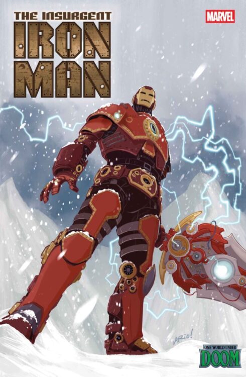
IRON MAN #9 is coming to your local comic book store June 18th, but thanks to Marvel Comics, Monkeys Fighting Robots has the exclusive first look at the issue!
The issue is a tie-in for ONE WORLD UNDER DOOM, a “status quo shift” that began recently, the likes of which Marvel says hasn’t been seen since 2008’s Dark Reign.
About the issue: IRON MAN DISASSEMBLED!
While the AVENGERS fight DOOM on the public stage, TONY STARK tries to bring him down from inside Latveria. But can his former teammate THE BLACK WIDOW trust his tactics? Find out when THE WINTER GUARD arrives for round two!
The issue is by writer Spencer Ackerman and artist Julius Ohta. The main cover is by Yasmine Putri, and the variant cover is by Ario Anindito (which you can see below).
Get your first look at Anindito’s cover for IRON MAN #9 here:
Are you enjoying ONE WORLD UNDER DOOM? Sound off in the comments!
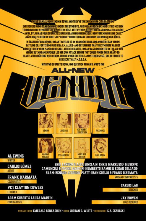
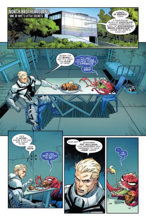
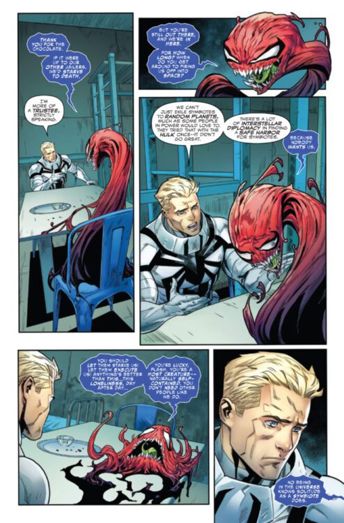
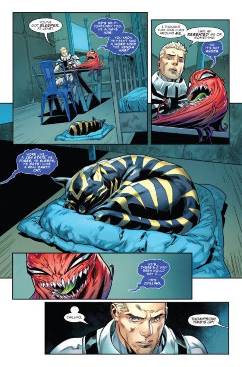
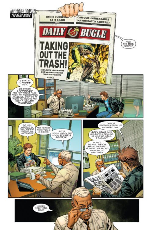
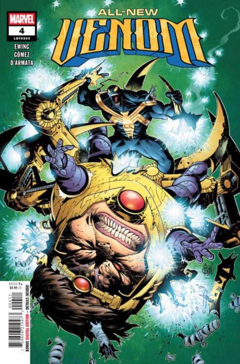
ALL-NEW VENOM #4 hits your local comic book store on March 12th, but thanks to Marvel Comics, Monkeys Fighting Robots has an exclusive four-page preview for you!
About the issue: M.O.D.O.K. MADNESS!
M.O.D.O.K. gets inside the All-New Venom’s head…and you won’t believe how! But whose side is Madame Masque on? One thing’s for sure – by the time you finish this issue, you’ll be one step closer to knowing who’s under the goo…Meanwhile, take a visit to S.C.A.R. HQ –and find out what happened to Flash Thompson, Agent Anti-Venom!
The issue is by writer Al Ewing and artist Carlos Gómez, with colors by Frank D’Armata, and letters by Clayton Cowles. The main cover is by Adam Kubert and Laura Martin.
Check out our ALL-NEW VENOM #4 preview below:
Are you reading ALL-NEW VENOM? Sound off in the comments!
From acclaimed writer Faith Erin Hicks (Avatar: The Last Airbender, Pumpkinheads) and industry veteran Lee Loughridge comes the next chapter in Image/Skybound’s Universal Monsters imprint with The Mummy #1. Hicks and Loughridge take the classic movie monster premise and bring a modern cultural examination to the 1920’s, making the lead characters just as important as the titular creature itself. With a compelling script and excellent visual work, The Mummy is off to a great start.
“Helen Grosvenor is a woman born to two worlds and belonging in neither, forever haunted by a cursed encounter as a child. When unknown voices bring her back to an Egyptian dig site from her past, Helen will unknowingly play an unexpected role in the rise of a monster known only as…THE MUMMY!”
Writing & Plot
Faith Erin Hicks crafts a script that goes well beyond just being a cool monster story with The Mummy #1. This opening chapter focuses even more on themes of imperialism, classism, and cultural heritage than it does on just the titular Mummy – all elements that existed (in very subtle amounts) even in the original Karloff films. Having the story open with such a focus on Helen’s half-British half-Egyptian heritage and her family’s wealth places readers into the shoes of the characters remarkably well. After all, the best horror works so well because of the humanity of its main characters. Watching Helen navigate being raised as a young girl torn between her native culture and that of colonizers – and then trying to relate to the very people who resent her family and status so much – is genuinely compelling storytelling. The supernatural elements that are introduced in the comic feel like secondary plot bits, but this isn’t a bad thing. We want to root for Helen, and it makes the lure of what’s coming next that much more irresistible. The Mummy itself feels like a force of nature rather than a monster, and this makes sense when paired with what Helen discovers about herself (no spoilers here). I can appreciate that there are pieces that feel pulled from the Brendan Fraser & Rachel Weisz Mummy films that are so loved by our generation. Faith Erin Hicks is off to strong start with this opening chapter.
Art Direction
Eisner-winning industry veteran Lee Loughridge is on hand to craft the sand and temple-laden panels for The Mummy #1, and as expected he does some stellar work. Loughridge’s unique visual style lends itself especially well to character designs and expressions – which is doubly important for a comic that centers so much on the people in the story. Every conversation feels important, and no space feels wasted as Loughridge establishes each scene. His design of the titular Mummy brings more humanity than some may be expecting, whille also clearly drawing from Karloff’s classic features. Loughridge sells the idea that the ancient creature is a force of nature brought about by the British archeologists’ interference with the ruins. The best (or at least my favorite) panel in the issue is of the Mummy standing on a sand dune, his silhouette cast by moonlight as Helen watches in awe. Loughridge brings a phenomenal mix of supernatural mysticism and humanity to the pages of The Mummy #1.
Verdict
The Mummy #1 is a fantastic opening to this newest chapter in Image/Skybound’s Universal Monsters imprint. Faith Erin Hicks’s script brings humanity and insightful commentary to a property that has always toyed with these concepts, but here they are an active part of the story. Lee Loughridge’s visual work is sharply directed and animated, expertly crafting both a mystical aesthetic and compelling visual characterization to the pages of this comic. Be sure to grab this debut issue when it hits shelves on March 26th!
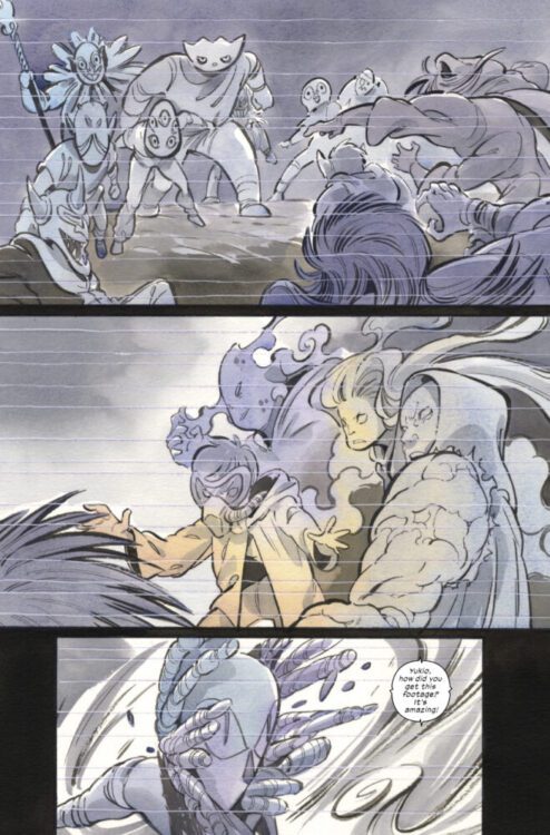
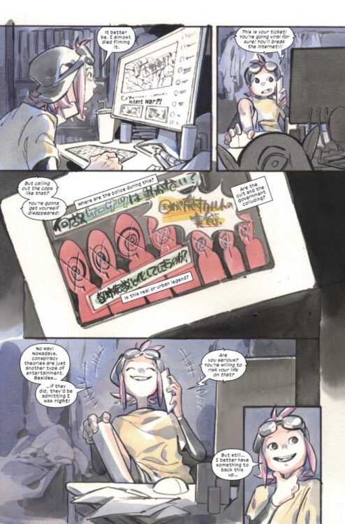
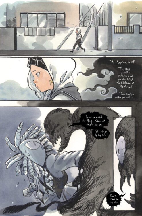
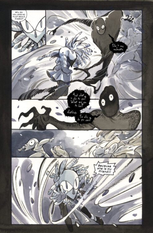
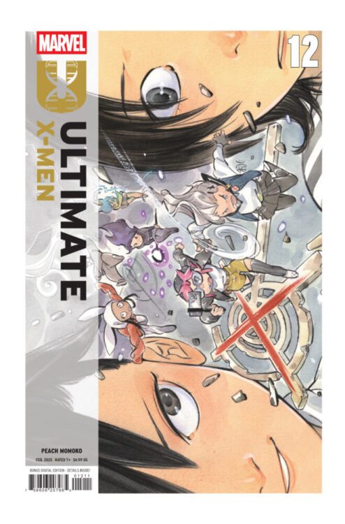
ULTIMATE X-MEN #12 hits your local comic book store on February 26th, but thanks to Marvel Comics, Monkeys Fighting Robots has an exclusive four-page preview for you!
About the issue: SHOWDOWN WITH THE SHADOW KING!
Maystorm leads her team of masked mutants in a climactic battle against Shadow King! But the confrontation leads to a huge rift between best friends Maystorm and Armor…
The issue is by writer/artist Peach Momoko, with script adaptation by Zack Davisson, and letters by Travis Lanham. The main cover is by Peach Momoko.
Check out our ULTIMATE X-MEN #12 preview below:
What’s been your favorite title of the new Ultimate Universe? Sound off in the comments!
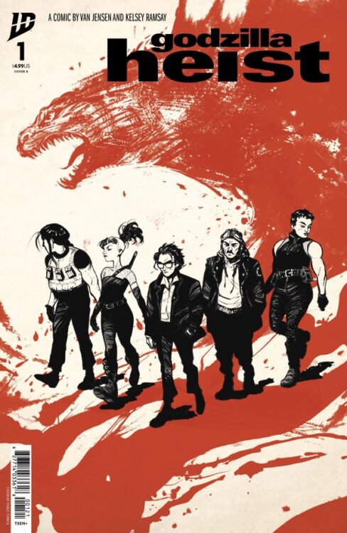
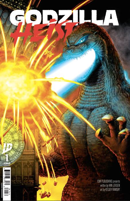
From writer Van Jensen (Green Lantern, James Bond) and artist Kelsey Ramsay (Dark Spaces: Good Deeds) comes a tale of thieves and skyscraper-sized legends in Godzilla Heist #1. Featuring color art by Heather Breckel and lettering from Sandy Tanaka, this opening issue offers a neat take on a Godzilla story by using classic heist cliches to the story’s advantage. With a predictable but solid script and excellent visual style, Godzilla Heist is off to a fun start.
“What if you could predict when and where Godzilla would appear? What if you knew of the perfect opportunity to pull off the heist of the century? Jai is a young man who knows two things: A heist needs a good distraction, and there’s no distraction like Godzilla. So, when Jai discovers Godzilla responds to specific energy signals he can send into the atmosphere, he creates the perfect opportunity to stage high-profile heists in the middle of Godzilla attacks. But these heists put Jai on the radar of some very dangerous men, men who want Jai to work with them to pull off the most dangerous job the world has ever seen.”
Writing & Plot
Anything involving Godzilla is going to be a good time, which is exactly the mentality Van Jensen takes with his script for Godzilla Heist #1. On the outset, using the world’s most legendary giant monster as a cover for stealing from banks and casinos is a genius concept – but it’s the small touches that really make the story work. Without getting into spoilers, Jai’s (the protagonist) use of Godzilla in this comic is a neat plot detail I didn’t expect. Many of the main plot points – Jai’s backstory, the crewmembers he meets, and all the little heist planning details – are familiar cliches. You’ve seen all of this done before, but now Godzilla is here. Even if much of the story feels like it treads familiar ground, Jensen’s handling of the plot overall still makes the story feel compelling. The final page twists add to the mystique going forward, making Godzilla Heist begin with a promising start.
Art Direction
One of the coolest parts of reading Godzilla comics is getting to see so many artistic renditions of one of pop culture’s greatest icons. This time, it’s Kelsey Ramsay’s turn to show off her take on the King of the Monsters in the pages of Godzilla Heist #1. Ramsay’s tight penciling and heavy use of hatching give this opening issue a unique feeling among Godzilla comics. This isn’t the sort of aesthetic I would normally pick for a Godzilla book, but Ramsay really makes it work. Her version of Godzilla is still big and terrifying of course (she uses the later Showa era and on design as a basis), but where her work really shines is in the more human-focused elements. Her character designs, much like Jensen’s script, come off as familiar stereotypes, but they are well rendered and fit into the comic’s atmosphere. Her facial animations are solid as well, making the cast feel more like people. I found the coolest moment in Ramsay’s work here to be a piece where we see Jai as a child, and the art style completely changes. It’s a great touch that not only fit the story and added to the protagonist as a person, but a chance for the artist to flex a bit as well. Heather Breckel’s color art in this comic really seals its unique atmosphere. There’s a sort of grimy, flat technique that Breckel uses that pulls readers into the smoke and ozone of the urban environments – especially when Goji is in town. Sandy Tanaka’s lettering is solid throughout the book, but really come to life when Godzilla shows up. Her SFX work when the big man shows up and unleashes his atomic breath is great stuff, becoming as much of the artistic backdrop as it does a part of the reading experience. Overall, Godzilla Heist is a solid and unique-looking comic in the Godzilla library.
Verdict
Godzilla Heist #1 is a predictable but fun opening chapter to this unique take on a Godzilla story. Van Jensen’s script takes familiar character concept and genre tropes and creatively throws them in a Kaiju story, creating something that feels a bit safe but still promises some compelling plot points in the future. The visuals from Kelsey Ramsay and Heather Breckel are a unique choice for a Godzilla comic, and offer a great sense of atmosphere to this kaiju-heist tale. Be sure to grab this debut issue when it hits shelves on February 19th!
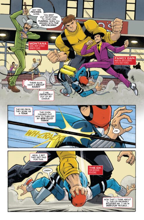
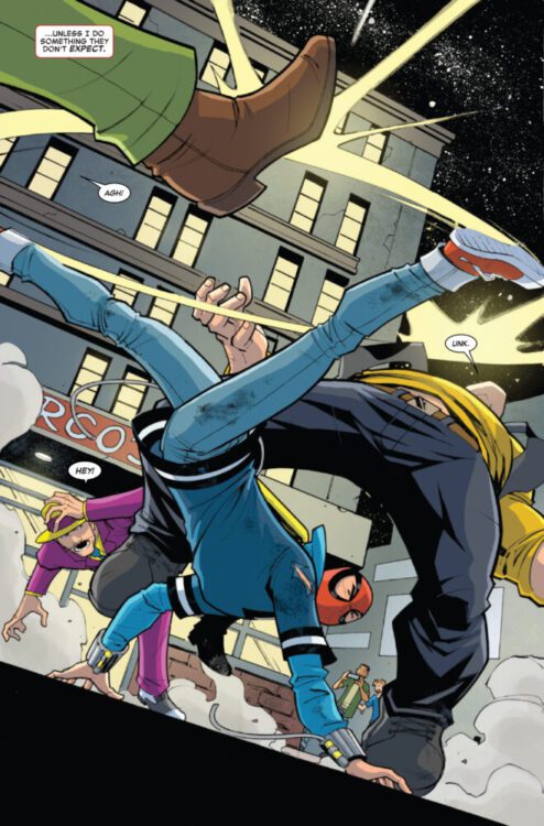
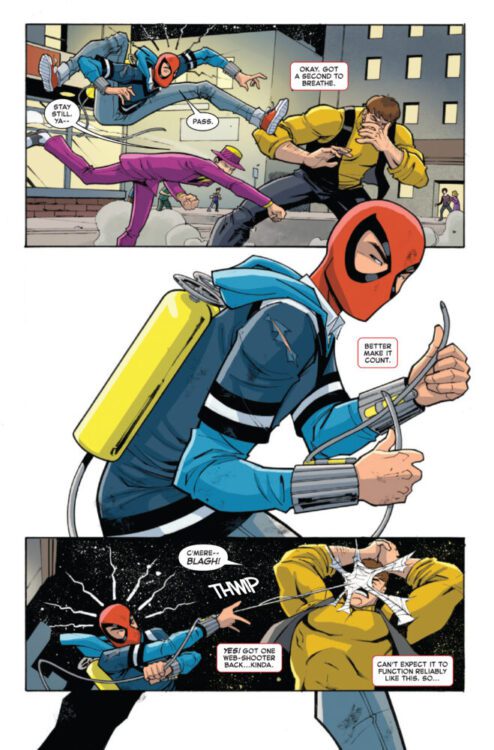
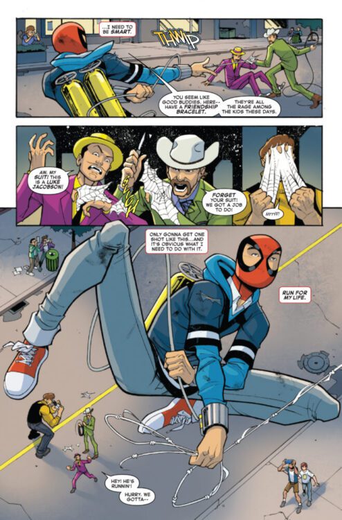
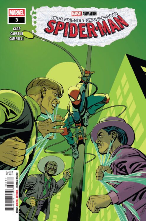
YOUR FRIENDLY NEIGHBORHOOD SPIDER-MAN #3 hits your local comic book store on February 19th, but thanks to Marvel Comics, Monkeys Fighting Robots has an exclusive four-page preview for you!
About the issue: SWINGING INTO TROUBLE!
With a new school, new powers and a new secret identity, Peter Parker’s in over his head as he tries to navigate his double life as Spider-Man. YOUR FRIENDLY NEIGHBORHOOD SPIDER-MAN is swinging into a new animated series on Disney+, but you can read about it first as he takes on THE ENFORCERS!
The issue is by writer Christos Gage and artist Eric Gapstur, with colors by Jim Campbell, and letters by Joe Caramagna. The main cover is by Leonardo Romero.
The comic is a prequel to the animated television series of the same name, currently streaming on Disney+.
Check out our YOUR FRIENDLY NEIGHBORHOOD SPIDER-MAN #3 preview below:
Are you reading YOUR FRIENDLY NEIGHBORHOOD SPIDER-MAN? Sound off in the comments!