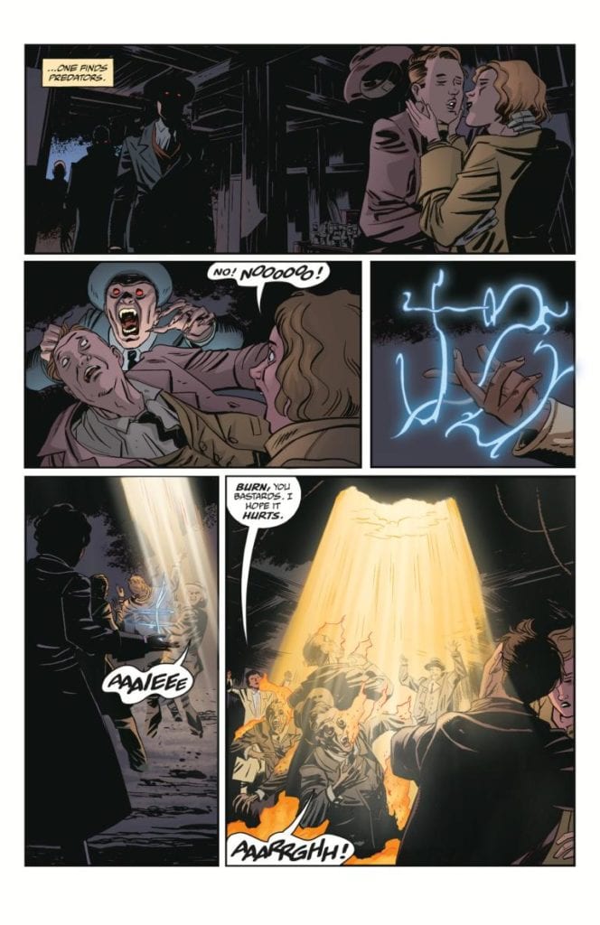
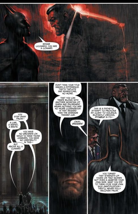
Shadowman #3 from Valiant Entertainment comes to comic stores on June 23. As writer Cullen Bunn’s plot intensifies, now is a good time to go over the title character’s magic system. With illustrations by Jon Davis-Hunt and coloring by Jordie Bellaire, the spirits tied to this magic never looked so menacing. The way letterer Clayton Cowles has these spirits speak adds another ghastly layer to them.
Shadowman #3 On Voodoo
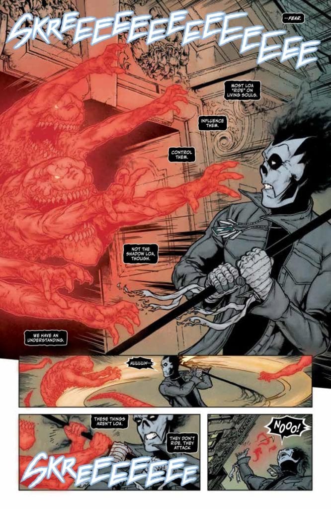
Shadowman #3 goes into Valiant’s take on Voodoo magic after briefly touching it prior. Interestingly enough, that’s why this issue connects to Bunn’s previous Voodoo series, Punk Mambo. In this case, it’s the ways the Loa interact with people. While previous issues of the series show healthier boundaries between the spirits, as Shadowman exemplifies, this issue goes into the more dangerous areas. In his brief time on screen, the issue’s antagonist, Pallbearer, shows how extreme these interactions can be. He’s driven by a need to dominate the Loa, who use mortals as playthings, functioning as a bigoted foil to Shadowman.
A Haunting Atmosphere
Davis-Hunt makes Shadowman #3 all about the spirits with their wild designs. The Pallbearer’s ghostly minions look threatening with their numbers as well as their sharp teeth. Their red glow by Bellaire and the way they attack a jellyfish-like Loa give them a pure predatory presence. But they pale in comparison to Jack’s companion, the demonic Shadow Loa, Bosou Koblamin, whose purple glow makes him look comforting.
The way the spirits stand out in the muted backgrounds makes their presence more pronounceable. The way regular people look so devoid of life in the setting of Barcelona, it’s like they’re already dead. Considering how one Loa rides a host, with ghastly designed word balloons from Cowles no less, it’s hard to tell if this atmosphere of the living dead is because of Pallbearer attacking or the Loa he wants to destroy.
Study Up In Shadowman #3
Shadowman #3 is a gripping look into a concept surrounding a greater arc. The way it’s presented makes it feel like something to remember at any time. Because if anyone goes into the next issue without context, they might be vulnerable to predatory forces.
Expository writing and overuse of caption narration weigh down an otherwise exciting introduction to Image Comics’ expanded Spawn universe. Available now, this giant 74-page comic has four stories written by Spawn creator Todd McFarlane.
Artists: Jim Cheung, Brett Booth, Steven Segovia, and Marcio Takara
Inkers: Adelso Corona, Todd McFarlane
Letterers: Tom Orzechowski, AndWorld Design
Colors: FCO Plascencia, Andrew Dalhouse, Peter Steigerwald
Since 1992, Spawn has captivated the attention of the hellspawn in all of us. Even the least comic-literate will recognize the badass red cape and sinister smile. It’s all thanks to McFarlane, the creator of the series. His inspired work notwithstanding, Spawn’s Universe #1 ain’t it. Unfortunately, it’s McFarlane’s writing that tanks the entire issue for me.
While I recognize the use of caption narration as a valid style choice, I think it’s overused in this book to the detriment of telling a visual story. The result is very distracting, and redundant captions overshadow the art. Often the caption states exactly what is shown in the art, like on page 30 when a new Spawn ally is both shown and described escaping chains and picking up guns. Why not simply let the art speak for itself?
Show, Don’t Tell
Moreover, on a character level, it doesn’t feel like we’re getting to know much of anything about the new and recurring cast. Fans of the series will recognize Medieval Spawn, Cogliostro, and Spawn himself, so there’s no work to be done for them. On the other hand, Gunslinger Spawn, a new hellspawn, doesn’t get much in the way of character. By that, I mean he gets some scenarios to showcase his abilities but nothing of his motivations.
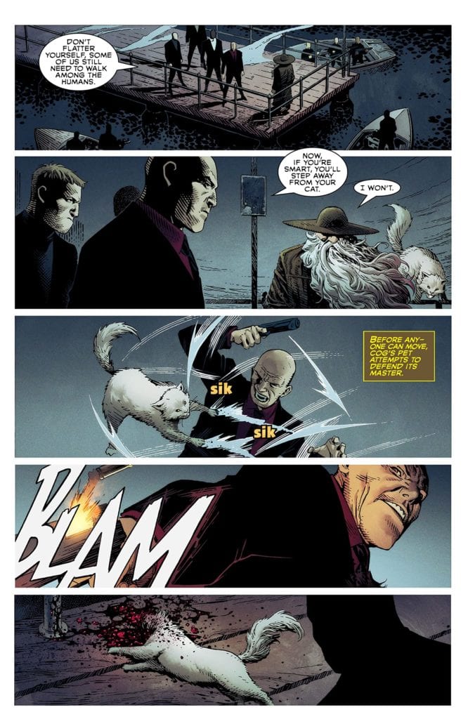
COGLIOSTRO’S CAT DEFENDS HIM FROM ENEMIES.
The only character with a sense of dimensionality is Jessica Priest, a familiar villain. Now known as She-Spawn, she gets a heartfelt confrontation with her family. This kind of emotional groundwork made her more intriguing than any of the other characters. But not all is lost for Spawn’s Universe.
Fortunately, the art almost makes up for such weak writing. Each illustrator adds their own stylistic flair to the four stories, but there is a thorough line of bombast and ruggedness. In my opinion, the standout was Jim Cheung’s work on the main story.
Cogliostro
Page thirty-two epitomizes Cheung’s unique contribution to the issue. Cheung’s scratchy line work and dramatic layout bring life to McFarlane’s expository captions. In the scene, Cogliostro has been kicked into a deep hole where he contrives to summon a new hellspawn called Plague Spawn. The background of the page is completely black, reflecting the darkness of the hole he’s in.
Cogliostro slumps in the middle of the hole, long grey hair flowing in front of him with inked shadows etched into every part of his clothing as if he’s made of darkness. Behind him are four inset panels outlined in red which close on him, shaving his face with a pointy piece of rock. By doing this, Cheung makes the reader like the camera closing in on an intimate, decisive moment. Furthermore, Cheung heightens the ominous tone by closing in on those few actions, assigning dramatic meaning to something as simple as a close shave.
From a lettering standpoint, Orzechowski and AndWorld Design do well in breaking up the exorbitant captions and long dialogue. However, the SFX often missed the mark. On multiple occasions, big blocky font was used that came across as flat instead of expressive. The blocky font didn’t complement the action, where a handwritten or bubble font might have better suited the action. For example, on page 13, there’s an explosion, and the word “boom” is written in blocky blue SFX next to it. Why choose such a cold color, first of all? Second, the blockiness of the letters reads flat where it could have emulated the feeling of an explosion.
Lastly, Plascencia, Dalhouse, and Steigerwald’s colors feel relatively consistent across the four stories. Characteristic of Spawn, the main color palette is comprised of red, green, and blue. Saturation of these colors seems dependent on the tone of the story. So, Medieval Spawn gets high saturation to reflect his theatrical heroic tone. On the flipside, Gunslinger Spawn gets muted colors and more white to reflect his isolation and the desolate landscape. The colors are another strength of the book, which, along with the pencils, kept me reading.
Honestly, I almost stopped reading Spawn’s Universe #1 a couple of times. Seventy-four pages of unnecessary exposition daunted me. But there was enough good in the book to keep me going. Maybe I wasn’t the intended audience.
Regardless, I could see myself returning to Spawn in the future out of curiosity because of this book. So I turn the question to old fans of Spawn: Has McFarlane’s writing style turned you off in the past? Or do you keep reading for the cool art and concept? Sound off, hellspawn!
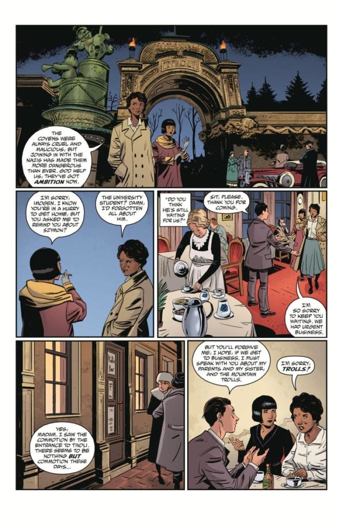
Dark Horse Comics’ Imogen of The Wyrding Way, a one shot in the Outerverse universe, shows how much potential fantasy has to be horrific. Like a scene from Pan’s Labyrinth, Imogen feels like it lives in the in-between. It could be dark or hopeful at any moment, and the reader is caught in the middle. Writers Mike Mignola and Christopher Golden, artist Peter Bergting, colorist Michelle Madsen, and letterer Clem Robins seem to love this middle ground. And they keep us there for as long as they can.
Writing
From the first few pages, Mignola and Golden assure us horror lurks within. Vampires and hellfire abounds. But it’s swept away quickly to bring us back to a quiet morning in a sunny seaside landscape. So as our main character, Imogen, sets off on a mission, we have a feeling in our gut that it may go wrong. Of course, there wouldn’t be a story if it went off without a hitch. But Mignola and Golden keep us, and their characters, hopeful. The most terrifying element to this issue is how normal everything seems.
The omens of things going sour are sprinkled in through conversations with grumpy sailors and unusual things noticed on winter hikes. And when we finally see the terror, Mignola and Golden pull us away. They don’t show us the gruesome details, and in doing this, they make it all the more terrifying. We’re left to imagine just how bad things may have gotten. And through it all, we’re still somehow hoping we’ve read the hints wrong.
Art
Bergting certainly has the ability to create terrifying images. Even the cover to Imogen of the Wyrding Way has a quiet terror to it. But this issue doesn’t feel like a horror comic in its imagery. In the same way that Mignola and Golden keep us wondering if we’re reading a fantasy comic or a horror comic, Bergting keeps things light and joyful. The big trolls walking through the forest look as funny as they do foreboding.
The dark creatures we’re met with in the opening of the issue are dealt with quickly, and there’s a playfulness to the page as it happens. Bergting is frugal with his use of creepy imagery. His avoidance of darkness is what makes his subtle moments of horror strike so deep. His most terrifying images are silhouettes and outlines. He spares us the details, bringing us back to a lighter norm that we feel is tainted by the dark images we’ve conjured up in our minds.
Coloring
Madsen starts us off on a dark note. We open on a scene that begins at night. As we enter a dark house, Madsen keeps everything a dark blue. The burst of light that Imogen uses to get out of their alive is short-lived and the next scene is dark but cast in an eerie green glow. This immediately tells us that these characters are surrounded by horror. But the next scene is a bright, sunny morning. It’s colored like something out of Tintin. And even as our character hike through a forest during the night, Madsen shows the color of their faces and clothes. Madsen brings us into a world of horror, but then lulls us into thinking it may have all gone away. Maybe there are only bright days ahead.
Lettering
Robins’ lettering is a masterclass in subtle differentiations. Robins follows a pretty straightforward style throughout. The font remains the same for the dialogue and the sound effects. Occasionally, a word balloon has warped edges as someone cries out. But when one character is panicking at what’s happening to them, Robins removes the spaces from between their words. “WHATDIDYOUDO?” they say in one word. The sound effects are identical for the most part. Whether it’s the “FFWOOOSHH” of fire or the “THWUMPP” of someone landing in snow, it’s the same block lettering. The one variation is devastating. And the “KRUNCH” of this moment stands out because it looks different from everything else. Robins uses variations to his style very rarely, so that they have more punch when they appear.
Dark Horse’s Imogen of the Wyrding Way is a relatively simple comic. Yet that’s part of what makes it so terrifying. It doesn’t try to horrify you with grisly images or ugly ghouls. No, it shows you just enough for you to connect the dots for yourself. It brilliantly blends fantasy and horror to make a subtle, slow terror. Pick up Imogen of the Wyrding Way, out from Dark Horse June 23rd, at a comic shop near you!
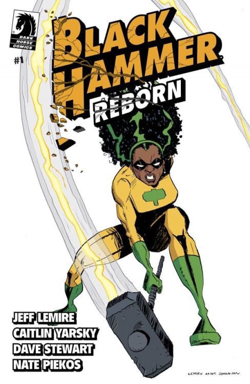
Dark Horse Comics’ Black Hammer Rebornis more like the original Black Hammer than you’d think. In Black Hammer, writer Jeff Lemire and artist Dean Ormston introduced us to a bunch of heroes that were well past their heyday. Stuck on a farm together, the heroes of Spiral City were dealing more with being cooped up than with fighting supervillains. With Black Hammer Reborn #1, writer Jeff Lemire, artist Caitlin Yarsky, colorist Dave Stewart, and letterer Nate Piekos bring us back to that feeling of days gone by. Lucy Weber, the second person to take up the Black Hammer mantle, has put crimefighting behind her. But maybe she won’t be able to for much longer?
Writing
Without the burden of worldbuilding in this new series, Lemire can do whatever he wants. We know the characters, we know the world, he can just dive into the story. But interestingly, this issue is very normal. Just like the original Black Hammer series, Black Hammer Reborn is subtle and human. Lucy Weber isn’t out there punching baddies in tights, she’s raising a family. And just as we begin to think Lemire is repeating himself, he throws in some new elements. We learn about dark secrets and unpredictable sci-fi forces that threaten to blow up Lucy’s existence. In many ways, there’s not much to the script of this issue. We see Lucy with her family, at work, we see a flashback of her fighting a villain, but not much else. But to those familiar with Lemire’s work, there are clues sprinkled in, seeds being planted for where this series might go.
Art
Yarsky’s art reminds us of who we’re dealing with. Lucy Weber was Black Hammer. She might be a mom or a corporate drone now, but she used to be a freaking superhero. And it’s in the drama and expressions that Yarsky shows us this. Lucy’s life is still big and bold, it’s just confined to a new stage. So, when her boss catches her looking up old articles on her computer, his self-righteous leer is that of a supervillain. When Lucy screams for her kids to come downstairs, the look on her face says she may as well be screaming at Anti-God himself. Her life is still full and colorful, it’s just different. Occasionally, moments feel melodramatic, even silly. But maybe these moments feel a little silly to Lucy too. After all, she’s saved the world. What wouldn’t feel silly after that?
Coloring
Not only do the flashback scenes look more vibrant, but they feel like they have a “Lucy” flavor to them that the modern scenes don’t have. As Black Hammer, Lucy’s costume is green and yellow. And when she fights a villain in a flashback, Stewart puts green and yellow everywhere. Yellow is the backdrop of a cop having his gun ripped away, green is the color emanating from the villain. These memories are Lucy’s and these moments were when she felt truly like herself. The modern day scenes feel a little drab in comparison. There’s not much green or yellow, mostly just blue and beige. But then Lucy begins to see things that remind her of her past, and the colors return. Stewart is showing us just how nostalgic Lucy is, even though she’s claiming not to be.
Lettering
Piekos also shows us the big difference between Lucy’s past and present. When she fought as Black Hammer, the fonts for dialogue were constantly changing size and style. There’s a rhythm and a playfulness to how Piekos writes these scenes. But her modern life is straightforward. Piekos rarely bolds worlds or has them jut out in a larger font. Except when Lucy is scolding her kids. It’s bittersweet that this is the only moment her voice shows expression. Sure, she has a simpler life now, but she only seems to come alive when she’s angry and tired of it all.
Dark Horse’s Black Hammer Reborn #1 is an interesting start to a new era. This creative team is easing us into the story to come. While we might not have much to go off of just yet, there are plenty of seeds planted that could lead in all kinds of directions. Pick up Black Hammer Reborn #1, out from Dark Horse June 23rd, at a comic shop near you!
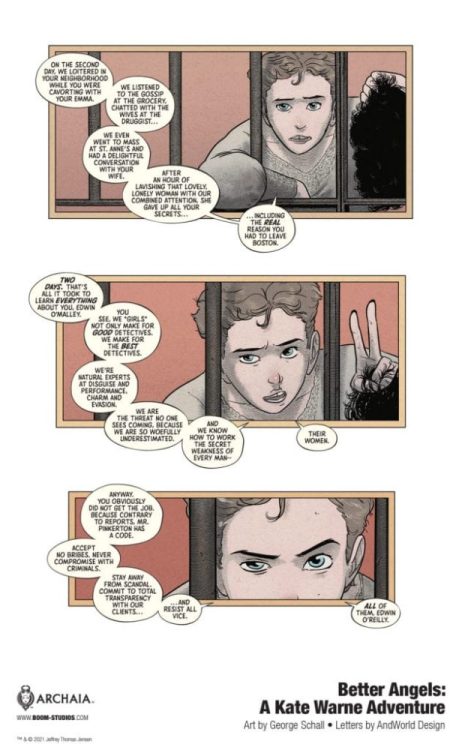
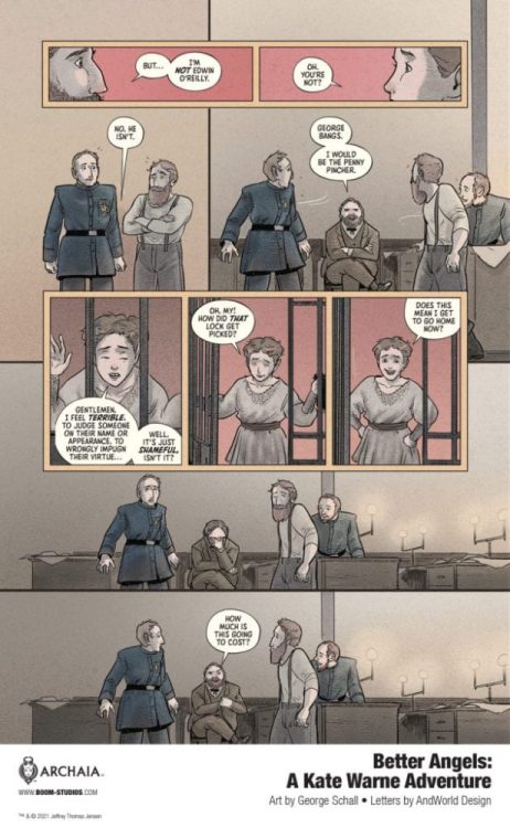
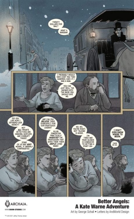
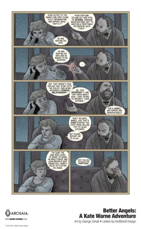
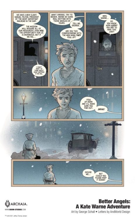
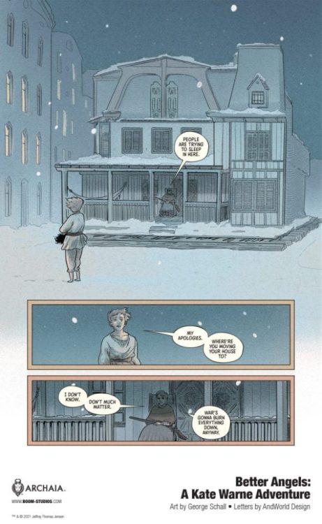
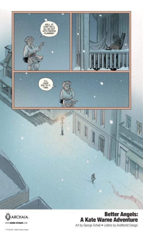
BETTER ANGELS: A KATE WARNE ADVENTURE hits your local comic book shop on October 27, but thanks to BOOM! Studios, Monkeys Fighting Robots has an exclusive seven-page preview for our readers. Emmy and Eisner Award-winner Jeff Jensen wrote the original graphic novel, with art by George Schall, and you will read AndWorld Design’s letter work.
About BETTER ANGELS: A KATE WARNE ADVENTURE: Inspired by the true story of Kate Warne, America’s first woman detective, and her singular achievement—thwarting a plot by Confederate radicals to kill Abraham Lincoln.
In 1861, America was at a crossroads. Abraham Lincoln, the man tasked with healing the nation, and his family are the targets of a conspiracy to assassinate them. Their safety – and the future of the American experiment – hinges on the success of a new kind of lawman, known by a word still novel in the culture: detective.
But there’s only one detective whose extraordinary cleverness, versatility, and mystery made them a singular individual who could save the Lincolns. Her name is Kate Warne. This is the true story of America’s first woman detective, who saved the life of her country’s greatest president and changed the course of history forever.
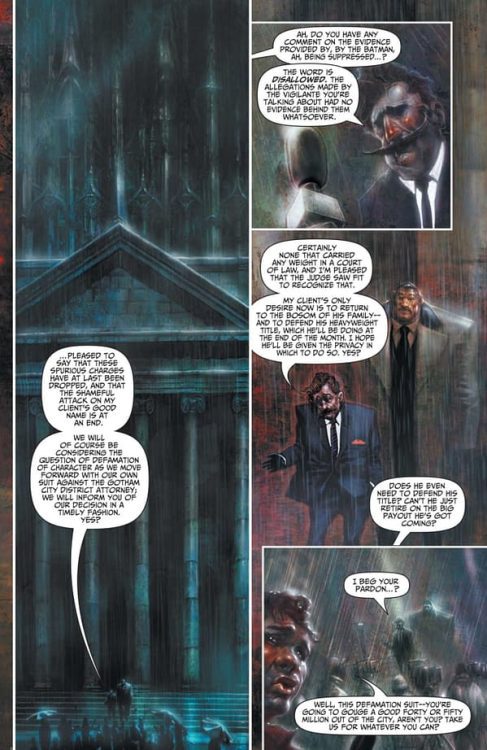
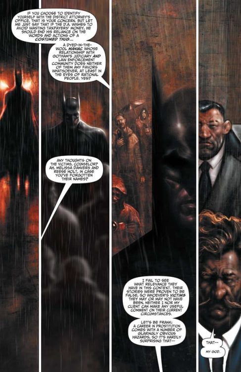
Comics legend Garth Ennis (Preacher, The Punisher) and artist extraordinaire Liam Sharp (Wonder Woman,Green Lantern), along with letterer Rob Steen create a Batman chapter from another era, in a manner that hasn’t been seen in decades. Batman: Reptilian #1 is a sharp and surprisingly frightening comic in the Dark Knight’s catalogue. With Ennis’s snark, dialogue-heavy script and Sharp’s menacing painted visuals, this is one of the most striking mainstream comics published in recent memory.
“What strikes fear into the hearts of those who terrorize Gotham? It used to be Batman, but something far more frightening than a mere man stalks the shadows and it’s after Gotham’s villains. How savage must a monster be to haunt the dreams of monsters? Pick up this dark and bone-chilling tale by comics legends Garth Ennis and Liam Sharp to find out!”
Writing & Plot
Never would I have thought that, in the year 2021, would we be receiving a Batman comic written by Garth Ennis. Batman: Reptilian #1 is a callback to an era where Batman was at his most frightening. Ennis’s famously anti-superhero sentiments come across in how the iconic writer writes Bats not as a gadget-toting dispenser of nighttime justice, but as a cerebral force of terror.
Reptilian’s status as a Black Label comic is readily apparent. A showdown unlike anything I’ve witnessed in a recent Batman comic sets the issue’s tone from the start. This intimidation tactic Batman uses covers subject matter and a grounded, grimy reality that would not fly in an in-continuity DC comic. Garth Ennis is writing a bolder, more abrasive Batman than has been seen in the past 30 years. I find myself more reminded of the work of Norm Breyfogle and his Legends of the Dark Knight title, as well as Morrison’s Arkham Asylum and Gothic, than by any recent Batman books.
Ennis writes Batman as a Sherlock-esque street-level and brash detective, while still maintaining that legendary sense of terror the character brings. This terror has been overshadowed in recent years by crossover events and team-up books. This isn’t an indictment of those mainline titles (many of them are fantastic), it’s just an observation. Ennis’s dialogue-heavy script is full of great lines that will stick with you long after you’ve closed the book. The manner in which he presents the Batman to the criminals he faces down is stunningly frightening – and immensely badass. Reptilian reads like a comic from a different time, which is nothing less than I’d expect from the iconic writer.
Art Direction
I wouldn’t blame you if you opened Batman: Reptilian #1 and thought “oh hey, McKean’s drawing a Batman comic?” I did the exact same thing. Artist Liam Sharp is very much channeling the same uneasy aesthetic Dave McKean brought to Arkham Asylum over thirty years ago. The painted and shadowy figures making their way through a darkness-choked city sets the desperate and tense tone perfectly. This is Gotham City at its most threatening. The city’s dark alleys and looming towers look ready to devour its denizens. Sharp’s designs of Batman and his rogues evoke a sense of fantastical terror and unease.
There’s a clever trick in his drawing of the Caped Crusader. When Bats is speaking to an ally in costume, we can see his face beneath the cowl. However, when Batman is intimidating a criminal, all we can see is the cowl and the cape. Sharp creates an image of Batman that exposes the terror he instills in his targets. His design is a fusion of McKean’s, the early 90’s aesthetic, and even the 1989 Burton film suit.
Panel Design & Lettering
The Green Lantern artist is proving himself to be a chameleon in the medium. Sharp painting the visuals in Reptilian is a surprise, but one I welcome. Panel layouts and direction are all unique as well. Sharp captures tiny character details in massive panels that often frame only a couple of characters. Mural-esque pieces where the nature of reality is meant to be distorted often follow the former. Panel shapes are also skewed, twisting the reader’s perspective as desired. The letters from Rob Steen are classically simple and easy to read. There are subtle font changes to keep the tone even with the story. Reptilian is a visually outstanding comic that harkens back to a style not seen in nearly thirty years.
Batman: Reptilian #1 is an unnerving and clever comic with tonally perfect art and intelligent writing. Garth Ennis’s dialogue-heavy script portrays a Batman as a psychological terror, using his words more than his fists or gadgets to instill terror. The painted art of Liam Sharp creates a dark and looming presence on every page that works to break down the already tenuous grip on reality Gotham has. Be sure to grab this first issue of this new mini-series when it launches on 6-22!
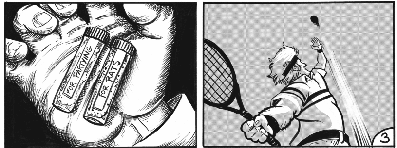
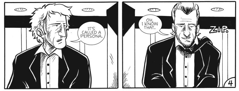
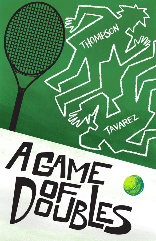
In A GAME OF DOUBLES, Jackson and Franklin Teach enter the bathroom during their 50th birthday to have a party of their own. While doing lines of cocaine they talk about the past, the future, and the double-sided life to their present.
A Game Of Doubles Written by: Jonathan Thompson Art by: Ryan Tavarez
WRITING
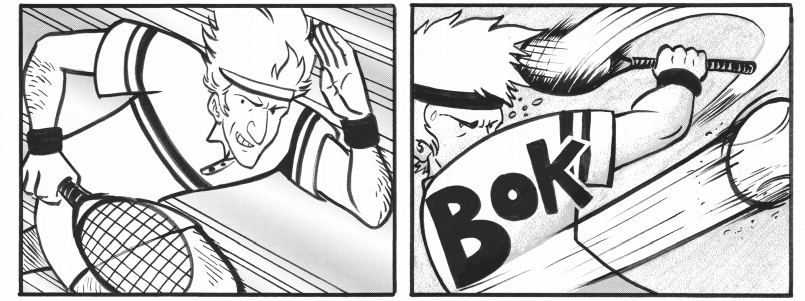
A Game of Doubles is not the first comic I have read by Jonathan Thompson. I have read (and loved) every book the prolific scribe has put out himself. Thompson has jumped around in genres, but the constant has always been a strong narrative that pushes you right till the end. A Game of Doubles is no different. Riffing on Hitchock and locked room mysteries, you would think a story like Doubles would be a hard read in the comics medium. It most definitely is not. Thompson uses a variety of techniques to keep the story bouncing. The dialog not only snaps, but it also feels realistic and tells you a lot about the people speaking. This is a story that literally starts in medias res (in more ways than one. Not only has the party already started, it’s also the literal mid-life of the character’s life. This is layered writing) and yet it does not feel expository at all. The back and forth and banter between brothers Jackson and Teach feels natural and its rhythm is much like a tennis game. Something that is further highlighted by cutting back and forth between a very defining match in Jackson’s tennis career. In just a few short pages and panels we get everything we need to get immersed in this story. A Game of Doubles also has two endings (pushing the double theme to an almost meta-level), and it feels less like a gimmick and more like a natural part of this deeply layered story. I won’t go into how this plays out, because experiencing it is the best way to take it all in.
ART
I wasn’t aware of Ryan Tavarez’s art before, but I have become an immediate fan. Tavarez’s characters fall on a slightly more cartoon style, but that does not take away from the darkness of the story being told. What that style does is allow Tavarez to create very strong expressions and ‘acting’ from his two main characters. And it’s done so well that even though Jackson and Teach are twins, there are subtle differences that make them not just identical copies. This is something done in a lot of films, but something I have never really seen in a comic before.
The linework is also fantastic. It’s all thick brush strokes with incredible shading and great use of zipatone. It gives a lot of life to an already beautiful piece of black and white art.
Tavares also excels at the action scenes. The tennis match panels have a ton of energy, with the speed and intensity of the kind of panels you find in the very best sports manga (Tayo Matsamuto’s Ping Pong immediately comes to mind. Something Tavarez mentioned to me in an interview)
CONCLUSION
A Game of Doubles is the kind of comic we need more of. It isn’t beholden by any one genre and its use of narrative and art techniques reveals creators at the top of their game. The book is almost at the end of its Kickstarter campaign (support it here), it well deserves your support. It’s a winner for sure.
Fast & Furious 9 wastes little time insulting audiences’ intelligence while delivering another fast-paced adventure. The overall tenth entry in the Fast saga stays afloat mostly due to the already established bond between the tenured characters and its edge of your seat, demand to be watched energy. Wanting to test the waters on how ridiculous it could get, Fast & Furious 9 suffers from its no brains needed action. This franchise has managed to embrace its ridiculous nature but this latest entry over steps.
Gone are the simple days of illegal street racing and a cop that wants to put them behind bars for it. The Fast Saga has been dishing out successful heist films for nearly a decade at this point, beginning with Fast Five, which is arguably the best in the franchise. Fast & Furious 9 ends that hot streak though, but it’s still a fun watch for those invested in this series. Directed by Justin Lin and co-written by Lin and Daniel Casey, the film stars Vin Diesel, John Cena, Charlize Theron, Michelle Rodriguez, Ludacris, Tyrese Gibson, Kurt Russell, and Jordana Brewster. Fast & Furious 9 follows Dom Toretto (Diesel) and Letty (Rodriguez) who appear retired and are taking care of Dom’s son, little Brian. However, Dom and his crew must team up once again for another mission to face Dom’s past, his younger brother, Jacob (Cena).
John Cena as Jakob in F9, co-written and directed by Justin Lin.
The biggest family man has been hiding a brother since the franchise’s inception and how that would be explained was a huge concern going into this film. Thankfully, the script for Fast & Furious 9 offers an acceptable backstory that explains Jacob’s absence. 1989 is a crucial year that’s revisited throughout the film, which can grow tiring at times. It’s a flashback that adds to why family is so important to Dom since that has been his code since the original film. Jacob feels he has lived in Dom’s shadow and has gone on to become a major assassin. Fast & Furious 9 takes the theme of family and finding peace with your past to a remarkable new level. Brian O’Conner gets a mention or two, which should satisfy fans that are hopeful for his return in some fashion.
Embracing its ridiculous nature has finally caught up to this franchise. Dom and his crew are made out to be invincible, so much that jokes about it exist to poke fun at how nonsensical it gets. The decision to write in countless life or death scenarios that result in no deaths or major injuries grows insulting. Fast & Furious 9 set up Roman (Gibson), Tej (Ludacris), and Dom in a position to be killed but audiences have already been conditioned to know they have more lives than cats. This makes all near-death sequences emotionless, but the film’s greatest insult comes from the ever-growing impractical stunts these characters continue to pull off.
(from left) Dom (Vin Diesel) and Letty (Michelle Rodriguez) in F9, co-written and directed by Justin Lin.
Lin’s direction keeps Fast & Furious 9 quite fast literally and its two-hour runtime plays out like an exhilarating, visual spectacle. The Fast saga never fails to deliver on the high-octane action sequences. Despite the absurdity of it all, Lin will have audiences glued to the screen the moment Dom and his crew are thrown back into what they seem to do best. Fast & Furious 9 gets by on being visually satisfying but stumbles over its desire to put these characters in unimaginable situations they shouldn’t survive. Brian Tyler’s score keeps the film intense and heartfelt, his contributions to the franchise never disappoint. While the character’s near-death sequences aren’t to be taken seriously, Tyler’s score can be very convincing at times.
Fast & Furious 9 may not be the end of this franchise but it highlights that ending it sooner rather than later will be best. The unrealistic stunt situations are undoubtedly going to take some out of this film but diehards will enjoy every second of it. In an attempt to raise the stakes, Fast & Furious 9 forgets to make its characters more important along the way.
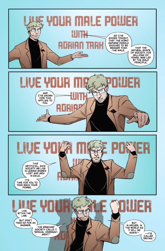
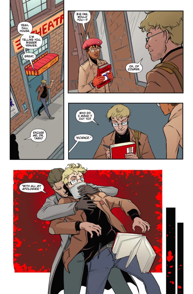
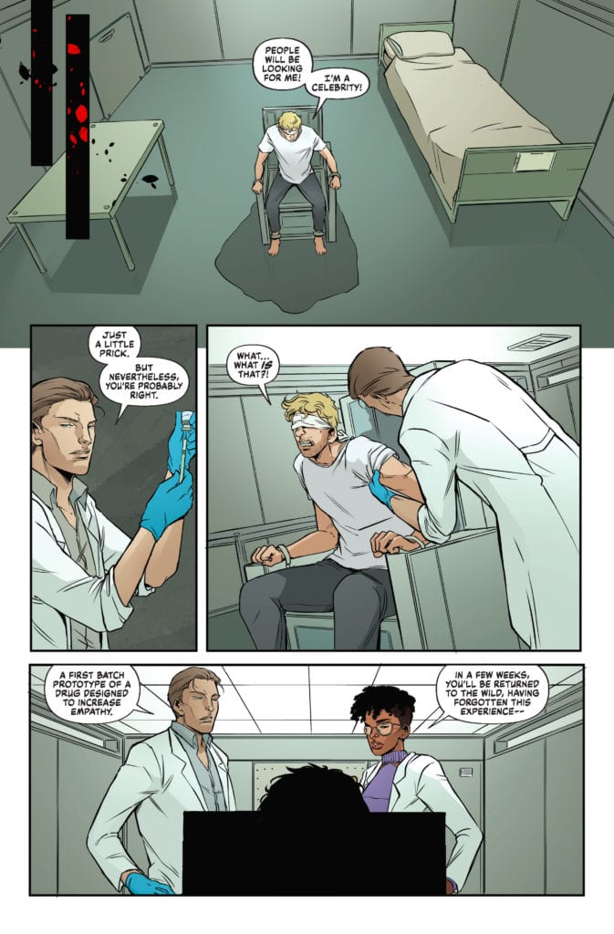
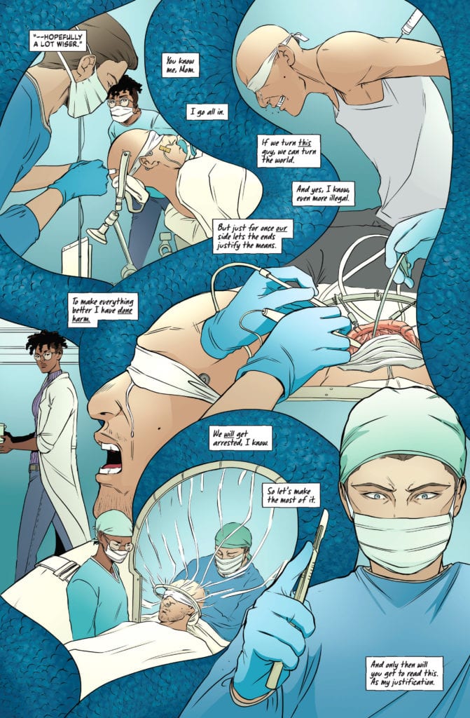
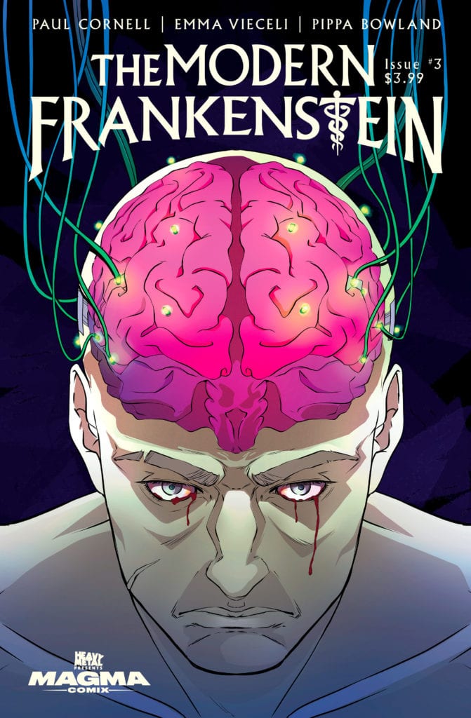
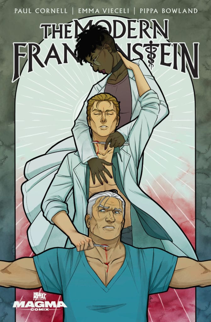
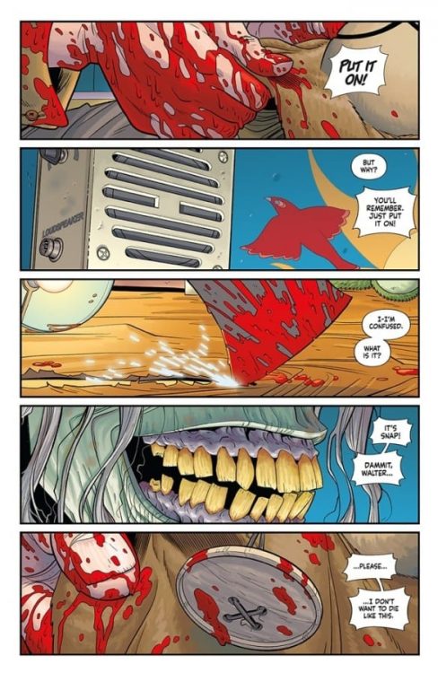
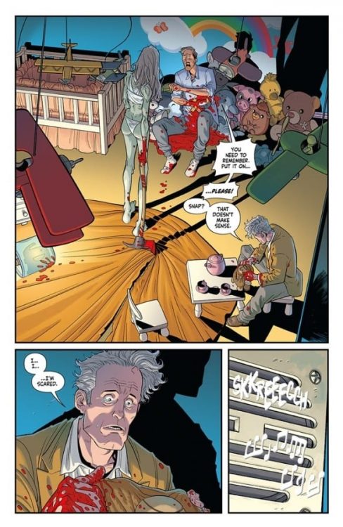
THE MODERN FRANKENSTEIN #3 hits your local comic book store this Wednesday, June 23rd, but thanks to Heavy Metal, Monkeys Fighting Robots has an exclusive four-page preview for you!
About the issue: When one of James and Elizabeth’s experiments spirals out of control, will they be able to contain the damage? And will it drive them apart, or closer together? A twisted horror/romance that walks a fine line between attraction and fear.
THE MODERN FRANKENSTEIN #3 is by writer Paul Cornell and artist Emma Vieceli, with colors by Pippa Bowland, and letters by Simon Bowland. The main cover is by Vieceli; the variant is by Kit Buss. Heavy Metal is publishing the title under its Magma Comix imprint.
MFR critic Tony Wendel describesTHE MODERN FRANKENSTEIN as “engrossing,” and a series “you can fall in love with.”
Check out the THE MODERN FRANKENSTEIN #3 preview below:
Are you reading THE MODERN FRANKENSTEIN? What is your favorite Heavy Metal title? Sound off in the comments!
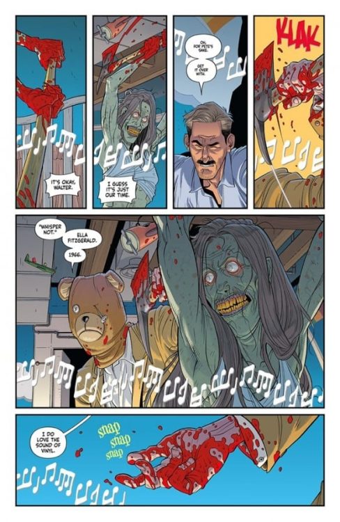
From Plastic creators Doug Wagner and Daniel Hillyard, along with colorist Dave Stewart and letterer Ed Dukeshire, comes an insane new comic dripping with absurdity and bits of human anatomy. Vinyl #1 is a sharply written, fast paced, and deviously funny opening chapter to this six-issue mini-series. With an airtight script and wildly vivid artwork, this is a debut issue not to be missed.
“When Walter’s best friend, the FBI agent charged with his capture, is kidnapped by a death cult of all-female sunflower farmers, Walter finds himself deep within an underground labyrinth filled with secrets and monsters…but are their monsters more horrific than his?”
Writing & Plot
Doug Wagner’s script for Vinyl #1 is a stellar mix of tight and engaging writing and weird absurdity. The ridiculous premise sells itself in the comic’s opening scene. This story’s grindhouse sensibilities and oddly endearing characterization pulls the reader into this tale’s absolute wackiness. Despite his true life as a fuzzy bear ear-wearing mass murderer, there’s a charm and likeability to Walter that makes him an almost loveable anti-hero. His hapless nature in his normal life makes him come across as a harmless old man who is aware of his dual nature, but does his best to keep it at arms length.
This, along with the general premise of the book, is what separates this comic from other cringe-inducing serial killer fiction. Walter isn’t some charming and handsome man posing as a gentleman so he can achieve his murderous goals; he is instead a peaceful old man who rides a bike and listens to classic tunes. Unfortunately, he has a near-uncontrollable side of himself that murders rampantly when he puts on a bear hat. If that last sentence doesn’t make you want to read this I don’t know what to tell you other than “But wait, there’s more!” There are a ton of different ingredients thrown into this plot-blender, including a disturbing Midsommar-esque cult that ties into the FBI investigation of our friendly neighborhood serial killer. This is a truly fun comic to read, with a script that is a sharp and twisted delight.
Art Direction
This sort of blood-drenched and twisted endeavor would fall apart if the right art team wasn’t on hand to craft its aesthetic. It’s a good thing then that Vinyl #1 has artist Daniel Hillyard and veteran colorist Dave Stewart on hand to deliver this comic’s outstanding design. Hillyard’s pencils are rife with lively animations and detail that sell the characters brilliantly. The wiry and joyful Walter has the look and presentation of a happy-go-lucky older man incapable of harm – who is able to seamlessly transform into a machine of murder with ease. The over-the-top nature of the comic works so well because of just how goofy and fun the aesthetic is made out to be, which is by design. Hillyard’s sense of expression and his almost cartoonish illustrations of murder and gore are what make this comic’s crazy premise work; that and of course Dave Stewart’s colors.
The now legendary colorist behind the likes of Hellboy and Black Hammer always manages to pick the perfect palette and style for whatever he is working on. And the same goes for this comic. Every image here explodes with bright, neon hues that give this issue its zany and bombastic overall tone. The panels pop in an almost 3-D fashion, and all of the surfaces have a super-clean sheen over them, but in a way that works perfectly for the story. Images of people being dismembered and gutted are reminiscent of piñatas being burst open. The lettering from Ed Dukeshire comes out in a big, simple font that has a sort of volume that matches the rest of the insane experience. This is a phenomenal looking comic book, with a detail and engrossing aesthetic that fits the sort of absurd story being told in these pages.
Vinyl #1 is an absurd ride of an opening issue, with a blend of different ideas and trope-breaking concepts all thrown into a single comic that manages to work stupidly well. The script from Doug Wagner is a silly and concise spin on the serial killer genre that subverts the genre with its well-meaning protagonist and teddy bear-hat wearing antics. The art from Daniel Hillyard and Dave Stewart is vivid and brilliant, with outstanding character animations and colors that pop so much that you will be wiping the blood-spray off of your face. Be sure to check out this ridiculously good time when it hits shelves on 6-23!


 Shadowman #3 goes into Valiant’s take on Voodoo magic after briefly touching it prior. Interestingly enough, that’s why this issue connects to Bunn’s previous Voodoo series, Punk Mambo. In this case, it’s the ways the Loa interact with people. While previous issues of the series show healthier boundaries between the spirits, as Shadowman exemplifies, this issue goes into the more dangerous areas. In his brief time on screen, the issue’s antagonist, Pallbearer, shows how extreme these interactions can be. He’s driven by a need to dominate the Loa, who use mortals as playthings, functioning as a bigoted foil to Shadowman.
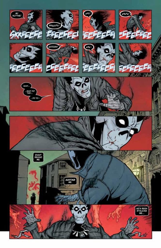 Davis-Hunt makes Shadowman #3 all about the spirits with their wild designs. The Pallbearer’s ghostly minions look threatening with their numbers as well as their sharp teeth. Their red glow by Bellaire and the way they attack a jellyfish-like Loa give them a pure predatory presence. But they pale in comparison to Jack’s companion, the demonic Shadow Loa, Bosou Koblamin, whose purple glow makes him look comforting.


")


 A Game Of Doubles