

Expository writing and overuse of caption narration weigh down an otherwise exciting introduction to Image Comics’ expanded Spawn universe. Available now, this giant 74-page comic has four stories written by Spawn creator Todd McFarlane.
Artists: Jim Cheung, Brett Booth, Steven Segovia, and Marcio Takara
Inkers: Adelso Corona, Todd McFarlane
Letterers: Tom Orzechowski, AndWorld Design
Colors: FCO Plascencia, Andrew Dalhouse, Peter Steigerwald
Since 1992, Spawn has captivated the attention of the hellspawn in all of us. Even the least comic-literate will recognize the badass red cape and sinister smile. It’s all thanks to McFarlane, the creator of the series. His inspired work notwithstanding, Spawn’s Universe #1 ain’t it. Unfortunately, it’s McFarlane’s writing that tanks the entire issue for me.
While I recognize the use of caption narration as a valid style choice, I think it’s overused in this book to the detriment of telling a visual story. The result is very distracting, and redundant captions overshadow the art. Often the caption states exactly what is shown in the art, like on page 30 when a new Spawn ally is both shown and described escaping chains and picking up guns. Why not simply let the art speak for itself?
Show, Don’t Tell
Moreover, on a character level, it doesn’t feel like we’re getting to know much of anything about the new and recurring cast. Fans of the series will recognize Medieval Spawn, Cogliostro, and Spawn himself, so there’s no work to be done for them. On the other hand, Gunslinger Spawn, a new hellspawn, doesn’t get much in the way of character. By that, I mean he gets some scenarios to showcase his abilities but nothing of his motivations.
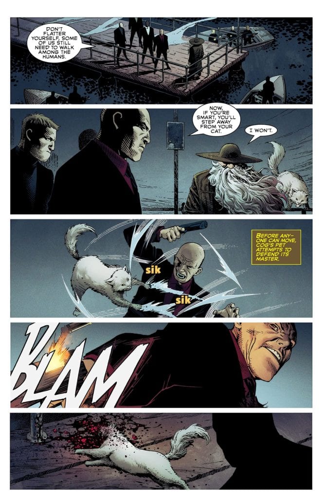
The only character with a sense of dimensionality is Jessica Priest, a familiar villain. Now known as She-Spawn, she gets a heartfelt confrontation with her family. This kind of emotional groundwork made her more intriguing than any of the other characters. But not all is lost for Spawn’s Universe.
Fortunately, the art almost makes up for such weak writing. Each illustrator adds their own stylistic flair to the four stories, but there is a thorough line of bombast and ruggedness. In my opinion, the standout was Jim Cheung’s work on the main story.
Cogliostro
Page thirty-two epitomizes Cheung’s unique contribution to the issue. Cheung’s scratchy line work and dramatic layout bring life to McFarlane’s expository captions. In the scene, Cogliostro has been kicked into a deep hole where he contrives to summon a new hellspawn called Plague Spawn. The background of the page is completely black, reflecting the darkness of the hole he’s in.
Cogliostro slumps in the middle of the hole, long grey hair flowing in front of him with inked shadows etched into every part of his clothing as if he’s made of darkness. Behind him are four inset panels outlined in red which close on him, shaving his face with a pointy piece of rock. By doing this, Cheung makes the reader like the camera closing in on an intimate, decisive moment. Furthermore, Cheung heightens the ominous tone by closing in on those few actions, assigning dramatic meaning to something as simple as a close shave.
From a lettering standpoint, Orzechowski and AndWorld Design do well in breaking up the exorbitant captions and long dialogue. However, the SFX often missed the mark. On multiple occasions, big blocky font was used that came across as flat instead of expressive. The blocky font didn’t complement the action, where a handwritten or bubble font might have better suited the action. For example, on page 13, there’s an explosion, and the word “boom” is written in blocky blue SFX next to it. Why choose such a cold color, first of all? Second, the blockiness of the letters reads flat where it could have emulated the feeling of an explosion.
Lastly, Plascencia, Dalhouse, and Steigerwald’s colors feel relatively consistent across the four stories. Characteristic of Spawn, the main color palette is comprised of red, green, and blue. Saturation of these colors seems dependent on the tone of the story. So, Medieval Spawn gets high saturation to reflect his theatrical heroic tone. On the flipside, Gunslinger Spawn gets muted colors and more white to reflect his isolation and the desolate landscape. The colors are another strength of the book, which, along with the pencils, kept me reading.
Honestly, I almost stopped reading Spawn’s Universe #1 a couple of times. Seventy-four pages of unnecessary exposition daunted me. But there was enough good in the book to keep me going. Maybe I wasn’t the intended audience.
Regardless, I could see myself returning to Spawn in the future out of curiosity because of this book. So I turn the question to old fans of Spawn: Has McFarlane’s writing style turned you off in the past? Or do you keep reading for the cool art and concept? Sound off, hellspawn!