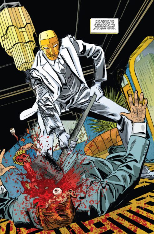
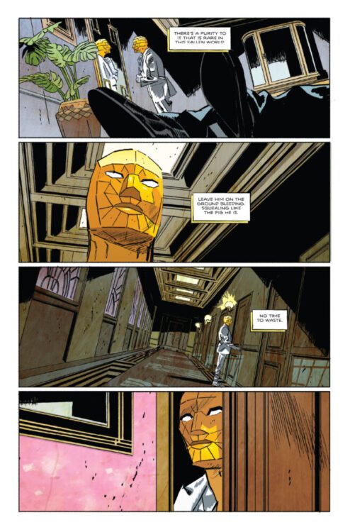
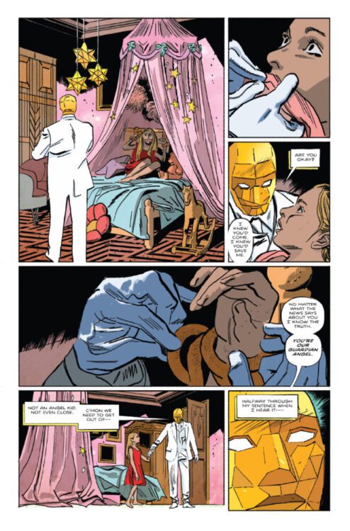
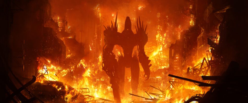
The acclaimed creators behind Lost Fantasy and Indigo Children launch a hyperviolent fever dream about revenge with iconic covers by Jae Lee
Curt Pires, the comics trailblazer behind Galactic, Lost Fantasy, and countless other celebrarted works has announced the Kickstarter campaign for The Objectivist, a 140-page original graphic novel with art from acclaimed artists Alex Diotto (Lost Fantasy, Indigo Children) and Luca Casalanguida (Lost Fantasy), colors from Mark Dale, and lettering from Micah Myers.The project features haunting covers by Eisner Award-winning artist Jae Lee. With a campaign set to launch on March 17, 2026, this boundary-breaking graphic novel deconstructs superhero adoration, vigilantism, and the terrifying rise of subjective truth.
The Objectivist follows an isolated vigilante whose grip on sanity unravels as he mounts a one-man war against corruption. His journey quickly spirals into moral freefall when the foundations of truth that have fueled his blood-splattered crusade begin to crumble. The resulting narrative sucker punch weaves thematic and visual threads ranging from The Question, Sin City, and Batman: Year One to Steve Ditko’s Mr. A.
“This is a comic that had to be made without compromise. No committees, no corporate filtering,” explains co-creator and writer Curt Pires. “This is both an embrace of the shadow-drenched noir I was raised on and an autopsy of the social conclusions those books subtly endorsed. Something this unsanitized could only happen on Kickstarter.”
Fans can sign up for The Objectivist’s mailing list to receive updates when the project will launch. The graphic novel will be released in a physical hardcover as well as digitally on the digital comics and manga hub, Neon Ichiban, with detailed reward tiers to be announced closer to the Kickstarter launch.
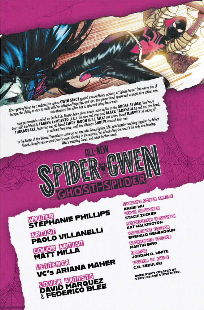
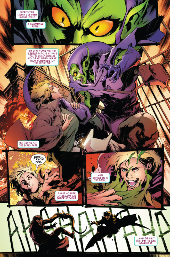
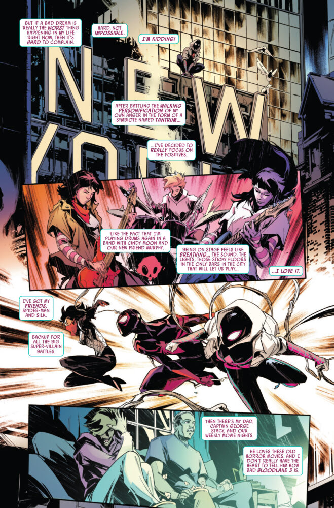
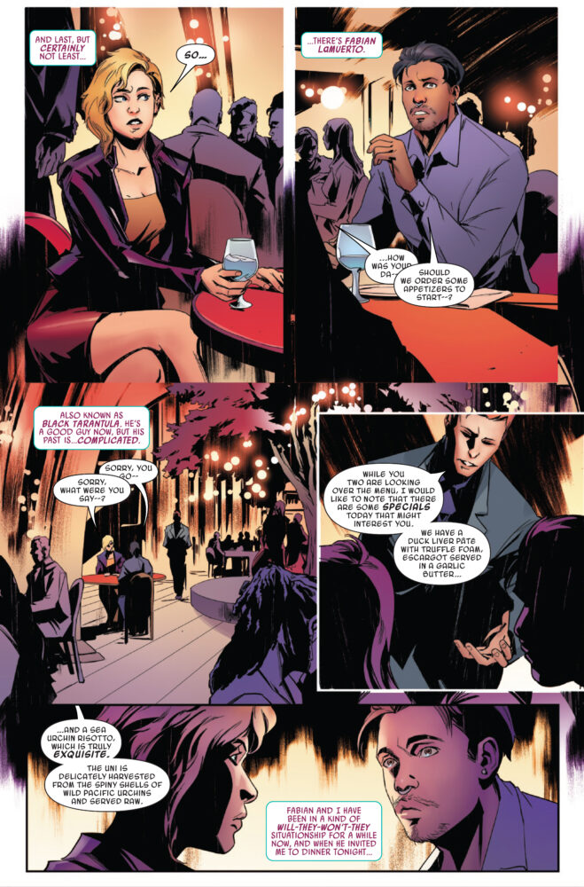
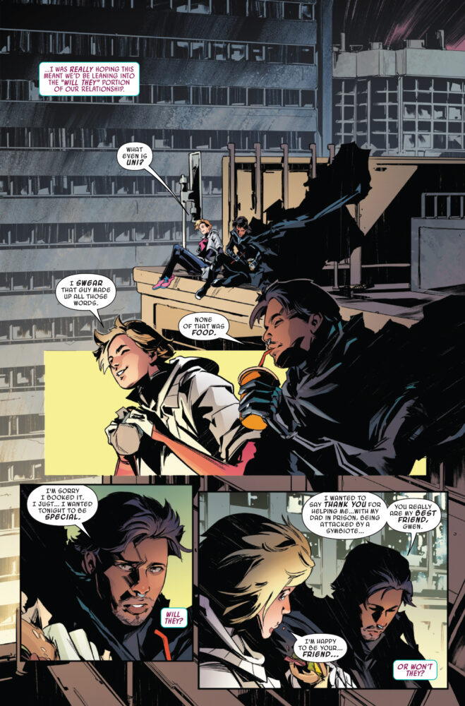
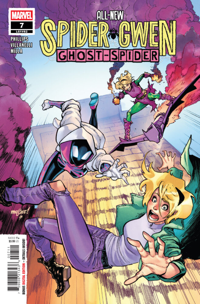
ALL-NEW SPIDER-GWEN: THE GHOST-SPIDER #7 hits your local comic book store on February 4th, but thanks to Marvel Comics, Monkeys Fighting Robots has an exclusive four-page preview for you!
About the issue: UNFRIENDLY COMPETITION?
Gwen’s new band competes in a Battle of the Bands! But things get more dangerous than they bargained for when someone unexpected takes the stage by storm. Will Gwen and her band survive?!
The issue is by writer Stephanie Phillips and artist Paolo Villanelli, with colors by Matt Milla, and letters by Ariana Maher. The main cover is by David Marquez and Federico Blee.
Check out our ALL-NEW SPIDER-GWEN: THE GHOST-SPIDER #7 preview below:
Are you reading ALL-NEW SPIDER-GWEN: THE GHOST-SPIDER? Sound off in the comments!
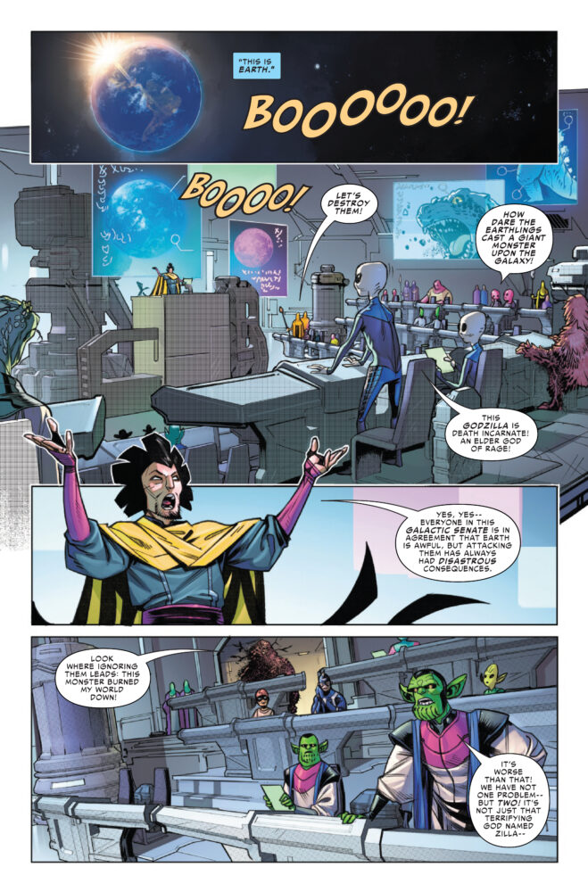
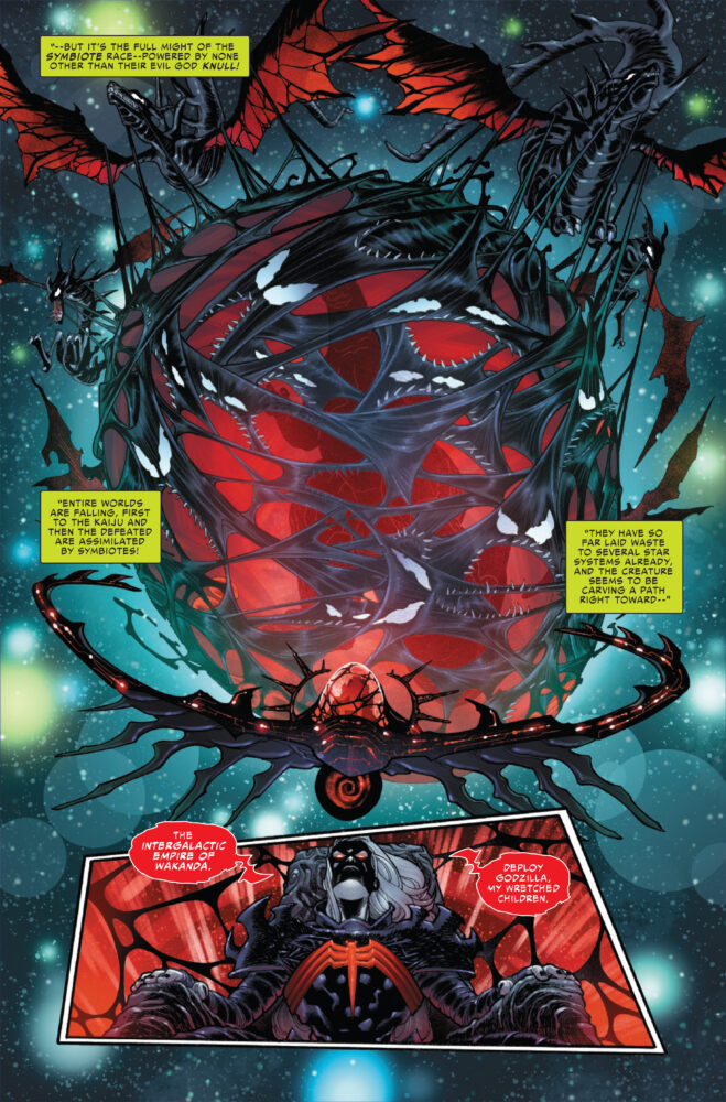
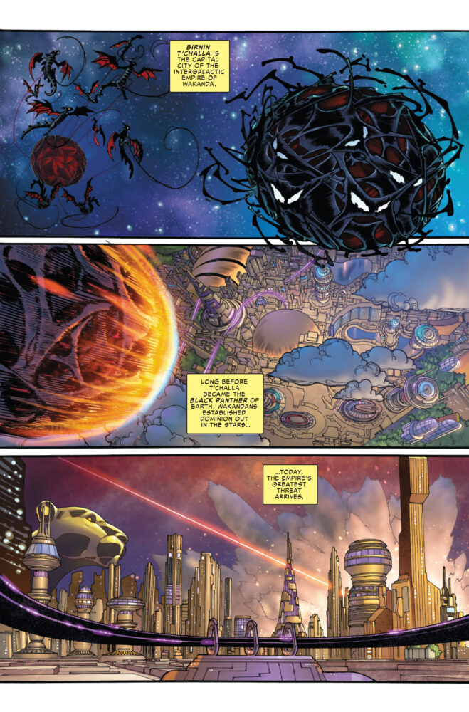
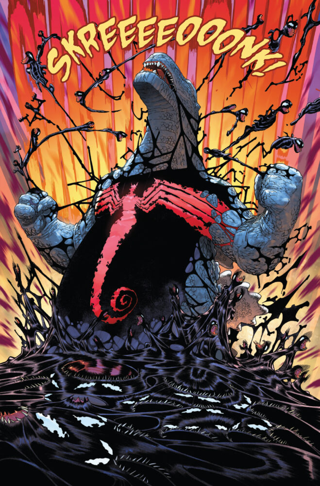
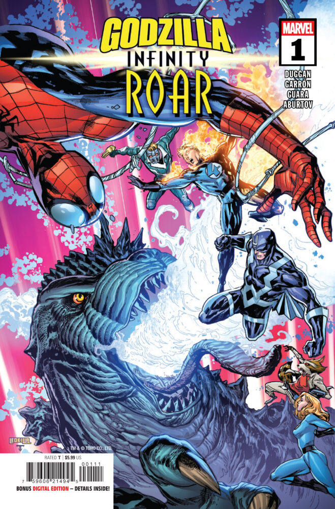
GODZILLA: INFINITY ROAR #1 hits your local comic book store on February 4th, but thanks to Marvel Comics, Monkeys Fighting Robots has an exclusive four-page preview for you!
About the issue: EARTH’S MIGHTIEST HEROES UNLEASH THE GALAXY’S DEADLIEST THREAT AS GODZILLA RAMPAGES ACROSS THE COSMOS!
The combined forces of Earth’s mightiest heroes managed to spare Earth by exiling Godzilla off into space…but in doing so may have just heralded the end of the larger galaxy! As Knull, the god of the symbiotes fans the flames of Godzilla’s anger, a new campaign for galactic conquest begins with the King of the Monsters and the King in Black at the helm! Will the cosmos be able to band together to stop the two juggernauts, or will a new era of death and destruction descend upon the cosmos? One things for sure, from the Galactic Empire of Wakanda, Shi’ar Empires, Kree-Skrull space and beyond, no planet will be safe as Godzilla destroys the Marvel galaxy!
The issue is by writer Gerry Duggan and artists Javier Garrón & Ig Guara, with colors by Jesus Aburtov, and letters by Travis Lanham. The main cover is by Ken Lashley and Juan Fernandez.
Check out our GODZILLA: INFINITY ROAR #1 preview below:
Are you excited for GODZILLA: INFINITY ROAR? Sound off in the comments!
Comics industry legend Stephen R. Bissette, the artist behind Alan Moore’s landmark run on Swamp Thing, and co-creator of John Constantine, brings a long lost comic series back from the prehistoric era.
Tyrant is a 4-issue mini-series created by Bisette and originally released back in the min 1990’s. The series follows a tyrannosaurus rex as it fights to survive in the Cretaceous period. Now, he is re-releasing the series as a hardcover edition with a ton of extra material.
This Kickstarter edition will consist of two versions:
Stephen R. Bissette’s TYRANT: The Original Art Edition—an oversized hardcover with 100-plus pages
Stephen R. Bissette’s TYRANT: The Complete Edition—hardcover with a slipcase and over 200-plus pages
These hardcovers will also include all of the backmatter from the original 4-issue run as well as additional illustrations from Rick Veitch, Jim Rugg (also designing the book), paleontologist Dr. Michael Ryan and tons of art that has never been collected.
Be sure to head over to the Kickstarter page to be ready when this project launches next month!
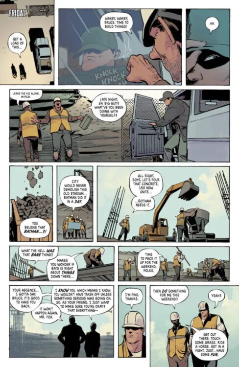
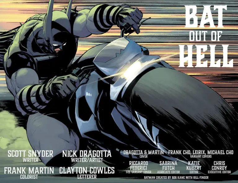
Absolute Batman #16 is the first issue in the series to feature another character from the wider Absolute Universe. This team takes a crack at Absolute Wonder Woman, with Scott Snyder and Nick Dragotta co-writing, and the latter continuing on the art for the series. Frank Martin colors the issue with letterer Clayton Cowles returning as well. The team wonderfully adapts Diana’s world in their own fashion, cleverly integrating Bruce into it while progressing his own story. It’s a tough and unlikely crossover, but one that this team really nails.
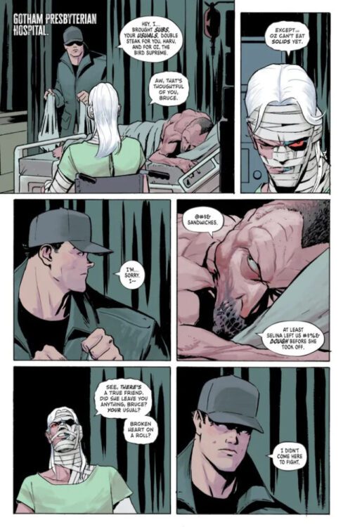
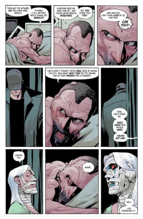
The issue starts with Bruce returning to work in the aftermath of Bane’s attack on the city. His boss, Mr. Fox, recommends that he takes the weekend to have fun and live a little. After that, Bruce visits his transformed friends in the hospital. Oz and Harvey want nothing to do with him. He leaves and suits up, drifting away on his motorcycle. He uses the amulet Wonder Woman had given him in the last issue of her book to summon her, and asks her to help him find a way to reverse what Bane had done to his friends.
Bruce Wayne returns to work.
WRITING
Snyder and Dragotta are both credited as writers on this one. Seeing Dragotta get more involved is really interesting, especially regarding this issue. It’s the second part of the Absolute Universe’s first crossover, and the two writers tie it up really nicely. They play around with Bruce and Diana’s dynamic here, and it’s very fun. They don’t have the pressure of introducing the two to each other, so they really just work to further their relationship. The characters just try to understand each other and their worlds better. Snyder and Dragotta write Diana trying to understand Bruce’s more “normal” life, while they have Bruce reaching out and opening his mind, desperate, for something that might his friends. There’s this special moment where the two encounter a cyclops. Bruce immediately assumes the creature will try to kill him. Diana says he won’t, and is confused at Bruce for even thinking he would. It encapsulates the two characters and their relationship perfectly. She’s always at the ready, and his heart is open.
The two put together a really powerful chunk where Bruce has a dream of his father. He’s a child in the Batman cowl and his father is with him. They both stand on this big origami structure. His father tells him to build Gotham up carefully. This is really an issue focused on Bruce’s path forward, and that’s given to him both by Diana and his father. Snyder and Dragotta create an emotional story of understanding and rebuilding, and they really stick the landing on it.
Bruce visits his friends in the hospital.
ART
Dragotta enters a new realm here as he accompanies Bruce and Diana into the underworld. He takes a break from his usual gorgeous cityscapes to visualize a beautiful but barren hell. His backgrounds are really special here. There are giant skulls and ribcages decorating the ground with scattered Greek architecture following Batman and Wonder Woman on their journey. Dragotta really excels with his character design here. In the aforementioned page with the cyclops, Dragotta makes him look large and intimidating with a giant club in his hands. When he turns his face to face us though, he looks kind and curious. It’s some of the best stuff of the issue. We follow Bruce’s perspective of Diana’s world, and we see the Cyclops as horrifying and menacing at first. But when we really look at it, like Bruce does, we see that there’s not really a big difference.
Bruce’s friends tell him to leave.
COLORS
Martin makes the passage of time in the underworld his focus in this one. His colors on the sky and how he makes it shift from night to day and vice versa are captivating and integral to keeping up with Batman and Wonder Woman’s journey here. A gorgeous looking moment to point out is one at night where Bruce and Diana are sitting by the campfire, discussing the plan for the next day. The blue night sky is cut off by the red and orange flame of their fire, illuminating and shadowing each of their faces. It sets the tone of the scene perfectly, Martin once again impressively and captivatingly displaying his understanding of the scene given to him.
Bruce rides his motorcycle.
LETTERS
Later in the issue, Batman and Wonder Woman go up against a centaur named Akrolis. When he appears, rather than giving him the normal text that Bruce and Diana usually have, Cowles gives him these rigid and Greek-esque style letters to really show his position in the underworld. It’s an interesting creative choice that pays off because it instantly makes him more menacing. He’s in his own realm fighting against the children of two worlds, and it makes it all the more intimidating for them. It’s a pretty cool split in the issue, and Cowles really nails the vibe of that confrontation through that.
CONCLUSION
Absolute Batman #16 is a story of understanding coming together in the face of overwhelming odds. Bruce is lost, and Diana does what she does and tries to assist him as best she can through that. While Bruce isn’t on anyone’s good side right now, this issue shows you that there’s hope despite that. Snyder, Dragotta, Martin, and Cowles give us a look at what it takes to rebuild what you feel is broken, and how to nurture yourself and the world around you back to the best versions of each.
From renowned concept artist Ben Mauro and publisher Read Only Memory comes Huxley and the recently released Huxley: The Oracle. These two stunning hardcovers are the first two releases in Mauro’s expanding science fiction universe, taking place in a used future after a great war against machines has taken place.
I recently got to sit down with Mauro to talk about his creative approach and his influences in taking this creative journey.
MFR: It’s plainly obvious that Huxley has been a project long in the making. Where exactly did this universe begin, and how have you changed your approach to its creation as time has passed?
MAURO: HUXLEY began with the original drawing of the yellow robot ‘Huxley’ back in 2014 or so, and slowly grew from there over the years. It started as that original drawing, and it got me thinking about who that character was, what world he lived in, what his story was, and who else would be with him in that world. A lot of this early writing and development happened with the intent of working on it full-time, but it turned out to be harder than I thought; another job always came up and delayed things. So I just decided to start on it and do both at the same time, finding an hour here, a few minutes there to chip away slowly on pages, and before long, I had 5 pages done, then 15, and so on. Some of the original style and drawings date back to college, and one of the small robots walking around in the original graphic novel was from around 2008. The style was there early on, but it didn’t come together until later when I drew Huxley. Early on, it was very design-driven, trying to see how all the characters would look and make sure it all felt cohesive. As the universe matured, I became more intentional about story arcs, character motivations, and long-term continuity. Now that I am diving into prequels and have more of a team with me, things have changed a lot. Planning the next few books for the first trilogy of stories and getting them out the door in the next few years takes up a lot of my time
right now.
MFR: The original Huxley story lives as a comic book-style graphic novel, while The Oracle is more of an illustrated story. What made you decide on the change in format?
MAURO: The format change was intentional, driven by the story’s needs and a desire to reach different audiences as the IP expands. The original HUXLEY graphic novel is much more of an Euro-style graphic novel, mixed with Japanese manga, in a way, something for fans of Metabarons, Heavy Metal, Moebius, Ghost in the Shell, Akira, and others.
The new prequel, HUXLEY: The Oracle, is much more of a serious war story set years before the original graphic novel, focusing on the character Max, earlier in his life as he joins the army. I wanted to dive deeper into the Ronin soldier culture, how humanity is born, trained, and lives in the backdrop of this machine empire led by the Oracles at the height of their power in the future. The artwork for this is much more like film or game production illustrations, and the new format is more in the vein of an illustrated story book, similar to ‘Simon Stalenhag’ style format. This book acts almost like ‘DUNE Part 1’. The next book will be sort of like ‘DUNE Part 2’ and conclude the larger narrative that began in Oracle. We just handed off the draft of this book to the publisher over Christmas, excited to see that one out the door. It’s going to be a pretty epic conclusion and connect to the start of the original graphic novel in a cool way.
MFR: It’s fitting that publisher Read Only Memory is best known for their large hardcover books breaking down technology in an artistic manner, as it seems to suit Huxley perfectly. How did your relationship with ROM develop, and how have they contributed to the vision you have for Huxley?
MAURO: My relationship with Read-Only Memory developed very organically. I was searching for the
right publisher for quite some time, talking to many companies and exploring even self-
publishing/manufacturing at one point. I had a friend, Liam Wong, whose amazing photography books ‘AFTER DARK’ (among others) were published by them, and I was really impressed by the quality and the distribution reach they had. I would see his book everywhere, and he helped connect me with their team. They understood HUXLEY immediately, not just as a story but its worldbuilding and long-term scope, which I was creating. Their background in creating books that treat technology, games, and culture with respect and depth aligned perfectly with what I wanted HUXLEY to be.
ROM and Thames & Hudson have been instrumental in raising the project’s standards,
especially in terms of physical quality, presentation, and distribution, ensuring that books reach bookstores worldwide. They treat the books as something special and important. That mindset has influenced how I think about HUXLEY overall, as something meant to last, to be revisited, and to feel substantial in your hands that you will hopefully enjoy for many years to come on your shelves and in your book collections.
MFR: For those who don’t know, you’ve worked on films such as Neil Blomkamp’s Elysium and Peter Jackson’s The Hobbit trilogy, as well as on video game franchises like Call of Duty and Halo. Were there any lessons or ideas you gained from working on these other projects and how have they contributed to your approach to Huxley?
MAURO: I think it helped me understand the scale and scope of something like a AAA movie or game and just how long it takes. When you are starting out, it can be a little hard to understand, but after going through a movie like ELYSIUM from start to finish over nearly 4 years, it really helped me pace myself, understand the different phases of production, and just have a lot of patience to complete something. How to take an idea from a couple of words on a page, to a script, to ground up worldbuilding for a completely new IP, illustrate all the story moments, have everything get built practically to go on set, vfx production, and see the final film in the theatre…
it’s quite an experience.
With HUXLEY, I apply the same discipline to my own world and story. After spending years
working on other people’s films and adapting other works, when it came time to adapt my story for trailers and cinematic content, it was much more straightforward. On a deeper level, I think all those early experiences just gave me the confidence to do this for myself. I really wanted to see how the best people in the world made films, games, and told stories before I felt comfortable doing it for myself.
MFR: What are some of the biggest influences that have contributed to your work on Huxley?
MAURO: HUXLEY is influenced by a mix of classic science fiction, history, and real-world technological advancements. There is a lot of influence from Euro artists and graphic novelists like Moebius, Juan Giménez, and Japanese manga and anime artists like Katsuhiro Otomo, Masamune Shiro, and Hayao Miyazaki, mixed together with American action and sci-fi films. Writers and filmmakers like James Cameron were early inspirations, especially in how they treat worldbuilding as something lived-in rather than explained. Aside from that, a huge influence on Huxley is my life experiences, going into the characters and stories. There’s a lot of myself in the different characters, good and bad. A lot of the moments in the books are drawn from my life experiences, where possible, to tell a more personal story.
MFR: Huxley is clearly an ongoing project spanning multiple mediums, now including a traditional graphic novel, an illustrated book, and even short (and incredibly well-animated) videos. Do you plan on returning to the print medium with this universe next, or are you looking at other storytelling mediums for your next chapter?
MAURO: Print will always be a core pillar of HUXLEY. There are stories that simply work best on the page, and the physical books are an important part of the universe’s identity as it shows up in bookstores worldwide. The next book in the series will conclude the larger Oracle story and was handed off to the publisher over the holidays. I am excited to see when that heads out into the world. The next book is the final story in the first HUXLEY trilogy, another prequel set even earlier, when Max and some of the other Ronin are teenagers. More of a YA-type story that I think people will enjoy, helping show humanity’s full life cycle in this universe: how they are born into the world, the trials and hardships they must go through to survive, before they are able to join the army and become Ronin in Machine City. I am still figuring out whether this last story will follow a similar narrative format to Oracle or something new.
The short animated pieces have been a great way to prove out how the IP looks in film and
game form, and to show how it can be adapted, which has been very cool to see audiences’
responses to over the years. I am very interested in continuing to expand HUXLEY across other media and franchise pillars. I am also interested in a more traditional novel for sci-fi fans who prefer classic storytelling, along with a new storyline that fits more with a traditional Japanese Manga series format.
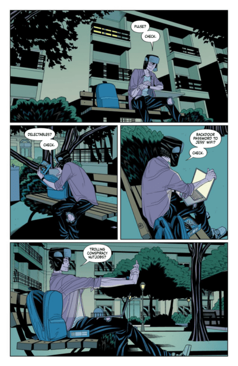
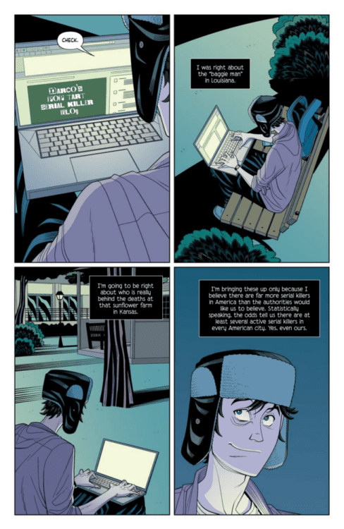
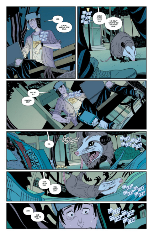
From the creators of the Materials universe writer Doug Wagner and Daniel Hillyard comes yest another entry in their world of quirky serial killers, but this time with a twist in Narco #1. Featuring Dave Stewart on colors and lettering from Ed Dukeshire, this opening issue offers a unique take on Wagner and Hillyard’s usual murderous fare – but sparing none of the gruesome charm we’re used to from their work. With a fun yet intense script and vivid visual work, Narco is another must-read for fans of the Materials universe and of the slasher genre as a whole.
“Marcus Wesphal blacks out from the slightest surge of excitement—a narcoleptic curse that’s kept him quiet, calm, and locked away at home. But when he witnesses the girl next door’s murder and collapses, he wakes to find himself the prime suspect. Now Marcus has one chance to clear his name: outrun his failing body, reconstruct the moments he lost, and hunt a killer before he blacks out again… possibly for good.”
Writing & Plot
Doug Wagner has a gift for crafting darkly comedic and weirdly fun scripts for the Materials universe, and he continues that trend with his writing on Narco #1. However, unlike most of the other Materials stories – consisting of Plastic and its prequel Plastic: Death & Dolls, Vinyl, Plush, and I Was A Fashion School Serial Killer – Narco’s protagonist is not a serial killer. Rather, he just hosts a blog harassing conspiracy theorists who obsess over serial killers. He also, in a great choice of character hook, tends to pass out when he gets overly excited. That latter detail is the narrative beat that really makes this comic pop, as it adds both a unique character ripple to Marcus and it racks the tension up to eleven. Wagner’s core character writing here is tight and naturalistic, with solid dialogue and overhead narration that never feels too heavy. This is a breezy script where the tense moments hit especially hard considering how casual the rest of the book feels. The final pages of the book have a perfect slasher movie-feel to them, with one of the best cliffhangers in an opening I’ve read in some time. Wagner has penned one of his most memorable issues with this opening chapter of Narco.
Art Direction
The most alluring aspect of the Materials universe outside of the delightful darkness of the storytelling has always been Danial Hillyard’s phenomenal visual work. This trend continues in the pages of Narco #1. Hillyard’s character animation is some of the best in the business. Every person in every panel feels so alive and is given so much personality through facial detail and body language, which can make whatever happens to them that much more tragic – or hilarious. Hillyard’s sequential direction is just as solid, as his choices in panels and how to frame each moment makes each scene in this book memorable. Each tiny detail is captured and feels important, and every interaction feels genuine and special – which again, can make the serial killer elements feel that much more urgent. Dave Stewart’s color art work’s perfectly for the comic, with his sort of flat palette bathing every panel is a sense of inescapable eeriness. The darkness of a park plate at night and the unsettling glow of apartment lighting make up much of this comic, making the reading experience feel that much more like a horror film. The lettering from Ed Dukeshire is dynamic and fits in with the book’s art direction well, especially his blood-curdling SFX work. Due to the relative calm (yet tense) tone of most of the comic, Dukeshire’s blood-red SFX letters work almost like a jump scare. Overall, Narco is another visually excellent addition to the Materials universe.
Verdict
Narco #1 is another great chapter in the Materials universe and to slasher comics as a whole. Doug Wagner’s script is a blast to read, offering a unique take on his own usual brand of comedic horror with stellar character work and one hell of a cliffhanger. The visual work from Daniel Hillyard and Dave Stewart is brilliantly detailed and animated, making for a reading experience that nails the feel of this comic and the Materials comics as a whole. Be sure to preorder this opening chapter before FOC on February 9th, then get ready for when it hits shelves on March 4th!
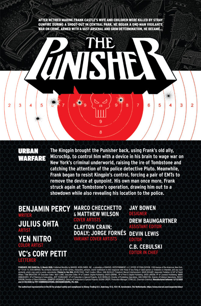
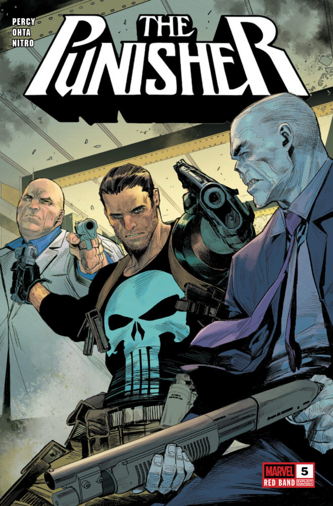
PUNISHER: RED BAND #5 hits your local comic book store on January 28th, but thanks to Marvel Comics, Monkeys Fighting Robots has an exclusive three-page preview for you!
About the issue: Frank Castle’s return to the Marvel Universe is cemented at last, as virtuosos of violence BENJAMIN PERCY and JULIUS OHTA’s symphony of slaughter reaches its killer crescendo!
HOW WAS FRANK PLUCKED FROM WEIRDWORLD?! WHY?! AND WHAT TWISTS AND TURNS ARE YET TO COME IN THIS SENSES-SHATTERING STORY?!
The issue is by writer Benjamin Percy and artist Julius Ohta, with colors by Yen Nitro, and letters by Cory Petit. The main cover is by Marco Checchetto and Matthew Wilson.
Check out our PUNISHER: RED BAND #5 preview below:
Are you reading PUNISHER: RED BAND? Sound off in the comments!
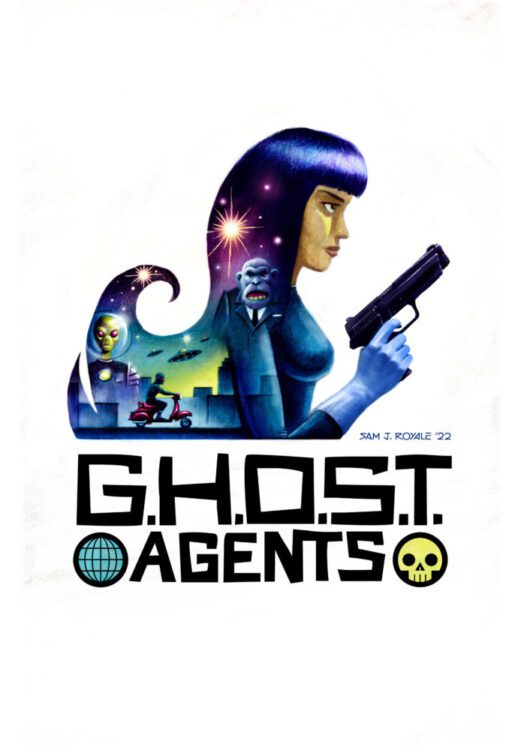
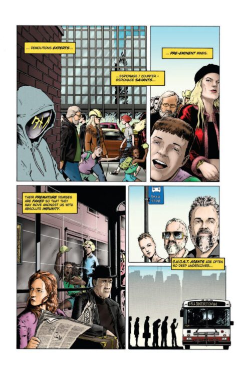
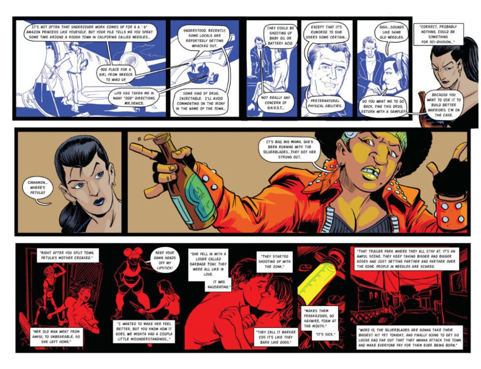
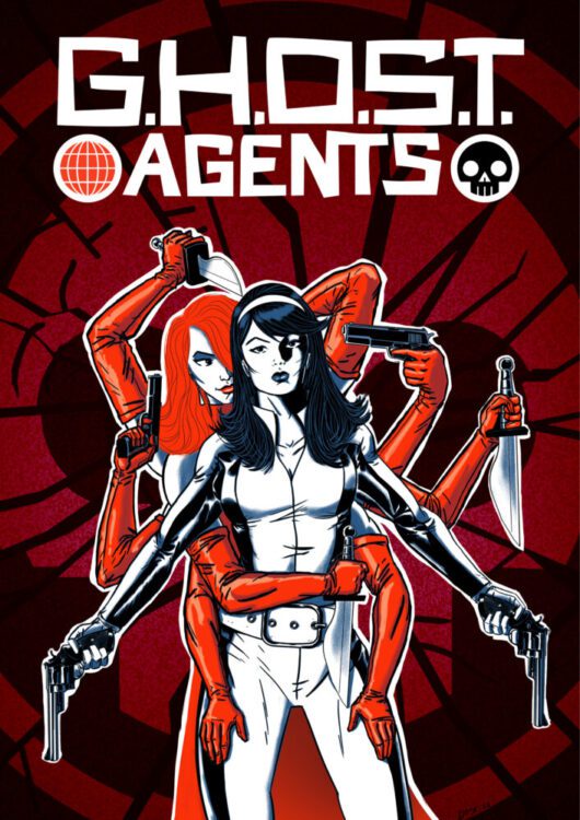
With ten successful releases in their dossier, the creators and characters of GHOST Agents have become an indie comics sensation. Cosmic Lion Productions has G.H.O.S.T. Agents: Crimson Apocalypse, a curated compilation of GHOST Agents stories. If you weren’t lucky enough to snag a copy of the previous ( and sold-out!) GHOST Agents comics, then Crimson Apocalypse is the place to course correct and start getting in on GHOST Agents. And what good comic doesn’t have an equally good back story? Like the spy-fi adventures it depicts, the stories behind GHOST Agents and the path towards Crimson Apocalypse are filled with twists and turns, colorful characters, and unexpected endings. It’s a story thats best told by those who lived it.
Art by Sam J. Royale
BEGINNINGS
In early 2020, when the COVID-19 epidemic was just really starting to fire up, a group of comic book fans found solace in each other by using social media to do one of their favorite things: talk about comics. As the world outside got more insane and terrifying, this group of folks decided to go from talking about comics to making one together. That was Image Grand Design, a book described by Rocko Jerome as “the greatest and most ambitious bootleg comic of all time, an anthology featuring the work of dozens of independent artists.”
ROCKO JEROME (Writer/Producer, GHOST Agents): In 2020, I found myself accidentally in the role of project manager for Image Grand Design. It was this huge, almost absurdly ambitious concept designed to make some sort of cohesive sense out of the early Imagecomics. I enjoyed advocating for and collaborating with cartoonists in that, and when it was over, I really wanted to keep going, but do stuff with longer legs than a bootleg comic ever could have. You know, the guys worked so hard on that, and when it was done, we had to be very careful not to just get sued into oblivion before it even got printed.
ELI SCHWAB (Publisher, Cosmic Lion Productions): It was a whirlwind of stuff. I kept asking some of the pros that I know for advice. People who have been in the business since, like, the eighties were telling us to be very careful and to reach out to people to let them know what we were doing. I actually did even reach out to Image at one point. Then people just above us were like, “Fuck it, just do your shit and ask questions later.” It was kinda wild.
ROCKO: I lost some sleep about it. These people worked on this book like it was their job, and the idea that no one might ever see it was distressing. And of course, no one was getting paid for this contraband. It was all for the love of comics.
ELI: I didn’t know what to think at first, and then I just went with my gut. There were too many people involved, and this was an indie tribute. We had to do it. Also, if we did end up getting sued by Image, that would have been an even better story and would have given us stories to tell for years!
Art by Sam J. Royale
ROCKO: The thing after that was, I didn’t really know if artists would want to keep working with me if it wasn’t what IGD was. Like, maybe this was just a one-off thing I got away with doing in my life, and I should leave well enough alone. The difference maker was a simple text from Chris Anderson, who has a nice career in comics going in addition to being a major force in IGD. He asked me, “What are you doing next?” I felt vindicated that he was interested, so I told him about this idea I had for a sixties spy-fi comic.
CHRIS ANDERSON (Spectral, Lost Angeles, Heavy Metal): I loved the concept of a retro Avengers-style book. The British TV show, not the Marvel thing. It was something that I hadn’t seen before and felt a little like our own version of G.I. Joe or something.
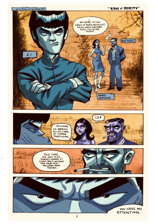
ROCKO: In the 2010s, I had this prose series I was writing about a character called Ben Venice, the conceit being that it was about what Nick Fury would be like if he were in a world just a smidge more realistic than the one depicted in Marvel comics. Venice was in charge of the Global Hierarchy Of Secret Tactics- GHOST. I didn’t really commit much to the series. Mostly because no one read it, which, you know, is always a buzzkill. But I had this idea that I could spin that off into comics, and I knew Eli would be game to give essential support. We were off to the races.
Art by Chris Anderson
KICKSTART MY ART
After Chris suggested using crowdfunding, Eli and Rocko promoted and released the first and every subsequent GHOST Agents project via Kickstarter, with a total of ten successfully funded campaigns to date.
ELI: Crowdfunding is a pretty amazing resource. Kickstarter has the name and the infrastructure to help creators take in a lot of money and trust, and has been helping indie creators like us get things made for a while. We could do GHOST Agents without it, but it would be a lot harder, and now that we have built a reputation on there and people look to KS for GA, it’s the perfect pairing.
ROCKO: I don’t think Guiness cares, but we probably hold some record in indie comics for doing the most Kickstarters in quick succession. For a while there, it was every few months, using the release of one book to promote the Kickstarter for the one immediately following. It’s stressful because this is how we pay the artists for work they already did, but I’m an addict at this point. It’s just the fact that you create this sense of immediacy, where if people don’t support it, it dies, and they see it in real time. Plus, you can add a lot of things for people to buy into, like Sean Luke is the master of drawing readers into the book, which is a privilege they purchase.
SEAN LUKE (creator of Karate Ninja): Rocko had the fantastic idea for a tier in the Kickstarters to have “Be A GHOST Agent,” where he wanted those backers drawn into the books. He felt, I disagreed, that I was “the guy” to do it. Likenesses are super difficult, and the way he wanted to work them in is also challenging. But he said, “No, you’re the guy,” and I couldn’t argue with that! It’s been incredibly fun to do.
Art by Sean Luke
PUTTING THE BAND TOGETHER
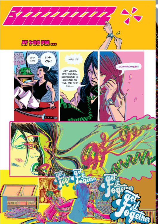
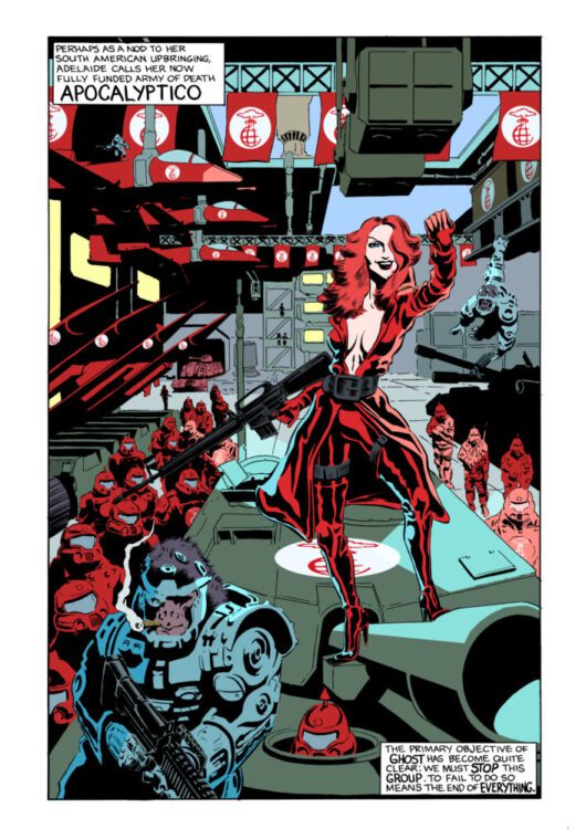
Using well-known tropes and character archetypes as starting points, Rocko and the recruited artists went about conceiving of characters that could be recognizably drawn by anybody after. Ironclad instantly iconic figures like Donna Printiss, the Amazonian knockout lady agent. The dashing and debonair gentlemen of mystery, Cross and Oleg. Kung-fu master Li. Hard-nosed dame May Zero. Hippie wizard Jack Infinity. And the cruel femme fatale, Adelaide Von Volker, leader of GHOST’s opposite number, the diabolical organization known as Apocalyptico. The real stars of GHOST Agents, however, are the artists.
ROCKO: I call myself the Writer/Producer because I write the initial scripts, then let the artists serve as director, cinematographer, special effects, and central casting, and try to stay out of the way as much as possible until it’s time to put all the short stories together and promote them.
Art by Ben Perkins
BEN PERKINS (Deathsligner, Heavy): I remember I was part of a book called Darkest Image, which had some people from Image Grand Design helping on that. I can’t remember how Rocko and I exactly connected, but I do remember him reaching out about the story Riders Howling In The Moonlight. I think that was the first one. And I knew immediately after that I wanted to work with him again. Mainly since he let me use this crazy layout to tell the story, and I think it worked well. I have done a lot for GHOST Agents, so I kinda lose track.
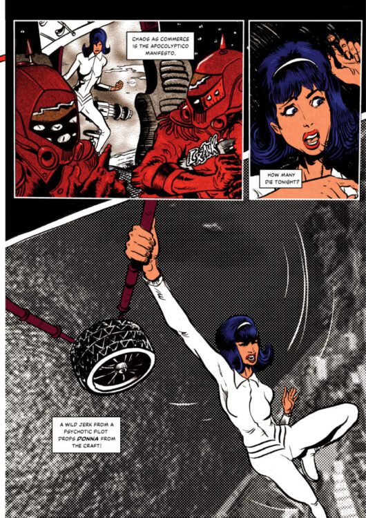
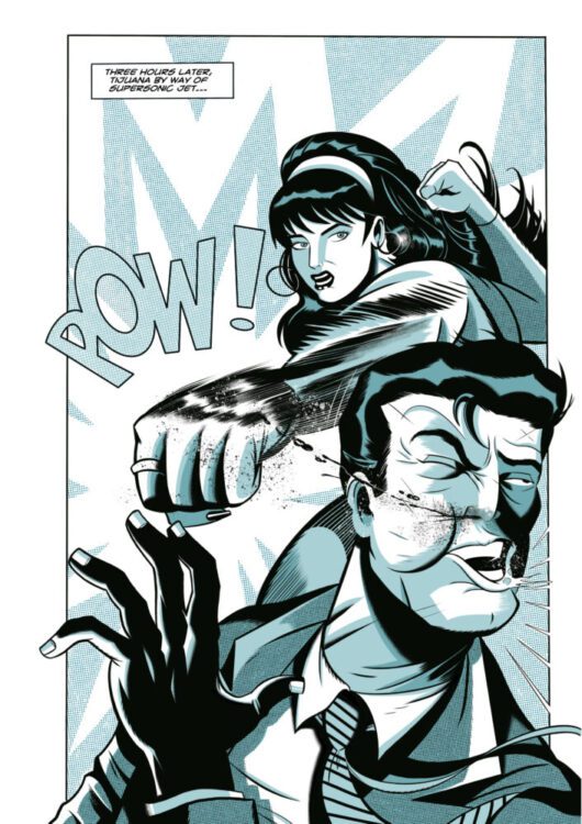
BARRY TAN (Stan Vs. Jack: How To Feud The Marvel Way!): (The GA story) Lost In The Nowhere Zone was the first collaboration between Rocko and myself, and was originally a short story set in Alan Moore’s 1963 universe that first saw print in the Darker Image anthology. Around that time, the first issue of GHOST Agents was being put together, and we agreed to include a reworked version of the story where the 1963 references were excised, and the scenes in the Nowhere Zone were given a more psychedelic 3D treatment so that it stood apart from the original version. We subsequently also did a really fun version of the story with the Nowhere zone sequences colored in a style inspired by Marvel’s old Blacklight posters.
Art by Barry Tan
ROCKO: What happened there with Barry that I always like to emphasize was that we took something that started as fan fiction, retooled three things, and suddenly, it’s our own intellectual property. That’s a lot of what GHOST Agents is. I don’t think I need to spell it out; you can see what we’re doing here. It’s never lost on me that George Lucas only began work on Star Wars when he couldn’t get the rights to Flash Gordon.
SAM J. ROYALE (Dishoom, Pariah): I was asked to do the cover art for the first issue of GHOST Agents, featuring Donna Printiss wielding a sword while riding a motorcycle. Maybe because of my background in graphic design, and maybe because I can be a control freak, I prefer to do cover art when I can also have some say in the layout, and—ideally—the title logo as well. I crossed my fingers and asked Rocko if there was already a logo in place for the book’s title, and luckily for me, I was able to expand my role on the project.
Logo design by Sam J. Royale
ROCKO: I was fucking thrilled Sam wanted to do a logo. I geek out whenever I see it.
SAM: The title logo was partially inspired by 1960s hand-cut movie poster lettering, like Hitchcock’s Vertigo, designed by Saul Bass. I also wanted it to have a Hanna-Barbera-ish adventure cartoon feel, too. GHOST Agentshas since expanded to be much broader, but at the time, it had a more specific retro spy-fi secret agent feel that the logo was meant to capture.
THE ATTITUDE OF LATTITUDE
GHOST Agents soon began to change and become about a lot of things besides the original concept. This was due to constant encouragement for cartoonists to go outside the lines.
JOHN BURKETT (Feral Star): Rocko recruited me after he saw the story I drew for Darkest Image 2. I agreed, and he asked me what I wanted to draw. I don’t think I knew what the premise was, so I said I wanted to draw a story that took place in a space station that was kind of a trailer park in space populated by the kind of people you’d see at the county fair. I think he was hesitant at first, but agreed and wrote The Dead End.
ROCKO: I immediately wanted to collaborate with John when I saw his work. My M.O. is always to get the artist to tell me what they want to do with the story, what they want to draw, and don’t want to draw, and then I get high and write that. Since John wasn’t actively aware of what GA was, he suggested something far different from my conception of what we were doing at the time, which was sexy sixties spy-fi. He’s talking about ugly people in a space station in the distant future, about as far from what I had in mind as I can imagine. Rather than try to bend him to my will, I elected to instead just take it as an opportunity to widen the premise of GHOST Agents. What if the sixties spy angle is just part of a complete timeline? Once we broke that barrier, a lot of things changed.
Art by John Burkett
BEN: Rocko’s scripts are easy to read, give you all the information necessary, and then just let you do what you do. He’s open to suggestions. My Howling story, I saw immediately in my mind. I just dashed out a set of thumbnails and sent it for approval. The cool thing is that my story structure, inspired by the script, led me to this layout where the story reads across both pages instead of one and then the other. It was a HUGELY RISKY move, but Rocko trusted me enough, and I had to rise to the occasion to actually pull it off. I think, for me, it was pretty successful and a whole heck of a lot of fun. And that’s the main thing. These things are FUN!! FUN COMICS! Fun, easily accessible comics!
Art by Ben Perkins
TODD FOX (Artist, Marvel Comics Presents, Aym Geronimo): I got a script from Rocko that detailed the first four pages with dialogue and descriptions. Rocko also described and dialogued the ending. The script then loosely described what he wanted in between and let me fill in the rest as I saw fit. During that process, Rocko messaged me a request for a certain action for Donna Printiss to be included somewhere. In the final story, any panel or page with dialogue was scripted by Rocko. Everything else was left up to me. I worked digitally on my iPad with Procreate. I learned a lot on that job and would change some things if I knew then what I know now. I have some slight regret that there are no original art pages, but I am pleased with how the job turned out.
Art by Todd Fox
ROCKO: A lot of my scripts will be like, PAGES 5-9: THEY FIGHT. The thing that I always think about with comics is that there are an infinite number of ways you can play with the narrative of the format. I don’t think that’s true of any other medium. I always want GHOST Agentsto be experimental.
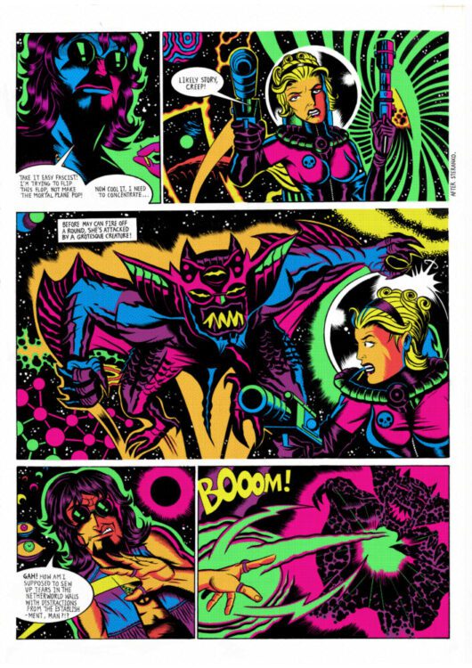
ANTON W. BLAKE (Zethia Space Witch): Rocko gave me a lot of freedom on the story I illustrated. I’d worked with him onImage Grand Design, so we already knew each other’s styles of working. I remember just telling him I wanted to do something strange that I could experiment with mixed media on, maybe something with a Lovecraftian monster. I think the first idea we talked about was a Jack Infinity in the Netherworld story, but it ultimately became The Coming of Krakkenggeddon. The script itself was very sparse, just simple descriptions of this eldritch creature arriving in our reality and drifting through the ocean over an indeterminate amount of time. From there, he just told me “go wild.” I’m somewhat known for my mixed media art now, but I had only introduced a little bit of it into my art before GHOST Agents. That story was my excuse to go all out with it, and Rocko was on board with everything I threw onto the page.
Art by Anton W.Blake
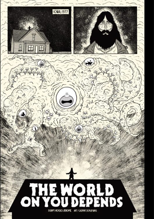
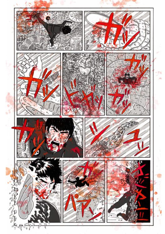
CASPAR SCHUMANS (First published in GHOST Agents): Rocko recruited me from a group drawing session over Zoom, from there it actually sounds a lot like what Anton described. Rocko asked what I would like to draw, and I jumped at the chance to do something with Jack Infinity and some Netherworld nasty. I was upfront about not wanting too many pages as I did not want to overpromise. From there, he got me a very short script which can be summarized as “Jack is old and burnt out, think fat Jim Morrison. One last stand against the Netherworld, and it kills him. Make it cool, make it weird.” There was a little bit of back and forth in regards to the title before we settled on The World On You Depends, tying nicely into the Jim Morrison reference.
Art by Caspar Schumans
ANTON: Rocko can correct me if I’m remembering this incorrectly, but I think the creature from that story is the same as mine.
ROCKO: One hundred percent! A lot of what fuels the way that narrative winds and weaves is based on what artists tell me they want to do with their pages. Like, I don’t know that I even wanted to do anything again with Jack Infinity until Caspar said that. And since we had established this weird, monstrous creature in Anton’s pages, it occurred to me that we could have it recur, and Jack could battle it in Caspar’s pages. That storyline would have gone differently if the cartoonists had other requests. We got really into having demons from Hell come to battle the Agents.
CASPAR: That is what it felt like to me when we were talking through what my pages would be, while also seeing what others were doing. A delicate balance of letting artists run wild but also reining it in just enough to have it all fit in the larger vision.
BARRY: In terms of how I approached the artwork for the three GHOST Agents stories I drew, there was a consistently clean, retro-looking style I wanted for the Lost In The Nowhere Zone and The Tijuana Affair Part 1 stories, and the monochrome scheme was obviously heavily influenced by Darwyn Cooke’s work on the Parker series. The Nowhere Zone story in particular was a joyous mash-up of some of my favorite artists: Wally Wood Space suits, Darwyn Cooke figures moving across Kirby and Ditko-inspired backgrounds, with a small hint of Druillet thrown in for good measure.
Art by Barry Tan
ROCKO: What I think you will find every artist I work with will tell you is that I grant a lot of latitude. I’m extremely proud of that. I feel like most comic book writers think of art as something you hire. I don’t. Comics are a visual art form first, a storytelling medium second, and I’m happy to be on the ride with killer cartoonists.
Art by Rick Lopez
BEN: That’s what I like about not what he created but how Rocko lets the organic nature of working with a multitude of others blend itself into a narrative that deserved the treatment of what we were doing with the art. Everything kind of just became integrated, and it’s amazing to see how we all kinda look like we are pushing the comics storytelling medium to the limit. All I can say with any honesty is that I feel safe to be able to explore wild, weird shit with Rocko because he trusts me to be able to tell the story in the best way that helps the GA style. Which is already a cool smorgasborg of seething, smoking hot talent! I get out of breath trying to keep up with these guys! That’s why I love that he lets me get away with these crazy ideas.
GHOST Agents: Crimson Apocalypse
GHOST Agents has mostly been released in treasury formats on newsprint, but for the compilation GHOST Agents: Crimson Apocalypse, Rocko and Eli arrived at an oversized, prestige format presentation that places a selection of stories in a precise new reading order.
ROCKO: I get the sense that few, if any, people read the various GHOSTAgents stories closely enough to catch this, but there is an overarching narrative. That’s ok, because this stuff works fine as art books for your coffee table. But it’s all there, reprinted from previous releases, in correct reading order as GHOST Agents: Crimson Apocalypse.
DAKOTA ALEXANDER (The Hunter, GHOST Agents: Crimson Apocalypse cover artist): I spammed Rocko while I was promoting this comic I did work on- The Masters. At this point, I had only done cover and pin-up work. I don’t know if it was just from all the countless pics I posted on Facebook or any of the actual commission work that brought me to Rocko’s attention, but he reached out to me on Messenger about the cover. I had the leeway of keeping the concept simple. With the cover and pin-up work I’ve done, in the beginning, it’s a lot of asking questions about characters, so I can get their general archetype sorted as well as the relationship to the antagonist in this case. After getting the reference imagery, it was just a case of figuring out how to break it down visually to fit within the themes of the book. I liked the spy aesthetic and the idea of personal tension between both characters, and I just thought “Octopussy”. Rocko was always there to answer any questions I had, but beyond that, he just let me run with it.
Art by Dakota Alexander
CHRIS: It was wild to see the world building carry on and to see the designs I did change with every artist who came after. I could absolutely have imagined it growing into the success it has become with Rocko’s go-get-em guidance and Eli at the publishing helm. So I’m not surprised in the least at what it has become or even where it will continue to go.
SEAN: I definitely gotta say, and I’ve told Rocko this a bunch of times, but it remains to be true. Since I tend to use my part as a break from working on my own stuff, every piece of work I’ve done for GA has made me better, and it’s wonderful because I fold it back into my own.
Art by Meesimo
ELI: GA has the potential to reach so many people. Like Rocko says, “GA has a million fans out there, we just gotta find a way to reach them.” I think GA could also find new life in multimedia as well. It’s as potent an idea as Mission Impossible or James Bond. Actually, it’s way more potent, what with all the different agents and time periods. But for now, I am super excited about seeing all the amazing creators who have worked on GA go to amazing heights with their own projects, as well as excited to see what new talent we find and how far they soar!
BEN: I keep saying that GA is the best current indie comic being published today, and I’m convinced we are this generation’s Haight and Ashbury or Mirage. It’s a watershed moment in indie comics.
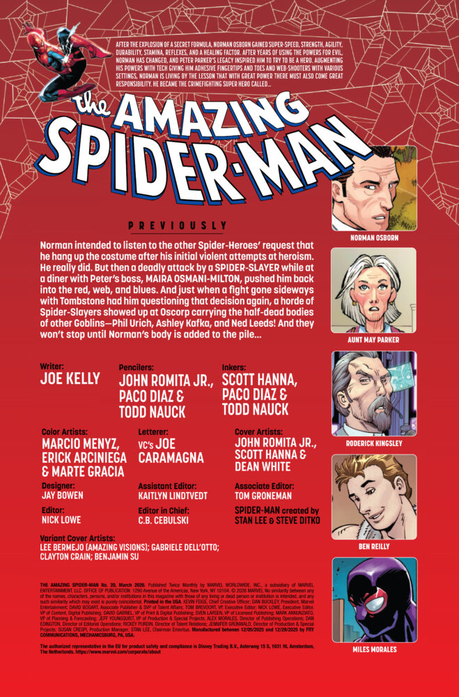
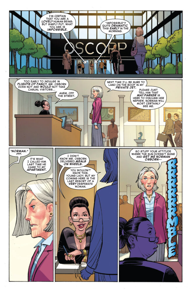
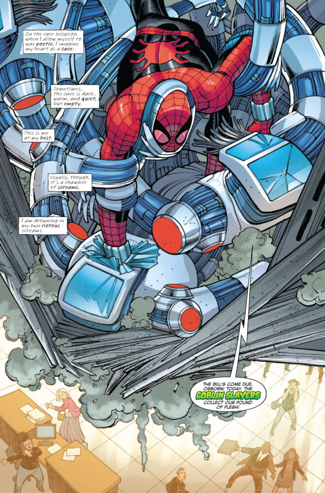
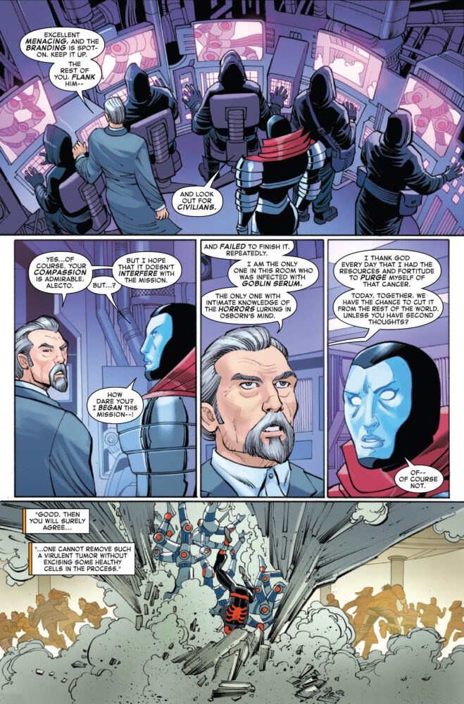
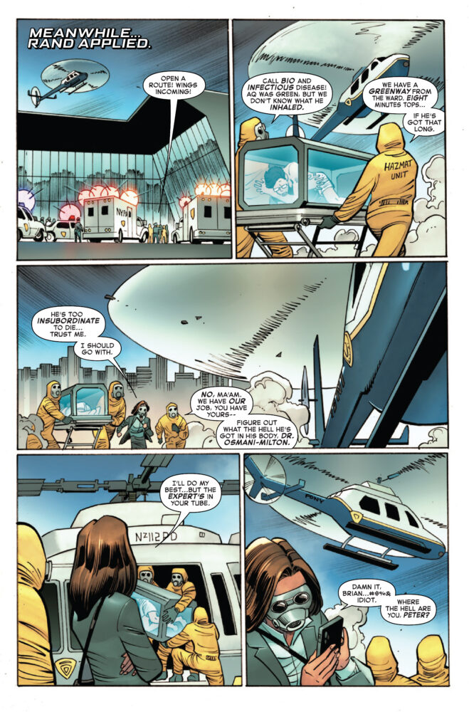
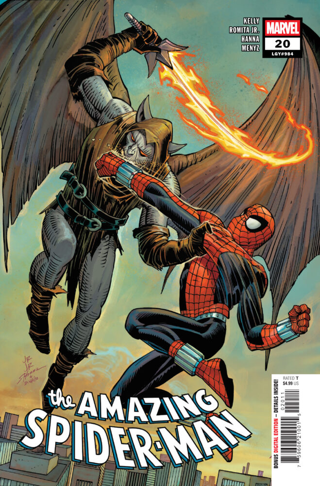
AMAZING SPIDER-MAN #20 hits your local comic book store on January 21st, but thanks to Marvel Comics, Monkeys Fighting Robots has an exclusive four-page preview for you!
About the issue: NIGHT OF THE GOBLIN (SLAYERS)!
Norman Osborn may be purged of his sins, but that doesn’t mean they can’t still come back to haunt him! HOBGOBLIN wants Norman out of the SPIDER-MAN game (and this life) for good – and he’s got the hyper-lethal tech of an entire goblin-slaying army at his disposal. What does Norman have…?! A Spider-Man or Woman or two who trust him as far as they can throw him…
The issue is by writer Joey Kelly, and artists John Romita Jr., Paco Diaz, & Todd Nauck, with additional inks by Scott Hanna, colors by Marcio Menyz, Erick Arciniega, & Marte Gracia, and letters by Joe Caramagna. The main cover is by John Romita Jr., Scott Hanna, and Dean White.
Check out our AMAZING SPIDER-MAN #20 preview below:
Are you reading AMAZING SPIDER-MAN? Sound off in the comments!