Zoop is a new entertainment pre-ordering/crowdfunding service dedicated to streamlining creator’s projects. How does it stand out amongst other ingrained services like Kickstarter? That’s what we’re here to find out with Zoop’s founder and CEO Jordan Plosky.
Monkeys Fighting Robots: What sets Zoop apart from competitors like Kickstarter or Indiegogo?
Plosky: For supporters, we make it easier and more intuitive to support your favorite creators. Unlike other platforms, we allow a supporter to select as many different tiers as they want, and as many of each as well, more of a traditional e-commerce cart system. Plus, right now we are starting with comics, but we’re going to be focused on the larger fandom community going forward.
For creators, we are more than just a platform. We also offer all the services needed for a crowdfunding campaign, such as campaign management, marketing, printing and fulfillment, etc. We take months of work off creator’s plates so they have more time to focus on what they do well: create!
MFR: Recently, there’ve been some controversies surrounding who should use crowdfunding websites for projects. What are your thoughts regarding big name publishers and creators using crowdfunding?
Plosky: I think crowdfunding is growing more and more across industries as a viable model for anyone to use. I don’t think gatekeeping helps anyone. If a company needs to de-risk a product in order to get it to market for people who really want it, I don’t see the problem with that. A rising tide floats all boats. I don’t believe it negatively impacts an individual creator’s efforts, as most of their backing comes from their own personal network typically.
MFR: I noticed on Zoop’s website that you have some impressive talent. What was the process of getting them on board?
Plosky: My co-founder Eric Moss and I have both been in the comics industry for a bit and have developed some relationships over the years. It doesn’t hurt that Eric was the project manager on Boom! Studios’ BRZRKR campaign, among others, and really knows his stuff!
But, when you’re solving MULTIPLE pain points, and providing a service that creators want and need, it makes it that much easier to start a working relationship with them.
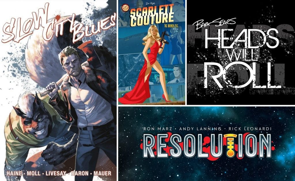
MFR: Why did you decide to have Slow City Blues be Zoop’s launch title? For that matter, what makes it the best representative for Zoop’s goals?
Plosky: It was a mutual decision. They wanted to be first, and we felt their offering of a full 5 issue series, as well as the A-list talent on their variant covers was a winning combination. When you have gorgeous work by David Finch, Howard Porter, Paul Pope, Derrick Chew, Brett Booth, Philip Tan, Cary Nord, Francesco Mattina, Yasmine Putri, Juan Totino Tedesco, and MORE, it felt like a homerun!
MFR: Who do you hope will join in on Zoop’s future campaigns: first-time hopeful creators, veterans unrestricted by schedules… both maybe?
Plosky: Right now as we are providing full services, we have a limited bandwidth. As a result, we are first working with established creators with existing fanbases. However, we are trying to quickly get to a more open version of Zoop quickly so we can welcome all creators!
Finally, when can users expect future campaigns to open?
Plosky: You’ll have to visit www.zoop.gg to see what we have coming up, and sign up for those individual e-mail lists to get notified of their launches!
But, we do have two more campaigns this month of June, with 4 more lined up for July and already filling our late summer/early fall schedule as well.
For more information about Zoop, and to back any of their upcoming projects, go to www.zoop.gg. You won’t want to miss out on the exciting titles that they have in store.
The Visitor #6 from Valiant Entertainment comes to comic stores on June 16. Writer Paul Levitz ends the mini-series with dynamic action from artist MJ Kim, colorist Ulises Arreola, and letterer Simon Bowland.
The Visitor #6: An Epic Afterthought
Levitz ends the series in a divisive fashion. While Kubo remains a danger to Dauber and the titular cyborg, the battle with him makes little sense. Previous issues show Kubo taking control of others with little effort. Seeing Dauber resist his control even more than the Visitor feels like a deus ex machina. The ending itself can be a little hollow, like nothing in the plot actually mattered. Unless The Visitor #6 can be seen as a tragedy where the world of Rai is inevitable. This leaves the Visitor himself, who now has more potentially memorable appearances with the rest of the Valiant universe.
Unbalanced Scaling
The return of MJ Kim as the artist for The Visitor #6 has its pros and cons. At its best, Kim’s art provides some very dynamic action, like when Dauber shows off an impact kick. It’s a great display using layouts for anticipation and to expose Dauber’s bionic leg. For Kubo in the background, it makes her a powerful weapon to use. Some of the coloring by Arreola adds to the action, like when Kubo’s orange psychic power match some small fires or the discharge of a bullet. It’s like Kubo has power over everything Dauber does. Unlike the brighter blue electricity of the Visitor. Some of the sound effects by Bowland further add to the tension.
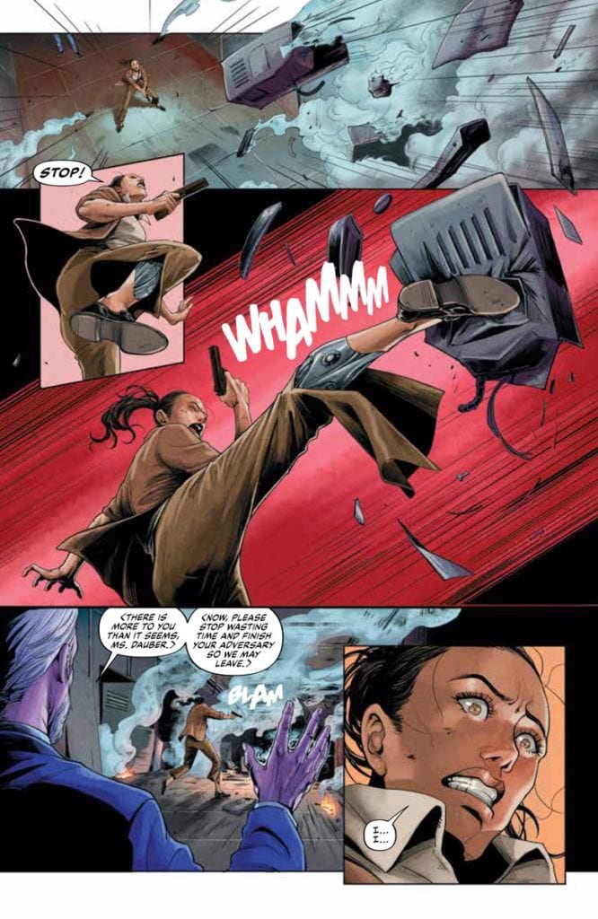
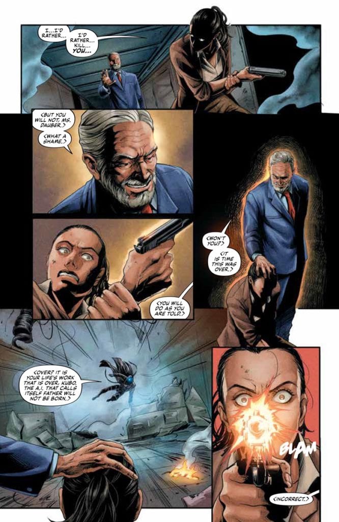
But there are some inconsistencies as well. Like when one panel shows the Visitor with his mask on even though it was removed earlier. Or even when the Visitor and Dauber shoot down a helicopter with Kubo in it. After which is a jarring bit of action where the Visitor leaps out of the copter to finish Kubo. Without the Visitor saying anything like “If the fall didn’t kill him, I will,” this feels like a redundancy.
Take Or Leave The Visitor #6
The Visitor #6 has its highs with some effective action scenes along with a tragic afterthought. But a few inconsistencies hold the overall impact back by quite a lot. Hopefully, this character can return to stand out amongst the Valiant universe.
Radiant Black #5, out now from Image Comics, builds on the momentum created by the previous issue and lets the reader understand the situation proposed by the series while still leaving many questions.
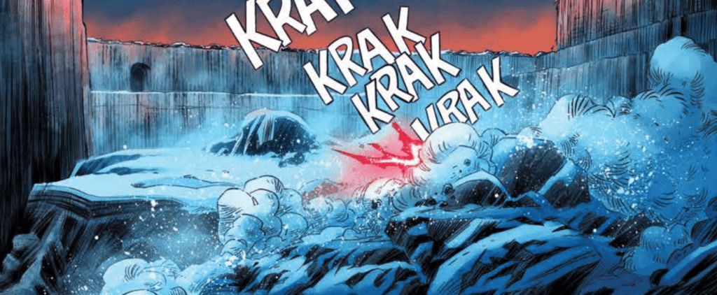
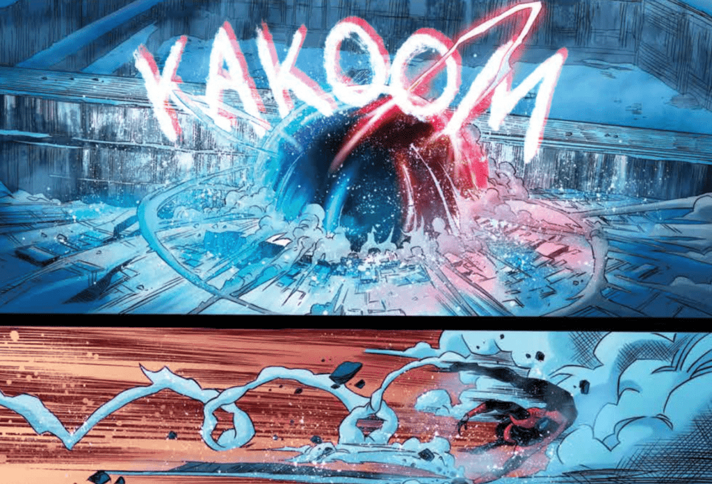
Kyle Higgins left the readers with an insane turn of events in the previous issue, and Radiant Black #5 keeps up that same energy with new twists and turns. The issue is also the first to elaborate on what is going on, and it turns Radiant Black into an entirely different kind of story. Higgins’ dialogue here also does a brilliant job of showing the characters realistically working through their emotions, which flows smoothly. In comic books, it isn’t easy to have a character monologuing for an extended period of time that doesn’t impede the flow of the story. Still, Radiant Black #5 pulls it off flawlessly.
Radiant Black #5 contains some awe-inspiring battles thanks to the work of Eduardo Ferigato and Marcelo Costa. These scenes are dynamic, and the new designs that we are exposed to shine brilliantly during these scenes. The explosions, debris, and energy blasts shown during the conflicts highlight the precise detail Ferigato and Costa put into their work. The result is a phenomenal and engaging issue. It is also worth mentioning how the expressive faces the characters make throughout the issue enhance the emotional moments and make the pain behind their eyes evident to the reader.
Becca Carey’s lettering in Radiant Black #5 does an excellent job illustrating the type of sound being made and fits perfectly with the art. The reader can see an example of this when the lettering adapts to a unique attack used during the final fight. The lettering mimics the style of the attack and provides a sound effect that complements the art. Carrey also uses various other techniques on speech bubbles to showcase the tone, such as having dialogue extend past the borders, giving them jagged outlines, or inverting the color scheme.
Radiant Black #5 is another issue that will hit you with unexpected twists and turns and leave you dying to get your hands on the next issue. From what is shown, it seems the series will contain many more fun and exciting characters, and there is a lot more to discover about this advanced suit that Nathan and Marshall found.
The Djinn is a horror film from co-directors David Charbonier (The Boy Behind the Door) and Justin Powell (The Boy Behind the Door), an 80s era fairy tale gone horribly wrong. Composer Matthew James washed the film with an evocative synth score.
Ezra Dewey is 12-year-old Dylan who can’t speak. Dylan believes his inability to talk caused his mother to leave, and he now lives with his father, a nighttime radio DJ. Alone at home, Dylan discovers a magical book offering a fix to the young boy’s vocal woes. However, as the saying goes, be careful what you wish for, especially when a magic book and supernatural powers are involved.
PopAxiom spoke with Matthew James about his road to making music for the horror film The Djinn.
Making Music
“I’ve been a musician since I was seven years old.” Matthew’s journey with music begins, like many, at an early age. “I started on keyboard instruments. I grew up as a band geek in school, then transitioned into guitars and stuff, playing in bands.”
Being a performing musical artist was the focus for Matthew at this time. “In my 20s, I was a singer-songwriter and multi-instrumentalist. I was trying to be a live performer in my 20s; then, I took a break from music to return to university to study psychology. I realized at the end of the day is that the music bug always calls me back. I came into composing later.”
Decades ago, Matthew’s route to film composition was uncommon. But going from pop music makers to composers is much more typical, with people like Danny Elfman, Johnny Greenwood, and Trent Reznor making the shift. “The big dog himself, Hans Zimmer, came from The Buggles. He was a nerd with a big wall of synthesizers, and not many people knew how to run that.”
“Zimmer’s kind of the granddaddy of any of the kind of rock-oriented musicians,” Matthew says, adding, “He ushered in the ability for the computer nerds to come in and make this a viable path for themselves.”
Matthew was a bassist during his teenage years when he discovered a musical genre that’s not mentioned often enough but has a pivotal role in inspiring countless musicians — jazz. “I discovered Victor Wooten, a lot of fusion jazz, like John Pistorius. I like to say the bass was my spirit animal at the time.”
“You can slap a bunch of notes together and call it jazz,” he says about the seminal musical genre. “Sometimes it sounds like a train is about to derail, and you pull it back. It’s a lot of fun.” Noting that the experimentation and challenge of jazz draw nearly every kind of musician to it at some point. “Jazz and fusion was also the more difficult stuff you could play outside of the typical classical.”
After more than 100 interviews with composers, it seems starting at an early age is a vital key to sonic success in the industry. “I think it’s one of those calling things. There are pictures of me as a baby plunking away at a family organ. It’s one of those things that’s like, without being generic, you’re kind of born for it. You can certainly learn. We all have rhythm and musicality. But you don’t choose this; it chooses you. Human spirit and will can overcome all things, so I’d love to see a story like that.”
About The Djinn
Matthew’s work on The Djinn began when he got “… connected with David Charbonier and Justin Powell back in 2019. I was coming off a project called Useless Humans. Ryan Scaringe, the producer, liked our relationship and offered me a chance at The Djinn. They showed me what was a rough cut of the film at the time. I could see the incredible work happening.”
“I wrote some demos for them,” he says about the first steps of the process. “The track ‘Artifacts Required’ ended up kind of being the cornerstone that sealed the deal. That’s the track that got me hired. Though I think it took two months to hear that I was on board.”
Scoring The Djinn started in late 2019. “By the nature of when I came on to start the project, they were still in the process of locking down the picture. I think we started scoring around October 2019. Since it was an indie, there was no hard deadline.”
“In the middle of January,” he continues, “We all got sick. We might’ve had COVID. We even tested negative for the flu. So, we were done around mid-February. If I had to say a hard time spent, it was probably the usual six weeks or so.”
Hit The Ground Running
Matthew’s transition from performing artist to composer didn’t take long, and he hit the ground running with the learning process. “I was fortunate that I came into this [composing] as an assistant on some major titles (Black Lightning, Being Mary Jane). I was used to these high-level productions that are super-polished. I’m going into Sony and Paramount dub stages. So, there’s a bit of a shock because I was spoiled.”
“In indie films,” he explains, “good ideas are often snuffed out by a lack of budget. Filmmaking is incredibly laborious. You have to be especially brilliant to use a tiny budget and make it into something viable. These guys on The Djinn did just that. With a tiny budget, they produced something that looks 10x more than it was. That’s a testament to the guys and how they understand story and cinema.”
Wrapping Up
Growing up a performing artist, Matthew quickly points to a trio of bands as significant influences. “Any kind of my age growing up in the 90s will say Nirvana. Smashing Pumpkins, Metallica too, but Nirvana’s “Smells Like Teen Spirit” was something else.”
I love sci-fi. I love the concept of space and the vastness of space. I love things like Gravity, Ad Astra, and Arrival. What’s scarier than the truly unknown and space is infinity. It doesn’t get bigger than that with the unknown. I love traditional fantasy too and writing orchestral stuff like that.”
Matthew says composers are notoriously competitive and love to challenge themselves. “I think comedy is some of the hardest music to write. You have to be so careful not to step on toes and understand the jokes and the cues. It’s so tough.”
He contrasts that with another genre, “That’s the beauty of horror — it’s ubiquitous. Everyone’s afraid of the dark and monsters and creepy things coming out of the closet. You’ll find similar boogie man archetypes. People understand “that’s scary, I’m going to die.” But comedy’s not like that, and it’s so tough.”
The Djinn is out on various streaming platforms, including Amazon and Apple TV. What’s next for Matthew? “I’m working on an Italian ghost story. It’s a period piece from the early 20th century. It’s a very traditional, orchestral thing. I may soon be working on a dystopian, sci-fi, virus film.”
Is The Djinn on your watch list?
Thanks to Matthew James and Projection PR
for making this interview possible.
After the excellent introductory episode “Glorious Purpose,” the second episode gets things going as Loki starts his work with the TVA.
The Variant strikes again by attacking a TVA unit at a Renaissance Fair in Wisconsin, 1985. The Variant is even able to a capture a TVA agent. Agent Mobius sees Loki as being the best way to the find The Variant and the Asgardian comes up with some theories on how to find them.
Out of all the properties Marvel has adapted Loki is the most ambitious and risky. That is really saying something considering some of the films and shows they have made. It’s a show that features time travel, alternative universes, and philosophical musing. It was like the ultimate hybrid of Rick and Morty and Doctor Who. Loki sets up that there are multiple universes but the timelines are fixed. It’s like Doctor Who where fixed points in time can’t be changed. If a new timeline is created in the MCU it could cause a Nexus event which might lead to the destruction of reality. It makes the stakes higher than in Avengers: Infinity War/Avengers: Endgame. The idea of different universes not being allowed to mix was similar to His Dark Materials.
Like Doctor Who, Loki was also filled with wibbly wobbly timey wimey explanations and logic. The scene when Loki explains using a salad and various seasonings to explain how The Variant hid felt like something The Doctor would do. This is the closest we will ever see Tom Hiddleston play The Doctor.
As well as the time and inter-dimensional Loki and Mobius did act as detectives. The premise of Loki was like Thomas Harris’ Hannibal series. The series so far centred on the relationship between Loki and Mobius with Mobius’ logic being they need a villain to catch a villain. The pair had to work together to look for potential clues in the files and use their logic to find The Variant. However, Loki is a character who’s always has his own agenda and looking for a way to benefit himself.
“The Variant” showed Loki and Mobius having a philosophical debate due to the big revelation from the previous episode. Loki states what I said in the previous episode review, that free will doesn’t exist. Loki acted a bit like Rick from Rick and Morty because he said ‘everyone’s going to die.’ It’s hardly surprising Loki had elements of Rick and Morty because the showrunner, Michael Waldron, worked on the popular animated series.
One of the interesting aspects of ‘Glorious Purpose’ was the character development with Loki getting his worldview rocked. ‘The Variant’ continued this in a small way when Loki read about Ragnarök and discovered that most of his people had died. This information hurt Loki but it also led to the god having an epiphany
On a final note it was noticeable that within the TVA there were many statues of the Time Keepers around their complex. They loomed large over everything and their presence was felt even if they haven’t made a physical appearance yet.
“The Variant” was an excellent piece of TV because of its mix of sci-fi, police procedural and humor. The episode ended on an incredible cliff hanger that will leave viewers wanting more.
Check out a four-page preview of Clans of Belari #1, thanks to AfterShock Comics. The new sci-fi adventure series from Rob Blackie, Peter Blackie, and artist Daniel Maine hits your local comic book store on July 7. The creative staff also includes colorist Carlos Lopez and letterer Taylor Esposito.
About Clans of Belari #1: PRIMARY LAWS OF THE BELARI SYSTEM:
1. No person or Clan may exit the system.
2. No person or Clan may do the Designated Work of another Clan.
3. Clans may not merge.
4. Any person that breaks a Primary Law shall be made an Outcast.
On the far side of the galaxy, an isolated branch of humanity is trapped in a feudal dystopia. Order is maintained by a system of oppression until an orphaned girl, and her incorrigible adoptive father sow the seeds of revolution and unite the clans against a fearsome alien threat.
GAMMA FLIGHT #1 hits your local comic book store June 23rd, but thanks to Marvel Comics, Monkeys Fighting Robots has an exclusive 4-page preview for you.
About the issue: SPINNING OUT OF IMMORTAL HULK, BRUCE BANNER’S GAMMA-POWERED ALLIES GO ON THE RUN! Gamma Flight had one job: Find and stop the Hulk. But when push came to smash, they sided with the Green Goliath-and the human world intends to make them regret it. Puck, Absorbing Man, Titania, Doc Sasquatch, Dr. Charlene McGowan and a horribly changed Rick Jones are fugitives from every known authority-but a team that full of gamma is bound to break before long. Al Ewing, Crystal Frasier and Lan Medina mastermind a whole new world of gamma!
The issue is by writers Al Ewing & Crystal Frasier and artist Lan Medina, with colors by Antonio Fabela, and letters by Joe Sabino. The main cover is by Leinil Francis Yu and Sunny Gho.
As the solicit info states, GAMMA FLIGHT is a spin-off of Marvel’s Eisner-nominated IMMORTAL HULK, which is coming to a close with issue 50 this September.
Check out the GAMMA FLIGHT #1 preview below:
Are you excited for GAMMA FLIGHT? Sound off in the comments!
Tom King and Bilquis Evely team up for a Kryptonian sword & sorcery revenge quest in Supergirl: Woman of Tomorrow #1. With colors from Mat Lopes and letters from Clayton Cowles, this opening chapter is gifted with a thoroughly imaginative (but slightly overwritten) script and Evely’s ever-incredible visual work making this a unique and intriguing first issue in this new take in the world of Supergirl.
Kara Zor-El has seen some epic adventures over the years, but finds her life without meaning or purpose. Here she is, a young woman who saw her planet destroyed and was sent to Earth to protect a baby cousin who ended up not needing her. What was it all for? Wherever she goes, people only see her through the lens of Superman’s fame. Just when Supergirl thinks she’s had enough, everything changes. An alien girl seeks her out for a vicious mission. Her world has been destroyed, and the bad guys responsible are still out there. She wants revenge, and if Supergirl doesn’t help her, she’ll do it herself, whatever the cost. Now a Kryptonian, a dog, and an angry, heartbroken child head out into space on a journey that will shake them to their very core.”
With Woman of Tomorrow #1, Tom King places Kara Zor-El in a situation I doubt any other writer has ever gotten the chance to address: what is she like if you pull her out from behind Superman’s shadow? We find Kara on a distant planet with a red sun just trying to be by herself before being pulled into a young warrior-in-the-making girl’s quest to avenge her father. Kara is presented in this comic as a sort of mythic being, but not in the way she or her more famous cousin are typically framed. She comes into this girl’s life in a rather embarrassing moment while trying to get away from the “Supergirl” name. This comic reminds me of a sword and sorcery/hack and slash adventure tale for numerous reasons (which I will cover), and the first is the sort of mythic status Kara is given by this young girl who is also our narrator. Her presence here is very similar to how Conan and Red Sonja are written in their respective stories, thrust into a cause for reasons that are almost entirely their own. The entire premise of humanizing Superman by depowering him is a worn out cliché at this point, but with Supergirl very little has been attempted to really dig at her character. Her arguably most well-known appearance in her publication history is in Crisis On Infinite Earths – where she’s most remembered for dying. This is an opportunity for King to discover and invent who Kara really is as a person, separate from the pressure of being known only as Superman’s cousin.
Stylistically, the writing here is compelling and entertaining – if not a bit much for an entire comic. The protagonist, and all of this strange planet’s denizens, speak in a long-winded high-fantasy dialect, resulting in large passages of dialogue on every page. This is obviously part of King’s setting up this comic’s connection to the sort of stories that he’s pulling influence from. While I tend to enjoy this kind of writing, and while I do think it works to an extent here, it does reach a point fairly quickly where it becomes a bit too much. I actually quite like the idea of an alien race who all speak like they’re on a planet created by Tolkien and Robert E. Howard. However, reading pages of this dialogue in an inherently visual medium does get to be a chore. Fortunately, the actual plot content of the writing is very engaging thus far, and this issue’s considerable word count wasn’t enough to keep me from wanting to see what else this story has to offer.
The most striking feature of Supergirl: Woman of Tomorrow #1 is of course the visual work of Bilquis Evely and colorist Mat Lopes. The same team behind The Dreaming now lends their talents to this hyper-imaginative superhero book in absolutely grand fashion. Evely’s pencils are a sea of detail, with her thin linework crafting intricate character animations and designs for a cast of very few (there are only 5 unique identifiable characters in the entire issue) that are all memorable in how they are drawn. From our protagonist’s youthful yet dignified determination to Kara’s wide range of emotions, the actors in this comic have internal journeys that play out across their faces in ways that make them instantly relatable. The environment of this alien world is a striking setting as well, with features that are familiar enough that they would be recognizable for Earth settings in a fantasy tale – were it not for the colors (more on that in a moment). Evely’s panel direction is much more reserved that her work in The Dreaming, which constantly challenged the conventional forms of panel direction. This issue takes a more standard approach with its organization, in a manner that is clean and easy to follow. The beauty that Lopes’s colors give this comic is absolutely stunning, and sets the audience firmly on the ground in this gorgeous alien setting. The light greens, pinks, and reds in this world’s foliage and atmosphere, as well as the litany of skin tones and shadings used on the characters, illustrates a deeply vivid visual experience for this comic. The lettering from Clayton Cowles is solidly conventional, with a naturalistic sense of font changes and italics to hone the reading experience into something that perfectly captures the tone of the narrative and dialogue. This is a brilliant looking comic book, and I would expect nothing less from this artistic team.
“Supergirl: Woman of Tomorrow” #1 is a delightful and stunning debut issue. While it may be a bit long-winded, Tom King’s script captures the essence of a classic genre and fuses it with a superhero story for a character journey that needs to be discovered. The visuals from Bilquis Evely and Mat Lopes are beyond gorgeous, bringing this world and these characters to life with emotional complexity and vast beauty. Don’t miss this new series when it debuts on shelves on 6-15!
DC Comics’ relaunch of Milestone Media’s short-lived yet timely series Static should come as a welcome shock to fans. Available now,Static: Season One #1 is written by Vita Ayala, with layouts by ChrisCross, and finishes and colors by Nikolas Draper-Ivey. Frequent DC collaborator AndWorld Design contributes lettering.
In Dakota City, the nucleus of Milestone Media‘s “Dakota-verse”, Virgil Hawkins struggles to cope in the aftermath of “The Big Bang.” Police use of an experimental gas to break up a peaceful student protest has left the entire city traumatized. It also gave teens superpowers. Virgil became Static, gaining the ability to manipulate electricity, though he doesn’t yet know how to control this power.
Ayala works from the inside out, immersing readers in Virgil’s psyche through narration. Before we even see the character use his powers, we get a sense of how he feels. We know Virgil has had problems harnessing his powers, but it isn’t until the end that we see just how explosive he can be.
Power and Control
It’s an effective and realistic slow burn, especially since we see the effect of Virgil’s shifting behavior on his family dynamic. He’s scared he might hurt someone, and this fear prevents him from opening up to his family and friends. Haven’t we all been there?
VIRGIL HAWKINS CONSIDERS HIS NEW POWERS.
Artistically, ChrisCross and Draper-Ivey capture Static’s young, troubled psyche in every uneven border and pixelated background. A favorite effect of mine was the use of TV static in a few panels to communicate Static’s mental picture of his anger and lack of control. By contrast, the layout itself lends a sense of objectivity to a story so rooted in Virgil’s point of view. And by “objectivity,” I mean in the film sense. There are few close-ups, no POV shots, and subtle actions and background pieces help advance the story.
Moreover, Draper-Ivey’s color palette favors cold blues, greys and blacks. This is a story of trauma which suffuses an entire town, so the environment is colored to reflect that. Also, to reflect Static’s powers, a blue wash runs through nearly the entire issue. Blue on its own evokes depression, but here it also evokes just how much power Virgil holds. The blue is almost sinister in that it suggests Virgil could unleash his full potential at any moment.
Effects
On a final note, AndWorld Design’s lettering follows the standard. Dialogue and caption narration flow with the action, and bubbles are shaped to reflect dialogue inflection. Additionally, SFX were reserved until the climactic action sequence. AndWorld’s use of SFX is the only source of complaint from me.
Overall, I stand by the rule that no matter the medium, effects should only be used where necessary to accentuate action. Even though the action sequence in question is incredibly dynamic, I don’t think every single big moment needed SFX, especially not in large font that ends up covering some of the action. But that’s a small gripe at what is ultimately a satisfying book.
In a time when reboots and relaunches have become the norm, Static is one that doesn’t read as cynical. It is full of the creators’ love and care for the character, and indirectly comments on America’s current social climate. For those reasons and more, I hope this time around Static is here to stay.
DC Comics’ Nightwing #81 is an almost contradictory mix of fun and gloom. We’re still seeing the same Dick Grayson who was hopping over rooftops just an issue before, but something is changing. Writer Tom Taylor, artist Bruno Redondo, colorist Adriano Lucas, and letterer Wes Abbott are bringing the drama in. There’s still plenty of fun to be had, but maybe not for long.
Writing
A lot of why this issue hits home comes from Taylor’s work on the series so far. Taylor set up a fun status quo. We’ve connected to Barbara, Tim, and Dick as they’ve hung out and shared pizza. So, when Heartless shows up, threatening to put an end to those days, we care. We’ve become attached enough to the good life that Taylor has presented, that Taylor’s threats to take it away are just as moving. And as we move into a more complicated chapter, we hold that vision in our minds. We hold onto the hope that though things may get rough, the characters can get back to the joy we’ve seen them share.
At one moment, Taylor does something a little familiar. As Dick, Barbara and Tim talk, Tim tells Dick, “Bitewing was pretty worried about you.” That’s the name Tim has given Dick’s new dog. “Bitewing? That’s… actually a great name,” Dick responds. This feels like a little joke Taylor is telling. But Dick saying it’s a great name feels like Taylor holding up an “audience laughter” cue card. Rule #1 of comedy is that you can’t tell people when to laugh. Your jokes ought to speak for themselves. There is so much charm to Taylor’s scripts. They’re brilliant, fun, and moving. But when Taylor seems charmed by them too, it takes a little of the magic away. Though, ultimately, this is a small blemish on the face of an otherwise fantastic script.
Art
Even in the midst of high stakes and dramatic moments, Redondo adds movement and levity. When Heartless takes a shot at Dick Grayson, then puts his gun away, we see it in a tiny panel in the corner. On the next double-page spread, we see their fight. It ends when Dick catches his baton in a little panel in the same corner. It creates a playful repetition to the scene, making the fight feel just as much like a dance as a battle. Later, when Nightwing fights with someone on a staircase, the panels follow the action. Redondo places the stairs on the page and separates each jab and punch with a gutter. It’s a gorgeous way of presenting a scene, showing the full staircase on the page, but then showing the individual moments of the battle too.
Coloring
Lucas’ coloring is a source of a lot of the dread in this issue. As Nightwing fights Heartless, the fire around them mingles with the night air to look red. This continues through ten pages of the comic. It sets a tone and creates a shift in the mood. Later, when the danger seems to have passed, Dick Grayson lies in bed. The color of his room is a cool blue. But outside, the night air still looks red. Something is changing in Nightwing’s world, and Lucas is showing us that moments of safety are fleeting.
Lettering
Abbott has always had a wonderful ability to make everything feel fun. I have spoken many times about the little tailored sound effects he uses for each noise in a script. No sound effect looks the same. This is on full display in this issue. The white “PSSSHHH” of a fire extinguisher actually mimics the movement of the foam. The “SHNK” of Heartless’ gun is messy and otherworldly. But even small moments have subtle differences. The “THP” of Heartless catching one of Nightwing’s batons looks so close to the “THD” of him then whacking Dick in the face with it. But the “THD” has a fuzzy outline, mimicking the ringing in Dick’s ears. From the big “BWOKs” to the tiny “CLKs,” Abbott is making everything a blast.
DC Comics’ Nightwing #81 is a shift in gears. Now that this creative team has shown us the good life, they’re threatening to take it away. They have done their work beautifully. They’ve made us care about these characters deeply. And now that things are taking a turn for the dramatic, we’re all already bought in. Pick up Nightwing #81, out from DC Comics June 15th, at a comic shop near you!