

DC Comics’ relaunch of Milestone Media’s short-lived yet timely series Static should come as a welcome shock to fans. Available now, Static: Season One #1 is written by Vita Ayala, with layouts by ChrisCross, and finishes and colors by Nikolas Draper-Ivey. Frequent DC collaborator AndWorld Design contributes lettering.
In Dakota City, the nucleus of Milestone Media‘s “Dakota-verse”, Virgil Hawkins struggles to cope in the aftermath of “The Big Bang.” Police use of an experimental gas to break up a peaceful student protest has left the entire city traumatized. It also gave teens superpowers. Virgil became Static, gaining the ability to manipulate electricity, though he doesn’t yet know how to control this power.
Ayala works from the inside out, immersing readers in Virgil’s psyche through narration. Before we even see the character use his powers, we get a sense of how he feels. We know Virgil has had problems harnessing his powers, but it isn’t until the end that we see just how explosive he can be.
Power and Control
It’s an effective and realistic slow burn, especially since we see the effect of Virgil’s shifting behavior on his family dynamic. He’s scared he might hurt someone, and this fear prevents him from opening up to his family and friends. Haven’t we all been there?
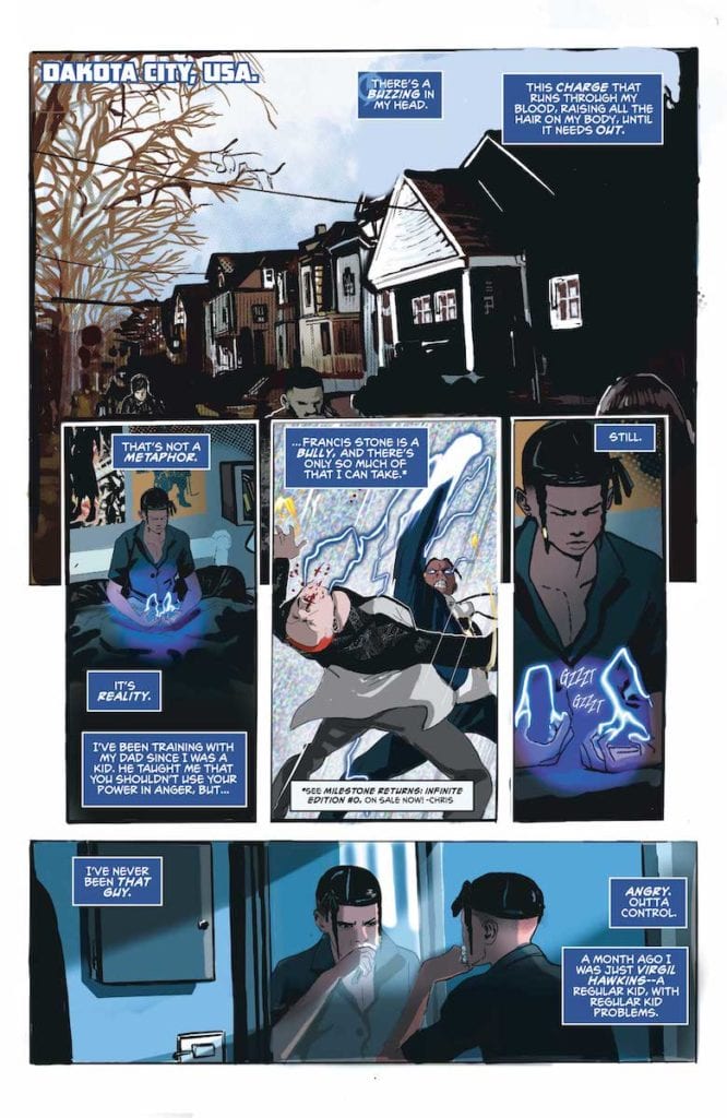
Artistically, ChrisCross and Draper-Ivey capture Static’s young, troubled psyche in every uneven border and pixelated background. A favorite effect of mine was the use of TV static in a few panels to communicate Static’s mental picture of his anger and lack of control. By contrast, the layout itself lends a sense of objectivity to a story so rooted in Virgil’s point of view. And by “objectivity,” I mean in the film sense. There are few close-ups, no POV shots, and subtle actions and background pieces help advance the story.
Moreover, Draper-Ivey’s color palette favors cold blues, greys and blacks. This is a story of trauma which suffuses an entire town, so the environment is colored to reflect that. Also, to reflect Static’s powers, a blue wash runs through nearly the entire issue. Blue on its own evokes depression, but here it also evokes just how much power Virgil holds. The blue is almost sinister in that it suggests Virgil could unleash his full potential at any moment.
Effects
On a final note, AndWorld Design’s lettering follows the standard. Dialogue and caption narration flow with the action, and bubbles are shaped to reflect dialogue inflection. Additionally, SFX were reserved until the climactic action sequence. AndWorld’s use of SFX is the only source of complaint from me.
Overall, I stand by the rule that no matter the medium, effects should only be used where necessary to accentuate action. Even though the action sequence in question is incredibly dynamic, I don’t think every single big moment needed SFX, especially not in large font that ends up covering some of the action. But that’s a small gripe at what is ultimately a satisfying book.
In a time when reboots and relaunches have become the norm, Static is one that doesn’t read as cynical. It is full of the creators’ love and care for the character, and indirectly comments on America’s current social climate. For those reasons and more, I hope this time around Static is here to stay.