Home Blog Page 424

Review: MARVEL COMICS #1000 Celebrates History While Beginning a New Mystery

Monkeys Fighting Robots

Marvel Comics #1000 Celebrates the 80th anniversary of Marvel’s debut comic (Marvel Comics #1) under original publisher Timely Comics, the big 80th-anniversary issue hits your local comic shop this week (If you want to learn more from the original press release, check out our coverage!). This beast of an issue features a creative team of 80, with each contributing one page focusing on the year of publication, while Al Ewing oversees writing duties; our as Marvel dubs him—The Mastermind. With no time like the present let’s crack open this issue 80 years in the making.

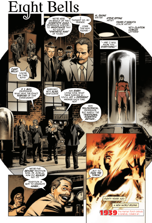
Ewing begins the 80 plus page giant by mirroring Marvel Comics #1’s first panel, with Phineas Horton opening the door for the Scientists’ Guild, thus opening the 80-year history of Marvel Comics. The stories written directly by Ewing tells the ongoing story, while others tell the story of specific years within one page. As the story builds Ewing’s overreaching plot is seen less and less throughout the multiple decades, but each time you read an Ewing page your eyes will be scanning it for details.

Essentially Ewing’s story is the spine holding it all together, as the rest of the creative teams write a singular page that contains its own story, while fundamentally tying in. These moments of synchrony at times can be hard-pressed to present itself, to the point you may need to re-read the giant that is Marvel Comics #1000. While at other times the single pages gel perfectly with the story that Ewing presents. This story that Ewing tells ranges from the very beginning of history to the now (2019), and beyond (2020).

Focusing around a new Marvel artifact titled Eternity Mask, Ewing sets up a mystery that climbs through the years of Marvel Comics, plus some movies, which seems weird but we’ll get to that. This mysterious mask makes its way through every era, yet is always hidden with a group always on the search, one being Three Xs’. If you don’t know who that is it’s okay, Ewing and team grabbed so deep in Marvel lore that they pulled characters that have only been used once! When Marvel claimed this would dig into its history they were correct.

This mystery of the Eternity Mask and teams searching for it seems to be pushing towards a future event, especially with one long lost character returning. Sorry, no spoilers! Each page Ewing writes adds to this time-spanning mystery with only a few years feeling like they could’ve focused on other big milestones. As every single page focuses on a single milestone of that year, some start to feel like a stretch or that they could’ve chosen something more prominent. Nonetheless telling a story in one page is hard, with some taking a novel approach by having his or her story be like a page out of a book.

As with the writing side, the art is done by an abundance of creators too. Each artist comes with their pros and cons, with the pros usually outweighing the cons. In a few cases, this statement isn’t true with some colors feeling off and pencils feeling stiff or boring. To fit a whole story for a specific year in one page is a hard feat with most accomplishing this feat, but for others, if the art had a chance to breathe it would’ve benefited.

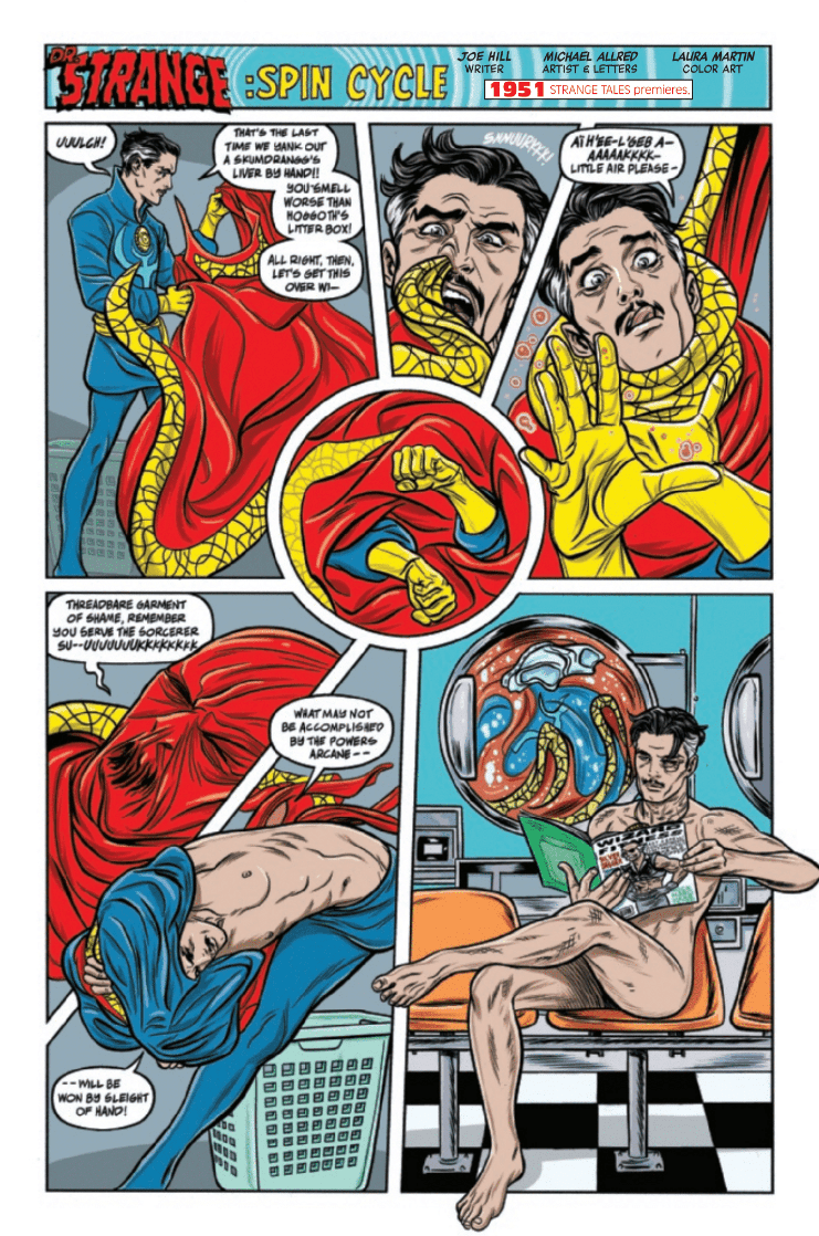
Another aspect of art that could’ve benefited by being different is matching art styles with the years. A good example of art style mixing with the publication year is Michael Allred for 1951 (Pictured Above). His style blends perfectly with the year, whereas 1939 has Steve Epting’s (picture below) style of art – which is great – but could’ve matched the year better. Instead Marvel could’ve had Tom Scioli, Ed Piskor, or Greg Smallwood (to name a few) to imitate the classic art style.

If Marvel tried harder to match the perfect artist with year,  the impact of each page would have hit that much harder. They did excel on some years that feature the artist that worked on that comic during said years. A great example would be 1991 with Rob Liefeld and X-Force/Deadpool, and the following year (1992) Erik Larsen is back on Spider-Man; which was the year he debuted as writer/artist for the title.

Without going into spoiler territory let me tell you about the best page—the year 2019 by Christian Ward. For a page that’s heavy in dialogue, Ward knocks it out of the park with no panels, just keeping it a one-page spread. In this we see Eternity as he informs the readers of events, which may sound boring, but with the swirling colors and LSD esque art it’s anything but.

Unlike the art and writing side lettering is accomplished by a team of 16 that rotates with the pages; with some artists doing it themselves. In most cases it’s the usual word bubbles, with nothing too extraordinary, but the few times the letterers let loose it’s a blast to see. Two great examples are the text in The Farmer, which is a story about Thanos and Galactus. In this story letterer VC’s Travis Lanham changes the format of all the dialogue with it becoming italicized and purple.

Another great example of changing the dialogue boxes/bubbles for the better is in The Guild of Strange Science which take place 1500 years ago. Instead of going with a simple box to show the inner narration, VC’s Clayton Cowles instead conveys it with a tattered scroll, befitting the era the story takes place in.

80 Years Of Story Telling (Conclusion)

Marvel set out to celebrate 80 years by respecting what came before them while setting pebbles of new plot scattered throughout its history, that seems to be building to a huge event for 2020. This team effort of 80 people is a big deal and every creator should be acknowledged for how much work went into it. Having to wrangle that many pages from so many people is a huge task, with Ewing and team knocking it out of the park.

Although it had a few minor blemishes with some stiff art at times, stories that felt like they didn’t add to the plot, a couple of stories killing the flow, and a few cases were Marvel could have picked something other than what they did for that year; Marvel Comics #1000 succeeded in its delivery.

Memorable Quote: “Sins Past” – J. Michael Straczynski

As great and memorable as some moments were, these two words had me in tears from laughing so hard.

A Marvelous Cast of Creators

With such a huge cast of creators here is Marvel’s credits page, with a complete list of who worked on this giant issue! Plus an “in memoriam”, which was great of them to add.

Dear Marvelous Reader

So dear reader I’ve got three questions for you! What did you think of Marvel Comics #1000, what was your favorite story, and which cover was your favorite!?

What is my favorite stories you ask? Well, I have two, that would be Joe Hill/Michael Allred, and Phil Lord & Christopher Miller/Javier Rodríguez!

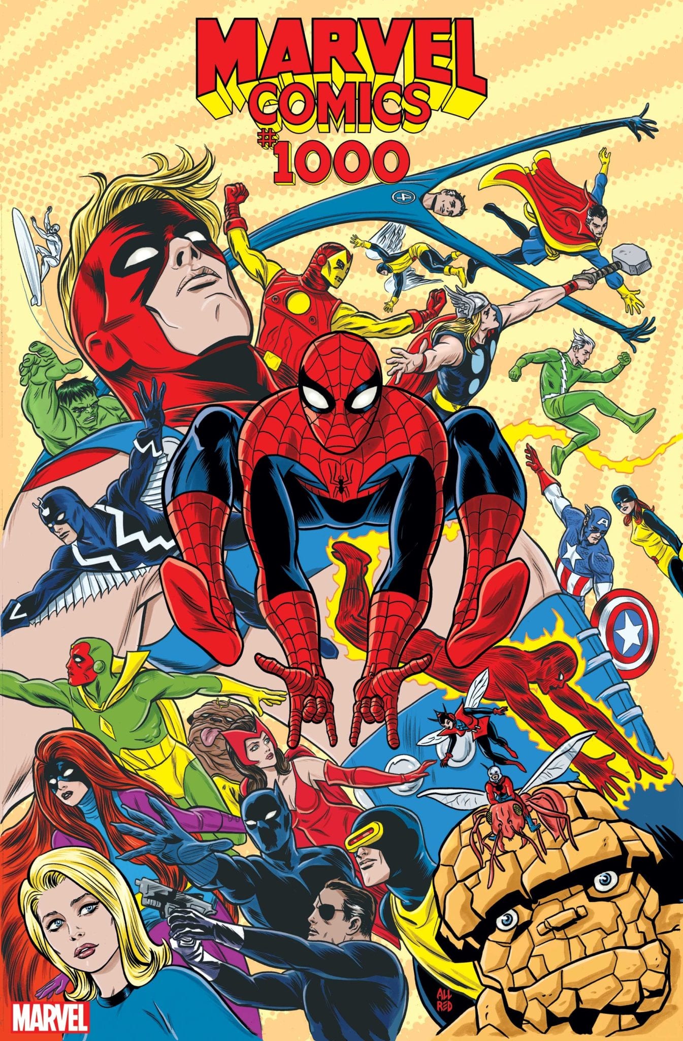
Plus my favorite cover below by Michael Allred!

Monkeys Fighting Robots Youtube

Review: STAR TREK YEAR FIVE #5 Reinventing A True Classic

Monkeys Fighting Robots

With Jody Houser taking over the writing duties on Star Trek Year Five, IDW Publishing have a master of science fiction storytelling on their hands. Heavily influenced by the 1960’s style of Star Trek, the latest issue out this week continues the run on familiar stories told in a modern way.

Star Trek Year Five #5 reinventing a true classic
Star Trek Year Five #5 Credit: IDW Publishing

Bygone Years

Landing on a desolate planet, the Enterprise away team embarks on an archaeological survey. They collect a few artefacts to transport back to Earth for investigation but Dr Bennett, the archaeologist amongst them, believes they are missing a rare chance for discovery.

Agreeing with her up to a point, Captain Kirk ponders on the alien life they already have on board: The Tholian they have nicknamed Bright Eyes.

After leaving the planet’s surface the crew return to their usual routine however a strange force begins affecting the crew. Tempers become frayed and patience seems be running out. Minor instances start to escalate and it’s not long before everyone appears affected.

With this issue of Year Five Houser has written a classic Star Trek story. Similar in concept to the Original Series episode, The Naked Time, and its Next Generation follow up, The Naked Now, the main premise deals with a cabin fever type situation. The crew of the star ship are trapped in close proximity to each other, living in each other’s shadows, unable to get away. Houser uses small breakouts to identify the problem, making it clear that these confrontations are bubbling just beneath the surface and it only takes a small unexplained nudge to bring it all out.

As the plot thickens, so does the intensity of the disagreements. The script reflects the frustration and resentment within the crew members and Houser draws attention to moments where the cast act out of character: for example, during the senior officers meeting there are some oddities within the conversation that makes the reader re-read several panels. This is intentional and is a way of highlighting the problem the Enterprise crew face.

Houser has a clear understanding of the characters and captures their voices and mannerisms wonderfully. The gently conversation between Kirk and Uhura is contrasted with the ‘boyish’ banter between the male officers. This type of behaviour was evident in the original T.V. series and Houser makes it work during this story without it seeming out dated.

STAR TREK YEAR FIVE #5 Reinventing A True Classic
Star Trek Year Five #5 Credit: IDW Publishing

Illustrating Trek

Silvia Califano uses fine inked lines to create detailed character work. There is an element of claustrophobia to her panels which mirrors the underlying theme of the narrative. The back grounds are sparse and often reflect the coldness between the cast members in the foreground. With the color assist from Thomas Deer some of the panels even take on the heightened emotions of the characters, alternating for a brief moment from cold greys to stark oranges or reds and back again.

These flashes of emotion drive the story forward and illustrate how out of character the regulars are. This impression is also given in the way that Califano handles the panel boarders. Occasionally the panels become small slivers behind the character or the boarders are irregular signalling to the reader that there is something amiss.

Because of this focus on characters there is a lot of space for Neil Uyetake to place his lettering. His speech balloons occupy the empty space but do not fill it. They are often subtle with small amounts of text in speech balloons that hover over a vast block of color. They almost become swamped by the emptiness around them and this has the opposite effect than a large, screaming word balloon. The speech is amplified by the background, almost like an awkward pause before someone speaks.

It is clear from the opening that this story is going to be about the crew, trapped together on the Enterprise with disaster lurking just around the corner. The panel layouts; the block, expressive coloring; and the tightly controlled lettering, all build the impression of a crew under pressure, a kettle reaching boiling point.

STAR TREK YEAR FIVE #5 Reinventing A True Classic
Star Trek Year Five #5 Credit: IDW Publishing

Conclusion

Houser has written for a number of science fiction franchises and she has an ability to get to the heart of the characters very quickly. She draws on their strengths and weaknesses to move the narrative on, knowing exactly who to put in each scene. The interactions between the main crew in Star Trek Year Five are perfect representations of the characters we all know and love. These are then illustrated with such fine precision by Califano.

The story is not original, not in general science fiction or even in Star Trek but this is irrelevant because the creators of Star Trek Year Five are telling their story in such a fun and exciting way. Small character moments make this issue a joy to read and there is also the ongoing Tholian story-line that is always central to what is happening aboard the Enterprise.

Each new creative team they bring onto Star Trek Year Five has made the comic their own while at the same time producing something that is simply Star Trek. This series, and this issue in particular, has included some of the best Star Trek moments in recent years. If you only read one Star Trek comic this year, it definitely has to be this one.

Monkeys Fighting Robots Youtube

Review: Spreading Fear With RESONANT #2

Monkeys Fighting Robots

Vault Comics takes you to a world filled with trepidation and uncertainty in Resonant #2, out this week.  Continuing the story of a family trying to survive after global catastrophe, David Andry and Alejandro Aragon begin to expand the landscape while developing the character’s emotional states.

After the atmospheric opening issue, the creators have more time to elaborate on the setting, extend the narrative, and explore the character’s relationships.

Spreading Fear With RESONANT #2
Resonant #2 Credit: Vault Comics

A Resonant Narrative

In the first issue Andry set the scene for his post-apocalyptic world using the small family unit as a focal point of the narrative. In issue two he has expanded the world, taking Paxton, the father figure, into the wild world beyond but also by bringing someone new to the homestead.

Paxton’s journey is one of world building. Andry uses the traveling man to introduce characters and ideas which may, or may not, prove important further down the line. These scenes act like a road map to the world, in essence uncovering for the reader sections marked with ‘here be dragons’. During this exploration the reader gets a good idea of the landscape which exists within Resonant.

For the most part these scenes prove interesting. They introduce a friend for Paxton to talk with and give the reader extra insight into the ‘Waves’ that terrorise the land. Some of the new aspects of the plot are intriguing and the settings are beautifully rendered however, there is an element that feels un-original.

Just like other comics in this genre, The Walking Dead or Orphan Age for example, there are elements that seem necessary to facilitate the narrative: a religious sect, an unexplained threat, an outpost of survivors. Unfortunately for Resonant, over familiarity with some of these elements make it harder to do something new and different with them. Andry succeeds in some areas, keeping the storytelling fresh, but there are moments in Paxton’s journey that lose the fight against the clichés.

The second part of the comic, with the children left behind, is where Resonant really succeeds as a drama. The claustrophobic nature of the children’s situation and the unnerving atmosphere that is created builds a growing tension which is far more exciting than Paxton’s journey. Andry focuses on the vulnerability of the children and the potential threat from the outside, gripping the reader in an emotional trap.

Spreading Fear With RESONANT #2
Resonant #2 Credit: Vault Comics

Illustrated Waves

With stories like Resonant that rely on genre mainstays, the success comes from the telling of the tale rather than the tale itself. In this respect Resonant is a glorious success. Aragon’s inks set the scene perfectly, giving each page a rough, unnerving atmosphere. His line work is scratchy allowing him to easily define or confuse images dependant on the scene.

Occasionally the figures blend into the scenery becoming one and the same, while at other times, when the narrative calls for clarity, the cast are set in almost empty panels. Aragon is also able to control the point of view with a delicate precision. So much so that there are panel transitions that make you believe a camera has slowly zoomed in on a character or prop giving you a sense of vertigo. The comic almost pulls you in to the dry and dusty world.

The uncomfortable and foreboding atmosphere prevalent in Resonant is controlled by Jason Wordie’s skilful use of color. He uses a stark contrast of light and shadows within a page to emphasis a particular panel. On a page turn the reader is drawn to the most important element of the page initially by the coloring and then works toward that image via the usual reading pattern. In turn this creates anticipation within a scene, building the tension necessary to give the narrative it’s punch.

Wordie’s colors also gives the overall world of Resonant it’s character. The storing use of hot oranges and dry terracotta’s have an effect on the reader as they move from page to page.  Paxton’s journey especially is through an uncomfortable world seemingly of relentless struggle. The character’s blur in and out of the background amplifying their fears and emotional states.

Only Deron Bennett’s lettering is able to bring the cast out with plain white speech balloons at odds with the colors of the panels. The speech and the gutters, matching in their cleanness, are the only none natural elements within the comic. The gutters separate the panels, creating focus on time and location, and the speech separates the character from the landscape. The balloons stand out and draw the reader to them, looking for characterisation and explanations. The artwork sets the scene and the text gives it meaning.

Spreading Fear With RESONANT #2
Resonant #2 Credit: Vault Comics

Conclusion

The visual aspect of Resonant is the main draw for this comic. Wordie’s colors over Aragon’s artwork is a beautiful world building experience. The threat, the fear and even the brief moments of emotional stability are best represented by the art. The plot follows a typical path for this type of story which is highlighted in some of the unoriginal sequences. There is an urge to skip over one or two scenes as the reader recognises them from any number of similar comics however, the art makes it almost impossible to do so.

The first issue set the tone and this second issue has expanded the world. Now it is up to the creative team to give the reader a new experience in a familiar world. Based on what we have already seen, Andry and Co are perfectly capable of doing this.

Monkeys Fighting Robots Youtube

INTERVIEW: Film Editor Matt Friedman Talks Every Frame Of The Farewell 

The Farewell is a new film starring quick-rising star Awkwafina (Ocean’s 8, Crazy Rich Asians) and directed by Lulu Wang (Posthumous) about a woman returning to China to say her last goodbyes to her grandmother except grandma is the only one who doesn’t know she’s soon heading off to the next level of life. 

Cutting The Farewell together is editor Matt Friedman who previously worked on films like John Tucker Must Die, Step Up Revolution, and The Boy Downstairs. The Farewell is undoubtedly an emotional family drama, and rapper and comedian Awkwafina is receiving a lot of praise for her performance. It was Matt’s job to watch Awkwafina and co-stars give heart-wrenching performances over and over and pick just the right one. We really don’t give editors enough love in this world because that sounds a bit like entertaining torture.

PopAxiom shared a moment of respite with Matt as he takes a break from being an editor or teaching about editing at the American Film Institute to talk about editing.

Draw Or Edit

From early on, Matt says, ““I knew I wanted to do something in film. Through the act of going through film school, I learned early on that I didn’t like the process of directing.”

Matt took a pro-active and strategic approach to getting work in the film industry. “I found a list of movies that were shooting in Georgia, and I looked for the movies where I didn’t recognize who any of the stars were. I figured these are the movies that probably need help.”

Matt’s logic met his creativity. “I faxed a Top 10 list to production offices with funny reasons for why they should hire me. I got a call back for an unpaid internship. My choices were either art department or editing.”

Was the art department an option? “I can’t draw for sh*t.”

Matt continues, “I took the editing internship under a woman named Emma Hickox, who is the daughter of Anne Coates, the editor of Lawrence of Arabia, among many other things.” For our geek nation out there, Anne Coates was also the editor for the 80s He-Man film.

About Emma, Matt says, “She took me under her wing. She taught me so much. Probably more than I learned in film school. I worked for her for three or four movies, and 25 years later here I still am.”

What’s a critical skill for being a successful editor according to Matt? “good attention to detail.”

Hello To The Farewell

Matt’s relationship with Lulu, the director of The Farewell, goes back to Posthumous, which Matt also edited. About their work together in The Farewell: “There are definitely some risky elements in what she did … We discussed them a lot. Unconventional things that went against the general wisdom. There were times where I would play devil’s advocate, and we’d reign those things in. There were times she’d say ‘Trust me on this one.’”

“We probably discussed virtually every frame in that movie.”

Matt’s motivation when editing is clear. “One of my overriding goals, and something that I say in virtually every class I teach at AFI, every frame matters. It must be there in support of the story.”

Matt elaborates, “In the case of The Farewell, there are long moments of silence where nothing is happening. But all of those frames are supporting the story.”

“I worked extraordinarily hard to take those silent moments that didn’t mean anything out.”

What did that entail? “Ignoring continuity in clever ways to take out a section of a shot that’s not necessary. Off-times. If a character says a line and walks to another point to say another line, we’d find ways to take empty in-betweens out.”

“The film is really incredible.”

Being An Editor

Matt’s come in to help movies reach a better place. What’s a flaw he often sees in these films? “Too many moments that make a movie feel long and slow.”

Matt uses his work on Lulu’s previous film Posthumous to explain a bit more what he means. “It was roughly a little over two hours long. I came in and took out about twenty minutes and replaced it with two full scenes that had been cut for time. But those moments left in for the sake of continuity don’t need to be there.”

Decisions, Decisions

What’s it like choosing between two takes of the same scene when an actor is delivering an excellent performance in both? “The director and editor will discuss moments like that. It’s actually not that difficult. What becomes difficult is when there are two takes of an actor doing a scene in different ways, and they both work.”

“During What Happens In Vegas, there were times where Zack Galifianakis and Rob Corddry are riffing, and it’s all hilarious. It’s excruciating to have to pick between scenes.”

Editing Dance

It’s one thing to edit actors walking and talking. It’s a whole different beast when there’s dancing. Matt worked on the film Step Up Revolution with extensive choreography to edit. “It’s harder on a technical level. You have so many cameras running on everything. Creatively, the music informs so much, and I love cutting dance. I sit there watching dailies, and sometimes everything fires off at once, the choreography, the performance, the music, the camera work, it’s all perfect and in sync. It’s so easy to build a sequence around those anchors.”

How does he do the work? “I basically line up every cut of a dance performance from every angle, one on top of the other in the timeline. I watch everyone from start to finish.”

What’s he looking for? “… the stuff I know is not going to be in the cut. I list all those moments and take them out. So I end up with a timeline of what I know are all the possibilities.”

From there, Matt will, “… start to connect the dots.”

Wrapping Up

My biggest creative inspiration is Jill Bilcock, both in terms of the way in which she edits and the way she shapes her career. She bounces back and forth between little character-driven films and giant studio spectacles.”

“I’m very lucky in my career to have worked as an assistant for a lot of great editors. Peter Teschner who cut the Brady Bunch among many things like Eddie Murphy’s first Dr. Do-Little.”

What’s next for Matt Friedman is currently happening as this entire interview took place while working on a new project. What is it? Well, Matt can’t exactly say. “It’s an Andy Sandberg movie. I don’t know how much I can say. But it’s a romantic comedy about a couple stuck in a time-loop. About how their relationship grows in a spot where everything stays the same.”

Thanks to Matt Friedman and Impact24 PR for making this interview possible. 

Want to read more interviews like this? CLICK HERE.

Monkeys Fighting Robots Youtube

Review: A Hero In Hell In ANGEL #4

Monkeys Fighting Robots

BOOM! Studios is starting to build a substantial fantasy world based on the Buffy The Vampire Slayer franchise and Angel is playing a massive part in it. Released this week is the dramatic end of Angel’s first story arc and it features a number of recognisable faces.

With the big sister title Buffy making some very large waves, can Angel stay afloat or will the title be lost at sea?

A Hero In Hell In ANGEL #4
Angel #4 Credit: BOOM! Studios

An Angel In Hell

At the end of last month’s issue, Angel had rescued the psychologically disturbed Fred from a physical attack but the demon was still free to spread it’s evil into the world. With Fred helping to open a portal, Angel is forced to take the fight to the demon’s home dimension.

Trapped in a hell dimension where he can’t rely on his own senses, Angel has to face up to some of his past indiscretions. Meanwhile Lilith is helping Fred, leading her back from the brink and giving her a higher purpose.

Bryan Edward Hill tells a straight forward horror story and packs it with in jokes and references. He creates a hell dimension with virtually no physical substance in order to develop Angel’s character. It is a concept that was used a number of times in the T.V. show and proves successful in this format. Despite the Legacy, Hill is still introducing his version of Angel to the reader so this first arc is important in establishing the character of the central protagonist.

The framing of Angel’s character development is a twisted version of the movie Labyrinth. Angel is cast into a maze and haunted by elements of his life from the ‘real’ world. The demon sits on a throne teasing the vampire, arrogance his greatest flaw. The sequences work well showing the reader who Angel was and contrasting that to what we have come to know of him in the previous three issues.

It also hints at elements of Angel’s future which is a theme picked up in Fred’s narrative, linking the plot threads together. Hill brings everything together towards the end of the issue creating a satisfying end to the first arc with enough of a hook to come back for more.

A Hero In Hell In ANGEL #4
Angel #4 Credit: BOOM! Studios

Dark and Darker

Gleb Melnikov’s art work is fantastic, seamlessly blending the supernatural fantasy elements with the modern technological aspects of the story. He has a dark, shadowy style that suits the Vampire with a Soul. The pages are shrouded in darkness with the backgrounds barely visible unless absolutely necessary. This sometimes means that there are no establishing shots and the space the characters inhabit lacks any sense of location. This approach works occasionally but not all of the time.

The mood and atmosphere, created in part by Melnikov’s use of solid black shadows and dark gutters separating the panels, takes over the comic producing an intensive read. The colors by Roman Titov keep everything shrouded in darkness with the only burst of color illustrating shocking elements of the narrative.

Ed Dukeshire has to deal with a number of disembodied voices throughout this issue. By using a combination of tail-less speech balloons and caption boxes, he places the text in logical positions within the panels so that it is easy for the reader to follow.

Just like the T.V. shows, the styles and themes in Angel are different to Buffy. They are more adult in nature and have a sense of experience to them. The characters aren’t as cut and dry; the line between hero and villain isn’t so much blurred as smeared across the landscape. The artwork in this first arc has represented that perfectly and is markedly different to the styles of Dan Mora and David Lopez over on Buffy.

A Hero In Hell In ANGEL #4
Angel #4 Credit: BOOM! Studios

Conclusion

Angel issue four completes the first story arc in style. It has the confrontation with the Big Bad and there is some resolution to the story, however there are enough threads left dangling. The main characters are fully realised, abound with flaws but with redemption on the cards. Both Fred and Angel have their own past and futures to face and this story is a great place for them both to start.

Hill presents a horrific, modern day villain and the damaged heroes who are compelled to battle him. He draws on pop culture references and Angel Lore to help the narrative flow in an entertaining way. The artwork creates an unnerving, uncomfortable atmosphere for all of this to take place in. In essence, this is the perfect Angel story and the best way to relaunch a character.

All that remains to be seen is if they can pull off the dramatic crossover event ‘Hellmouth’, due out later in the year.

Monkeys Fighting Robots Youtube

Review: A Classic Villain Is Given a New Mask In YEAR OF THE VILLAIN: BLACK MASK #1

Monkeys Fighting Robots

Have you ever wanted the power to wear any face like a mask? If so, what would you do? Become a kingpin? Return as the king of the underworld? Gain money and power? Or would build an empire and shape the course of history? This being one of many questions Black Mask has to answer in DC Comics’ Year of The Villain: Black Mask #1, out this week (check your local comic book store).

Black Mask was originally introduced in 1985 but hasn’t been seen around as often as other Bat-villains. He has been lucky enough to be included in multiple media formats, but never in the forefront as the others in the Dark Knight’s rogue gallery. Funny enough he is known more for his run ins with Catwoman in Ed Brubaker and Cameron Stewart’s amazing Catwoman series.

Having been portrayed throughout his comic history as a ruthless crime lord who loves torture as much as masks, he has never been anything more than a normal human. That character trait changes with Tom Taylor’s Year of The Villain: Black Mask #1. Although it’s labeled as a Year of The Villain tie-in no info for the event is needed, other than Lex can give other powers.

Having Black Mask #1 act as a tie-in while having it essentially a stand alone works to it’s benefit for readers interested in said character. This shows DC’s great marketing strategy with the Birds of Prey movie releasing next year with Black Mask as the villain. This movie will mark his live-action debut while also marking Renee Montoya debut, who DC has also pushed lately.

Dedicating the first nine pages as a retelling of Black Mask’s history, Taylor gives the audience a quick backstory so they learn what is needed without having to read other stories. This retelling is told from none other than Black Mask as he holds a bank teller hostage. Taylor could have easily made this opening boring, but instead played it off with Black Mask wanting to finally talk to someone; so why not tell you origin? With the backstory for newcomers done we make our way to the Year of The Villains aspect, enter Lex Luthor.

Helping Black Mask escape from the bank Lex promises him whatever he desires, as long as he takes power from Lex. What best to go with a mask obsessed villain than the power to change your face? As great as this power is it’s never defined how it works. Is it like One Piece’s Bon Kurei where he needs to first touch the person? Or like the dozen other shapeshifters where he just needs to see a picture?

Besides the question of how his powers works, Taylor crafts a superb new origin story that builds upon Black Masks history while making him more accessible. While the issue is titled after Black Mask it features a heavy dose of Batwoman teaming with Renee Montoya. As previously stated DC has been pushing Montoya often lately, but this works out for the best in most cases. As did Lois Lane having Montoya team up with her, the same concept applied here is a smart idea to bring to the public’s eye. On the subject of eye’s, how about that art?

On a visual level Black Mask #1 comes off as an adult cartoon turned into a comic with pencils by Cully Hamner. This style gels quite well with the story being told but wasn’t as such from the get-go. For Black Masks flashback of his younger years he has a misshapen face, at first you think this is done on purpose, but once young Bruce comes into panel he looks the same. It’s not story breaking, but it’s very noticeable when one side of a character’s face is slumping down like melted butter.

This face slumping happens a few more times in the present but nothing as jarring as the last segment. The rest of the pencils look great with Hamner making great use of paneling for dialogue and in a few action sequences, well that is true except one instance. Although it is drawn quite well and has a smart use of coloring in the panel, there is a slap scene early on that seems to break the laws of physics.

Yes comics can break this law (and others), but that’s for those with powers; in this case, it’s Black Masks father (Richard Sionis). Angry at his son he lashes out with a slap so forceful the colors of the panel turn black and red, thanks to Dave Stewart’s stimulating emotions with colors. Richard smacks Roman (Black Mask) with his left hand moving right to left connecting violently to Roman’s left side face.

If you’re visualizing this you’re probably thinking Roman’s head would turn to the right as he falls. That would be how it should happen, but sadly it doesn’t, instead his head (and body) flies to the left making no sense. This is a minor problem in what was otherwise a well-drawn issue, plus this physics breaking has occurred in comics before.

Helping emphasize on certain scenes and emotions is Stewart’s fantastic eye catching colors that are bright and lively when needed and dark somber moods in others. Stewart’s colors hammer home the smack Roman receives (even with the physics problems already said) and the loud BANG that fills the panel when Black Mask shoots a gun.

A Black Mask Affair (Conclusion)

Taylor writes a great Black Mask, granted it would have been nice to see his brutal torture methods he’s famous for but the story being told didn’t warrant that. As great as the Black Mask moments are the Batwoman and Montoya moments outshine the titular character. The two heroes have a great chemistry that Taylor and team play upon making it a blast anytime they are together.

Combining the great blend of story shifting, the art and colors makes Year of The Villain: Black Mask #1 perfect for those new to the character, or those already invested in Year of The Villain.k

Memorable Quote: “Well, that’s dark. But to each their own.” – Lex Luthor

Coming from Lex Luthor, that’s pretty hilarious!

Dear Reader Behind The Mask

If your now joining in on DC’s Year of The Villain then check out some coverage from the beginning of the year to catch yourself up! Or if your a newcomer interested in Black Mask or a fan already caught up that wants to read this Bat-tastic issue then check your local comic store!

Monkeys Fighting Robots Youtube

Review: READY OR NOT Is A Pleasant Horror Comedy That Proves In Laws Are The Worst

A film that is able to smoothly transition from its comedic dialogue to horrific situations deserves everyone’s attention, and Ready or Not is that film. The late summer hit that no one saw coming or shrugged off because of the trailer’s kind of showing too much. In recent memory, Blumhouse’s Groundhog Day slasher film Happy Death Day was the last well-done horror-comedy. Surprisingly though, Ready or Not isn’t a Blumhouse production, and it isn’t as heartfelt as Happy Death Day but like Happy Death Day, the film balances two genres so well.

Ready or Not tells the story of a wedding night gone to hell….almost literally. Directed by Matt Bettinelli-Olpin and Tyler Gillett, the film follows Grace, a newlywed to her husband Alex Le Domas who comes from a wealthy background. Grace’s wedding night takes a terrible turn when she learns that the Le Domas family intends to kill her before the sun rises to fulfill a family tradition. What Grace initially takes as a simple game of ‘hide and seek’ soon becomes a fight for her survival. This surprisingly hilarious film stars Samara Weaving, Adam Brody, Mark O’Brien, Henry Czerny, Andie MacDowell, and Melanie Scrofano.

ready
Samara Weaving in the film READY OR NOT. Photo by Eric Zachanowich. © 2019 Twentieth Century Fox Film Corporation All Rights Reserved.

What this film does so well comes from its script, which seems to have been executed in the best way possible. It is indeed very delightful to watch snobby rich people get taken out in the most comedic manner by someone less fortunate than them with all of the horrors still in the mix. Written by Guy Busick and R. Christopher Murphy, Ready or Not doesn’t develop much of the Le Domas family outside of Daniel (Brody), Alex (O’Brien), and the newest member Grace (Weaving). Also, the characters will have certain beliefs one second and completely turn around and do something entirely against what they said, which isn’t very believable. However, the script does offer numerous chances to laugh uncontrollably and it gets you invested in the main character by presenting the Le Domas family as the lowest of the low despite their status in society.

Weaving gives an amazing performance as Grace, and it is enjoyable but sad to watch her wedding night go up in flames. Grace doesn’t have the most fortunate background like her new husband, so it is easy to connect to her based on that alone whether you have been in her situation or not. Weaver goes through several different emotions in this film, and the best by far comes in the end when the truth is finally revealed. All of the performances are enjoyable and well-acted by everyone involved.

ready or not le domas
(L to R) Kristian Bruun, Melanie Scrofano, Andie MacDowell, Henry Czerny, Nicky Guadagni, Adam Brody, and Elyse Levesque in the film READY OR NOT. Photo by Eric Zachanowich. © 2019 Twentieth Century Fox Film Corporation All Rights Reserved.

The film’s direction is almost great until the final moments when it seems like there was a shift from smooth handheld filming to something unpolished. Bettinelli-Olpin and Gillett offer some amazing shots of the beautiful Le Domas mansion, which is where the majority of the story takes place. There is a lot of effective tension building and the duo perfectly balances the hilarious moments as well as the horrific ones. Ready or Not’s score by Brian Tyler is one of the year’s best and compliments every moment to be in terror or snicker at the ridiculousness that unfolds on screen.

Ready or Not proves how bad in-laws can be, and it will probably be very enjoyable for those that don’t fancy their own in-laws. A well-acted, well-paced horrific wedding night for Grace Le Domas will end up being a thrill ride for everyone that goes to see it. This movie had no business being this good, but the trailers certainly don’t show as much as many think. Ready or Not is a horrific, but laughable experience with the haves and the have nots.

Monkeys Fighting Robots Youtube

Review: Solid Action, Jumbled Storytelling in VAMPIRELLA #2

Monkeys Fighting Robots

How does a vampire “get a life?” If you’re Vampirella, the answer is simple: team up with squadron of heavily-armed combat nuns to take on an underground group of devil-worshippers and werewolves, as she does in Vampirella #2, out this week from Dynamite Entertainment.

As intriguing as that premise sounds, though, the execution is not as consistent as one would hope.

Vampirella #2

The Writing

With his run on Vampirella, writer Christopher Priest seems interested in deconstructing the character, putting her on the psychiatrist’s couch (literally) to explore her persona. We can appreciate the deconstruction of a classic character. Vampirella #2 is less of a deconstruction, though, and more abstraction. We get more nonlinear storytelling, using the psychiatrist’s couch as a framing device. However, it doesn’t feel cohesive or coherent. Instead, the storytelling comes across as having nothing driving the narrative in any particular direction.

In Vampirella #2, you get the sense that Vampirella is an interesting character. That said, we’re not really seeing it transfer over to the page as fluidly. It’s as if the author is explicitly telling us the character is interesting, without giving us any actual reason to believe that’s the case. Her portrayal feels somewhat stiff, while the characters around her remain one-dimensional.

The first half of Vampirella #2 is rather dull from a storytelling perspective. A good chunk of it is more of the same banter between Vampirella and her psychiatrist. While it had a certain level of charm the first time, that quality seems to offer diminishing returns. The humor doesn’t land very effectively, and there aren’t any real narrative stakes or reasons to care that can keep the reader’s interest.

It’s in the book’s second half that when it feels like the narrative really gets underway in earnest. There’s plenty of action here, and although we don’t yet have a clear motivation for our titular character the chapter is at least compelling and catches the reader’s interest.

Vampirella #2

The Artwork

Artist Ergün Gündüz does a fairly impressive job with the material in Vampirella #2. He divides the pages into regularly-spaced panels, employing a lot of repetition and variation on his motif to provide a nice cohesive product without feeling repetitive. This is especially prominent in the book’s first half, which feels very much like a slice-of-life story.

The latter half of the issue is much more action-packed and chaotic. Gündüz manages to relay information effectively through his visuals, while also delivering some eye-catching, stylized gore. The work has a delightfully campy aesthetic in that section (werewolves vs. combat nuns, anyone?), making for a fun visual sequence.

The colors are rich and vibrant in Vampirella #2. We see lots of contrasts between dull grays and sharp splashes of red, making for a striking presentation. The only real complain in the art department is that the character designs can sometimes feel a bit static and lifeless. Otherwise, it’s a good showing.

Final Thoughts

Vampirella #2 isn’t bad. However, the first half of the book is dedicated mostly to extraneous tedium, while the second half offers action with some missing context. Check it out for yourself at your local comic book shop.

Monkeys Fighting Robots Youtube

Review: Scout Comics’ HEADLESS #1 is a Ghoulish Good Time

Monkeys Fighting Robots

Long before Freddy Krueger came to Elm Street, before Michael Myers came home, or Jason took Manhattan, one horror icon haunted the dreams of people across the nation: the Headless Horseman, and the legend is returning in Headless, a new series from Scout Comics.

In the hundred plus years the horror legend has existed, he’s become some people’s absolute favorite ghastly villain. So a comic about him has a lot to live up to. Happily, Scout’s venture into the world of Washington Irving’s monster is a worthy title, even without the preconceived adoration of those Headless HorseStans, and if horror comics mean anything at all to you, it’s worth the cover price.

HEADLESS Issue One Cover: Scout Comics
Photo courtesy of Scout Comics, Robert Ahmad

A Sleepy Town, A Hollow Job

We begin at a crime scene in Salem, Massachusetts, where rookie cop Rick Winter has just stumbled into a gruesome crime scene. Rick just transferred from a rural community, a fact his condescending fellow officers won’t let him forget, and is having no luck to adjusting to life, much less police work, in Salem. The Sheriff ushers Rick out of the crime swiftly, and within the few moments he’s away, the Salem cops have finished their “investigation.” Of course, what Rick doesn’t know is that they’ve already located the culprit of the crime: an invisible demon that the cops exorcise. Rick heads home from his shift confused, angry, and completely unaware of the supernatural turn his career path has taken.

Also adjusting to Salem is Rick’s brother, Chris. Not only will Chris have to deal with strange, demonic forces intimately involved with his new life, he’ll also have to tackle being a teen in the 80s. And as several horror franchises have gone out of their way to prove recently, that’s pretty much a death sentence. Still, Chris has a loyal group of new geek pals by his side, and it appears he’ll need them soon. By the end of this issue, we’ll see that the Winter brothers are facing a threat that stretches back to the Knights Templar, and down into the depths of Hell.

HEADLESS Issue One Page Seven: Scout Comics
Photo courtesy of Scout Comics, Robert Ahmad

CSI: Spooksville

Writer Alexander Banchita starts the story in blood, with our main character standing over two brutalized teenagers. Not only does this scene confirm we’re in for some drive-in slasher fun, it kicks our tale off with a punch to the nerves, which is a great way to tell a horror story. From there, we’re introduced to a deep lore that Banchita has buried under Salem, with interesting lead characters and a big bad who’s already a horror legend. The story in Headless #1 is sure to have you excited for this this plot unfold, and find out the Winters’ part in it, not to mention see a new take on a fantastic baddie.

One critique of Banchita’s writing is that the dialogue is pretty on-the-nose. A lot of it felt expositional, like the characters were explaining their backstories to the reader instead of talking with each other. Still, that’s hard to avoid in an introductory issue, and though Banchita trips up a bit in this field, he’s effectively gotten on course to run.

Detailed Devils

Robert Ahmad will definitely not disappoint anyone coming to Headless for the art. Ahmad’s got a great eye for minute facial details, so even though his style is minimalistic, there’s plenty of variety in character design. Still, Ahmad can separate himself from humans long enough to put a very effective demon on to the page. Fans of either Mike Mignola or Todd McFarlane will find something to love in Headless. As for its colors, it might have been better had Ahmad used some of the watercolors that he frequently posts to Twitter, but the simple pinks and blues of the world do the job well enough. They give it a retro vibe, and any lack of diversity in the tones gets made up for in shading and pencils.

HEADLESS Issue One Page Four: Scout Comics
Photo courtesy of Scout Comics, Robert Ahmad

Overall Thoughts

Headless #1 is a strong start to an interesting series. Fans of It, Stranger Things, or even just the X-Files will no doubt come to adore it, but there’s plenty to love for the average teen-slasher fan as well. The comic does a great job of grounding the series so that we know enough of what’s going on, but keeping back elements of a larger mystery at play. Hopefully the creative team will keep that flow of information going, revealing more about the evil in the town and its inhabitants, who may or may not have a different evil within themselves. You can find Scout Comics’ Headless #1 at your local comic book store on August 28th, and we highly recommend that you do. Headless will appeal to any horror fan with a brain…and maybe some without theirs.

HEADLESS Issue One Page One: Scout Comics
Photo courtesy of Scout Comics, Robert Ahmad

For more comic reviews, previews, and creator interviews, stay tuned to Monkeys Fighting Robots.

Monkeys Fighting Robots Youtube

Marvel Comics Exclusive Preview: VENOM #17 And The Other Side Of ABSOLUTE CARNAGE

Monkeys Fighting Robots

Venom #17 is out August 28th, but thanks to Marvel Comics, Monkeys Fighting Robots has an exclusive five-page preview to share with you.

The book is by writer Donny Cates and artist Iban Coello, with colors by Rain Beredo and letters by Clayton Cowles. The cover is by Kyle Hotz and Dan Brown.

Coello previously worked on this volume of Venom while it was tying into War of the Realms (issues 13-15).

venom #17 marvel comics exclusive preview

About the issue:
ABSOLUTE CARNAGE TIE-IN! With CARNAGE on the loose, VENOM must protect his son Dylan — at all costs! But as longtime Venomaniacs know, VENOM AND CARNAGE aren’t the only symbiotes loose in New York!

As stated in the description, this issue is a tie-in to Marvel’s current Absolute Carnage event, by Cates and Ryan Stegman (Venom‘s usual series artist). In the preview below, readers get to see the other side of the event: while Venom and Spider-Man are off taking on Carnage, Eddie Brock’s son Dylan is hiding out with Normie Osborn and The Maker, an alternate Reed Richards carried over from the Ultimate Universe.

Cates and Stegman’s Venom run has been both a critical and a commercial success for Marvel, with Absolute Carnage #1 now going to a fourth printing. The writer/artist duo have been building towards this event since they launched the symbiotic solo title last year.

Take your first look at VENOM #17:

venom #17 marvel comics exclusive preview

venom #17 marvel comics exclusive preview

venom #17 marvel comics exclusive preview

venom #17 marvel comics exclusive preview

venom #17 marvel comics exclusive preview

venom #17 marvel comics exclusive preview


Are you reading Venom? Sound off in the comments!

Monkeys Fighting Robots Youtube