Home Blog Page 341

Review: SPIDER-MAN NOIR #1 Now’s The Time To Jump Onboard

Strap on your detective boots and put on your spider suit as the crimebusting, Private Eye Spider-Man of Earth-90214 returns this Wednesday in Marvel Comics’ five-issue mini-series, Spider-Man Noir #1.

Spider-Man Noir #1 Origin/Title page

Before joining Spider-Man Noir of Earth-90214 on his detective case, a little backstory is needed. The title page (seen above) does give you some info, yet not all. During 2018’s Spider-Geddon Spider-Man Noir was killed by Morlun. Alas, you can’t keep a good spider down as he was resurrected in Feburaury’s Spider-Verse #5. While you’re picking up Spider-Man Noir #1 at your LCS, make sure you pick up those titles to learn more.

Death and resurrections in comics, you got to love them, huh?

SPIDER-MAN NOIR IS ON THE CASE

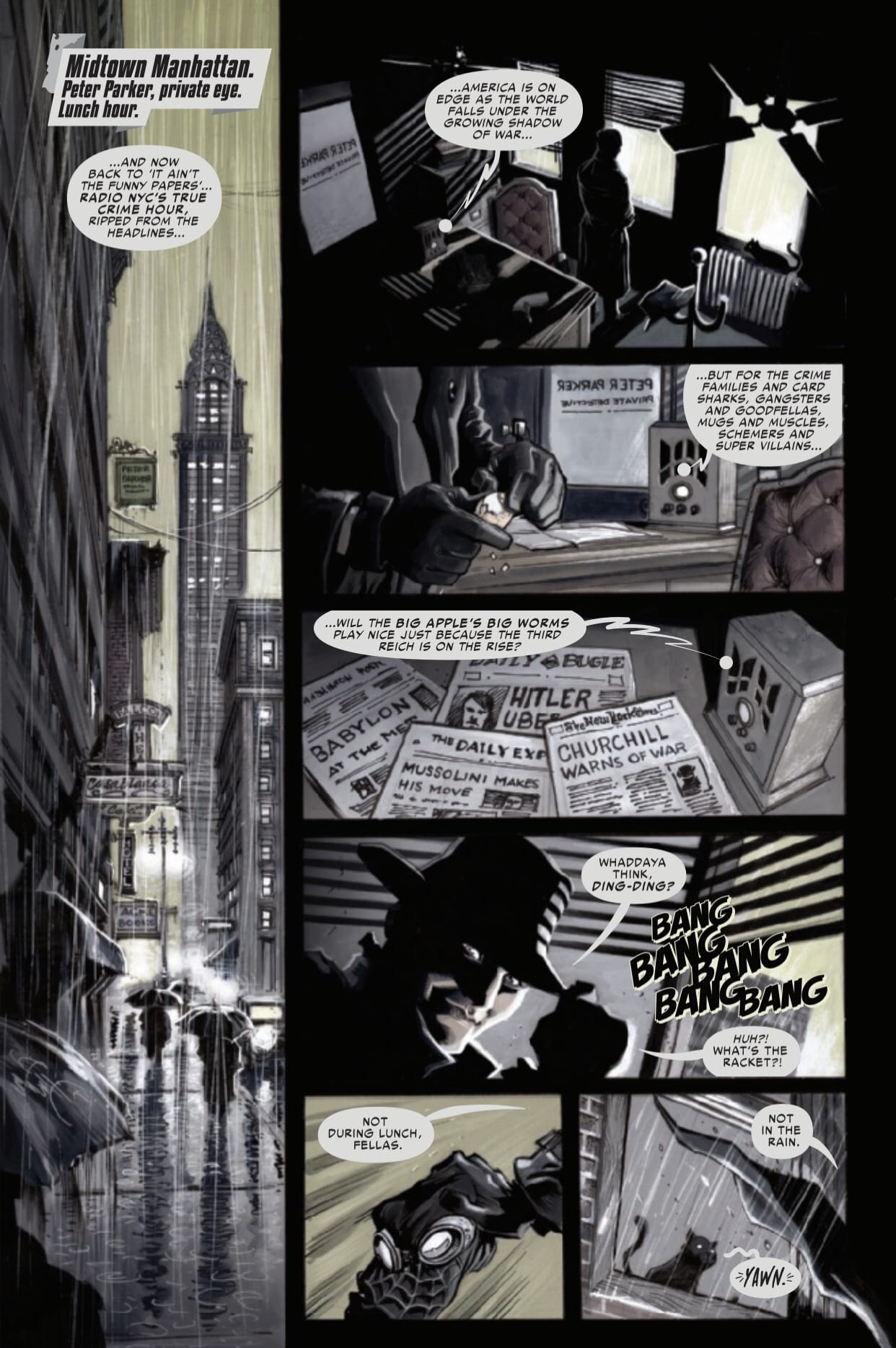
For the first issue in the series, Margaret Stohl brings the reader right into the action with her writing. Instead of taking time to explain everything about Spider-Man Noir, she uses the above title page to explain all that’s needed. This effectively gives her the full page count to tell the story she wants, instead of catching readers up. This works out for the better as all the reader really needs to know is Spider-Man Noir is a Private Eye that’s not afraid of using a gun. Plus, within the first page, she can set the state of the world with a radio broadcast.

One massive factor of Spider-Man Noir that should stick out is the speech pattern. Detective/noir stories usually have a specific jargon, that people recognize. Stohl perfectly understands this lingo and the rhythm that the dialogue needs. Stohl’s dialogue has a music-like ebb and flow between characters that read smoothly. While reading Spider-Man Noir #1, you’ll be reminded of old Detective movies, for all of the best reasons. Furthermore, there is one story beat that was equally hilarious and well done containing an egg.

During the first page, Spider-Man Noir is peeling an egg but receives the call of action. Pocketing the egg, he takes on a few speed happy robbers. Once finished, he remarks that keeping the neighborhood friendly “ain’t over easy,” then proceeds to eat the over-easy egg in the next panel. This dry humor is fantastic and seen throughout. Yet the joke is amplified by Juan Ferreyra’s visuals.

A great opening page
Art by Juan Ferreyra. Letters by VC’s Travis Lanham

A BUSY AND DANGEROUS CITY

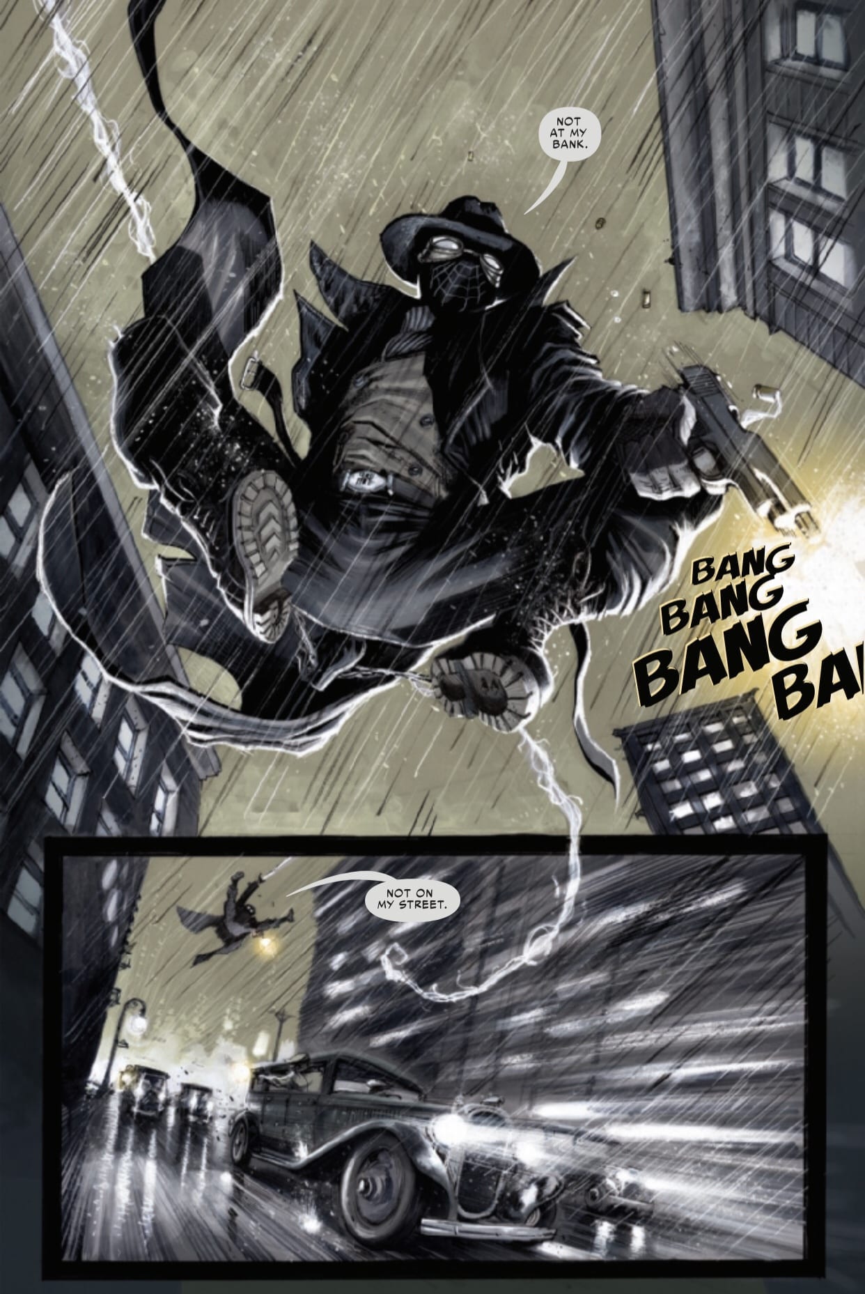
If anyone was tasked with the art department for Spider-Man Noir #1, it had to be Ferreyra. Ferreyra’s art has fluid movement to it that never feels like too much or little. Instead, it helps pace the story along while you turn the page.

Nonetheless, that isn’t the only reason his art makes perfect sense for the series. His lines are solid, helping the characters pop off from the busy background, which Spider-Man Noir #1 has a bit of. Furthermore, each action scene is fluid, lively, and moves along amazingly, whereas the backgrounds can be explained the same. Ferreyra adds the right amount of details to make the world feel alive, while not to busy.

Keeping the noir trend, Ferreyra colors Spider-Man Noir #1 with heavy blacks and whites compared to other colors. This expands to the usual white-colored panel lines. Instead, Ferreyra uses a pure black to keep the noir trend. Not all objects are colored as such, though. When he wants to highlight a person or object, he adds a bright color that stands out. This can be seen with Mary Jane, Aunt May, the dead victim, and his spider-sense, to name a few. Like all other Spider-Men and women, this version has a spider-sense. It’s used once, yet, Ferreyra colors it red and has it surround his face. It may sound simple, but he makes it gorgeous.

Not on my watch
Art by Juan Ferreyra. Letters by VC’s Travis Lanham

WORDS OF MYSTERY

As with most Detective tales, Spider-Man Noir #1 has a bit more dialogue. Furthermore, the darker shades of colors Ferreyra uses means the usage of pure white bubbles may look weird. Luckily VC’s Travis Lanham combats both of these in his lettering. During the heavier bits, he is able to flex the lettering around while putting indents in some to make others fit. For the color aspect, Lanham changes the bubbles inside color to a grey shade that matches the ton of art. The same can be said for the various sound effects seen throughout.

A GLOBETROTTING CASE

Spider-Man Noir’s first issue starts Spider-Man of Earth-90214’s newest case on a great foot. It’s a fastpaced story as the team goes straight into the globetrotting tale. Even if this is your first time reading a Spider-Man Noir story, you won’t be confused, and you’ll find why people love the character.

Memorable Quote: “Sometimes it’s not your mind that changes. Sometimes the world changes around you.” – Huma Bergmann

I’ve never heard that one, yet it has a simple beauty to it.

Monkeys Fighting Robots Youtube

Review: Paths Diverge in KILL WHITEY DONOVAN #4

Sydney Duncan and Natalie Barahona’s Civil-War era revenge series “Kill Whitey Donovan” nears its end with issue #4, and its approach is one of foreboding. This is an issue rife with internal character tension and more close escapes, all the while mounting towards an ending paved with mythic references. Duncan’s writing hits new poetic heights while Barahona’s stellar work maintains its gorgeous and moody aesthetic for yet another engrossing chapter of this series.

“The mysterious Oracle Jones, an Underground Railroad ”conductor,” claims to know the whereabouts of Hattie’s mother, whom he helped escape years ago after she was sold off by Old Man Donovan–and he says he can help Hattie find her.
But the women are close to Atlanta, and Anna can almost taste her revenge. Will this new revelation cause the unlikely pair to split for good, and if so, can Anna possibly kill her fiance without Hattie’s help?”

Writing & Plot

Sydney Duncan‘s writing on “Kill Whitey Donovan” #4 takes the artful yet naturalistic style of her work on this series and adds a layer of mythical foreshadowing to the plot. This issue includes intriguing character conversations and revelations that will no doubt keep the reader engaged while also including yet another intense and stressful escape sequence. The inclusion of a one-eyed newcomer with some much-needed knowledge for one of our two lead characters offers more of that grim foreshadowing that’s been discussed, while also giving the pair a much needed helping hand. Duncan’s usual excellent pacing of dialogue and silence adds a certain poeticism to the mix for this issue, as the series draws closer to its finale. The final page here offers a warning to our tired and battle-hardened leads, and makes the wait for the finale a punishing one.

Art Direction

The stunning and dark artwork of Natalie Barahona has maintained the atmospheric vision of “Kill Whitey Donovan” beautifully for its entire length, and this fourth chapter keeps this trend going. The sharp character detail paints suspicion, determination, panic, and every emotion in-between on the cast in this tension-filled comic. The crisp linework and darkened color choice create stunning and professional-looking work that oozes with atmosphere. The lettering from Troy Peteri comes in a more standard font, but it’s easy to read and has careful bold points that make the processing of the dialogue an easy task. Once again, excellent visual direction to be found in this issue of “Kill Whitey Donovan.”

“Kill Whitey Donovan” #4 is a tense issue that looms the promise of the threat to come in its dark and poetic words. Duncan’s script mixes her artful writing with her knowledge of when to let the art and setting do the talking. Barahona’s artistic vision once again creates a gorgeous and atmospheric world that pulls the reader into its swamps and humidity. Wih only one more issue to go, be sure not to miss out on this excellent series when issue #4 hits shelves on 3/4!

Monkeys Fighting Robots Youtube

C2E2 Aftermath: Tom Bilyeu Talks Publishing And HEXAGON

Hexagon by Impact Theory featuring Don Diablo

Tom Bilyeu, the founder Impact Theory, which has expanded into comic book publishing was at C2E2 this past weekend and talked with Monkeys Fighting Robots about recruiting talent and the company’s next series Hexagon.

Hexagon is a five-issue mini-series written by Michael Moreci, with art by Jheremy Raapack, and Jorge Corona worked on the cover. Dutch DJ and record producer Don Diablo collaborated on the project with Moreci. The first issue hits your local comic book store on March 18.

About Hexagon:
It’s the 1980s, and all twelve-year-old Don wants to do is play video games at the local arcade. Don’s father, however, refuses to let him play. Egged on by his friends and trying to impress a girl, Don sneaks out to join an all-night game-a-thon. Defying the odds (and on his first-quarter ever!), Don beats Crucible, a game long considered unbeatable. In an instant, his world is turned upside down when his victory triggers an alien invasion and sucks him into an intergalactic battle that has been raging for years, a battle his father was desperately trying to protect him from!

Enjoy the interview below

MFR: How did you find Michael Moreci for Hexagon?

Tom Bilyeu: I found Michael Moreci’s other comics like Wasted Space, and I just had to recruit him. I stalked him, begged, even borrowed favors just to get him on.

[Laughs]

MFR: How exactly does Impact Theory recruit new talents?

Tom Bilyeu: Mostly through networking. Having the right kind of portfolio helps a lot. But so does knowing the right people. Like when I want to have certain people for projects, I tell everyone about it. So whenever I’m doing something else a friend can tell me of a good time to speak with certain talents.

MFR: For Hexagon, was the team aware of the possibility of drawing parallels to 80s settings like in Stranger Things?

TB: Absolutely, drawing parallels is a good way to get a story out there for people to pay attention. If we can advertise this as “Stranger Things meets Star Wars” fans can be like “oh I like this” and jump onto the story.

MFR: Talk about the makeup of the creative team of Hexagon?

TB: Well like you said at first, everybody has a role to play. Don is obviously the heart and soul of this project. Michael, here is the writer. As for me, I barely do anything because I’m just the f***ing publisher. It is all just a matter of finding people to work with and finding how they create something good into something better.

MFR: Thank you for your time and best of luck with Hexagon!


Do you plan on picking up a copy of Hexagon #1? Comment below with your thoughts.

C2E2 Aftermath: Tom Bilyeu Talks Publishing And HEXAGON

Monkeys Fighting Robots Youtube

C2E2 Aftermath: Panda Mony’s Ryan Magnon Explains ALTER NATION

C2E2 Aftermath: Panda Mony's Ryan Magnon on the ALTER NATION

Panda Mony’s company president Ryan Magnon was at C2E2 this past weekend and he talked with Monkeys Fighting Robots about its toy franchise Alter Nation and unique style of marketing.

Panda Mony is an up-and-coming toy company looking to entertain kids through a new franchise, Alter Nation. To get the word out Magnon entertains a few techniques including a partnership with Dark Horse Entertainment. The preview issue is available in select comic stores or with online vendors like Comixology. Detailing the adventures of a military group of genetically altered soldiers chasing cryptids and conspiracies; Magnon hopes to make his franchise equivalent to ones like G.I. Joe and TMNT. But Coppa has been cracking down on websites that use cookies to collect kid’s data. Not to mention the main demographic of comic stores are over the age of 18. So how does Panda Mony go about this? At C2E2 I ask Magnon that.

Enjoy the interview below

MFR: On Panda Mony’s website your motto is to give the kids of today equivalents of the figure lines of decades prior. What are your strategies to reach them? Given the stricter control on social media including but not limited to Coppa.

Magnon: Coppa doesn’t have regulations on typical forms of advertising like book fairs or US mail. We can still provide content on YouTube just not collect their information. Also, we try to spread to retailers by getting the word out through cons like this and previously mentioned.

MFR: Bouncing off of that, how does Panda Mony plan to spread its brands to the general public if the availability is in very limited areas like select stores in states? I for one only found Alter Nation by chance twofold. The preview comic from Comixology and word of mouth from my friend who collects figures.

Magnon: Those stores on the website don’t necessarily mean all of the stores we have on call. Like I said before we try to spread the word out like our partnership through Dark Horse, which will be releasing a graphic novel. While kids don’t necessarily go to comic book stores, they do still visit book stores like Barnes and Nobles and book fairs. We also have our webisodes on our website and YouTube channel, which again we can still have despite the Coppa laws. We’re also in talks with animation and production studios for an all-ages TV series to reach the public.

MFR: A friend of mine likes the quality of Panda Mony’s figures. Who judges the designs and personalities that go into the figures?

Magnon: I do actually while Curtis and the rest of the team play their parts. We interview kids through surveys on subjects like what’s their favorite animal and what kind of characters they like. Afterward, we use their feedback to make characters those kids and others would like.

MFR: In the exclusive comic preview of Alter Nation, I could not help but notice the similarities between franchises like GI Joe, TMNT, and X-Men. With those franchises having such large followings that continue today; how do you plan to make Alter Nation stand out?

Magnon: All series and franchises actually have some similarities. Star Wars, for example, was inspired by Flash Gordon and I’m sure Flash Gordon had other inspirations. As for Alter Nation, while it kind of is X-Files with superpowers, we try to give it an angle that those series never tried before. In Alter Nation while we do have similarities with TMNT and X-Men we have a real focus on conspiracy theories.

MFR: With everyone on screens just about anyone can join in on that front.

Magnon: That’s true.

MFR: Do you and the Panda Mony team have favorite characters?

Magnon: Curtis likes Sabotage since he came up with the villain. As for me, I like them all but I hold a special place for Albert VII with all the accessories he can come with.

MFR: Ryan, thank you for your time and best of luck with Alter Nation!

C2E2 Aftermath: Panda Mony's Ryan Magnon on the ALTER NATION

About Alter Nation: The Mystery of Whining Winny:
The GK Delta team is the only line of defense against threats that normal humans can’t stop. Join the team as they’re dispatched to Nevada where it’s rumored that a monster is menacing locals and this monster may be the newest member of the team. If not, GK Delta will be trapped between this new monster and the townspeople they need to save. Written by Tim Seeley (Grayson, G.I. Joe: A Real American Hero), illustrated by Mike Norton (Battlepug), colored by Allen Passalaqua (Battlepug), and lettered by Crank!

The Alter Nation: The Mystery of Whining Winny original graphic novel will hit your local comic book store this fall.

Monkeys Fighting Robots Youtube

C2E2 Aftermath: Cullen Bunn Talks Voodoo And SHADOWMAN

Cullen Bunn and what leads to Shadowman

Cullen Bunn was at C2E2 in Chicago this past weekend, and Monkeys Fighting Robots got a chance to speak with him about Shadowman and his writing process. Shadowman hits your local comic book store on May 20.

Bunn is known for indie work on Harrow County and The Sixth Gun, but the writer has a history with voodoo with titles like Punk Mambo and Bone Parish.

Enjoy the interview below

MFR: You’ve written about voodoo in Bone Parish and Punk Mambo, will these books influence Shadowman?

Bunn: Voodoo has always been something I’ve been interested in. The magic system is unique, and I thought it would be good to implement. But the voodoo you find in Valiant isn’t the traditional kind, just the Valiant variant. As for leading into Shadowman, Punk Mambo at least will lead into some events in Shadowman.

MFR: You seem to employ the deeper meanings behind mythical and religious teachings. How much research goes into these series and is there a method in how you apply them?

Bunn: I do enough research to be dangerous. I like to make the research feel real to the readers. But I don’t spend weeks and weeks doing my research, just enough to feel immersive.

MFR: Critics love your work in horror and fantasy, but you don’t shy away from other genres. How do you approach working in different genres?

Bunn: Yes, whenever I work on a different genre and series I always want to be able to bring something only I can do to each of them.

MFR: On that note, have any characters from your previous works influenced how you develop other series?

Bunn: Every character I work with has in some way influenced me and my series. However, it’s never as big or as overt. Sometimes even I don’t notice how much influence comes in.

MFR: What else are you working on?

Bunn: I do have titles coming from Valiant and creator-owned titles that I am working on, but I’m not at liberty to discuss them at this time.

MFR: Thank you for your time Cullen!

Cullen Bunn and what leads to Shadowman

About Shadowman:
A BRAND-NEW HORROR SERIES!
From the bestselling master of horror Cullen Bunn (Venom) and bone-chilling artist Jon Davis-Hunt (Clean Room) comes a shocking supernatural odyssey.
The forces of darkness are awakening, and they are hungry for life. Will Jack Boniface, feared by the forces of evil as the protector Shadowman be able to save us all?


Are you looking forward to Shadowman? Leave your thoughts in the comment section below.

Monkeys Fighting Robots Youtube

Review: X-O MANOWAR #1 Delivers Great Pacing To Restart The Series

X-O MANOWAR #1 Cover
X-O MANOWAR #1 2020

Valiant Comics’ X-O MANOWAR #1 jumps right into the action with a fun, lighthearted adventure created by Dennis Hallum, Emilio Laiso, Ruth Redmond (colors), and Hassan Otsmane-Elhaou (letters). It’s a fast-paced story that mildly suffers from cluttered art design.

Story & Dialog:

Writer Dennis “Hopeless” Hallum has crafted a fun fish-out-of-water story to restart one of Valiant’s headlining characters. Right from the start, you’re introduced to Aric, a 4th-century Visigoth, who returns to Earth after centuries in captivity with an alien race called the Vine. During his time away, Aric is bonded with a powerful super-suit run by an advanced AI that can access all Earth communications and stores of knowledge to bring the hero up to speed.

It’s a brisk 20 pages that showcases everything from a space battle to a basketball game that goes comically wrong to the accidental destruction of a neighbor’s car. Where the dialog really shines is the internalized interaction between Aric and his suit’s AI, Shanhara. Shanhara directs Aric to trouble spots and fills in his knowledge gaps about modern life. They bicker like an old married couple, which works to keep the tone light most of the time.

X-O MANOWAR #1 Dialog Sample

Where the story falters slightly is in the inconsistencies with Aric’s assimilation into modern Earth life. He recognizes stinger missiles and assorted types of firearms, but doesn’t know the purpose of a wrench. It’s a small quibble, but there are several examples peppered throughout the issue that pull you out of the story briefly.

Lastly, the issue opens up several questions that are not answered by issue’s end in order to keep you invested and interested in the story. Questions related to backstory (e.g How did he lose his left hand? How did Aric make it back to Earth?), and questions that presumably are setup for future issues (e.g. Who was the evil scientist? How does he know Aric? What’s with the evil killbot?). I’m interested to see how and when these questions are eventually answered.

Art:

The issue is jam-packed with panels by Emilio Laiso, and that is both the highlight and the shortcoming of this first issue. Ruth Redmond’s colors are bright, the characters are distinctive, and nearly every inch of space is filled with action. It’s a visually engaging issue. However, some pages are overstuffed with panels so much that it’s difficult to make out what’s going on. Most of the panels seem to be locked in constant close-up mode, making every scene feel small. Several of the bigger action scenes would work better if they weren’t crowded out by surrounding (overlapping) panels and the artist had pulled back to give a wider picture of what’s going on. Give the scene more room to feel big.

X-O MANOWAR #1, pg. 3

Otsmane-Elhaou did a remarkable job with the lettering by balancing the external conversations with the internal dialog and (in one case) translating an alien language. Through it all, the lettering remained clear and easy to follow.

Conclusion:

X-O MANOWAR #1 is a well-written start for a new reader interested in Aric’s adventures. The story is full of action without taking itself too seriously, and the interaction between Aric and his suit’s AI carry the story through. The art is visually interesting even if the perspective and overlapping panels make several pages feel muddled and small. It’s worth picking up.

Monkeys Fighting Robots Youtube

Marvel’s C2E2 2020: Ultraman, EMPYRE, And Lots of Swords

C2E2 Ultraman

Marvel Comics made a lot of news at this year’s C2E2 convention. Buckle up and we’ll try to hit the big items below:

Silk a.k.a. Cindy Moon, the Korean Spider-Man spinoff character, will be getting her own series this July from writer Maurene Goo and artist Takeshi Miyazawa. Goo said in a statement that followed the announcement, “The opportunity to write a Korean American super hero—a woman, no less—is one that I never thought would come my way.”

C2E2 Silk

Japan’s Ultraman arrives at Marvel in a five-issue limited series by Kyle Higgins, Mat Groom, and Francesco Manna. This follows from the publisher’s partnership with Tsuburaya Productions announced last year.

C2E2 Ultraman


The big X-Men event of 2020 was also unveiled at C2E2: July’s 15-part X of Swords, where ten mutants will wield different legendary blades from across the Marvel Universe against a yet-to-be-revealed threat. Writers Jonathan Hickman and Tini Howard will be the primary drivers behind the event.

C2E2 X of swords

And speaking of events, with Empyre almost upon us, Marvel revealed more tie-in titles at the title’s C2E2 panel. They include three Lords of Empyre one-shots: Emperor Hulkling by Chip Zdarsky, Anthony Oliveira, and Manual Garcia; Celestial Messiah by Alex Paknadel and Alex Lins; The Swordsman by Paknadel and Thomas Nachlik.

C2E2 empyre swordsman

Additional tie-ins will be The Invasion of Wakanda by Jim Zub and Lan Medina; Storm Ranger by Saladin Ahmed and Steven Cummings; Empyre: Spider-Man by Taran Killam and Diego Olortegui; and Empyre: Captain America by Phillip Kennedy Johnson and Ariel Olivetti. The Fantastic Four and Avengers main titles will be doing much of the heavy lifting.

Old school Marvel fans will not only appreciate the return of the Swordsman, but the amount of groundwork being laid to tie this new event into the Kree-Skrull War of old.

C2E2 was only the first in a long line of conventions for the year, so more reveals are no doubt on the way. Keep an eye on Marvel.com for these and other upcoming titles.

Monkeys Fighting Robots Youtube

KING OF NOWHERE: Master of Letters

King of Nowhere #1
King of Nowhere #1 Credit BOOM! Studios

When people think about comic book creators they tend to think about the writer or artist first, depending on where personal interest lies. In the same way a movie director or star is the first port of call for selling a movie.

But just like a movie, a comic book is created by a number of people. They each add something to the pot and help create the wonderful soup you pick up month after month. Most people don’t realise that’s the case and only see the main ingredient but they would probably notice if those hidden ingredients weren’t there.

Everyone has read a comic where the images are crowded with massive word balloons, the text inside a mix of inconsistent fonts with haphazard emphasis. The plot is actually lost beneath a behemoth of Comic Sans and bold words, with crossed balloon tails that overlap a character’s face.

What those comics need is a good letterer, which leads us nicely into King of Nowhere.

The first issue of King of Nowhere is published by BOOM! Studios and released on 4th March. It is written by fan favourite W. Maxwell Prince and illustrated by Tyler Jenkins. The lettering has been provided by Andworld Design, the lettering and design studio that was founded by Eisner nominated Deron Bennett.

Lettering is often the unsung hero of comic books. Seen only as a way to relay the speech and thoughts of the characters to the reader. It is overlooked despite being the focal point for the audience. Studies are currently being undertaken to determine how people interact with comics and the initial findings is that our eyes pick out the text first before the image. Therefore, if you get the lettering wrong, it will affect the way that your reader will interact with the rest of the comic.

Luckily for Prince and Jenkins, Andworld Design are experts at what they do.

King of Nowhere #1 Credit BOOM! Studios
King of Nowhere #1 Page 3 Art Credit BOOM! Studios

Functions of the Letters

The lettering has two main functions. Firstly to impart information to the reader, such as the inner thoughts of the central character, Denis, as he staggers through the unknown town of Nowhere. And secondly, to help establish the mood or tone of the comic. The lettering has to mirror and reinforce the concepts set out by the illustration and plot.

The First function is easy to see within the King of Nowhere. Taking the third page as an example, the script enforces the situation that is facing Denis. The speech points out the obvious from his point of view, “Are you a… Deer?”.

This observation is reinforced by the next panel on the page, with the character leaning out of his car. The statement is taken a little further with the Deer’s reply because he imparts information that is not otherwise presented to the reader. “A newbie. This place is going to eat you alive.” From this the reader learns that Denis is not where he should be and that there is a certain element of danger in this town.

But this is scripting, where the lettering comes in is via placement. The script alone does not inform the reader that Denis is unsure about what he is looking at or that he is having a moment of disconnection from the world around him. That element is relayed through the placement of the speech balloons and the break, with a linking tail, of the sentence.

King of Nowhere #1 Credit BOOM! Studios
King of Nowhere #1 Page 3 detail Credit BOOM! Studios

The two balloons joined by a link give the impression of a pause, enhancing Denis’ uncertainty. The reader quickly discovers that the character does resemble a deer which in turn makes them question the pause. It is obviously a deer which means that a) Denis wasn’t expecting to see a deer, therefore this is not a normal occurrence for him, and b) Denis is questioning what he sees to discover where the problem lies, is it with him or the world around him.

There are a number of ways that the speech could have been laid out, each would have produced a slightly different emphasis on the sentence. By using a linked balloon the pause accentuates the final word. It becomes a question about the species of the creature. Two separate balloons might indicate that Denis was trying to find the correct word to describe what he was looking at and a single balloon would rob the moment of the confusion the central character was feeling.

This is just one small example of something Andworld Design does throughout King of Nowhere. Placement, emphasis, and the layout of the speech gives emotional information to the reader and extends understanding of the characters/situation.

King of Nowhere #1 Credit BOOM! Studios

Designed Contrast

The other wonderful thing that Andworld Design does relates to the actual design of the word balloons and caption boxes. To understand the brilliance of the design you have to first understand the concept of the comic because the two are linked.

King of Nowhere is about a man lost in a world that is familiar in a number of respects but alien in others. It’s like Nick Burkhardt suddenly being able to see the Wesen in Grimm. Denis understands the mechanics of the town he is walking into, cars, bars, violence, but he has trouble reconciling the appearance of the people he sees. Ergo, he believes he is in a dream.

There are a number of elements in the comic that reinforce Denis’ state of mind. Some of it is in the speech, some in the artwork, but the lettering gives the reader the best indication of Denis’ state of mind.

The lettering is displayed in two ways throughout the comic: speech balloons and caption boxes. The first represents the town of Nowhere. It is rooted in the town, a part of it. The second is the inner thoughts of Denis and therefore do not belong to the town. His thoughts have strong links to what came before, what Denis understands ‘normality’ to be.

Andworld Design knows the distinction between the two and as such treats the two modes of delivery slightly differently. The caption boxes are, for want of a better term, ‘classic comic book’. The design is straight forward; rectangular boxes with aligned text inside. There are no borders but the distinctive yellow colouring creates a natural barrier between the boxes and the world behind them.

The caption boxes are as normal as possible, something recognisable by anyone who reads comics. They are Denis’, and by extension the readers, link to the real world; or at least what Denis understands the ‘real’ world to be.

King of Nowhere #1
King of Nowhere #1

In contrast the speech balloons are abnormal. They do not conform to the tradition of usual comic book speech balloons, but only in a subtle, slightly different way. There is the white background with the black text that a reader would expect but the rest of the design is off kilter. Their shapes are irregular with the borders barely visible or in some cases, encroaching onto the white. In short, they represent the unfamiliar world that Denis has found himself in: it’s just not quite right.

The design contradicts what the reader would expect from the speech balloon. In another comic this might cause a problem, but in King of Nowhere it is perfect. The contrast between imperfect speech balloon and ‘normal’ caption box reinforces the central characters dilemma and the core of the plot itself. Something so simple creates a visual dynamic on the page that enhances character and plot.

It gives the comic depth and another layer of storytelling. It is also something that is unique to comic books. What other medium can create a visual contrast between the voice inside a character’s head and the one other characters can hear?

There are a number of comics out there that have outstanding letterers, King of Nowhere is just one of them. Without their hard, often overlooked, work the comics we read would lack an element that makes comics such an exciting medium. With the possible exception of Picture Books, Comics are the only medium that utilise Letters as a visual component in every aspect of the storytelling process. Andworld Design excel at what they do and I can’t wait to see what they do in future issues of King of Nowhere.

Monkeys Fighting Robots Youtube

HOW YOU CAN COMPARE GREEN ENERGY EFFECTIVELY

HOW YOU CAN COMPARE GREEN ENERGY EFFECTIVELY

One of the ever-rising energy options widely used by various households in the UK is green energy. Regardless of this increasing number, there are still individuals with the notion that it is more expensive paying their gas and electricity bills using green energy. This is not true; on the contrary, it saves cost, creates a clean environment and could even generate profits if the right steps are taken. This article will help you understand what green energy is and how you can significantly benefit from it.

What Is Green Energy?

Green energy or renewable energy is produced from natural sources such as sunlight, tides, wind, algae, plants, and geothermal heat. They are renewable, in the sense that they can be naturally reproduced. As we advance, there are more energy suppliers that offer green energy tariffs, based on the supply of eco-friendly energy, to various households. The energy supplied is 100% renewable and comes in various forms, ranging from wind farms to solar panels.

In the UK, there is a regulatory body that oversees the supply of gas and electricity by energy retailers to households. This regulatory body is known as Ofgem – Office of Gas and Electricity Markets. They have implemented a Green Energy Certification Scheme that provides scrutiny and audit to willing energy providers, after which their services are being certified as ‘green’.

Although some energy providers are not certified by Ofgem, they still provide environmentally friendly energy to consumers.

Is It Cheaper To Use Green Energy?

Green energy is slightly more in price when compared to the standard energy tariffs – the reason being that it costs a lot to produce renewable energy. However, it has its benefits. An important factor to note is that not all energy suppliers have expensive green energy tariffs. There are suppliers that offer cheap tariffs; all you need to do is to find and compare various tariffs from energy suppliers to get the best deals. This way, you can save tons of money and conserve energy.

How To Get The Best Green Energy Deal?

There are several energy companies out there that offer various amazing deals on energy tariffs. One of them is Simply Switch. They give you an option to compare various energy services available. You can get the best deal based on your location. There is a list which is available on request that contains various green energy tariffs in price order, from which you can select the best option for your needs.

Green Energy Tariffs You Can Compare?

There are various utilities that are made available for you to compare, including gas and electricity, as well as mobile phones and broadband. The following energy categories can be compared:

  • Electricity Only
  • Gas Only
  • Green Energy
  • Duel Fuel

If you a looking for a platform where you can compare prices of various energy utilities and their providers before you switch to a cheaper and efficient option, you can do that quickly, easily, and freely still using Simply Switch. All you need is to enter your postcode. If you would like to know more about green energy options, please visit this link: Simply Switch – Energy Comparisons.

Monkeys Fighting Robots Youtube

Best Comic Books Of The Month – February 2020

suicide squad #3 dc comics best of the month

February is officially in the books, so we are counting down the best comics of last month according to our staff!

We ranked our top five best reviewed comics of February 2020; be sure to ring your local comic shop to see if they still have any of these fine books:

1. Suicide Squad #3 (DC Comics)

Score: 5/5 Stars

We only had one five-star review in February, and it was for Suicide Squad #3 by Tom Taylor, Bruno Redondo, Adriano Lucas, and Wes Abbott. In fact, reviewer Zac Owens has given each issue of Suicide Squad a perfect score, making this run an early contender for comic of the year.

“I’m calling it. This may be the best book of the year. And it’s only February. If Taylor and company continue to fire on all cylinders, we are in for a wild and magnificent ride. They know when to keep their readers in the dark, and even when they provide answers they know how to keep us asking questions.”

2. John Constantine: Hellblazer #4 (DC Comics)

Score: 4.9/5 Stars

By Simon Spurrier, Matias Bergara, Jordie Bellaire, and Aditya Bidikar

“The team behind HELLBLAZER #4 are in complete sync, making one of the best issues to date. HELLBLAZER #4 does everything right and will have you going through a range of emotions. If you haven’t started Constantine’s newest series you absolutely need too.”

3. Hexagon #1 (Impact Theory)

Hexagon #1 cover

Score: 4.8/5 Stars

By Michael Moreci, Jheremy Raapack, Abraham Lee, David Kim, Nuo Xu, Marc Conroy, and Farhad Heydarian

“Get ready for a series that will make your 80s nostalgia sense explode, because there’s a whole lot more coming.”

(Hexagon #1 technically isn’t out until March 18th, but our review came out in February, so I’m counting it! Be sure to tell your shop to order you this one.)

4. Death to the Army of Darkness #1 (Dynamite)

Score: 4.6/5 Stars

By Ryan Parrott, Jacob Edgar, Kike J. Diaz, and Hassan Otsmane-Elhaou

“The creative team behind Dynamite’s DEATH TO THE ARMY OF DARKNESS #1 nails the tone of the movie perfectly. Fans new and old alike will find something they love in the introductory issue of Team Ash.”

5. Heartbeat #4 (BOOM! Studios)

Score: 4.6/5 Stars

By Maria Llovet and AndWorld Design; translated by Andrea Rosenberg

“Maria Llovet’s Heartbeat continues to be a fantastic slow-burning story dealing with one’s moral decline and the consequence that follow.”


What were YOUR favorite comics from February 2020? Sound off in the comments!

Monkeys Fighting Robots Youtube