When people think about comic book creators they tend to think about the writer or artist first, depending on where personal interest lies. In the same way a movie director or star is the first port of call for selling a movie.
But just like a movie, a comic book is created by a number of people. They each add something to the pot and help create the wonderful soup you pick up month after month. Most people don’t realise that’s the case and only see the main ingredient but they would probably notice if those hidden ingredients weren’t there.
Everyone has read a comic where the images are crowded with massive word balloons, the text inside a mix of inconsistent fonts with haphazard emphasis. The plot is actually lost beneath a behemoth of Comic Sans and bold words, with crossed balloon tails that overlap a character’s face.
What those comics need is a good letterer, which leads us nicely into King of Nowhere.
The first issue of King of Nowhere is published by BOOM! Studios and released on 4th March. It is written by fan favourite W. Maxwell Prince and illustrated by Tyler Jenkins. The lettering has been provided by Andworld Design, the lettering and design studio that was founded by Eisner nominated Deron Bennett.
Lettering is often the unsung hero of comic books. Seen only as a way to relay the speech and thoughts of the characters to the reader. It is overlooked despite being the focal point for the audience. Studies are currently being undertaken to determine how people interact with comics and the initial findings is that our eyes pick out the text first before the image. Therefore, if you get the lettering wrong, it will affect the way that your reader will interact with the rest of the comic.
Luckily for Prince and Jenkins, Andworld Design are experts at what they do.

Functions of the Letters
The lettering has two main functions. Firstly to impart information to the reader, such as the inner thoughts of the central character, Denis, as he staggers through the unknown town of Nowhere. And secondly, to help establish the mood or tone of the comic. The lettering has to mirror and reinforce the concepts set out by the illustration and plot.
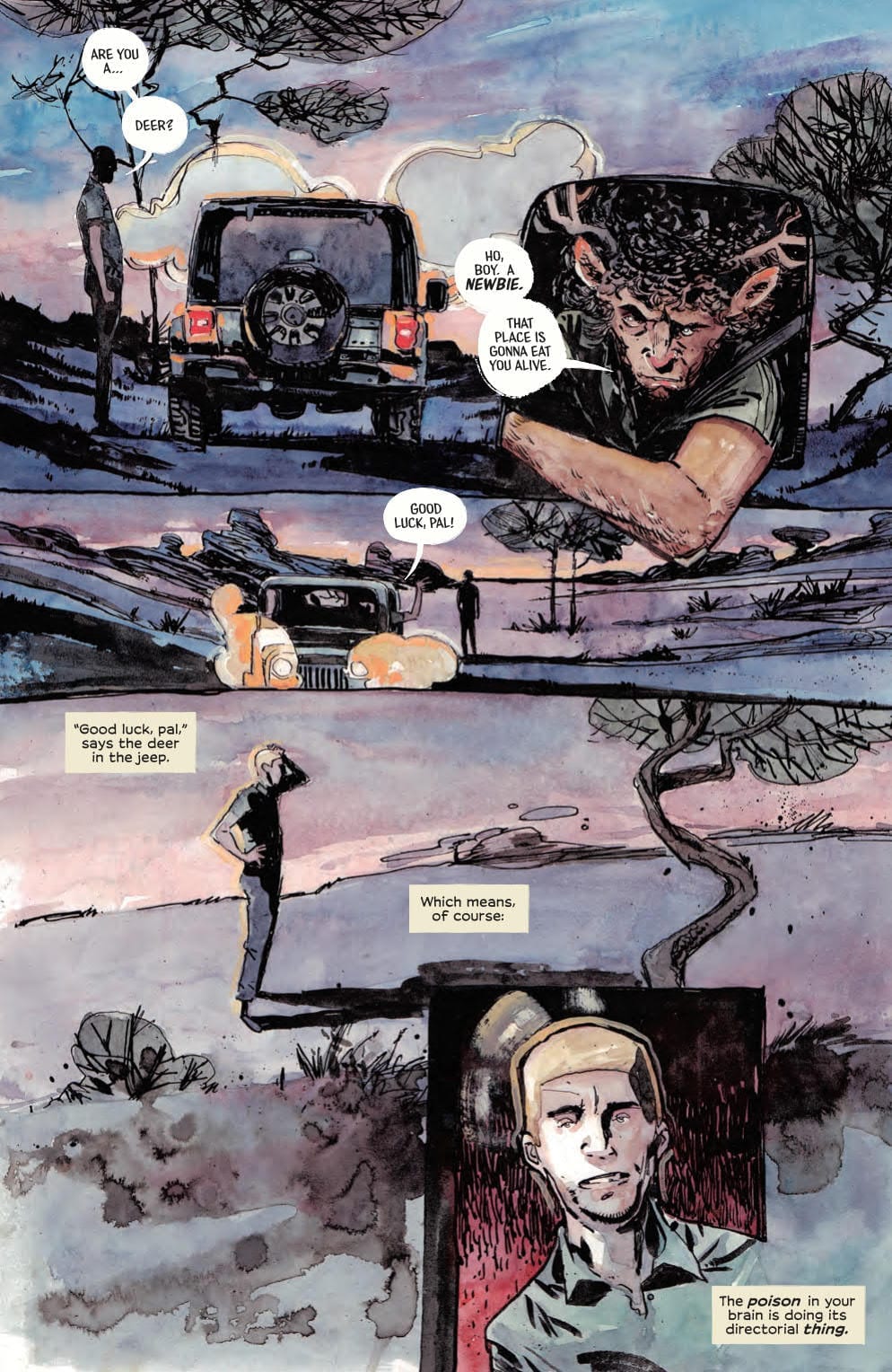
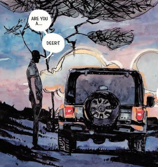
The First function is easy to see within the King of Nowhere. Taking the third page as an example, the script enforces the situation that is facing Denis. The speech points out the obvious from his point of view, “Are you a… Deer?”.
This observation is reinforced by the next panel on the page, with the character leaning out of his car. The statement is taken a little further with the Deer’s reply because he imparts information that is not otherwise presented to the reader. “A newbie. This place is going to eat you alive.” From this the reader learns that Denis is not where he should be and that there is a certain element of danger in this town.
But this is scripting, where the lettering comes in is via placement. The script alone does not inform the reader that Denis is unsure about what he is looking at or that he is having a moment of disconnection from the world around him. That element is relayed through the placement of the speech balloons and the break, with a linking tail, of the sentence.

The two balloons joined by a link give the impression of a pause, enhancing Denis’ uncertainty. The reader quickly discovers that the character does resemble a deer which in turn makes them question the pause. It is obviously a deer which means that a) Denis wasn’t expecting to see a deer, therefore this is not a normal occurrence for him, and b) Denis is questioning what he sees to discover where the problem lies, is it with him or the world around him.
There are a number of ways that the speech could have been laid out, each would have produced a slightly different emphasis on the sentence. By using a linked balloon the pause accentuates the final word. It becomes a question about the species of the creature. Two separate balloons might indicate that Denis was trying to find the correct word to describe what he was looking at and a single balloon would rob the moment of the confusion the central character was feeling.
This is just one small example of something Andworld Design does throughout King of Nowhere. Placement, emphasis, and the layout of the speech gives emotional information to the reader and extends understanding of the characters/situation.

Designed Contrast
The other wonderful thing that Andworld Design does relates to the actual design of the word balloons and caption boxes. To understand the brilliance of the design you have to first understand the concept of the comic because the two are linked.
King of Nowhere is about a man lost in a world that is familiar in a number of respects but alien in others. It’s like Nick Burkhardt suddenly being able to see the Wesen in Grimm. Denis understands the mechanics of the town he is walking into, cars, bars, violence, but he has trouble reconciling the appearance of the people he sees. Ergo, he believes he is in a dream.
There are a number of elements in the comic that reinforce Denis’ state of mind. Some of it is in the speech, some in the artwork, but the lettering gives the reader the best indication of Denis’ state of mind.
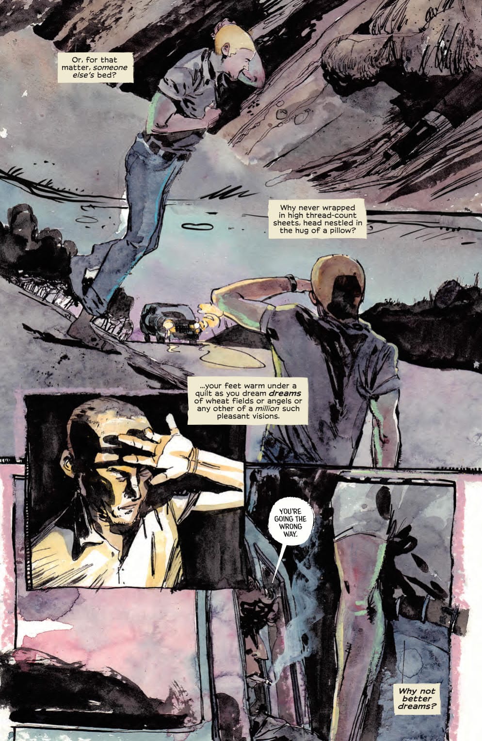
The lettering is displayed in two ways throughout the comic: speech balloons and caption boxes. The first represents the town of Nowhere. It is rooted in the town, a part of it. The second is the inner thoughts of Denis and therefore do not belong to the town. His thoughts have strong links to what came before, what Denis understands ‘normality’ to be.
Andworld Design knows the distinction between the two and as such treats the two modes of delivery slightly differently. The caption boxes are, for want of a better term, ‘classic comic book’. The design is straight forward; rectangular boxes with aligned text inside. There are no borders but the distinctive yellow colouring creates a natural barrier between the boxes and the world behind them.
The caption boxes are as normal as possible, something recognisable by anyone who reads comics. They are Denis’, and by extension the readers, link to the real world; or at least what Denis understands the ‘real’ world to be.

In contrast the speech balloons are abnormal. They do not conform to the tradition of usual comic book speech balloons, but only in a subtle, slightly different way. There is the white background with the black text that a reader would expect but the rest of the design is off kilter. Their shapes are irregular with the borders barely visible or in some cases, encroaching onto the white. In short, they represent the unfamiliar world that Denis has found himself in: it’s just not quite right.
The design contradicts what the reader would expect from the speech balloon. In another comic this might cause a problem, but in King of Nowhere it is perfect. The contrast between imperfect speech balloon and ‘normal’ caption box reinforces the central characters dilemma and the core of the plot itself. Something so simple creates a visual dynamic on the page that enhances character and plot.
It gives the comic depth and another layer of storytelling. It is also something that is unique to comic books. What other medium can create a visual contrast between the voice inside a character’s head and the one other characters can hear?
There are a number of comics out there that have outstanding letterers, King of Nowhere is just one of them. Without their hard, often overlooked, work the comics we read would lack an element that makes comics such an exciting medium. With the possible exception of Picture Books, Comics are the only medium that utilise Letters as a visual component in every aspect of the storytelling process. Andworld Design excel at what they do and I can’t wait to see what they do in future issues of King of Nowhere.

