Home Blog Page 165

Review: POST AMERICANA #5 And The Deceitfulness Of Appearances

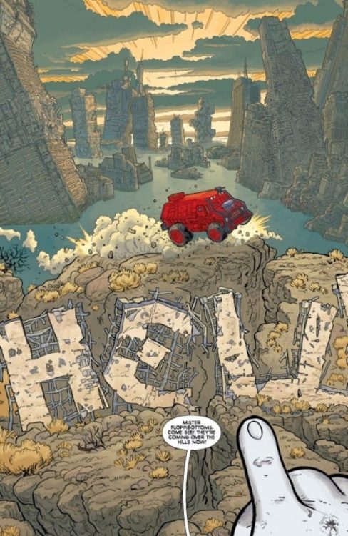
POST AMERICANA #5, available in comic book stores on Wednesday, April 21st, details our favorite wastelanders’ arrival at the mysterious Marcy’s abode. Mike made contact with her earlier in the series and hatched a plan to breach the Bubble of the President. But when his group arrives, they will find more than they bargained for.

Story

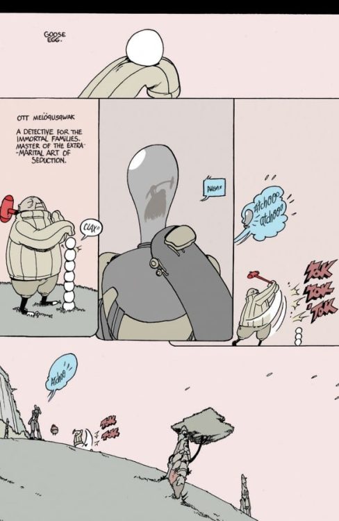
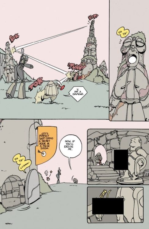
After days of trials and tribulations, Mike’s dedication to finding Marcy has finally paid off. Our crew of protagonists arrive at Wonder Studios, an entertainment studio akin to those in our own world. However, there is one key difference—the mascots are fully automated, self-conscious robots.

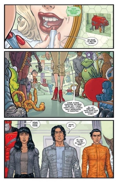
The life of luxury and comfort is a far cry from the desperate circumstances Marcy led Mike to believe they were in. This seeming betrayal reminds us of times in our lives when people took advantage of our actions of goodwill. Their bewilderment speaks volumes. We wonder if there’s still any hope of the two groups teaming up to take on the Bubble.

Steve Skroce’s writing does a great job of guiding readers along this new set of circumstances. We finally see where all the fantastical “hero” types, such as Night Terror, come from. And readers will find there’s more than meets the eye in the person of Marcy, especially after learning she’s roughly 100 years old!

Artwork

Skroce’s penciling and ink work, Dave Stewart’s coloring, and Fonografiks’s lettering were stunning as always. The cartoonish designs of the automatons are a stark juxtaposition of the more realistic protagonists. The human characters are filled with natural tones in contrast to the bright, rainbow colored robots, further differentiating the two groups. The lettering was also impressive as well—despite the large amount of explanatory dialogue, the word balloon placements refrain from taking over the panels.

Conclusion

POST AMERICANA #5 introduces to a new character with an intriguing characterization. We’re anxious to see what role Marcy has to play in the coming issues.

Do you think the team at Wonder Studios will have a chance at infiltrating the Bubble? Let us know in the comments below!

Monkeys Fighting Robots Youtube

No More Playing Nice in CHAMPIONS #6

Marvel’s CHAMPIONS #6, available now, brings us back to our conflicted young heroes. They may have won the battle, but the war against Kamala’s Law is far from over. Written by Danny Lore, with art from Luciano Vecchio, Federico Blee, and VC’s Clayton Cowles, this is not an issue to miss.

Starting off Champions #6 with a fight!

It finally happened. Last issueThe Champions, against all odds, managed to take on C.R.A.D.L.E. and prove that the intent behind Kamala’s Law had been corrupted (assuming that it hadn’t been corrupt the whole time…).

You’d think that would be the end of it. That Kamala’s Law – the law that made being an underage hero illegal – would automatically get repealed. But nothing is ever that easy, especially not once it has hit this stage.

That’s where Champions #6 begins. Our heroes are trying to pick up the pieces broken by the events of Outlawed. And they’re struggling. What’s happening here isn’t just about the faith they lost in the system; it’s about what happened among the Champions. It’s about the trust that they’re struggling to get back, even on the most personal levels.

They sure do know how to make an entrance, don’t they?

Writing

Champions #6 is the start of a new plot arc, appropriately titled “Killer App!” Written by Danny Lore, there is a lot to unfold from this issue. The Champions may be back together, but that doesn’t magically erase everything that they just went through.

Thankfully, Lore seems to agree and made a point of showing readers the damage to group morale. But really, it’s more than moral, isn’t it? They had what appeared to be a traitor in the group, and that sort of thing doesn’t heal overnight.

As if that wasn’t enough, there’s still the enemy to contend with—the real driving force behind Kamala’s Law. Any Marvel fan will appreciate the difficulty that comes with battling a certain iconic evil corporation. You know the one.

As far as social commentary is concerned, there’s plenty worth reading into here. There’s commentary on laws, injustice, battling corporations, and even about our obsession with social media and apps. It adds a whole new layer to the Champions story.

There’s lots going on in this fight, with new characters to learn about.

Artwork

Champions #6 is a bright issue with lots going on inside the pages. Okay, neither of those facts are actually all that much of a surprise. The Champions have always been good at keeping busy (and into trouble), and it shows in their artwork.

Luciano Vecchio’s artwork is bold, portraying all of our favorite heroes in bright designs that stand out against the backdrop. The fight scenes are fast-paced, pack a real punch (or zap), and show the full scale of the situation (thanks, Ms. Marvel). Conversely, the new app and all the merch that goes along with it are painfully bubbly and bright. It has that flashy media look that we’re all far too used to.

Federico Blee’s colors help make those parts stand out, with color palettes that practically scream for attention. I’m pretty sure that if this company could create a paint that could literally scream, they would. So this is in keeping with their whole branding at the moment. The colors are borderline jarring. We know that an enemy is hidden here, but they’re trying so hard to hide in plain sight.

VC’s Clayton Cowles lettering is a treasure in this issue. It’s understated at times, and yet at other times, it can keep up with a vast amount of dialogue. Not to mention hint at dozens of little details, from tech to hits and everything in between.

Looks like this team may just be the perfect match for The Champions.

Conclusion

Champions #6 is an issue worth grabbing if you love villainous Marvel corporations. This is an issue that provides some winding down from the last major conflict while setting up for the next one. All while addressing the things that have been broken in the meantime. It makes for a worthwhile read.

Monkeys Fighting Robots Youtube

Going Back to Basics in SPIDER-WOMAN #11

Marvel’s SPIDER-WOMAN #11, available now, is going back to basics. Making this a perfect jumping-in point for fans old and new. Jessica Drew is getting her life back together – she’s got her new (old) suit, her family, and now she’s fighting crime once again. It feels good. Even if it feels like she’s missing something…

And so the newest plot arc kicks off in Spider-Woman #11.

Spider-Woman #11 is about to bring Spider-Woman, aka Jessica Drew, back to basics. Last we saw, she had been going through quite a lot. She found some family she didn’t know existed, and that admittedly did not go as well as planned. Then she got poisoned, had to help battle Knull, and find a cure for herself, her son, and her niece (the aforementioned unknown family member).

Now that all the dust has settled from that, she’s back home and loving every minute of it. Though with everything she’s juggling (superhero life, social life, and a baby), it seems inevitable that eventually, she would miss something.

Looks like there’s a couple of new enemies introduced in Spider-Woman #11.

Writing

There is something so satisfying about seeing a hero go back to basics. It’s a feeling that rises in Spider-Woman #11, thanks to Karla Pacheco’s writing. Once again, Jessica Drew is back in her classic red, yellow, and black costume, and it is a sight for sore eyes.

Better yet, all of the costume changes she’s been through lately have been part of a plot point. So the change feels organic, even as she goes back to a classic. Thankfully, there’s also plenty of room for humor in this case, as Drew is not above commenting on everything that has happened.

It’s a light start to the issue, and it smooths out the introduction to this new plot. One that almost immediately begins telegraphic a certain message. The message? That Jessica Drew is missing something, and it’s right under her nose.

Once that scene has been set, it’s time for some fun and dramatic action! It’s what Spider-Woman does best, after all. With lots of quips and kicking, naturally. The new villains introduced raise some questions, but it’s going to be some time before the readers get to fully understand what is going on there.

Dramatic pose complete with the new (old) suit!

Artwork

Spider-Woman #11 is fast-paced and busy in all the ways we can hope and expect from her series. She’s bouncing all over the scene while battling enemies one minute, and the next, she’s happily living her domestic life, which is admittedly reasonably chaotic on its own.

Pere Perez’s artwork is an excellent foundation for this issue. The action scenes work hard to steal the show. There’s such a sense of motion in those panels; it really makes you realize how quickly she moves through a fight. Not to mention how hard she hits.

The new enemies introduced are engaging on an aesthetic level, and I, for one, am looking forward to seeing what they will showcase in their next appearance (we all know that they’re coming back, right?).

Frank D’Armata’s lean towards the darker side more often than not, but it works for this story. A battle in the middle of the night should not be well-lit, after all. It adds a level of intensity while making the bright moments stand out more (such as when Drew is trying to have a normal life).

Finally, there’s the lettering, provided by VC’s Travis Lanham. You can tell that a bit of fun was had here, but that matches the overall tone of the issue. Lanham did a great job of showcasing the number (and severity) of the impacts in this issue.

If you wanted a dramatic fight, here it is!

Conclusion

Spider-Woman #11 was an entertaining start to the newest Spider-Woman arc. It’s introduced new enemies and conflicts while bringing back a fan favorite (hint: the suit). Is anyone willing to place bets on how long it’ll be before those enemies are back? Or before the rising drama comes to a head?

Monkeys Fighting Robots Youtube

How the Battle Rages in NOMEN OMEN #14

As you might have guessed, there's a rather large enemy waiting in Nomen Omen #14.

Image Comics’ NOMEN OMEN #14, available now, is bringing fans ever closer to the end of the series. While that will be a bittersweet moment, it does mean we are ever closer to seeing how the final battle, both for Arcadia and New York, will play out.

As The World Falls Down” Part Four has brought us even closer to the end, with only one issue left to wrap up the brewing war. In the last issue, it was difficult to predict how Becky (and her assorted allies) were going to find a way to win.

Now, it’s starting to make a bit more sense. The battle cry has been sounded, and everything is about to kick off, thanks to Nomen Omen #14. Though admittedly, it’s still difficult to believe that this series will soon be over.

Writing

There is a lot happening in Nomen Omen #14, but then again, that shouldn’t really be a surprise. There’s been a lot happening for quite some time now, with everyone split up and fighting their own battles.

More surprisingly, new characters have entered the fray. It may seem like it’s too late to be doing that, yet somehow Marco B. Bucci is making it work. The character raises countless new questions while also implying a balance that this world of Arcadia is striving so hard to gain.

Likewise, this issue went a long way in showing readers just how much Becky has grown in such a relatively short period of time. Fourteen issues ago, she would have freaked out at the sight of her latest enemy. But now? She’s calm, cool, and okay, pretty ticked off about the whole thing.

It’s refreshing to see the secondary characters and their stories going somewhere as well. It had been difficult to tell how important their presence was going to be. Now even that is getting a bit clearer with time.

Artwork

Out of all the issues so far, Nomen Omen #14 has some of the most striking artwork. That in itself is saying quite a lot, as the visual storytelling in Nomen Omen has been superb. The characters are more vibrant than ever, which should signify something if you’ve been following along.

Jacopo Camagni’s artwork lends well to the fantastical elements that took over in this issue. There are so many enormous, terrifying, or beautiful creatures to be found here. They’re in sharp contrast to the more mundane characters, though even that is sometimes thrown into question.

Fabiola Ienne’s colors have helped make this series so iconic, with bold color choices that helped set the tone and establish a magical system. Now the opposite is holding true, as colors bleed across the pages, leaving small spots where the color is markedly absent.

Fabio Amelia’s letting is the final touch for this issue, adding tension, weight, and impact – especially during one of the more significant battles that occurred. You can almost hear the wind and magic blowing through the air as the final battle begins.

Conclusion

The stakes have officially been raised in Nomen Omen #14, which I didn’t think was possible. At this point, it already felt like everything was on the line. Yet this issue helped remind us of everyone involved and the importance of the fight they’re taking up. It’s a good reminder, given that the next issue will tell us how the battle itself will play out.

Monkeys Fighting Robots Youtube

How the Tale Comes to an End in CRIMSON FLOWER #4

Dark Horse’s CRIMSON FLOWER #4, available now, continues the dark and twisted tale of one young woman and her quest for vengeance. Her story is full of folklore and surprises, not to mention a fair bit of gore.

Crimson Flower is the story of one young woman, Rodion, and the dramatic quest she has taken up. Years ago, she watched her father get murdered, and now it is finally time for her to get revenge on the man that did it.

So far, her quest has been heavily infused with Russian folk tales. It’s a trend that gets stronger the closer she gets to success, with each battle creating a new spike in creativity. Crimson Flower #4 is going to continue that trend, as she finally nears the end.

Writing

Crimson Flower #4 is the darkest and most disturbing issue of the series, which is entirely appropriate, given that it is also the conclusion. Written by Matt Kindt, this is not a series that pulls punches.

Rodion’s quest has been full of pain, bloodshed, and determination. She has somehow found peace with it all, thanks heavily to the folklore elements already mentioned. It translates the horror and gore and turns it into something else entirely.

That’s been a running theme, yet somehow Kindt managed to twist even that. Now the presence of those stories feels horrifying instead of comforting. Yet even that feels right at home with the story that has been created here.

The implications of the conclusion are…heavy. They’re thought-provoking as well, leaving the readers to think about the story that has been told and the lesson that it was trying to teach. After all, don’t all folk tales have a lesson in their core?

Artwork

I’ve said it before, and I will happily do so again. The artwork inside Crimson Flower #4 is one of the most visually unique comics I’ve read. Probably ever. They say that a picture is worth a thousand words, but that would be underselling this series.

The infusion of folk tales and fantasy elements utterly changes the story. The world, proportions, and characters warp depending on what tale Rodion is leaning into. It’s disturbing in some ways and fascinating in others.

Matt Lesniewski (art) and Bill Crabtree (colors) did an excellent job of running with those intentionally off-putting elements. Rodion’s world comes alive here, and yes, I did specify ‘her’ world with intention. It’s been part of the story this whole time, and the artists were clearly trying to telegraph that right from the beginning.

Conclusion

Crimson Flower #4 is every bit the conclusion that this series deserved. It was intelligent and creative, and not afraid to take some major risks in both design and storytelling. I can’t speak for everyone out there, but the ending to this series will leave me unsettled for quite some time – something I’m sure was intended.

Monkeys Fighting Robots Youtube

Review: GODZILLA: MONSTERS & PROTECTORS #1 Emerges With Promise

Godzilla

Godzilla: Monsters and Protectors #1 comes out this week from IDW Publishing and marks Godzilla’s return to the publisher. This new installment comes out on the release of the highly praised film, Godzilla vs. Kong and aims to be a promising series for young fans of the classic monster. The return of the King of the Monsters is brought to life thanks to Erik Burnham (writer), Dan Schoening (artist), Luis Antonio Delgado (colorwork), and Nathan Widick (lettering).

Summary

When a coldly single-minded businessman uses an untested element to create clean energy for a profit, he inadvertently awakens the beast from the deep–Godzilla! Sensing the harm the new energy poses to the planet, Godzilla attacks the heart of the problem–humankind!

Godzilla

Writing

From the very first page, it is apparent this series is obviously intended for a younger audience. The juvenile cast members standing in front of Godzilla on one of the covers should have made this obvious. Still, Godzilla has many roles throughout the years, such as being a hero of the Earth or an alpha predator meant to keep other monsters in line. This is the appeal of Godzilla, he is a character who has been used in many stories for many different audiences. One of his films, Godzilla’s Revenge (aka All Monsters Attack) featured a kid having adventures with Minya, Godzilla’s son. This is a long way of saying don’t dismiss this series just because it is for younger readers.

The story features an 8th grader named Cedric who insists he helped save the world from Godzilla. The King of the Monsters appears when a company tries an experimental power source and it upsets nature. It casts Godzilla as the Earth’s immune system, showing up to take down threats against the planet (much like in Legendary Entertainment’s Monsterverse). The story has an immediate feel of a Godzilla comic and is off to a good start introducing the world and the characters affected by Godzilla’s attack. Overall, the first issue has the making of a fantastic Godzilla story.

Godzilla

Artwork

The art by Dan Schoening helps to make the book feel like it was meant for a younger audience. Instead of being presented as a being of nightmares and destruction, Godzilla is still recognizable but resembles versions of the character from the later Showa series. The carnage displayed through the artwork makes it abundantly clear this version of Godzilla may look softer but is just as destructive.

The coloring by Luis Antonio Delgado adds a vibrant element to the story. From Godzilla’s signature atomic blast to the destruction created in the wake of his advance, all of it has an eye-catching look. It is all thanks to the intense energy the colorwork provides to the issue.

Godzilla

The letter work by Nathan Widick adds a perfect audio aspect to the issue. The impressive sound effect work is able to perfectly capture the sound of Godzilla’s iconic roar. The use of letterboxes aids in helping direct the reader in a fantastic two-page art splash detailing Godzilla’s path of destruction. It is one of the best moments of the entire issue.

Conclusion

Godzilla: Monsters and Protectors #1 is not the ideal series for fans of more mature Godzilla stories but this is because it is intended for a different audience. The protagonist is young but the look and story of the comic make it feel like a standard Godzilla story. It may not be the ideal cup of tea for many in the Godzilla fandom, but please try to approach it without a dismissive tone. After all, everyone deserves to enjoy Kaiju.

Monkeys Fighting Robots Youtube

Review: Everybody Has An Extra Body In RAIN LIKE HAMMERS #4

Brandon Graham starts bringing together his endgame with “Rain Like Hammers” #4. This is undoubtedly the most audacious issue of this story yet, with the insane plot twists and threads all coming together like mind-bending clockwork. Graham’s surprising emotional core carries this issue along with his unexpectedly intelligent writing, clever humor, and unmistakable visual style, and makes the wait for this series’ finale an enormously difficult one.

“Supercriminal Brik Blok plans to steal a high-ranking aristocrat’s fingers and use them as keys to access the palace-world’s deepest sub-levels. Elsewhere, a detective working for the Immortals, and his sexy-sex robot assistant, are traveling across the solar system to investigate the strange happenings on Skycradle. SCI-FI FINGER BUTCHERY IN FULL COLOR!!”

Writing & Plot

Brandon Graham’s obfuscated and careful plotting in this tale starts to wrap itself up in “Rain Like Hammers” #4. The full scope of what each character represents and who they really are is shown in its entirety for the first time, with a series of  flashbacks and twists that are totally insane yet brilliantly put together. The generally loose and ever-changing rules this comic’s world has allows for such crazy twists – which involve clones, birthing oneself, and implanting consciousness into another body – to be totally reasonable in this universe. These moments also have a surprising amount of emotional resonance, as the buildup through what these main characters have gone through makes these revelations very satisfying. Graham’s trademark humor is still here, but it’s a bit more reserved going into the series finale. The story also finally gets a single antagonist in the form of a sexually charged detective (also the source of most if this issue’s humor), but while his addition is welcome, the story’s focus on the larger picture makes it clear that there has always been a more major, societal enemy in play here. I desperately look forward to how Graham decides to end this wickedly fun romp in the stars.

Art Direction

While it seems almost impossible, Brandon Graham’s visuals seem to reach new heights and complexities in “Rain Like Hammers” #4. The way Graham knits together this issue’s time and consciousness-jumping narrative, along with the seemingly enhanced animations and emotional details in the cast this time around makes this issue a true gem among uh… a bunch of other gems. Graham’s quirky designs for his characters and myriad alien beings will never get old, and he’s constantly coming up with new ones. His mixture of Seuss-ian and Moebius-esque architecture is an unmistakable sight to behold, with Skycradle’s cityscapes having a sort of abstract familiarity like it’s being seen in a strange dream. His panels here are an artfully inconsistent range of large and small sequential images that bleed together. His muted colors bounce all over the place, in a way that remains colorful and vivid but also deceptively bland (but in a meaningful way). This comic feels like a puzzle of visual storytelling, with the images in this plot unlocking the pieces of a massively meaningful plot with every turn of the page. This is incredible work, and possibly the best seen in this comic series so far.

“Rain Like Hammers” #4 is a daring and impressively mind-bending chapter in a series full of daring mind-benders. Brandon Graham’s writing is every bit as clever as usual, but now with the addition of a kind of plot-driven intelligence and foresight that is surprising even by this comic’s lofty standards. His art is as abstract and joyously weird as ever, but with an emotional detail I haven’t noticed since the debut chapter. This is a staggeringly good semi-final issue, so be sure to grab it when it hits shelves on 4-21!

Monkeys Fighting Robots Youtube

Where Friends Have Secreted Away in CATWOMAN #30

DC Comics’ CATWOMAN #30, on sale now, sends Selina Kyle on the hunt for an old friend, all while trying to rebuild a reputation and protect her part of the city. It’s no easy task, and one better left alone. But when has Catwoman ever turned away from a potential heist?

This alternative cover of Catwoman #30 hints at who she will be trying to save.

We all know that Catwoman does not have the cleanest past. She’s made deals with Joker, the Riddler, and countless other villains in her time as the best thief around. Yet she’s also spent her fair share of time trying to save the day.

Perhaps that is the reason why, in Catwoman #30, she can’t seem to turn her back on a friend in need. While the details are muddy, it is clear that Poison Ivy is in grave danger. Selina Kyle could walk from this danger, of course. But then again, this is exactly the sort of situation that wakes up her curiosity.

The cat is on the hunt in Catwoman #30.

Writing

Catwoman #30 continues to weave a complex tale, pulling together multiple plots to create something new and not entirely predictable. Written by Rav V, it’s getting more and more difficult to predict what the most significant threat might be.

This is an issue that simultaneously deals with the past and the present. Selina’s past is never far behind – it’s a bit of a running theme at the moment. Part of it stems from her attempt to re-establish her reputation, but the other part? That comes from something more profound. Those conflicted emotions that Batman’s presence brings to the forefront.

This tangled mixture is the background for this issue, setting the tone. It is off-putting and leaves the reader expecting something horrible to happen. The search for Poison Ivy only works to enhance that feeling of dread.

There are several twists within this issue, all of which feel like they’re setting the scene for future events. There are at least two significant arcs/threats to be dealt with at the moment, and once again, it’s hard to be certain how much Catwoman is aware of.

Pro-tip: clearing the room is usually not a good sign.

Artwork

As with the story, the artwork in Catwoman #30 is expansive. The scenery changes as quickly as a cat’s mood. Yet the tone tends to stay the same – a darker and foreboding sense emanates even from that very first panel and holds firm right up until the final few pages.

Fernando Blanco’s artwork manages to keep up with all of these transitions, and it does so flawlessly. One moment Selina is on the street; the next, she’s Catwoman leaping from building to building. And then the next? She’s all glammed up and ready to steal a few hearts. Perhaps literally, depending on her mood.

Many of these pages really did feel right at home in a series focused on the one and only Catwoman. Yet, there are certain scenes that stand out above the rest. Such as the moment that revealed where Poison Ivy had disappeared to. The change in art is subtle – but it does its job well, creating an intentionally jarring moment.

Jordie Bellaire’s colors helped to enhance that moment even further. The colors on those pages are drastically different than anything else in the issue. It makes that moment jump out at you. Meanwhile, most of the rest of the issue feels intentionally dark – almost brooding.

Tom Napolitano’s lettering is the final touch this issue needed. The highlight here is the sense of impact that comes with jumping from car to car at high speed.

What are the odds that the Riddler will answer all of her questions?

Conclusion

Catwoman #30 is an ambitious issue, one that has many threads weaving in and out of Selina Kyle’s life. It’s anyone’s guess which one is going to become the next big threat for this thief.

Monkeys Fighting Robots Youtube

Review: NIGHTWING #79 is the Sunny Day Before the Storm

Nightwing Taylor DC Comics

Dick Grayson has a pretty big fanbase. People love everything from his days as Robin to his time as a secret agent. Nightwing #79, from DC Comics, makes it clear that writer Tom Taylor, artist Bruno Redondo, colorist Adriano Lucas, and letterer Wes Abbott are some of Dick’s biggest fans. DC Comics’ Nightwing #79 is a fun, goofy, earnest celebration of all things Nightwing.

Writing

Taylor provides lots of laughs. But this issue is also full of heart. We see Dick dealing with the repercussions of the last issue. What can he do with his newfound wealth? His back and forth with Barbara about this conundrum is funny, but it’s punctuated by real moments of soul searching. Occasionally, Taylor wanders into the territory of patting himself on the back. Funny things happen and other characters comment on it. Sometimes, it’s hard not to see that as Taylor pointing out the joke he made. But these instances are also a sign of how enthusiastic Taylor is about this project. And these moments are quickly pushed aside when Taylor introduces real terror into the script. For every laugh, he makes us gasp. This sunny start to Taylor’s run on Nightwing is already showing the signs of taking darker turns.

Art

Redondo’s work in this issue is a love letter to the whole comic book medium. He shows a splash page of Dick Grayson through the years. He uses Ben Day dots to emulate the art styles of each era. Throughout the issue, Redondo is constantly playing with page layouts. At one point, Dick and Barbara sit and look at a statue as they talk. On the left hand side of the page, Redondo places the statue. On the right hand side, he places panel after panel of Dick and Barbara’s conversation. Not only does it make it so the statue exists outside of the same time frame, but he also makes it look as though Dick and Barbara are looking at the statue as they talk. On every page, Redondo experiments with space and time. It often feels as though characters can look from one panel to see the next. Nightwing #79 is easily some of Redondo’s best work!

Nightwing Taylor DC Comics

Coloring

In the splash page of Dick Grayson through the ages, Lucas is very specific with his coloring. The first image we see, of the Flying Graysons, mimics the four color printing method of old comics. The same can be said of the old images of him as Robin. But as we get into the Teen Titans era, Lucas makes things more colorful. There’s still the faded and flat look of an 80’s comic, but it’s not just primary colors anymore. And finally, as Nightwing runs off into the modern era, the colors look deep. The reds are vibrant, the blues are dark, and the coloring is used to show light sources and shadows. It’s a fantastic and subtle tour through comics’ history.

Nightwing Taylor DC Comics

Lettering

Abbott uses height to add a lot of tone to the dialogue. When a word balloon is shown low on the panel, it feels laid back or quiet. Barbara’s “You’re a billionaire now,” reads differently than Dick’s “Oh, right,” which is just underneath it. It almost seems like Dick is muttering that to himself. When he speaks up again, his word balloon is at a normal height. “Four slices, please.” Without the change in height, we lose some of the comedy of this moment. It would still be funny, but Abbott adds that layer of Dick almost talking to himself. Throughout the issue we get these little moments: Barbara quietly saying Dick’s name as he’s ranting or a father calming his son as they’re being mugged. Abbott’s levels can make a moment playful or heartbreaking. But, thanks to this approach, no moment ever feels flat.


DC Comics’ Nightwing #79 is a blast. It feels like a birthday party for Dick Grayson. This creative team is having lots of fun with this series. But, we’re also seeing a dark new chapter rear its head. Pick up Nightwing #79, out from DC Comics April 20th, at a comic shop near you!

Monkeys Fighting Robots Youtube

BOOM! Studios Exclusive First Look: PROCTOR VALLEY ROAD #3

boom! studios proctor valley road #3 exclusive preview

PROCTOR VALLEY ROAD #3 hits your local comic book store May 12th, but thanks to BOOM! Studios, Monkeys Fighting Robots has an exclusive five-page preview for you.

About the issue:
The girls are supposed to stay out of trouble…and away from the haunted stretch of Proctor Valley Road. But a stolen police car leads to the return of the Proctor Valley Bull and more danger than anyone could imagine…

PROCTOR VALLEY ROAD #3 is by writers Grant Morrison and Alex Child, and artist Naomi Franquiz, with colors by Tamra Bonvillain and letters by Jim Campbell. The main cover is by Franquiz, with three variants by Chris Wildgoose, Christian Ward, and James Harren, respectively.

MFR reviewer Justin Munday calls PROCTOR VALLEY ROADknife-sharp and wickedly funny,” and “a complete blast of an adolescent horror comic.

Check out the PROCTOR VALLEY ROAD #3 preview below:

boom! studios proctor valley road #3 exclusive preview

boom! studios proctor valley road #3 exclusive preview

boom! studios proctor valley road #3 exclusive preview

boom! studios proctor valley road #3 exclusive preview

boom! studios proctor valley road #3 exclusive preview

boom! studios proctor valley road #3 exclusive preview

boom! studios proctor valley road #3 exclusive preview

boom! studios proctor valley road #3 exclusive preview

boom! studios proctor valley road #3 exclusive preview


Are you reading PROCTOR VALLEY ROAD? Sound off in the comments!

Monkeys Fighting Robots Youtube