Home Blog Page 166

Review: Waging War Against Nazi Witches In COJACARU THE SKINNER #1

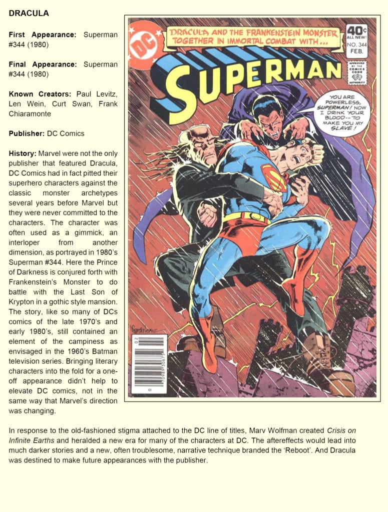
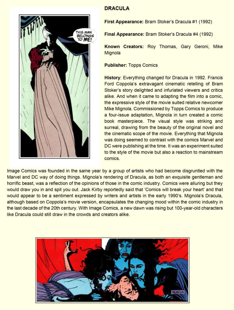
Horror comics icon Mike Mignola and writer Christopher Golden, along with artist Peter Bergting, colorist Michelle Madsen, and letterer Clem Robins bring us another turbulent paranormal tale from the Outerverse with Cojacaru The Skinner #1. Despite being bogged down by needless narration, this is still a sharply written and wickedly fast paced issue with engaging lore, intense and brutal action, and fantastically grim artwork that stands up to the Mignola name.

“Cojacaru the Skinner, the strange and enigmatic bane of Eastern European witches, has been dead many years. But from a bloodied French town in the throes of World War II, a plea for help carries across the winds of time. A desperate band of resistance soldiers and their white witch allies rest their fate in the hands of Cojacaru’s ghost. And when she answers their call, it will be heard near and far.”

Writing & Plot

Mike Mignola and Christopher Golden’s script for “Cojacaru The Skinner” #1 reads and feels much like many other Mignola comics. It’s full of its own lore and storytelling, using both narration and character dialogue to build both the rules of this world and the characters themselves. This shares a universe with Baltimore and Joe Golem, so many of the supernatural elements are already known to readers of this comic, but in true Mignola fashion there can never be enough magic and monsters. The concept of World War II soldiers fighting against Nazi aligned evil witch coven with the help of good witch covens and their ancient allies (as our titular is) is the type of Mignola-style paranormal goodness that I will never tire of.

What does get tiring here though is the unnecessarily bloated narration of the lieutenant of the allied soldiers charged with taking on these 3rd Reich sorceresses. Narration in the form of journal notes is nothing new in comics – especially in Mignola comics. Hell, I even think it works more often than not. However, after reading through these notes numerous times, it becomes clear that they don’t accomplish anything for the story that the artwork doesn’t handle on its own.

Luckily, it only sticks around for the first third or so of the comic, but it’s still a detractor. The script is mostly praiseworthy outside of this, with the stakes and terror being felt from the opening page. The mystery of who Cojacaru is, as well as her arrival on the battlefield, is full of weight and intrigue while not giving away much about the character herself. Outside of the narration issues, this is a wholly solid read and the exact kind of tale you’d expect from a Mignola book.

Art Direction

If a comic is going to have Mike Mignola’s name on the cover, then it has to look the part. Fortunately for Cocjacaru The Skinner #1, artist Peter Bergting is on hand to deliver the exact sort of creepy and unique design shared amongst the other Outerverse and Mignolaverse series. Bergting’s thick, heavy pencils and dense shadows fill out the designs of his characters both human and witch with an unsettling edge that sells this comic’s atmosphere.

His designs for the invading witches are a work of some level of body horror, with their wiry and gaunt designs meshing with their uncanny movements distorted facial features. The architecture of wartime Europe is highly detailed as well, and sets the tone for this comic as a desolate and bombed-out backdrop. Michelle Madsen’s colors work wonders here as well, with the drab color palette coming alive in tandem with Bergting’s pencils.

Her red skies and mottled buildings, as well as her colors on the human characters contrasting with the dead skin of the witches, plants the reader firmly in this comic’s atmosphere. The sudden flashes of magical lightning are a shocking contrast to the decay and death in most of the book, and really sell the power of Cojacaru’s importance and power. Letterer Clem Robins uses the same font found in basically every other Mignola comic, and I wouldn’t have it any other way. The visual work on this issue is up to par with just about every other comic I’ve read with Mignola’s name on the cover.


Cojacaru The Skinner #1 is a fast paced and engaging comic issue, with fantastic visuals and tons of lore to get into. The script may be a bit bogged down by needless narration, but it makes up for it in its pacing and carefully laid world building. The visuals from Peter Bergting and Michelle Madsen are grim, creepy, and brutal in just the way this story and any Mignola comic deserves. Be sure to grab this issue when it hits shelves on 4-21!

Monkeys Fighting Robots Youtube

THE FALCON AND THE WINTER SOLDIER – The Truth | TV Review

The Falcon and the Winter Soldier has reached its penultimate episode. It’s a case of the calm before the storm as the show resolves some of the storylines before the climax.

“The Truth” picks up where “The Whole World is Watching” left off with the new Captain America snapping and killing a man in public. The Falcon and the Winter Soldier have to fight the rage-fuelled super soldier and retrieve the shield from him. With the shield back in their procession, Sam has to consider whether he should become the next Captain America whilst the Flag Smashers prepare for their final move.

One of the biggest criticisms against the show has been its pacing. The later episodes have led to the show slowing to a crawl and “The Truth” was evidence of this. After the initial action scene, the episode focused on Sam’s personal journey. This took Sam to revisit Isaiah and helping his sister repair the family fishing boat. The aim of the episode was to show how Sam comes to a decision to take up the shield after giving it away earlier in the season. It was a shame the episode did it in such an uninteresting way.

The bulk of the episode took place in Sam’s hometown with Sam getting the neighbors to help his sister. The aim of these scenes was meant to show Sam’s normal life as he comes to his decision. But it wasn’t a thrilling way to get there. It wasn’t like Spider-Man 2 where the main character struggled to balance their personal and superhero lives and realize why he needs to take on the superhero mantle. This detour to Louisiana shows that The Falcon and the Winter Soldier didn’t have enough material to justify the six-episode run.

The other aspect of Sam’s choice was what it would mean to African Americans. When Sam visited Isaiah the older man warned that any black man who becomes Captain America would be nothing more than a government stooge. This was due to Isaiah’s experience.  But Sam as Captain America could also be seen as an inspiration for young black people. The episode was tapping into real-world issues with racial issues still being topical in the US and Isaiah did have a heart-breaking story because of the abuses he had suffered. But Isaiah stated that Captain America and the shield was a symbol of oppression which doesn’t work so well in the context of the MCU because Steve Rogers stood for real American values of democracy, freedom, and liberty. He rebelled against his own government to make sure those values were upheld.

The aim of the series has been to get Sam to don the shield and show two different versions of Captain America. Jack Walker’s version of Captain America was meant to be a personification of the worst aspect of America by being a government agent who only knows how to use force and had a ‘ends justify the means’ approach. He was more like The Comedian in Watchmen. Whilst Sam was more in the model of Steve Rogers. In the episode Sam does practice with the shield which led to a montage and this reminded me of the ‘Montage’ song from South Park.

The Falcon and the Winter Soldier did introduce story ideas but some still felt unresolved. Isaiah’s role in the series felt more like a lingering tread than actually servicing the plot and the MCU was leaving open the idea that Bucky could be forced back to the dark side.

This episode introduced Julia Louis-Dreyfus as Valentina Allegra de Fontaine. She only appeared for one scene, but she was a dominating force for it. It goes to show much more of a screen presence the VEEP star is. It leads to the question what is her role going to be in the MCU? She has the potential to be a wildcard like Kathryn Hahn as Agatha Harkness.

Despite its title, “The Truth” didn’t actually reveal any truth. This episode was a case of killing time before the final showdown.

Monkeys Fighting Robots Youtube

Comics Studies: DRACULA And The Changing Face Of The Comic Industry

“His face was a strong – a very strong – aquiline, with high bridge of the thin nose and peculiarly arched nostrils; with lofty domed forehead, and hair growing scantily round the temples, but profusely elsewhere. His eyebrows were very massive, almost meeting over the nose, and with bushy hair that seemed to curl in its own profusion. The mouth, so far as I could see it under the heavy moustache, was fixed and rather cruel-looking, with peculiarly sharp white teeth; these protruded over the lips, whose remarkable ruddiness showed astonishing vitality in a man of his years. For the rest, his ears were pale, and at the tops extremely pointed. The chin was broad and strong, and the cheeks firm though thin. The general effect was one of extraordinary pallor.”

(Bram, Stoker. Dracula Oxford : Oxford University Press, 2011)

The range of representations of Dracula: Prince of Darkness throughout comic book history is not just at the mercy of the creators’ whim but, in essence, reflects the trends of the larger industry. As the moods of the readers changed, swayed from one genre to another, the adaptation of a classic like Dracula moved with the audience. This is a phenomenon that can be seen in cinema as well as on the pages of comic books. From metaphor to monster and back again, Dracula embraces his historic legends and modern sensibilities in equal measure.

The following is an extract from The (Un)Official Handbook of the Universal Monster* that tracks the Prince of Darkness’ comic book legacy:

DraculaDraculaDraculaDracula

Conclusion

In the last 30 years, comics have featured a string of vampires. Whether in the mainstream or in self published work, the Vampire is still an allure for creators who want to use violence and bloodlust as a metaphor for elements of modern life. And Dracula often features as a character within these stories as the epitome of evil, love, or other emotional allegory. Whether this is in Buffy the Vampire Slayer, Marvel’s superhero comics, or one-shots like Dracula Motherf**cker, Alex De Campi’s psychedelic retelling published by Image Comics, the character still has the ability to be adapted to fit the need of the story.

With each new adaptation the character is changed with different aspects seeping into the audience’s subconscious, growing the legend. It is ironic that elements of Francis Ford Coppola’s movie that were ridiculed, such as Dracula walking during daylight, were taken directly from the original novel, however the strength of the movie and comic adaptations over the years have altered the audience’s perception of what the character is and can do. Vampires are instantly killed by sunlight. This has become the accepted truth.

Living in the shadows and on the fringes of popular culture, Dracula, as a character in comics, has never reached the literary heights of Stoker’s original striking figure. Used as a foil for modern superheroes to emphasize their modernity, or as a way to interject an inflated sense of importance into a horror comic, the Prince of Darkness is a fan favourite colloquialism for the horror genre. His appearances over the years have ranged from a hunched, goblin-esq creature to a sophisticated gentleman, but none of his visual representations have lifted him from the gutter. And maybe this is why Dracula will always have a home in comics, because Comics (with a capital C) is also struggling with this breakthrough from the gutter into the light; from mere entertainment into high art.


*A totally fictitious guide

Monkeys Fighting Robots Youtube

Cullen Bunn’s EDEN – Read The First Five Pages Of The Horror/Romance

Cullen Bunn's EDEN - Read The First Five Pages Of The Horror/Romance

Stop what you are doing and check out this exclusive preview of EDEN from AfterShock Comics! The prestige format one-shot is written by Cullen Bunn, with art by Dalibor Talajić, colorwork by Valentina Briški, Marshall Dillon letters the issue, and Dalibor Talajić created the cover. Incentive cover by Tony Harris. The book hits your local comic book shop on May 5.

About EDEN:
Tattoo artist Niles lives his life in a kind of daze. Minute after minute, he muddles through the repetitive moments of his job, his life, and his guilt. All that changes when Eden walks through the doors of the tattoo shop. She’s looking for something…different…and she finds it with Niles. But Eden is a woman surrounded by deep mysteries…not the least of which is how and why her new tattoos vanish after only a few days. As Niles learns more about Eden, he is driven to fathomless depths of both love and horror. Be prepared to accompany the notions of love, creation, and heartbreak to terrifying places.

Enjoy the preview below.

Monkeys Fighting Robots Youtube

AMAZING SPIDER-MAN #64 – Read The First Four Pages!

AMAZING SPIDER-MAN #64 - Read The First Four Pages!

Listen up, True Believers! AMAZING SPIDER-MAN #64 hits your local comic book store next week, but thanks to Marvel Comics, Monkeys Fighting Robots has an exclusive preview for our readers.

“King’s Ransom Part Two” is written by Nick Spencer. With sick artwork by Federico Vicentini, Alex Sinclair drops the colors. You will read Joe Caramagna’s letter work, and Mark Bagley created the cover.


About the book:
Tombstone and Robbie are at each other’s throats, and much of Spider-Man’s life is collateral damage. Does this have anything to do with Mayor Kingpin’s moves of late? Short answer – yes.


Enjoy the preview below.

Monkeys Fighting Robots Youtube

Review: BUFFY THE VAMPIRE SLAYER #24—Into the Darkness

Main Cover

Until now, the Scooby Gang never thought that the greatest force they’d have to face would come from their own ranks. In Buffy the Vampire Slayer #24the Gang takes on a darkness out of their control. This issue is written and illustrated by long-time contributors Jeremy Lambert and Ramon Bachs, respectively. Also returning are colorist Raul Angulo and letterer Ed Dukeshire.

#24 picks up right where the previous issue left off: the Scooby Gang all engaged in a battle against two of their own. While Buffy’s knocked out on the ground of Sunnydale High, new slayer Faith kills a beloved member of the Scooby Gang in self-defense. Or did she?

With the help of a magic portal, the Gang fall into the astral realm, hoping to save the soul of their friend. Robin and Faith are the only two left behind. And so it seems we’re heading into a new chapter: out of the Ring of Fire and into the darkness.

Not With A Bang…

Given the climactic nature of the issue, Lambert uses minimal dialogue in service to the action. Nonetheless, what little is said packs an emotional punch. No panel feels out of place either, as Lambert gives Bachs ample space to hone in on character expressions. The reader sees each character’s pain, blood and tears.

Buffy
BUFFY WORRIES FOR XANDER.

Another noteworthy aspect of Lambert’s writing is that he’s actually adapting a plot point from the TV series. Without getting into spoilers, the character who dies has a similar arc to one of Buffy’s love interests in the show. Yes, some might find the use of a familiar storyline frustrating or limiting to the comic book series. But Lambert changes enough character motivations and emotional beats for this to stand on its own.

Moreover, Bachs’ extra scratchy cross-hatching and deep black shadows cement the tragic mood of the whole issue. Each action is also accented with lines that match the scratches on Buffy’s body as she takes a hit from Dark Willow. This dramatic choice both contrasts and complements Bachs’ typical Archie-meets-pop-art style. Bachs’ harsh lines and shadows, against cartoonish character designs, represent the impact of adult tragedy on such a young group.

But A Whisper

Meanwhile, Angulo’s contrasting cold blue and grey against warm purple and red emphasize the Gang’s feelings of shock and sadness. The purple also represents Willow’s immense power and dominance over the situation. Despite the utter tragedy on display, the colors and illustration are aesthetically pleasing as much as they are affecting.

Dukeshire’s lettering parallels Lambert’s minimal dialogue. All the dialogue is in small font, as if the character’s are whispering the entire time. Most of the bubbles are also centralized, which allows room for the action to speak for itself. Unique to this issue, Dukeshire does not include any sound effects, another choice that makes space for action. Thus, each panel flows smoothly from one intensely emotional beat to the next.


Thanks to its emotionality and artistic agility, Buffy the Vampire Slayer #24 might be my favorite issue so far. Wherever it leads them, I’m ready to follow the Scooby Gang down this dark path.

Monkeys Fighting Robots Youtube

Review JENNY ZERO #1: The Life And Times Of A Kaiju Fighting Burnout

Jenny Zero #1 Cover

Jenny Zero #1 from Dark Horse Comics comes to your local comic shop on May 5. Co-writer/letterer Dave Dwonch and co-writer Brockton McKinney depict a hard-drinking kaiju fighter in a parody of Ultraman. The art by Magenta King looks absolutely hallucinogenic with coloring by Megan Huang adding to the surrealism.

Jenny Zero #1: Multiple Directions

Dwonch and McKinney introduce the reader to Jenny Tetsuo, a directionless alcoholic with a lot of troubles. Jenny feels human in how she portrays an adult disconnected from everything that once gave her life meaning. With her father dead and the job of an Ultraman style science officer she inherits from him ringing hollow, Jenny tries to drown herself out in hedonism. By the time she rolls into action, Jenny is half-drunk and playing music while shooting monsters dead. While capable, the fact that Jenny is back on the job despite psychological problems gives readers an idea of her workplace relationship. In short, rather exploitive and unwilling to invest in alternatives.

Take A Trip!

Between Magenta King’s illustrations and Huang’s colors, Jenny Zero #1 looks like the reader is inside Jenny’s high. The fact that Jenny’s equipment grotesquely attaches to her makes the reader question if they’re even looking at the real world. In a way, the drugs Jenny takes before putting her gun on is for the reader to suspend their disbelief. That is after they see Dwonch’s lettering as it expresses the feeling of waking up to a radio alarm clock announcement in sound effect form.

For Jenny, this kind of life is as mundane as her civilian life, where she goes to clubs. The only real difference comes from how the colors of her surroundings evoke feelings. At the club are a myriad of cool colors for comfort. It’s why Jenny’s room has similar if plainer colors to rest after partying in safety. Unlike the bright orange and yellow colors accompanying kaiju attacks.

Jenny Zero #1: First Shot To A Wild Ride

Jenny Zero #1 hooks readers in with an all too human story about workplace troubles. Because with a job as stressful as Jenny’s, looking at it while intoxicated might make it easier.

What do you all think? Does the activities of Ultraman’s science teams look too absurd for a mundane person? Do you identify with somebody who doesn’t enjoy her job? Leave your thoughts in the comments.

Monkeys Fighting Robots Youtube

Review: Nixon, Joplin, and Demon Hyenas in PROCTOR VALLEY ROAD #2

From comics icon Grant Morrison and writer Alex Child, with artist Naomi Franquiz and colorist Tamra Bonvillain, comes the second chapter of a politically-tuned and teen rebellion-driven supernatural horror-comedy. “Proctor Valley Road” #2 is a knife-sharp and wickedly funny comic full of period-accurate political focuses and a group of kick-ass teenage girls who are all their own unique characters. With a killer script and stellar visuals, this 2nd chapter has be hooked on this new series.

“August, Rylee, Cora & Jennie are the prime suspects in the disappearance of the missing boys, but the authorities have no idea what monsters roam the Proctor Valley Road.  As the town – and even their families – closes in on the girls, August makes a choice to visit that haunted road one last time.  And even if she survives, an even greater threat may have its eyes on these four friends..”

Writing & Plot

What makes Grant Morrison and Alex Childs’s script for “Proctor Valley Road” #2 so much fun is the mixture of realistic-feeling teenage characters enduring the turbulence of the late 60’s/early 70’s with the mixture of some good ol’ supernatural horror. The main cast consisting of high school girls August, Rylee, Cora, and Jennie are all written spectacularly well, with each of them carrying a completely different personality and set of interests while still making it apparent that their friendship works. Much like the comic’s obvious influences (The Goonies, Stranger Things, etc.), the group are all social outcasts with individually turbulent home lives. Their families don’t really know how to handle them, so they often find their own ways through living in their town – which is what lands them in trouble in the first place. The angle at which the socio-political climate is addressed as well is clever. From the perspectives of the teens, the issues being discussed here are obviously relevant to the time (the Vietnam war, lingering post-segregation racism), they are handles in such a way that makes them feel relevant to current issues without beating you over the head. The horror elements take a bit of a back seat to the interpersonal and political goings-on in this comic, but there’s a cleverness even to that. The story is structured like a horror film from this time period, with suspenseful bits leading up to the big horrifying reveal (there are some horrifying reveals here but not *the* reveal). This allows the characters and world to take shape and flourish while the supernatural threat takes shape in the background. The other big clever bit to the comic’s backseat approach to the horror: the protagonists are basically kids. The weight of mortality and the incursion of reason that adults have hasn’t really hit these girls yet, which is why when the big spooky stuff comes along it’s a big deal – but it isn’t exactly earth-shattering. This is a brilliant script that makes me immensely excited to see where this comic takes me.

Art Direction

I was a huge fan of Naomi Franquiz’s artwork when I first happened upon it in Tales From Harrow County, so I knew I was in for another treat upon seeing more of her work on “Proctor Valley Road” #2. Her eye for character animation and detail makes this cast of characters immediately likeable and relatable to the reader, with their personalities painted across their faces in each and every panel. Their attire is smartly put together too, as it’s attuned to their personalities as well as their age. Franquiz builds a fantastic view of a quiet desert town in 60’s/70’s California as well; the sand-worn houses and period correct cars all function as dead giveaways to the story’s setting but manage not to date it in any negative fashion. The colors from Tamra Bonvillain are the real key to this book’s aesthetic though. The mottled reds of the desert sun that paints the town during the day fades into a headlight and bonfire colored night in the sandy desert, dotted by strikingly eerie neons when the spooky stuff starts. The panel direction isn’t anything particularly outstanding, mostly made up of 3 to 4 large panels per page in a manner that quickly progresses the story. This is a sensible choice though, as the story is so focused on the interactions of multiple characters and these large panels fit multiple people and their body language efficiently. The letters from Jim Campbell are widely fluid and dynamic, often changing size and clarity seamlessly to denote the tone or volume of a character’s words. This comic has the perfect aesthetic and design for the story being told here.

“Proctor Valley Road” #2 is a complete blast of an adolescent horror comic. Morrison and Child’s script is packed with personality, cultural insight, and cleverly laid building blocks getting to the horror elements in the story. The visuals from Franquiz and Bonvillain are a mixture of lively characterization and eerie environmental design. This issue has sold me on wherever this comic is headed, so be sure to grab a copy when it hits shelves on 4-14!


Monkeys Fighting Robots Youtube

Review: TEENAGE MUTANT NINJA TURTLES: JENNIKA II #6 — The Conclusion Of Jenny’s Redemption Arc

TEENAGE MUTANT NINJA TURTLES: JENNIKA II #6, available on Wednesday, April 13th, is the concluding issue of Ronda Pattion, Jodie Nishijima, and Shawn Lee’s story of Jennika’s personal life. Readers have followed the ninja through her personal transformation while interacting with fellow people in Mutant Town. And things have been tough. But this issue concludes one of the most impactful redemption arcs in a TMNT series.

Story

Last issue, Jennika was captured by Lucia Rosetti and her henchmen after refusing to serve as her personal assassin. The nefarious gazelle isn’t ready to give up, opting to further torture the ninja by playing on her past life as a killer.

Refusing to bend to Rosetti’s will, Jennika invokes the names of her found family, reminding the crime lord what a powerful force they are. But the villain’s cruelty knows no bounds. Readers will be shocked to find that Rosetti stoops to harming her own child in order to reach her goals.

Pattison’s narrative accomplishes two important tasks—it allows Jennika to confront her past life as a criminal and forgive herself for those very actions. We see the culmination of an issues-long transformation of the ninja as she seeks to save a boy whose life hangs in the balance.

Artwork

This issue’s illustrations fit perfectly with the story’s mob movie themes. Nishijima’s illustrations, combined with Pattison’s coloring, set Jennika and Junior’s forms against dark shadows to represent her assailants’ forms. Readers can feel the pressures faced by the duo, especially the shock Rossetti’s attack. Lee’s lettering also worked well with these depictions of our protagonists by increasing font sizes for their exclamations.


Conclusion

TEENAGE MUTANT NINJA TURTLES: JENNIKA II #6 wraps up this six-part series with the perfect balance of heart, redemption, and action. We hope to see a lot more of Jennika in future stories.

Were you happy with the conclusion to this series? Let us know in the comments below!

Monkeys Fighting Robots Youtube

Review: HOME #1 Unveils The Harsh Realities Of Refugee Life

HOME #1, available in comic book stores on Wednesday, April 14th, is the first installment of a brilliant new series honing in on the injustices facing immigrants. Readers will join in the travels of people fleeing for their lives. The American Dream purports to offer opportunity for everyone, but this groundbreaking issue reveals a harsh truth most of us already know: some people are barred from our country’s promises.

Story

The story introduces us to an unnamed mother and child making their way to what’s presumed to be the United States. We see them catching bus rides and sleeping outside in the hopes of finding a better life.

Rather than detailing the characters’ dialogue, the story relays what appears to be a speech from an official of the former President’s administration. The language is thoroughly xenophobic, filled with a hatred and fear of immigrants. This contrasts with the images of the refugees simply seeking safety.

The most scathing indictment of the administration’s attitude toward immigrants and refugees comes from the former President’s words himself.

The family eventually arrives at the border to the U.S. where they prepare to meet with border police officers. What ensues is a horrific process of separation that will change the young family’s life forever.

Julio Anta’s powerful story weaves together elements of hope and terrible circumstances. His ability to depict the harsh realities faced by immigrants is eye-opening—even for those who claim they’re aware of these human rights violations.

Artwork

The illustrations within this issue tell a story of hope and heartbreak—arguably more so than the written narrative. Anna Wieszczyk’s penciling and ink work detail the traumatic experiences of the protagonists. Fleshed out with Bryan Valenza’s coloring, the reader sees the red flushes on their weary faces to represent the hardships experienced. In addition, Hassan Otsmane-Elhaou’s lettering does a brilliant job of differentiating between the Spanish and English dialogue using alternating red and black fonts.

Conclusion

HOME #1 is the story we need right now. It’s great to see a tale told from a marginalized group’s perspective in the comic book medium.

Do you think more real world traumatic events will be featured in subsequent issues? Let us know in the comments below!

Monkeys Fighting Robots Youtube