DRACULA, MOTHERF**KER!, available now from Image Comics, is a reinvention of the Dracula story that pays homage to the strongest examples of 70’s exploitation horror. Written by Alex de Campi and illustrated by Erica Henderson, this graphic novel has a lot to like for horror fans if you can get past some glaring rough spots.
Cover Art
Henderson’s cover is a pristine encapsulation of the story with a perfect tone to match the 1974 setting. The combination of colors is sickeningly garish, but they flow in mellow strokes and curves to create a fever dream of composition for all the central characters. It’s loud and tacky but smooth and dreamy all at the same time, and that pretty much sums up the 70’s aesthetic.

Writing
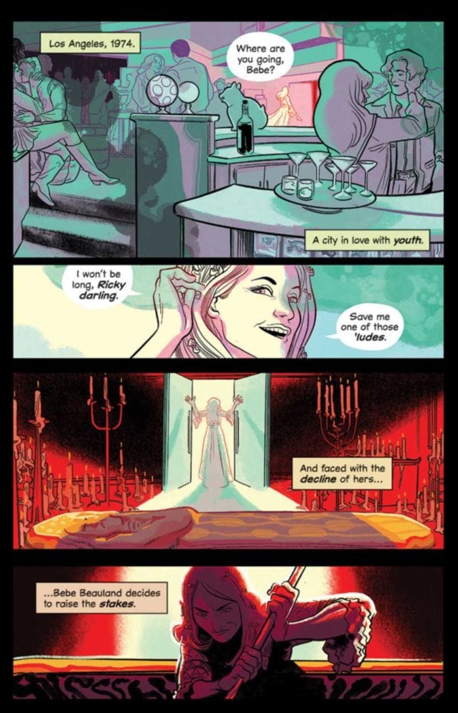
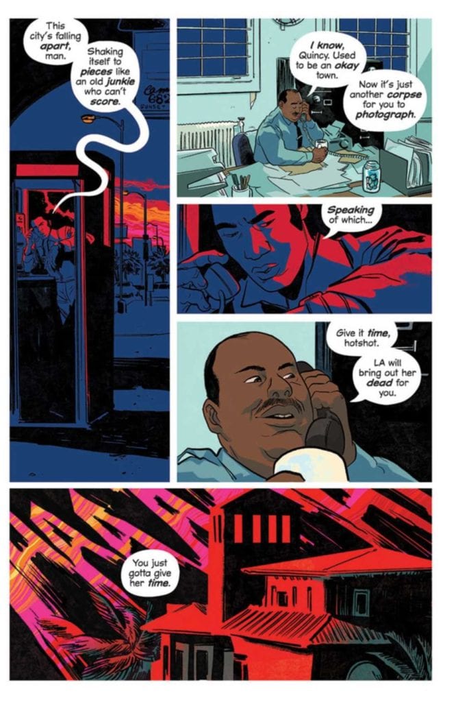
I really, REALLY liked the setup of this alternate version of Dracula. In 19th Century Europe, Dracula’s brides turn on him and imprison him “forever.” In 1974, an aging Hollywood starlet freed Dracula intending to petition Dracula to make her young and beautiful “forever.” A nighttime paparazzo photographs the bodies as they begin to pile up before he notices he’s attracted the attention of the monster. The pieces seem familiar, but nothing like this setup exists, and high praise goes to de Campi for dreaming it up.
That said, this is a frustrating book. The story setup is there. The 70’s setting is there. The characters, beyond the titular Count, are period-accurate and interesting. More importantly, giving the brides some agency in the Dracula story is something I’ve never seen before. It gives the legend a completely new layer of possibilities that I quite liked. What detracts from the greatness of this book are the plot holes, very big plot holes. This type of book feels good in the first reading and overall execution, but once you start to think about things that don’t make sense, the whole thing unravels.
For example, if the brides could incapacitate and imprison Dracula, why not simply destroy him instead of burying him in some undisclosed location? How did the aging starlet know Dracula was real and where to find him? If the brides knew about the starlet and her location, why not simply stop her from freeing the Count?
And the biggest question (less plot hole and more unexplained plot point) after reading the book through twice – why was Dracula so interested in going to extreme lengths to kill the paparazzo that posed absolutely no threat? I get the impression that if de Campi had added more pages to address these holes (and a few more not mentioned) this would have been a solid entry in the Dracula library. This is a big story, and by trying to tell too much too fast, it winds up feeling incomplete.
Pencils/Inks
Henderson’s artwork for this book is, generally, very good. It’s a treat to follow cars along the California coast with neon-soaked, streaking headlights on their way to crime scenes blown out in ambulance light reds. There’s a Hitchcockian feel to the panel work that would make Robert Burks (Hitchcock’s go-to cinematographer) proud. The setting and surroundings’ entire design is spot on for a stylistic impression of 1974, rather than a realistic recreation, and that was a great design choice.
By far, the artistic highlight is Henderson’s rendering of Dracula. Here, Dracula is no dusty, European aristocrat but a demonic force. He’s something akin to Lord Aku from Samurai Jack but with oodles of predatory malevolence (and many more eyes). He’s depicted as a true monster in every sense, and it makes him much scarier than your standard Count with fangs.
Where Henderson’s art doesn’t quite work is in the featureless character designs, excluding Dracula. The aging starlet is supposed to be “aging,” but there’s not a blemish or wrinkle on her to make you believe it. There are so many women in this book, but I constantly struggled to keep track of which woman was because they lack any distinguishing features and are never, except for the starlet, named. It would have served the book more to add some distinction to the characters’ look, especially the women.
Coloring
Again, frustrating. I love the neon-noir palette and Henderson’s choices in shading different settings in different colors to guide the story’s direction. In keeping with the 70’s time frame, all the right Day-Glo splashes are present, but the panels were never washed out.
The frustration comes in with the coloring and shading of the characters, particularly with Ateera. There are some scenes where the panel filter is so strong, coupled with the lack of facial definition, that it was difficult to tell which character was in panel. At one point, I thought a fourth bride had entered the story because the lighting on Ateera’s face was so extreme that she appeared as a completely different character. The coloring palette selection is great, and its application on the settings is excellent, but some colors were simply overdone.
Lettering
This is not good lettering. This is GREAT lettering.
Henderson uses a mix of fonts and applications to create a collage of visually interesting narration. The highlight, again, is the depiction of Dracula’s voice. The first time you read (hear?) it, the voice transmits as something speaking with old, malignant authority. Even Dracula’s voice feels inhuman, consistent with his outstanding design.
Conclusion
DRACULA, MOTHERF**KER!, available now from Image Comics, hits all the right notes for fans of 70’s horror, but incomplete story structure and uneven art keep it from being great. If you can overlook the rough spots, you’ll enjoy it. This book is a guarded recommendation.