Home Blog Page 164

Review: THE MANY DEATHS OF LAILA STARR #1 is a Trope-Busting Wonder of Storytelling

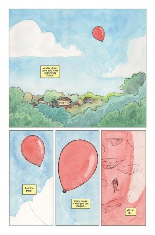
The Many Deaths of Laila Starr No. 1 is the first in a five-issue miniseries from Boom! Studios, written by Ram V and drawn by Filipe Andrade, that provides a trope-busting look at reincarnation, thanks to the goddess of death. With a vibe that calls back to one of my favorite novels, Good Omens by Neil Gaiman and Terry Pratchett, Laila Starr combines dry wit and the absurd with a touch of humanity and the fantastic.

On the busy streets of Mumbai at rush hour, the story begins with a woman in labor, along with her harried husband, being rushed to the hospital with all the unintentional real-life hilarity accompanying such events. While the expectant parents are weaving through the traffic of India’s largest city, our titular Ms. Starr is at a party, filled with the kind of people Laila clearly finds uninteresting.

(Read the room, Dhiraj.)

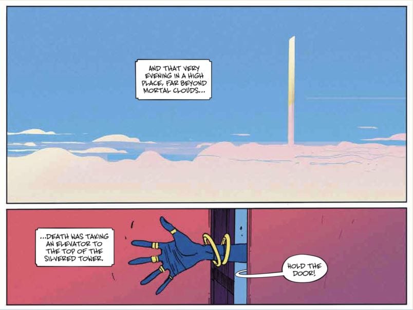
As all this is happening upon the mortal plane, the corporate office for what appears to be the Hindu pantheon of gods is bustling. The Goddess of Death, Kali (not named, but the blue skins, six arms, and job description seems to confirm her identity), is rushing to the office of the three-faced “purveyor of all goodness” who can be assumed to be Brahma the Creator. Brahma is the nervous bearer of bad news, as it’s revealed the child rushing to be born in a Mumbai cab eventually discovers the key to immortality, removing death as a threat to mortals.

And also removing Death from a job.

After some dealings and machinations, she manages to place herself directly into the lives of the infant and Laila. After a twist both hilarious and disturbing, Death is forced to rework her plans. The goal is to get her job back. How she intends to do it, though; that’s the rub.

(Just an example of how even the dream jobs have negatives.)

Ram V’s story is quirky in that way real life feels quirky sometimes. There are areas where he could have fallen within an awaiting trope, be it reincarnation, the meddling of gods in the affairs of humans, trying to change the future, etc. Ram expertly moved past them all by avoiding the well-known and well-used Greek and Norse gods and instead, focusing on Hindu mythology. The principals of the pantheon are treated with respect, while providing them with 21st century anxiety and neurosis.

The characters feel real. We understand Laila’s ennui at the party, we understand Death’s shock at being fired at the job she was literally created to do. The greatest villains are the ones who create conflict within us. Thanos, for his seemingly murderous plans, believed he was on the righteous path. Darth Vader, twisted and evil, became that way because of his very-human flaws. Death’s hesitation at a crucial moment creates a moment of humanity, one that follows her throughout the series, creating conflict for the reader. Does Death overcome her need for revenge? How does the baby fit into her plans? These and more questions, all born from that moment of doubt.

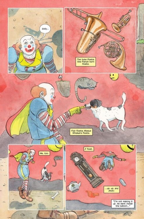
Andrade’s art is perfect for this story. This isn’t a series needing the hyper-realism of Jim Lee and the like. So many of the emotions exhibited by the story’s characters are abstract and are reflected by the art. The overblown pain and mystery of childbirth is etched on the faces of the soon-to-be parents. How do you properly convey panic from a god forced to give the walking papers to another, very angry god? Andrade captures it with both humor and a pen capable of adding the little touches that make the scene believable.

The book’s colors, featuring assistance from Ines Amaro, blast off the page. A seeming car crash of dark shades, pastels, and heavy inks, it works splendidly within the story, the atmosphere tinted by the feelings emoted by Ram’s chracters. Deron Bennett of AndWorld Designs provided the words and his jaunty slash marks fit the story, adding to the mixture of the surreal, the paranormal, and the day-to-day. A great letterer does their job without distracting, but a great letterer also knows when it’s time to add flair and a little panache. This is one of those times and it helped tell the story beautifully.

The Many Deaths of Laila Starr was sold out before it shipped and is already being reprinted, for good reason. This book feels like one of those special gifts, the kind of comic sitting outside the norms of the genre while reminding us why we love comics in the first place.

Monkeys Fighting Robots Youtube

Review: DETECTIVE COMICS #1035 is the Start of a Whole New World

Detective Comics Tamaki DC Comics

Detective Comics #1034 was brilliant, but it was also a rather straightforward issue. We met some new characters, were introduced to Bruce’s new norm, and were left with a final cliffhanger. But DC Comic’s Detective Comics #1035 is a different story. It takes all of the same characters we saw in the previous issue and shows that there’s a life to each of them. Writer Mariko Tamaki, artist Dan Mora, colorist Jordie Bellaire, and letterer Aditya Bidikar aren’t just writing a story, they’re building a world.

Detective Comics Tamaki DC Comics

Writing

In Detective Comics #1035, we see the basic premise of Tamaki’s run begin to fracture into more threads. It’s no longer one story, but the start of many. With the inciting incident of Sarah Worth’s murder, Tamaki brings in all kinds of new plotlines. Tamaki also promises, for each plotline we thought we knew, that there is something deeper. We meet Mr. Worth, Sarah’s father. He immediately seems like a man with a dark past, who now has a huge grudge. We, as readers, also seem to know who killed Sarah. At least, we have some strong suspicions. But even in that, Tamaki has us drawn deeper into guessing at the reasons why. And with one final cliffhanger, everything we know gets thrown into question. Tamaki is brilliantly setting up question after question, building up the mystery of what’s turning into a fantastic crime-thriller.

Art

Mora’s pacing is magnificent. His page layouts often involve overlapping panels, moments that seem to happen all at once. But in one particular page, he slows everything down. We follow Neil, a mysterious new character who is also our prime suspect. On one page, he’s speaking to the mayor, getting out some pills. The page is crisp, clean, and completely traditional: 5 panels with a thin, white gutter between each. In the context of the rest of this issue, the page is almost boring. But then Neil drops his pills on the floor, and all Hell breaks loose. The next page shows panels twisting and tumbling down the page, some morphing into a completely different shape, with characters barely inside them. Mora sets this up by having a normal, traditional page ahead of it: the calm before the storm. For that reason, this wild page packs so much punch.

Coloring

Bellaire’s coloring, as is common in Batman comics, is quite muted in this issue. We see Batman running through sewers or people having board meetings in dimly lit rooms. Everyone is either shown in the dark, or the colors of their face are muddled by the lights of screens and billboards. But there’s one scene where the coloring is warm and full of flesh tones. That’s the scene of Mr. Worth talking about the death of his daughter. This is fantastic because it makes Mr. Worth’s pain feel real and human. He’s just himself in that moment. There’s no façade, no putting on of airs to the scene. It stops the reader because it stands out. We can’t help but feel and connect to Mr. Worth’s pain, a colorful moment in a bleak world, even if feeling his pain is hard to do. It’s a fantastic choice that forces the reader to not just read this comic, but to feel it too.

Detective Comics Tamaki DC Comics

Lettering

Bidikar’s lettering is always fun to read. There are brilliant little moments, like a bullet speeding through the noise it’s making, or the lettering of a “WHIIIIIIP” noise actually whipping around on the page. But Bidikar also underplays a lot of moments. They don’t overdo sound effects or dialogue, so that they can pick their big moments carefully. And their big moment in this issue is the same as Bellaire’s. It’s Mr. Worth’s dialogue that jumps off the page. “My daughter is gone. And nothing is right until I have justice.” The lettering is huge, scrambled, and desperate. “Gone” is written in larger font to emphasize it, while “justice” is written in giant, red block letters. Mr. Worth is the new driving force of this series and Bidikar won’t let us miss why he’s shown up.


Tamaki, Mora, Bellaire, and Bidikar are doing beautiful work. They’re showing us that every character they’re introducing is there for a reason. And as we learn about their lives, the plot continues to spread out into this vast world they’re creating. Pick up Detective Comics #1035, out from DC Comics April 27th, at a comic shop near you!

Monkeys Fighting Robots Youtube

Read The First 5 Pages of SEVEN SECRETS #8 by Tom Taylor & Daniele Di Nicuolo

Exclusive First Look at SEVEN SECRETS #8

SEVEN SECRETS #8 hist your local comic book shop on May 12, but thanks to BOOM! Studios, Monkeys Fighting Robots has the first five pages for our readers. The book is written by Tom Taylor, with artist Daniele Di Nicuolo, colorist Walter Baiamonte, and letterer Ed Dukeshire.

About the issue:
The Order has managed to find their way through the land of Faerie, but danger awaits them on the other side. After experiencing a devastating loss of friends and a Secret, can Caspar continue to keep his vow as a Holder to protect the Secrets before all else?

SEVEN SECRETS #8 features main cover art by series artist Daniele di Nicuolo and variant cover art by acclaimed artists Vincenzo Riccardi and Miguel Mercado.

Enjoy the preview below.

Monkeys Fighting Robots Youtube

Review: RECKLESS: FRIEND OF THE DEVIL and Having No Home

Reckless Brubaker Image Comics

Welcome back to the world of Reckless. Writer Ed Brubaker, artist and letterer Sean Phillips, and colorist Jacob Phillips’ second installment in their Reckless series, Friend of the Devil, is as fantastic as their first.

Writing

Brubaker didn’t have a home growing up. Well, he did. But his afterword in this graphic novel describes his upbringing as a little different from most people’s. He was a military brat, which meant he wasn’t in one place for very long. Growing up all over the world can make you feel all sorts of ways. You can feel like you don’t have a home, because you’ve never been anywhere long enough to really connect to it. Sometimes, people look at you and think you’re just the same as them. You look like them, you must be like them. But under the skin, you feel totally different. Other times, you might live somewhere where you stick out like a sore thumb. But beneath it all, whether you look like you’re from that place or not, it’s the closest thing you have to a home.

Brubaker shows us both of these extremes in Friend of the Devil. Ethan Reckless looks just like everybody else, but he isn’t even at home in his own skin, let alone his time or place. Linh, the woman Reckless meets in this chapter, is a Vietnamese immigrant. Reckless assumes a couple things about how she would have felt growing up in America. But it turns out he’s wrong, she feels connected to where she lives. She’s as American as anyone else. Brubaker sets Reckless’ narrations in the future. It’s Ethan looking back on events. It makes him feel disconnected from the now, dreaming of the past just like he’s doing in his own narration. And Linh avoids talking about her past at all. Her identity is a touchy subject. It’s with this simple narrative distancing and omissions of backstory that Brubaker helps us to see the DNA of these characters.

Reckless Brubaker Image Comics

Art

Sean Phillips pulls back on the details of a lot of his settings. He focuses us in on the characters and the action, the driving forces of the plot. Even some of the more detailed background have a sense of repetition to them: booths in a diner, chairs in a theatre. But all the settings that feel particularly detailed are nostalgic. At one point, Reckless is shown into a room with a bunch of old movie reels. We can see details on the posters, the rows and rows of reels, each individually drawn. When Reckless interviews someone and they talk about an old cult, we see the 70’s in all of its glory. People crowd the sidewalks, the writing on flyers being handed out is visible, and you can see cars driving through the streets. Phillips shows us how Reckless feels more welcomed in the past than in the present.

Coloring

This whole graphic novel is mostly colored in blues, yellows and pinks. Jacob Phillips uses yellow to show the bright days in LA. But it also washes everything out a little. The sun gives everything a similar hue. At night, the scenes look intoxicating and bright blue. Phillips connects us to Reckless’ loneliness in a way that feels frighteningly comfortable. It’s as though this blue feeling that Reckless gets at night is familiar. He’s lived his life alone, this is how he operates. When Reckless and Linh go for nighttime strolls on the beach, we see how at home she is in his blueness. Their melancholy is complementary. Phillips also shows us scenes of the 70’s in bright, neon pink. Phillips’ coloring makes everything feel like one big drug trip. We can sense Reckless’ longing for those times in how he envisions those days, even if he seems rather stoic at the moment.

Reckless Brubaker Image Comics

Lettering

Sean Phillips’ lettering is pretty straightforward. But it’s in the small things that we see his brilliance. When one of the bad guys sees Reckless coming at him, he says “Fuck.” It’s a large word balloon with tiny font at its center. We can hear the character, almost too scared to speak. Later, as one of the others is monologuing at Reckless, the captions begin to overlap his dialogue. We see that Reckless isn’t listening anymore. He’s lost in his own thoughts. At one point, we see Reckless get confused. “??” is written into his word balloon. The font for the question marks looks a little odd, when placed on their own. At first glance, they look like Z’s. But that’s a small, easy to miss problem in what is an otherwise fantastic work of lettering.


Reckless: Friend of the Devil is a beautiful graphic novel. The masters of crime comics, Ed Brubaker, Sean Phillips, and Jacob Phillips, are showing that they’ve still got it. Pick it up, out from Image Comics on April 28th, at a comic shop near you!

Monkeys Fighting Robots Youtube

THE FALCON AND THE WINTER SOLDIER – One World, One People | TV Review

The Falcon and The Winter Soldier has come to its conclusion with an action-packed finale.

The Flag Smashers have attacked the GRC meeting in New York to stop their vote on the forced relocation. This brings Sam and Bucky into action with Sam now wearing a new costume and in procession with Captain America’s shield.

“One World, One People” was like the season finale of WandaVision where all the characters and their plotlines were tied together. To put it another way, it was the final act of a Marvel movie. It was fun to see Sam finally become the new Captain America. He got to wear a new costume and he was able to combine his flight suit and the shield. It was triumphant to see Sam fly in, smash through a window and use the shield.

Sam had the best action scenes in the episode, like when he had to fight Karli. The rest of the action sequences were less impressive. It’s made even worse when you consider the series having some strong fight and action sequences in the previous episodes. The worst part of “One World, One People’s” action scenes was when Bucky and John Walker were fighting the Flag Smashers on the streets and the editing was so choppy it became hard to follow the action.

As The Falcon and The Winter Soldier progressed it had become more and more frustrating. The series had issues with its characterization, dialogue, lingering plotlines, and political messaging and the finale had all of these. John Walker has been an inconsistent character. Initially he was portrayed sympathetically because he had the weight of being Captain America on his shoulders and then showing his temper in later episodes. The final episode had Walker going on a vengeance mission against Karli before having a sudden redemption. The expository dialogue came when the identity of the Power Broker was revealed and it was incredibly chunky.

The series did attempt to have a social-political message. This was done in two ways – the first was the impact of reversing the Blip which drove Karli’s ideology. The second involved the theme of race and raises the question about how America would react if a black man became Captain America. These two themes merged when Sam comes down the street like an angel carrying Karli and talks to the media about being a black man dressed in the iconography of America and saying that Karli did have a legitimate cause even if her methods were extreme. It was a ham-fisted way of getting this message across. This episode and TV series as a whole was just an excuse for the MCU to have Sam as Captain America. However, audiences who watched Endgame knew this was going to come anyway. Captain America 4 has already been announced.

At the time of writing “One World, One People” only has a 59% rating on Rotten Tomatoes which is really low for a TV episode. It’s fitting for a series that has sadly underwhelmed and one of the weakest MCU projects.

Monkeys Fighting Robots Youtube

INTERVIEW: Cinematographer Juanmi Azpiroz Shoots Frank Grillo In Hulu’s BOSS LEVEL

Boss Level is a Hulu original film starring Frank Grillo (Captain America: The Winter Soldier, The Grey) in a wild action movie that draws inspiration from video games, 80s action films, and a comedy classic. Cinematographer Juanmi Azpiroz (White Lines, Wheelman) shot the film and had an epiphany while doing it.

In Boss Level, Roy Pulver (Grillo) wakes up every day to utter chaos. Machetes, bullets, and bombs come flying his way, and when they successfully kill him, he wakes up yet again, and the cycle begins anew. At the heart of this repeating cycle of destruction and death, maybe Roy’s estranged wife played by Naomi Watts and her misguided boss played by action movie legend Mel Gibson. Roy has to get better at this repeating level of his life to find a way to stop it all from happening.

PopAxiom spoke with Juanmi about becoming a cinematographer, making Boss Level, and the epiphany I mentioned earlier.

San Sebastian

Juanmi, short for Juan Miguel Azpiroz, calls San Sebastian in northern Spain home. “I think I told my parents when I was about 13 or 14 that I wanted to make movies,” he says, “At the beginning, I wanted to be a director.”

“My passion was photography,” he adds. It might’ve been for the best since another creative endeavor had a lot of competition. “In my hometown, a lot of my friends were musicians, but I could not do that to save my life. I started taking pictures of the people in my hometown.”

“At 19 years old, I got to work on a movie as a camera trainee, and I never looked back.”

boss level-mel gibson-frank grillo

About Boss Level

Boss Level is exclusive to the streaming platform Hulu. How did Juanmi become a part of the project? “I did a movie called Wheelman produced by Joe Carnahan. While I was shooting that movie, Frank Grillo was in it, and Joe asked if I wanted to shoot for him. I thought he was joking, and he said, ‘I never joke about this stuff.’ So, I said yes.”

A short while later, Joe “came to me with Boss Level. I had a blast shooting that movie. Joe has a great visual mind. He thinks in pictures and is a great storyteller.”

“I don’t think we had a conversation about the look of the movie per se,” he says, denoting a deviation from the usual order of things. “We started prepping the movie with a small crew. We started talking about the movie. There was never a conversation saying that the movie had to look like this or that. We put out ideas, and it kept growing and growing.”

Of course, a lot of the ideas were fueled by the action films of a particular era. “We’re all suckers for 80s action movies. Joe and I are around the same age, so we have a similar cultural background. We love the same movies, same bands. From the beginning, we said Boss Level was Groundhog’s Day meets Die Hard.”

Juanmi’s love for 80s movies runs deep. “In the movie, there’s even a reference to Raiders of the Lost Ark. You know, Indiana Jones isn’t infallible. He fails, and he pokes fun at himself for it. We drew that as inspiration.”

Every film project is a unique beast of equal parts beauty, and chaos. Here’s where we get to Juanmi’s epiphany as a cinematographer with dozens of projects under his belt. “One day, while sitting in front of the monitors at video village, I was looking at my Instagram, and I thought ‘What am I doing? I’m living the dream of my life. I’m with a great director shooting a multi-million dollar movie at a hit studio with an amazing production designer and amazing cast; this is where I’ve wanted to be my entire life.”

“So, I don’t have social media since that day. I’d rather be here in the moment enjoying what I achieved.”

Wrapping Up

“There’s a lot of good cinematographers, and I try to learn from all of them,” he says. “Probably my all-time favorite is Roger Deakins. I hope one day to be even on the same planet with him as a cinematographer. I try to watch everything and learn from all of it.”

“I won’t say no to an Indiana Jones movie or a James Bond movie,” he says, adding, “Indiana Jones would be the dream of my life. The only movie poster I have in my house is for Raiders of the Lost Ark. It seems impossible, but dreaming is for free, right?”

Boss Level is available on Hulu. So, what’s next for Juanmi? “I’m prepping a thriller that starts shooting in a couple of weeks. There are two or three more coming, but they’re not confirmed as of yet. Cop Shop, another movie I did with Joe Carnahan, will be out soon.”

Is Boss Level on your watch list?

Thanks to Juanmi and Impact24 PR
for making this interview possible.

Dozens of more interviews are waiting for you!

Monkeys Fighting Robots Youtube

Review: STARGAZER Contains The Full Emotional Rollercoaster

Stargazer vol 1
Alternative Cover for Stargazer #1 Credit: Mad Cave Studios

When it comes to talking about comics, it’s all too simple to compare the narrative to other media (i.e. “If you like these films, you’ll love this comic”). And this is especially easy to do with a comic like Stargazer from Mad Cave Studios. In my review of issue 1, I compared it to the X-Files, Close Encounters of the Third Kind, and even Douglas Adams novels. The clichés of the Alien Abduction narrative form the backbone of Stargazer, and though some are universal to the point of tedium, “tedium” is not a word that you can associate with this story. Stargazer is a page turner — a visually engaging, often challenging, examination of friendship, family, and of course the mythology surrounding the obsession with Alien Abductions. It goes far beyond being a reflection of a movie or television show.

All of the original six issues are brought together in a single volume due for release on 28 April 2021. The book follows the story of four friends who were abducted by aliens as teenagers and as adults have to deal with the emotional and psychological fallout. The situation is made worse when it appears that the aliens are returning and the group are forced to face the truth about what happened to them years before.

Stargazer Vol 1
Stargazer Vol 1 Credit: Mad Cave Studios

Unidentified Flying Objects Sighted

The rotting corpse of a whale is found in the middle of a dessert.

As openings go, it’s a scene stealer. Writer Anthony Cleveland sets up the series perfectly with his opening gambit. He draws on tropes from the genre and creates a mystery that is fundamental to the plot without giving anything away. This mystery weaves throughout the chapters and infects every aspect of the narrative. Each of the major arcs contains a mystery that needs to be solved in order for the arc to end, and this narrative layering keeps each chapter fresh. Yes, you can draw parallels with the X-Files, but this has more in common with the comic Saucer State, or AfterShock’s Midnight Vista. Both of these comics deal with the aftereffects of abduction and how it changes the lives of the people involved.

Cleveland’s story is about people involved in events they don’t fully understand; victims and survivors. Conspiracy plays a major part in the plot, but it’s a means to an end rather than the point of the story. The comic medium allows the creators to highlight both the realistic lives of the characters and the psychedelic otherworldliness without undermining either. Each element of the narrative is fueled by strong character work, which means that, as a reader, there is always a point of emotional focus. You become involved in these people’s lives.

The strength of the writing lies in Cleveland’s ability to express realistic characters in unrealistic situations. The reactions of the cast are natural and authentic. The way that the characters behave in the face of the trauma they have experienced is believable and, most importantly, relatable. As a reader you can identify with the difficulties within the characters’ lives because, despite the science fiction element, they are about the universal experiences of loss.

Stargazer Vol 1
Stargazer Vol 1 Credit: Mad Cave Studios

Visual Impact

The driving force behind Stargazer, the element that makes the tropes more palatable, is the stunning artwork. It’s difficult to separate the inking from the colors to see which is doing more heavy lifting, because they both serve the function of the narrative. Artist Antonio Fuso’s inking style appears heavy-handed, with large blocks of black shadow and thick exaggerated outlines. This style gives the characters a sense of presence on the page, especially when Stefano Simeone’s colors are applied. Simeone has little regard for the orderly placement of color, rejecting Herge’s formalist approach and instead sweeps the pages like an expressionist. He draws out the emotion and builds a sense of location rather than a realistic representation of the landscape. The desert scene at the beginning is dusty and uncomfortably warm with the color creating the atmosphere and the more detailed line work fading into the haze. The visuals drag you into the location and you instantly have empathy for the characters.

Isolation and the focus on the outcast are themes that run throughout Stargazer. Characters are separated from family and friends, with walls of protection and of forced distancing blocking interactions like the borders of a panel. These themes take hold of the page and skewer the layout, heightening the feelings of isolation and visually illustrating the tensions between the characters. This attention to character is ultimately the driving force of the comic. It is a way in for the reader and the reason that this creative team keeps you invested.

Fuso packs the panels with expressive, almost over the top, physical gestures. He reduces the line work to its barest minimum while still evoking a sense of emotion and physical reaction. The moments where the art is least effective is when it becomes too complex and too much detail is added to the panel. With more in the panel, Justin Birch has less room to play with the lettering and Simeone’s colors cause confusion, resulting in a struggling read. It is on these pages where the inconsistency in Birch’s lettering is noticeable, but only on these rare occasions, and for the most part the flow of the page is subtly dictated by Birch’s balloon placement.

Stargazer Vol 1
Stargazer Vol 1 Credit: Mad Cave Studios

Conclusion

I think it will be fair to say that if you read any of the single issues of Stargazer, you probably read them all. If you didn’t pick any of the singles up, buying the collection will save you time tracking down all six chapters. And you will definitely want to read this series from start to finish. Words like “engaging,” “exciting,” and “stunning,” all relate to the work put in by the entire creative team.

Elements of the story will feel familiar, and the 1980’s nostalgia that has fueled popular culture in recent years is reflected in these pages. Like Brian K. Vaughan and Cliff Chiang’s Paper Girls from Image Comics, Stargazer takes the children’s adventure concept, popular 35 years ago, and gives it a modern twist. Just as Paul Cornell turned the X-Files into a political drama with Saucer Country, Cleveland, Fuso, Simeone, and Birch have turned The Flight of the Navigator into an adult survivor story that deals with themes of guilt, helplessness, and the treatment of mental health disorders.

If you enjoy your science fiction with expressive, emotional artwork then Stargazer is the book for you.

Monkeys Fighting Robots Youtube

Exclusive 4-Page Preview: PROJECT PATRON #2 by Steve Orlando & Patrick Piazzalunga

Exclusive 4-Page Preview: PROJECT PATRON #2 by Steve Orlando & Patrick Piazzalunga

PROJECT PATRON #2 drops at your favorite comic shop on May 12, but thanks to AfterShock Comics, you can read the first four pages now!

The book is written by Steve Orlando, with art by Patrick Piazzalunga, Carlos Lopez brings the color, Hassan Otsmane-Elhaou is your letterer, and David Talaksi created the cover.

About PROJECT PATRON #2:
Thirty years ago, we lost THE PATRON in a prehistoric fistfight with the monster WOE! The United Nations secretly replaced the Patron with a perfect duplicate, a Reploid.

This is the story of the five pilots who embody the Patron to repay the world’s faith and hope, and risk their lives to do so. When the leader of Project Patron dies, the team is shattered. Can they come together in time to solve the murder and stop Matthew Mammon, the Patron’s greed-worshipping nemesis, without the world figuring out the truth?

Enjoy the preview below.

Monkeys Fighting Robots Youtube

Read The First 4-Pages Of SPIDER-MAN CURSE OF MAN-THING #1

SPIDER-MAN CURSE OF MAN-THING #1

Did Captain America go inside Man-Thing, weird?

SPIDER-MAN CURSE OF MAN-THING #1 hits your local comic book shop next week, but thanks to Marvel Comics, you can read the first four pages right here.

The book is written by Steve Orlando, with art by Marco Fialla, Guru-eFX dropped the color, you will read Clayton Cowles’ letter work, and Daniel Acuña created the cover.

About SPIDER-MAN CURSE OF MAN-THING #1:
DISCOVER THE HORROR MAN-THING HIDES WITHIN, IF YOU DARE! MAN-THING‘s supernatural abilities have been pirated thanks to HARROWER, a zealot intent on clearing humanity off the board so a new species can get a shot at the top. The world burns, and fear is the accelerant! Meanwhile, SPIDER-MAN races across New York desperate to avert disaster and find the one man that just might be able to get through to Man-Thing…his former colleague CURT CONNORS, A.K.A. THE LIZARD! But deep within the Man-Thing’s psyche, it’s Spider-Man that discovers something he never expected: a devilish secret and a doctor seeking redemption. Part 2 of 3!

Enjoy the preview below.

Monkeys Fighting Robots Youtube

Review: HAHA #4 — What It Means To Lighten Our Burdens

HAHA #4, hitting stores on Wednesday, April 21st, offers readers one of the most surreal stories from creator W. Maxwell Prince. In a world full of fear and heavy burdens, readers will find commonality with a story focused on lightening their load. Whether it’s a young boy weighed down by difficult family circumstances or a clown unsatisfied with life, all of us sooner or later find life heavy. Thankfully, this story shows what it looks like to confront our burdens and lighten their weight.

Story

Upon cracking open this book, readers find themselves staring at a red balloon floating into the sky. But something is off about this seemingly mundane scene—there’s a miniaturized clown standing inside the balloon.

Readers are introduced to Gustav the Magnificent, a party clown who’s marveling at a number of floating objects inside the balloon itself. The man soon finds that he floats as well, leading him to wonder what these circumstances could mean.

Readers soon find that Gustav was originally performing at a young boy’s birthday party before shrinking down and entering the balloon. When the boy tries to tell his mother what happened, she dismisses his claim and draws similarities between the clown and his irresponsible father.

Prince’s unique way of storytelling draw readers more and more into the narrative with each page. The parallels he draws between the boy, his mother, and Gustav reminds us how all members of humanity must deal with their own burdens. The deeper into their backstories the narrative gets, the more we sympathize with these well-rounded characters.

Artwork

Patrick Horvath’s penciling, ink work, and coloring gave the written narrative the perfect tone. Gustav and the boy’s family are rendered with smooth lines and soft hues so as to invite the reader into the story. This effect is used within the internal dialogue boxes as well—letterer Good Old Neon employs a light yellow color to keep the tone mellowed. These aspects make for a relaxing read.

Conclusion

HAHA #4 offers readers a unique deviation in the style of stories the creative team is telling in this series. Though there’s plenty of somber tones within the story, we find an undeniable sense of hope as well.

Do you want more stories of this nature in the future? Let us know in the comments below!

Monkeys Fighting Robots Youtube