


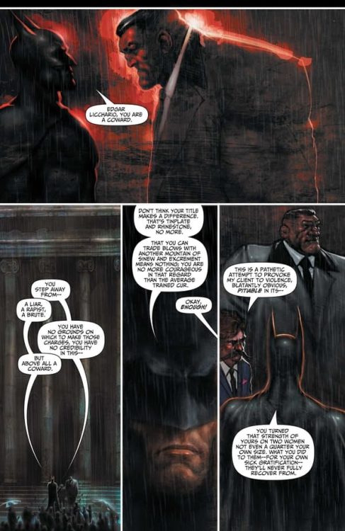
Dark Horse Comics’ Imogen of The Wyrding Way, a one shot in the Outerverse universe, shows how much potential fantasy has to be horrific. Like a scene from Pan’s Labyrinth, Imogen feels like it lives in the in-between. It could be dark or hopeful at any moment, and the reader is caught in the middle. Writers Mike Mignola and Christopher Golden, artist Peter Bergting, colorist Michelle Madsen, and letterer Clem Robins seem to love this middle ground. And they keep us there for as long as they can.
Writing
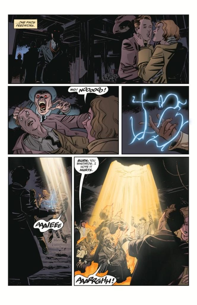
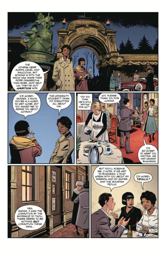
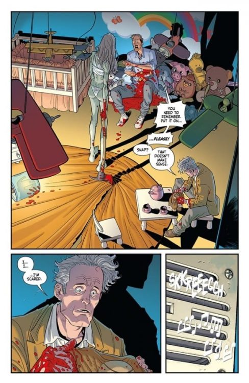
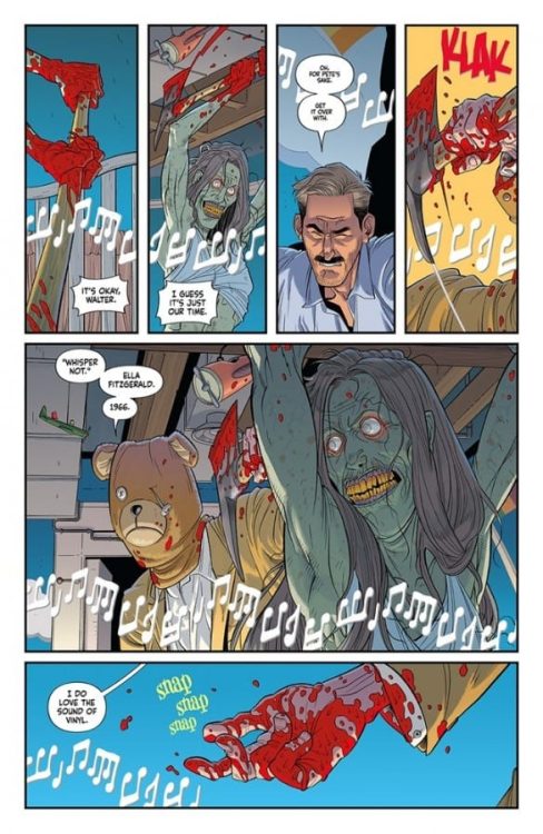
From the first few pages, Mignola and Golden assure us horror lurks within. Vampires and hellfire abounds. But it’s swept away quickly to bring us back to a quiet morning in a sunny seaside landscape. So as our main character, Imogen, sets off on a mission, we have a feeling in our gut that it may go wrong. Of course, there wouldn’t be a story if it went off without a hitch. But Mignola and Golden keep us, and their characters, hopeful. The most terrifying element to this issue is how normal everything seems.
The omens of things going sour are sprinkled in through conversations with grumpy sailors and unusual things noticed on winter hikes. And when we finally see the terror, Mignola and Golden pull us away. They don’t show us the gruesome details, and in doing this, they make it all the more terrifying. We’re left to imagine just how bad things may have gotten. And through it all, we’re still somehow hoping we’ve read the hints wrong.
Art
Bergting certainly has the ability to create terrifying images. Even the cover to Imogen of the Wyrding Way has a quiet terror to it. But this issue doesn’t feel like a horror comic in its imagery. In the same way that Mignola and Golden keep us wondering if we’re reading a fantasy comic or a horror comic, Bergting keeps things light and joyful. The big trolls walking through the forest look as funny as they do foreboding.
The dark creatures we’re met with in the opening of the issue are dealt with quickly, and there’s a playfulness to the page as it happens. Bergting is frugal with his use of creepy imagery. His avoidance of darkness is what makes his subtle moments of horror strike so deep. His most terrifying images are silhouettes and outlines. He spares us the details, bringing us back to a lighter norm that we feel is tainted by the dark images we’ve conjured up in our minds.
Coloring
Madsen starts us off on a dark note. We open on a scene that begins at night. As we enter a dark house, Madsen keeps everything a dark blue. The burst of light that Imogen uses to get out of their alive is short-lived and the next scene is dark but cast in an eerie green glow. This immediately tells us that these characters are surrounded by horror. But the next scene is a bright, sunny morning. It’s colored like something out of Tintin. And even as our character hike through a forest during the night, Madsen shows the color of their faces and clothes. Madsen brings us into a world of horror, but then lulls us into thinking it may have all gone away. Maybe there are only bright days ahead.
Lettering
Robins’ lettering is a masterclass in subtle differentiations. Robins follows a pretty straightforward style throughout. The font remains the same for the dialogue and the sound effects. Occasionally, a word balloon has warped edges as someone cries out. But when one character is panicking at what’s happening to them, Robins removes the spaces from between their words. “WHATDIDYOUDO?” they say in one word. The sound effects are identical for the most part. Whether it’s the “FFWOOOSHH” of fire or the “THWUMPP” of someone landing in snow, it’s the same block lettering. The one variation is devastating. And the “KRUNCH” of this moment stands out because it looks different from everything else. Robins uses variations to his style very rarely, so that they have more punch when they appear.
Dark Horse’s Imogen of the Wyrding Way is a relatively simple comic. Yet that’s part of what makes it so terrifying. It doesn’t try to horrify you with grisly images or ugly ghouls. No, it shows you just enough for you to connect the dots for yourself. It brilliantly blends fantasy and horror to make a subtle, slow terror. Pick up Imogen of the Wyrding Way, out from Dark Horse June 23rd, at a comic shop near you!

")


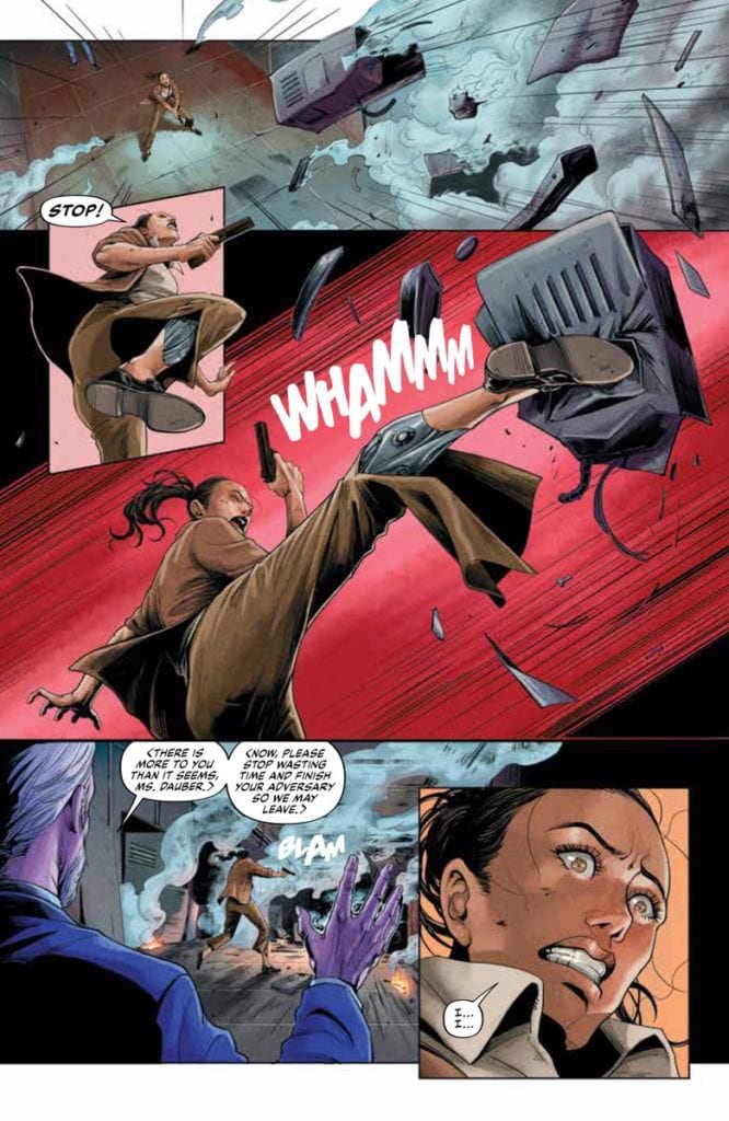
 A Game Of Doubles


 The return of
 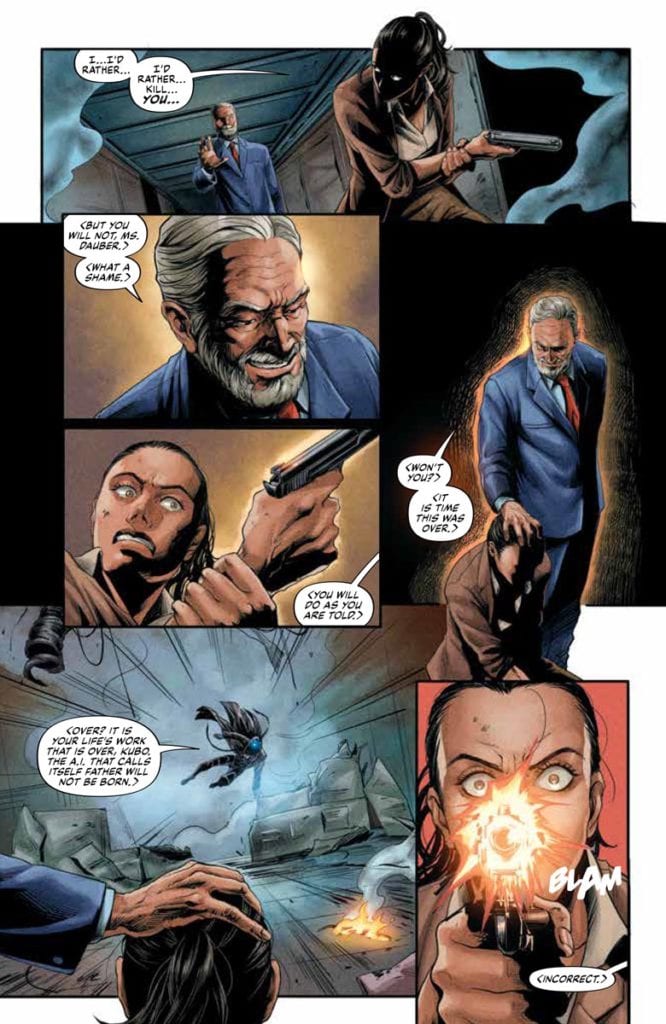 But there are some inconsistencies as well. Like when one panel shows the Visitor with his mask on even though it was removed earlier. Or even when the Visitor and Dauber shoot down a helicopter with Kubo in it. After which is a jarring bit of action where the Visitor leaps out of the copter to finish Kubo. Without the Visitor saying anything like “If the fall didn’t kill him, I will,” this feels like a redundancy.