After the excellent introductory episode “Glorious Purpose,” the second episode gets things going as Loki starts his work with the TVA.
The Variant strikes again by attacking a TVA unit at a Renaissance Fair in Wisconsin, 1985. The Variant is even able to a capture a TVA agent. Agent Mobius sees Loki as being the best way to the find The Variant and the Asgardian comes up with some theories on how to find them.
Out of all the properties Marvel has adapted Loki is the most ambitious and risky. That is really saying something considering some of the films and shows they have made. It’s a show that features time travel, alternative universes, and philosophical musing. It was like the ultimate hybrid of Rick and Morty and Doctor Who. Loki sets up that there are multiple universes but the timelines are fixed. It’s like Doctor Who where fixed points in time can’t be changed. If a new timeline is created in the MCU it could cause a Nexus event which might lead to the destruction of reality. It makes the stakes higher than in Avengers: Infinity War/Avengers: Endgame. The idea of different universes not being allowed to mix was similar to His Dark Materials.
Like Doctor Who, Loki was also filled with wibbly wobbly timey wimey explanations and logic. The scene when Loki explains using a salad and various seasonings to explain how The Variant hid felt like something The Doctor would do. This is the closest we will ever see Tom Hiddleston play The Doctor.
As well as the time and inter-dimensional Loki and Mobius did act as detectives. The premise of Loki was like Thomas Harris’ Hannibal series. The series so far centred on the relationship between Loki and Mobius with Mobius’ logic being they need a villain to catch a villain. The pair had to work together to look for potential clues in the files and use their logic to find The Variant. However, Loki is a character who’s always has his own agenda and looking for a way to benefit himself.
“The Variant” showed Loki and Mobius having a philosophical debate due to the big revelation from the previous episode. Loki states what I said in the previous episode review, that free will doesn’t exist. Loki acted a bit like Rick from Rick and Morty because he said ‘everyone’s going to die.’ It’s hardly surprising Loki had elements of Rick and Morty because the showrunner, Michael Waldron, worked on the popular animated series.
One of the interesting aspects of ‘Glorious Purpose’ was the character development with Loki getting his worldview rocked. ‘The Variant’ continued this in a small way when Loki read about Ragnarök and discovered that most of his people had died. This information hurt Loki but it also led to the god having an epiphany
On a final note it was noticeable that within the TVA there were many statues of the Time Keepers around their complex. They loomed large over everything and their presence was felt even if they haven’t made a physical appearance yet.
“The Variant” was an excellent piece of TV because of its mix of sci-fi, police procedural and humor. The episode ended on an incredible cliff hanger that will leave viewers wanting more.
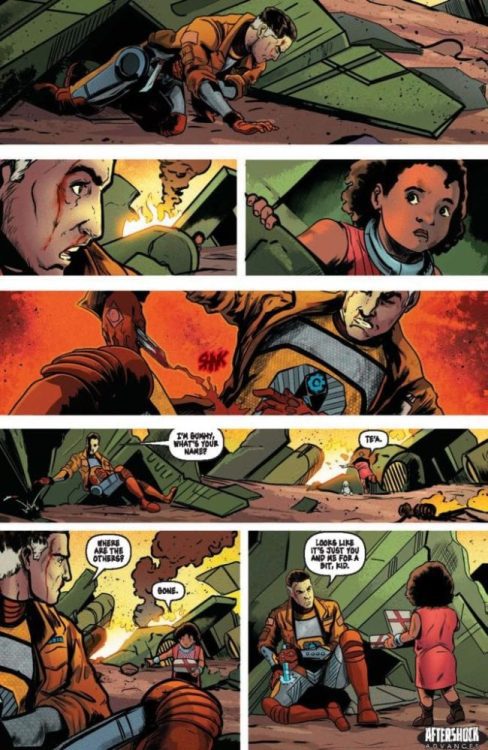
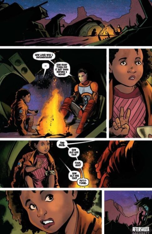
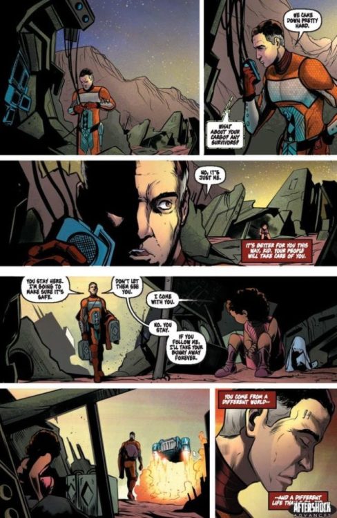
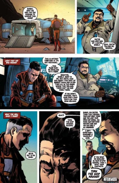
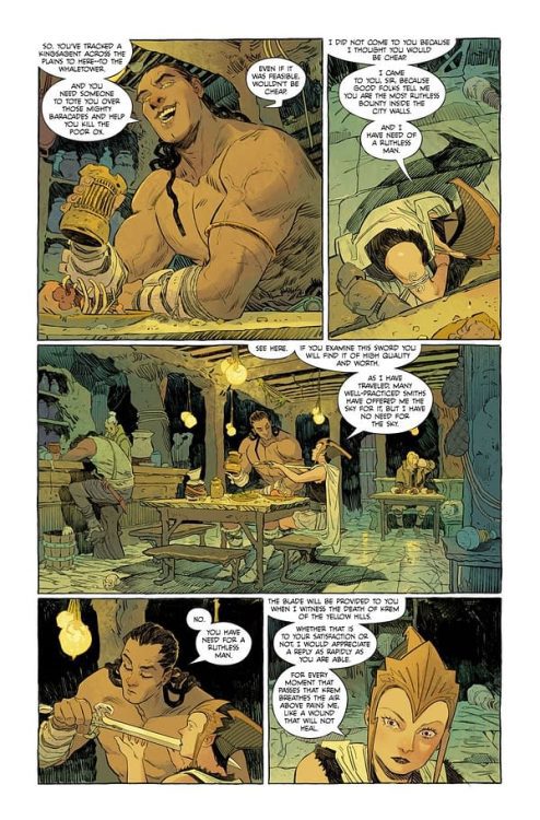
Check out a four-page preview of Clans of Belari #1, thanks to AfterShock Comics. The new sci-fi adventure series from Rob Blackie, Peter Blackie, and artist Daniel Maine hits your local comic book store on July 7. The creative staff also includes colorist Carlos Lopez and letterer Taylor Esposito.
About Clans of Belari #1: PRIMARY LAWS OF THE BELARI SYSTEM:
1. No person or Clan may exit the system.
2. No person or Clan may do the Designated Work of another Clan.
3. Clans may not merge.
4. Any person that breaks a Primary Law shall be made an Outcast.
On the far side of the galaxy, an isolated branch of humanity is trapped in a feudal dystopia. Order is maintained by a system of oppression until an orphaned girl, and her incorrigible adoptive father sow the seeds of revolution and unite the clans against a fearsome alien threat.
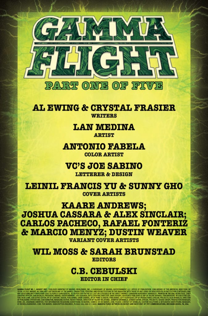
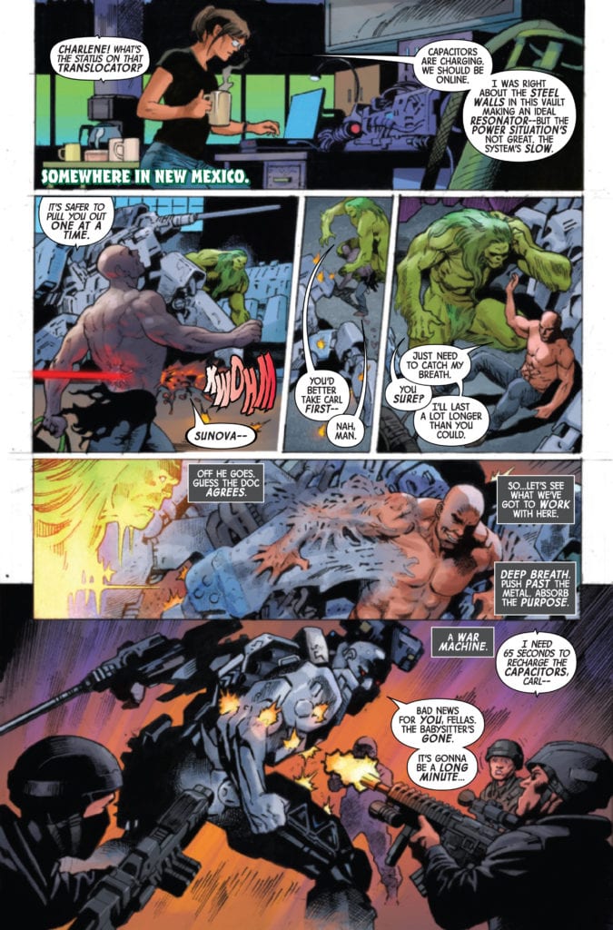
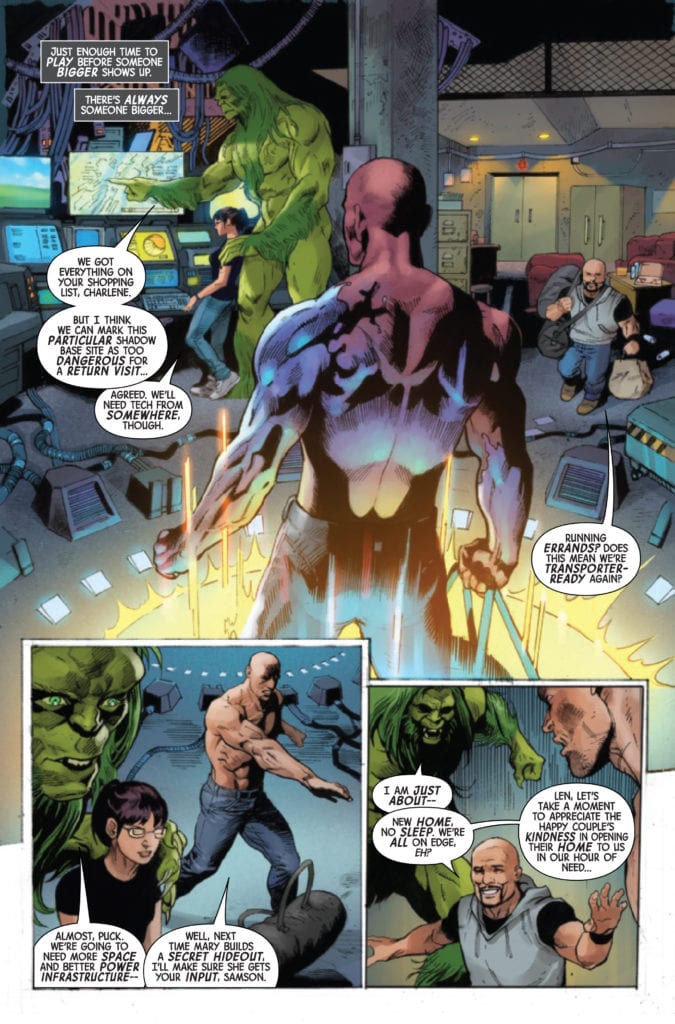
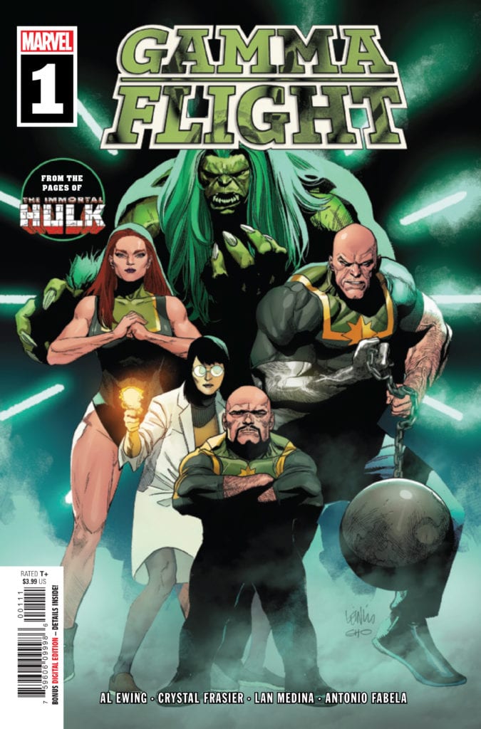
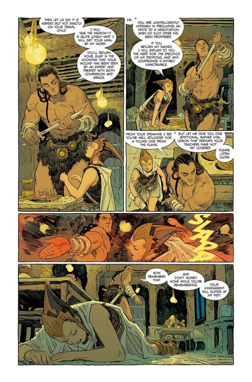
GAMMA FLIGHT #1 hits your local comic book store June 23rd, but thanks to Marvel Comics, Monkeys Fighting Robots has an exclusive 4-page preview for you.
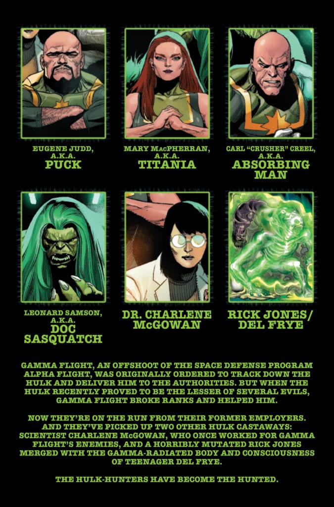
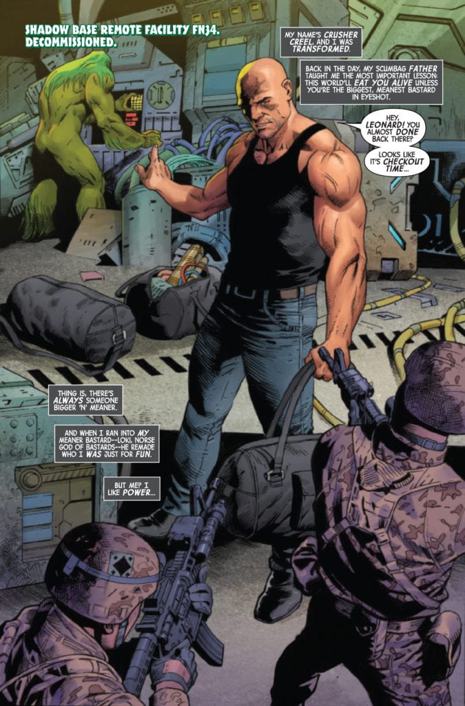
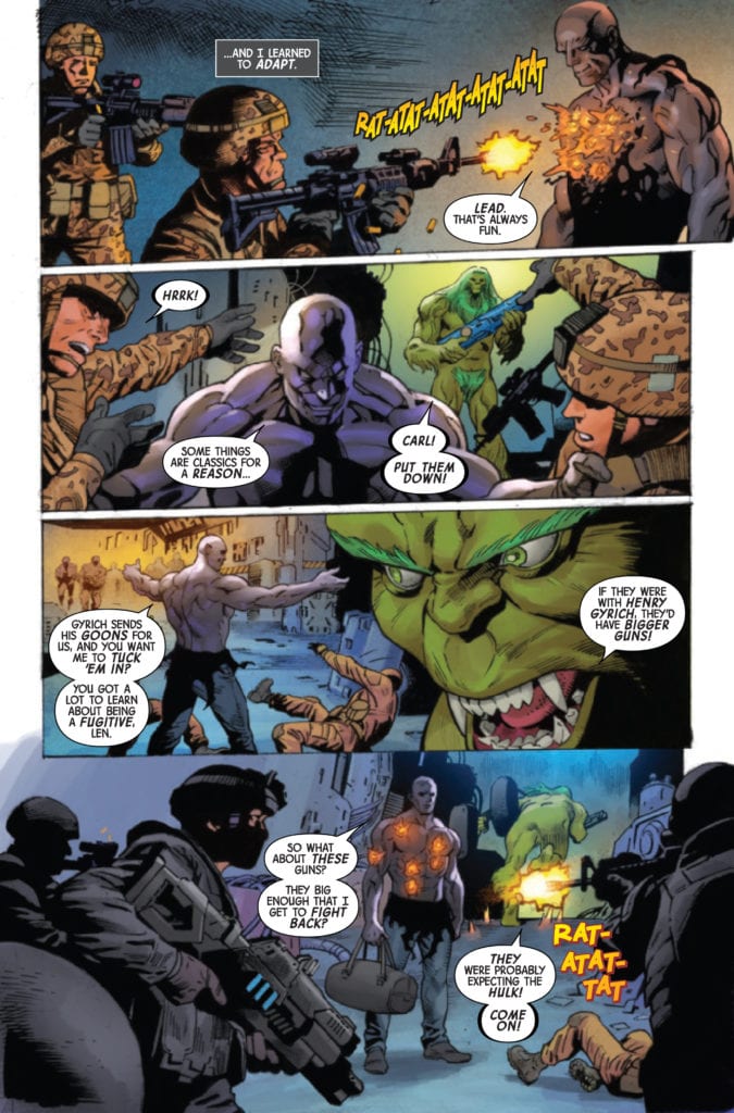
About the issue: SPINNING OUT OF IMMORTAL HULK, BRUCE BANNER’S GAMMA-POWERED ALLIES GO ON THE RUN! Gamma Flight had one job: Find and stop the Hulk. But when push came to smash, they sided with the Green Goliath-and the human world intends to make them regret it. Puck, Absorbing Man, Titania, Doc Sasquatch, Dr. Charlene McGowan and a horribly changed Rick Jones are fugitives from every known authority-but a team that full of gamma is bound to break before long. Al Ewing, Crystal Frasier and Lan Medina mastermind a whole new world of gamma!
The issue is by writers Al Ewing & Crystal Frasier and artist Lan Medina, with colors by Antonio Fabela, and letters by Joe Sabino. The main cover is by Leinil Francis Yu and Sunny Gho.
As the solicit info states, GAMMA FLIGHT is a spin-off of Marvel’s Eisner-nominated IMMORTAL HULK, which is coming to a close with issue 50 this September.
Check out the GAMMA FLIGHT #1 preview below:
Are you excited for GAMMA FLIGHT? Sound off in the comments!
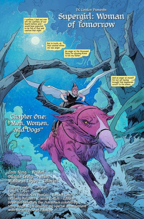
Tom King and Bilquis Evely team up for a Kryptonian sword & sorcery revenge quest in Supergirl: Woman of Tomorrow #1. With colors from Mat Lopes and letters from Clayton Cowles, this opening chapter is gifted with a thoroughly imaginative (but slightly overwritten) script and Evely’s ever-incredible visual work making this a unique and intriguing first issue in this new take in the world of Supergirl.
Kara Zor-El has seen some epic adventures over the years, but finds her life without meaning or purpose. Here she is, a young woman who saw her planet destroyed and was sent to Earth to protect a baby cousin who ended up not needing her. What was it all for? Wherever she goes, people only see her through the lens of Superman’s fame. Just when Supergirl thinks she’s had enough, everything changes. An alien girl seeks her out for a vicious mission. Her world has been destroyed, and the bad guys responsible are still out there. She wants revenge, and if Supergirl doesn’t help her, she’ll do it herself, whatever the cost. Now a Kryptonian, a dog, and an angry, heartbroken child head out into space on a journey that will shake them to their very core.”
With Woman of Tomorrow #1, Tom King places Kara Zor-El in a situation I doubt any other writer has ever gotten the chance to address: what is she like if you pull her out from behind Superman’s shadow? We find Kara on a distant planet with a red sun just trying to be by herself before being pulled into a young warrior-in-the-making girl’s quest to avenge her father. Kara is presented in this comic as a sort of mythic being, but not in the way she or her more famous cousin are typically framed. She comes into this girl’s life in a rather embarrassing moment while trying to get away from the “Supergirl” name. This comic reminds me of a sword and sorcery/hack and slash adventure tale for numerous reasons (which I will cover), and the first is the sort of mythic status Kara is given by this young girl who is also our narrator. Her presence here is very similar to how Conan and Red Sonja are written in their respective stories, thrust into a cause for reasons that are almost entirely their own. The entire premise of humanizing Superman by depowering him is a worn out cliché at this point, but with Supergirl very little has been attempted to really dig at her character. Her arguably most well-known appearance in her publication history is in Crisis On Infinite Earths – where she’s most remembered for dying. This is an opportunity for King to discover and invent who Kara really is as a person, separate from the pressure of being known only as Superman’s cousin.
Stylistically, the writing here is compelling and entertaining – if not a bit much for an entire comic. The protagonist, and all of this strange planet’s denizens, speak in a long-winded high-fantasy dialect, resulting in large passages of dialogue on every page. This is obviously part of King’s setting up this comic’s connection to the sort of stories that he’s pulling influence from. While I tend to enjoy this kind of writing, and while I do think it works to an extent here, it does reach a point fairly quickly where it becomes a bit too much. I actually quite like the idea of an alien race who all speak like they’re on a planet created by Tolkien and Robert E. Howard. However, reading pages of this dialogue in an inherently visual medium does get to be a chore. Fortunately, the actual plot content of the writing is very engaging thus far, and this issue’s considerable word count wasn’t enough to keep me from wanting to see what else this story has to offer.
The most striking feature of Supergirl: Woman of Tomorrow #1 is of course the visual work of Bilquis Evely and colorist Mat Lopes. The same team behind The Dreaming now lends their talents to this hyper-imaginative superhero book in absolutely grand fashion. Evely’s pencils are a sea of detail, with her thin linework crafting intricate character animations and designs for a cast of very few (there are only 5 unique identifiable characters in the entire issue) that are all memorable in how they are drawn. From our protagonist’s youthful yet dignified determination to Kara’s wide range of emotions, the actors in this comic have internal journeys that play out across their faces in ways that make them instantly relatable. The environment of this alien world is a striking setting as well, with features that are familiar enough that they would be recognizable for Earth settings in a fantasy tale – were it not for the colors (more on that in a moment). Evely’s panel direction is much more reserved that her work in The Dreaming, which constantly challenged the conventional forms of panel direction. This issue takes a more standard approach with its organization, in a manner that is clean and easy to follow. The beauty that Lopes’s colors give this comic is absolutely stunning, and sets the audience firmly on the ground in this gorgeous alien setting. The light greens, pinks, and reds in this world’s foliage and atmosphere, as well as the litany of skin tones and shadings used on the characters, illustrates a deeply vivid visual experience for this comic. The lettering from Clayton Cowles is solidly conventional, with a naturalistic sense of font changes and italics to hone the reading experience into something that perfectly captures the tone of the narrative and dialogue. This is a brilliant looking comic book, and I would expect nothing less from this artistic team.
“Supergirl: Woman of Tomorrow” #1 is a delightful and stunning debut issue. While it may be a bit long-winded, Tom King’s script captures the essence of a classic genre and fuses it with a superhero story for a character journey that needs to be discovered. The visuals from Bilquis Evely and Mat Lopes are beyond gorgeous, bringing this world and these characters to life with emotional complexity and vast beauty. Don’t miss this new series when it debuts on shelves on 6-15!
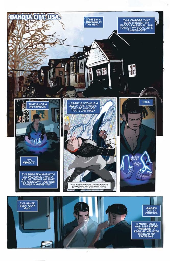
DC Comics’ relaunch of Milestone Media’s short-lived yet timely series Static should come as a welcome shock to fans. Available now,Static: Season One #1 is written by Vita Ayala, with layouts by ChrisCross, and finishes and colors by Nikolas Draper-Ivey. Frequent DC collaborator AndWorld Design contributes lettering.
In Dakota City, the nucleus of Milestone Media‘s “Dakota-verse”, Virgil Hawkins struggles to cope in the aftermath of “The Big Bang.” Police use of an experimental gas to break up a peaceful student protest has left the entire city traumatized. It also gave teens superpowers. Virgil became Static, gaining the ability to manipulate electricity, though he doesn’t yet know how to control this power.
Ayala works from the inside out, immersing readers in Virgil’s psyche through narration. Before we even see the character use his powers, we get a sense of how he feels. We know Virgil has had problems harnessing his powers, but it isn’t until the end that we see just how explosive he can be.
Power and Control
It’s an effective and realistic slow burn, especially since we see the effect of Virgil’s shifting behavior on his family dynamic. He’s scared he might hurt someone, and this fear prevents him from opening up to his family and friends. Haven’t we all been there?
VIRGIL HAWKINS CONSIDERS HIS NEW POWERS.
Artistically, ChrisCross and Draper-Ivey capture Static’s young, troubled psyche in every uneven border and pixelated background. A favorite effect of mine was the use of TV static in a few panels to communicate Static’s mental picture of his anger and lack of control. By contrast, the layout itself lends a sense of objectivity to a story so rooted in Virgil’s point of view. And by “objectivity,” I mean in the film sense. There are few close-ups, no POV shots, and subtle actions and background pieces help advance the story.
Moreover, Draper-Ivey’s color palette favors cold blues, greys and blacks. This is a story of trauma which suffuses an entire town, so the environment is colored to reflect that. Also, to reflect Static’s powers, a blue wash runs through nearly the entire issue. Blue on its own evokes depression, but here it also evokes just how much power Virgil holds. The blue is almost sinister in that it suggests Virgil could unleash his full potential at any moment.
Effects
On a final note, AndWorld Design’s lettering follows the standard. Dialogue and caption narration flow with the action, and bubbles are shaped to reflect dialogue inflection. Additionally, SFX were reserved until the climactic action sequence. AndWorld’s use of SFX is the only source of complaint from me.
Overall, I stand by the rule that no matter the medium, effects should only be used where necessary to accentuate action. Even though the action sequence in question is incredibly dynamic, I don’t think every single big moment needed SFX, especially not in large font that ends up covering some of the action. But that’s a small gripe at what is ultimately a satisfying book.
In a time when reboots and relaunches have become the norm, Static is one that doesn’t read as cynical. It is full of the creators’ love and care for the character, and indirectly comments on America’s current social climate. For those reasons and more, I hope this time around Static is here to stay.
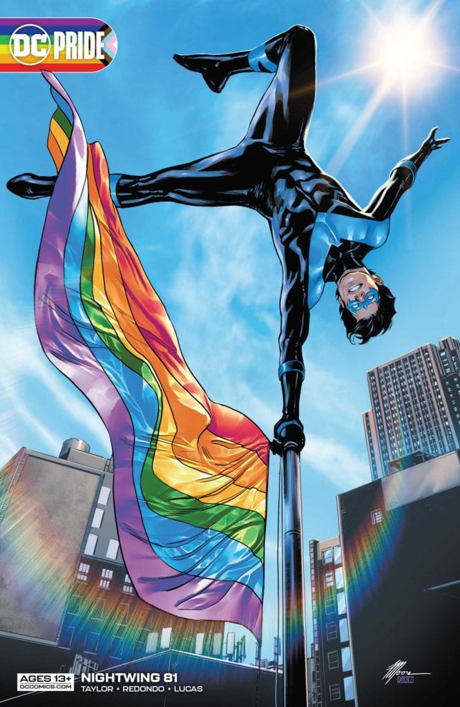
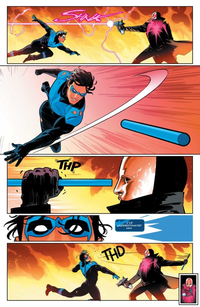
DC Comics’ Nightwing #81 is an almost contradictory mix of fun and gloom. We’re still seeing the same Dick Grayson who was hopping over rooftops just an issue before, but something is changing. Writer Tom Taylor, artist Bruno Redondo, colorist Adriano Lucas, and letterer Wes Abbott are bringing the drama in. There’s still plenty of fun to be had, but maybe not for long.
Writing
A lot of why this issue hits home comes from Taylor’s work on the series so far. Taylor set up a fun status quo. We’ve connected to Barbara, Tim, and Dick as they’ve hung out and shared pizza. So, when Heartless shows up, threatening to put an end to those days, we care. We’ve become attached enough to the good life that Taylor has presented, that Taylor’s threats to take it away are just as moving. And as we move into a more complicated chapter, we hold that vision in our minds. We hold onto the hope that though things may get rough, the characters can get back to the joy we’ve seen them share.
At one moment, Taylor does something a little familiar. As Dick, Barbara and Tim talk, Tim tells Dick, “Bitewing was pretty worried about you.” That’s the name Tim has given Dick’s new dog. “Bitewing? That’s… actually a great name,” Dick responds. This feels like a little joke Taylor is telling. But Dick saying it’s a great name feels like Taylor holding up an “audience laughter” cue card. Rule #1 of comedy is that you can’t tell people when to laugh. Your jokes ought to speak for themselves. There is so much charm to Taylor’s scripts. They’re brilliant, fun, and moving. But when Taylor seems charmed by them too, it takes a little of the magic away. Though, ultimately, this is a small blemish on the face of an otherwise fantastic script.
Art
Even in the midst of high stakes and dramatic moments, Redondo adds movement and levity. When Heartless takes a shot at Dick Grayson, then puts his gun away, we see it in a tiny panel in the corner. On the next double-page spread, we see their fight. It ends when Dick catches his baton in a little panel in the same corner. It creates a playful repetition to the scene, making the fight feel just as much like a dance as a battle. Later, when Nightwing fights with someone on a staircase, the panels follow the action. Redondo places the stairs on the page and separates each jab and punch with a gutter. It’s a gorgeous way of presenting a scene, showing the full staircase on the page, but then showing the individual moments of the battle too.
Coloring
Lucas’ coloring is a source of a lot of the dread in this issue. As Nightwing fights Heartless, the fire around them mingles with the night air to look red. This continues through ten pages of the comic. It sets a tone and creates a shift in the mood. Later, when the danger seems to have passed, Dick Grayson lies in bed. The color of his room is a cool blue. But outside, the night air still looks red. Something is changing in Nightwing’s world, and Lucas is showing us that moments of safety are fleeting.
Lettering
Abbott has always had a wonderful ability to make everything feel fun. I have spoken many times about the little tailored sound effects he uses for each noise in a script. No sound effect looks the same. This is on full display in this issue. The white “PSSSHHH” of a fire extinguisher actually mimics the movement of the foam. The “SHNK” of Heartless’ gun is messy and otherworldly. But even small moments have subtle differences. The “THP” of Heartless catching one of Nightwing’s batons looks so close to the “THD” of him then whacking Dick in the face with it. But the “THD” has a fuzzy outline, mimicking the ringing in Dick’s ears. From the big “BWOKs” to the tiny “CLKs,” Abbott is making everything a blast.
DC Comics’ Nightwing #81 is a shift in gears. Now that this creative team has shown us the good life, they’re threatening to take it away. They have done their work beautifully. They’ve made us care about these characters deeply. And now that things are taking a turn for the dramatic, we’re all already bought in. Pick up Nightwing #81, out from DC Comics June 15th, at a comic shop near you!
Welcome to Self-Published Spotlight, a regular interview column where I will be highlighting self-published comics and the cretors and small print publishers who make them.
Last week I had the pleasure to talk to the artist on A Game of Doubles, Ryan Tavarez (you can check out that interview here). This week, I’m talking to Jonathan Thompson, the writer of the series. Check out what he has to say about A Game of Doubles and then make sure to support the Kickstarter and get in the game with this book!
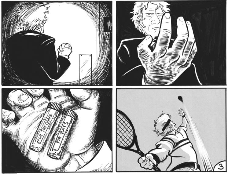
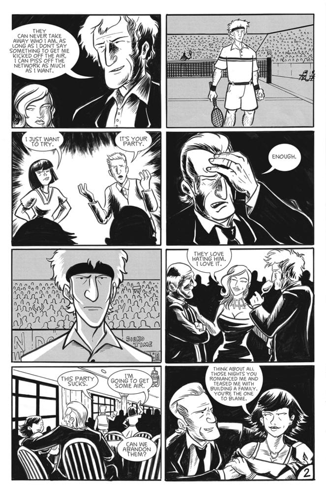
Monkeys Fighting Robots: Jonathan, as always thanks for the time to talk to us. So let’ get right to it. A Game of Doubles is your latest Kickstarter project. Can you serve us some details? Both on the book and your Kickstarter campaign? Jonathathan Thompson:A GAMES OF DOUBLES is about Jackson and Franklin Teach, identical twin brothers celebrating their 50th birthday with friends and family at a nice country club. Jackson used to be number one in the world as a tennis pro but one game 18 years ago brought that to an end. Now, staring at his brother across the party hall he grips two vials in his pocket. One with cocaine, the other rat poison.
You can back the campaign really in 3 different ways…First is you pick a random ending. Being doubles there are two ways this story can play out. You can then get (my preferred artistic way) the 48-page flipbook version. This way you get both endings and you just flip the book around to read it. Finally, there is the Director’s Cut TPB which I plan on making really special…adding process and development of the book, so a ton of back-matter.
MFR: Was A Game of Doubles seen as a Kickstarter project from the get-go, or did you have any other publishing plans for it as well? JT:Kickstarter was the go-to place for this project. It’s an odd little book for a publisher, especially in its 48-page flipbook form. Honestly, there is just more power doing it yourself through KS. I don’t take a paycheck. Everything in the KS budget goes right to paying Ryan and paying for the printing/shipping. You know, it’s amazing how people from everywhere can see your project and bet on you as a creator. I really love it.
MFR: And how has the response to the campaign been so far? JT:The campaign has been great so far. People really seem to be enjoying the concept of the alternate endings and Ryan’s magnificent art. I mean when you look at those pages how could you not love it?
MFR: The first two books I read from you were deeply rooted in genre, Tales of The Dead Astronaut was sci-fi, and the currently running Burn Residue is gritty crime/noir. A Game of Doubles more ambiguous. Where did the concept for it emerge from? Did you approach this book any differently than your others? JT:That’s a good question. I kind of think of this as a crime story as well…there’s definitely a dead person at the end whichever ending you pick. But, this whole story has been spinning in my mind for years now. It started just being in a country club bathroom for some event and thinking about a story that could take place there. Then I came up with the brothers. I started thinking of a little Hitchcock-style story of two brothers doing cocaine and knowing that there was poison mixed in. I wanted to play with the idea of the double or doppelganger and this all kind of came together for me perfectly. And in terms of my approach. When I was scripting I knew that I wanted to use that 8-panel grid but I knew that I wanted to use it to play with pacing and the doubling between the brothers.
MFR: Would you cite any specific artist or work as having an influence on A Game of Doubles? JT:The first would be STRAY BULLETS by David Lapham. For the past year, I’ve been going through that gigantic UBER ALLIS edition taking my time and really letting the stories sit with me. Midway through the series, there are these wonderful one-off stories of these oddball characters going through life. Telling a perfect story in about 24 pages became my goal. Then I turned to this story that was sitting at the back of my mind for years and applied it to that STRAY BULLETS style. I think we nailed it.
MFR: How did you find artist Ryan Tavarez? JT:I found Ryan on Instagram through his work with NOMADS. I was a huge fan, to say the least. For the past year, I’ve been trying to find a project that would fit us both (and see if he was interested). After he read Burn Residue I think he was pretty game to see what I could come up with. So of course I sent him a tennis comic about twins doing cocaine in a bathroom to follow up his CONAN-like fantasy book…he turned out to be the perfect fit.
MFR: How do you two work together? What’s the creative process between the two of you? What are the logistics? JT:We’ve been working insanely well together. I learned a long time ago to just let myself go to the creative journey that is making comics. All I knew was that it needed to have the 8-panel pages for rhythm and that I wanted Ryan to stick with just ink. No digital tricks. Just raw black ink. Once I got the thumbnails from him we were ready to run because he just nailed it. Now, I just have to sit back and wait for it to be done.
MFR: Tennis and the tennis world seem to be a big part of A Game of Doubles. Is the sport something you have always been interested in? Was the sport always part of the story? JT:Tennis came from the Hitchcock influence. In the late British and early American films of Hitchcock, he used sports players a lot. I think of THE MAN WHO KNEW TOO MUCH and STRANGERS ON A TRAIN. I liked that element. It gave me something to bounce off of. It provided dramatic action as well while the brothers talked and partied. Then I watched IN THE REALM OF PERFECTION, a documentary on John McEnroe and really that was it. The book kind of emptied itself out onto the page after that.
MFR: So when does the Kickstarter end? And do you have any stretch goals or surprises in mind? JT:Let’s focus on funding first, Manny! If we get lucky to pass our goal…I’ll definitely set a stretch goal for the sequel… and I have one more pin-up that might be coming in that is very on-brand for the STRAY BULLETS influence.
MFR: Anything final you would like to add? JT:Check out the campaign and see if you dig it. My whole back catalog of work from TALES FROM THE DEAD ASTRONAUT to BURN RESIDUE along with Ryan’s NOMADS are on the add-ons section. You can get the full package for what I’ve been up to for the past year. I’m all about good comics…I hope you all enjoy them. And I have a newsletter…
The title of Image Comics new original graphic novel Jim Lives: The Mystery of the Lead Singer of The Doors and The 27 Club is a statement of fact (Jim Lives) and the introduction of an urban legend (the 27 Club). Where Marvel have What if..? and DC have their Elseworlds, Image Comics have the conspiracies of Paolo Baron and Ernesto Carbonetti. They are fascinating and engaging stories of urban myths and hopeful pipedreams.
The second volume in The Conspiracy Trilogy asks what would have happened to Jim Morrison, lead singer of The Doors, if his death had been faked. Who would have been responsible, how could it have been done, and more importantly, where would the Lizard King end up?
Jim Lives Credit: Image Comics
Ride the Snake
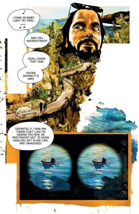
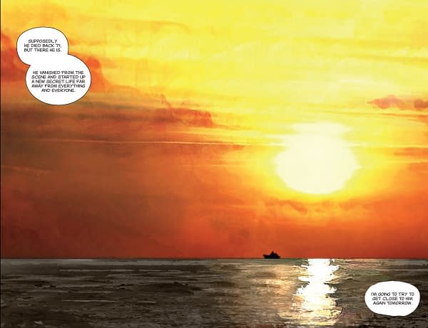
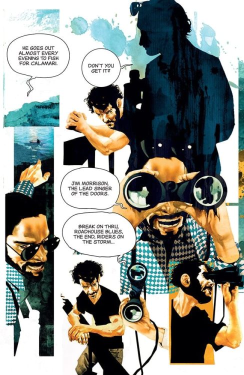
Jim Lives opens with a journalist, hot on the trail of the long dead singer. His stalking of an elderly fisherman in a coastal Italian town is intrusive and obsessive. Jax, the journalist, is convinced that the distant shape fishing for squid is the legendary singer, but his companion is not yet on board.
As a reader you assume Jax is speaking the truth. You have, after all, picked up a book exclaiming the very thing the young journalist is excited about: Jim Lives. This is going to be about Jim Morrison and the life he would have led.
Well, yes and no.
Like numerous other texts involving Morrison, such as the biography No One Here Gets Out Alive by Jerry Hopkins and Danny Sugerman and the Oliver Stone movie, Jim Lives is as much about the lives affected by the lead singer’s presence than it is about the man himself. Baron and Carbonetti take the reader on a journey of obsession and love. In this case, they show a relationship between father and son. Both of these are themes that epitomize Morrison’s life experience. Jax and his companion, and eventually his father, are all riders on the storm, swept along by an idea that becomes impossible to let go. It is an addiction that mirrors Morrison’s drink and drug dependence. As the story unfolds, the consequences of this addiction are played out in various forms. Each sequence becomes a metaphor for the inevitable effects of this unhealthy addiction: the highs and lows, the good and bad.
The script cleverly weaves elements of The Doors music and lyrics into a thematic exploration of Jim Morrison’s life and the wider concerns of celebrity. The destructive highs of fame and fortune are sorted through and illustrated by references to other bright flames who burned bright but fast. Cameos by the likes of Kurt Cobain and Amy Winehouse highlight the discussion of the 27 Club and act as reminders for the tragic lives these stars led. While the book celebrates life it is also a constant reminder of the losses. There are moments that will make you laugh and fill you with glee at the references being made but there is also a somberness to much of the narrative.
Jim Lives Credit: Image Comics
The Show Is About To Begin
Carbonetti captures a beautiful, sublime world soaked in the Mediterranean sun. The bright Italian landscapes and clear ocean scenes are wondrous to behold: works of art in their own right. A high number of double page spreads allows Carbonetti to capture spectacular vistas. This is a dream world, suited to someone like Jim Morrison and therefore believable that this is where he would end up. It is the singers utopia, influenced by real landscapes and the visual style of Oliver Stone’s biopic The Doors. Golden lights flood the scenery and glisten on the sea. The landscapes merge with the characters and fade out before the borders of the panels. This creates an ethereal sense to the location. It is the very essence of idyllic.
However, the strong use of silhouettes and negative space gives Jim Lives a darker undertone, often reflected in the script. Not everything is as it seems and you are led through this labyrinth of possibilities with Jax. The desire to meet Jim Morrison pushes the narrative but this longing is also expressed through the artwork. A series of quick glimpses, distant figures, and recognizable faces help to grow a lyrical tension befitting of a Doors song. It is time to break out Waiting for the Sun and Morrison Hotel and play them as you read. The music fits beautifully with the book: a perfect unison between music and art.
Somewhere the Lizard King stirs as his spirit is called.
Lord Jim Credit: Fleetway Publications
Other Voices
In 1991, to celebrate 20 years since Jim Morrison’s death, the British Comic Crisis published a story entitled Lord Jim. Written by Igor Goldkind and illustrated by Steve Sampson, the short comic followed a desperate journalist on an obsessive quest to find the lead singer who potentially had faked his own death. Although similar in plot, the 1991 take focused on the cult status of the singer and the destructive quality of his life. He was an unstoppable force that led many to their destruction. Coming out of the 1980’s, especially with UK politics and the thematic comics emerging at the time, Lord Jim was a product of its time. Self reflective, desperate, and destructive. Jim Lives is of a different ilk. Even with the darker undertones and the sad reflection of lost talent, Baron and Carbonetti’s tale is optimistic and about self discovery.
Obsession was a large part of Jim Morrison’s life: obsession with Pamela Courson, obsession with pushing life to its extremes, obsession with experience. Jim Lives captures that essence with the interplay of self destructive obsession and the celebration of life. There is a duality to the narrative that comes from the characters’ interactions. The links to real people gives the book a solid foundation for its premise and you can almost believe in the conspiracy that it flaunts. There is a truth beneath the surface that you can’t help but pick at. Not the one surrounding the famous singer but something more universal about relaxation and living a secluded, balanced life. The hustle and bustle of the modern world blinds us to the simplicity of existence and contemplation. Jim Lives reminds us that it is worth taking time out. Be reflective and take a breath.
Ultimately Jim Lives is a story about a man who wanted to be left alone and a world that wouldn’t allow such selfishness.
Jim Lives Credit: Image Comics
The End
Jim Lives is a triumphant book packed with outstanding art work and reflective storytelling. There are layers to the narrative that are mirrored throughout the layouts and sublime panels. The painted quality of the art creates a dreamlike world populated by dreamers, some who are trying to find their way and others who are already there. You will become enraptured with the conspiracy aspect of the story, especially with the surprising amount of humor that Baron puts into the script, but there is so much more to discover and learn from this humble 140 page book.
Before he died Morrison expressed some regrets with the way his life unfolded. This is evident in the writings that he left behind. He was a creative thinker trapped in a corporate world and in need of an escape:
The horror of business
The Problem of Money
guilt
do I deserve it?
The Meeting
Rid of Managers & agents
After 4 yrs. I’m left w/a
mind like a fuzzy hammer
regret for wasted nights
& wasted years
I pissed it all away
(From Wilderness: The Lost Writings of Jim Morrison published by Penguin Books 1988)
Jim Morrison was a poet and a self destructive force of nature. But thanks to Image comics, Paolo Baron, and Ernesto Carbonetti, 50 years after his body was found in his apartment in Paris, the life of The Doors frontman is celebrated and Jim Lives again.
Loki is the latest Marvel show to hit Disney+, this one focusing on the MCU’s popular anti-hero. “Glorious Purpose” is the best opening episode so far for a Marvel show.
During the Avengers’ Time Heist a past version of Loki was able to escape with the Tesseract. However, Loki gets apprehended immediately by the Time Variance Authority (TVA) and taken to be put on trial. Mobius M. Mobius (Owen Wilson) one of the TVA’s best agents believes Loki could be of use to the organization and tries to convince the Asgardian to join them.
The opening episodes for WandaVision and The Falcon and The Winter Soldierhad to set up their respective worlds and stories and Loki had to do the same. “Glorious Purpose” had to set up who the TVA were, their backstory, and why Mobius wanted to recruit Loki. It was a backstory that featured timeline/multiverse wars, Gods that maintain the sacred timeline and showing that there is a great threat that could destroy all reality. These ideas were so barmy that they made Guardians of the Galaxy look restrained.
This explanation of what the TVA were and why they came to be does raise some big questions. The TVA’s job is to keep the timeline running its natural course. This leads to the question ‘if everything predetermined does it mean free will doesn’t exist?’ Loki’s defense was that it was The Avengers who traveled back in time and altered the timeline but the judge, Ravonna Renslayer (Gugu Mbatha-Raw) stated The Avengers’ actions were meant to happen. The idea felt like it came from the Wheel of Time books because that’s a fantasy series set in a multiverse and fate is meant to go a certain way.
“Glorious Purpose” does set up an intriguing world and premise, what elevated Loki was the character drama. The key scene was when Mobius questioned Loki about what the villain wanted and psychoanalyses him. This Loki is a different one to the character in the MCU films. This Loki didn’t experience the character development of films where he turned from a power-hungry villain to an anti-hero, so the episode had to fast-track this. There was a wonderful montage where Loki watches all the tragedies from the MCU movies, and it breaks him. It was like the scene in Interstellar where Matthew McConaughy’s character watched his children grow up on a TV screen. Tom Hiddleston showed his ability as an actor because we got to see his world get shattered in this episode.
Owen Wilson also did well in the episode. I know Wilson mostly as a comedic actor, so it makes a change to see him in a more serious role, or at least playing a character straight. He is a bit older and grayer and he convinced as an experienced yet compassionate agent.
Loki had a great look. The production design had a retro-futurist look to it. There were big computer monitors, there was a use of old-fashioned film reels, and the decorations were garish. The TVA looked like they hired their designer from the ‘70s or ‘80s. The mix of retro-futurism and the bureaucracy within the TVA made it seem like the world from Terry Gilliam’s Brazil. The retro-futurism and the use of colors were also similar to the FX superhero show Legion. The score by Natalie Holt deserves a note because it sounded a lot like A Clockwork Orange.
“Glorious Purpose” was a great opening episode because it was able to balance out the world-building and character drama. It’s what an opening episode should be.
The Hitman’s Wife’s Bodyguard is just as ridiculous as its predecessor and more convoluted. The star power is enough to warrant laughter thanks to the chemistry between the film’s leads, but it doesn’t excuse its underwhelming story. The Hitman’s Wife’s Bodyguard could be considered more fun than the original and that’s mostly due to the comedic banter between Ryan Reynolds, Salma Hayek, and Samuel L. Jackson. Hayek joins Jackson and Reynolds full-time for this outing and her addition makes the film better. If not for these three and the hilarious adventure they tackle, the film would be a complete misfire.
One improvement from the original film is the attempt to flesh out the characters beyond their professional titles (hitman, con-woman, bodyguard). While Jackson and Reynolds played off each other’s personalities very well, The Hitman’s Bodyguard never made either of the two the most interesting characters, which left the film forgettable. The Hitman’s Wife’s Bodyguard isn’t that much better as a whole, but the added backstories are appreciated. Directed by Patrick Hughes and written by Tom O’Connor, Brandon Murphy, and Phillip Murphy. The film stars Ryan Reynolds, Samuel L. Jackson, Salma Hayek, Antonio Banderas, Frank Grillo, and Morgan Freeman. The Hitman’s Wife’s Bodyguard reunites Michael Bryce (Reynolds) with Darius Kincaid (Jackson) and his wife Sonia (Hayek). Michael is supposed to be on a break from bodyguarding but is recruited by Sonia to help save Darius, his favorite hitman. This obnoxious adventure leads them to mafia kingpin, Aristotle Papadopolous (Banderas), who shares a history with Sonia.
Ryan Reynolds as ‘Michael Bryce’ and Samuel L. Jackson as ‘Darius Kincaid’ in The Hitman’s Wife’s Bodyguard
Adding in Sonia from the bleacher’s assists in making this film more enjoyable than it should be. Hayek’s over-the-top behavior makes up for the atrocious dialogue unleashed by Sonia. Michael and Darius, arguably the most uninteresting frenemies to date have their relationship enhanced by Sonia’s presence. Darius is once again displayed as nothing more than Jackson portraying himself. The dialogue in this film grows tiring, specifically Jackson’s overuse of his favorite word that audiences know and love. Michael’s sabbatical from work is short-lived after Sonia reels him into Darius’ latest troublemaking. Details about Michael’s past are uncovered once the dysfunctional trio meets Michael’s father, Senior (Freeman). A moment that is sure to spark laughter with audiences, after meeting Michael’s father it is revealed that his mother died in a bizarre freak accident. This adds motivation behind his bodyguard career since he blames himself for his mother’s demise.
Sonia and Darius’ reckless love for each other is put to the test by Aristotle, who promises Sonia the family she desperately wants, which Darius can’t provide due to his unfortunate medical condition brought on by Michael’s impeccable marksmanship. The Hitman’s Wife’s Bodyguard embraces the goofiness of its story, but it fizzles out into being a mess for the most part. There is far too much being juggled, with little room to digest the important plot elements. Europe has a virus on the way, Michael’s father is ashamed of him, and Aristotle’s role as the primary antagonist is forgettable due to the poor time management of this narrative. Jackson, Reynolds, and Hayek deliver exhilarating performances as this unusual trio of characters. Their chemistry is the film’s greatest asset and makes up for the narrative shortcomings. Hughes keeps the film exciting with its fast pacing and eye-catching action sequences. However, tonally the feel can be uneven at times due to its constant desire to crack a joke, some that aren’t very funny.
Salma Hayek as ‘Sonia Kincaid’ and Ryan Reynolds as ‘Michael Bryce’ in The Hitman’s Wife’s Bodyguard
The Hitman’s Wife’s Bodyguard coast on star power to hide its unoriginality and shoestring plot. It may be nostalgic for those who grew up with films like this from the 1980s, but it’s ultimately just a dumb, fun, action-comedy. It builds on the goofiness of its predecessor and doesn’t overstay its welcome like the original film. The Hitman’s Wife’s Bodyguard requires very little brain activity and delivers an action-packed time at the theater.