Artemis and the Assassin #1 hits your local comic book store on March 18, but thanks to AfterShock Comics, Monkeys Fighting Robots has a first look at the interiors of the issue.
The book is written by Stephanie Phillips, with art by Meghan Hetrick and Francesca Fantini, colors by Lauren Affe, and letters by Troy Peteri. Phil Hester is the cover artist.
About Artemis and the Assassin #1: What happens when a time-traveling assassin and a spy from 1944 try to kill each other?
For a price, a top-secret assassination organization will travel through time and interfere with watershed moments. Trained as the agency’s top Assassin, Maya is sent to kill Virginia Hall, the deadliest spy of WWII. Charged with carrying important plans about the invasion of Normandy to the Allied troops, Virginia’s death would have a cataclysmic effect on WWII as we know it.
If you like what you see, make sure to let your shop owner know as the final cut off for orders is next Tuesday, February 24.
Check out the first look below
Are you going to add Artemis and the Assassin #1 to your pull list? Comment below with your thoughts.
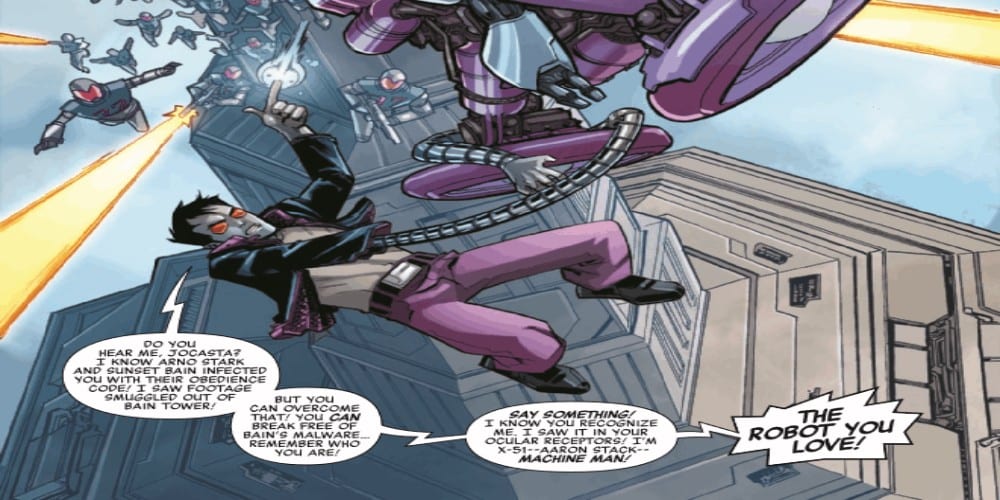
The Robot Revolution continues in Machine Man 2020 #1 thanks to Christos Gage, Andy MacDonald, Dono Sanchez-Alamara, Tom Delfaro, Mike Hawthrone, Andriano DiBenedetto, and Erick Arciniega. Does this outing with X-51, the Machine Man run seamlessly or does it need a reboot?
The A.I. uprising has begun, and Machine Man finds himself torn about his place in the revolution! As the battle rages around him, will Machine Man aid mankind’s fight for survival or join his robot brethren in ushering a new age?
Writing
This comic contains two stories, one focusing on Machine Man and the other following his old team, The Midnight Wreckers. The Machine Man story by Cristos Gage finally decides to address the elephant in the room. A character calls out Machine Man on his change in behavior, which hasn’t seemed very heroic as of late. Between his character in Tony Stark: Iron Man and him now leading the robot rebellion, its good someone got around to asking why he decided to become so extreme with his methods.
The second story by Tom Defalco, featuring The Midnight Wrecks helps to add to the world-building of the 2020 event. It showcases what is happening as the robot rebellion is taking place outside of the main focus on Iron Man 2020 and Machine Man. Sadly, it doesn’t really help give any indication where the event. Frankly, the entire issue feels like a side story.
Artwork
Machine Man 2020 #1 has two different teams for the two different stories. For the one focusing on X-51, Andy MacDonald does the artwork and Dono Sanchez-Almara provides coloring. Their work produces some detailed action scenes and is the most stunning part of the issue. The battles Machine Man has against his robotic opponents as he tries to catch up with Jocasta is the highlight of the issue.
With the Midnight Wrecker story, Mike Hawthrone is on Pencils, Andriano Di Benedetto is the inks, and Erick Archiega is on colors. Their style allows for a very cyberpunk style for the characters and the setting. This helps to provide the atmosphere of being cutting edge, which the Midnight Wrecker team was known for in previous stories they appeared in.
VC’s Travis Lantham takes care of the lettering work for both stories. Through proper placement of dialogue boxes, a great flow is established to the battles taking place. Also, it helps to add to effect work whenever Machine Man decides to use his scanners.
Conclusion
Machine Man 2020 #1 reads like a side story and doesn’t give enough time to the main character. It is nice Machine Man is getting the time to explore his decision to care more about robots than humans, but it probably could have been told in a single issue. Instead, its stretched out and half the issue is dedicated to side characters who haven’t been mentioned in years.
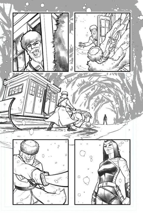
Bloodshot #0 out this week from Valiant Entertainment is the prologue to writer Tim Seeley’s main run with impressive art by Marc Laming. For everyone who misses the reluctant hero of Jeff Lemire’s run, this is your chance to see him.
Bloodshot #0 Story
Taking place after Bloodshot Salvation but before the beginning of Seeley’s Bloodshot #1, Bloodshot tries to get away from all of the grief as an oil pipeline worker in Siberia. Tired of just being another weapon, he doesn’t even protect himself from the angry locals. The aesthetic elements, however, feel out of place when it comes to the Russian setting. Just look at news reports about the Druzhba Pipeline. As such, they feel like things to get attention from Americans with opposing political leanings.
The true story of Bloodshot #0 comes from how Bloodshot comes to care for a young teenager and his choice of actions. The teen girl wants to be useful to somebody yet has to put up with abuse, not unlike Bloodshot. While Bloodshot doesn’t want to get close to anyone, he can’t help but empathize with her. They’re a couple of lost souls looking for purpose but choose to be on the move.
When an undercover agent asks for Bloodshot’s help in a disappearing people case, he refuses, which is a little tragic considering the agent is without backup. But more importantly, he knows about the good Bloodshot did. Something that’s continuously been lacking in Seeley’s issues. Bloodshot’s humanity is what makes him such a good character, flaws, and all. Instead of the tragic brooder in most of Seeley’s run, we get a reluctant hero who makes decisions and regrets in Bloodshot #0.
The Art
Laming’s artwork evokes feelings similar to the numerous artists of the Lemire era. Similar to Doug Braithwaite’s art, the characters feel like real people with movement and camera angles. Whatever actions do happen are simple and not trying to fit too much in one panel. It’s efficient for both action and expressive features. Whenever Bloodshot is in focus in his civilian form, his body language expresses his need to remain hidden. Whether he’s at work or trying to tell the agent to leave him alone. Sometimes the background fills in just as crucial details like the scornful looks of Bloodshot’s coworkers.
The muted colors by Andrew Dalhouse perfectly encapsulates the dour mood of the issue. Everything seems so rigid and cold, befitting the wintery setting. Once the real action begins, atmospheric reds and yellows occupy panels between blue backgrounds. All of which get help from Dave Sharpe’s onomatopoeias. Unlike the rest of the series where he recycles stock images, Sharpe shows a genuine dedication to this issue with custom wordmarks. Red and white wordmarks differentiate the attacks of Bloodshot between the yellow wordmarks of his attackers. Orange wordmarks meanwhile symbolize a direct confrontation between a thug and Bloodshot. Something that could very well transition from one side to another. Pure white wordmarks meanwhile displays a surprise that affects both Bloodshot and the reader. The surprise is so powerful; it pushes them to the main series.
Give Bloodshot #0 A Shot
If past issues of Seeley’s run aren’t clicking with you, look to this issue for some nostalgic goodies. More importantly, it displays what Seeley can really do in the right circumstances. Who needs a narrative ad for a movie when you can make a good story?
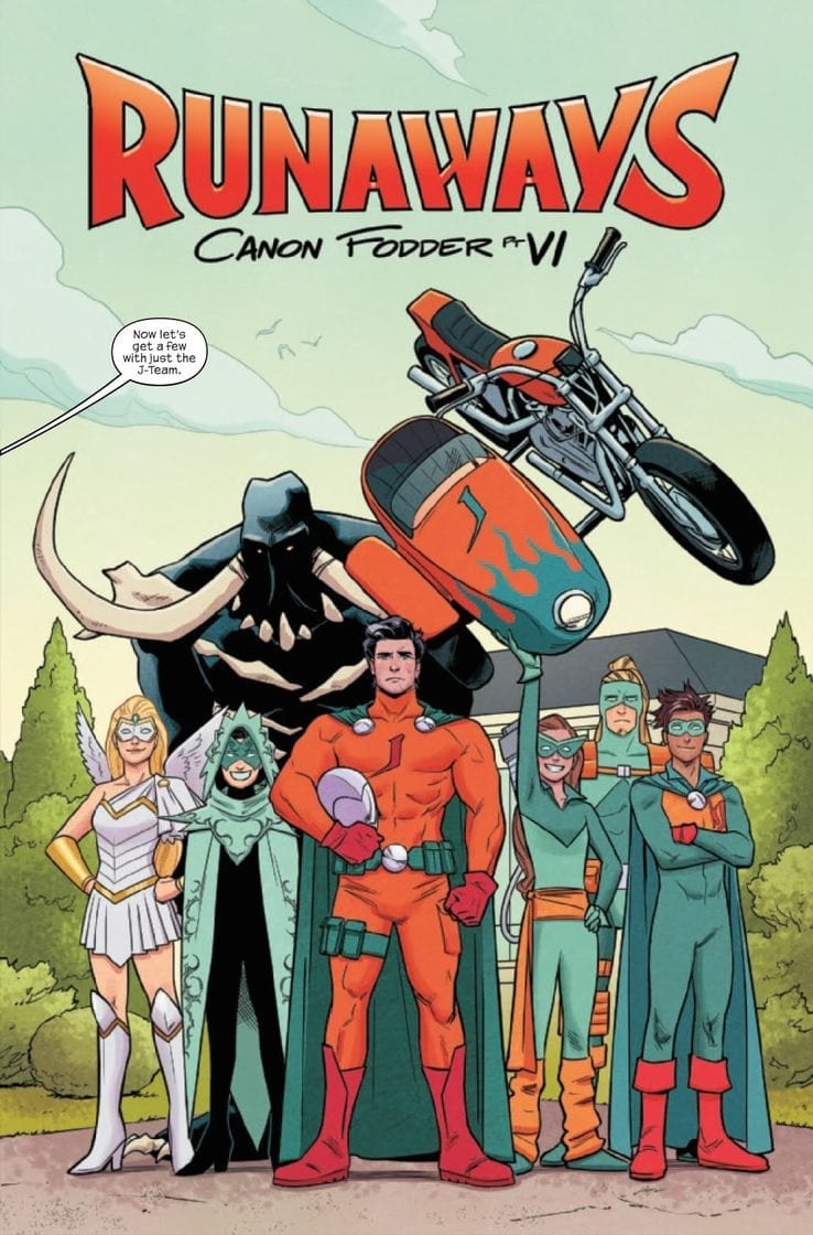
RUNAWAYS #30, out this Wednesday from Marvel Comics brings the now infamous Doc Justice back to the forefront, as his long game is revealed. This is the vindication many fans have been looking for.
Gert and Old Lace look about ready to get to the bottom of things in Runaways #30.
***SPOILER WARNING***
Fans of the Runaways (us included) have been having a significant amount of concerns about Doc Justice. Over the course of the last several issues, his character and insidious habits and plots have slowly been revealed. But while that might have been enough for many fans to condemn him, it didn’t carry the same satisfaction as seeing the Runaways catch him in the act.
Assuming they’d be willing to see what was right in front of their eyes, that is. The truth of the matter is; the Runaways went from being a bunch of teenagers too paranoid to trust any adult to adoringly following his every wish. With the exception of one.
That is where this issue begins. Runaways #30 is the second to last for this plot arc, and this is one we’ve been eagerly waiting for. You just know that things are about to start going wrong. After all, this is the Runaways we’re talking about. Something always goes wrong.
Canon Fodder is proving to be an apt name for this plot arc.
The Plot
Runaways #30 is a dramatic issue through and through. This is the sort of plot that Runaways fans live for. These young heroes have faced off against plenty of adults in their day, but perhaps nothing with quite so much buildup.
Rainbow Rowell really took their time building up the whole Doc Justice plot. There was something so chilling – yet satisfying – about watching it all come to ahead. Fans could clearly see the writing on the wall, while desperately wishing the characters could as well.
This is the issue that made all of that buildup and anxiety worth it. Though it also took some time to further buildup the tension. The revelations were cleverly done, leading us to be concerned about what is about to happen. And giving us even more fuel to hate Doc Justice with. It’s a win/win.
There are so many layers and little details to pick through from this issue. Doc Justice is a character who has been at this game for a long time, and we likely haven’t even seen the half of what he’s done. But the creative storytelling techniques used in this issue gave us a glimpse – without having to spend a ton of time doing so.
Don’t tell her not to smile. Don’t tell her to smile, either.
The Art
Runaways #30 features some dramatic art to go alongside all of that buildup, don’t worry. Though most of the action will occur later in the issue itself, there’s still plenty to appreciate leading up to that moment.
The photoshoot scene is one of the highlights of this issue, having this odd balance of humor and foreshadowing. Most of these elements are nonverbal, and thus relied heavily on the artwork. Another moment worth talking about is the clever storytelling mentioned above. This was a ton of information that had to be offloaded in a way that was interesting and not overwhelming. Easier said than done, but our artists found a way.
Andres Genolet was the lead artist for this issue. So you have them to thank for the dramatic poses, which are another highlight worth talking about. Our Runaways have really come into their own, which is a bit ironic, given what is happening.
Dee Cunniffe was the colorist, and they did a fantastic job with this issue. Karolina in particular really shines here – pun not intended, but welcome. Finally, VC’s Joe Caramagna was the letterer for this issue. And their work was especially vital during that scene we’ve already talked to death. It just wouldn’t have worked otherwise.
Doc Justice doesn’t seem like the type of man who takes being turned down well…
In Conclusion
Runaways #30 was basically everything that fans have been hoping for when it comes to this plot. The conclusion is now only an issue away, and there’s no doubt in our minds that it is going to be a dramatic one. In the meantime, this issue left plenty of little details worth pouring over. So that’ll keep fans busy for a time.
FLASH FORWARD #6, available in comic book stores Wednesday, February 19th, concludes the action-packed, heart-felt mini-series from Scott Lobdell, Brett Booth, and team. After being exiled to the Dark Multiverse to purge the dark matter in the worlds within, Wally West has finally reunited with his children. And through these actions he’s become the beacon of hope he always wanted to be. What’s more, he recently reunited with his kids from the pre New 52 reality. But what he doesn’t know is that the world they’ve been stranded on is of his own creation, and it holds the key to his ultimate role in this chaos.
Story
Lobdell’s writing throughout this arc shows just how immersed he is with the character of Wally. From the anxiety and guilt fueling his actions in the race to save the multiverse, to the warm embrace of his children in this issue, readers are treated to a fully humanized hero who’s overcome their demons.
Wally wants nothing more than to spend an eternity with his children after being separated from them for so long. He enjoys a few nights of peace with them to make up for lost time, but is led away from their campsite to speak with Tempus Fuginaut. The cosmic being informs our hero that his main mission was to destroy this very planet housing his children, using the Mobius Chair to do so.
The decision Wally makes in the end is both heart-warming and heart-wrenching; it’s a choice that will change the foundation of the multiverse as we know it.
Artwork
Booth’s penciling, with Norm Rapmund’s ink work, presents panels full of fluidity and motion, matching the mobile nature of Wally. Combined with Luis Guerrero’s coloring, we’re treated to varying shades of reds and blues, representing both the Scarlet Speedster and the flashes of light emanating from the Mobius Chair. ALW’s Troy Peteri’s lettering fits nicely into these effects by placing the dialogue/thought bubbles in such a way that it appears to be zapping into panels like the lightning that’s always present.
Comic Covers
Main Cover
Doc Shaner’s main cover artwork gives readers a god-like illustration of Wally holding the Earth in his grasp. This seems to represent the powers he will gain from the Mobius Chair, and, more importantly, where he will set his sights next.
Variant Cover
Inhyuk Lee’s variant cover is of the same ilk as Shaner’s, though this edition places our hero in the Mobius Chair itself. His stoic appearance suggests a possible change in demeanor in Wally’s future.
Conclusion
The anticipated conclusion in FLASH FORWARD #6 is immensely satisfying. It completes the character arc for Wally that began in Heroes in Crisis and opens up the realm of possibility for individuals within the the Flash mythos.
What do you think is in store for Wally following this issue? Let us know in the comments below!
CRITICAL ROLE: VOX MACHINA ORIGINS II #5, available on Wednesday, February 19th, follows Vox Machina’s quest to save their beloved member Grog. This issue focuses on Team Nightmare, the portion of the party who split off to track down the fiendish Nightmare creature. This being’s skull has the ability to save their goliath companion. But how will Pike, Keyleth, and Scalan take down a monstrosity of this sort?
Story
The trio heads into Joren Village, a small community tucked away in the Umbra Hills. Scalan, being a charismatic bard, asks a townsperson if they had heard word of any evil forces affecting them. She claims a man in charge of a mysterious cult was held in the village jail. So, the group heads toward the establishment.
The group soon finds that the prisoner isn’t what they expected. Percival Fredrickstein von Musel Klossowski de Rolo III of Whitestone (“Percy” for short) is a kindly, middle-aged man who believes he was framed by the actual cultists.
Faced with these conflicting stories, the team asks him more about the cult. He tells them they’re called the “Nightmare Cult” and that he’ll lead them to their meeting in exchange for helping him escape and retrieve his confiscated weapon. And after much deliberation, they decide to trust Percy and set off to track down the Nightmare that could potentially be summoned by the cult.
Jody Houser’s script captures the essence of each member of the party. She helps the reader feel as if Matthew Mercer and crew were leading a Dungeons & Dragons session in the comfort of their own home.
Artwork
The artwork with this issue offers a brilliant rendition of the world crafted by Mercer and company. Olivia Samson’s penciling and ink work, working in tandem with Msassyk’s coloring, presents readers with highly detailed buildings, faces, and landscapes that are filled with effective variants in shading. Ariana Maher’s lettering is also particularly operative, employing dialogue balloons coming from character’s off panel; this helps readers imagine the entire world of the comic taking place just out of sight.
Comic Cover
The cover artwork from COUPLEOFKOOKS gives readers a close look at Percy in his shackles, emphasizing the focus character of this issue.
Conclusion
CRITICAL ROLE: VOX MACHINA ORIGINS II #5 both introduces a new character to the party and features a mysterious being that will keep readers on the edge of their seats. We’re excited to see what happens to our heroes next!
Do you think Percy is a trustworthy ally? Let us know in the comments below!
This Wednesday, Maria Llovet’s Heartbeat #4 from BOOM! Studios shows the aftereffect of Eva’s decision, as those close to her quickly figure out her dark secrets.
Interior art by Maria Llovet. Letters by AndWorld Design
If you need a quick refresher, check out our reviews for the previous three issues here. Plus, Darryll Robson includes a great breakdown of a moment in Heartbeat #3 in his article, Silence Is Golden: The Wordless Panel.
HEARTBEAT’S END BEGINS
As the series comes to its inevitable end, Llovet doesn’t spend time wrapping things up; instead, she stacks onto Eva’s troubles. Nothing too extreme that couldn’t be wrapped up in a single issue, just enough to give Heartbeat an extra final beat. Being so infatuated with the mystery Don protrudes before her, Eva makes some glaring mistakes. First in Heartbeat #3, where she is caught by Mack. Next, when she loses her cellphone, that gets picked up by another.
The latter part seems a bit too convenient and unrealistic for Eva’s character. For someone who has damning evidence of a murder being investigated, why wouldn’t she freak out? It could’ve happened off-panel, yet Eva never goes back to grab her phone. If she indeed was worried, it could’ve been shown. Alas, at no point is she shown worried. Although on the other hand this could be Llovet showing how deeply Eva has fallen, with nothing around her mattering. Nonetheless, this small blight seems awkward in a tightly woven plot.
A MULTI-LINGUAL TALE
All creators since the beginning of Heartbeat have remained the same with AndWorld Design on lettering, while translated by Andrea Rosenberg. AndWorld Design keeps the same quality of maneuvering around Llovet’s art to keep the visuals intact. Without having read the original series or the other language additions, it’s hard to tell if Rosenberg changed much in translation. Yet, at no point does the information seem lost, or the integrity of Llovet’s story broken.
Interior art by Maria Llovet. Letters by AndWorld Design
STEADY BEATING HEART
Llovet has kept the same top-notch quality throughout the four issues of Heartbeat. That in mind, it’s hard to mention anything new on the art. This is due to her work constantly looking gorgeous and her never “wasting” a panel. Instead, she makes use of everything in her arsenal. Each panel that portrays a single action either with/without words speaks volumes on her visual storytelling ability.
The few shots of the city besides the school feel empty and decrepit. Not to mention the locations, some of the students hang out vary in structure. Within those few shots, Llovet shows a world outside of Eva’s that may be in descent just as she. At first, these establishing shots seem just that, alas, these panels help show the world Eva inhabits. This adds in great visual layers into Llovet’s story that makes you want to venture deeper into her world.
Llovet keeps the subtle/real-world color palette seen in the previous issues. This palette keeps her world grounded while giving it an eerie feel. Her eye for colors and how they pertain for certain moments is keen. No moment in Heartbeat #4 has colors that don’t match the vibe or visual story she is trying to tell.
Interior art by Maria Llovet. Letters by AndWorld Design
CONCLUSION
In its fourth issue, Maria Llovet’s Heartbeat continues to be a fantastic slow-burning story dealing with one’s moral decline and the consequence that follow. Instead of reading as a build-up to the climax of the series, Llovet presents Heartbeat #4 as a continuation while adding more elements. Llovet can draw the reader in by adding new elements and revelations before the finale.
DEAR READER
As Eva’s story in Heartbeat is starting to wrap up, what have you thought so far? Plus, if you’re looking for more of Llovet’s amazing writing/art, check out her new Graphic novel, LOUD!
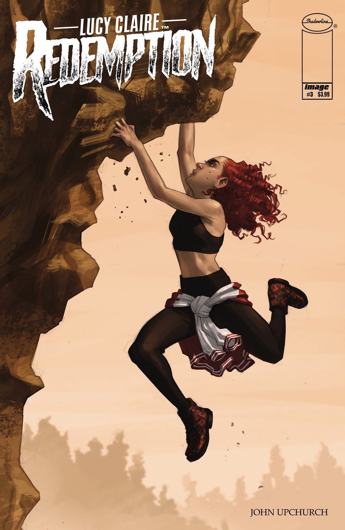
LUCY CLAIRE: REDEMPTION #3, out this Wednesday from Image Comics continues the dramatic tale of a disgraced werewolf hunter, laying out all of her pain and guilt while building the tension for what is to come.
Iconic and relevant imagery for the cover of Lucy Claire: Redemption #3.
***SPOILER WARNING***
Lucy Claire: Redemption has been a chilling and thrilling read so far. This werewolf hunting series is one that stands out among the pack (pun intended) and with good reason. Lucy Claire is a disgraced werewolf hunter, one who carries her loss and guilt on her slim shoulders.
One of the things that make this series so impressive is that it is written, illustrated, and lettered by only one person: John Upchurch. This is without a doubt a labor of love, albeit a labor of love full of violence and tense backstory.
The alternate cover for Lucy Claire: Redemption #3 gives a glimpse at the new antagonist she’s about to face.
The Plot
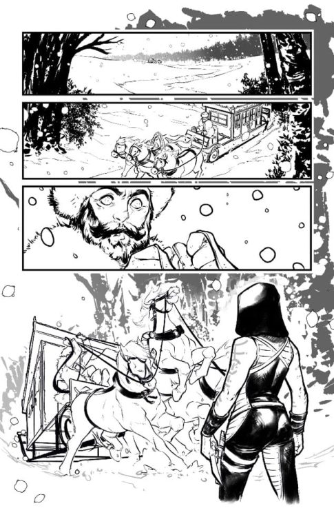
Lucy Claire: Redemption #3 picks up exactly where the last issue left off. The battle in the dump has just ended, and Lucy is not certain about what she just witnessed. Given everything she’s been through lately; we don’t blame her for not trusting her own senses.
One thing is certain, that’s one heck of a way to start off an issue. It wasted no time throwing readers into the thick of things. It also truly set the pace for the rest of the issue. Everything quickly rolled from one moment to the next.
This is another one of those carefully balanced issues. On the one hand, there’s plenty of action and gore to go around. On the other hand, there’s the fragile creature that is Lucy’s mental and emotional state. The two bounce off each other to shockingly great effect, resulting in a tale that is full of drama and impact.
The final battle portrayed in this issue is an intense one, but it goes deeper than that as well. It was a well-written series of events. And it left readers eager for the next issue, where the truth of what is really going on will finally (hopefully) be revealed.
The Art
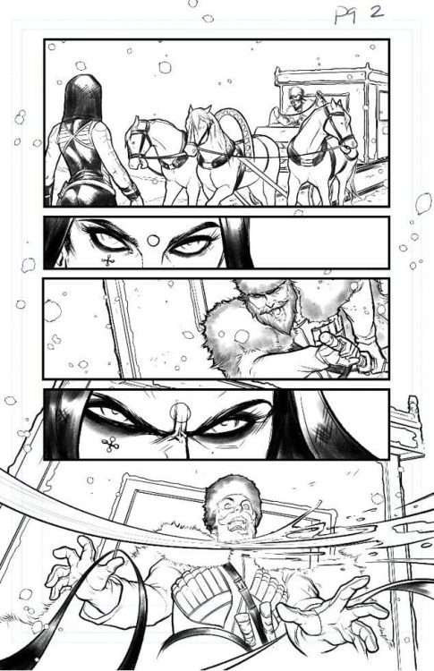
The artwork in Lucy Claire: Redemption #3 is outstanding. The colors are vibrant and lush, the characters full of personality and a range of emotions, and much more. There’s a lot to love about this issue, from the individual panels to the full page spreads.
One highlight of this issue has got to be the fight scenes. There are two fights in this issue, though both are dramatically different from one another. Both have interesting setups, but neither would have carried the same weight without the artwork to support it. There’s this real sense of danger, thanks to the creatures being portrayed. You can get a sense of movement and impact as well – something that will make you wince with sympathy a time or two.
The variety of wolves portrayed in this issue (and series as a whole) is another element worth talking about. There’s not one stagnant type of wolf that Lucy is battling here. The variety in itself adds a certain amount of visual appeal, and that’s before taking into account the more ephemeral way the larger beasts are drawn. That just takes the series (and its antagonists) to a whole new level.
A peek at the cover for Lucy Claire: Redemption #4.
In Conclusion
Lucy Claire: Redemption #3 is another intense read in this series. Honestly, it’s hard to believe that we’re only three issues in, given how much has occurred. This is a thrilling tale that sets the werewolves and werewolf hunters on a completely different path than the norm. All by adding shocking twists and turns at every opportunity.
LUMBERJANES #71, out this Wednesday from Boom! Studios merges the past with the present as it finally reveals the history of the beloved Lumberjanes camp. Fans who have been curious about its origins will not want to miss out on this tale.
The past and the present mirror one another on the cover of Lumberjanes #71.
***SPOILER WARNING***
It’s hard to believe that Lumberjanes has been running long enough to have earned 71 issues. And yet at the same time, it feels like it’s always been here for the fans. What is perhaps more surprising is that we’ve never learned the origin of the camp itself – until now.
The camp we know has always been open, loving, and accepting. We’ve seen all sorts of campers find a home here, while also having the freedom to be who they are. But that wasn’t always the case, as the latest issues have been quick to show us.
Our fearless leader appears to be at some risk on this alternate cover of Lumberjanes #71.
The Plot
Lumberjanes #71 is a carefully woven story. One that bounces back and forth between the present and the past to make a very specific point. This is the origin story of the Lumberjanes – and it is a moment we’ve all been waiting for.
It’s so tempting and easy to assume that the Lumberjanes have always existed, or at least have always been in the form that we know and love. That is to say, it’s easy to assume that has always been a camp willing to accept its campers.
But as Shannon Watters and Kat Leyh have shown us here, that is not exactly the case. This campsite originally had a very different purpose. This revelation actually adds a whole new layer to the series and has quickly become a new emotional point worth discussing.
Jane’s tale is revealed through carefully used storytelling techniques. Fans get to learn about her through the Roanoke cabin, which is actually something we’re fairly used to at this point. Interestingly enough, there are a couple of subplots revolving around this one. This little extra touch adds so much complexity to the story and makes us even more eager to see more.
And suddenly we know what sort of life Jane has to come back to.
The Art
Lumberjanes #71 is full of charming and endearing artwork, as always. Kanesha C. Bryant and Julia Madrigal were the lead artists for this issue, with Maarta Laiho providing the colors, and Aubrey Aiese doing the lettering.
Together they’ve created an enchanting issue. It’s always easy to tell the difference between the two timelines, something that we always appreciate here. The color palette and clothing styles change significantly between one and the other (as do the characters themselves, obviously). This is a simple yet highly effective way of conveying such a change.
There are a lot of subtle moments worth appreciating in this issue. The backdrops, the glimpses into Jane’s journal, and the exaggerated expressions of our campers, just to name a few. That being said, there’s one panel with a very obvious reference (involving one infamous plant) that we’re still chuckling about. Be sure to take a look for yourself.
Apparently stockings take a higher priority than wounded ankles…
In Conclusion
Lumberjanes #71 is another highly entertaining issue in this sometimes chaotic series. The origin of the camp is not at all what we expected – it’s much more intriguing. The complexity and depth to this plot do the entire series justice.
FIREFLY #14, out this Wednesday from Boom! Studios continues this surprising twist of events for Malcolm and his allies. This is perhaps the strangest plot yet, but there’s no doubt that the crew of Serenity has a plan for what is to come.
A colorful sunset with careful foreshadowing for Firefly #14.
***SPOILER WARNING***
Joss Whedon’s beloved series, Firefly, has made several successful comic series over the years. But this latest run is proving to be one of the more unique ones available, which is saying something. Or perhaps it’s more accurate to say that this is a plot that fans could never have expected – or predicted.
Thanks to a strange series of events, Mal has found himself on the opposite side of the law. And now, we don’t mean that he’s behind bars. It’s more accurate to say that he is the law. At least, on one small moon. Though for how long that will last will be anyone’s guess.
Mal’s new ally is looking dramatic on this variant cover of Firefly #14.
The Plot
Firefly #14 brings us once again to the universe of Firefly, and thus to the characters we’ve come to love so much. Though it is highly unlikely that any fan could have predicted the situation that Malcolm Reynolds is currently in.
Greg Pak has certainly managed to surprise the fans again and again. Though in many ways, this issue felt more like we were coming back around to core plots and values of the series itself. It had a more somber tone to it, especially in regards to Zoe’s plot. That very much rang true to elements we’ve seen already.
The series is setting up for something, though it’s currently hard to tell what that will be. On the one hand, we can see Zoe establishing a connection to others (with heartbreaking implications if we’re to assume this is set before Serenity).
On the other hand, we have Mal’s escapade, which feels like is coming to an end. Or perhaps that is just what they want us to think? It’s tough to be certain. While we don’t see the position lasting long for Mal, we’ve got to admit that there are certain elements that fit firmly with his beliefs and stubbornness. It’s nice seeing that side of him highlighted here.
Moon takes center stage on this variant cover…and it’s mildly concerning.
The Art
Firefly #14 boasts some of the best artwork in recent times. The artistic team really ran away with some of the scenes, portraying the core themes of the series in such an emotional and heartrending manner. These are the sort of scenes that really strike home.
The art style was changed for this issue, but arguably for the better. All of the characters still read as being clearly influenced by their actor counterparts – but at the same time, it feels like they’ve been liberated. The artists portrayed the world and characters how they wanted. Or at any rate, that was how it felt while reading this issue.
Lalit Kumar Sharma was the lead artist, with Francesco Segala providing the colors, and Jim Campbell doing the lettering. Together they created an issue full of dynamic artwork. The expressions during specific scenes and the overall color palette are absolutely stunning and are a combination we hope to see again.
Firefly #14 features a stunning new art style.
In Conclusion
Firefly #14 was an unexpected and entertaining read. One that combines the surprising elements with plots that bring the series back to its roots. The combination is shockingly effective while leaving us curious about what will happen next.


 The muted colors by Andrew Dalhouse perfectly encapsulates the dour mood of the issue. Everything seems so rigid and cold, befitting the wintery setting. Once the real action begins, atmospheric reds and yellows occupy panels between blue backgrounds. All of which get help from Dave Sharpe’s onomatopoeias. Unlike the rest of the series where he recycles stock images, Sharpe shows a genuine dedication to this issue with custom wordmarks. Red and white wordmarks differentiate the attacks of Bloodshot between the yellow wordmarks of his attackers. Orange wordmarks meanwhile symbolize a direct confrontation between a thug and Bloodshot. Something that could very well transition from one side to another. Pure white wordmarks meanwhile displays a surprise that affects both Bloodshot and the reader. The surprise is so powerful; it pushes them to the main series.