Home Blog Page 347

Loss and Determination in LUCY CLAIRE: REDEMPTION #3

LUCY CLAIRE: REDEMPTION #3, out this Wednesday from Image Comics continues the dramatic tale of a disgraced werewolf hunter, laying out all of her pain and guilt while building the tension for what is to come.

Iconic and relevant imagery for the cover of Lucy Claire: Redemption #3.

***SPOILER WARNING***

Lucy Claire: Redemption has been a chilling and thrilling read so far. This werewolf hunting series is one that stands out among the pack (pun intended) and with good reason. Lucy Claire is a disgraced werewolf hunter, one who carries her loss and guilt on her slim shoulders.

One of the things that make this series so impressive is that it is written, illustrated, and lettered by only one person: John Upchurch. This is without a doubt a labor of love, albeit a labor of love full of violence and tense backstory.

The alternate cover for Lucy Claire: Redemption #3 gives a glimpse at the new antagonist she’s about to face.

The Plot

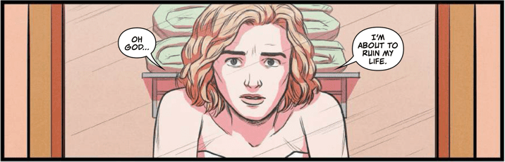
Lucy Claire: Redemption #3 picks up exactly where the last issue left off. The battle in the dump has just ended, and Lucy is not certain about what she just witnessed. Given everything she’s been through lately; we don’t blame her for not trusting her own senses.

One thing is certain, that’s one heck of a way to start off an issue. It wasted no time throwing readers into the thick of things. It also truly set the pace for the rest of the issue. Everything quickly rolled from one moment to the next.

This is another one of those carefully balanced issues. On the one hand, there’s plenty of action and gore to go around. On the other hand, there’s the fragile creature that is Lucy’s mental and emotional state. The two bounce off each other to shockingly great effect, resulting in a tale that is full of drama and impact.

The final battle portrayed in this issue is an intense one, but it goes deeper than that as well. It was a well-written series of events. And it left readers eager for the next issue, where the truth of what is really going on will finally (hopefully) be revealed.


The Art

The artwork in Lucy Claire: Redemption #3 is outstanding. The colors are vibrant and lush, the characters full of personality and a range of emotions, and much more. There’s a lot to love about this issue, from the individual panels to the full page spreads.

One highlight of this issue has got to be the fight scenes. There are two fights in this issue, though both are dramatically different from one another. Both have interesting setups, but neither would have carried the same weight without the artwork to support it. There’s this real sense of danger, thanks to the creatures being portrayed. You can get a sense of movement and impact as well – something that will make you wince with sympathy a time or two.

The variety of wolves portrayed in this issue (and series as a whole) is another element worth talking about. There’s not one stagnant type of wolf that Lucy is battling here. The variety in itself adds a certain amount of visual appeal, and that’s before taking into account the more ephemeral way the larger beasts are drawn. That just takes the series (and its antagonists) to a whole new level.

A peek at the cover for Lucy Claire: Redemption #4.

In Conclusion

Lucy Claire: Redemption #3 is another intense read in this series. Honestly, it’s hard to believe that we’re only three issues in, given how much has occurred. This is a thrilling tale that sets the werewolves and werewolf hunters on a completely different path than the norm. All by adding shocking twists and turns at every opportunity.

Monkeys Fighting Robots Youtube

The Expectations of the Past in LUMBERJANES #71

LUMBERJANES #71, out this Wednesday from Boom! Studios merges the past with the present as it finally reveals the history of the beloved Lumberjanes camp. Fans who have been curious about its origins will not want to miss out on this tale.

The past and the present mirror one another on the cover of Lumberjanes #71.

***SPOILER WARNING***

It’s hard to believe that Lumberjanes has been running long enough to have earned 71 issues. And yet at the same time, it feels like it’s always been here for the fans. What is perhaps more surprising is that we’ve never learned the origin of the camp itself – until now.

The camp we know has always been open, loving, and accepting. We’ve seen all sorts of campers find a home here, while also having the freedom to be who they are. But that wasn’t always the case, as the latest issues have been quick to show us.

Our fearless leader appears to be at some risk on this alternate cover of Lumberjanes #71.

The Plot

Lumberjanes #71 is a carefully woven story. One that bounces back and forth between the present and the past to make a very specific point. This is the origin story of the Lumberjanes – and it is a moment we’ve all been waiting for.

It’s so tempting and easy to assume that the Lumberjanes have always existed, or at least have always been in the form that we know and love. That is to say, it’s easy to assume that has always been a camp willing to accept its campers.

But as Shannon Watters and Kat Leyh have shown us here, that is not exactly the case. This campsite originally had a very different purpose. This revelation actually adds a whole new layer to the series and has quickly become a new emotional point worth discussing.

Jane’s tale is revealed through carefully used storytelling techniques. Fans get to learn about her through the Roanoke cabin, which is actually something we’re fairly used to at this point. Interestingly enough, there are a couple of subplots revolving around this one. This little extra touch adds so much complexity to the story and makes us even more eager to see more.

And suddenly we know what sort of life Jane has to come back to.

The Art

Lumberjanes #71 is full of charming and endearing artwork, as always. Kanesha C. Bryant and Julia Madrigal were the lead artists for this issue, with Maarta Laiho providing the colors, and Aubrey Aiese doing the lettering.

Together they’ve created an enchanting issue. It’s always easy to tell the difference between the two timelines, something that we always appreciate here. The color palette and clothing styles change significantly between one and the other (as do the characters themselves, obviously). This is a simple yet highly effective way of conveying such a change.

There are a lot of subtle moments worth appreciating in this issue. The backdrops, the glimpses into Jane’s journal, and the exaggerated expressions of our campers, just to name a few. That being said, there’s one panel with a very obvious reference (involving one infamous plant) that we’re still chuckling about. Be sure to take a look for yourself.

Apparently stockings take a higher priority than wounded ankles…

In Conclusion

Lumberjanes #71 is another highly entertaining issue in this sometimes chaotic series. The origin of the camp is not at all what we expected – it’s much more intriguing. The complexity and depth to this plot do the entire series justice.

Monkeys Fighting Robots Youtube

The Aftermath of War in FIREFLY #14

FIREFLY #14, out this Wednesday from Boom! Studios continues this surprising twist of events for Malcolm and his allies. This is perhaps the strangest plot yet, but there’s no doubt that the crew of Serenity has a plan for what is to come.

A colorful sunset with careful foreshadowing for Firefly #14.

***SPOILER WARNING***

Joss Whedon’s beloved series, Firefly, has made several successful comic series over the years. But this latest run is proving to be one of the more unique ones available, which is saying something. Or perhaps it’s more accurate to say that this is a plot that fans could never have expected – or predicted.

Thanks to a strange series of events, Mal has found himself on the opposite side of the law. And now, we don’t mean that he’s behind bars. It’s more accurate to say that he is the law. At least, on one small moon. Though for how long that will last will be anyone’s guess.

Mal’s new ally is looking dramatic on this variant cover of Firefly #14.

The Plot

Firefly #14 brings us once again to the universe of Firefly, and thus to the characters we’ve come to love so much. Though it is highly unlikely that any fan could have predicted the situation that Malcolm Reynolds is currently in.

Greg Pak has certainly managed to surprise the fans again and again. Though in many ways, this issue felt more like we were coming back around to core plots and values of the series itself. It had a more somber tone to it, especially in regards to Zoe’s plot. That very much rang true to elements we’ve seen already.

The series is setting up for something, though it’s currently hard to tell what that will be. On the one hand, we can see Zoe establishing a connection to others (with heartbreaking implications if we’re to assume this is set before Serenity).

On the other hand, we have Mal’s escapade, which feels like is coming to an end. Or perhaps that is just what they want us to think? It’s tough to be certain. While we don’t see the position lasting long for Mal, we’ve got to admit that there are certain elements that fit firmly with his beliefs and stubbornness. It’s nice seeing that side of him highlighted here.

Moon takes center stage on this variant cover…and it’s mildly concerning.

The Art

Firefly #14 boasts some of the best artwork in recent times. The artistic team really ran away with some of the scenes, portraying the core themes of the series in such an emotional and heartrending manner. These are the sort of scenes that really strike home.

The art style was changed for this issue, but arguably for the better. All of the characters still read as being clearly influenced by their actor counterparts – but at the same time, it feels like they’ve been liberated. The artists portrayed the world and characters how they wanted. Or at any rate, that was how it felt while reading this issue.

Lalit Kumar Sharma was the lead artist, with Francesco Segala providing the colors, and Jim Campbell doing the lettering. Together they created an issue full of dynamic artwork. The expressions during specific scenes and the overall color palette are absolutely stunning and are a combination we hope to see again.

Firefly #14 features a stunning new art style.

In Conclusion

Firefly #14 was an unexpected and entertaining read. One that combines the surprising elements with plots that bring the series back to its roots. The combination is shockingly effective while leaving us curious about what will happen next.

Monkeys Fighting Robots Youtube

Blood, Family Ties, and Guilt in FAMILY TREE #4

FAMILY TREE #4, out this Wednesday from Image Comics continues the horrifying yet thrilling tale of one family and the dramatic changes they are going through. This is a series that takes the concept of a family tree more literally than most.

This family is on the run for the cover of Family Tree #4.

***SPOILER WARNING***

Family Tree is one of those unique series that’ll make fans stop and think. It merges family drama with chilling horror, and the end result is something memorable. Here we have one family torn apart. At first glance, it’s just the normal drama. Dad bails on his family, never to be heard from again.

But it’s not that simple, is it? The last few issues of this series have revealed all of the reasons why the father had no choice to leave – and the legacy he unintentionally left behind in his wake. Now it’s up to the disgraced father to change the course for those that remain. It’s safe to say that this is a tale as full of bitter feelings as it is intrigue.

The creative team behind Family Tree has been going all out to make this series something memorable. Together, Jeff Lemire, Phil Hester, Eric Gapstur, and Ryan Cody have merged such human elements with something utterly disturbing – the concept of losing everyone and everything to something outside of your control.


The Plot

Family Tree #4 is a heavy-hitting issue. That’s an impressive feat when you consider the issues that this one has had to follow. The last issue focused on the transition itself (with the daughter taking center stage, understandably). Issue four opted to go a different direction, allowing readers to see the plot from a whole new angle.

What unfolded here was intriguing at first, but quickly evolved to something more…something darker, as the issue went on. This is a family that has been put through hell and back, and it’s pretty clear that their journey is far from over.

This is a fact that was made painstakingly clear over the course of these pages. It was almost hard to bear at times. But it was certainly the perfected combination of horror and family drama. Though one could argue that they’re pushing those concepts to the extremes.

The conclusion for this issue is admittedly a bit of a rough one. It’s one of those endings that’ll make the month-long wait feel worse than normal. Fans will be eager to see what happens next…as well as having some confirmations on our assumptions.


The Art

You wouldn’t think that a series set primarily with bright lights and colors would be terrifying. But Family Tree #4 manages to do exactly that. This is an issue that is alarmingly bright in color, while the themes march steadily towards darkness.

There’s something to be said in that. The creative team has done something different here while creating these pages. There’s a lot that could be said about the artwork, including the color palette we’ve already touched upon.

One highlight for this issue would have to be the last several pages. Those pages contain a series of fights – but that almost feels like an understatement. Here we have a brutal fight for survival. No, a fight for family. It’s bloody and fierce, and unafraid to show how desperate a fight like that would truly be. The sheer determination poured from the pages, increasing the impact of the events tenfold.

A peek at what might be in store with the cover of Family Tree #5.

In Conclusion

Family Tree #4 was an alarming and dramatic issue, one that was unafraid to show the brutality and desperation that comes from fighting for your life. This is an issue that will leave fans on the edge of their seat, waiting for the fifth issue to drop.

Monkeys Fighting Robots Youtube

DCEASED UNKILLABLES #1: The Apocalypse Has Never Been Better

DCEASED Unkillables by Tom Taylor for DC Comics

With DCEASED Unkillables #1, writer Tom Taylor returns to his zombie apocalypse in style. Taylor is joined by penciler Karl Mostert, inkers Trevor Scott, Neil Edwards and John Livesay, colorer Rex Lokus and letterer Saida Temofonte. DCEASED Unkillables #1 shows what happens to the immortals during a zombie apocalypse. And with characters like Red Hood, Mirror Master, and the Creeper, we are in for a ride.

Writing

Taylor continues to have a blast with his characters in this issue. He creates a team among the survivors and establishes their rapport almost immediately. With jokesters like the Creeper, and badasses like Slade Wilson, and those who are a little of both like Red Hood, Taylor’s continuation of DCEASED is sure to be a hit. And just because Taylor has fun with his script, doesn’t mean there aren’t heartfelt moments. And so we get heart-wrenching scenes followed by side-splitting jokes.

Art

Mostert, Scott, Edwards, and Livesay create splash pages and apocalyptic devastation beautifully. Yet their human faces sometimes veer into the territory of the Uncanny Valley. With eyes that seem slightly too small for their faces, the art can occasionally be distracting. Yet their ability to set a scene is impressive. With corpses strung up on buildings, or mirror dimensions showing a highlight reel of the gory details, the art shines.

Coloring

Despite the world ending, there is something very bright about this comic. Lokus rarely goes for grim or dark in this issue but seeks to balance out the grim details with a bright palette. In some ways, it gives the feeling of a complete lack of mortality. This series centers around a lot of immortal characters. And why shouldn’t the apocalypse seem bright to many of them? Once the storm passes, they’ll have anything they want. Except… maybe… other people.

Lettering

Temofonte makes sure we never forget the bloodiness of events. Throughout the issue, text boxes and datelines don’t escape the massacre. They’re flecked in blood. And many of the sound effects become part of the carnage in one way or another. Sounds from explosions seem to rip through bodies. The crunching of wheels running over zombies is written in a bloody mess.


DCEASED Unkillables #1 is a fun start to what will surely be a fun ride. If there’s anything you should read before the Apocalypse, it’s this. Pick up DCEASED Unkillables #1 February 19th at a comic book shop near you.

Monkeys Fighting Robots Youtube

GOING TO THE CHAPEL: How To Make A Dysfunctional Family Sitcom

Going To The Chapel Trade Cover

Going To The Chapel by David Pepose and company is a sitcom that hits notes similar to The Simpsons. Unlike that show and many that follow in its footsteps after more than a decade, Pepose’s series retains its integrity. But what is it about Going To The Chapel that makes it comparable to animated sitcoms; bratty kids and dumb man-children of dads? None, it’s the dysfunctional quirky families revolving around a simple premise.

Why At A Chapel?

A simple premise can have a very compelling story behind it if it’s relatable. In Going To The Chapel‘s case, it’s the lead character Emily Anderson’s trepidation on marital commitment. Because what person doesn’t get cold feet at their wedding? Not only that, but for Emily, it’s worse than dealing with her wealthy but dysfunctional family. Even the hostage situation lead by her ex-boyfriend, Tom can’t compare. This situation can, however, be compared to Simpsons episode “Last Exit To Springfield.”

The premise is Homer Simpson standing up to his boss Mr. Burns. Burns, at this point, disregards his workers’ union for healthcare plans. With Homer’s daughter Lisa needing braces, Homer acts as union president to protest against Burns. Everybody wants to stand up to their boss when the boss does something underhanded in disguise of benevolence. The case being giving up dental plans in exchange for free beer at staff meetings. But it’s a whole other story when the family gets involved even if it’s not entirely benevolent. Homer cares about Lisa, but he hates having to pay for her braces even if Lisa’s cheaper braces involve a hilarious hallucinogenic “Yellow Submarine” sequence.

The Dysfunctionally Hilarious Support

Going To The Chapel with its nutty support cast.
FYI, that’s not caramel.

All sitcoms seem to feature dysfunctional families that reflect in someway people’s lives. While the Anderson family is immensely wealthy, they’ve their own lives and struggles that could warrant their own series. A personal favorite comes from Grandma Harriet, a hedonistic Vietnam War veteran bound to a wheelchair and oxygen tanks. Despite her frail looks, she’s highly resourceful, from using her medical bracelet to call for help in the hostage situation to spiking a piece of cake with Ambien. Not to mention when all’s said and done, Harriet has a deeper side to her — being the one to encourage Emily the most when it comes to living her life the way she wants.

I dare you not to laugh!The rest of the Anderson’s steal the spotlight just as often. Emily’s parents epitomize first-world problems with trying to be as extravagant as possible. Her dad wants to have a thousand doves at the wedding while constantly worrying about money. Emily’s cousin(?), Natalie, meanwhile, makes a serious call for help as a way to a means to advertise her Instagram influencer status. Naturally, some straight men need to be in these situations including Emily’s fiance Jesse. That’s not to say he can’t play the funny man with his acts of bravado. Those acts, in turn, help build up his character as well as his relationship with Emily.

A Sistine Chapel For Animated Sitcoms

Probably the best thing about this series is how easily accessible it is for new readers. Any sitcom worth its ratings deserves its episodes to be mostly jumping on points. Because let’s face it, starting a sequential story from the middle is a terrible thing to do. It offsets the flow of the story.


Meanwhile, the middle issues of Going To The Chapel act like a buffer for what’s come before. With a minimal amount of intel yet just the right amount of it, readers get the gist of things without chunky exposition. Sometimes the art by Gavin Guidry, like a partially wrecked wedding cake says more.

Also, due to using panels instead of live-action cameras, the cast and setting can get away with anything. With no huge budgets, the conflicts can be as over the top as they want. The cartoony violence and jokes decorate every page. For that matter, it gives the series a sense of longevity. This allows for creators to develop characters and settings for as long as they want.

A Satisfying Ending

First season jitters?
Oh, come on! We’re not even at the point where it’s all dumb jokes!

Like all good things, they must come to an end. It’s all well and good to stick to a premise and milk it for all its worth, but there will be times those ideas clash with characters. Because jokes are only memorable in comedy series if they help drive the plot. The jokes aren’t meant to be a plot, especially if they distract the audience from what’s at hand — for example, the numerous cutaway gags in Family Guy. In the final issue of Going To The Chapel, the emotional stakes are at their highest when Emily is torn between options. Either become a master thief with Tom or join Jesse in matrimony.

On the side, things are flaring up with Tom’s relationship with Emily coming up with Tom’s Bad Elvis Gang and the town sheriff. While it’s tempting to know what would happen after the final issue, those are stories for another time. Going To The Chapel is Emily’s series, so she’s the one who calls the shots. Who knows maybe if Pepose likes the idea enough, he could create a spin-off around one or more of these characters. It can’t be any worse than The Cleveland Show.

Monkeys Fighting Robots Youtube

HELLBOY & THE BPRD: THE RETURN OF EFFIE KOLB #1 Revisits the Past

Hellboy and the BPRD: The Return of Effie Kolb #1 by Mignola, from Darkhorse

Written by Mike Mignola, with art by Zach Howard, colors by Dave Stewart and letters by Clem Robins, Dark Horse’s Hellboy and the BPRD: The Return of Effie Kolb #1 kicks off a new chapter from old territory. The great charm of a hero like Hellboy is that he kicks butt, and somehow everything gets wrapped up. He stumbles unto his successes. But the question remains, do those problems stay solved? The creative team behind this new issue of Hellboy and the BPRD begin to answer that question.

Writing

While it’s essential first to do a quick re-read of The Crooked Man, Mignola’s new story carries its weight. Drawing directly from The Crooked Man, the first appearance of Effie Kolb, Mignola brings Hellboy back to the town where it all happened. Though years have existed between these stories, both in publication and in the Mignolaverse, the reentry is seamless. Mignola’s quiet style and quieter hero are a welcome return. Mignola achieves inter-character dynamics brilliantly. In as little as one issue, we sense a bond between the characters. Mignola asks us the question: Is the Crooked Man dead? And if so, what happens when evil leaves a void to be filled? The next issue promises to have answers.

Art

Howard strikes a satisfying balance in this issue. While he recreates many of Richard Corben’s creatures from The Crooked Man, he somehow both emulates Corben and maintains his own style. And many of the new additions to the cast of characters, Howard gives an unnerving air of normalcy. Despite hints that some characters are secretly up to no good, Howard presents us with ordinary people. The terrifying implication being that evil knows how to hide itself away. Howard and Mignola work together brilliantly. As Howard chooses to approach Mignola’s characters with the same subtlety as the writing.

Coloring

Stewart, long-time Mignolaverse and Dark Horse veteran, returns to Hellboy and the BPRD for more stunning work. It is Stewart’s coloring that makes Howard’s work seem like a balance between Mignola’s own art and that of Corben. The dark tones and overlaid shadows bring everything into familiar territory. But where Stewart strays from the usual, he shows his brilliance as a colorist. As the issue displays flashbacks to the events of The Crooked Man, Stewart colors flashback’s background in golden hues. Giving the sense that that was the Golden Age for these characters. And in one moment, as a character emulates his younger self, Stewart colors that panel in the same golden hues. This approach to the coloring connects us to the past story while continuing to tell a new one.

Lettering

Robins’ lettering helps relieve some of the gloomy atmosphere of the issue. While the characters are having heart-to-hearts about the past and investigating the future, it’s the green and orange sound effects that give events a lightheartedness. Peppered throughout the issue, so as to never ruin the tone, the sound effects bring a sense of fun. Robins makes the lettering for the dialogue and the word balloons as small as possible and set off to the sides of each panel to make room for the art on each page. Robins has a deep understanding of the tone of this issue and helps to balance it throughout.


Hellboy and the BPRD: The Return of Effie Kolb #1 revisits some old territory. Yet it never simply becomes a retelling of The Crooked Man. Instead it builds off of that old short story thematically and gives Hellboy a walk down memory lane. Pick up Dark Horse’s Hellboy and the BPRD: The Return of Effie Kolb #1 February 19th at a comic shop near you.

Monkeys Fighting Robots Youtube

Review: Logan Slices Into A New Era In WOLVERINE #1

Wolverine 1 Cover

In Marvel Comics’ Wolverine #1, on sale February 19, Logan is back, and he’s better than ever. But writer Benjamin Percy brings him down to Earth; Logan’s back at square one, and Percy starts to the elements involved with an intriguing two-pronged mystery that features everything from tragic deaths to wild battles with vampire hordes. The whole issue functions as a love letter to Wolverine’s past and as an explosive new beginning for the character.

Wolverine 1 Preview
In a bit of a tribute to Old Man Logan, Percy shows us that Logan has killed his friends.

Story 1: “The Flower Cartel”

Writer: Benjamin Percy

Artist: Adam Kubert

Color Artist: Frank Martin

Letterer: VC’s Cory Petit

Back To Logan’s Roots

The beginning of Percy’s run on Wolverine paints a familiar picture. We see Logan battered and bloodied, and his friends’ dead bodies lay scattered around him. The mangled corpses of Jean Grey, Domino and Quentin Quire are striking; artist Adam Kubert uses three jagged claw marks to emphasize that Logan killed them. Logan, similarly maimed, gradually heals and color artist Frank Percy captures both the durability of Logan’s Adamantium skeleton— it’s unblemished amidst the carnage — and the grotesque image of his body putting itself back together. Immediately juxtaposes this tragic scene with a flashback to the newfound happiness Logan has found on Krakoa. Naturally, we’re left wondering what happened. Percy slowly reveals the course of events, but by the end of the issue, we still don’t know what went wrong. By starting at the end and working backward, Percy quickly draws us in because we’re desperate to fill the intentional gaps.

Wolverine 1 Preview
Percy captures the reader’s image on the first page by revealing a broken Wolverine.

The shift to the recent past, where Logan was happily playing hide and seek with children on Krakoa, is heartbreaking. Martin uses tranquil green grass and a calm blue sky to set a peaceful tone that’s cut with an underlying sense of dread. Kubert shows Logan sincerely smiling, both here and while he shares a drink with Kitty Pryde. Kitty notes that being surrounded by his loved ones has fulfilled Logan; “You’re you, but a better you.” Of course, she’s right. We rarely see him enjoy sustained happiness — there’s always another threat right around the corner. That’s why it’s disappointing that Logan is immediately pushed back to his typical self. Later in the issue, in another desolate scene, he walks through a snowstorm by himself and narrates, “People should stay away from me. I don’t have family. I shouldn’t have friends.” In the span of roughly 30 pages, Logan has taken a few major steps backward. Hopefully, Percy is merely breaking the character down before he builds him back up.

Story 2: “Catacombs”

Writer: Benjamin Percy

Artist: Viktor Bogdanovic

Color Artist: Matthew Wilson

Letterer: VC’s Cory Petit

And Now For Something Completely Different

In “The Flower Cartel,” Percy crafted an emotional story about Logan’s loss of his new lease on life. “Catacombs” features Wolverine fighting hordes of vampires. Sure, a sizable chunk of the narrative has nothing to do with bloodsuckers. First, when Omega Red arrives in Krakoa, we get a compelling debate between Logan and Magneto, as they butt heads over who deserves Krakoa’s amnesty. Even before they say anything, their costumes hint at the clash in their beliefs. Color Artist Matthew Wilson gives Magneto’s outfit a pure, white shine that represents his idealism. On the other hand, Logan’s wearing his usual brown-and-yellow suit that implies his traditional outlook, which is open to interpretation; either Logan is too stubbornly old-fashioned and old fashioned, or he’s more of a realist. Magneto’s and Logan’s words only confirm these mindsets.

Wolverine 1 Omega red
Omega Red’s arrival in Krakoa triggers a heated debate between Wolverine and Magneto.

Logan calls Omega Red a “one hundred percent grade-A psycho” who doesn’t deserve rehabilitation. Magneto sagely responds, “There are those who would say the same of us both.” Magneto loses some of the moral high ground when he dismisses Wolverine’s concern that Omega Red will kill mutant children by saying, “Resurrection will be available if any become his prey.” Percy explores the issue of mutant amnesty throughout “Catacombs,” and it’s a safe bet that he’ll continue to do so moving forward.

But let’s get back to the main event — vampires. Percy quickly transforms the story into a horror movie when Logan winds up in a hellish nightclub in Paris. Wilson uses blood-red lightning and pitch-black shadows to tease the presence of vampires, and Logan quickly finds himself hung upside down with a tap draining the blood from his body. Of course, he brutally decapitates a vampire to escape; artist Viktor Bogdanovic shows us the victim’s shocked face flying through the air. From there, Logan wages war with another horde in the Catacombs of Paris. The claustrophobic nature of the space strengthens the foreboding mood of the scene. Here, we also get one of the issue’s most visually exceptional panels.

As a swarm closes in on Logan, one of the vampires says he wants, “a taste. Only a taste,” of Logan’s blood. As the bloodsucker says the line, Bogdanovic closely zooms in one of his eyes and shows us the eye’s tiny pupil. Framed by the vampire’s sunken eye socket and combined with Wilson’s use of a scarlet sea for the eye itself, the image is terrifying because it captures the monster’s sheer hunger.

The ending of the issue makes it clear that Wolverine’s issues with vampires are just starting; in fact, we could be looking at an all-out war between mutants and vampires in the near future. Count this writer as someone who can’t wait for that story to develop.

Wolverine #1 allows Logan to do what he does best — look like a total beast while he fights monsters and investigates a captivating mystery. The creative team hits a bullseye, and the whole issue is a powerful tribute to one of Marvel’s most iconic heroes.

What’d you think of Wolverine #1? Where do you hope to see the story go from here?

Monkeys Fighting Robots Youtube

Review: HIDDEN SOCIETY #1 is a Gorgeous Grind of a Read

Writer Rafael Scavone teams up with artist Rafael Albuquerque to create a new world of mystery and magic in “Hidden Society” #1. Albuquerque’s phenomenal direction and detail in conjunction with Marcelo Costas colors make for a comic that that stunning to the eyes. Unfortunately, the experience is severely marred by an overly vague plot and tonally confused dialogue that makes the story itself an obstacle to be overcome rather than a world to be explored.

“Hidden from ordinary eyes, there is a world alongside our own full of deities, demons, and danger–where magic wins out over science and dark secrets lie in wait. Ulloo, the last wizard from the Hidden Society, enlists the aid of a blind girl and her demon, a young magician, and a cursed bounty hunter in order to stop a group of nihilist warlocks from waking the Society’s greatest nemesis: a primeval force that, unchecked, will scorch the planet bare of all life.”

Writing & Plot

While the core plot of “Hidden Society” #1 is certainly not a unique one in this day and age, the premise can still show promise if guided in an engaging manner. Unfortunately, the storytelling here is jumbled and poorly paced, with no discernable direction towards the central plot. The main story itself is lost in a slew of character introductions that have the potential to be entertaining but are marred by awkward dialogue that makes these characters difficult to relate to. On paper, the different characters ought to be an interesting bunch as well; an outlaw, a blind sorceress and her daemon sidekick, an ancient wizard, and a young boy specializing in hat tricks. Their archetypes are intriguing, but the story itself does nothing for them. This comic is tonally confused as well. The presentation of the dialogue would have a reader think this is a young adult comic, but much of the language and some of the situations would suggest it’s for mature readers. This is a messy comic to read that never seems to get itself really going in the direction it needs to tell a full story.

Art Direction

The visual treat of Rafael Albuquerque‘s (“A Study In Emerald”, American Vampire) art in “Hidden Society” #1 is this debut issue’s saving grace. The characters are drawn with a fluid humanity and expression that makes them visibly relatable in ways the writing fails to do so. From the cartoonish nervousness of a young stage magician to the cool sarcasm of a shape-shifting daemon, the character art shines in a variety of detail. The environments are just as varied and convincing within the story’s logic. The extra dimensions brought on by Marcelo Costas’ colors create a comic that is an astonishing feast for the eyes. This is without a doubt one of the most beautifully drawn comics to come out this year so far.

“Hidden Society” #1 is off to a rocky start held up by spectacular work from the art team. The jarring pacing, awkward dialogue and lack of pointed direction makes for a rough beginning to an only four-issue mini-series. Fortunately, the work of Rafael Albuquerque and Marcelo Costas on pencils and colors results in one of the best looking single-issues to come out in 2020 thus far. If you’re confident you can brave the unsteady script and want some of that gorgeous Albuquerque penciling, then grab “Hidden Society” #1 on 2/26!

Monkeys Fighting Robots Youtube

Review: TRANSFORMERS #17 Slowly Introduces A Big Problem

Transformers

With Transformers #17, a major threat approaches the planet of Cybertron thanks to Brian Ruckley, Anna Malkova, Bethany McGuire-Smith, Joana LaFuente, and John-Paul Bove. With the threat help to move the story along or is it a colossal nightmare?

Summary

Megatron is faced with the ultimate decision. He can forge ahead on the path he’s started down, or he can take the last chance at doing things by the book. Either way, Cybertron is on the verge of change, and after this, nothing will ever be the same.

Transformers

Writing

Before getting to the problem introduced at the end of the previous issue, there is a bit of set up by checking in with a familiar face. Cyclonus is shown to still be plagued by ghosts and only slowly moving towards a decision to act. Though it seems wrong to keep comparing this run of Transformers to the previous run by IDW (after all the new series has been around for over a year), its hard when some characters are not as powerful as they were previously. Cyclonus was a deep and stoic character and seeing him meander around and be unsure of what moves to take next feels wrong.

With this issue, it becomes apparent writer Brian Ruckley is playing the long game with the storytelling for this series. After the previous issue where it was revealed a Titan had awakened, it seemed carnage and destruction were on the horizon. Instead of immediately dropping into the center of Cybertron and tearing up the place, the writer throws up some obstacles to help add to the tension. Basically, the overall plot is progressing but individual characters could stand to be more developed.

Transformers

Artwork

Two different artists take care of the Pencils and Inks on this issue which plays to each of their individual strengths. The pages Anna Malkova focuses more on atmosphere and settings which come off well. Meanwhile, the pages by Bethany McGuire-Smith are more action-based. Together, the issue has a very impressive look to it.

The colorwork by Joana LaFuente and John-Pal Bove helps to compliment each of the artists they are working with. LaFuente adds to the battle scenes as they unfold and Bove’s work adds to the unsettling nature of the ghosts plaguing Cyclonus. The issue definitely isn’t lacking in the visual department.

Transformers

The Lettering by Jake M. Wood and Neil Uyetake allows for great dialogue from varying sources. Between communication channels, musical lyrics, and telepathic messages, the lettering is able to convey the different forms of interaction.

Conclusion

Transformers #17 shows the creative team knows what they are doing with the plot but the characters need to be developed more. Hopefully, the Titan rampage will give opportunities for some character development. Nothing helps to allow for growth like fighting against a giant robot bent on destroying a city.

Monkeys Fighting Robots Youtube