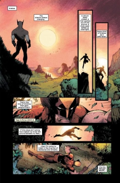
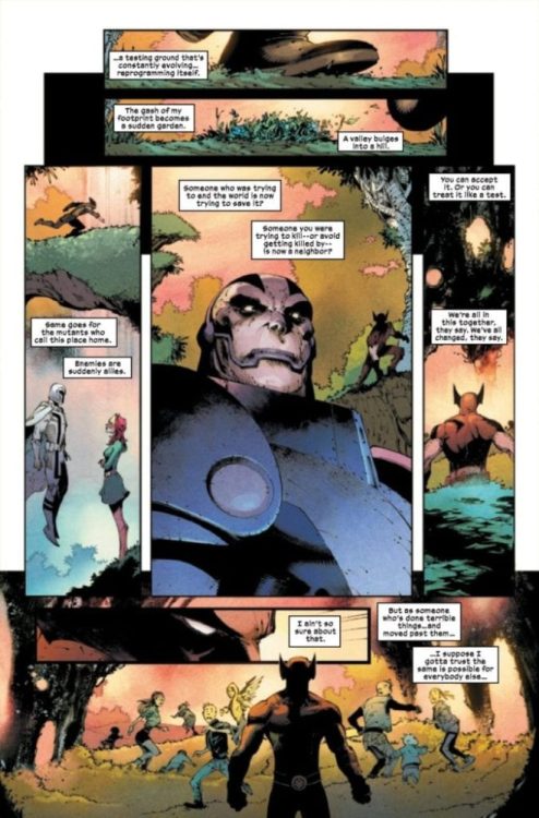
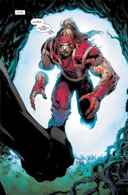
Welcome to PANEL BREAKDOWN, a weekly series where we take a look at our favorite panels of a comic book. This week we are talking about the new Marvel Comics series Wolverine #1 written by Benjamin Percy, with art by Adam Kubert, colors by Frank Martin, and you are reading Cory Petit’s letters. Tom Muller is the designer on the issue and has a significant influence on the book.
Part 1 – Adam Kubert
Part 2 – Viktor Bogdanovic
About Wolverine #1: THE BEST IS BACK!
Wolverine has been through a lot. He’s been a loner. He’s been a killer. He’s been a hero. He’s been an Avenger. He’s been to hell and back. Now, as the nation of Krakoa brings together all Mutantkind, he can finally be… happy? With his family altogether and safe, Wolverine has everything he ever wanted… and everything to lose. Writer Benjamin Percy (X-FORCE, WOLVERINE: THE LONG NIGHT) and legendary artist Adam Kubert (X-MEN, AVENGERS) bring the best there is to his new home! PLUS: The return of OMEGA RED!
Are you picking up Wolverine #1 this Wednesday, or will the $7.99 price-tag scare you off? Comment below with your thoughts.
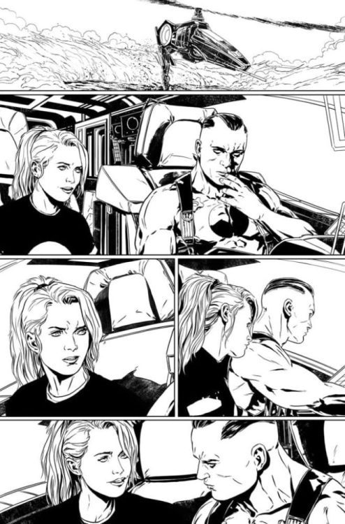
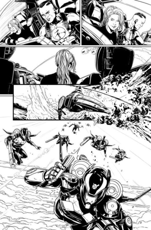
Bloodshot #7 hits your local comic book shop on March 11, but thanks to Valiant Entertainment, Monkeys Fighting Robots has an exclusive first look for you.
The book is written by Tim Seeley, with Marc Laming’s pencils and inks, Tyler Kirkham worked on the cover. The finished pages will feature Andrew Dalhouse’s colors, and Dave Sharpe will provide letters.
About Bloodshot #7: You’ve seen Vin Diesel’s Bloodshot in the big screen… now leap into the thrilling comics with “THE LONG SHOT” PART ONE! Bloodshot’s globe-hopping adventures explode into this new story as he faces his biggest foes yet!
Have you been reading the new Bloodshot series? Comment below with your thoughts.
Bloodshot was was created by Kevin VanHook, Don Perlin and Bob Layton. Bloodshot’s first appearance was a cameo in Eternal Warrior #4 (November 1992), with his first full appearance in Rai #0 (November 1992).
The origin of Bloodshot: Bloodshot is a former soldier with powers of regeneration and meta-morphing made possible through nanites injected into his blood, hence the name Bloodshot. After having his memory wiped numerous times, Bloodshot is out to discover who he is and get vengeance on those who did this to him. Bloodshot’s bloodstream contains a billion nanobots, enabling him to heal from injuries quickly, interface with technology, and shapeshift his mass.
The first issue of Bloodshot back in February of 1993 sold one million copies and featured the first “Chromium” comic book cover.
Bloodshot hits theaters on March 13 starring Vin Diesel as The Every Man.
Based on the bestselling comic book, Vin Diesel stars as Ray Garrison, a soldier recently killed in action and brought back to life as the superhero Bloodshot by the RST corporation. With an army of nanotechnology in his veins, he’s an unstoppable force –stronger than ever and able to heal instantly. But in controlling his body, the company has sway over his mind and memories, too. Now, Ray doesn’t know what’s real and what’s not – but he’s on a mission to find out.
Trouble is always around the corner for the chainsaw and boomstick wielding Ash Williams, yet in Dynamite’s newest series, Death to The Army of Darkness #1, Ash receives help from a team of himself.
Art by Jacob Edgar. Colors by Kike J. Diaz. Letters by Hassan Otsmane-Elhaou
Death to The Army of Darkness #1 follows Sam Raimi’s 1992 Army of Darkness film, but the first issue includes a quick recap. Luckily this means prior knowledge isn’t needed, nor do you need to read the previous comic series. Nonetheless, if you haven’t seen Army ofDarkness, do yourself a favor and watch it. You still have time, as Death to The Army of Darkness #1 hits an S-Mart near you on February 19th.
GOOD. BAD. I’M THE GUY WITH THE PLOT
Writer Ryan Parrott isn’t new to franchised comics, as he has been putting out fantastic work in Saban’s Go Go Power Rangers. Yet, Death to The Army of Darkness is a completely different beast in many aspects. Nonetheless, Parrot is able to respect the cult classic franchise while still building upon its lore. All the humor, gore, horror, wacky adventure, action, and lovable main man are present for longtime fans.
Although Death to The Army of Darkness #1 is a direct sequel to the movie, newcomers will feel completely welcome. The aforementioned recap page helps a great deal while Ash adds information on his past with the Necronomicon Ex-Mortis. Parrot seems to pluck concepts brought forth in the movie while adding in original ideas. The way that Ash and the world around him mirror the movies so well, you’d swear Parrott worked on the film back then.
The new concepts showcased throughout are welcome while still making since worldbuilding wise. Death to The Army of Darkness #1 contains a fair amount of story to give the reader in one issue, yet it never feels overburdened with the plot. Instead, readers are treated to the beginning of a new misadventure with their favorite lovable oaf.
Art by Jacob Edgar. Colors by Kike J. Diaz. Letters by Hassan Otsmane-Elhaou
GROOVY ART
Jacob Edgar’s art blends realism and cartoon in a manner befitting the movies. The cult classics never took themselves too seriously, and Edgar’s art emulates this magnificently. Instead of falling on the side of realistic/cartoonish too much, his lines perfectly blend the two. The mixing of the two work immensely when over the top moments are desired, making said scene hit harder. During the action scenes, Edgar overlays the panels on each other. This method gives the actions a chaotic feeling that amps up the violence being portrayed.
Helping the vibes that Edgar’s art portrays are the colors by Kike J. Diaz. Much like the line art, Diaz’ work borders nicely between realistic/cartoonish. One scene stands out amazingly in favor of the gorgeous colors. During this moment, Ash uses his trusty boomstick (shotgun) to kill a deadite. The reason the colors stand out here more as opposed to other panels is because of the wide palette it uses. The blast of his boomstick is strikingly yellow/orange, which illuminates his face while helping the shadows stand out more. Mix in blood spluttering from off panel and Diaz’ use of an ocean (blue green) background, and you have a visually gorgeous panel.
Art by Jacob Edgar. Colors by Kike J. Diaz. Letters by Hassan Otsmane-Elhaou
WRITTEN IN BLOOD
Lettering is a hard (often times thankless) job, yet Hassan Otsmane-Elhaou always makes it look perfect. That sentiment carries into Death to The Army of Darkness #1 where he has a blast with varying letter methods. Each page, Otsmane-Elhaou adds in extra flare into any given piece of lettering, essentially breathing a flow that makes you carry on. Not only does he make each page stand out with a vast array of fantastic lettering, but at no point does the placement hinder the art.
Instead, Otsmane-Elhaou keeps a constant groove that beautifully guides your eyes throughout. All that while adding amazing special effects that feel like they’re straight from the classic films. If you’re interested in behind the scenes on lettering (among other things) in comics, I’d highly recommend checking out Otsmane-Elhaou’s Twitter.
Art by Jacob Edgar. Colors by Kike J. Diaz. Letters by Hassan Otsmane-Elhaou
DEATH TO THE ARMY OF DARKNESS, LIFE TO TEAM ASH
Death to The Army of Darkness #1 reads as if a group of pals got together, marathoned the original trilogy of Evil Dead while talking about multiple universes, personified emotions, then set out to create a comic. The premise isn’t a new one, yet the team executes the idea amazingly.
Side Note: When I first heard of the multi-Ash mini-series, it seemed to be a multiverse series. Yet, after reading it it seems to be one where many aspects of Ash’s personality coming to life. As amazing as the multiverse sounds, the personification of his emotions calls back to the movie while being a great idea.
Memorable Quote: “….groovy.” – Ash
Death to The Army of Darkness #1 is filled to the brim with quotable bubbles, but, you gotta love a classic.
DEAR DEADITES
Is this your first time reading a comic in the Evil Dead/Army of Darkness Universe? If so, let us know what you thought, or – if you’re a longtime Deadite – tell us how you felt below.
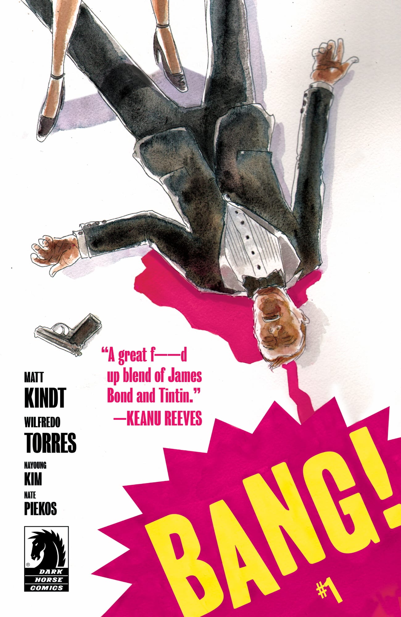
BANG! #1 is out this Wednesday, February 19th, from Dark Horse Comics, and we had the chance to speak with writer Matt Kindt about the highly anticipated series.
The series is by Kindt and artist Wilfredo Torres, with colors by Nayoung Kim and letters by Nate Piekos. BANG! has received a lot of positive buzz leading up to its release, especially after Deadline Hollywood unveiled the book’s trailer last month. The first issue has already sold out and gone to a second printing in advance of publication. It promises to be a mind-bending thriller, sure to enthrall fans of high-concept storytelling.
Variant cover to issue #1 by Kindt.
About the series: A best-of-the-best secret agent with memories he couldn’t possibly possess, a mystery writer in her 60s who spends her retirement solving crimes, a man of action with mysterious drugs that keep him ahead of a constant string of targeted disasters, a seemingly omnipotent terrorist organization that might be behind it all . . .
And they’re all connected to one man: a science-fiction author with more information than seems possible, whose books may hold the key to either saving reality or destroying it.
MFR critic Grant DeArmitt praised the first issue, saying “you should absolutely add BANG! to your pull list,” and giving it a near perfect score.
Read on for our full interview with Kindt:
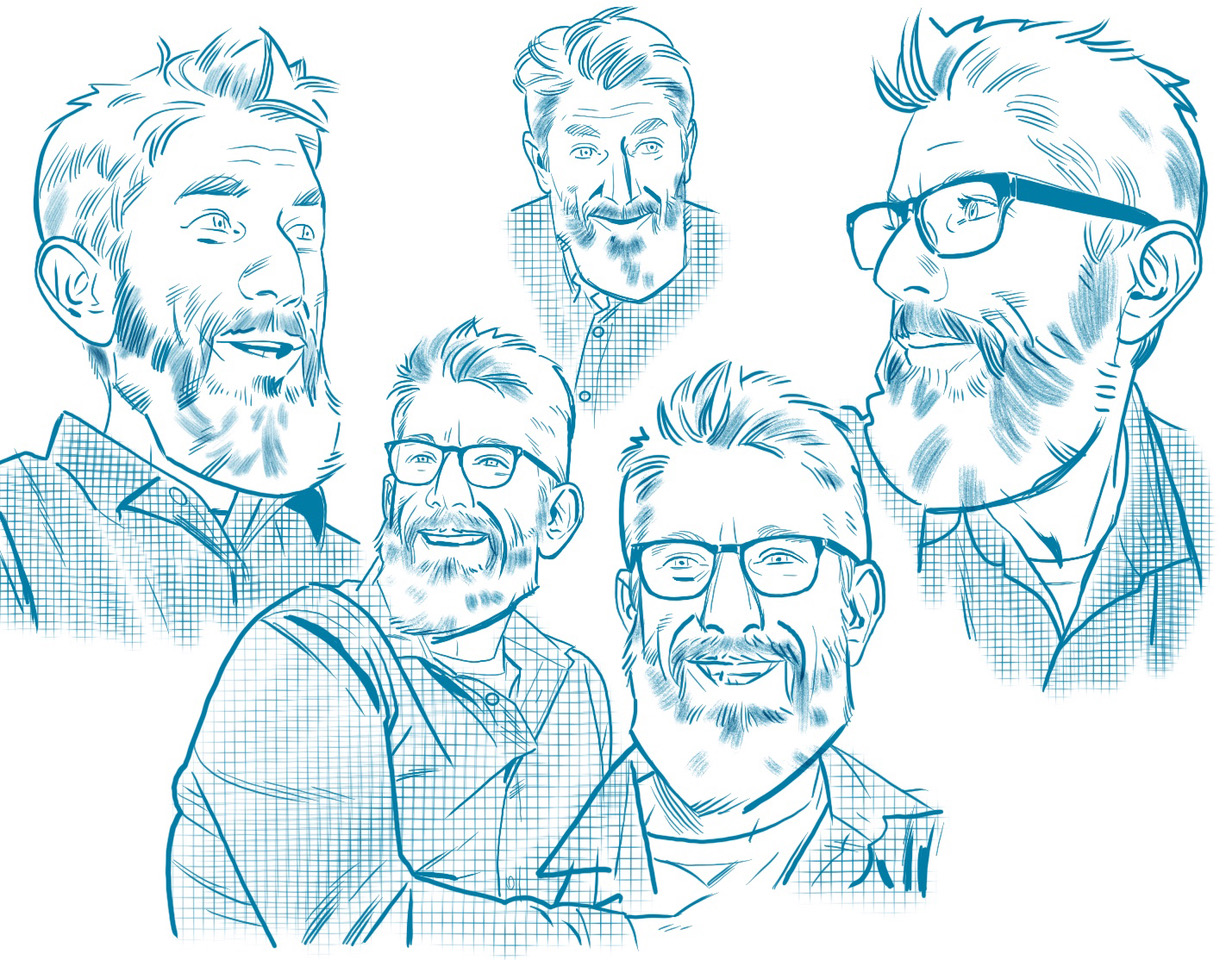
Kindt, as drawn by series co-creator Wilfredo Torres.
Monkeys Fighting Robots: Matt, thanks for taking the time to talk with us.
You got a pull quote from Keanu Reeves (the man, the myth, the legend), who called BANG! “A great #$%^ed up blend of James Bond and Tintin.” How does that happen?
Matt Kindt:Keanu loves comics and really knows art. He’s got a really good and honest eye for it. I sent him issue one…and he liked it…(laughs)
MFR: I saw that BANG! ties into another one of your books, Revolver. Do new readers need to know anything before picking up BANG! #1, or can they go in cold? And how do you handle that balance of tying your works together, rewarding old fans but making sure everything is still accessible to newbies?
MK:There is a character – usually a villain I use a lot – he’s in almost every book I’ve ever done. But there’s no real continuity. You don’t need to read one book to understand another. It’s more like how Tarantino’s movies all take place in the same “universe” but for me – it’s reversed. I have one character that takes place in all universes. BANG! works completely on its own – the overlap with other books is more of an Easter egg for super-fans.
Half the cast of BANG!…
MFR: What works inspired BANG!, other than James Bond (and possibly Tintin)?
MK:Ha! Well. Philip K. Dick was a big influence on everything I’ve done but also take the moral dilemmas in Graham Greene’s books and mix it with Agatha Christie, The 60s Emma Peele Avengers, McGyver, A-Team, Knight Rider, and a dash of Charles Bronson – shake that all up and this is what comes out. I really wanted to do something that was straight forward action and ended up doing something that was straight-up action with a really crazy twist to it. Nothing is every really straight-forward by the time I get done with it…I tried. I really did. I just can’t do straight-forward. But this is my attempt. (laughs)
MFR: This first issue is packed with action, and there are a good handful of pages with little to no dialogue. How do you and Wilfredo collaborate on those mostly visual scenes? Since you’re also an artist, are you able to better script them, or does Wilfredo have the freedom to go nuts and handle them however he sees fit?
MK:I script them – and Wilfredo tweaks ‘em – adds panels – moves things around. And sometimes comes up with ideas for different staging – I really feel like, especially with the action – my script is a suggestion – a starting off point. I have specific ideas for details – but it’s no fun collaborating if you don’t collaborate. It’s always a bit of a learning curve when writing for an artist you haven’t worked with before – but we’re developing a short hand now – I know what he likes to do and the deeper we get into it – the more I try to write to his strengths and give him some pages that will make him laugh – or at least get him excited to draw. He ends up adding so much more detail than I script – and I tell him – he’s doing it to himself. It’s not my fault! You can tell on the page though – he loves to draw so I try to stay out of his way.
…and the other half!
MFR: How autobiographical of a character is Phillip Verve? Or – if not autobiographical – is he inspired by anyone in particular?
MK:He came from real-life. But I won’t talk about it. Everybody has an arch-enemy at some point in their life…and he sprung from that. So yeah – he is in every universe – including ours. For me, he’s a good reminder to treat everyone well. Be kind. Don’t have enemies. I don’t have any enemies now (that I know of) but Verve serves as a reminder – let bygones be bygones. Forgive people. It’s the most powerful thing you can do.
MFR: There’s a giant mystery behind this series. Without giving anything away, where’s the best place in issue one to look for clues?
MK:Inside front cover and the inside back cover.
Thanks again to Matt Kindt for taking the time to answer our questions, and to David Hyde from Superfan Promotions for facilitating this interview. Make sure to pick up BANG! #1 when it hits your local comic shop this Wednesday, February 19th.
Read what people are saying about BANG!:
“What Knives Out did for whodunits Bang! does for 007-style spy adventures by flipping sexist and culturally condescending tropes on their head.”—DEADLINE HOLLYWOOD
“I will literally read anything by Matt Kindt or Wilfredo Torres. Put them together and it’s magic. Skip dinner and buy this book”—Mark Millar
“I f$%^ing love this comic! it’s literally everything I want out of one of my favorite creators!! Congrats to the entire team. This is how you make comics!!—Brian Michael Bendis
“BANG is a fun, twisty spy thriller with a great meta-twist.”—Jay Faerber
“I love Matt Kindt and I love Wilfredo Torres, so it’s no surprise that I loved BANG! It’s like the weirdo, mind-bending James Bond story I didn’t know I wanted.”—Jeff Lemire
“Thanks to Kindt and Torres we finally have our Idris Elba – James Bond, and it’s exactly as cool as you imagined.”—Jeff Parker
“Imagine James Bond being abducted by David Lynch and forced into a maze that shifts with every step forward. The ground is unsteady. The walls of reality move. This is the world of Bang!, a spy thriller expertly conducted by Kindt and Torres, a mystery box that truly starts off with a… Well. You know.” —Van Jensen
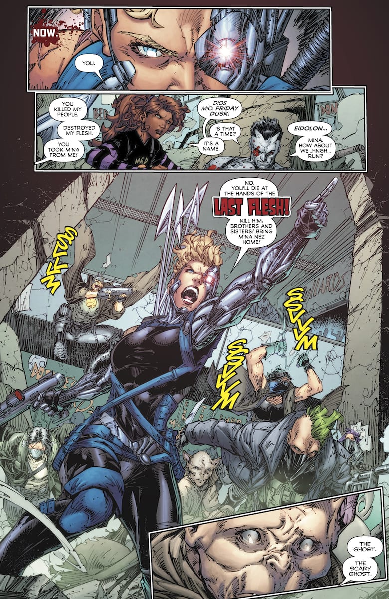
Bloodshot #6 is the end of the second act of Tim Seeley’s run. Which the perfect way to speak about it, considering this series is building up to the Bloodshot movie starring Vin Diesel.
Recap
After the events of Bloodshot Salvation, Bloodshot is back on the run taking fights to numerous groups. One of which is the Last Flesh, a cyberpunk cult dedicated to augmentations so that they can inherit the world. Another is Black Bar, a black-ops sect in dedication to dealing with threats like them and Bloodshot. All of which revolves around Mina (a.k.a. Eidolon) a psiot who Bloodshot captured in his Project Rising Spirit days.
After being sold to Black Bar, she serves as the main weapon against Bloodshot. Only the leader Grayle treats Mina like anything human by allowing her to go out every once in a while. The rest of Black Bar however keep Mina on a short leash. Members of the Last Flesh meanwhile want to reclaim Mina having used her abilities to augment their physiologies. Bloodshot comes between these groups to rescue her with help from The Burned, a secret society of disowned soldiers.
Bloodshot #6 Writing
Tim Seeley likes to make use of foils, like during his run on Nightwing. In Bloodshot #6 he has three groups of foils for Bloodshot: The Last Flesh (augmentations), Black Bar (black-ops work), and The Burned (rogue soldiers). In theory this does work, but there is so much in story, it feels suffocating. Black Bar in particular feels like just another Project Rising Spirit in how they treat Mina as a weapon. Then there’s Last Flesh commander Friday Dusk, who presents herself with only superficial similarities to Bloodshot. She can access memories through her implants but that’s it. Otherwise Dr. Dusk is just a manipulative dominator who quickly turns when she doesn’t get her way.
As for Bloodshot, there’s nothing all that interesting about him in this issue. Right now he’s just the guy shooting at stuff to redeem himself. When he acts up to scare pedestrians away about his killer reputation, it feels like he’s a stereotypical brooder. Bloodshot #6 continues to use this redundancy of his past for drama. Heck, his affiliation with The Burned is out of place. Bloodshot chose to leave his handlers, they didn’t leave him behind. Something Mina chooses to do as well despite the fact she should have more reservations about going with him. She kisses him for crying out loud! Now Eidolon just feels like a damsel-in-distress stereotype.
Artwork
Brett Booth’s rough penciling does look impressive, as it befits the gritty outlook of the series. However with so much of his time focusing on dynamic poses, it sometimes looks like he’s trying to make cover art instead of panel work. Adelso Corona’s inking attempts to give focus on the action taking place. However, wherever there are bold lines, they’re usually reserved for close-ups. In the faux-pin-up artwork, some of the lines just barely blur figures from the background. Especially when their bodies have colors that would’ve blended in. Fortunately, Andrew Dalhouse’s coloring is the highlight of the artwork. Against some of the muted coloring appear bright blasts of energy. Occasionally the backgrounds shift to certain hues of color. From the green dust kicked up by actions near the beginning to red hues indicating dangers.
All things in consideration, Dalhouse and letterer Dave Sharpe have their hands full with other titles like Rai. It’s why some of the gunfire onomatopoeias look the same from that series and Roku: they’re images Sharpe seems to recycle. He does deliver some original pieces, like a very fitting sputtering wordmark for something very specific, such as Eidolon making Bloodshot’s skin explode (he grows it back). However Sharpe’s placement of word balloons demonstrate some of the flaws of the art. In one panel, it starts with Bloodshot complaining about the Last Flesh’s numbers before his gun is destroyed. It looks like the panel would’ve flowed better if it was flipped.
Hopefully Bloodshot #6 Makes the Movie Look Good
Every cliche about Bloodshot, like his past sins and his place in world, can get readers through this run. Unfortunately, this somber soldier is now just another action hero, including having an attractive woman at his side. Vin Diesel better not be anything like this. But do you have anything to say about this? Leave your thoughts in the comments.
Wolverine #1 hits your local comic book shop this week, and Marvel Comics dropped a six-page preview on Friday, and it looks like Logan is in over his head once again.
The book is written by Benjamin Percy with art by Adam Kubert and Viktor Bogdanovic. Frank Martin Jr and Matt Wilson worked on colors. Tom Muller was the designer on the issue.
About Wolverine #1: THE BEST IS BACK!
Wolverine has been through a lot. He’s been a loner. He’s been a killer. He’s been a hero. He’s been an Avenger. He’s been to hell and back. Now, as the nation of Krakoa brings together all Mutantkind, he can finally be… happy? With his family altogether and safe, Wolverine has everything he ever wanted… and everything to lose. Writer Benjamin Percy (X-FORCE, WOLVERINE: THE LONG NIGHT) and legendary artist Adam Kubert (X-MEN, AVENGERS) bring the best there is to his new home! PLUS: The return of OMEGA RED!
Are you picking up Wolverine #1 this Wednesday, or will the $7.99 price-tag scare you off? Comment below with your thoughts.
As the Sonic The Hedgehog series celebrates its first milestone by reaching 25 issues with IDW comics, its time for fans of the Archie Comics series to jump on board. It may be hard to accept, but the characters from Archie’s run are not needed in the new universe created by IDW.
With the debut of the new series, fans were still holding out hopes; IDW would make some reference to the long-running Archie series. Whether through magic, science, or some combination of the two way to connect the old Sonic world (because through the 25 issues, it has become clear this isn’t a world featuring any of the landmarks in the Archie run).
Furthermore, fans don’t just want the characters featured in Archie back; they also want the storyline to be fixed. When hit with a legal battle (a summary of which can be found here), the creators found they had to remove several characters tied up in the legal dispute. Thanks to a plot device known as the Genesis Wave, Archie removed the characters but moved the series on like nothing had happened. Many fans were hoping legal disputes would eventually be resolved, and the effects of the Genesis Wave would be reversed. Sadly, with the cancellation of the series by Archie Comics, this hope seemed to burn out.
Now with 25 issues under the belt, fans have been presented with a brand new world for Sonic and his friends to explore. One which is unencumbered by the problems from the lawsuit or the 25 years of mythology.
The IDW stories have proven to be a joy to read. The introduction of new characters such as Dr. Starline, Whisper the Wolf, and Tangle the Lemur (Tangle and Whispered even received their own 4 issue mini-series), has shown there is no need to rehash the Archie timeline. There is plenty of great moments so far and there is sure to be more in the future. Writer Ian Flynn has an in-depth knowledge of the franchise since he was the writer of the previous series. Flynn has crafted several great arcs so far under the IDW banner.
Perhaps in the future, the series will work towards finding a way to tie back into the Archie Comic Sonic history. Perhaps Princess Sally, Bunny Rabbot, Antoine DeCollete, and all of the cast who lived in the comic books on after Sonic The Hedgehog cartoon was canceled will return. Fans will always clamor for a Genesis Wave reversal as they are emotionally invested, but if you’re a fan of Sonic you should be reading the IDW series as a new set of characters have their arms wide open for your embrace.
—
What do you think of the IDW Sonic The Hedgehog series? Leave a comment below and let us know.
It is also a powerful tool for creating drama and expressing emotion.
Imagine, you are watching a larger than life action movie at the cinema. Everything is explosions and noise. Then suddenly, all of the sound disappears, no incidental music, no speech, nothing exploding. As a member of the audience you are forced to focus 100% on the images passing across the screen, the information they relay are undisturbed by anything else. Your attention is honed, fixated on a world where less is suddenly more.
This is a clever technique for grabbing the audience’s attention and is also something used to great effect in comic books. There have been a few examples from the last month which have used ‘silence’ in magnificent ways.
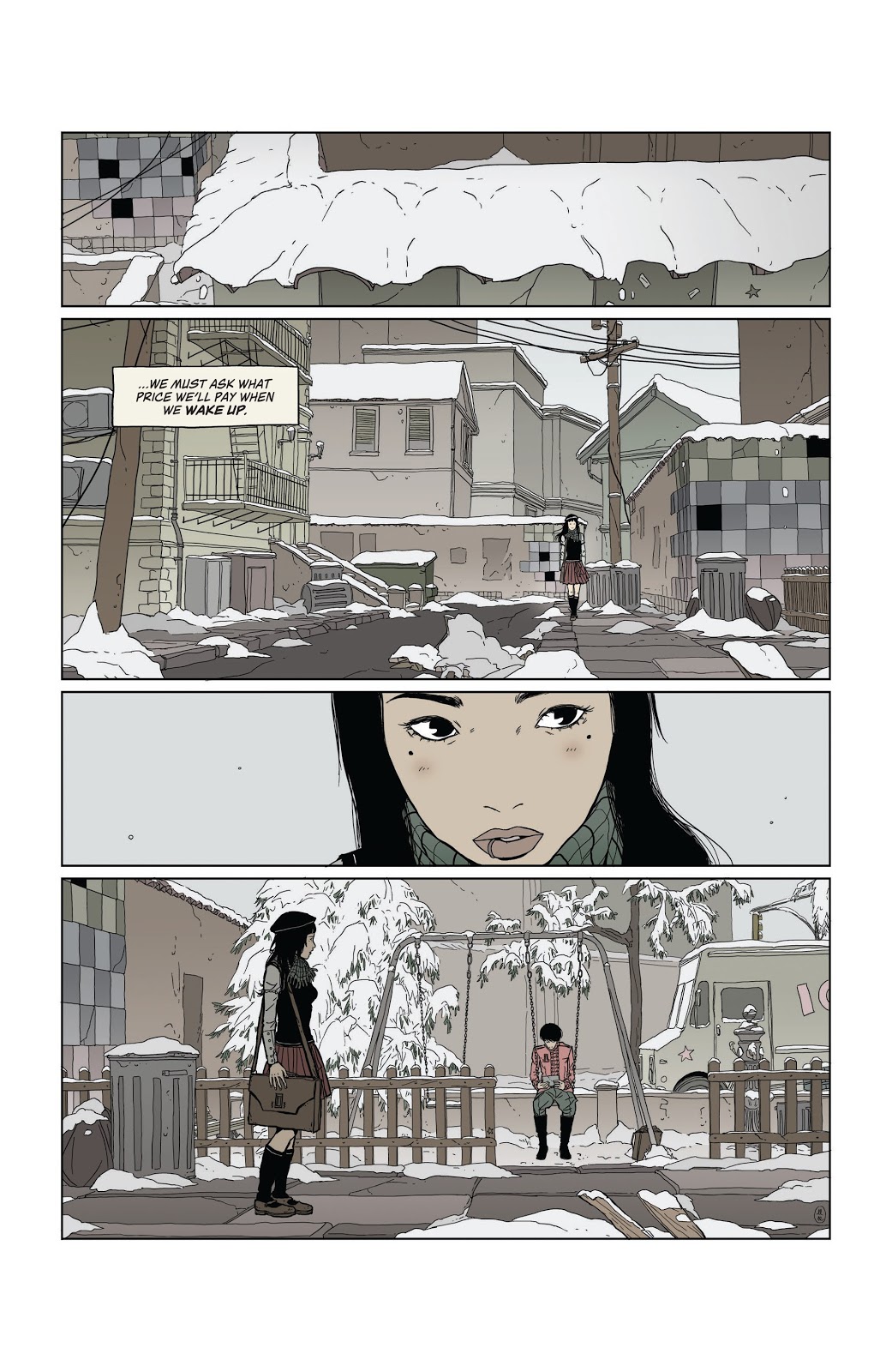
Heartbeat #3 Credit: BOOM! Studios
Quiet Heart Break
My first example juxtaposes panels of silence against conversational panels to enhance the interaction of the characters and illustrate emotional connections.
In issue 3 of Heartbeat, published by BOOM! Studios and written/drawn by Maria Llovet, the opening sequence has two of the central characters reminisce about their past and their friend who died in a previous issue.
From the moment that Eva first sees Mack in the playground the reader instantly knows that there is distance in the relationship. On the final panel of page 2 (see above), Eva is standing in the foreground looking across the panel to Mack in the background. There is a van passing behind them and previous panels have established they are on an inner city street, however the panel is left without sound effects; no noise of any kind.
The lack of sound helps to establish the mood, as much as the pale colouring or the blanket of snow. There is no communication between the two characters and you get the impression that Eva is waiting, building up courage to talk to her friend. The entire lack of sound establishes Eva’s fixation on Mack. Her place in the foreground makes her the centre of attention and we assimilate everything else in the image in relation to her, therefore the lack of sound insinuates a focus, in this case Eva’s undivided attention on Mack in the background.
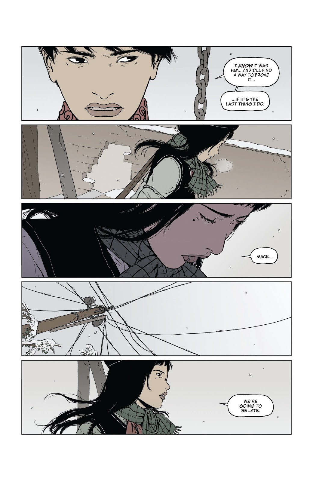
As the scene progresses the two characters have an awkward conversation about their childhood. Llovet breaks up the back and forth, often not showing the speaker in the panel, instead the lettering by Andworld Design uses an inverted tail on the speech balloons giving the scene a broken, disjointed look. This coldness between the characters is emphasised on page 5 (below) when the conversation is broken with a silent panel.
Heartbeat #3 Credit: BOOM! Studios
The top three panels in the stack build the tension between Eva and Mack. It starts with a view of the photo of them as children, followed by an angry shot of Mack and then a pleading shot of Eva. Each panel has dialogue that helps to read the image. The fourth panel however lacks dialogue. As it is the only panel on the page that doesn’t have any text, it stands out, draws your eye. The intensity of Mack’s stare is enhanced by the silence, it illustrates the waves of emotion flowing through him. It’s not just anger, like in the previous panel where the letterer gives the speech punch by bolding one of the words. It is also not just the nostalgia and sense of loss that the first panel on this page represents.
That silent stare draws the reader into Mack’s mind, taking a moment to contemplate the characters next actions. It creates a significant pause in the narrative flow, after drawing your attention in the first place. You start this page knowing that this panel is important and when you get to it you are forced to read more into the image that Llovet is giving you.
This idea of making the reader focus on the imagery by drawing your attention to it by removing any other stimuli, is used to greater effect on the next page. In this sequence of five stacked panels, Llovet has created a rhythm with the speech. The panels with speech are the quick beats while the two silent panels are slower as you take in the image, rather than the words. The beat for the page is quick, slow, quick, slow, quick. A threat followed by a moment of contemplation. The start of an appeal followed by an abstract cut away and finished with a change to the conversation.
Heartbeat #3 Credit: BOOM! Studios
In these quiet panels you are forced to look closer at the images. The lack of speech gives you the impression that there is something else you should be looking at. In panel two Eva is half turned away, not entirely closed off to what Mack is saying, just as there is a hole in the wall behind her, a sign that the barrier between them isn’t completely built. It’s a small hope in a cold scene.
Panel four serves a similar purpose. The silence draws your attention to the network of telephone wires strung out across the street. In a scene where two characters are having trouble communicating with each other, the Phone lines can be seen as an image of hope. The lines of communication are still there, they haven’t been severed completely. Although there is silence at the moment it does not mean that they are entirely cut off.
Llovet uses silent panels to emphasise something within the image, whether it is as straightforward as illustrating a strong emotional reaction or something more abstract, like a metaphor for communication. Heartbeat is an emotional narrative that combines quick beats with slow, contemplative moments. The silent panel allows Llovet to stop the narrative flow, for a brief time, and focus the reader on the image she is presenting.
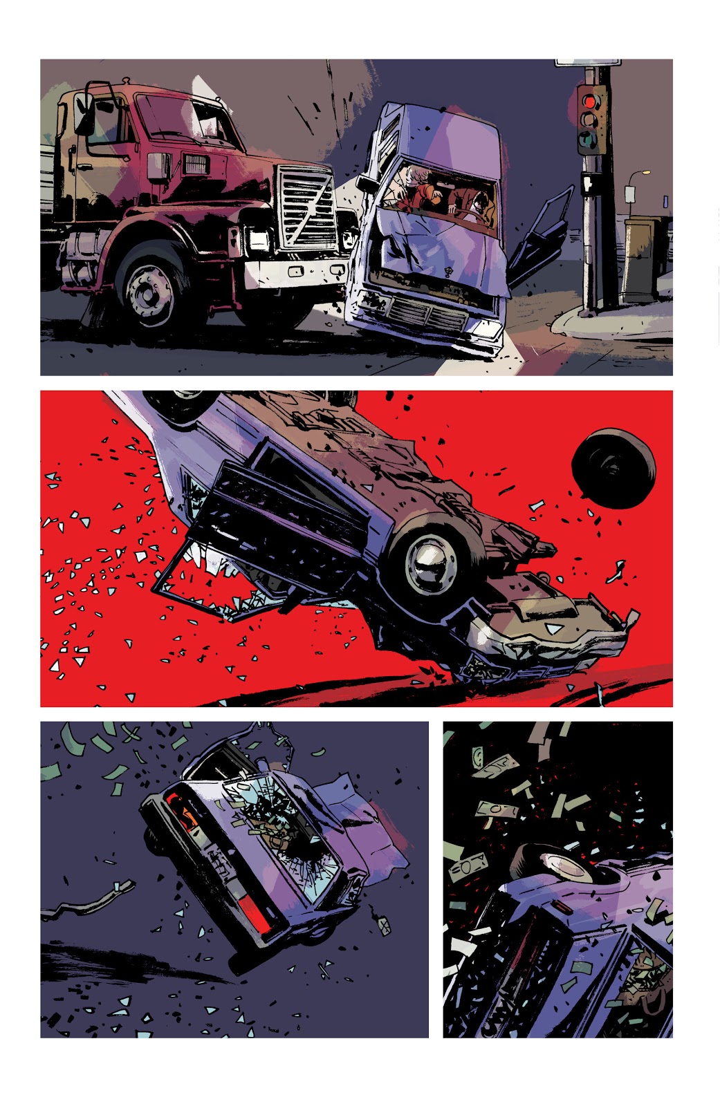
Criminal #12 Credit: Image Comics
Soundless Action
Ed Brubaker and Sean Phillips use silence in a slightly different way in the final issue of Criminal, released by Image Comics in January 2020. In the final part to the Cruel Summer story-line, there are two extended scenes where there is no speech, and in one case not even the voice over that runs heavily throughout the Criminal series.
The first, a three page sequence, is one of the more explosive moments in the comic, if not the run itself. After forcibly being taken from a Motel room she was sharing with Teeg, the central character in the story, Jane fights with her kidnapper. The struggle ends badly and, as Teeg watches helplessly as the car Jane is in is side swiped by a lorry and flipped over, and over (see image above).
Throughout the comic, up to that point, there is a lot of text: speech balloons and Caption Boxes. The dialogue is mixed with pulp fiction prose that tells the story, with the visuals adding additional context. Fairly standard, although superbly executed. The car accident changes the dynamic between the text and the art. The reader is suddenly confronted with a distinct and deliberate soundless vacuum. You become riveted to the accident as it plays out, in slow motion, before your eyes. Without sound effects or a monologue of any kind, you are forced to look, really hard, at the car as it is crushed beneath the lorry.
In the second panel on page 10, the background falls away and is replaced with a solid block of red. This strong, visual image tells the reader everything they need to know about the occupants in the car. No sound is necessary, in fact the lack of any noise makes the moment more upsetting. The image implies the fate of the driver and his victim; you imagine characters distress, cries of pain, and like any good horror, Brubaker and Phillips make you imagine their horrific fate. Less is more.
Criminal #12 Credit: Image Comics
The silence on these few pages enhances the traumatic incident. There is even a moment at the bottom of page 12 (see above) where a character screams, soundlessly, into the air. It’s a powerful image, and a powerful sequence, that stands out in the narrative because it lacks the one thing that Brubaker and Phillips are known for: the pulpy voice over.
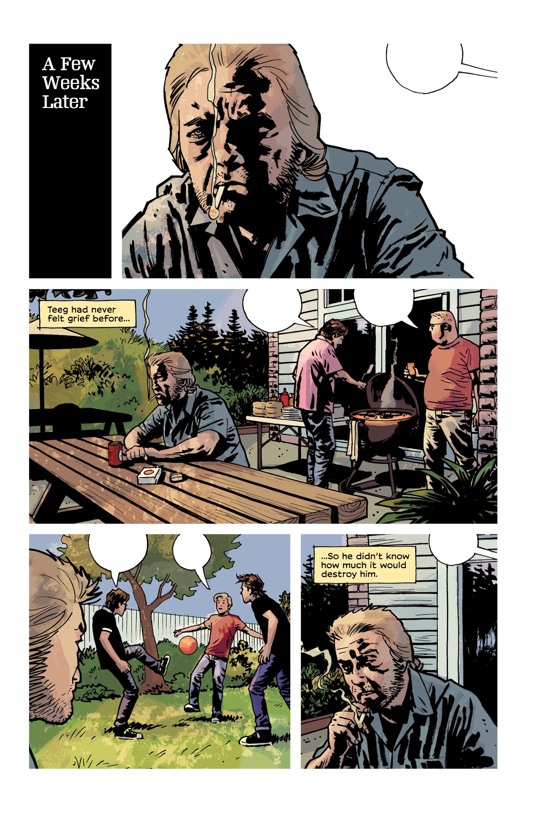
Page 14 (image below) of this issue uses the lack of speech in another way, different from the examples I have already mentioned. The narrative caption boxes are back and there are even some speech balloons but the balloons are empty.
A few weeks have passed since the car crash incident and Teeg is grieving. He is at a Bar-B-Que with his friends but mentally, he is somewhere else. The captions inform the reader that Teeg has been affected badly but it is the empty speech balloons that really get the message across. Here is a situation where a number of characters share a page but the creators want you to focus solely on one of them.
Criminal #12 Credit: Image Comics
As you move from panel to panel, you become as detached from the surroundings as Teeg because there is something missing. This page could have been drawn with no speech balloons and still had some effect. However, it is those empty balloons, hanging in the air, that really make this page so wonderful. You want to be a part of the BBQ, playing football with the young boys but you’re uncontrollably locked out. If this page, with its depiction of life just out of reach, isn’t a perfect representation of a character suffering from depression, I don’t know what is.
Teeg feels as though he has lost everything and this page of art both illustrates that he hasn’t but also that he is too detached to realise it.
The partial silence, the switching off of sound, enhances the narrative voice and distances the central character further and further away. The third panel, in the centre of the page, has Teeg sharing space equally with two of his friends yet the impression is that he couldn’t be more alone. It is a masterpiece of imagery and a heartbreaking page.
Better Left Unsaid
Comics don’t have actual sound but they do have a lot of speech and a lot of sound effects. Some comics are packed with a collection of strange onomatopoeic words or conversations long enough to keep Quentin Tarantino happy. However, just like film, sometimes silences are louder than the noise. A well placed soundless panel or sequence can really attune the audience, forcing the reader to concentrate on exactly what the creators want you to see. They can slow down the story, break the narrative flow, or even enhance the emotional punch of a moment.
Silence is indeed golden and is also a wonderful tool for any comic creator to keep in their box.
There are a number of comics out there that use this technique, and I didn’t even talk about Black Bolt! Why not let us know in the comments below of any good examples that you find.
After months of online rumor and speculation, DC’s plans for the future are finally starting to take shape. First we had the key story in Wonder Woman #750, establishing Diana as the DCU’s first costumed superhero. Then came the announcement of Generation Zero for this year’s Free Comic Book Day. Now, the publisher has unveiled the next piece of the puzzle.
Generation One: Age Of Mysteries, arriving in May, is the first in a series of one-shots that appear to establish a new (or newly clarified) DC timeline. We’ve heard rumblings of something called “5G,” which could end up being the fifth book (Generation Five) from this new series; for now, there seem to still be more questions than answers.
Check out the press release below:
DC PRESENTS GENERATION ONE: AGE OF MYSTERIES
The Charge Towards DC’s Future Continues!
Series of Five One-Shot Comics Spotlight DC’s Super Hero Heritage, While Revealing Secrets that Will Shape its Future!
BURBANK, CA (February 13, 2020) – The path to DC’s future continues to unfold in Generation One: Age of Mysteries! On sale in May, Generation One: Age of Mysteries is the first of five oversized Prestige format one-shots, each detailing a different age in DC’s storied, super heroic legacy!
“The Generation series of specials are built to bring the new DC timeline to life,” said DC Publisher Dan DiDio. “With Generation One: Age of Mysteries and every subsequent volume we’ll be shining a spotlight on the 80-plus-year publishing history of the DC universe while charting the course for the bright future of DC’s characters. All of our greatest stories and events will create the backdrop and context for the great new adventures we have planned. Everything counts, and we guarantee there’ll be surprises along the way!”
Readers of Generation One: Age of Mysteries will witness firsthand major events from throughout the history of the DC universe as seen through the eyes of characters like Wonder Woman, Lucius Fox, Alfred Pennyworth, Green Lantern (Alan Scott), The Spectre (Jim Corrigan), Mister Terrific (Terry Sloane), and others. The series of one-shots will also expose secrets from DC’s history, such as:
What was the previously undocumented “big bang” of the Age of Mysteries?
Which character truly ushers in the dawn of Super Heroes, inspiring all the rest?
What was the real reason behind the Justice Society of America’s retirement?
Which Golden Age hero will become history’s greatest villain?
What contentious alliance kept the Wayne family dynasty alive after Thomas and Martha’s deaths?
Who are the new, never-seen-before wildcards that will be instrumental in fashioning DC’s push to the future?
These five books will have all the answers to these questions, setting up DC’s boldest storylines ever while laying the groundwork for more excitement to come. The five Generation issues will feature a who’s who of creative talent, with an overarching story by Brian Michael Bendis, Dan Jurgens, Andy Schmidt, Robert Venditti, and Joshua Williamson, illustrated by artists including Doug Mahnke, Bryan Hitch, Mikel Janín, Ivan Reis, David Marquez, and more.
Generation One: Age of Mysteries is scripted by Andy Schmidt, with lead art by Doug Mahnke. Each of DC’s Generation one-shots will feature a cover by Jim Cheung and a variant cover by Gary Frank. Generation Two: Age of the Metahuman, Generation Three: Age of Crisis, Generation Four: Age of Rebirth and Generation Five: Age of Tomorrow will follow monthly after Generation One: Age of Mysteries.
Generation One: Age of Mysteries is a 48-page, Prestige format one-shot on sale at comic book stores and participating online retailers on May 27, 2020.
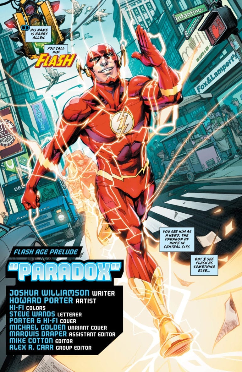
During the final battle of The Flash War, we got a tease of a big bad that was coming. This threat has been teased in the background in every other story with Commander Cold. The villain known as Paradox appears to be the next big threat for the Flash series as we approach the 750th issue.
As Rogues’ Reign came to a close, Barry gets a surprise visitor in the Future Flash. This character searches for the now late Commander Cold and learns of his death. He proceeds to disintegrate in front of his past self as he warns of the impending threat of Paradox. This leaves both the reader and the Flash with a single question. Who is Paradox?
**Some Spoilers Below**
Story:
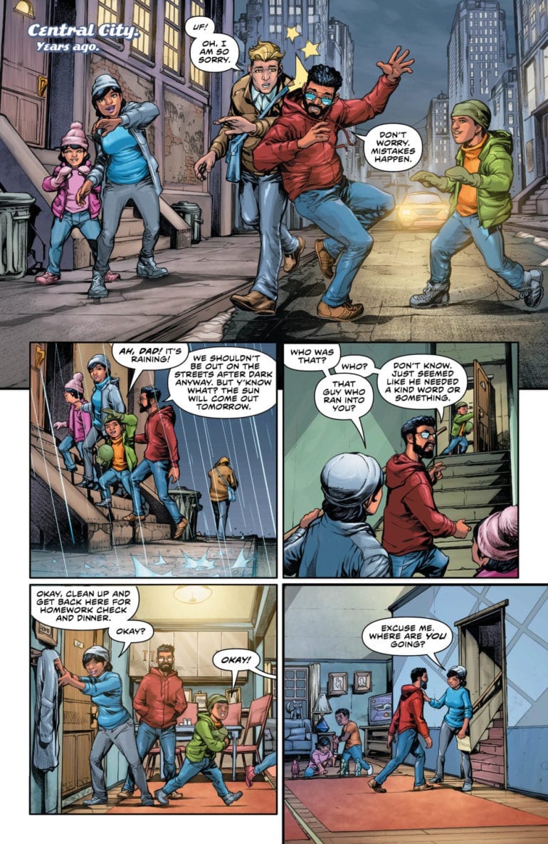
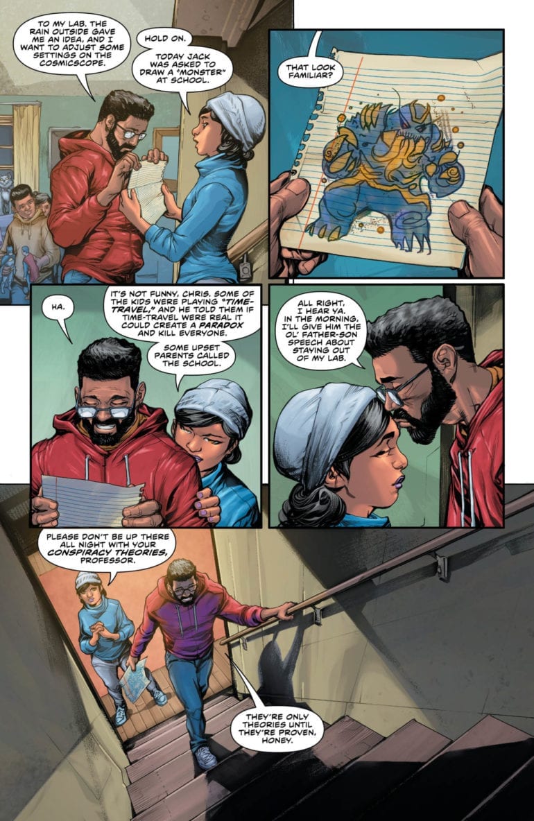
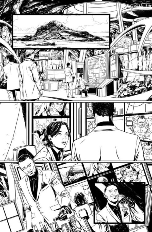
We open our story during The Flash Year One, where a father spends time with his family. This man is a professor who has been studying the time stream and has theorized about the changes made. One night, his lab is struck by lightning, and he sees the multiverse as a whole. A few days later, during the final battle with Barry and King Turtle, the man is teleported away. It turns out Flash’s connection to the Speed Force triggered the man’s ability to travel into it. He spends what appears to be years in there, and the man turns into the villain, Paradox.
This origin story for the next big bad really isn’t anything new. It’s your standard obsessed scientist plot that has been in comics since it began. Usually, there’s a gimmick that goes with this to add a nice twist to it. Right now, the only gimmick he has is his travels change him into a monster, and even then, that isn’t too original. You can find three villains just like him in this comic run alone!
This is a prelude to the next big arc of the Flash, so I wouldn’t be surprised if they add to it once the story starts. The lab we see has references to Doomsday Clock and several crises. This means he could provide more connections to the history of the DC Universe than any other character. But references to better stories don’t make a great stand-alone issue. It just makes me want to read those better comics! As it stands alone, however, there isn’t enough new to really enjoy this one.
Art:
Howard Porter returns and gives us a fantastic looking issue. His past stories during this run gave us great visuals, especially in terms of projecting powers during action sequences. With Paradox, we have a terrifying design and a cool looking set of meta abilities. The professor’s change into his more monstrous form was a highlight. We see him change little by little before getting the reveal as he returns home. I genuinely hope we get to keep Porter in the illustrator’s seat for the upcoming arc. This issue alone proves he’s more than capable of delivering fantastic visuals for The Flash Age.
Conclusion:
The Flash Age is now coming, but their prelude isn’t quite up to snuff. The origin story of Paradox is not particularly original, and this story is probably going to suffer for it. When the Flash Age finally arrives in March, Paradox is going to need to pull some big moves to catch readers’ attention. Porter and the rest of the Art team pull their weight on this issue. They provide a visual feast for the eyes that makes each page better than the last. With the coming storyline, we can only hope that this character can only match the art given by the end.


 As for Bloodshot, there’s nothing all that interesting about him in this issue. Right now he’s just the guy shooting at stuff to redeem himself. When he acts up to scare pedestrians away about his killer reputation, it feels like he’s a stereotypical brooder. Bloodshot #6 continues to use this redundancy of his past for drama. Heck, his affiliation with The Burned is out of place. Bloodshot chose to leave his handlers, they didn’t leave him behind. Something Mina chooses to do as well despite the fact she should have more reservations about going with him. She kisses him for crying out loud! Now Eidolon just feels like a damsel-in-distress stereotype.