STRANGER THINGS: SIX #4 is out this week from Dark Horse Comics, and it concludes the dramatic prequel series. Here we’ll see how Six and her fellow test subjects fair, in a time before Eleven became the major focus.
The man we love to hate takes center stage on the final cover of Stranger Things: SIX
***SPOILER WARNING***
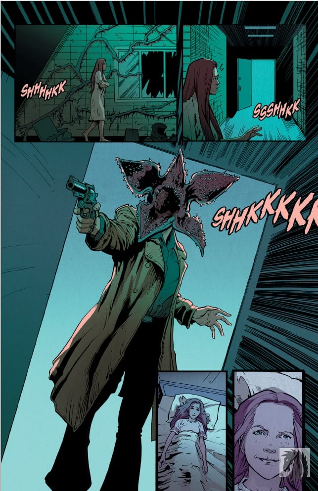
Stranger Things: SIX #4 brings with it the conclusion to this miniseries, giving us fans the answer to what happened to the test subjects in a time before Eleven became the main focus. As far as prequel series go, this one has been fairly interesting the whole way through.
The series has followed Six – though she actually had a real name before the program began. Unlike Eleven, she didn’t grow up inside the facility. Perhaps that’s why she was so determined to find a way out.
Not all fans love adaptations like these or even prequels. So this series isn’t for everyone. But for anybody that’s wanted to learn a bit more about the people who came before Eleven, this series is worth checking out.
A retro title page that fits the style of the series.
Jody Hauser was the writer for Stranger Things: SIX #4 and she wrapped up this plot perfectly. The tone felt distressing similar to another tale of the time – the one where Eleven’s (Jane) mother tried to run a rescue mission.
There was always a bit of a limiter on this series, as the characters that are shown here couldn’t be more powerful than Eleven (because why else would they have moved on to her). But Hauser managed to make Six’s powers interesting – and to give her enough of a reason to want to run.
The final issue tied back together with the Netflix series in stronger ways than we’d seen previously. It really took the tale full circle – reminding us of the timeline, and what was soon to follow. It was both satisfying and distressing, for obvious reasons.
Well, that’s an attention grabber!
Stranger Things: SIX #4 had a large creative team making it work. Edgar Salazar was brought on for the pencils, while Keith Champagne did the inks. Marissa Louise did the coloring for this issue, and Nate Piekos of Blambot joined to do the lettering.
The end result of all that work? Stranger Things: SIX ended up looking and feeling remarkably like the Netflix series it originated from. The characters don’t quite feel like they were pulled from screen to paper – but it was a near thing. The creative team kept the series flowing organically, preventing most of the issues that arise visually from this sort of adaptation.
Six’s visions, in particular, were striking, and easily the most memorable moments (visually) in the issue. Especially the one that started off this issue. It was certainly an effective way to grab our attention!
The time to escape is now.
Stranger Things: SIX #4 brought this series full circle. Now we can say that we know the tale of Six, and how her story tied in with the larger plot shown in the Netflix series. In many ways, this series did capture the tone and feel of the series, while also being its own unique tale. And for that reason, we feel like this was a strong adaptation.
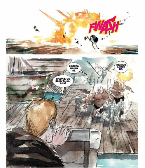
Things have been ramping up to new levels of excitement in Jeff Lemire and Dustin Nguyen’s ASCENDER series—Mila and her father Andy, most famously known as one of the protagonists in DESCENDER, have spent the past four issues evading the vampiric army of the villainous sorceress Mother. At the same time, Mother herself wastes no time plotting against all forms of technological resistance within the galaxy, and she’s finally found a trace to Mila and Andy’s home on Sampson.
ASCENDER #5, available in comic book stores on Wednesday, August 28, follows the father-daughter duo as they desperately search for a ship to take them off-planet. But will they find it before Mother arrives?
Story
In their exploration of Sampson’s dock area, Andy runs into Telsa, a ship captain friend from his past. Unfortunately, the woman is passed out on her own deck. Andy, lacking all the subtlety of a bullhorn, slaps her until she wakes up.
Their shaky relationship from the events of DESCENDER do nothing to discourage Andy’s pleas; he makes clear his determination to get his daughter off the increasingly dangerous Sampson at all costs. Lemire captures the heart of a caring father in Andy’s sincere plea: “Telsa … she’s my little girl. Me and Eff. She’s–she’s all I have left in the universe. I–I can’t lose her.”
While this reunion is taking place, Mother consults a seer and discovers Andy and Mila’s location. But the duo is not what concerns her; it’s their pet robot, Bandit, a perceived threat to her empire. She then proceeds to set her sights on the planet Sampson, just as the father and daughter attempt to make their escape.
Will Telsa agree to help Mila and Andy escape their perilous predicament? And what’s so special about Bandit that Mother would abandon everything else to pursue him? These questions and more will be answered for readers in the thrilling events of ASCENDER #5.
Artwork
Dustin Nguyen’s penciling and coloring, combined with Steve Wands’ lettering, perfectly capture the action elements present in the narrative. Nguyen crafts crisp waves in the Sampson dock area to set the scene for Mila and Andy’s attempted escape, then abruptly shifts to the explosions created by the vampire troops to effectively wreck this harmonious scene. He also makes these stark shifts in his coloring, depicting a colorful marina on Sampson while removing almost all color from the scenes featuring Mother. These sudden changes only enhance the story’s dichotomic elements, showing the overblown polarities we perceive in our world.
In addition, Wands’ lettering brings the characters to life. He too adds unexpected shifts, specifically in the dialogue, helping readers imagine the character’s reactions to the shocking events as they unfold.
Comic Cover
Nguyen’s cover artwork features a hooded figure, most likely Mother, gazing into a void full of asteroids and planets. It reminds readers of her determination to conquer the universe through her sorcery.
Conclusion
ASCENDER #5 is a fitting conclusion to the “The Haunted Galaxy” arc in this series. With such tumultuous events leaving our protagonists in dire straits, it’s anyone’s guess at how they will avoid Mother’s grasp.
Do you think Mother will clash with Andy and Mila soon? Let us know in the comments below!
With Marvel Comics’ Absolute Carnage #2 (on sale August 2), writer Donny Cates continues the series’ hot start while he plunges the Marvel Universe deeper into Carnage’s bloody and nightmarish schemes.
Stegman and the art team blur the lines between hellish demons and infected symbiotes.
Absolute Carnage #2
Writer: Donny Cates
Penciler: Ryan Stegman
Inker: JP Mayer
Color Artist: Frank Martin
Letterer: VC’s Clayton Cowles
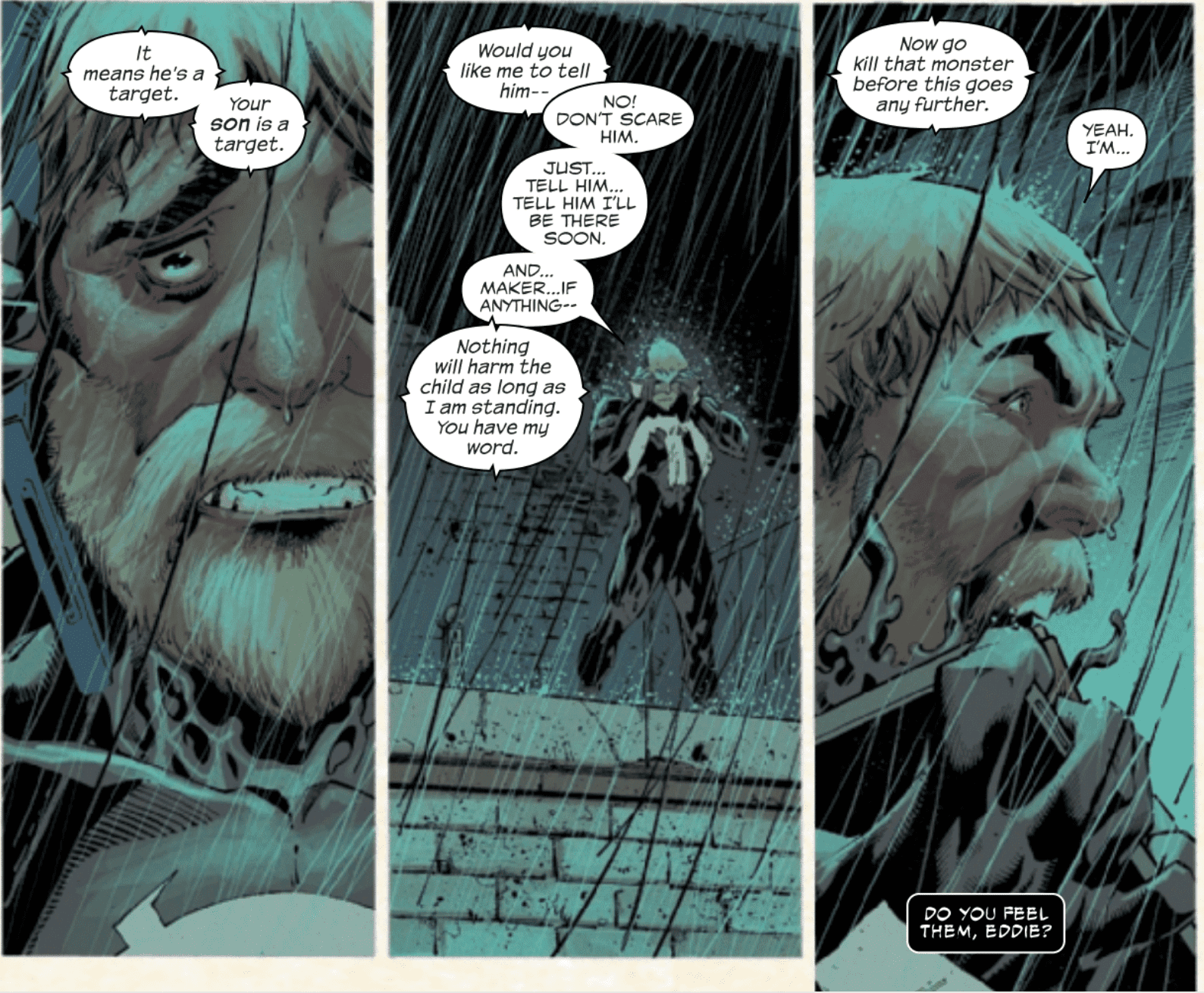
With Absolute Carnage #1, Cates, Stegman and the entire art team delivered a masterpiece. The second installment of Marvel’s newest blockbuster is similarly remarkable for similar reasons. Once again, Stegman’s art, especially with the character’s facial expressions, elevate the issue to the next level. Meanwhile, Cates’ script is still rich with memorable quotes, compelling moments and, surprisingly, a few comedic moments sprinkled in with the horror.
Stegman’s facial expressions continue to impress.
With this series, Stegman brings his “A” game and then some. For the second issue in a row, the penciler’s detailed facial expressions add pure emotion to the story. Stegman continues to show the reader exactly what these characters are feeling, whether it’s Norman Osborn’s symbiote-enhanced insanity or Eddie Brock’s despair when he realizes his son Dylan is one of Carnage’s targets. Stegman makes the characters feel like real people and this sense of realism makes Cates’ story even more impactful.
It’s Miles Morales’ (brief) time to shine.
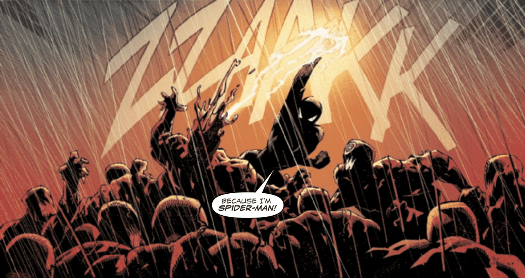
At times, that impact is gut-wrenching. Near the end of the issue, Cates gives fan-favorite webslinger Miles Morales a few delightful hero moments. These scenes feel like Morales’ coming-out party, particularly in Cates’ Venom-centric world. While Miles and Eddie have interacted before, this issue marks the first time Cates gives Miles the spotlight in such an important way. Miles and the Scorpion are fighting a horde of Carnage’s underlings. When the Scorpion questions Miles’ prowess as a hero, he valiantly yells, “Because I’m Spider-Man!” as he gains the upper hand on the infected symbiotes. To make the moment even more cinematic, Miles’ Venom blast looks like a bolt of brilliant lightning. This combination of Cates’ script and Stegman’s art demonstrates the quality of the duo’s collaboration; both men continue to click with each other.
Miles gets another moment to shine later when he bravely sacrifices himself to save Scorpion from Norman. Here, Miles’ courageous action feels like a punch to the stomach because it comes moments after his latest validation as a legitimate hero. At the end of the issue, the future looks bleak for Miles and, rather than skeptically thinking about how the hero will eventually be fine, the reader genuinely mourns this (temporary) loss.
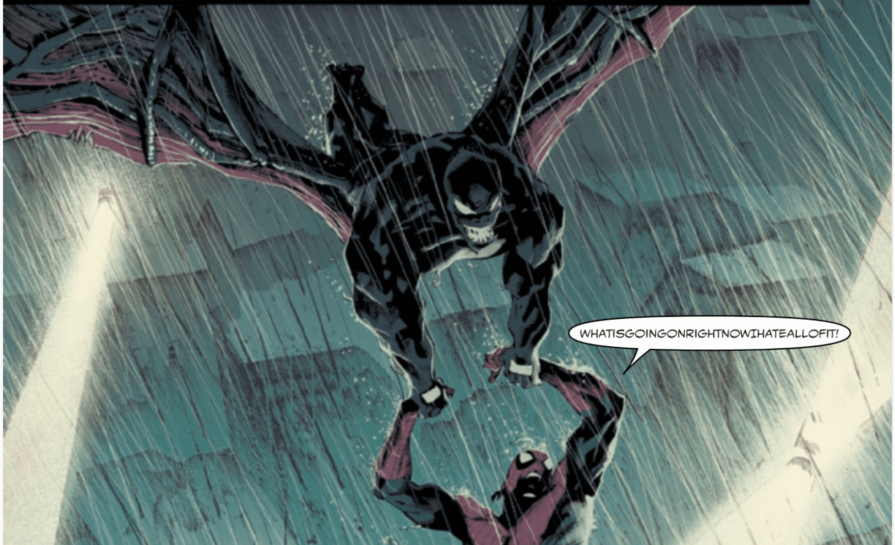
Venom has wings now, so Spider-Man goes for a ride.
With a series like Absolute Carnage, you’d be forgiven for assuming that the pages would be filled with an unrelentingly horrific tone. After all, thanks to Stegman, inker JP Mayer and color artist Frank Martin, each and every glimpse of Carnage, his goons and his headquarters look like portraits of the devil and hellscapes. Plus, the rapid progression of Carnage’s widespread infection is terrifying in its own right. But Cates adds a few bits of comedy to lighten the mood and the results are wonderful.
Primarily, this comedy comes early in the issue. Venom and Spider-Man (Peter Parker) are on the side of a building with no way down. (Peter’s out of webfluid, so they’re both in trouble.) Peter starts to stress out about how they’re going to get out of this predicament. With a silly, toothy smile on his face, Eddie practically says, “Don’t worry, be happy.” Eddie proceeds to grow dragon wings and fly away while he carries Spider-Man. Naturally, Peter freaks out and VC’s Clayton Cowles humorously runs Spidey’s words together so they read, “WhatisgoingonrightnowIhateallofit!” You wouldn’t expect to laugh out loud during a horror story but, once again, Cates and the art team continue to defy expectations in the best way possible.
Absolute Carnage #2 continues the series’ strong start and, thanks to the consistently addicting story and Stegman’s beautiful art, it’s clear that Marvel has another winner in its hands.
What’d you think of Absolute Carnage #2? Where do you hope to see the story go from here?
Just because you’ve never been bonded to a symbiote, that doesn’t make you safe. Miles learns this the hard way in Absolute Carnage: Miles Morales #1, out this week from Marvel Comics.
The Scorpion (Matt Gargan) attempts to rip-off an armored truck, coincidentally right in from of Miles. The two faceoff, with the young Spider-Man actually starting to gain the upper hand. Just then, Carnage’s squad of symbiotes crashes the scene, and Miles is caught up in the middle of the horror.
The Writing
If you weren’t aware, this book exists as a side-story to the Absolute Carnage event currently unfolding. The entirety of Absolute Carnage: Miles Morales #1 is, in essence, one continuous action sequence. The book picks up with Gargan’s heist, and remains firmly planted in the moment-to-moment sequence of events.
Beyond the intense action, the issue serves to reinforce Miles as one of Marvel’s most idealistic characters. The Scorpion serves as a perfect foil to Miles; the former is cold and viscous, the latter unfailingly principled. Upon realizing the symbiotes are not consciously attacking him, Miles insists they try not to hurt them. Scorpion, for his part, is wholly uninterested in whether the assailants live or die. This characterization comes through loud and clear in the book.
“We can do this without killing them!” Miles exclaims at one point, to which Gargan replies “Maybe. But where’s the fun in that?” This contrast of personalities is a deliberate move on the part of writer Saladin Ahmed, who describes Gargan in a recent interview as “a surly, thorough scumbag – a monster of a person” (warning: interview contains spoilers).
Absolute Carnage: Miles Morales #1 is engaging and compelling from beginning to end. The only real problem is that it isn’t really essential to the overall narrative.
The book relays events we see unfold in Absolute Carnage #2, only viewed with a focus on Miles’s story, rather than Eddie Brock’s. If you haven’t yet read that book, the events here will likely come as a surprise. That said, Absolute Carnage: Miles Morales #1 doesn’t bring much new information to the table if you’ve read it already.
The Artwork
As mentioned, the book is essentially one continuous action scene. With a lesser artist on duty, it could have easily devolved into a hard-to-follow blur of confused and disjointed illustrations. Fortunately, artist Federico Vicentini proves up to the task, providing some excellent visual work for Absolute Carnage: Miles Morales #1.
The work captures the chaos with vivid, dynamic energy without disorienting the reader. The artist lays out each page in a different manner, but follows a regular, starkly-delineated scheme from one panel to the next. As a result, we can follow from panel to panel, never feeling lost or unmoored. Vicentini’s character designs are angular, yet sleek and stylized. The style lends itself well to the action on the page and drives home the energy of the storytelling.
Erick Arciniega provides colors for Absolute Carnage: Miles Morales #1. His work is vibrant and meshes well with the dynamism of Vincentini’s illustrations. He shadows streaking figures in motion, distinguishing them from stationary objects and making the figures leap off the page.
Final Thoughts
Absolute Carnage: Miles Morales #1 is a fun and action-packed read. If you’re only interested in material essential to the larger Absolute Carnage event though, it can be skipped. Check it out for yourself at your local comic book shop.
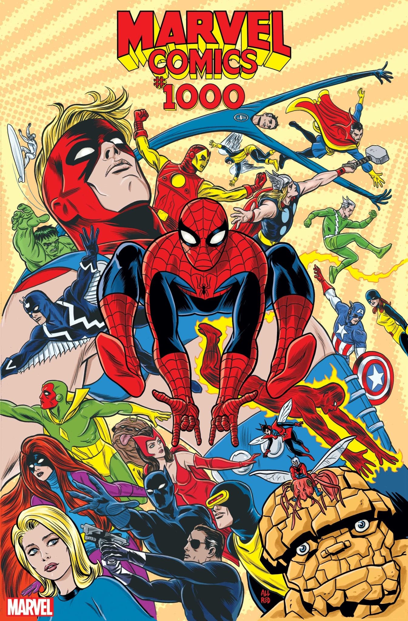
Marvel Comics #1000 Celebrates the 80th anniversary of Marvel’s debut comic (Marvel Comics #1) under original publisher Timely Comics, the big 80th-anniversary issue hits your local comic shop this week(If you want to learn more from the original press release, check out our coverage!). This beast of an issue features a creative team of 80, with each contributing one page focusing on the year of publication, while Al Ewing oversees writing duties; our as Marvel dubs him—The Mastermind. With no time like the present let’s crack open this issue 80 years in the making.
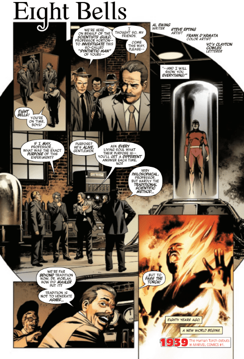
Ewing begins the 80 plus page giant by mirroring Marvel Comics #1’s first panel, with Phineas Horton opening the door for the Scientists’ Guild, thus opening the 80-year history of Marvel Comics. The stories written directly by Ewing tells the ongoing story, while others tell the story of specific years within one page. As the story builds Ewing’s overreaching plot is seen less and less throughout the multiple decades, but each time you read an Ewing page your eyes will be scanning it for details.
Essentially Ewing’s story is the spine holding it all together, as the rest of the creative teams write a singular page that contains its own story, while fundamentally tying in. These moments of synchrony at times can be hard-pressed to present itself, to the point you may need to re-read the giant that is Marvel Comics #1000. While at other times the single pages gel perfectly with the story that Ewing presents. This story that Ewing tells ranges from the very beginning of history to the now (2019), and beyond (2020).
Focusing around a new Marvel artifact titled Eternity Mask, Ewing sets up a mystery that climbs through the years of Marvel Comics, plus some movies, which seems weird but we’ll get to that. This mysterious mask makes its way through every era, yet is always hidden with a group always on the search, one being Three Xs’. If you don’t know who that is it’s okay, Ewing and team grabbed so deep in Marvel lore that they pulled characters that have only been used once! When Marvel claimed this would dig into its history they were correct.
This mystery of the Eternity Mask and teams searching for it seems to be pushing towards a future event, especially with one long lost character returning. Sorry, no spoilers! Each page Ewing writes adds to this time-spanning mystery with only a few years feeling like they could’ve focused on other big milestones. As every single page focuses on a single milestone of that year, some start to feel like a stretch or that they could’ve chosen something more prominent. Nonetheless telling a story in one page is hard, with some taking a novel approach by having his or her story be like a page out of a book.
As with the writing side, the art is done by an abundance of creators too. Each artist comes with their pros and cons, with the pros usually outweighing the cons. In a few cases, this statement isn’t true with some colors feeling off and pencils feeling stiff or boring. To fit a whole story for a specific year in one page is a hard feat with most accomplishing this feat, but for others, if the art had a chance to breathe it would’ve benefited.
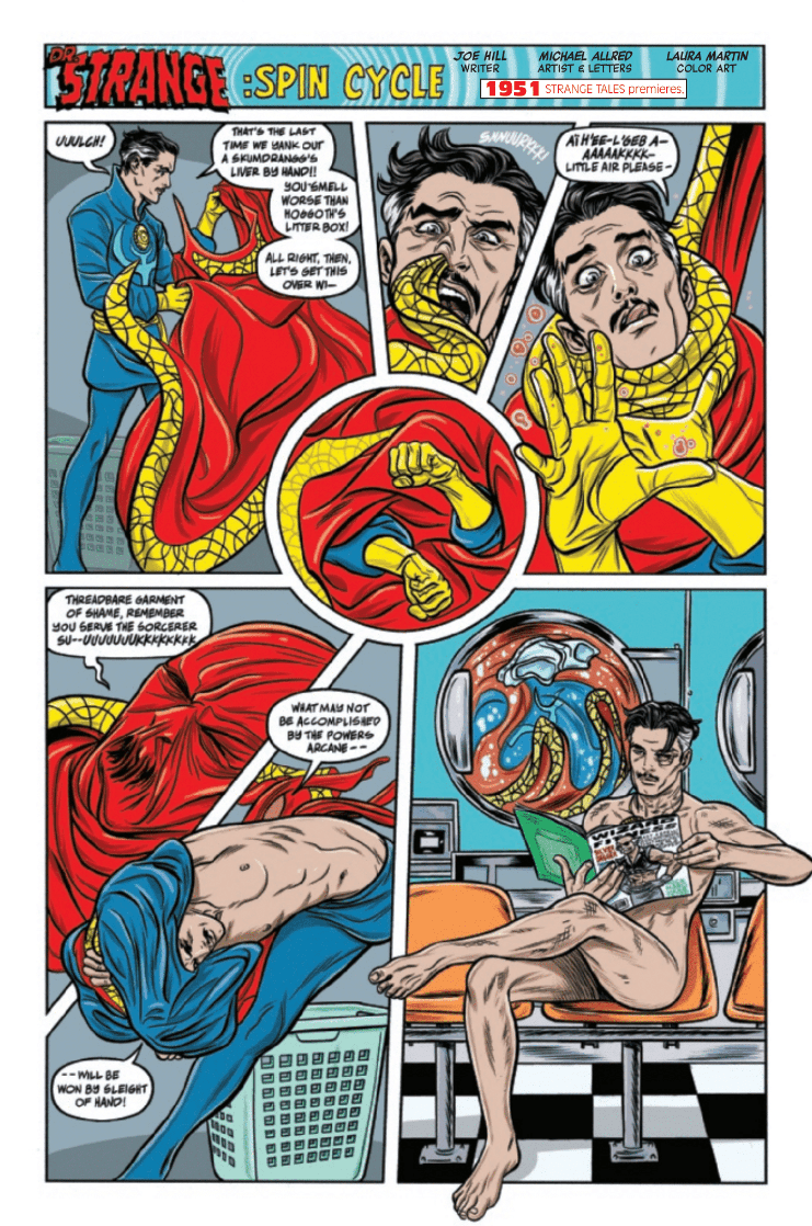
Another aspect of art that could’ve benefited by being different is matching art styles with the years. A good example of art style mixing with the publication year is Michael Allred for 1951 (Pictured Above). His style blends perfectly with the year, whereas 1939 has Steve Epting’s (picture below) style of art – which is great – but could’ve matched the year better. Instead Marvel could’ve had Tom Scioli, Ed Piskor, or Greg Smallwood (to name a few) to imitate the classic art style.
If Marvel tried harder to match the perfect artist with year, the impact of each page would have hit that much harder. They did excel on some years that feature the artist that worked on that comic during said years. A great example would be 1991 with Rob Liefeld and X-Force/Deadpool, and the following year (1992) Erik Larsen is back on Spider-Man; which was the year he debuted as writer/artist for the title.
Without going into spoiler territory let me tell you about the best page—the year 2019 by Christian Ward. For a page that’s heavy in dialogue, Ward knocks it out of the park with no panels, just keeping it a one-page spread. In this we see Eternity as he informs the readers of events, which may sound boring, but with the swirling colors and LSD esque art it’s anything but.
Unlike the art and writing side lettering is accomplished by a team of 16 that rotates with the pages; with some artists doing it themselves. In most cases it’s the usual word bubbles, with nothing too extraordinary, but the few times the letterers let loose it’s a blast to see. Two great examples are the text in The Farmer, which is a story about Thanos and Galactus. In this story letterer VC’s Travis Lanham changes the format of all the dialogue with it becoming italicized and purple.
Another great example of changing the dialogue boxes/bubbles for the better is in The Guild of Strange Science which take place 1500 years ago. Instead of going with a simple box to show the inner narration, VC’s Clayton Cowles instead conveys it with a tattered scroll, befitting the era the story takes place in.
80 Years Of Story Telling (Conclusion)
Marvel set out to celebrate 80 years by respecting what came before them while setting pebbles of new plot scattered throughout its history, that seems to be building to a huge event for 2020. This team effort of 80 people is a big deal and every creator should be acknowledged for how much work went into it. Having to wrangle that many pages from so many people is a huge task, with Ewing and team knocking it out of the park.
Although it had a few minor blemishes with some stiff art at times, stories that felt like they didn’t add to the plot, a couple of stories killing the flow, and a few cases were Marvel could have picked something other than what they did for that year; Marvel Comics #1000 succeeded in its delivery.
Memorable Quote: “Sins Past” – J. Michael Straczynski
As great and memorable as some moments were, these two words had me in tears from laughing so hard.
A Marvelous Cast of Creators
With such a huge cast of creators here is Marvel’s credits page, with a complete list of who worked on this giant issue! Plus an “in memoriam”, which was great of them to add.
Dear Marvelous Reader
So dear reader I’ve got three questions for you! What did you think of Marvel Comics #1000, what was your favorite story, and which cover was your favorite!?
What is my favorite stories you ask? Well, I have two, that would be Joe Hill/Michael Allred, and Phil Lord & Christopher Miller/Javier Rodríguez!
With Jody Houser taking over the writing duties on Star Trek Year Five, IDW Publishing have a master of science fiction storytelling on their hands. Heavily influenced by the 1960’s style of Star Trek, the latest issue out this week continues the run on familiar stories told in a modern way.
Star Trek Year Five #5 Credit: IDW Publishing
Bygone Years
Landing on a desolate planet, the Enterprise away team embarks on an archaeological survey. They collect a few artefacts to transport back to Earth for investigation but Dr Bennett, the archaeologist amongst them, believes they are missing a rare chance for discovery.
Agreeing with her up to a point, Captain Kirk ponders on the alien life they already have on board: The Tholian they have nicknamed Bright Eyes.
After leaving the planet’s surface the crew return to their usual routine however a strange force begins affecting the crew. Tempers become frayed and patience seems be running out. Minor instances start to escalate and it’s not long before everyone appears affected.
With this issue of Year Five Houser has written a classic Star Trek story. Similar in concept to the Original Series episode, The Naked Time, and its Next Generation follow up, The Naked Now, the main premise deals with a cabin fever type situation. The crew of the star ship are trapped in close proximity to each other, living in each other’s shadows, unable to get away. Houser uses small breakouts to identify the problem, making it clear that these confrontations are bubbling just beneath the surface and it only takes a small unexplained nudge to bring it all out.
As the plot thickens, so does the intensity of the disagreements. The script reflects the frustration and resentment within the crew members and Houser draws attention to moments where the cast act out of character: for example, during the senior officers meeting there are some oddities within the conversation that makes the reader re-read several panels. This is intentional and is a way of highlighting the problem the Enterprise crew face.
Houser has a clear understanding of the characters and captures their voices and mannerisms wonderfully. The gently conversation between Kirk and Uhura is contrasted with the ‘boyish’ banter between the male officers. This type of behaviour was evident in the original T.V. series and Houser makes it work during this story without it seeming out dated.
Star Trek Year Five #5 Credit: IDW Publishing
Illustrating Trek
Silvia Califano uses fine inked lines to create detailed character work. There is an element of claustrophobia to her panels which mirrors the underlying theme of the narrative. The back grounds are sparse and often reflect the coldness between the cast members in the foreground. With the color assist from Thomas Deer some of the panels even take on the heightened emotions of the characters, alternating for a brief moment from cold greys to stark oranges or reds and back again.
These flashes of emotion drive the story forward and illustrate how out of character the regulars are. This impression is also given in the way that Califano handles the panel boarders. Occasionally the panels become small slivers behind the character or the boarders are irregular signalling to the reader that there is something amiss.
Because of this focus on characters there is a lot of space for Neil Uyetake to place his lettering. His speech balloons occupy the empty space but do not fill it. They are often subtle with small amounts of text in speech balloons that hover over a vast block of color. They almost become swamped by the emptiness around them and this has the opposite effect than a large, screaming word balloon. The speech is amplified by the background, almost like an awkward pause before someone speaks.
It is clear from the opening that this story is going to be about the crew, trapped together on the Enterprise with disaster lurking just around the corner. The panel layouts; the block, expressive coloring; and the tightly controlled lettering, all build the impression of a crew under pressure, a kettle reaching boiling point.
Star Trek Year Five #5 Credit: IDW Publishing
Conclusion
Houser has written for a number of science fiction franchises and she has an ability to get to the heart of the characters very quickly. She draws on their strengths and weaknesses to move the narrative on, knowing exactly who to put in each scene. The interactions between the main crew in Star Trek Year Five are perfect representations of the characters we all know and love. These are then illustrated with such fine precision by Califano.
The story is not original, not in general science fiction or even in Star Trek but this is irrelevant because the creators of Star Trek Year Five are telling their story in such a fun and exciting way. Small character moments make this issue a joy to read and there is also the ongoing Tholian story-line that is always central to what is happening aboard the Enterprise.
Each new creative team they bring onto Star Trek Year Five has made the comic their own while at the same time producing something that is simply Star Trek. This series, and this issue in particular, has included some of the best Star Trek moments in recent years. If you only read one Star Trek comic this year, it definitely has to be this one.
Vault Comics takes you to a world filled with trepidation and uncertainty in Resonant #2, out this week. Continuing the story of a family trying to survive after global catastrophe, David Andry and Alejandro Aragon begin to expand the landscape while developing the character’s emotional states.
After the atmospheric opening issue, the creators have more time to elaborate on the setting, extend the narrative, and explore the character’s relationships.
Resonant #2 Credit: Vault Comics
A Resonant Narrative
In the first issue Andry set the scene for his post-apocalyptic world using the small family unit as a focal point of the narrative. In issue two he has expanded the world, taking Paxton, the father figure, into the wild world beyond but also by bringing someone new to the homestead.
Paxton’s journey is one of world building. Andry uses the traveling man to introduce characters and ideas which may, or may not, prove important further down the line. These scenes act like a road map to the world, in essence uncovering for the reader sections marked with ‘here be dragons’. During this exploration the reader gets a good idea of the landscape which exists within Resonant.
For the most part these scenes prove interesting. They introduce a friend for Paxton to talk with and give the reader extra insight into the ‘Waves’ that terrorise the land. Some of the new aspects of the plot are intriguing and the settings are beautifully rendered however, there is an element that feels un-original.
Just like other comics in this genre, The Walking Dead or Orphan Age for example, there are elements that seem necessary to facilitate the narrative: a religious sect, an unexplained threat, an outpost of survivors. Unfortunately for Resonant, over familiarity with some of these elements make it harder to do something new and different with them. Andry succeeds in some areas, keeping the storytelling fresh, but there are moments in Paxton’s journey that lose the fight against the clichés.
The second part of the comic, with the children left behind, is where Resonant really succeeds as a drama. The claustrophobic nature of the children’s situation and the unnerving atmosphere that is created builds a growing tension which is far more exciting than Paxton’s journey. Andry focuses on the vulnerability of the children and the potential threat from the outside, gripping the reader in an emotional trap.
Resonant #2 Credit: Vault Comics
Illustrated Waves
With stories like Resonant that rely on genre mainstays, the success comes from the telling of the tale rather than the tale itself. In this respect Resonant is a glorious success. Aragon’s inks set the scene perfectly, giving each page a rough, unnerving atmosphere. His line work is scratchy allowing him to easily define or confuse images dependant on the scene.
Occasionally the figures blend into the scenery becoming one and the same, while at other times, when the narrative calls for clarity, the cast are set in almost empty panels. Aragon is also able to control the point of view with a delicate precision. So much so that there are panel transitions that make you believe a camera has slowly zoomed in on a character or prop giving you a sense of vertigo. The comic almost pulls you in to the dry and dusty world.
The uncomfortable and foreboding atmosphere prevalent in Resonant is controlled by Jason Wordie’s skilful use of color. He uses a stark contrast of light and shadows within a page to emphasis a particular panel. On a page turn the reader is drawn to the most important element of the page initially by the coloring and then works toward that image via the usual reading pattern. In turn this creates anticipation within a scene, building the tension necessary to give the narrative it’s punch.
Wordie’s colors also gives the overall world of Resonant it’s character. The storing use of hot oranges and dry terracotta’s have an effect on the reader as they move from page to page. Paxton’s journey especially is through an uncomfortable world seemingly of relentless struggle. The character’s blur in and out of the background amplifying their fears and emotional states.
Only Deron Bennett’s lettering is able to bring the cast out with plain white speech balloons at odds with the colors of the panels. The speech and the gutters, matching in their cleanness, are the only none natural elements within the comic. The gutters separate the panels, creating focus on time and location, and the speech separates the character from the landscape. The balloons stand out and draw the reader to them, looking for characterisation and explanations. The artwork sets the scene and the text gives it meaning.
Resonant #2 Credit: Vault Comics
Conclusion
The visual aspect of Resonant is the main draw for this comic. Wordie’s colors over Aragon’s artwork is a beautiful world building experience. The threat, the fear and even the brief moments of emotional stability are best represented by the art. The plot follows a typical path for this type of story which is highlighted in some of the unoriginal sequences. There is an urge to skip over one or two scenes as the reader recognises them from any number of similar comics however, the art makes it almost impossible to do so.
The first issue set the tone and this second issue has expanded the world. Now it is up to the creative team to give the reader a new experience in a familiar world. Based on what we have already seen, Andry and Co are perfectly capable of doing this.
The Farewell is a new film starring quick-rising star Awkwafina (Ocean’s 8, Crazy Rich Asians) and directed by Lulu Wang (Posthumous) about a woman returning to China to say her last goodbyes to her grandmother except grandma is the only one who doesn’t know she’s soon heading off to the next level of life.
Cutting The Farewell together is editor Matt Friedman who previously worked on films like John Tucker Must Die, Step Up Revolution, and The Boy Downstairs. The Farewell is undoubtedly an emotional family drama, and rapper and comedian Awkwafina is receiving a lot of praise for her performance. It was Matt’s job to watch Awkwafina and co-stars give heart-wrenching performances over and over and pick just the right one. We really don’t give editors enough love in this world because that sounds a bit like entertaining torture.
PopAxiom shared a moment of respite with Matt as he takes a break from being an editor or teaching about editing at the American Film Institute to talk about editing.
Draw Or Edit
From early on, Matt says, ““I knew I wanted to do something in film. Through the act of going through film school, I learned early on that I didn’t like the process of directing.”
Matt took a pro-active and strategic approach to getting work in the film industry. “I found a list of movies that were shooting in Georgia, and I looked for the movies where I didn’t recognize who any of the stars were. I figured these are the movies that probably need help.”
Matt’s logic met his creativity. “I faxed a Top 10 list to production offices with funny reasons for why they should hire me. I got a call back for an unpaid internship. My choices were either art department or editing.”
Was the art department an option? “I can’t draw for sh*t.”
Matt continues, “I took the editing internship under a woman named Emma Hickox, who is the daughter of Anne Coates, the editor of Lawrence of Arabia, among many other things.” For our geek nation out there, Anne Coates was also the editor for the 80s He-Man film.
About Emma, Matt says, “She took me under her wing. She taught me so much. Probably more than I learned in film school. I worked for her for three or four movies, and 25 years later here I still am.”
What’s a critical skill for being a successful editor according to Matt? “good attention to detail.”
Hello To The Farewell
Matt’s relationship with Lulu, the director of The Farewell, goes back to Posthumous, which Matt also edited. About their work together in The Farewell: “There are definitely some risky elements in what she did … We discussed them a lot. Unconventional things that went against the general wisdom. There were times where I would play devil’s advocate, and we’d reign those things in. There were times she’d say ‘Trust me on this one.’”
“We probably discussed virtually every frame in that movie.”
Matt’s motivation when editing is clear. “One of my overriding goals, and something that I say in virtually every class I teach at AFI, every frame matters. It must be there in support of the story.”
Matt elaborates, “In the case of The Farewell, there are long moments of silence where nothing is happening. But all of those frames are supporting the story.”
“I worked extraordinarily hard to take those silent moments that didn’t mean anything out.”
What did that entail? “Ignoring continuity in clever ways to take out a section of a shot that’s not necessary. Off-times. If a character says a line and walks to another point to say another line, we’d find ways to take empty in-betweens out.”
“The film is really incredible.”
Being An Editor
Matt’s come in to help movies reach a better place. What’s a flaw he often sees in these films? “Too many moments that make a movie feel long and slow.”
Matt uses his work on Lulu’s previous film Posthumous to explain a bit more what he means. “It was roughly a little over two hours long. I came in and took out about twenty minutes and replaced it with two full scenes that had been cut for time. But those moments left in for the sake of continuity don’t need to be there.”
Decisions, Decisions
What’s it like choosing between two takes of the same scene when an actor is delivering an excellent performance in both? “The director and editor will discuss moments like that. It’s actually not that difficult. What becomes difficult is when there are two takes of an actor doing a scene in different ways, and they both work.”
“During What Happens In Vegas, there were times where Zack Galifianakis and Rob Corddry are riffing, and it’s all hilarious. It’s excruciating to have to pick between scenes.”
Editing Dance
It’s one thing to edit actors walking and talking. It’s a whole different beast when there’s dancing. Matt worked on the film Step Up Revolution with extensive choreography to edit. “It’s harder on a technical level. You have so many cameras running on everything. Creatively, the music informs so much, and I love cutting dance. I sit there watching dailies, and sometimes everything fires off at once, the choreography, the performance, the music, the camera work, it’s all perfect and in sync. It’s so easy to build a sequence around those anchors.”
How does he do the work? “I basically line up every cut of a dance performance from every angle, one on top of the other in the timeline. I watch everyone from start to finish.”
What’s he looking for? “… the stuff I know is not going to be in the cut. I list all those moments and take them out. So I end up with a timeline of what I know are all the possibilities.”
From there, Matt will, “… start to connect the dots.”
Wrapping Up
My biggest creative inspiration is Jill Bilcock, both in terms of the way in which she edits and the way she shapes her career. She bounces back and forth between little character-driven films and giant studio spectacles.”
“I’m very lucky in my career to have worked as an assistant for a lot of great editors. Peter Teschner who cut the Brady Bunch among many things like Eddie Murphy’s first Dr. Do-Little.”
What’s next for Matt Friedman is currently happening as this entire interview took place while working on a new project. What is it? Well, Matt can’t exactly say. “It’s an Andy Sandberg movie. I don’t know how much I can say. But it’s a romantic comedy about a couple stuck in a time-loop. About how their relationship grows in a spot where everything stays the same.”
Thanks to Matt Friedman and Impact24 PR for making this interview possible.
Want to read more interviews like this? CLICK HERE.
BOOM! Studios is starting to build a substantial fantasy world based on the Buffy The Vampire Slayer franchise and Angel is playing a massive part in it. Released this week is the dramatic end of Angel’s first story arc and it features a number of recognisable faces.
With the big sister title Buffy making some very large waves, can Angel stay afloat or will the title be lost at sea?
Angel #4 Credit: BOOM! Studios
An Angel In Hell
At the end of last month’s issue, Angel had rescued the psychologically disturbed Fred from a physical attack but the demon was still free to spread it’s evil into the world. With Fred helping to open a portal, Angel is forced to take the fight to the demon’s home dimension.
Trapped in a hell dimension where he can’t rely on his own senses, Angel has to face up to some of his past indiscretions. Meanwhile Lilith is helping Fred, leading her back from the brink and giving her a higher purpose.
Bryan Edward Hill tells a straight forward horror story and packs it with in jokes and references. He creates a hell dimension with virtually no physical substance in order to develop Angel’s character. It is a concept that was used a number of times in the T.V. show and proves successful in this format. Despite the Legacy, Hill is still introducing his version of Angel to the reader so this first arc is important in establishing the character of the central protagonist.
The framing of Angel’s character development is a twisted version of the movie Labyrinth. Angel is cast into a maze and haunted by elements of his life from the ‘real’ world. The demon sits on a throne teasing the vampire, arrogance his greatest flaw. The sequences work well showing the reader who Angel was and contrasting that to what we have come to know of him in the previous three issues.
It also hints at elements of Angel’s future which is a theme picked up in Fred’s narrative, linking the plot threads together. Hill brings everything together towards the end of the issue creating a satisfying end to the first arc with enough of a hook to come back for more.
Angel #4 Credit: BOOM! Studios
Dark and Darker
Gleb Melnikov’s art work is fantastic, seamlessly blending the supernatural fantasy elements with the modern technological aspects of the story. He has a dark, shadowy style that suits the Vampire with a Soul. The pages are shrouded in darkness with the backgrounds barely visible unless absolutely necessary. This sometimes means that there are no establishing shots and the space the characters inhabit lacks any sense of location. This approach works occasionally but not all of the time.
The mood and atmosphere, created in part by Melnikov’s use of solid black shadows and dark gutters separating the panels, takes over the comic producing an intensive read. The colors by Roman Titov keep everything shrouded in darkness with the only burst of color illustrating shocking elements of the narrative.
Ed Dukeshire has to deal with a number of disembodied voices throughout this issue. By using a combination of tail-less speech balloons and caption boxes, he places the text in logical positions within the panels so that it is easy for the reader to follow.
Just like the T.V. shows, the styles and themes in Angel are different to Buffy. They are more adult in nature and have a sense of experience to them. The characters aren’t as cut and dry; the line between hero and villain isn’t so much blurred as smeared across the landscape. The artwork in this first arc has represented that perfectly and is markedly different to the styles of Dan Mora and David Lopez over on Buffy.
Angel #4 Credit: BOOM! Studios
Conclusion
Angel issue four completes the first story arc in style. It has the confrontation with the Big Bad and there is some resolution to the story, however there are enough threads left dangling. The main characters are fully realised, abound with flaws but with redemption on the cards. Both Fred and Angel have their own past and futures to face and this story is a great place for them both to start.
Hill presents a horrific, modern day villain and the damaged heroes who are compelled to battle him. He draws on pop culture references and Angel Lore to help the narrative flow in an entertaining way. The artwork creates an unnerving, uncomfortable atmosphere for all of this to take place in. In essence, this is the perfect Angel story and the best way to relaunch a character.
All that remains to be seen is if they can pull off the dramatic crossover event ‘Hellmouth’, due out later in the year.
Have you ever wanted the power to wear any face like a mask? If so, what would you do? Become a kingpin? Return as the king of the underworld? Gain money and power? Or would build an empire and shape the course of history? This being one of many questions Black Mask has to answer in DC Comics’ Year of The Villain: Black Mask #1, out this week (check your local comic book store).
Black Mask was originally introduced in 1985 but hasn’t been seen around as often as other Bat-villains. He has been lucky enough to be included in multiple media formats, but never in the forefront as the others in the Dark Knight’s rogue gallery. Funny enough he is known more for his run ins with Catwoman in Ed Brubaker and Cameron Stewart’s amazing Catwoman series.
Having been portrayed throughout his comic history as a ruthless crime lord who loves torture as much as masks, he has never been anything more than a normal human. That character trait changes with Tom Taylor’s Year of The Villain: Black Mask #1. Although it’s labeled as a Year of The Villain tie-in no info for the event is needed, other than Lex can give other powers.
Having Black Mask #1 act as a tie-in while having it essentially a stand alone works to it’s benefit for readers interested in said character. This shows DC’s great marketing strategy with the Birds of Prey movie releasing next year with Black Mask as the villain. This movie will mark his live-action debut while also marking Renee Montoya debut, who DC has also pushed lately.
Dedicating the first nine pages as a retelling of Black Mask’s history, Taylor gives the audience a quick backstory so they learn what is needed without having to read other stories. This retelling is told from none other than Black Mask as he holds a bank teller hostage. Taylor could have easily made this opening boring, but instead played it off with Black Mask wanting to finally talk to someone; so why not tell you origin? With the backstory for newcomers done we make our way to the Year of The Villains aspect, enter Lex Luthor.
Helping Black Mask escape from the bank Lex promises him whatever he desires, as long as he takes power from Lex. What best to go with a mask obsessed villain than the power to change your face? As great as this power is it’s never defined how it works. Is it like One Piece’sBon Kurei where he needs to first touch the person? Or like the dozen other shapeshifters where he just needs to see a picture?
Besides the question of how his powers works, Taylor crafts a superb new origin story that builds upon Black Masks history while making him more accessible. While the issue is titled after Black Mask it features a heavy dose of Batwoman teaming with Renee Montoya. As previously stated DC has been pushing Montoya often lately, but this works out for the best in most cases. As did Lois Lane having Montoya team up with her, the same concept applied here is a smart idea to bring to the public’s eye. On the subject of eye’s, how about that art?
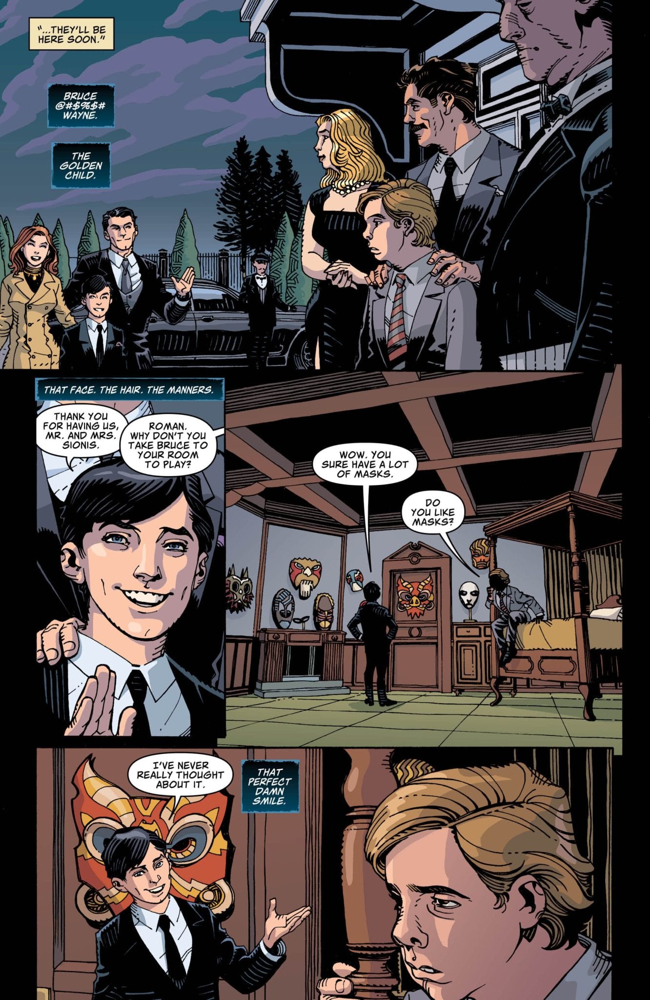
On a visual level Black Mask #1 comes off as an adult cartoon turned into a comic with pencils by Cully Hamner. This style gels quite well with the story being told but wasn’t as such from the get-go. For Black Masks flashback of his younger years he has a misshapen face, at first you think this is done on purpose, but once young Bruce comes into panel he looks the same. It’s not story breaking, but it’s very noticeable when one side of a character’s face is slumping down like melted butter.
This face slumping happens a few more times in the present but nothing as jarring as the last segment. The rest of the pencils look great with Hamner making great use of paneling for dialogue and in a few action sequences, well that is true except one instance. Although it is drawn quite well and has a smart use of coloring in the panel, there is a slap scene early on that seems to break the laws of physics.
Yes comics can break this law (and others), but that’s for those with powers; in this case, it’s Black Masks father (Richard Sionis). Angry at his son he lashes out with a slap so forceful the colors of the panel turn black and red, thanks to Dave Stewart’s stimulating emotions with colors. Richard smacks Roman (Black Mask) with his left hand moving right to left connecting violently to Roman’s left side face.
If you’re visualizing this you’re probably thinking Roman’s head would turn to the right as he falls. That would be how it should happen, but sadly it doesn’t, instead his head (and body) flies to the left making no sense. This is a minor problem in what was otherwise a well-drawn issue, plus this physics breaking has occurred in comics before.
Helping emphasize on certain scenes and emotions is Stewart’s fantastic eye catching colors that are bright and lively when needed and dark somber moods in others. Stewart’s colors hammer home the smack Roman receives (even with the physics problems already said) and the loud BANG that fills the panel when Black Mask shoots a gun.
A Black Mask Affair (Conclusion)
Taylor writes a great Black Mask, granted it would have been nice to see his brutal torture methods he’s famous for but the story being told didn’t warrant that. As great as the Black Mask moments are the Batwoman and Montoya moments outshine the titular character. The two heroes have a great chemistry that Taylor and team play upon making it a blast anytime they are together.
Combining the great blend of story shifting, the art and colors makes Year of The Villain: Black Mask #1 perfect for those new to the character, or those already invested in Year of The Villain.k
Memorable Quote: “Well, that’s dark. But to each their own.” – Lex Luthor
Coming from Lex Luthor, that’s pretty hilarious!
Dear Reader Behind The Mask
If your now joining in on DC’s Year of The Villain then check out some coverage from the beginning of the year to catch yourself up! Or if your a newcomer interested in Black Mask or a fan already caught up that wants to read this Bat-tastic issue then check your local comic store!