Home Blog Page 422

Review: Jeff Martin’s HELL, INC. Is “Dilbert” Set In, Well, Hell

Monkeys Fighting Robots

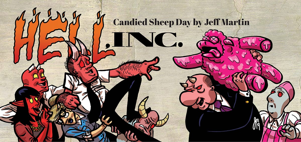
Working in an office is a hell that most people can relate to. The 9 to 5 hours feel like an eternity. The cubicle feels like a coffin. The boss is a micromanaging demon. That’s exactly what cartoonist Jeff Martin is poking fun at in Hell, Inc., the weekly webcomic currently fundraising its way to print via Kickstarter.

Hell Inc #2 Cover

Story

Hell, Inc. is an office comedy set in Hell – think The Office meets Dante’s Inferno. It is the story of Doug, a lowly office drone desperately trying to wring any bit of happiness he can out of his soul-crushing existence.

Though Martin compares Hell, Inc. to a show like The Office, it reads much more like the Dilbert comic strip by Scott Adams. Both are satires about office politics, relationships, and overall calamity. Both comics deal with a Kafkaesque bureaucratic office, and the hapless desk jockey at the center of it all. But where Dilbert’s comedy is often highbrow, Hell, Inc. digs low to the Ninth Circle, complete with corny puns (“What the here?”) and cartoon humor.

Martin writes Doug as a wholly ordinary demon trapped in both a proverbial and literal hell of heightened situations and supporting characters. We’ve seen this kind of humor time and time before in workplace comedies (see: Superstore, Office Space). However, it’s these all too relatable jokes and situations, coupled with the overabundance of hellish puns and references, which makes the book all the more enjoyable to digest. 

Hell Inc Page

Art

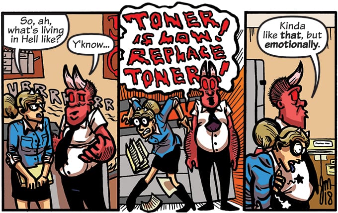
The artwork of Hell, Inc. has a surreal quality to it, which just adds more flavor to the elevated writing. Martin overstuffs each panel, leaving little breathing room, conveying the claustrophobic qualities of an office environment. The character work is fairly tame, albeit cartoony. It’s substances like blood, acid, fire, and ink toner that are bombastic, and bleed through from panel to panel.

Conclusion

Relatable workplace comedy humor and hellish puns makes Hell, Inc. an enjoyable read. 

You can pick up a print copy of Hell, Inc. by supporting it on Kickstarter. You can also read the webcomic from the very beginning right here. Jeff Martin also has a Patreon page with early and exclusive content. And be sure to follow Martin and Heat Comics on Facebook, Twitter and Instagram for updates on Hell, Inc. and his other projects.

Is your office like Hell, Inc.? Let us know why in the comments.

Monkeys Fighting Robots Youtube

Review: Black Condor Takes Center Stage in FREEDOM FIGHTERS #8

Monkeys Fighting Robots

The Freedom Fighters’ Black Condor goes Undercover to Save the Day

The war for Earth X has taken a surprising turn since the return of Uncle Sam. The Freedom Fighters plan to unite under him to retake America, but two people stand in their way. The first is Adolf Hitler III, the mad grandson of the original fuhrer, who seeks to torture and kill the group. The second is Overman Hank Henshaw, a cyborg replica of the Man of Iron(The Superman of this Earth).

Together, the nazi supervillains plan the ultimate trick: kidnap one of the Freedom Fighters and plant a disguised Plasstic Man in their place. During a meeting with one of the Fighters’ informants, the Nazis capture Doll Woman and send in the shape-changing metahuman in her place. Are the Freedom Fighters doomed to fail? 

Freedom Fighters 8 cover

**Some Spoilers Below**

Story:

We open our tale over two decades in the past in the city of Detroit. We focus on an African American couple who gives birth to a boy in secret. That secret doesn’t last long as the Nazis come and steal the boy to prepare him for his work as a factory worker. We return to the present to see that the baby is Black Condor, who is going undercover to find the Plasstic Man creation formula in the city. The last time Condor was here was the day he escaped, using the wings he made, regretfully leaving his mother and father behind. 

Black Condor and Doll Woman enter the camp with the mighty miniature woman keeping reconnaissance from the rooftops as Condor disguises himself as a worker. Little do the Freedom Fighters know that Plasstic Man is still in their ranks as a spy, preparing to expose the plan.

Freedom Fighters 8 p1

It’s honestly a pleasant surprise that we’re three-quarters of the series and it continues to excite. Seeing the origin and infiltration of Black Condor felt like a part of a war movie, with every tense moment pulling this reviewer to the edge of his seat. I was nervous when Black Condor was called out by a foreman. It isn’t that we haven’t seen scenes like this in past stories, but the setting and flashbacks make the entire issue feel tense in the best possible way.

The only downside of the issue is that they revealed Doll Woman was a Plasstic Man spy and it did nothing. I know the hope is the Freedom Fighters aren’t captured, but the last issue was spent setting this plot point up. By the end of this one, nothing comes from it. It’s a small part, but still an annoying nitpick.

Freedom Fighters 8 p2

Art:

The art team has been going all out with every issue so far, and this one is definitely no exception. Every time we get a panel of Black Condor flying in Detroit, the whole city feels gigantic and genuinely frightening. The enslavement of the people can be upsetting to look at, but also fits the kind of world the series is based in. The colors and inks are also well done, giving dark tones and shadows to fill the reader with hopelessness until the brightly colored Black Condor makes his move.

Freedom Fighters 8 p3

Conclusion:

The Freedom Fighters continues to be the surprising hit nobody saw coming. The story is able to have tension rise as one of the members goes undercover and still give us an epic sequence to cheer for the heroes. The art team continues to go above and beyond, making this one of the more darker comics on the shelves. Overall, it’s still a great comic as we enter the final act.

Monkeys Fighting Robots Youtube

Review: A Magical Journey To Hell Begins In DOCTOR MIRAGE #1

Monkeys Fighting Robots

How do you solve the case of your own death, is the question Valiant Entertainment’s Doctor Mirage #1 out this week asks its titular character and the reader. The answer is a colorful panel-breaking mystery that’s just the first step into hell.

Doctor Mirage is a character that’s been around for more than 20 years, then was rebooted in 2013 receiving multiple limited series from 2014 until 2016; with this year marking the first ongoing in years. Luckily for the new series, you don’t need to know any of her backstories. Instead, Magdalene “Mags” Visaggio catches the reader up on all of the essentials in the first few pages.

Amazing first page. Art by Nick Robles. Colors by Jordie Bellaire

Doctor Mirage #1 starts off in the most magnificent manner as Doctor Shan Fong Mirage is falling through a blue, purple, and orange landscape filled partly by a moon, drawing the reader’s attention to the action. Continuing her fall into the next page Doctor Mirage is shown slowly descending into a vast page filled with dark blues and a hint of pink.

Artist Nick Robles keeps the focus on Doctor Mirage smack dab in the middle, with the deluded colors by Jordie Bellaire barely shining enough; as not to take away the reader’s attention. Through this opening two-page sequence, letterer Dave Sharpe displays the narration through a film clapperboard, which may not make sense now, but when we learn of her past profession it makes sense.

Doctor Mirage then goes about her day thinking to herself how she has never learned to be alone, for these panels Robles makes the room look gigantic compared to the Doctor. The difference in size emphasis Doctor Mirage’s feeling of being alone. Through her narration, we learn of a spell that she presides to try to bring back the ghosts that she used to see. With a palette of psychedelic colors, Bellaire sets the mood for the spell gone wrong while Robles shows the house’s insides unhinged. This mind-bending use of panels and perception is used throughout Doctor Mirage #1 with great success, making scenes that use magic pop out like its happening in front of you.

Fantastic first page. Art by Nick Robles. Colors by Jordie Bellaire

Yet going any further in Doctor Mirage #1’s story would spoil a great deal of what Visaggio has set up as the road map for the ongoing. What Visaggio does present in Doctor Mirage’s character is one of loneliness now that she has lost her powers of talking and seeing the dead. Through her actions and thoughts, we see how defeated she is, while Bellaire helps this mood with light purples and blues littering the walls of her house.

The Life and Death of Doctor Mirage

The reason behind the panels and pages looking this magically fantastic is due to the harmony between everyone on the team. Throughout Doctor Mirage #1 the plot, art, colors, and lettering are a sight to behold, making it seem as if this team of creators is in fact, one person. Visaggio wrote Eternity Girl for DC Comics in 2018 which also had amazing panel usage

Looking back at her history of writing comics it seems like she knows exactly what material to inspire an artist to create fantastic panels and pages that feel unique. That’s not taking credit away from Robles, Bellaire, and Sharpe’s hard work. Each panel/page could be dissected throughout this magical first issue and very well should. Doctor Mirage #1 will quickly grab any readers attention and make then impatient for the next issue.

Memorable Quote: “Or do you wanna come with me and see the parts of hell even the devil is scared to visit?” – Grace Lugo

Hell yeah, you can count me in!

The Doctor In You Dear Reader

Is this your first foray into Doctor Mirage? If so let us know what you think! Or if you have a long history with this character we’d like to know what you thought of this first issue!

Monkeys Fighting Robots Youtube

Review: BATMAN: CURSE OF THE WHITE KNIGHT #2 Captivating Conspiracy

Monkeys Fighting Robots

An homage to the Three Musketeers, Batman: Curse of the White Knight #2, out this week from DC Comics Black Label, is an action-packed elaboration on the history of the Wayne’s.

Opening with some gorgeous panels straight from the work of Alexandre Dumas, Sean Murphy illustrates some of the amazing European architecture of the past. Murphy even uses some of the famous names from Three Musketeers for characters and places in this story.


Matt Hollingsworth always does an amazing job coloring Murphy’s art. In the panels from the past, reds dominate the pages giving the impression the only source of light back then was fire or the burning sun. Murphy makes a point to add lanterns and candles into many of the panels to keep the aura alive. As soon as the story reverts to the present the softer and cooler blues take over. Hollingsworth does a fantastic job giving each environment of the story its own atmosphere.

AndWorld Design handles the lettering and it fits extremely well with Murphy’s art. Murphy dives into his work with great detail adding so many lines in such a small space it seems like he uses pencils with microscopic tips. The lettering in this story is small when necessary but booming when the story calls for it.

WARNING: SPOILERS FOLLOW

Batman: Curse of the White Knight #2 doesn’t have a slowdown and catch your breath moment. Each page delves into important history or exposition unfolding more drama into the present day.

The story opens in the past and shows us why the sword the Joker gave to Azrael in issue #1 is significant. Edmond Wayne is freed by a murderous priest named Bakkar who believes he has been ordained by God for higher purposes. Killing in the name of freeing Edmond is fine, but taking the lord’s name in vain is not. Bakkar wields the giant sword to kill the carriage driver and later gives it to Edmond when they begin training.

Bakkar trains Edmond in sword fighting, sparring, whips, tight ropes, shooting guns, preparing him to be the first Batman. In Edmond’s journal, he outlines why Bakkar needs Edmond and why training him is so important to his goals. Familiar names like Arkham and Gotham remind the reader that this is in fact a Batman story.

Murphy has created a vulnerable Batman for his White Knight universe. This Batman doesn’t seem to have had enough prep time, and he hasn’t taken every precaution the Batman we’re used to would have taken. This version is very reminiscent of Christian Bale’s Batman, and this story combines aspects from many amazing stories into an action-packed chapter.


Batman: Curse of the White Knight #2 takes from Three Musketeers, The DaVinci Code, and even Mission Impossible. Conspiracy abound and plenty of guns to go around. Azrael has secured backing from the elites with deep pockets, and he assembles a team where each member has a specialty. The costume design is new and creative, combining Musketeers, Knights Templar, and Knightfall costumes to make quite the intimidating look.

Batman: Curse of the White Knight #2 is amazing, and another non-stop action-filled chapter in Murphy’s universe. This issue in integral and touches back to events from the first series, and not a single panel is wasted. This is an issue that is not to be missed.

What did you think of Sean Murphy’s twist on the Musketeers? Let us know how much you liked this issue in the comments.

Monkeys Fighting Robots Youtube

Review: JUSTICE LEAGUE #30 and the Time Heist for Totality

Monkeys Fighting Robots

The Year of the Villain is in full swing, and Justice League #30 kicks off the Justice Doom War. It is the culminating event to everything Scott Snyder and James Tynion IV have been writing in Justice League since the series began in May, 2018. To quote Snyder on Twitter, “if you only ever pick up one issue of our run, let it be this one.” 

In short, Snyder is right. 

** Some Spoilers Below **

Justice League #30 Cover

Story

The “Justice Doom War” starts here! The Lex Luthor the League has known and fought is no more, replaced by an apex predator version of Lex, powered by Perpetua with a goal of bringing tragedy to the DC Universe. Now that Lex has powered up villains across the cosmos, he marshals his own troops, sparking a war between the Legion of Doom and the Justice League that will span space, time and the Multiverse itself. This is the start of the next big Justice League event, with consequences affecting “DC’s Year of the Villain” and beyond! 

As the greatest heroes of the DC Universe assemble for an epic showdown, so does a terrific creative team. Snyder and Tynion take on co-writing responsibilities to bring this vast event to its crux. The stakes are set as the newly-expanded Justice League prepare for an imminent attack from Lex Luthor (looking like a full on Prometheus Engineer), who now possesses six of the seven hidden energies needed to bring Perpetua to full power. 

Snyder’s infamous worldbuilding is on full display in Justice League #30, which is so perfectly designed for the comic book medium. It’s difficult to think about an attempt to make a movie out of this story. It’s so cosmic and grand, and precisely what makes comics great. Can you imagine the string theory board Snyder needed to put this story together?

The standout character in this issue is without a doubt Starman. Since being reintroduced way back in 2017’s Dark Nights: Metal, his strength and purpose has finally been brought to light. It was apparent he was a powerful hero, and somehow integral to this story. But, after this issue, it’s safe to say that Starman is probably the most important hero in the DC Multiverse at the moment.

The final pages of Justice League #30 are something to behold, and an outstanding setup of what’s to come. The plan to retrieve the Totality fragments in the past and future rings similar to another epic superhero team-up time heist. However, that doesn’t make it any less exhilarating and compelling. 

Justice League #30 Page

Art

Jorge Jimenez and Alejandro Sanchez are back, and their immeasurable talent is as strong as ever! There is a moment, however brief, where the exposition starts to drag. But it’s the vast array of colors and designs as the heroes and villains of DC gather that bring those pages of Justice League #30 to life. 

Another shining example of the artwork are the opposing images of Justice and Doom over a depiction of the Multiverse in its gleaming glory. The visuals this team crafts to aide in the intricate worldbuilding have been some of the artwork in comic books today. Though this one is a bit cluttered with caption boxes, the artists’ use of color and light and kinetic energy is nothing short of stunning.

Conclusion

In the 20 short pages that make up Justice League #30, you will find a continuation of impressive universe-building, stunning artwork, and an ending so mind-bogglingly exciting you’ll be counting the minutes until the next issue is released.

What did you think of Justice League #30? Let us know in the comments!

Monkeys Fighting Robots Youtube

Review: MARVEL MONSTERS #1 Frenzied Monster Mashing For All Ages

Monkeys Fighting Robots

While Marvel Monsters #1, out this week from Marvel Comics is not what I expected, it is a fun and informative look into the monsters of the Marvel world.

Cullen Bunn provides the story and Scott Hepburn handles the art for the actual story portion in the issue. Israel Silva provides colors and shows off his great ability to get these larger than life creatures to pop right off the page. With so much going on at once, so much can get lost, yet we can see clearly what every monster is doing, no matter how small they are.

Travis Lanham handles the lettering in this one-shot, and with all the monster action, he had his work cut out for him. The noises and roars from the monsters don’t take away from the artwork and actually blends in and becomes part of the art.

WARNING: SPOILERS FOLLOW

Marvel Monsters #1 is a one-shot that pits Kid Kaiju and Max Frankenstein against each other in a battle for a monster anatomy book. Kei Kewade is in the Baltic Sea exploring an abandoned castle on a small island. While searching the ruins with his monster companion Scragg, they happen upon an altar surrounded by candles enshrining a book. The book appears to be about monster anatomy, and something Max Frankenstein has been using to create his evil creatures.

A Timely publication from 1939, the book shows all the different monsters and all their statistics. It shows height, weight, and the functions of each part of the monster, and is a considerable opportunity for different artists to draw pin-ups of the monster each page is detailing.

Many great artists contribute full-page pin-ups and they are stunning. Marvel Monsters #1 is an art book Marvel made to show off their more unknown offenders. Stephanie Hans, Clayton Crain, Michael Allred, Nick Bradshaw, Becky Cloonan, and Gerardo Zaffino are just over half of the artists contributing full-page pin-ups. Superlog does a fantastic job with the cross-sections breaking down their anatomy and explaining their powers, giving it an old worn look.

While Kid Kaiju can manifest monsters just by drawing them, it appears the book Kei found was research material for the Frankenstein family. Max has to create his monsters just like his namesake, so this book is paramount to his evil schemes.

Kid Kaiju is still a fairly new character. I didn’t read much of the Monsters Unleashed run about him, so I’m not aware if that series gave him an archenemy like a Joker to his Batman. Marvel Monsters #1 presents Kid Kaiju with a super-villain that could prove to be his big bad guy to contend with.

This issue provides some amazing art and a new direction for a new character. I fully expected this to be a horror centered story that perhaps led to a longer series. Although disappointed when I opened the book, I was pleased when I did a little reading. I grew up watching Godzilla so it’s nice when a story like this can be enjoyed by fans of all ages.

This is not a story full of destruction and blood. It is a story to get children interested in some aspects of Marvel they may not be familiar with. Any fans of monsters will enjoy the anatomy and full-page pin-ups, and collectors of horror and monster books won’t want to miss this.

How awesome are those monster pin-ups? Let us know how surprised you were by this issue in the comments below.

Monkeys Fighting Robots Youtube

Review: TRIAGE #1 Is Strong & Surreal SciFi via Phillip Sevy

Monkeys Fighting Robots

At first glance, Phillip Sevy’s Triage (soon to be released by Dark Horse Comics) might seem like several different comics accidentally printed together. The styles and moods of the different pages almost lack a connection. But read on, and you’ll find that this strong, surreal weird-fiction adventure is beautifully and intricately connected in the most satisfying ways, hinting at a story that is both as big and breathtaking as the scope of the first issue itself.

Triage #1: Cover by Phillip Sevy, Dark Horse Comics

A Tri-Cornered Tale

Our story begins with Evie Pierce, a clever nurse leading a straight-forward, perfectly average life. Evie goes through the familiar daily struggles of every young professional. She deals with work and relationship drama, questions her purpose. Suddenly the story takes a turn, introducing us to Orbit, an over-powered, over-confident superhero and public figure. Orbit’s life is the opposite of Evie’s; while our nurse deals with the uglier parts of another person’s pregnancy, Orbit takes on a massive robot wreaking havoc in the city. The scenes end and we the audience search for a connection. Why are Evie and Orbit focal points of this story? And who is the gas-masked rebel we meet next, living in some post-apocalyptic wasteland? In just a few introductory pages, Triage sets up stories that could stand on their own as a great new title. Luckily for the reader (though maybe not so much for the characters), what appears as three stories is really just one. Massive, far-reaching, but cohesive.

Page-Turning Plot

For a story that is definitely complex, the first issue of this book makes for an engaging, followable read. This is mostly because Phillip Sevy, auteur of Triage, has incredible control over his narrative. He releases just the amount of information we need to know in any given scene through his dialogue, but manages to keep it grounded and not overly expositional. This achieves two pretty impressive things: 1.) it keeps the reader’s interest in the mystery, going into sparse character detail to make us turn pages while sparing us awkward world-building. And 2.) it lets his art absolutely sing.

Triage Issue 1, Page 2 – Credit Dark Horse, Phillip Sevy

A Symphony of Strange Sights

That’s not being hyperbolic, reader. There’s a strange, alien music to Sevy’s art that makes Triage worth the cover price and more. Fans of either Phillip K. Dick or Salvador Dali with both find something fascinating about his otherworldly imagery, how it moves on the page and dances between literal hard-sci-fi tech and abstract dreamscapes. Sevy takes on the lions’ share of his book, contributing both the pictures and the words that make Triage, and the seamlessness of their matching makes difficult ideas easy to convey, like in the more ethereal issues of Hellboy or some of the best Sandman stuff. Weird-fiction fans should of course pick up this book, but so should anyone interested in seeing a well-constructed comic.

A Retro Rainbow

If there’s one thing not terribly revolutionary about Triage, it’s the coloring. The book is made up of neon purples, pinks, and blues, reminiscent of an 80s VHS logo. It’s not that the colors are poorly done, just that a readership who’s seen promo pics for Stranger Things, Atomic Blonde, or even a couple episodes of Riverdale won’t find anything new about the retro tones. That said, the colors do fit the images appropriately. In fact, that might be the problem. When the obvious choice for how to color an image is as commonplace as it is now, it could have been cool to see some thinking outside the box. But hey, if so many people are using those colors, it must be because they’re interesting, right? You can’t fault Triage for that.

Overall Thoughts

Weird-fiction is experiencing a revolution right now. Trippy episodes of Black Mirror and films like Annihilation are making everyone reconsider their perceptions of the sci-fi and fantasy genres. Comics of course are part of that march, and Dark Horse’s upcoming title is in the vanguard. You can pick up Triage at your local comic book store September 4th, make sure you don’t miss out. There’s a fascinating future contained in the first issue of Triage, don’t get left in the past.

Triage #1: Cover by Hannah Templer, Dark Horse Comics

For more comic reviews like this one, keep an eye on Monkeys Fighting Robots.

Monkeys Fighting Robots Youtube

How Chaos Ensues in LUMBERJANES #65

Monkeys Fighting Robots

LUMBERJANES #65 from Boom! Box is out this week and it is looking about just as chaotic as we’ve ever seen them. Here our campers have their own goals and even a new mystery on their hands. But what will come of it?

The Zodiac Cabin is fighting for center stage on this cover!

***SPOILER WARNING***

The Lumberjanes is one of those fun series that makes for a perfect escape. And Lumberjanes #65 is no exception to that rule. This issue begins a new plot, and from the looks of things, it’s going to be even more chaotic than normal. Assuming that’s even possible.

This issue spent a lot of time setting up for something big, so we just know that the next issue or two is going to be pure Lumberjanes chaos. Add to the fact that there are two favorite authors for this plot, Shannon Watters and Kat Leyh, and you just know they’re working on something major here.

The Roanoke Cabin is looking good in the preorder version of Lumberjanes #65.

There’s actually a lot going on in this issue; at least two plots that we’re aware of. And knowing the Lumberjanes, there’s possibly even more on the horizon. The issue starts off casually enough, but it doesn’t take long for us to realize that something else is going on.

After all, when a group of campers like these, you know something is up when people start sneaking off in the background. That always means something is up; no exceptions. Still, we appreciated the subtle foreshadowing done early on.

The plot then splits into two elements. On the one hand, a group of campers trying to look at a meteor shower �� which means that something else is absolutely going to happen to change those plans. And then there’s the other group…who want to hunt aliens and/or talk about their feelings – it sort of depends on who you ask.

The badge for this issue gives us several ideas for what is in store for the Lumberjanes.

The artwork for Lumberjanes #65 was interesting. The style has changed slightly from the last plot – but that’s not unusual. The creative team behind this series is constantly shifting, and fans have gotten pretty used to that fact.

Our characters seem to be even smaller – and dare we say even more adorable than usual. The style suits many of the campers, as well as the general chaos shown in this issue. So it’s basically perfect here.

Kanesha C. Bryant is the main reason behind the new art style being shown, as she took overdrawing for this plot. Meanwhile, Maarta Laiho did the coloring, and Aubrey Aiese the lettering. This team works well together, so hopefully, they’ll stick around for a while.

A casual start to a hectic issue.

Lumberjanes #65 was a fun and chaotic issue. This issue, in particular, managed to show the individual chaos our members can have, as well as many of their unique traits and qualities that make them who they are.

The issue also took a lot of time setting up the plot – so fans just know that it’s going to be a brilliant adventure for our Lumberjanes. Now we just have to wait for the next issue to see where this is going.

Monkeys Fighting Robots Youtube

BATGIRL #38: Can This Town Handle An Oracle And A Batgirl?

Monkeys Fighting Robots

BATGIRL #38, out this week from DC Comics begs the question; who would win in a fight; Batgirl or Oracle? This question may end up being a lot less theoretical than you might expect.

batgirl 38 review dc comics

***SPOILER WARNING***

Batgirl #38 continues the plot arc started during the Year of the Villain crossover. Our heroine is still on the hunt for the Moth – and probably only partially because of her damaged pride. Unfortunately, her funds are running low – all the while there are enemies working just out of sight.

Cecil Castellucci has been weaving a net for Batgirl – and it’s not going to be pretty. Yes, Batgirl always gets back up. That’s one of the things we love about this character. But that won’t stop her from taking a beating on the way. And we mean that in the most literal sense possible.

It’s easy to get so focused on your target that you forget to watch out for any other surprises. It’s something we’ve seen Batman and his allies do on more than one occasion. And now, we’re witnessing Batgirl do it as well.

batgirl 38 review dc comics

The plot for this issue has been split into two major focuses; one that Batgirl can see and track. And the one that is about to blindside her. Both have been fairly interesting; though as time has gone on our eyes keep getting drawn back to the one she can’t see. But she soon will.

This whole buildup has been fairly intense, not to mention effective. Using Batgirl’s distraction to have other antagonist run off and get into trouble is clever. But to have them introduce a new antagonist this way? It completely ups the ante and is leaving us anxious to see the inevitable fight.

batgirl 38 review dc comics

The artwork in Batgirl #38 was brilliant, just as we hoped. Batgirl’s new suit is well…not new. It’s a combination of old suits, but she made it work. It’s impressive that our creative team was able to depict this so clearly.

And then there’s the Oracle. Her design is eye-catching, all sharp lines and bright colors. She makes for the perfect mirror to our Batgirl. A fight between these two characters is going to look amazing.

Carmine Di Giandomenico was the lead artist for this project, with Jordie Bellaire providing the colors. And we can’t forget about the letterer, Andworld Design. Their work here brought an interesting plot to an all-new level.

batgirl 38 review dc comics

Batgirl #38 was an interesting read. The balance between the two plots – one concluding and the other developing – was well done. And it leaves us anxious to see the inevitable fallout for the whole situation. Something that we know is bound to happen within the next issue. Until then, we’ll have to practice being patient! Or play the guessing game. How do you think this fight is going to go?

Monkeys Fighting Robots Youtube

How Adjustments Are Made in RUNAWAYS #24

Monkeys Fighting Robots

RUNAWAYS #24, out this week from Marvel Comics, shows us what it’s like to be a team full of people who desperately need to find themselves. The short answer is; a whole lot of adjustments. The longer answer is a bit more complicated than that.

Two of the Runaways are prepping for a new attempt at being heroes.

***SPOILER WARNING***

Runaways #24 is one of those classic setting up issues. There are a lot of little things that happen in it (and some big things), and you just know that it’s all going to be followed up with an explosive issue next time around.

Rainbow Rowell has done an excellent job of showing us how much the team has grown during their years apart – and what that means for the Runaways. They’re not the misfit teens they once were, as hard as it is to picture.

This issue really focused on that, showing us all of the changes our heroes are dealing with. And all of the changes they’ve been trying to make for themselves. In that sense, it’s a bit of a ‘feel-good’ issue.

Time for a big costume reveal!

Though, this is the Runaways we’re talking about. There’s always something darker looming just on the horizon. In this case, there are two elements than likely will leave fans concerned. The first; there’s Gib. They still haven’t managed to feed him, and since new Runaways members don’t have a great track record…and that leaves us concerned about his fate.

And then there’s Karolina and Nico. It’s awesome that they’re trying to become heroes again, even if they are doing it outside of the main group. But it’s likely that they’ve bitten off more than they can chew. At least, if the fight we saw is anything to go by. But we’re sure that they’ll figure something out sooner rather than later.

A title page and a costume reveal, all in one!

Runaways #24 is full of fun panels – brightly colored and shown with strong lines. It’s an iconic look, for this team. Although some of the panels are more memorable than others – particularly the ‘dancing’ scenes that come towards the end. Those were a riot.

Andrews Genolet was the artist for this issue, with Matthew Wilson being the colorist to work alongside him. They did a solid job on this issue, though you can tell that they had more fun on certain pages.

The costume designs in this issue (for Nico and Karo) do leave something to be desired…but they’re not bad either. Perhaps we just need to see them in action a bit more before giving a final say on that count.

The Runaways has come a long way since they took this photo. For better or for worse.

This issue was a fun and lighter read, which makes us feel like it’s the calm before the storm. Given the past patterns with the Runaways, this doesn’t seem like an unreasonable leap. We know one thing for sure – we’re going to keep reading to find out exactly who this mysterious new stranger is.

Monkeys Fighting Robots Youtube