Are you tired of interstellar travel that somehow always starts a war with aliens? Or any of the weirdly obscure adventures the Fantastic Four go on? Well, Fantastic Four 4 Yancy Street is right up your street. Out now at your local comic shop.
Fantastic Four 4 Yancy Street is more of a one-shot than the start of anything; or as Marvel says, “the first in a series of regular essential release.” Taking place in between the ongoing (reviews here), the Fantastic Four now reside on one of the most famous streets in Marvel history—Yancy Street. This street means a lot to the Fantastic Four, but the most to Ben Grimm (The Thing), who this story primarily revolves around.
Retelling of Ben Grimm’s childhood, with art by Greg Smallwood
Ben’s love for Yancy Street runs deep, he has fond memories of his older brother, until said brothers death. Writer Gerry Duggan and artist Greg Smallwood use three pages to retell Ben’s troubled childhood. They use a newspaper print look and simplistic art style/paneling. The three pages even have the small colored box on the top of its page. This art is beautiful and works best for the flashback, with Smallwood then changing his style to reflect the present. This style change comes with the popularly used white paper, while Smallwood opens his panels to breath more.
The present by Greg Smallwood
With his troubled past now retold, Ben stumbles upon graffiti on the youth center dedicated to his older brothers memory. Wanting to “clobber” the urban artist Ben makes his way home asking Reed for help on finding the suspect. The moment inside the Fantastic Four’s house Smallwood starts to open his panels more until he goes full Kirby structures. When Reed enters the frame, Smallwood graces the reader with a full-page filled with devices Kirby would have loved.
As the pace quickens, Smallwood returns to the simple square panels, now with six per page helping Duggan’s story keep the flow. Then, all the sudden, Mark Bagley takes over. For the battle between Ben and The Terrible Trio, Bagley makes the panels huge. As great as Bagley’s art is, it was such a vast departure from Smallwood’s that its jarring, in a negative way.
Mark Bagley starts the action!
Then, before you know it, Luciano Vecchio and Pere Pérez are the artists on the book. This shift in style doesn’t hit as hard as the previous since Vecchio and Pérez’s style art similar to Bagley, but the change still feels awkward.
A great call back to the artistic history of the Fantastic Four is the way letterer VC Joe Caramagna plays around with the font size and colors. Anytime a character yells Caramagna makes sure you know with boisterous lettering that screams off the page. The conversations are very stylized. This old-school technique is refreshing and fits perfectly.
The Fantastic Four On Yancy Street (Conclusion)
Fantastic Four 4 Yancy Street is a fun Ben Grimm story that keeps the Fantastic Four grounded. Yancy Street acts as a standalone story that those not reading any current Fantastic Four stories can enjoy.
The art my take a hit each time it changes artist, but for the most part, it works quite well. 4 Yancy Street would’ve benefited by staying with just one artist. Smallwood’s art is the highlight of the issue.
Memorable Quote: “I don’t smash–I CLOBBER!” – The Thing
Yeah, because then your catchphrase would be, “It’s smashin’ time!” Which sounds weird and inappropriate!
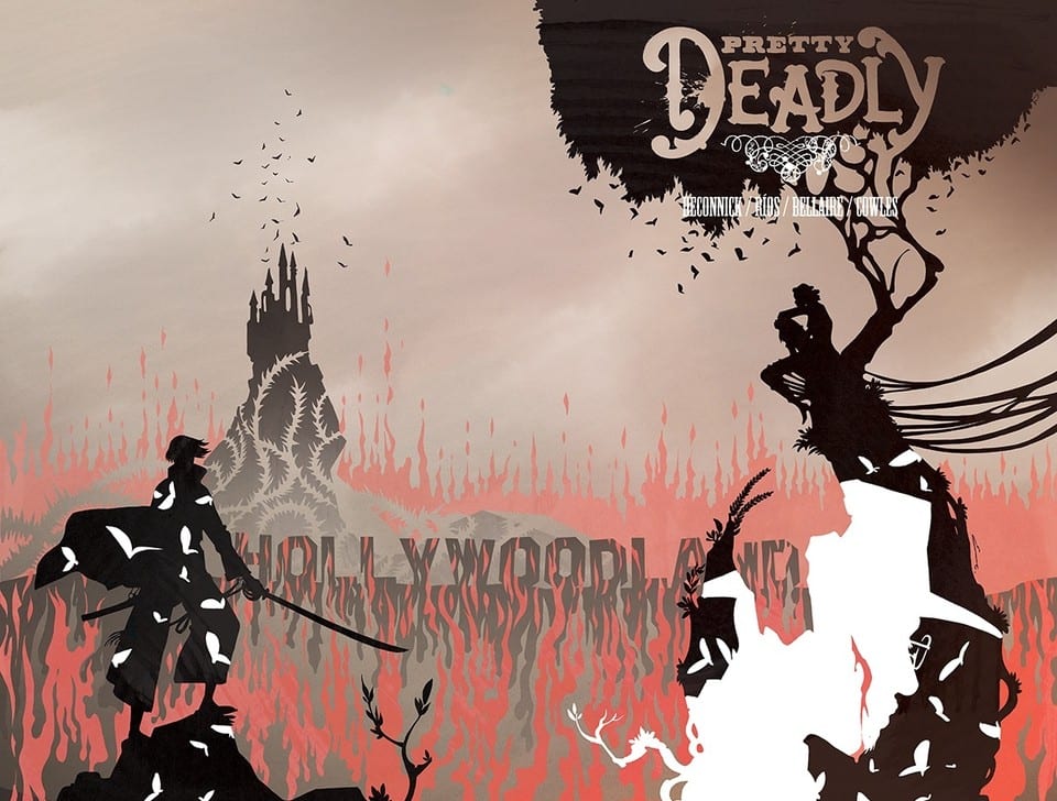
Bones Bunny and Butterfly return to regale you with more Pretty Deadly tales from the creative minds of Kelly Sue DeConnick, Emma Rios, Jordie Bellaire and Clayton Cowles. Released by Image Comics on 4 September, The Rat is the third volume in the Pretty Deadly series and moves the action to 1930’s Hollywoodland.
Pretty Deadly The Rat #1 Credit: Image Comics
Pretty Tales
As the rain falls hard upon Hollywoodland, the body of Clara Fields is found in the mountains. The police trace the next of kin, her uncle Frank: The Conjure-Man, and so begins a murder mystery attended to by Death herself.
This new volume of Pretty Deadly has the same framing elements as the previous two arcs. The mystical characters, Bones Bunny and Butterfly, lead the reader back into DeConnick’s magical-realist world. The opening pages bleed in to the main story, setting the tone and preparing the reader for the adventure that is to follow.
Each volume of Pretty Deadly is drawn from a particular genre, the first was a western and the second was a war comic. This third volume comes out of the expressionist movies of the 1920’s and the influence that they had on American noir movies of later decades.
DeConnick’s narrative pacing follows the structure of an early crime movie; the body, the investigation, and the need for revenge. She uses the tragedy of Clara Fields, who the reader knows nothing about at the start, to introduce the other characters into the plot. The grief and anger that Frank feels is evident in his speech but also his desperate actions. These actions lead the reader through the darkness of Hollywoodland as DeConnick slowly reveals Clara’s character via the debris of her life left behind.
There are stories within stories with linking themes weaving through them all. It is a highly complex and poetic tale unfolding in front of the reader. DeConnick gives the story a theatrical essence from the opening and this is followed up throughout. The reader sits and watches this magical tale play out, lost in time with these characters.
Pretty Deadly The Rat #1 Credit: Image Comics
Deadly Art
Emma Rios’ art is perfect for this type of story. She creates magical images even out of the most mundane or grotesque things. Her fluid drawing style and highly detailed images produce a total immersive experience for the reader. It is impossible not to fall into this world completely. The beauty and horror are mixed together with no visible joins so that it becomes difficult to separate the two. This is the visual equivalent of Frankenstein, a gothic/romantic horror.
The influence of 1920’s movies is evident on each page. The abstract nature of some of the panel layouts and the metaphorical use of imagery creates a magical world similar to a Fritz Lang movie. Rios manipulates the standard notions of comic book layouts, breaking the rules as often as she can to produce extraordinary visuals. Gutters break into the panels helping to establish mood; collections of images are stacked to produce complex representations of characters; The very boarders of the panels shatter to break the wall between worlds.
All of this outstanding art work is colored beautifully by Jordie Bellaire, proving why she is one of the best in the business. The depression of the era flows through the muted colors surrounding Frank as he investigates his niece’s death. As Clara’s life is revealed to the reader, Bellaire floods the pages with brightness and life. The dreams and stories take on a life of their own, so much larger than the reality of Franks existence. Scenes of passion are expressed with red washes, while greed and obsession have their own hues.
Leading the reader through this dreamland is Clayton Cowles lettering, holding it all together. The change in fonts and caption box design signpost to the reader which part of the many realities the action is taking place in.
The narrative flow is controlled by the sweeping lines of the artwork and the smart placement of the lettering. The character’s emotional states are also displayed in the same way. Frank’s arrogance, grief and finally anger is there in his speech, the words, the text and the balloons all working together to create an emotional state. Broken speech balloons, balloons that are small and cramped with only a few words, and large balloons with heavy boarders and bold text, give the comic it’s drama and creates the character’s stage presence.
Pretty Deadly The Rat #1 Credit: Image Comics
Conclusion
Pretty Deadly is a spectacular read. It’s like sitting in a theatre and disappearing into a magical, dramatic world. The narrative flows thanks to clever writing and beautiful artwork that breaks conventional comic book rules. Everything from the opening page to the stunning final moments of this issue are mind blowing. It is the best entry so far in this planned five volume collection.
If you are a fan of The SandmanUniverse or classic experimental Hollywood movies, then Pretty Deadly is for you. It is magical realism realised in the most exemplary fashion. If Pretty Deadly doesn’t stimulate your imagination, then nothing will.
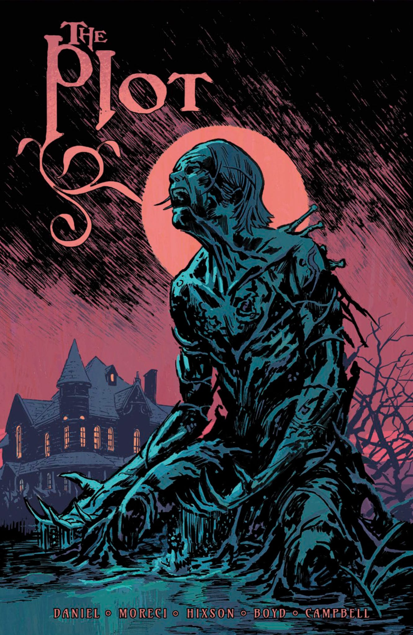
The Plot #1 is out this September from Vault Comics, and it’s a chilling horror story wrapped up in a compelling family drama, perfect for fans of Locke & Key and The Haunting of Hill House.
When his estranged brother and sister-in-law are murdered, Chase Blaine becomes guardian to his niece McKenzie and nephew Zach. The three move back to the 200-year-old Blaine family house in Cape Augusta, Maine, but something spooky and supernatural awaits them there. The series is by writers Michael Moreci and Tim Daniel, and artist Joshua Hixson, with colors by Jordan Boyd and letters by Jim Campbell. The Plot will be the inaugural title for Nightfall, Vault’s new annual horror imprint.
Yes, this is another “dysfunctional family moves into an old, haunted mansion in the secluded corners of Maine” story, but there’s a reason this plot structure works so well. It allows creators to tell deep, complex, and – most importantly – uniquely personal stories. The Plot may share some key themes with the aforementioned Lock & Key and Hill House, but still it doesn’t feel like anything you’ve read before.
Like most successful horror stories, this is a very character-driven narrative. Daniel and Moreci understand that in order for the scares to be effective, the stakes have to feel real, and for the stakes to feel real, you have to be connected to the players. The Plot is ultimately a story about family, and the Blaine family feels like a family you know. It may even be your family. Their struggles and their conflicts are understandable. They have secrets in their past that they try to bury, things they’re ashamed of. You relate to them as a reader, because whose family doesn’t have secrets, and so when those secrets start crawling out of the woodwork, the dread hits home hard.
If you read Shanghai Red, you know that Josh Hixson is a star on the rise. His art is grim and atmospheric, especially when coupled with Boyd’s soft and muted color palette. This team is a match made in horror heaven. They capture small moments perfectly, like a hand reaching out to pick up the phone and pulling back at the last second. You can feel the tension here; horror lives in these moments. The Blaine family home comes alive through the art. If you ever heard the expression “the setting is a character in itself” and questioned what that means, The Plot is your answer. Every hallway oozes impending doom. Every shadow harbors a devastating secret. Reading this comic is a claustrophobic experience; you feel trapped within this house alongside these characters, unable to escape the terrors that lie within.
And that’s ultimately what The Plot is all about, the things we can’t escape. Our pasts. Our families. The monsters that live in the bog behind our ancestral family homes. It’s about having to face our demons, both literal and figurative, which is about the scariest thing any of us can do. Again, that’s what makes this comic so effective. It’s taking all of those abstract things we’re terrified of in real life and bringing them to life.
Jim Campbell is a letterer at the top of his game here. This is a first issue, so there’s a decent amount of exposition (no worries, Moreci and Daniel never make it feel heavy-handed), but the way Campbell letters the dialogue, you’re able to navigate the monologues and conversations with ease. This comic flies by, which is shocking when you consider all that happens. That’s largely thanks to Campbell’s handiwork. And then there are the horrifying sound effects, which Campbell kindly acknowledged were done by Hixson. Every “KRAK” is bone chilling; every “WHUD” hits with the impact of a brick to the head. Even everyday sounds like a phone ringing or a dog barking seem scarier here.
The Plot is comics’ next great horror masterpiece. It’s clearly a very personal project for all of the creators; you can feel the passion and care put into every panel. You have until this Monday (September 2) to order it at your local comic shop, so get on it!
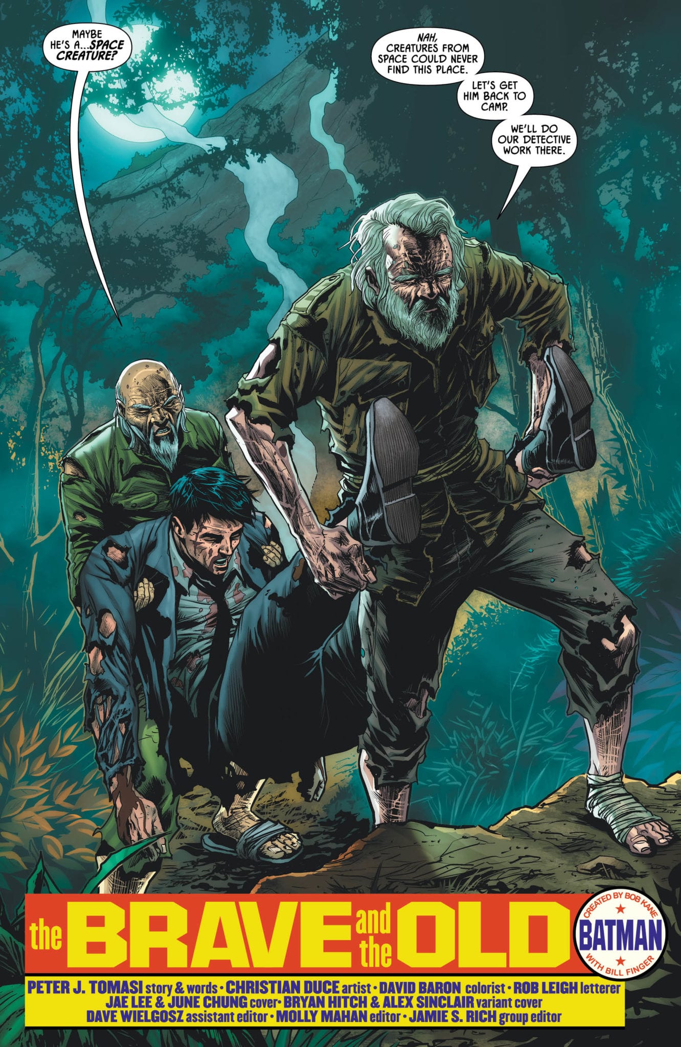
Just sit right back and you’ll hear a tale… Well, it’s a tale of Batman, some billionaires, an assassin, and a couple of long-lost castaways on a South Pacific island in Detective Comics #1010, out this week from DC Comics.
Bruce is separated from the rest of the survivors after their plane crashes on a seemingly-deserted island. He’s rescued by some unexpected residents, but the rest of the party remains under Deadshot’s command. For now, it’s up to Batman to try and rescue the captives, even if help is still thousands of miles away.
The Writing
Detective Comics #1010 delves into many of the tropes of “stranded on an island” stories. We have man-eating animals, surprising locals, perseverance against adversity, man’s inhumanity to man…it’s all here. The tone is part Lost¸ part Gilligan’s Island, a fact that Deadshot himself lampshades at one point. Writer Peter J. Tomasi is able to take those clichés and do something interesting with them, though.
Bruce spends a large chunk of the issue swapping stories with two castaways stranded on the island since World War II. This twist is likely inspired by real-life stories of soldiers hiding out in the jungle for decades, unaware of the war’s end. The men, Clarence and Hiroshi, have an interesting and charming tale to tell, and will presumably return in successive issues. Former enemies, they eventually learned to trust one another and survive. This theme of enemies-turned-allies seems to echo the issue’s official synopsis on DC’s website, despite the narrative not really progressing to that point in the story just yet.
Most of the book’s action is contained within the last few pages. Detective Comics #1010 builds to a suspenseful ending, hooking the reader and ensuring we come back for the next issue.
The book lays a mystery regarding who paid Deadshot to kidnap the people. We’re yet unsure of how this plays into a larger narrative, but the character’s statements suggest there’s much more at play than just what we see here. It’s quality writing all things considered.
The Artwork
Artist Christian Duce is back for Detective Comics #1010. He brings many of the same strengths to the table we saw in our last issue, blending expressive and exaggerated elements alongside more grounded images.
Duce generally sticks to a very meat-and-potatoes approach here. No elements of the work leap out as exceptional, but on the flipside, everything is firmly respectable. There’s no shame in that; as a visual storyteller, one doesn’t need to mystify the reader on each page. The work hits the narrative beats well, forming a cohesive final product.
David Baron provides colors for Detective Comics #1010, bringing a vibrant and varied palette to the table. From the lush, bluish greens of the jungle to the fiery reds and yellows of Deadshot’s blaster, Baron meshes nicely with his fellow artists on a stylistic level. He even embraces a sepia tone at one point, which was a nice stylistic touch given the subject at hand.
Final Thoughts
Detective Comics #1010 is a great chapter in Tomasi’s ongoing story. It’s Batman by way of a WWII-era Howling Commandos comic, so if that catches your attention, you’ll find plenty to like here.
Continuing the story of The Batman Who Laughs, DC’s newest ongoing Batman/Superman #1 sees the duo take on villainized heroes and friends. The plot may not be anything new or groundbreaking, but with the duo of Batman and Superman, it’s an entertaining ride.
What’s a better combination than peanut butter and jelly? The classic combination of light and dark, yin/yang, Boy Scout and Dark Knight, we’re talking about Batman and Superman!
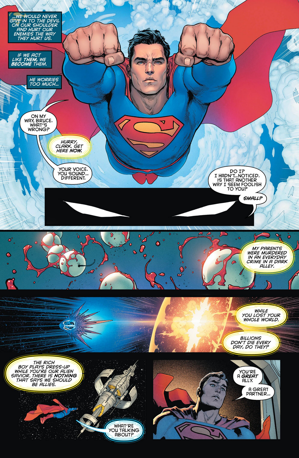
Writer Joshua Williamson quickly introduces us to the Batman Who Laughs with a gore-filled origin. For those that didn’t follow his introduction in 2017’s Dark Knights: Metal (check out our Reviews of Metal and more here). Transporting the reader back to Earth-0 we learn our Batman was regaling this story to Gordon, who in turn tells the Dark Knight that he has heard this. Per usual with Batman, nothing is what it seems, as he was talking to Superman, not Gordon, with Superman arriving on the scene in a two-page spread. This spread is a great first page to show the duo, with Superman carrying a fainted Killer Croc as he hovers above Batman.
Primarily this moment furthers the point of how powerful Superman is compared to Batman as the Boy Scout nonchalantly apologizes, “Had some business to take care of on the way over.” Killer Croc seems like a cat in a tree for Superman. Artist David Marquez highlights their differences by having Batman hold his cape in a manner of nearly hiding, while Superman is flying above his friend. Batman/Superman is Marquez’s first work at DC Comics.
Marquez’ pencils and Sanchez’ colors work well with the story. The dark mood plays off Marquez’ realistic pencils as the story seems like it could happen in real life. Sanchez’ use of neutral colors spotlights this aesthetic.
The colors by Alejandro Sanchez show the duo in their token themes by having the light hit Superman while draping Batman in shadows. This lighting isn’t limited to this page, but runs throughout Batman/Superman #1. While this dark and moody coloring isn’t only on Batman but all through Gotham and other residents; in comparison, the few scenes in Metropolis are bright in tone. This theme is played within Williamson’s inner dialogue and interactions between the duo.
There are a few moments in Batman/Superman #1 where letterer John J. Hill’s work shines through. The transition between Batman to The Batman Who Laughs is an excellent example of changing the dialogue box and font to match what is happening. It would have worked well if Hill kept this theme throughout the book. When we see a villainized Shazam, all that is different is a shaker box/font. In Shazam’s moment of transformation, a change of color to red would have helped dramatize the scene.
Batman is more planned oriented, Superman seems more laid back and “come as it may,” which Bats isn’t a big fan off. In their inner thoughts, the characters act as opposites, but not in a disrespectful manner, more as how two friends would act. Williamson has a great understanding of the characters and how they interact. Beginning the main plot point Gordon informs the duo of a kidnapping by a “Superman” that is laughing, making the team believe that the Batman Who Laughs may be behind it. This plot comes hot off the ending plot of The Batman Who Laughs, but Williamson doesn’t test if you’ve read it. Instead, the backstory is explained by Batman and Superman as the story moves along.
Batman/Superman #1 doesn’t feel like the start of an ongoing. Instead, it feels like the beginning and middle of a line-wide event. DC Comics has been planning something akin to this story with the Batman Who Laughs since his introduction. Maybe DC Comics should’ve had this story as an event instead of making it the core story in a new ongoing. This story even has tie-ins naturally making it feel like a 2019 event, but alas it’s not.
A Batman/Superman Team Effort (Conclusion)
Batman/Superman #1 is an enjoyable ride, but instead of being an ongoing series, the book should have been a limited series. This might bother new readers who were going in looking for a fresh start. With the Tie-ins titled with a heroes name then Infected it would’ve worked better if this was called DC infected or something akin to that. The word infected brings up another point.
Heroes turned into a villain is such an old trope that now it feels overdone, and nothing new. My feels on this could very well change by the end of this overreaching, line-wide plot, but we won’t know for another few issues. Plus, that trope sells like Aunt May’s wheat cakes!
Memorable Quote: “You should really consider quitting smoking.”
Well, when Superman tells you that you probably should listen!
Side Note: Why the hell couldn’t Superman hear Billy’s heart? Just a minor flub on his powers, but that seems to always happen when necessary for plot reasons.
Body horror and petty crime open up the first issue of IDW Publishing’s new title Mountainhead which hit stores this week. A dark humoured tale of consequences populated with an array of disturbing characters: Mountainhead doesn’t set out to make any friends.
Mountainhead #1 Credit: IDW Publishing
Scaling The Mountain
The opening page of the comic is the most disturbing visual in the comic. From the very beginning John Lees wants the reader to know what kind of story they are getting into.
The image is gruesome and not easy to decipher. There are the remains of numerous people jumbled together, scattered across the crisp white snow as if they have just fallen from a torn bag made of human skin. This is matched with a nihilistic voice-over of a child who turns out to be the main protagonist.
Without doubt, a stark, blood soaked, eye-catching opening.
From there John Lees introduces the reader to the character of Abraham and his paranoid father through a series of house break ins and dodgy hotel stays. Their relationship is one built on mutual respect and dependency. It is made clear that the father/son relationship only exists because of the psychological manipulation of the youngster. Abraham is ‘required’ by his father and made to feel guilty if he desires a different life.
John Lees gives the two character’s distinctive voices and Abraham’s is clearly the more reasonable, constantly reassuring his father and acting like a hostage negotiator. His calming tone comes through the cleverly selected speech and sentence structure. In contrast his father’s speeches ramble on, long winded, paranoid rantings. He is a man under pressure and, most likely, already passed breaking point.
When the story moves away from the down town crime narrative it becomes less engaging. The towns folk Abraham meets in British Columbia are caricatures with little substance. John Lees doesn’t give the reader time to adjust to these characters instead concentrating on an attempt to create a Twin Peaks like atmosphere. The narrative moves too quickly through Abraham’s new life, not giving him or the readers time to adjust. It is as if the writer can’t go a scene without including something out of the ordinary.
Mountainhead #1 Credit: IDW Publishing
Carving Out The Mountain
Ryan Lee has a distinctive style. His characters have over exaggerated features creating highly detailed caricatures. The faces of the cast take on the most prominent aspects of their personalities, in a similar way that the villains from Dick Tracy did in the 1940’s.
Abraham has a simply innocence to him, with a small stature reflecting the years he has spent at the psychological mercy of his abusive father. The rest of the characters each cast their distinctive shadow across the panels making them easily recognisable.
Ryan Lee’s artwork is playful and brings out the dark humour that runs through the narrative. However, the accentuated figures highlight some of the personality deficiencies from the script. Visually speaking the characters are wonderful but some of them lack substance.
As with the script, the lettering has highs and lows. Doug Garbark gives the speech balloons a soft edge, lacking a black boarder, which integrates with the art very well. There are also some irregularities with the shape of the balloons or the text within them that gives the speech emphasis and even added humour.
Whereas the irregularities add to the storytelling some of the placements create inconsistencies. In one panel two characters may be separated by the speech, creating a natural wall insinuating a distance between them but this disappears almost straight away. The speech moves to the edges pushing the character’s together even though nothing has changed in the relationship.
There is also the matter of the caption boxes changing color. This happens on the very first page, different colors are used even though there is a single speaker. This causes confusion in the reader which effects the pacing of the story.
The coloring across the rest of the comic, provided by Shawn Lee is wonderful. He adapts his color pallet to match the scene as it plays out. This requires realistic coloring on some pages and hyperbolic shading on others. Red washes flood violent or disturbing panels just as the night scenes are dulled with greyish blues.
Mountainhead #1 Credit: IDW Publishing
Conclusion
Mountainhead has some strong storytelling techniques and expressive art work. The page layouts lead the reader dramatically through a page while the coloring sets the scene and atmosphere. However, the expressive artwork doesn’t help to cover up areas of character lacking from the script. The pacing is often broken by inconsistencies causing unwanted pauses and the introduction of Abraham casts a shadow across the rest of the comic.
An intriguing first half let down in the second but there is potential for something exhilarating. The mix of dark humour and gore just needs a few strong characters to carry it forward.
Absolute Carnage: Symbiote Spider-Man #1 hits your local comic book store next week, but thanks to Marvel Comics, Monkeys Fighting Robots has an exclusive three-page preview of Peter David’sAbsolute Carnage tie-in.
Absolute Carnage: Symbiote Spider-Man #1 is written by David, with art by Francesco Mobili, colorwork by Java Tartaglia & Rain Beredo, letters by Travis Lanham, and Greg Land, Jay Leisten & Diana Albers were the cover artists.
About the issue: AN UNTOLD TALE OF A SYMBIOTIC HOST FROM YESTERYEAR…
During its first visit to New York City, the alien symbiote that would come to be known as Venom bonded to a host that wasn’t Spider-Man or Eddie Brock. Face front, True Believers, as this mysterious man meets his destiny… at the hands of CARNAGE!
Will you add Absolute Carnage: Symbiote Spider-Man #1 to your pull list? Comment below with your thoughts.
TAKE YOUR FIRST LOOK AT Absolute Carnage: Symbiote Spider-Man #1
Agents of Atlas #2 hits your local comic book store next week, but thanks to Marvel Comics, Monkeys Fighting Robots has an exclusive five-page preview of Greg Pak’s saga.
Marvel seems to be spinning a bunch of fun titles out of War of The Realms, and Agent’s of Atlas might easily be the best one yet. It’s a nice little corner of the MU being showcased here if you are looking for something different and fun. – Manuel Gomez
Agents of Atlas #2 is written by Pak, with art by Nico Leon & Pop Mhan, colors by Federico Blee, and Joe Sabino’s letters. Junggeun Yoon worked on the cover, with a variant cover by Sabine Rich.
About the issue: PANDEMONIUM IN PAN!
Through stunning science-magic teleportation tech, the visionary named ISAAC IKEDA has connected slices of neighborhoods from a dozen different Asian cities into the cross-Asian portal city of Pan. Is this new utopia a glorious pan-Asian multicultural dreamworld, free trade mecca, and tourism experience? Or is it a violation of hundreds of local and international laws, a magnet for monsters and maniacs, and a dangerous social experiment about to explode? AMADEUS CHO and the AGENTS OF ATLAS, as Pan’s new protectors, are about to find out! Also: Love is in the air! Which two Agents are about to melt the ice?
What did you think of the first issue of Agents of Atlas? Comment below with your thoughts.
House of X #3 may start slow as the plot builds but ends with a bang that will make you (e)Xcited for the next issue. The sixth installment of Jonathan Hickman’s grand plan for the X-world releases today at an X-Mansion near you. Plus if you need some catching up check out our reviews of Powers of X, and House of X.
The last few issues Hickman has brought mutants, obscure references, and plots from the past into play. With House of X #3, he takes a more straightforward story. It may be heavier on dialogue than the, but plot-wise it reads smoother without the feeling of needing a Ph.D. in X-men.
MINOR SPOILERS FOLLOW!
Last weeks Powers of X Moira was injected with the information on how to overcome Nimrod, House of X #3 picks up this plot with Professor X and Magneto sending a team of X-men to stop a group of scientists from making these advancements. Instead of wasting time having an exposition dump between characters, Hickman includes a graph/chart that explains how the information was received to make this possible. The graphs and charts included help expand the story and world-building greatly; while finally giving a full Krakoan translation and history on a graph.
Krakoan language and history are revealed! Feels like opening up a cereal box with a decoder ring!
With this information now in tow Professor X and Magneto task Cyclops as leader of the raiding of The Orchis Forge, which is one of the coolest looking spaceships. Before his departure, the duo gives him a quick motivational speech, which seems weird. The weirdness of the scene comes from the manner the duo speak to Cyclops and his response. The tone and wordage Professor X uses sound derogatory towards Cyclops, while his response seems like someone under mind control, or afraid of retribution if they mess up.
During this interaction of three characters, we have the only falter by artist Pepe Larraz. With this scene being the first of House of X #3 it opens on a wide rectangle panel of Cyclops standing under an arch of vegetation, while a bright illuminating light hits him from the back creating a ring of light around him; thus making him look angelic. The paneling, art structure, and lighting are magnificent for this moment, with the next being a response from Professor X and Magneto, then Cyclops responding. The problem with Cyclops’s response is Larraz reuses that amazing first panel in a cropped version.
Reusing panels is nothing new in the comic world, but when used the panel that is a copy directly follows the original, for either dramatic or comedy reasons. This case of using the same panel makes no sense here. With Cyclops responding to a question he is asked he should have moved even just a little, due to the sense of time flowing between panels. Instead, it seems he is frozen in time until his turn to respond, wherein he stands in the same spot.
House of X #3 Cover by Pepe Larraz
Besides the aforementioned art blemish, Larraz does amazing throughout House of X #3, with colorist Marte Gracia helping (e)Xcel the pencil work. House of X #3 has some of the best lighting in comics. With the first Cyclops moment being one, then this trend carries throughout as the sun near The Orchis Forge is illuminating the whole panel making the X-Men’s ship dark, or in minor cases with Sabretooth in the courtroom; which is a scene we’ll touch upon later. Gracia’s placement and willingness to play with light and shadows benefits House of X #3 greatly.
The shadows Gracia adds in a scene isn’t something common in comics, but by adding this Gracia helps Larraz’ art stand out while feeling realistic. House of X #3 follows a few different locations throughout but has two main plots going on; Cyclops and team going to space and Sabretooth in court with Emma Frost and the Cuckoos showing up. As great as the space adventure with Cyclops and team is Hickman’s writing shines through in the court scene.
Opening with a retelling of the suspect’s crime Hickman doesn’t tell us the name, just the allegations, and the Counselors fear of the suspect. On the following page, Larraz panels Sabretooth as 75 percent of the page in shackles spitting, telling you everything you need to know about his character. What makes this opening moment great is Hickman and team make Sabretooth a surprise, since it’s not stating who it is, only giving the reader hints until we see the reveal.
Variant Cover by Mike Huddleston.
Following the back and forth between the judge and Sabretooth, Emma Frost and The Cuckoos make their way in, with a bright light reflecting behind them; so bright Emma is wearing sunglasses. Through this scene, Emma makes her case and gets the raving mutant back in her care, the greatest part is Hickman showcasing how this can be done in a non-violent manner, with no mutant powers, and finally how above the law mutants may now be. All of this happens through dialogue with no action scenes happening, so Larraz plays with panels to make it less of a bore.
With how many dialogue bubbles there are it’s amazing how none of them feel too cluttered, but in a few cases the plot would’ve benefited if letter VC’s Clayton Cowles added a variety of narration boxes to help indicate who it is instead of sticking to a generic white box. There are a few moments of high tension or drama that would’ve also been improved upon if the lettering helped show the weight of the scene.
The House of X Continues (Conclusion)
Hickman and team continue to create the new epic for Marvel’s Mutant Universe. Making the plot and character grand in scale while still being fun and moving in the right direction. The writing is greatly complimented by Larraz’ fantastic art, and Gracia’s magnificent coloring and lighting. Being the middle part of a massive storyline House of X #3 could easily have been a speed bump, but instead, it adds so much to the plot, making the week-long wait even longer.
Variant Cover by Jeff Dekal.
Memorable Quote: “Normally, I’d dominate that little mind of yours and make you stick that gun where your last boyfriend left you….” -Emma Frost
Can you say, I’m in love? Seriously, it’s always nice when writers remind us how cold and badass Emma can be!
Dear Fellow Mutants (Our Readers)
What did you think of House of X #3? While we’re on the subject of mutants, what power would you want? And who is your favorite mutant!? They don’t have to be in this book either!
I was always a fan of Iceman’s powers, and I live in Alaska, so I’d pick that power set. For my favorite mutant. Doop, hands down! Don’t judge me!
Ever since embarking on his journey through the magical realms, Timothy has held his mother and father at the forefront of his mind. Guaranteeing their safety has been his number one priority. Unfortunately, his efforts failed to protect his mother from being kidnapped by the Cult of the Cold Flame, a nefarious group hell-bent on harming Tim through any means necessary. Now she’s returned, but is all well in the Hunter household?
Story
Kat Howard begins BOOKS OF MAGIC #11 with Tim in a rare state of elation: his mother has finally returned, restoring the once broken Hunter family unit. The abrupt shift is almost unsettling, as he’s spent months agonizing over his missing parent. And sure enough, the happiness peters out almost as quickly as it came. Hearkening back to her original disappearance, the young wizard recalls feeling as if either he or his father did something horrible to cause her to leave. Unfortunately, he realizes his initial guilt was justified—she reveals the Cold Flame held her prisoner for weeks, only letting her go on the condition Tim never use magic again.
For Tim, this is simply another reminder of how his status as a wizard constantly wrecks his “normal” life.
We then see flashbacks from the young wizard’s active mind as he imagined how much better life at home will be now that she’s returned. He’s imagines enjoying board games and meals together, but the reality of the situation proves to be disappointing. His parents barely talk to him and seem to infuse of depressing aura throughout the household. These painful panels offer a shockingly realistic look at the lives of children with separated or divorced parents—expecting things to go back to the way they were only to be incredibly disappointed.
A distraught Tim decides to get out of his house and clear his mind by paying a visit to Hettie, who’s been looking after the owl Yo-yo. This reunion is heart-warming; in response, Hettie reminds Tim how important is it to stay connected with the bird, alluding to the danger he is sure to face from the Cold Flame.
Artwork
Tom Fowler’s penciling, Brian Churilla’s inking, Jordan Boyd’s coloring, and Todd Klein’s lettering fantastically set the mysterious tone of BOOKS OF MAGIC #11. Illustrations of Tim’s mother show a beautiful resemble to her son, highlighting the close connection that was once strong between them. The dark colors and heavy inking throughout the rest of the panels give readers a sense of mystery, as if the Cold Flame could be hiding within every shadow. The letter boxes are placed in optimal locations to emphasize both the dialogue written and the characters’ body language.
Comic Cover
Kai Carpenter’s cover features Hettie twiddling a piece of fabric between her hands while a demonic shadow looms over her. The shadow carries an uncanny resemblance to Tim, suggesting that he may unwittingly play a roll in Hettie’s doom in the coming issues.
Conclusion
BOOKS OF MAGIC #11 takes a deep look a the toll Tim’s magic adventures have taken in his family life. It’s also a story full of reunions, though some are more happy than others.
Do you think Tim will go along with the Cold Flame’s demand to never practice magic again? Let us know in the comments below!