Home Blog Page 376

How Far She’s Fallen In LUCY CLAIRE: REDEMPTION #1

LUCY CLAIRE: REDEMPTION #1 is the first in an all-new series from Image Comics, coming out this Wednesday. Lucy Claire: famous wolf hunter. Only, not. She’s disgraced and retired. And as it turns out, she’s desperately needed once again.

Lucy Claire: famous werewolf hunter. A legend to most. And still very dangerous.

***SPOILER WARNING***

Are you a fan of werewolves and violence? What about sass, snark, and satire? Then the odds are fairly good that you’re going to enjoy Image Comics’ latest series, Lucy Claire: Redemption. Written and illustrated by John Upchurch, this is a series that’s already getting a serious amount of ink.

And with good reason. Lucy Claire: Redemption #1 is an intense and graphic introduction into a world where werewolf hunters become things of legend. Assuming they do it well that is, rather than merely becoming another snack for a hungry wolf.

A bunch of rookie hunters…because that will go so well.

The Plot

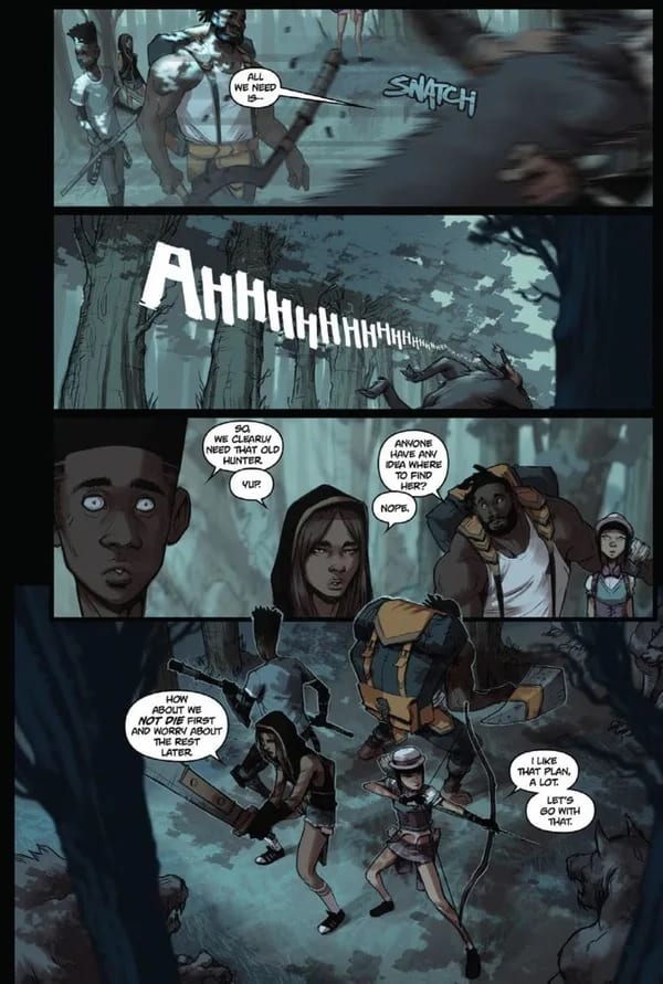
Lucy Claire: Redemption #1 wastes no time in throwing readers into the thick of things. This issue features several perspectives and points in time, all of which give us an idea of the bigger picture. And that larger picture is a grim one.

Once upon a time, Lucy Claire was the best wolf hunter in town. Then all the wolves went away, or so the people thought. That was all good and fine since Lucy herself seemed to disappear into legend. Like all legends, that means nobody could agree on what actually happened to her.

Enter the beautiful (and slightly concerning) imagery that is Lucy’s past.

Writing

As it turns out, Lucy isn’t so far gone as people might have thought. And once again, that’s a good thing. Because the wolves aren’t gone either. And they’re hungry for violence. Or for people. Take your pick.

And that is the world that John Upchurch has thrown at us. It’s dark and morbid, full of dangerous characters. Lucy herself is clearly not in a great mental state, a fact that Upchurch has only begun to explain to us.

Lucy’s character is put in harsh juxtaposition to the wanna-be hunters shown. They’re young and oh so full of hope. Oh, and they’re desperate to save lives. And then there’s Lucy, she’s tired and jaded, and she’s content with smashing a wolf if she sees one.

This plot is already proving to be delightfully compelling, thanks to the characters and hints liberally strewn around about their backstories. And by all appearances, the plot is only going to get thicker from here.

It’s impressive how much Upchurch was able to fit inside a single issue. There are several scene shifts, and each new scene provides a better understanding. But that also requires more planning and thought – which apparently Upchurch has an abundance of. No wonder people are talking about this series so much.

Nothing like waking up hungover in a prison cell.

The Artwork

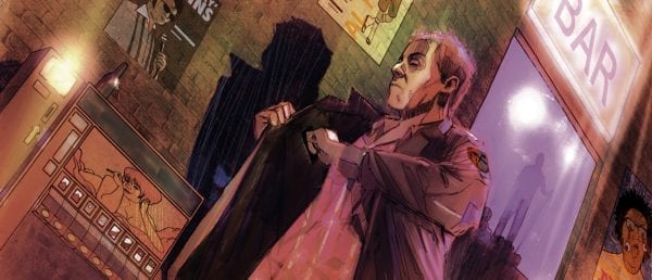
And then there’s the artwork itself. Lucy Claire: Redemption #1 is as effervescent and beautifully drawn as it is dark and foreboding. If you want an idea of what is in store for you, take a look at the cover. It’s a true representation of what you’ll find in these pages.

Impressively, the color palette changes along with each scene and perspective. This was the right call for a variety of reasons. One important factor is that it helped make each transition very clear. The other is that it got to show off Upchurch’s sense of color. And trust us, that is something to be aware of because he’s got talent.

There’s a lot to love from this issue. Lucy’s flashback is perhaps the most beautiful set of panels to behold, thanks in part to the lovely and warm colors used. Though the setting itself is stunning – even if the images themselves leave fans concerned about the past.

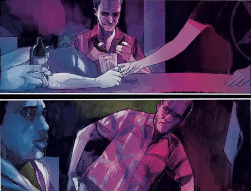
Or perhaps we should talk about the fight scenes, which were quick and brutal. Given that these are werewolves we’re talking about, that’s probably the only way a fight could go down. And thus the fight is both satisfying and oddly realistic.

Once again, it was Upchurch who provided all of the artwork for this issue. Everything from the lines to the colors. And the cohesion alone is noteworthy. The style is spectacular, leaning towards the dynamic sort of lighting that works so well in horror stories.


Lucy Claire: Redemption #1 was a breathtaking start to a new series. Some fans might be asking themselves if all the talk about this series is simply that: talk. But let us put that fear to rest. Lucy Claire: Redemption has already proven to be an outstanding and memorable series. And it’s only one issue in. This is not a series to miss out on. That goes doubly so if you’re a fan of rich character development and brutal fights.

Monkeys Fighting Robots Youtube

Temptations and Trickeries in STEEPLE #4

STEEPLE #4, out this Wednesday from Dark Horse Comics, is full of witches, spells, familiars, temptations, and trickery. It’s an issue that is sure to be a laugh, all while the characters find themselves questioning their long-held biases and beliefs.

Things are looking a bit awkward on the cover of Steeple #4.

***SPOILER WARNING***

The second to last issue of Steeple is here, and it’s full of fun little twists and turns. Oh! And did we mention all of the witches? Tredregyn is about to host Witchfest – which is exactly what it sounds like. It seems this town is not as quiet as they want you to think.

Steeple #4 is an issue in which the characters are constantly finding themselves confronted with their choices and biases. In a world full of moral gray areas, that shouldn’t be terribly shocking. After all, hardly anything is as black or white as we’d like to think it is.

Monsters and cosplayers and witches, oh my!

The Plot

Steeple #4 was an interesting issue, all things considered. Though it’s hard to imagine how they’re going to wrap up the series from here. With Witchfest hot on the horizon, Billie has found herself wrapped up in the whole ordeal. That sort of thing tends to happen if you sign up for every volunteer opportunity without reading the fine print.

John Allison has managed to introduce us to a world where nothing is quite as it seems. The monsters coming out of the ocean weren’t monstrous – they only looked that way. And perhaps the members of the church of Satan aren’t all that bad either. At least one of them was at risk of getting picked up by the rapture.

The fourth issue in this series has a lot of reveals and changes to make. Some of these reveals are quite surprising, while others actually fit in perfectly with the characters we’ve been introduced to thus far. It’s yet another example of how people can have many layers.

What is fascinating about this issue is the number of questions it raises. While the characters are forced to confront their own assumptions and temptations, we’re also left asking about our own lines drawn in the sand. It’s a fascinating approach to storytelling, but one that is delightfully thought-provoking.

The Artwork

Steeple #4 was written by John Allison, obviously. But it was also drawn by him. And he has such a unique art style as well. His characters are full of life and personality. Some of them are awkward and gawky, while others have this air of confidence around them. Its impressive seeing how much of all of that becomes infused into the artwork.

There are perhaps a few highlights of this issue. The panels full of storytelling were particularly hilarious to read, especially as they showcased exaggerated telling of the Reverend’s adventures. The magical portrayal (remember: Witchfest) were also fascinatingly done, leaving readers hoping to see just a bit more of that.

Sarah Stern was the colorist for this issue. And her infusion of color was exactly what this series needed. She wasn’t afraid to stay with muted colors when needed. But given the excuse to go bold or bright, she didn’t hesitate. That’s perhaps why the magical scenes ended up looking so good.

And finally, Jim Campbell was the letterer for this issue. And there’s a lot to be impressed with here. Though the posters and billboards are sorts of taking center stage this time around. They’re hilarious.


Steeple #4 was another charming addition to this series. Each and every character is developing in their own way – but none of them are following a predictable path. The end result has been something fascinating and unique. And it will be a shame when it all ends.

Monkeys Fighting Robots Youtube

It All Comes to An End in STRAYED #5

STRAYED #5, out Wednesday, December 18th from Dark Horse Comics, is a dramatic conclusion to the series. Lou and Klara’s journey has come to an end, and it’s a bittersweet moment all around.

Lou and his owner are looking brilliant on this final cover of Strayed.

***SPOILER WARNING***

Strayed #5 concludes the series involving an astral projecting cat. And readers can only ever hope to have a cat as loyal and loving as Lou. Okay, and as powerful. Though power does come at great cost, as this series has been intent to prove to us.

Strayed was an interesting series, all things considered. It’s the story of a cast who would astral project; his loving owner, who invented a way to communicate with him; and a greedy government, who found a way to use and manipulate them both.

It isn’t every day that a comic series comes out that is absolutely perfect for cat lovers. And yet that is exactly what this series had to offer. Carlos Griffoni (author), Juan Doe (artist), and Matt Krotzer (letterer) found a way to crack open our hearts, leaving us unsure how to feel about the series concluding.

A battle of monsters on this variant cover of Strayed #5.

The Story

Strayed #5 was an issue without any conversations. Instead, it was comprised entirely of Lou’s thoughts – a running monologue of what was happening on the panels. And a voice working their way through what had to come next.

In that sense, this issue had an interesting twist on the writing style. It didn’t read like a normal issue. And in some ways that actually added to the emotional intensity of what was happening. But in other ways it allowed the readers to take a step back.

This issue was largely ephemeral, in a sense. Lou’s grasp on the physical world was always tenuous at best, and now he’s losing even that bit of grounding. Despite this challenge, Lou’s determination to get the job done as a powerful thing to behold.

One thing is for certain, Griffoni set up a conclusion that is sure to leave readers misty-eyed. All endings are bittersweet. But some tug at us more than others. And Lou was a good boy, even if his journey was only a few issues long.

Artwork

One of the most striking things about Strayed #5 is the artwork. It also boasts one of the best covers of the series – which is saying something. This series has always had such a way of showing the strange and alien through vibrant colors and artwork. And this issue was no exception.

The scenes portrayed in this issue were…unique is perhaps the best way to put it. Lou took some strong measures to complete his goal; the sort of actions that could only be done by an astral projecting cat. They were dynamically drawn and colored, lending life to the plot.

As mentioned above, Juan Doe was the artist for this whole series. And thank goodness he stayed on until the end. Strayed just would not have been the same without him. His grasp of organic life and power is unparalleled in many ways. And we hope to see him pop up in another series in the near future.

Matt Krotzer was the letterer for this issue, and that means he was responsible for making the (internal) monologue fit the pages. That is a task easier said than done, as those words are what gave weight to the imagery.


Strayed #5 was a bittersweet ending, through and through. It is one of those issues that will make you think. And perhaps it is not the ending fans imagined. But it is the ending that they’ve been building towards this whole time.

Monkeys Fighting Robots Youtube

Marvel’s THOR: METAL GODS Starts This Week On Serial Box

THOR: METAL GODS Starts This Week On Serial Box

How we consume content continues to evolve as Marvel Comics has partnered with Serial Box, as the serialized audiobook Thor: Metal Gods hits the digital airwaves on December 12 from the talented writing staff of screenwriter Aaron Stewart-Ahn (Mandy), Brian Keene (The Horror Show with Brian Keene), Jay Edidin (Jay & Miles X-Plain the X-Men), and Yoon Ha Lee (Ninefox Gambit).

The preview of the series is epic, and you need to listen to it to truly understand the scale of the project (take a listen below). Daniel Gillies’ narration will give you chills (sidenote – Gillies was John Jameson in Sam Rami’s Spider-Man 2).

About the series:
Propelling the saga forward are a fierce Korean demi-goddess, Horangi, and Captain Zia, a charismatic, gender-ambiguous space pirate who shares history with Loki.

Thor and Loki embark on a cosmic odyssey to stop the return of an ancient evil.
A space adventure on an epic scale, Metal Gods propels Thor and Loki on a quest to recover a dangerous alien artifact. Together with a Korean tiger-goddess, a charismatic, gender-fluid space pirate, and Frost Giant mercenaries, the sons of Odin must each confront their pasts and face the truth behind the destruction of a planet that Thor once tried to help. Tinged with humor, celestial horror, complex relationships, space battles, barroom brawls, and blasts of sheer fun.

“The story of Thor is staggeringly epic—from Asgardian myth to intergalactic quests, to the (sometimes surprising, often hilarious) depth of his relationships—he’s got it all,” says Hayley Wagreich, Head of Content at Serial Box. “But what makes this story truly exciting to us as we kick off our collaboration with Marvel is how grounded his story is in real issues of identity, humanity, and what it means to be a hero. We can’t wait to bring Metal Gods to Thor fans across the globe.”

Thor: Metal Gods is the first Marvel e-book series to launch on Serial Box, with more to follow in 2020.

Monkeys Fighting Robots Youtube

Review: DYING IS EASY #1 – Laugh to Death, Brutally

An ex-cop tries his hand at comedy because homicide is too easy in Dying is Easy #1, out this week from IDW Publishing.

Joe Hill writes this new mystery thriller outside of his Hill House Comics line. Most likely because this story reads more like a mystery than anything horror. The most frightening part of the issue might be the cop’s brand of humor.

It’s the exact material you would expect to hear from an ex-cop who’s had just about enough. Hill captures the grimey and insufferable traits of a disgraced cop extremely well. I’ve had a ton of experience with cops (unfortunately), so it’s always enjoyable to see an honest and truthful portrayal of police. It’s disgusting to hear what some people will say to other people just because they assume we’re like them.

Martin Simmonds captures the shady atmosphere of late night comedy clubs and bars filled with neon lights and smoke with perfection. His character designs are extremely on the nose. If our insulting detective was any more stereotypical he’d have a goofy hat and cigar, but instead just a Hawaiian shirt. He looks like a Florida cop, which would also explain his behavior. HA

Dee Cunniffe’s stage lighting in a small venue is spot on. With one spot light there are blinding bright spots and extreme shadows. Light from the sides are usually from beer signs or cell phones. This is a place I’m sure we’ve all been before and had a drunkenly fantastic time. Cunniffe colored this issue like he had a specific venue in mind. Just looking at the comedy club panels reminds me of waiting to go on stage.

Shawn Lee takes care of the lettering for this murder mystery. There’s not much action from the walking stereotype’s comedy routine, but there were some laughs and crowd reactions. With the size and style of the crowd reactions you would expect there to be a packed house. It must be that the Joker is in attendance because the club looks mostly empty besides staff and the other comedians.

I think it gives an inaccurate description of the situation when there’s laughter covering up empty tables. I would expect much smaller lettering or the laughs to hover over one person to show that it is all one person being obnoxiously loud.

In my experiences, and on body cam video, we’ve all heard police joke about hurting people. Recently we saw body cam footage of police joking about pancakes after they murdered him, so the behavior from Shit-Talk Homes is no where near the worst things we’ve heard cops say.

The actions Homes is accused of in this story don’t sound that awful. Especially after the delinquent murder hungry cops in the news this week playing Punisher with civilian vehicles as cover as they murder some jewel thieves and the hostage, (who was on his FIRST DAY as a UPS driver). I bet Joe Hill tried to think of something truly heinous, but the cops in real life were like “Hold my beer”.

I digress, but Hill has created a character to care about in Dying is Easy #1. Even if you want him to die horribly, that’s still caring. A highly hated character is more appealing anyway. People want to see the villain fall to their karma. A triumphant hero is getting old and boring.

All that being said, cops make many enemies every day. There’s no telling who might have set up the insulting detective. Maybe next issue we’ll see him get a little taste of his own medicine?

What did you think of Dying is Easy #1? What do you hope happens to Syd Homes? Let us know in the comments below.

Monkeys Fighting Robots Youtube

Review: UNDISCOVERED COUNTRY #2 – Death to Invaders!

Humans just can’t stop screwing each other over in Undiscovered Country #2, out this week from Image Comics.

Undiscovered Country is a new extremely original idea from the minds of Scott Snyder and Charles Soule, and if you’re looking for two better guys in comics you’d be hard pressed to find them. Oftentimes you hear that you should never meet your heroes, and while there are some artists out there that have left a sour taste in my mouth and pretty much ruined my fandom for them, Snyder and Soule are the antithesis of that. If you have a chance to meet them or talk to them, I recommend you take it.

Art for this issue comes from Giuseppe Camuncoli and Daniele Orlandini. Undiscovered Country is filled with insane fantastical things, and the world designs have Luke Skywalker blasting womprats on Tatooine vibes, with an almost steam punk technology. I can’t think of many comic book characters with extensive tattoos until this book. It seems like adding tattoos would be a ton of extra work which is most likely why I can’t think of any characters like that except for another new title called The Marked. There are also some character design sketches in the back of the book giving the readers a more in depth look at the process.

The color blending is magnificent. Where some styles let the colors changes create their own lines, the realistic blending Matt Wilson uses helps make this world real. It’s hard to keep your face from showing how stressed you are and we see the flushed red faces here. Less realistic styles can take a little longer for the reader to be able to immerse themselves into that universe, but Undiscovered Country feels like looking out the window.

Crank! always uses appropriate lettering for the story being told. Nothing too extravagant in this issue, just plenty of backstabbing and double crossing. The Destiny Man’s speech has serious Joker vibes as the words are quivering and unsound. This makes it pretty obvious which characters have evil intentions.

Undiscovered Country also uses a storytelling device that I love from the Watchmen. At the end of each issue there are small excerpts from in universe writings and publications. In this issue there are some quotes from a history book giving readers a small taste of this United States leading up to the events in the story. Taking the extra effort to make this world as real as possible shows me that this is a story the team really cares about.

There are some books out there with errors all over the place **cough Spawn cough**, and it just makes the editors and everyone working on the book seem lazy to me. I have a hard time justifying spending my money on stories that I don’t feel the creative team is invested in. Mistakes happen and we’re all human, and you can’t make everyone like your story, but you can proofread your own story and spell words correctly. If you don’t care enough to read your own book than why should I?

Undiscovered Country goes above and beyond what most creators do. Writers like Jonathan Hickman with his charts and Kieron Gillen creating a game out of Die have taken back matter to a new level. Learning about the world outside of the main narrative creates a more extensive universe that can be built upon for many years to come. Some people might just see a funny quote about Episode XII, but a TV producer sees spin-offs, product placement, and more seasons.

A universe with plenty of history and loads of untold stories is just a literal gold mine for any production company in the age of streaming services. Just look at The Walking Dead and everything that has spawned from Kirkman’s creation. I firmly believe he ended the comic after the death of Rick so he could save any other ideas for the TV shows and other properties.

The possibilities are endless for Undiscovered Country, and my favorite aspect of this issue was the mention of popular music and movies from this fictional version of the United States. It would be extremely fun just thinking of all the different bands reuniting, movie sequels, and property crossovers that would happen. Perhaps they actually do a Home Alone remake and use 40 year old Macaulay Culkin in the same role? Of all the terrible sequels and remakes, I would actually pay to see that one.

With the success of The Mandalorian, Undiscovered Country couldn’t have been released at a better time. Westerns were lacking a little something and I think it was sledsharks and Baby Yodas.

What did you think of Undiscovered Country #2? Do you like the universe they are building or is it too off-the-wall for you? Let us know in the comments below?

Monkeys Fighting Robots Youtube

Does Amazon’s THE BOYS Do The Comic Justice?

Does Amazon's THE BOYS Do The Comic Justice?

The entertainment space is continually being flooded by new movies, reality shows, and TV series covering a number of different genres to cater to a global audience. While new movies and TV shows are released on a weekly basis, most of the production generally revolve around the same themes.

It is rare for a producer to come out with a completely unique theme. Any producer who decides to introduce something new to the market always faces the risk of failure as they have no idea how the market will react. The new Amazon series adaption The Boys is one such production that is getting mixed reviews.

History Behind THE BOYS

A lot of viewers who have tuned into Amazon’s ‘“The Boys”’ over the last few weeks are not very aware of the history behind the production. Two writers by the names of Garth Ennis and Darick Robertson began working on an interesting comic book series called ‘“The Boys”’ and released their first issue back in 2006.

 Kind of but not quite, but the show is actually kickass

The first issue came under Wildstorm, which was an imprint of DC Comics. This comic series only lasted six issues because it was completely different from the usual comics that the market was used to. The writers decided to not go with the usual superheroes theme but instead decided to depict superheroes as humans who have flaws just like everybody else.

“The Boys” were known for using a lot of foul language, being sex-crazed, and resorting to a lot of violence – characteristics that superheroes are not known for. The writers focused on changing and warping the idea behind superheroes, and they wanted to gauge the reactions of the readers. It is safe to say that the market as a whole did not buy into the comic series, and as a result, the publican was canned after just six issues.

Garth Ennis did not give up on his comic book series as he believed there was a demand for such a theme in the market. He had the rights for the series and managed to work out a deal with Dynamite Entertainment and went on to release another 66 issues. Over the years, “The Boys” built up a unique market following around the world.

Amazon Brings THE BOYS Back to Life

Amazon is always looking for new and interesting programming to add to its portfolio. The company decided to give “The Boys” new life by developing a new TV series based on the comic book characters. Fans of the comic book series were both excited and skeptical when news broke that Amazon was going to produce a TV series based on these superheroes or supes.

A lot of fans were concerned that Amazon might not do justice to ‘“The Boys”’ and mess things up. This trepidation is real because there are a number of classics that have been ‘killed’ when movie producers tried to develop a new and modified version of the same.

It is not just movie producers but also video game and slot developers who often butcher a classic because they struggle to find the right balance between retaining the old and taking news to the next level with the new. However, slot developers are not going to be keen on developing a new game revolving around “The Boys.” This is because it is harder to create a free spins slot machine around superheroes that exhibit the worst of human traits without a backlash.

Eric Kripke took on the responsibility of developing “The Boys” for Amazon, and just like the comic book, the story revolves around a group of vigilantes who fight the supes who are anti-heroes that bully people and are just outright mean.

The Amazon series went live on July 26th, 2019, and was received rather well by the majority of viewers. Just like any TV series, there were people who did not like Amazon’s version of “The Boys,” and they were not shy in expressing their views and opinions on social media. However, given the fact that Amazon has decided to renew the series for a second season, it is safe to say that “The Boys” have found a demographic who is interested in what it has to offer.

THE BOYS: Cast and Characters

The success of a movie or TV show depends heavily on its cast and how they perform. The cast for Amazon’s Boys featured Karl Urban, who served as the main character Billy Butcher who is the leader of “The Boys.” Hugh “Hughie” Campbel is played by Jack Quaid, and Antony Starr does a good job playing the role of Homelander, who is despised by Billy Butcher.

Some of the other characters include:

  • Erin Moriarty who plays the role of Starlight
  • Chace Crawford who plays the Deep
  • Dominique McElligott  who acts as Queen Maeve
  • Tomer Capon who plays Frenchie
  • Karen Fukuhara as Kimiko
  • Elisabeth Shue who acts as Madelyn Stillwell.

The plot for “The Boys” is very interesting, and viewers who are not familiar with the comic series will have to pay careful attention in order to follow the story. There are eight episodes in Season 1, and each episode runs for nearly an hour. “The Boys” can be watched on Amazon Prime and best suited for adults.

The Verdict

The general verdict is that Amazon has done a good job of bringing “The Boys” back to life. During the first ten days of its release, the show has been viewed over 8 million times, which makes it one of the most successful original products on Prime.

Rotten Tomatoes has 88 reviews on “The Boys” and an average rating of 7.5 out of 10 and an approval rating of nearly 83 percent. Some of the other review sites have also given “The Boys” positive ratings. “The Boys” Season 2 will most likely be released in the second half of 2020.   

Monkeys Fighting Robots Youtube

Review: The Cruise from Hell in ALIEN VERSUS PREDATOR: THICKER THAN BLOOD

Disregarding (and hopefully forgetting) the two films, the Alien Vs. Predator franchise has had a litany of successes in the worlds of novels, video games, and of course comics. Now, writer Jeremy Barlow and artist Doug Wheatley team up for a new AVP mini-series from Dark Horse Comics, “Thicker Than Blood.” This first issue offers a simple but fun and bloody close-quarters adventure with a unique starring cast of a young girl and her android little brother.

The USSC Double Down is a luxury cruise vessel packed with vacationing patrons indulging in all the ship has to offer, with the all-family crew going about their usual tasks. That is, until the ship takes a detour through uncharted space and attracts the attention of some skull-hunting undesirables. Now, the two children of the ship-owning family must work together to dodge a bloody end and make it off the ship alive.

Writing an Alien Vs. Predator series as opposed to just an Alien or Predator one requires a different and arguably more mainstream approach than either of the other two. The sort of tense slasher-in-space mixed with hard sci-fi of the former and the prey vs. hunter tone of the latter needs to be juggled with an almost blockbuster style bravado. Jeremy Barlow‘s script manages to do just this, all the while maintaining a simple story with breakneck pacing. Things happen rather fast in this first issue, with only a short quiet moment on the first page to introduce the most important protagonist. Despite this, Barlow still manages to skillfully introduce Tyler and Maria (the two leads) and their conflicts with each other in moments between carnage. The speed at which the blood starts flying in this debut issue may be an issue for more slow-burn horror fans of traditional Alien and Predator titles, and this is understandable. However, for a four-issue mini-series starring a couple of kids on a cruise ship, this kind of pacing is sensible and still brings on the terror these aliens are known for in bursts. Without getting into spoilers, future issues are already looking promising in ramping up the horror and bloodshed.

The universe that these two iconic aliens inhabit requires a sort of specific talent to bring out the dark and claustrophobic tone an Alien Versus Predator comic needs. Fortunately, this series is blessed with talents of Doug Wheatley‘s spectacular pencils and inks in conjunction with Rain Beredo‘s choice color palette. Wheatley’s level of detail when it comes to shipboard enviornments, invidivdual characters and of course the titular beasts themselves is second to none. The halls and rooms of the ship vary from the sanitized and gray crew rooms to the colorful guest attractions, and colorist Beredo is given a surprising amount of variety for a comic most would assume would just be filled with black, gray and red. Lots and lots of red. This isn’t the case however, and the brighter moments contrast neatly with scenes dressed in claustrophobic shadows. Each individual character, from the main cast to random passengers, each look completely different and can be told apart by identifying features. Wheatley’s art has a touch of photo-realism which helps immensely with the immersion. His heavy inks he uses for detail work superbly with Beredo’s use of dense shadows to create the exact aesthetic this comic needs.


“Alien Versus Predator: Thicker Than Blood” #1 is a fast paced and brutal start to a promising new mini-series. Writer Jeremy Barlow’s script may be simple and maybe even slightly rushed by franchise standards, but the premise behind its central characters is intriguing enough to stick with the story. Doug Wheatley and Rain Beredo’s deliver their talents in spades, bringing to bear possibly some of the best artwork this franchise has ever seen. If you’re a fan of these iconic monsters and the franchise as a whole, be sure to pick this issue up at your local comic shop on 12/11.

Monkeys Fighting Robots Youtube

Review: THE RED MOTHER #1 Has You Directly In Her Sights

The Red Mother alternative cover
The Red Mother #1 Credit: BOOM! Studios

BOOM! Studios like to have a horror comic on their roster and their new title The Red Mother definitely fits that bill. It features survivor guilt, unnerving sequences, and redefines the notion of ‘Seeing Red’.

In the current climate of uncertainty and a growing fear in society, horror comics have plenty of real world issues to draw on and manipulate. The best horror comments on the world around it, as can be seen by the changing face of the Dracula story, and this years offerings are no different. The Red Mother feeds off the fear in society creating an uncertain world populated by self inflicted insular people. 

The Red Mother #1 Credit: BOOM! Studios

Raising the Red 

While planning a romantic get-away, Daisy and Luke are attacked in the street by an unseen assailant. Luke is dragged into the darkness and Daisy’s eye is torn from her head. 

Her recovery isn’t easy, especially with the strange, new visions she is experiencing where she literally sees red.

Jeremy Haun (The Beauty published by Image Comics) is no stranger to horror and this opening issue sets the tone perfectly. Haun layers the narrative like building blocks, laying character development on top of action, on top of mystery. He sets the scene for future issues and manages to hook the reader straight into the story.

A disturbing opening throws shadows across the rest of the comic. It creates an uncomfortable atmosphere for the reader from the very beginning, meaning that you are constantly staring into the shadows, waiting for something unspeakable to come out. But Haun is more interested in creating suspense than using cheap jump scare tactics. Very little is shown or explained this early on which makes the moments where something supernatural occurs that much more upsetting. 

There is one moment which is especially creepy. It is created by preying on a growing fear of crowded places, of being lost in a sea of unrecognisable people. A horde of nameless faces march towards us as the nervousness builds up inside, turning to fear and then to panic. Daisy experiences such a feeling and, within that moment, Haun produces one of the creepiest scenes in comics this year. 

The Red Mother
The Red Mother #1 Credit: BOOM! Studios

Drawing Blood

Some comics adopt a style that is either realistic or expressive, depending on the emphasis they want to put on the narrative. With The Red Mother Danny Luckert (Haunted) is in the unique position of being able to do both in the same comic without it looking unnatural. 

For the most part, while telling Daisy’s story, Luckert produces a tangible world using fine line work and detailed sets for the characters to inhabit. He builds up the realism, giving the reader a world they can identify with. The mundane elements of Daisy’s life is reflected through the use of abstract panel transitions or a series of seemingly unrelated actions: snapshots of life continuing despite the horror that the central character has suffered. 

Into this are, for the most part brief, moments designed to unnerve the reader and distort the world view. These panels are distinguished mostly by their coloring, also provided by the artist, as they are soaked entirely in red. This is where the mystery and the visual horror occurs, standing out on the page like a beacon.  

Creating realistic scenes in comics can be difficult, the very nature of the format is a constant reminder to the reader that it is merely a representation of reality. There are, however, a number of things that the creators can do to make it feel more real: one of those things is to produce realistic speech patterns and rhythms. 

Ed Dukeshire (the list of his work is endless, but check out Once and Future) constructs a flow of dialogue through his speech balloons that feels natural. A series of small balloons, linked by touch, gives the speaker a tempo, producing a beat within the panel and then further across the page. 

There are also a lot of overlapping speech balloons  as characters interrupt or console each other. Not only does this change the pacing of a scene but it also says something about the characters and their relationships. 

The Red Mother #1
The Red Mother #1 Credit: BOOM! Studios

Conclusion

Introductions to stories can be difficult and different genres have their own obstacles to overcome. Horror comics have to make a decision early on as to the type of horror they are going to portray. The visual design and opening scene of Winnebago Graveyard , for example, instantly sets the tone for the rest of the story. 

In a similar way Haun does the same with The Red Mother. The disturbing elements are distinctive and separate from the real world with firm, visual walls between the two. The insinuation is that these walls will break down and this is the hook that pulls the reader in. 

BOOM! Studios may not put out many horror titles but the ones that they do publish are always of an impressive standard. Based on this opening salvo, The Red Mother with it’s compelling characters and top notch storytelling throughout, will join the highly praised ranks of other horror titles like The Empty Man and Angel.

Monkeys Fighting Robots Youtube

DC Comics Exclusive Preview: GOTHAM CITY MONSTERS #4

Gotham City Monsters #4 hits your local comic book store on December 11th, but thanks to DC Comics, Monkeys Fighting Robots has an exclusive six-page preview for you.

About the issue:
Melmoth has come to Gotham City, and he’s ready to use the dark forces of the city to carry out his final attack on the Multiverse at large. While he figured his old servant Frankenstein would be rallying his monstrous friends to give him trouble, Melmoth didn’t bargain on the Bat family taking notice. (Don’t they have enough to do with Bane and all that other stuff?) But take notice Batwoman has, and she’s looking to add some extra kick to the efforts of Killer Croc, Lady Clayface, and the rest. It may not be enough, however, when Melmoth puts one of their own- Andrew Bennett, a.k.a. I, Vampire-under his evil spell.

Gotham City Monsters #4 is by writer Steve Orlando and artist Amancay Nahuelpan, with colors by Trish Milvihill and letters by Tom Napolitano. The cover is by Howard Porter and Hi-Fi.

The miniseries is exploring the corner of Gotham known as “Monster City” and stars DC’s monster characters like Frankenstein, Andrew Bennett (I, Vampire), Killer Croc, and more.

MFR critic Jason Jeffords had the following to say about the series:

If you’re looking for a horror-themed comic from the big two, GOTHAM CITY MONSTERS fills that space in a beautifully grotesque way! Between the dimly lit streets, horrific monsters, and general feeling of uneasiness, Monster City is a place best visited through a comic book.

Check out the Gotham City Monsters #4 preview below:

gotham city monsters 4 dc comics exclusive preview

gotham city monsters 4 dc comics exclusive preview

gotham city monsters 4 dc comics exclusive preview

gotham city monsters 4 dc comics exclusive preview

gotham city monsters 4 dc comics exclusive preview

gotham city monsters 4 dc comics exclusive preview

gotham city monsters 4 dc comics exclusive preview


Are you reading DC Comics’ Gotham City Monsters? Sound off in the comments!

Monkeys Fighting Robots Youtube