Home Blog Page 375

Review: THE DARK KNIGHT RETURNS: THE GOLDEN CHILD

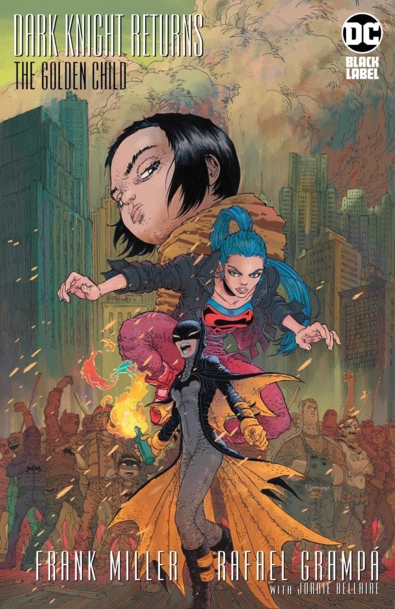
The Dark Knight Finale Raises More Questions than Answers

In 1986, DC put out the legendary miniseries, The Dark Knight Returns, by Frank Miller and Klaus Janson. It chronicles the story of an old Bruce Wayne coming out of retirement to bring order back to Gotham. Along the way, he takes on a new Robin, Carrie Kelly, and faced off against Superman. It was universally acclaimed, and Miller would return 15 years later for a sequel, The Dark Knight Strikes Again. While that story received much criticism, DC asked for one final series, with a few stipulations. One of these was working with Brian Azzarello.

While the final series, The Dark Knight: The Master Race, received great reviews, Frank Miller said he had one more story to tell in that universe. This story would truly be the end of The Dark Knight story, and it would be on his terms. How will this legendary tale end?

The Dark Knight Returns The Golden Child cover

**Some Spoilers Below**

Story:

Opening up a few years after The Master Race, we focus on three characters: Superman’s children and Batwoman. During this period, a new political candidate(which may or may not be a parody of the current president) is pushing a hate-filled agenda. This has gotten the American people to start protests against him. A Joker style gangs rush these protesters in an attempt to break it up. Before they get too far, Batwoman and the Sons of Batman stop them while trying to find the leader. 

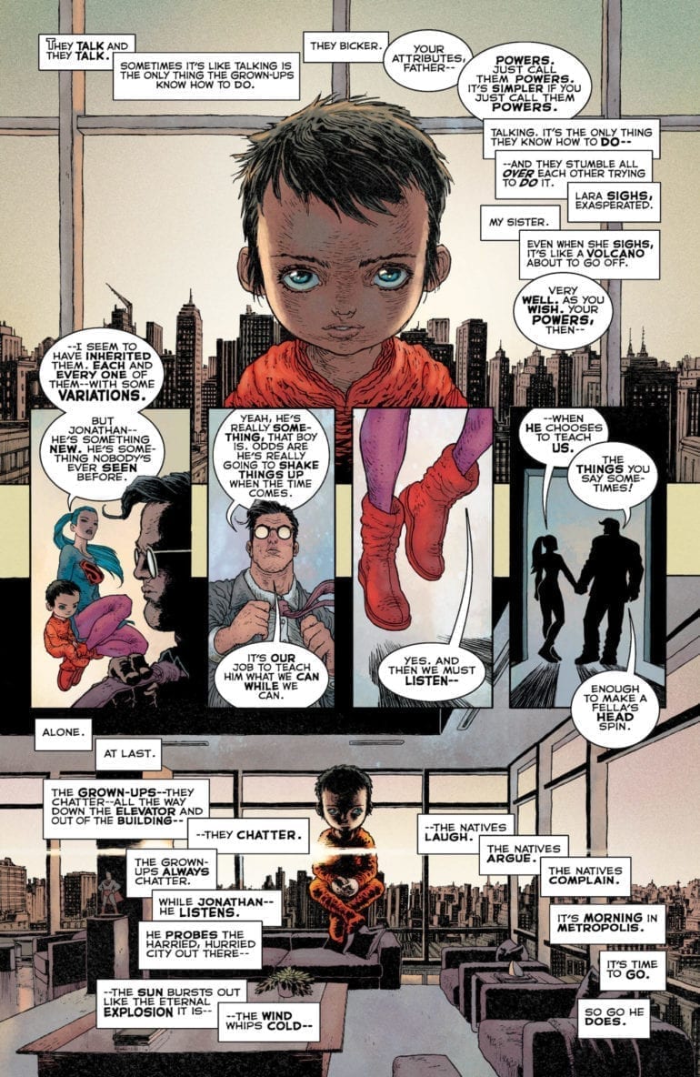
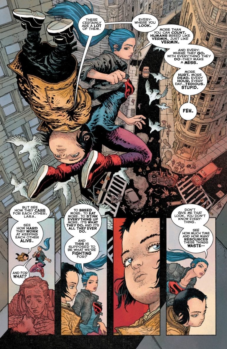
Meanwhile, Lara Kent is teaching her little brother about the world and how fragile humans are. Despite him being practically a toddler, Jon is quite intelligent and powerful, gaining the attention of the most dangerous villain in the universe.

The Dark Knight Returns The Golden Child p1

After reading through this a few times, I honestly don’t see anything new. The commentary of this tale is nothing we haven’t heard before in recent stories. As for the involvement of the big villain, I’m scratching my head in confusion. Not because of who it is but why he is doing this. His whole part in the story felt forced as his master plan seemed a bit small for his level of thinking.

The Dark Knight Returns The Golden Child p2

Another issue I have is the problem with how Miller continues to write the children of Superman as terrible people. Lara continues to be one of the most unlikable members of the Super-Family. Jon is not as bad, as he tries to prove to his sister that humanity is good, but still has this creepy tone and look that unsettles. 

The only major part I liked was Carrie Kelly’s return as Batwoman. Seeing from where she started to where she is now is incredible. The best part was at the end, where she chases off the villain after inspiring the protesters against him. If this is truly the end, at least we got to see Carrie Kelly become the hero she was supposed to be.

The Dark Knight Returns The Golden Child p3

Art: 

As strange as this sounds, Rafael Grampa’s disturbing and bizarre art style is perfect for this world. It fits the aesthetic of the Dark Knight universe exceptionally well by giving us violent imagery and a dark future for us to return to. The action is visceral and will stick with you long after putting the comic down. The only issue with his style comes in the form of Jon, who kind of looks like one of the psychic children from the movie Akira. While nothing can quite match Klaus Janson’s style in the original story, this art team gets pretty close.

Conclusion:

Despite great creepy artwork and the return of Carrie Kelly, I’m wondering, “Why was this story made?” Other than taking a quite obvious political stance with Carrie and Lara, there was no need to tie this into TDKR Universe. When Frank Miller first announced this, he made it sound like that this was going to be the definitive ending to this world. All I see was one that in the end, felt forced and unnecessary. There will be those who like this book, but for me, this book just fell flat.

Monkeys Fighting Robots Youtube

Review: Triage #4 is an Emotional Punch to the Gut

For the past four months, Phillip Sevy has been churning out some of the most visually interesting, emotionally resonant science fiction on comic book shelves. His book, Triage, is the story of three parallel universe versions of the same woman. Evie, Marco, and Orbit are hunted across realities by an alien killer and tasked with saving all of the multiverse. In issue four, Sevy begins his wrap-up to the series, placing our heroes in an almost no-win situation against time and their pursuer. It’s a penultimate chapter for the ages, inching us toward a conclusion that promises to be as deadly as the series’ armored antagonist. Read on to find out more.

When we left our trio of heroes, Marco had just kissed Tab, Evie’s longtime girlfriend. This added tension to the already fraught situation of being trapped on Marco’s home world. There, the forces of gravity are actively working against human civilization. With the Hunter still in their tail and tensions rising to a boiling point, the trio will have to find common ground and fix the damaged teleporter that Marco wears on her wrist. Without it, there’s nowhere to run from the relentless pursuit of the Hunter.

The Story

In our last review of Triage, we commented on the depth of character development. Little did we know, he had barely scratched the surface. Issue four is a punch to the gut for readers emotionally invested in Evie and her alternate versions. We get more backstory on her mother, plus further exploration of her relationship with Tab and reason Tab fell so quickly for Marco. This is a heavy, meaningful issue, but Sevy doesn’t fall into the trap of explaining backstory at the expense of the present. Everything we learn of Evie’s past matters immensely to her current situation, and will have ramifications toward her immediate future. A good writers knows when to hold off on explaining the full backstory of a character, and issue four proves Sevy deserves that title.

The Art

Reading Triage is a little bit like hopping across realities yourself. Triage’s world is built of landscapes that are so wildly different, it can feel like you’re reading two different books from page to page. There’s a danger in science fiction adventure stories for the settings to look too similar, but Sevy actively avoids this problem every time he switches location. After Triage wraps up next month, science fiction comics will have a lot to live up to visually.

The Lettering

Throughout Triage, letterer Frank Cvetkovic has done a great job bringing sound and voice to Phillip Sevy’s art. From sound effects to narration to important digital text that connects us to the series’ technology, Cvetkovic has immersed the reader in Triage’s strange, alien setting. However, this issue saw Cvetkovic doing a lot of normal dialogue and, unfortunately, it occasionally didn’t come together. Some of the speech bubbles took up a lot of space and contained too little text. The pattern of speech was sometimes hard to follow. Still, this tiny distraction wasn’t enough to draw away from the story or forget about Cvetkovic’s fantastic past work. Plus, issue five promises to be an action-packed final confrontation. Cvetkovic’s sound effects work has every chance to shine again.

Overall Thoughts

Though it may not be as visually thrilling as the first issue, issue four of Triage is a perfect showcase of what this series can be. The back-and-forth between Evie and her mom, then between Evie and Tab, were extremely powerful. Readers will be hard-pressed not to find themselves connection with these characters; excited to see what happens to them next but dreading the situation in which they find themselves. Pick Triage #4 up now for a penultimate comic done right, but make sure not to jump on with this one. This issue is a rewarding near-conclusion to a fantastic story; make sure you go into it informed.

For more reviews like this, follow us on Twitter. And for all the best comic book reviews, discussion, and news, stay tuned to Monkeys Fighting Robots.

Monkeys Fighting Robots Youtube

TMNT #100: Believe the Hype

IDW’s Teenage Mutant Ninja Turtles #100 fulfills the markers for a great comic. The culmination of years of plot lines? Yup. Big emotional hits? Check. A massive battle that defines the word EPIC? Absolutely. But it’s more than that. The book has a sense of its bigness. It feels important.

There’s a weariness about the story, the final piece of the City at War arc. It has that vibe you get in the final act of a blockbuster action movie; the heroes are against the wall. Not everyone is going to make it, but they’ll never stop fighting. There will be laughs and tears and blood, but the battle is glorious, and our noble warriors do the right thing.

In case you need to be brought up to speed, Karai has taken control of the Foot Clan after defeating Splinter on the heels of Old Hob setting off a mutagen bomb in New York City (Sidebar: At this point, don’t NYCers kind of deserve it if they refuse to move after decades of metahuman shenanigans?). Meanwhile, Katsune is resurrecting the Dragon, who happens to be her dad.

(This, kids, is what happens when Dad gets too many ties for Father’s Day…)

Beyond the well-hyped (and deservedly so) previews screaming that nothing in the Turtleverse will be the same again, what makes it so are the personal moments. Raph’s painful confession to Leo on the heels of his berserker rage while battling Bishop makes the story a human one. It reminds the reader of the themes of TMNT throughout its history. Acceptance. Redemption. Trust. On the other end of the spectrum, this issue reminds us that people can do the right thing and still leave a disappointing void.

The other component of this book that qualifies it for greatness is story quality. I’m not a Turtles guy. Nothing against those who are, just not my deal. This is the first TMNT book I’ve ever read, and it kept me hanging off every page. Yes, had I followed them throughout their history, this book would be a massive payoff. For readers of my age, think Uncanny X-Men #200 or Secret Wars #12. But those readers were going to buy the product anyway. What this murderer’s row of creators has done is not only tie up years’ worth of storylines, but present it in a way that attracts new fans, making them want to backtrack through all the issues leading up to this one.

(…and a pony.)

Kevin Eastman, Bobby Curnow, and Tom Waltz (with Waltz providing the script) imbued this story, from beginning to end, with love and respect for not just this arc, but the history of the book and its characters. Every aspect is firing on all eight, with the battle scenes mixed with comedic asides from B-Bop and Rock Steady and emotional depths interspersed with personal triumphs.

The art of Dave Wachter and Michael Dialynas is perfect. It combines the raw, indy feel that throws back to the books’ humble roots with the polish needed and deserved for a story this big. The buzz about this finale was not oversold. If you’ve invested any amount of time as a fan of TMNT, you understand this is a book that needed to radiate that kind of vibe. Rhonda Pattison’s colors work in concert with the pencils and inks to bring readers an emotional experience. Shawn Lee’s lettering is both solid and unobtrusive. It’s not sloppy, but not so overdone and embellished that it distracts from the overall piece.

If your only exposure to Teenage Mutant Ninja Turtles are the cartoons (or the toys, which are featured in the new season of Netflix’s “The Toys That Made Us” and brilliantly done) and you’re not sure why the four shellbacks have such a rabid following, read this book. And then read the other 99.

Did Teenage Mutant Ninja Turtles #100 live up to the hype? Let us know in the comments below.

Monkeys Fighting Robots Youtube

NEW MUTANTS #3 – Different Team, Same Recruitment Mission

There are some new mutants in town this Wednesday in Marvel Comics’ NEW MUTANTS #3, no not the New Mutants, but another cast of rambunctious teenage mutants!

The beauty of Krakoa in New Mutants
Interior art by Flaviano. Colors by Carlos Lopez. Letters by VC’s Travis Lanham

Although New Mutants #3 doesn’t follow the hip gang from the past two issues, it does reference them. For that reason, you should pop over and check our review for issue one, and two. Or pick them up at your local comic shop.

A Group of New Mutants in Town

As you may have noticed, New Mutants #3 doesn’t contain the same group of mutants as the previous two issues. Instead, it revolves around: Armor, Glob, Sage, Boom-Boom, Maxime, and Manon. This grouping of mutants happens to live in the same “housing unit” as the New Mutants—Akademos Habitat. In this habitat resides eight different teams of younger generation mutants. Here they all live together while passing ideas through each other and teaching one another. All are students. All are teachers.

New Mutants #3 may be focused on a differing set of mutants, but Ed Brisson keeps the plotting roughly the same. Noticing that some mutants are missing from Krakoa, Armor goes out into the world to extend a welcoming hand; even though Charles has already done this. Luckily this isn’t swept under the table, as Sage mentions this. Nonetheless, Armor rounds up a few other young mutants and goes out to invite Beak and Angel into the mutant utopia. But, as any X-title goes the “team” gets attacked. The word, “team” is quoted in the previous sentence because although the five mutants group up, they never feel like a team.

Whereas the previous two issues focused on the original New Mutants team with a few members, New Mutants #3 feels like Armor and Glob randomly run into people that help. New Mutants #1 had the original team and newcomers going to space to bring Sam to Krakoa. Yet, where the previous team felt like a family that jokes and fights together, New Mutants #3 never feels like this.

Interior art by Flaviano. Colors by Carlos Lopez. Letters by VC’s Travis Lanham

Different Team, Different Art

The changing of teams doesn’t stop with the New Mutants, as New Mutants #3 features a different visual team with Flaviano on pencils and Carlos Lopez on colors. Although Flaviano’s art is completely opposite of Rod Reis’ it works in conjunction with the story being told. Seeing as the beginning of the new story focuses more on setting up the plot and less on violence, Flaviano’s realistic art bodes well with Brisson’s words. The same can be said on Lopez’ colors.

By keeping the colors in a spectrum that’s realistic, Lopez makes the more colorful moments pop out in contrast. This usage of bright colors helps distinguish the main characters from the background and mutants powers happening all around them. It may seem weird that compared to the backgrounds the main characters feel realistic, yet it works. Resuming lettering from the previous issues is VC’s Travis Lanham. New Mutants #3 is heavier in dialogue, which shows in some cases. For the most part, Lanham is able to easily guide the readers eyes through the page. But in some moments this isn’t the case, as the word bubbles become too much and clutter the art.

Seems like it's always party time in Krakoa!
Interior art by Flaviano. Colors by Carlos Lopez. Letters by VC’s Travis Lanham

Conclusion

New Mutants #3 never hits the fun chaotic feeling that the previous two issues had, yet it seems like it wasn’t going for that. Instead, Brisson and team wanted to tell the beginning of a new team on a more grounded note, than the interstellar other New Mutants. At times the characters shine through, but never as a group as they should. Hopefully, when this “team” is explored further down the line they start to feel more organic.

Memorable Quote: “I guess this is why they always send Wolverine first.” – Maxime

If I was the leader of any team including Wolverine I’d always send him first. The little guy is immensely terrifying.

Dear Reader

What did you think of the switching of teams? Let us know!

Monkeys Fighting Robots Youtube

SABAN’S GO GO POWER RANGERS #26 Has Tommy Back At Center Stage

Cover by JLOU

Coming to stores near you this week from BOOM! Studios, Saban’s Go Go Power Rangers keeps the balling rolling with issue #26.

If you’ve been keeping up with the “Necessary Evil” story arc, or at least with my reviews on it, you know that this story has taken a focus to Jason Lee Scott more than it has the other Rangers. For all you Tommy Oliver fans out there, you’ll be happy to know this is an issue centered almost entirely around him.

Lately, Saban’s Go Go Power Rangers has been covering the start of events that would lead to Jason, Zack, and Trini’s, transformation into the Omega Rangers that we’ve seen so much of in the sibling comic Mighty Morphin Power Rangers, as well as Tommy’s inevitable transformation into the White Ranger. Issue #26 definitely focuses more on the latter as writer Ryan Parrott explores his own take on the White Ranger’s inception.

Guess that’s the only sensible thing to do… Right?

Alongside the White Ranger’s origin, this issue actually comes right in with a flashback of Tommy under Rita’s spell as the Green Ranger, potentially letting us know that story is not done with just yet. Who knows? Maybe one day we’ll have that awesome “White Ranger vs Green Ranger” episode adapted as well.

I can assume this is right after he stomps the Rangers if this follows how the show went.

This look at Tommy’s evil past is accompanied also by some layers of his more present character peeled back as well. Seeing powerless Tommy hell-bent on becoming a Ranger again, and doing whatever it takes for his friends, is a fitting direction towards who he is to become.

Francesco Mortarino’s art continues to impress me over and over with each stunning panel. From clean character designs that match the actors in the show with a cartoony twist to these insane backgrounds and architecture that are glistening with life and originality, his art shines especially bright with the settings in this issue paired with the immaculate colors from Raúl Angulo.

I love how absolutely over the top the design of this big white and gold tower is.

Ed Dukeshire continues the lettering in this issue and I’ll have no complaints as long as we keep my favorite sound effects that I’ve covered in my past reviews in place. Genuinely worth noting that dialogue in these comics is very fun to read and easy to imagine with the voices of the cast members of the original show. That’s not the easiest thing to accomplish when re-writing characters.

There continues to be this childhood grabbing whimsicality in every issue of this series, even more so in Saban’s Go Go Power Rangers than Mighty Morphin Power Rangers. From the more cartoony art style to the overall tone in the dialogue and writing, Go Go feels more in touch with the lighter side of the series. That’s not to say it gives up the depth that is written into Mighty Morphin but I will say the approach feels more “all ages” than anything.

As “Necessary Evil” continues I find myself growing more eager, awaiting each issue as they come. Issue #26 is no exception as the story continues to comes together page by page. I am very excited to see what else the team has in store for us here and if they’ll do anything to dramatically cross over the two series as they did back in the “Shattered Grid” arc.

Knowing what we already do from Mighty Morphin Power Rangers, what are you excited to see explored further in Saban’s Go Go Power Rangers? Rocky Adam and Aisha’s first appearance? How the Omega Rangers meet Kiya? Let us know in the comments!

Monkeys Fighting Robots Youtube

Review: A Curse Travels Through Time in THE DOLLHOUSE FAMILY #2

Vertigo all-stars Mike Carey, Peter Gross and Vince Locke continue to deliver an engrossing slow-burn horror experience in “The Dollhouse Family” #2. Two equally engaging plot lines separated by a century make for a complex and thoroughly engaging read that is brought to life by pitch-perfect classically-minded art direction.

After the brutal death of her father and subsequent wrongful imprisonment of her mother, young Alice is sent to a state orphanage where she is tormented by other young girls. Fortunately, her favorite dollhouse has followed to keep her company in these trying times. The house continues to offer Alice a place to stay in happiness with the rest of the family, with a price to be paid of course. Meanwhile, the house decides to take us on a trip down memory lane, to see how exactly this family came to be.

Writing & Plot

Acclaimed writer M.R. (a.k.a. Mike) Carey is no stranger to complex plots. His years of work on Vertigo titles such as Lucifer, Hellblazer and The Unwritten have proven that. As such, it’s an unsurprising relief that he hasn’t lost his touch with “The Dollhouse Family.” The story juggles two simultaneous plot lines that take place a century apart. Despite this, there is neither confusion nor disappointment when leaving one plot for another. The engrossing “present” story with Alice in the orphanage is matched in its compelling nature by the chilling origins of the dollhouse itself.

Carey once again flexes his ability to write in numerous dialogues and styles. Every bit of dialogue, from present casual British English to 19th century Scottish slang, feels natural and particular to each character. Carey’s taste for mysterious slow-burn mystery and horror shines through in this second issue. The desperation and stakes Alice faces swell into a dramatic crescendo by the issue’s end. This is joined by the suspenseful story of the parallel plot, which is written like a carefully executed demonic horror film. Specific revelations and cliffhangers in this chapter will make the wait for issue #3 a daunting concept.

Art Direction

Vertigo alumnus Peter Gross (Lucifer, The Unwritten) and Vince Locke (Sandman, A History of Violence) provide perfectly appropriate layouts and pencils respectively to “The Dollhouse Family” #2. Gross’ layouts provide intricate plot direction for the reader’s eyes to wander through smoothly. Locke’s easily recognizable line and ink work provide excellent and often dread-inducing visual detail. Characters are all recognizably different, and emotional expressions ranging from sadness to fear are compelling. The colors in “Dollhouse” have a dreary effect on the atmosphere, and this is meant in a positive manner. This style replicates the newspaper print colors of comics of old, and reinforces the mysterious horror atmosphere this comic so perfectly encapsulates.

The lettering from Cris Peter aids the atmosphere and reading experience in the best ways lettering can. Normal spoken lettering is given a by-the-book font, but internal narration narration from the “Dollhouse” itself are given their own unique lettering. These other fonts not only help differentiate speakers, but also add a sense of ominous mystique to the “Dollhouse” and its plot. The lettering is not unlike that of Lucifer Morningstar’s in Lucifer and Sandman, if that’s any indicator for the gravity of this character’s presence.

Conclusion

“The Dollhouse Family” #2 is a wonderfully macabre and devilishly strange follow-up to a fantastic debut. This issue takes more time to acquaint the reader with the story’s overarching plot and slow-burn storytelling method. M.R. Carey’s plot construction and dialogue continues to be among the most intriguing and well-constructed in the comics medium. Peter Gross, Vince Locke and Cris Peter all combine their talents to create an eerily engaging visual aesthetic for the series. Head to your local comic shop to keep this one in your file come 12/11.


Monkeys Fighting Robots Youtube

Review: FAR SECTOR #2 Brings Drugs, Murder and Alien Love

N.K. Jemisin and Jamal Campbell’s “Far Sector” has improved upon every facet from its first issue by taking more intimate time with its wide cast of characters and delivering considerably more breathtaking artistic scenes. The mystery and world-building at the series’ core is given life through its characters, and it will make the wait for the next issue all the more stressful.

After watching her first murder suspect (and the first murder suspect on The City Enduring in 500 years) get killed in the interrogation room, new Green Lantern Sojourner Mullein has to dig even deeper to find the history and conflicts of this planet’s people. As it turns out, the three civilizations living together in emotionless harmony each have more complex and clandestine pasts than Mullein could have imagined. Now, she’ll have to be wary of drug abusing aliens, possibly being eaten, and apparently even romantic advances if she’s going to solve this planet-scale murder case.

Acclaimed novelist N.K. Jemisin really comes into her own as a comic writer on this second issue of “Far Sector.” While the first issue spent a lot of time dumping exposition via narration to acquaint the reader with this new world, this follow-up exposes the plot’s complexities through meaningful and intimate character interactions. The characters are all so interesting to read here. There are three distinct interactions with different supporting characters that each have their own different tones and they are all so compelling to read. Mullein herself as a character is strengthened through these interactions, as well as made more multi-dimensional through her newly explored flaws. At this rate, she could easily make for one of the best new additions in DC’s roster. The chunks of expository narration are replaced by internal reflection from Mullein, as well as more of the comic-specific style of letting the art do the talking. The pacing from the opening chase sequence to the conversational scenes is fantastic and never feels slow. The dialogue itself is naturalistic and varied among the cast. Overall Jemisin knocks it out of the park on this issue, and it’ll be interesting to see if she can maintain this style in her scripts.

As impressive as Jamal Campbell‘s art was in “Far Sector” #1, it appears that he’s been given considerably more to work with in this second issue. As amazing as his alien city-scapes and sci-fi character renderings are, he really gets to shine through the quieter moments of conversation this issue has. The one thing about his art that was wanting in the previous issue was the characters’ lack of individual expression. This problem is completely removed here. The incredible moments of interaction inter-cut with massive Bladerunner style metropolitan views and quick action make for some of the most wildly impressive art in comics this year. His massive range of digital neon colors breathes a sea of life into the panels, and gives a feast for the eyes on every turn of the page. Absolutely stunning work from one of the best recent artists to enter the industry.

“Far Sector” #2 is as excellent a follow-up issue as any comic could hope to have. It properly improves upon every creative element of the previous issue while also improving on the storytelling itself. N.K. Jemisin’s script fleshes out characters in intimate moments of conversation that also reveal more about the plot itself. Jamal Campbell’s artwork is given even more of a chance to shine with his stellar work on the quieter moments between the characters. Regardless of what your opinions may have been about the first issue, this follow-up showcases the possibilities of this new series. Be sure to pick it up at your local comic shop on 12/11.

Monkeys Fighting Robots Youtube

Review: A Breech Into Another Dimension Erupts In BATTLEPUG #4

Sprinkles staring into breeach

Moll, the Kinmundian’s companion and on-again/off-again love interest, has been having visions of a dimensional break in reality for four issues now. In them she sees flashes of light and an overwhelming presence seek to draw the Kinmundian into its clutches. Unfortunately, these visions have become reality in BATTLEPUG #4 when the Kinmundian attempts to prevent the Queen of the Northland Elves from accessing a realm of magical power far beyond comprehension.

Readers will find the stakes higher than ever when BATTLEPUG #4 hits comic book stores on Wednesday, December 11th.

Story

Knowing nothing of Moll’s visions of destruction, the Kinmundian fights on in the Northland caves in search of the Queen and his recently stolen Sniffles. But the mayhem of battle ultimately gets to the warrior, leaving him at the mercy of a cave of a Yeti-like creature named Juan Diego. Wasting no time, the Kinmundian musters up enough strength to overpower Diego, obtaining vital information about a “magic doorway” in the process.

It is here where readers will undoubtedly see the pieces of the puzzle fall into place. The Queen’s deal with the giant wasn’t for the sole purpose of stripping the Kinmundian of his beloved pet—it was a barter to gain access to the magical realm from whence he came.

Mike Norton’s writing over the past few issues has been leading up to this climatic event, and in this issue the plot is more intense than ever. He shows he’s able to introduce these world-altering events into the story while retaining the same zany tone that made us fall in love with this series.

Artwork

Norton, Allen Passalaqua, and CRANK!’s artwork in BATTLEPUG #4 reflects the increasingly high stakes found within the story. The mix of snow covered landscapes, otherworldly energy pulses from the dimensional breech, and the blood covered ground shows just how much has happened over the course of a few issues. And the lettering is a fitting piece; the onomatopoeia letters seem to break out of dialogue balloons and wrap around the characters, emphasizing their impact.

Comic Covers

Cover A

The book’s main cover features artwork from Norton depicts Sprinkles in front of this breech, bearing witness to his possible involvement with the climatic events to come.

Cover B

Declan Shalvey’s art for Cover B shows the Kinmundian riding Sprinkles as in issues past. This shows us the dynamic duo in their prime, and increases readers’ longing for the two reunion.

Conclusion

BATTLEPUG #4 brings all our favorite characters together in an epic event that’s sure to set the tone for issues to come. Readers are ready to learn more about this new dimension, and the creative team is ready to reveal it.

Do you think the Kinmundian will reunite with Sprinkles? Let us know in the comments below!

Monkeys Fighting Robots Youtube

DOCTOR MIRAGE #5 – A Peaceful End And A Fiery First Step

Everything great comes to an end, but as one emotional door closes in DOCTOR MIRAGE #5, another flame-filled entrance makes way for a not so bright future.

Letters by Dave Sharpe. Art by Nick Robles. Colors by Jordie Bellaire

Yes, this is the end for Valiant Entertainment’s 2019 Doctor Mirage, if you haven’t read the previous issues you’ll surely be behind in the plot department. Check out our reviews for the previous issues or run by your local comic shop and pick them up!

The End is Just The Beginning

A large amount of 2019’s Doctor Mirage has leaned on the many emotions of its titular character, Dr. Shan Fong. Above all, this statement rings true in the mini-series’ final installment. These varied emotions come in the revelation of what exactly has transpired recently in the Doctors life, and why it has happened. Without going too far into spoiler territory, the story of Doctor Mirage (2019) is the process of grief over a loved one and moving on. This process is written magnificently by Magdalene “Mags” Visaggio with Doctor Mirage #5 bringing it all to a close.

Through all the trials and tribulations Shan has had one thing in mind since she lost the powers of talking to the dead—find Hwen. This goal has seen her stopping at nothing to be connected once more with her dead husband. Visaggio concludes this plot point in a realistic manner that anyone who has struggled through loss can understand. By the end of the issue, Shan comes to accepting of her dead loved one, and loss of powers. Thus concluding with her moving on and the selling of their house.

Visaggio has brought an understandably human side to Shan in the previous issues. Throughout the series, Visaggio has written a character that all readers will enjoy, while relating with. Aside from an amazing plot, this realistic take on the character helps any reader be able to understand Shan’s motives. All of these great character moments and plots come together in a satisfying conclusion. But, every ending is a new beginning as we soon learn in the final pages.

Letters by Dave Sharpe. Art by Nick Robles. Colors by Jordie Bellaire

Otherworldly Art

In the reviews of the previous issues, I’ve gushed about how great the art team of Nick Robles, Jordie Bellaire, and Dave Sharpe are. The top-notch quality the team has portrayed still stands. You’d be hard-pressed to find any singular page that wouldn’t make your wall look gorgeous. Hell, if you hung up the pages of Doctor Mirage #5 in your living room, your guest will ask where you bought this work of art. Interior home design aside, the team behind the art may be one of the best visual teams out there.

Robles’ panel work continues to change up nearly every page, helping keep a constant pace of speed during the moments that need it, or slowing down for the somber pages. During these emotional pages Roble crafts each characters face with enough emotion to carry the plot sans words. On the opposite spectrum of slow moments are the chaotic fights seen throughout Doctor Mirage #5. In these moments Robles crafts a beautiful fluid action set that’s easy to follow, yet gorgeous in its execution.

Taking Robles’ work to the next level are the vibrant colors that Bellaire showcases in psychedelic manners. The magic showcased in Doctor Mirage #5 pop off the page brilliantly as the colors dance around vividly in your head. These magical moments feel like a multicolored fire come to life, that burns bright and beautiful. That doesn’t mean Bellaire paints everything in a fever dream spectrum, with her balancing these moments with dark shades of colors. Finishing the fantastic art is Sharpe’s use of varying lettering techniques. Be it changing the color style for a character possessed, or the continued use of a film clapperboard, Sharpe continues to help make Doctor Mirage visually stunning.

Letters by Dave Sharpe. Art by Nick Robles. Colors by Jordie Bellaire

The New Beginning For Doctor Mirage

Looking back the number of issues could be on purpose with the five stages of grief/loss. But, the other Doctor Mirage series’ have the same amount of issues. This thesis warrants a look back at the issues to see if they follow each step, especially with issue fives theme of acceptance. Nonetheless, Doctor Mirage #5 is an amazing ending that nails every aspect, while tantalizingly teasing the future of our beloved Dr. Hopefully the next series keeps the same team of creators, as they made one of the best mini-series of 2019.

Cover Story: Honestly, Shan’s face and eyes on the main cover are freaking terrifying!

Cover By Kano

A Look Back With The Reader

What did you think of the final issue of 2019’s Doctor Mirage? Better yet, what have you thought of the series in full? Let us know below!

Monkeys Fighting Robots Youtube

Review: SPIDER-MAN 2099 #1 Revisits Miguel O’Hara’s Origin

SPIDERMAN-2099 #1 main cover artwork

SPIDER-MAN 2099 #1, available in comic book stores on Wednesday, December 11th, reintroduces us to Miguel O’Hara, a.k.a. Spider-man of the year 2099. Fans last saw him at the beginning of the Marvel 2099 event in which the hero warned Peter Parker of an impending doom in the future. However, the version of Miguel presented to us in this issue appears to have an entirely different story—he’s not Spider-Man, for one, and the only life he knows is within Alchemax.

Story

The issue opens with Miguel waking up from a nightmare within his futuristic apartment. His home’s A.I., Lyla., can tell he’s clearly distraught, but the young man opts to proceed with his day. We then learn that the dream was spurred on his recent venture in a former testing area called the Ravage.

Miguel enters the Ravage

The scene flashes back to the Ravine, where Miguel takes samples from genetic “experiments” he was tasked to examine by the notorious chemical company Alchemax. It’s clear he hates working for them, but we learn it’s a price he’s willing to pay to stay afloat in the corporate-controlled world Earth has become—a particularly fitting metaphor for our own reality.

Miguel soon realizes that, though most of the genetically spliced creatures are dead, a few are hidden within the walls. Upon further investigation of the area, a spider-like beast screeches words in an unknown language just as hundreds of spiders fall on Miguel’s feet.

Miguel runs into a genetically modified spider

Could this be the new origin story of Miguel? How does this tie into the version of him in continuity? Writer Nick Spencer, as if responding to these questions, has Miguel experience visions of himself in costume and other events from Marvel Comics history—it’s almost as if the previous version is reaching out to this new character. However, one’s thing’s for certain: the timeline is experiencing fluctuations, and the fate of the future rests on Miguel’s reclaiming of the Spider-Man mantle.

Artwork

Zé Carlos’ penciling and ink work, Brian Reber and Andrew Crossley’s coloring, and VC’s Cory Petit’s lettering were each wonderful additions to this issue’s artwork. The illustrations of Nueva York capture a unique futurism that’s not too farfetched; the buildings look like slightly sleeker versions of those in real life New York. At the same time, the creative team shows a stark contrast between these images and those of the slums and Ravine—the former employs cool colors that are common in digital formats while the latter uses more earthy colors to reflect its lack of technological progression.

In addition to the brilliant illustrations, SPIDER-MAN 2099 #1’s lettering makes it easy for readers to follow Miguel and the other characters’ dialogue amidst the fast-paced scene transitions. The effective use of font and color changes prevent us from losing track of who’s speaking at any given time.

Comic Covers

Main Cover

Viktor Bogdanovic’s main cover artwork depicts Miguel in his classic Spider-Man 2099 garb, centering the focus of this issue on the character.

Variant Covers

Travel Foreman’s and Ron Lim’s variant covers both feature the titular hero swinging through Nueva York. Foreman’s version depicts the supposed futuristic city falling apart, revealing the corruption lying underneath the surface. Lim’s version similarly features the hero roaming between the buildings to show his fierce determination.

Conclusion

This issue is the perfect set up story for the Marvel 2099 event. Telling a new story of a beloved character while keeping it in continuity with comic canon appears is a daunting task, but SPIDER-MAN 2099 #1 seems like it’s perfectly suited for the task.

Do you think this is an official retelling of Miguel’s story? Let us know in the comments below!

Monkeys Fighting Robots Youtube