Home Blog Page 377

INTERVIEW: Composer Rendra Zawawi Put The Music In M For Malaysia

The 2018 Malaysian general election featured the return of a 92-year-old former Prime Minister, and is documented in the film M for Malaysia where composer Rendra Zawawi digs into his roots to create a soundscape worthy of controversial country-spanning historical events.

Mahathir Bin Mohamad was the Prime Minister of Malaysia for 22 years, beginning in 1981 up until his retirement in 2003. But after 15 years of what was likely blissful retirement, the “Father of Modernisation” got back into the often brutal ring of politics. M For Malaysia documented the events as directed by Dian Lee and Ineza Roussile and was the official selection from Malaysia for Best International Feature Film at the 92nd Academy Awards.

PopAxiom flew to Malaysia to speak with Rendra only to find out he lives in L.A. So, we came back home and called him to talk about life making music, video games, and the process of scoring M for Malaysia.

Other Side Of The World

Rendra was born and raised in Malaysia to parents who were both academics. “My dad is a professor of anthropology. But my dad dabbled in music too.”

Naturally, Rendra was going to be a musician from the start. “I was a civil engineer before this.”

Music was just a hobby for Rendra. “I told my dad, ‘Can you teach me some guitar chords just for fun?’ I went into my room and wrote a song. The next day I played it for my dad, and he was impressed. When people would come into the house, my dad would say ‘Perform! Perform!”

Rendra was a “… a singer-songwriter first while pursuing a civil engineer degree in the U.K.”

At this point, music was “… a professional hobby.”

However, the pro hobby was taking over. “After civil engineering, I went to Berklee to pursue music professionally.”

Some naysayers think Rendra wasted time studying civil engineering. Still, he views it in a completely different way, saying that the two share similarities, mainly being fundamentally about vital structures. The knowledge he gained “… contributes to making music.”

About M For Malaysia

Getting connected to M for Malaysia was a degree of friends. “I got connected by a mutual friend who had a friend looking for a composer for a feature documentary.”

Rendra spoke with one of the directors of the film. But his familiarity with scoring a doc was minimal. “I’d done one documentary before.”

The composer began to learn more details about the project. “It’s about the Malaysian elections in 2018. I was following it from afar. She [producer/director] had all this footage from behind the scenes … privileged access. She sent me some of the raw footage for me to watch.”

Rendra was surprised by what he saw. “It was so much behind the scenes of the future Prime Minister at home with his wife. The narrator [and director] was his granddaughter. That’s when I realized the film’s narrator [and director] and the woman I spoke to was Ineza Roussille, the Prime Minister’s granddaughter.”

“That shifted my view …” Rendra says about the close and personal point of view. And despite the potential bias, Rendra explains, “… the documentary was painting the Prime Minister in both positive and negative lights. I thought his granddaughter was brave for doing it this way. The documentary is very neutral.”

Neutrality and avoiding a political lean was important for Rendra. “I didn’t want to be part of a sort of propaganda thing. I believe in the power of the people. I thought this would be a good way to give back to the country.”

https://vimeo.com/314465987

Temps And Anthems

Early discussions about the music for M for Malaysia revealed that the filmmakers “… wanted a documentary with cinematic scores. ’We don’t want it to be too mellow. We want traditional instruments but also contemporary. A local taste … a sprinkle [of Malaysian tradition] on top.”

As with any film, Rendra received a cut of M for Malaysia with temp tracks. “A lot of the cinematic temps they used was stuff from like, Hans Zimmer, Harry Gregson-Williams, and John Powell. There was a Man of Steel reference in there. It was a lot of the sort of usual temp music a lot of movies use these days.”

For Rendra, the temps were an exciting point to start from. “I get to reinterpret those temps into a Malaysian voice. I used some traditional instruments like the Kompang and the Bamboo Flute. Later down the road, I proposed the idea to use the Malaysian National Anthem as a sort of a motif to weave things together.”

About using the anthem, Rendra says, “It’s a very familiar motif that every Malaysian knows. No matter what your political affiliation, everyone knows the national anthem.”

Watch the music video for the Original Song “Bermula Kita”
featuring Malaysian superstar Yuna …

Wrapping Up

I ask Rendra what movie remake would he want to score, but it becomes a two-part answer. The first part involves video games, which is something the composer dearly loves. “Final Fantasy is my biggest video game. I had the pleasure of having dinner with Nobuo Uematsu.”

Shifting to film, Rendra speaks to the power of inspiration from what’s unarguably the most celebrated film composer of all time. “The first composer I fell in love with was John Williams. His melody, same with Nobuo … that’s how I kind of approach my scores and have layers of melodies.”

As for the movie remake, he’d love to be a part of? “The movie I would love to do is the movie Hook.”

What’s next for Rendra? “I’m going back to Malaysia for a few weeks, to write for one of the biggest companies in the country, but I can’t reveal the name. I’m doing a brand song with a 70-piece orchestra. I have something for early next year, a feature film, but that’s under NDA for now. And I’m working with Mac Quayle (Scream Queens, Mr. Robot) on a project which I can’t really talk about, but it’s a cool video game.”

Thanks to Rendra Zawawi and Impact24 PR for making this interview possible.

Want to read more interviews like this? CLICK HERE.

Monkeys Fighting Robots Youtube

Review: On the Road of Vengeance in the Old Deep South with KILL WHITEY DONOVAN #1

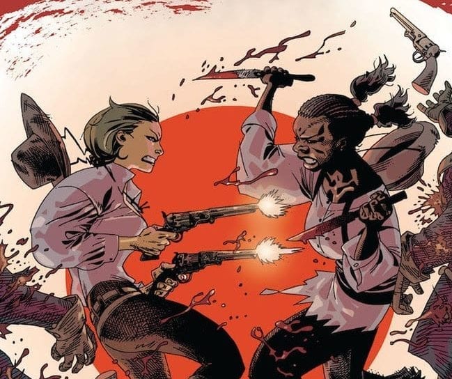
Novelist and first time comic writer Sydney Duncan and artist Natalie Barahona ally with 12-Gauge Comics and Dark Horse to bring us the first issue of “Kill Whitey Donovan.” This revenge soaked story starring two women during the Civil War era is off to a strong start, with a dense but still sharp script and gritty atmospheric visuals.

After Anna Hoyt’s sister commits suicide, she sets out across the deep south in search of the man who destroyed her family; Jim “Whitey” Donovan, her fiance. She’s gonna need help though, and that help comes from one Hattie Virgil, a slave to the Donovan family who has just as much reason to kill Whitey as Anna – if not more so. The two set out with the aim to lay their vengeance upon Whitey. But the deep south in the 1860’s is a cruel place, and the pair will need to dodge even more obstacles – including the slave hunter on their tail – to reach their goal.

Writer Sydney Duncan‘s experience as a novelist becomes readily apparent upon reading the first page of “Kill Whitey Donovan.” Her overarching narration throughout the novel gives the reader a window into Anna’s internal turmoil that fuels her need for vengeance. There’s a clever use of first person limited as well, meaning that the reader is given full insight into Anna’s thoughts, but no one else’s. This maintains a continual sense of tension and suspense as the story goes as well as with other character interactions. This novelist approach to writing a comic is admittedly a little dense to read, especially as the eyes wander from small paragraphs of narration back to imagery. However, the script itself is purpose-built for tension and immersion. The varied dialogue and steady thriller-like pacing of this issue is superb. Duncan sells the time time period not just through situational context, but by how the characters use their dialogue and how each one fills a purpose in this sort of environment. There are short flashback moments as well with just enough backstory to give insight to Anna and Hattie’s rather tenuous relationship (the latter is a slave in the deep south after all), but leave enough mystery to have us wanting more. From compelling lines of narration and dialogue to a perfectly paced script, Duncan does a great job on this first issue.

The tension and atmosphere put forth by the script is brought to life by Natalie Barahona‘s unique vision with her artwork. The look of Alabama in 1864 as done by Barahona is dusty, sweaty and filled with shadow. As such it perfectly encapsulates the overall tone of the issue. The urgency Duncan writes in the script is realized by Barahona in quiet hushed moments fear and anxiety across character’s faces. Chase sequences explode to life with frantic kinetic energy and desperation. The character detail is fantastic, with all ranges of emotion looking different to each character. The use of heavy shadows in this first issue gives it the appearance of a thriller or horror story, and makes the desperation of the two lead characters that much more felt by the reader. There is a definite digital sheen that comes with Barahona’s technique that may turn some more classically-minded readers away. If so it’s a shame, because the artwork here is truly stellar for the sort of comic this is.

“Kill Whitey Donovan” #1 is a compelling and tension filled start to a unique sort of historical fiction revenge quest. The mysterious build-up of backstory for both Anna and Hattie as characters and their motivations to kill Donovan as well as a brutal cliffhanger make the wait for a second issue near painful. The creative duo of Sydney Duncan and Natalie Barahona are off to a great debut in what could be one of the most memorable comics of the year. Be sure to add this one to your pull list at your local comic shop.

Monkeys Fighting Robots Youtube

Review: QUEEN & SLIM Offers A Beautiful American Nightmare

Social messages have become a staple in recent films, but very few are capable of delivering an important message while also telling a gripping story and Queen & Slim is one of those few that can do both very well. A powerful fugitive film that balances an engaging love story while also speaking to the current climate in America’s black community. While not a complete hit from start to finish, Queen & Slim delivers an overall thrilling tale about a tinder date gone to hell.

Directed by Melina Matsoukas and written by Lena Waithe, the film follows two young African American adults who go on a first date only to end up on the run from the law after an act of self-defense against a crooked cop. The two become legendary after footage of the incident goes viral and they are labeled the black Bonnie and Clyde. Queen & Slim stars Daniel Kaluuya, Jodie Turner-Smith, Bokeem Woodbine, Chloe Sevigny, Sturgill Simpson, and Indya Moore.

Waithe’s script is covered in symbolism, themes and multiple metaphors that reference the way society currently is for African Americans that find themselves in situations like the one our two protagonists find themselves in. The two leads are very likable characters for the most part, but Queen is fleshed out a little bit more than Slim. Initially, she comes across as a snobby, arrogant, entitled individual. However, the film spends time unpacking why she has certain traits by diving into her rough background. Slim is just a regular man looking for acceptance for who he is as opposed to something he isn’t. He has a take me as I am or leave me where I stand attitude. In regards to the social messages, Queen & Slim speaks to police brutality, racism, and the unfortunate effects it has on society.

Adding to that, the film does an amazing job at illustrating the different views that an intense encounter with an officer can spark amongst African Americans. The viral video featuring our two leads causes a movement across the nation, and many of these participants view Queen & Slim as heroes or saviors for the community. However, perhaps they don’t want to be viewed as heroes and simply just want the truth to be told without it resulting in chaos from their peers. In fact, the names of these two “heroes” aren’t revealed until the final moments, echoing how it seems black lives matter more after the fact or when something corrupt happens. Queen & Slim falls short a bit in the pacing, which feels very tense for both the characters and the audience for two acts, but one act drags a bit due to the nonexistent tension.

Kaluuya stars as Ernest Himes (Slim) and Smith stars as Angela Johnson (Queen). Kaluuya is fantastic in his role, and while it may come across as the same old thing we have seen from him in the past, he manages to make this character unique. Smith is great in her role as Angela, who happens to be an attorney so she knows how the system works against certain people based on the experiences she has had with clients in the past. This pairing worked really well and watching their two characters fall in love over the course of the film is an absolute treat. They do an amazing job of portraying two people who know they may be on borrowed time and just simply want to cherish what could be their final days of freedom.

Matsouka’s direction is impressive for a directional debut, but there is certainly room for improvement. Overall though, she captures a lot of great shots in this unexpectedly sweet film about two strangers caught in an American nightmare. Matsouka is more known for her work with music videos, but for a directional debut in film she showed off her talents really well. Cinematographer Tat Radcliffe also complimented with her direction, as the images on screen are very pleasing. Perhaps the biggest component working for Queen & Slim is the score by Deonte Hynes, which is very thrilling and makes every scene that much better, specifically the film’s final moments, which is very strong and intense.

Queen & Slim doesn’t appear to be getting the recognition it deserves, but this is a film with a purpose and a beautiful story backing it up. Whether or not it will get award recognition when that time comes is anyone’s guess, but Kaluuya and Smith deserve one for their performances and so does Waithe’s for this well-written script. Queen & Slim isn’t a must-see, but it has a lot to unpack and enjoy for everyone.

Monkeys Fighting Robots Youtube

Review: SENTIENT #1 – Terrified & Alone In The Endless Void

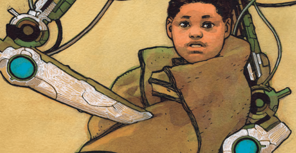
All alone in the void of space, every adult is dead, how are the children supposed to survive? Find out in Sentient from TKO Presents.

Jeff Lemire brings his signature elements of horrifying despair to a new publisher that sells directly to consumers. Sentient explores the terror of being cut off from everyone with no way to communicate for help. Not only that, but factor in that the only surviving crew members are children and you’re flirting with a Lord of the Flies situation.

Gabriel Walta is the award winning artist from The Vision returning to science fiction to illustrate this harrowing tale of children immediately forced to grow up. So much work goes into science fiction especially when there’s spaceships and technology involved. What gets overlooked because it is not the focus of the panel are all the stars, wires, and other components in the background that are so important for making the setting feel as real as possible for something that almost none of us will ever experience.

Walta does a fantastic job of using a dark color palette that realistically portrays the artificial light you’d encounter while exploring the darkness of space. Weeks and maybe even years away from the closest light source a ship out in space would be like the darkest of alleys and brighter in places like the cockpit.

Sentient feels like it could be a part of the ALIEN universe with the lack of communication with the outside world and fear of the unknown. If this was an ALIEN movie the A.I. would’ve found a “hidden” planet that looks like a good place to make a home, but after landing, all the children would get their own facehuggers to take home. Valarie would then care for the xenomorphs and escort them to the new colony.

This is an over-sized book so Steve Wands gets more room to work as the letterer. His work is very easy to read, even when voicing Val with blue on blue, it doesn’t strain the eyes at all. It’s something I never really noticed before, but it adds so much to the book when you can make a word actually look like it’s producing the sound without having to read it.

When all the adults are dead, who is there for the children? Val, the A.I. of a spaceship, has the responsibility of raising a group of orphans. Will the children obey something without a physical presence? Will children respect what is essentially just a voice? What if you were never able to look into the eyes of the person who raised you? How would that shape the person you become?

Sentient raises quite a few questions for me when considering if this really took place. It is a compelling story that will leave you thinking about it for days after you’ve read it. TKO Presents found a fantastic Lemire story to be apart of their second wave of releases.

TKO Presents does something different and hopefully something that will take off in the industry. With comic books, I think many people in the industry will agree that Diamond is the biggest headache. They don’t seem to care about the product they sell as some of the books we receive look like they were dragged across the concrete, and others that are just completely bent in half and thrown into boxes with reckless abandon.

TKO takes Diamond’s terrible work ethic and performance out of the equation. Diamond needs a wake up call and I think publishers selling directly to consumers is the easiest way to give Diamond a reason to finally care about their quality of work.

I also hope TKO succeeds in such a way that other publishers follow their lead. I would be a very happy boy if a slew of Diamond employees had to find new jobs where work ethic matters. They would more lost than the children in Sentient.

Sentient is a story about survival at all costs and the sacrifices we have to make to ensure that happens. How different of a person would you be if you had to skip being a carefree teenager? What if you were suddenly the oldest person around at 10 years old? I’m 31 and taking care of children frightens me, to imagine it even as young as 18 sends shivers down my spine.

What did you think of Sentient? What do you think of TKO Presents? Let us know in the comments below.

Monkeys Fighting Robots Youtube

Review: the Sins of the Father & the Son in BATMAN #84

Batman #84

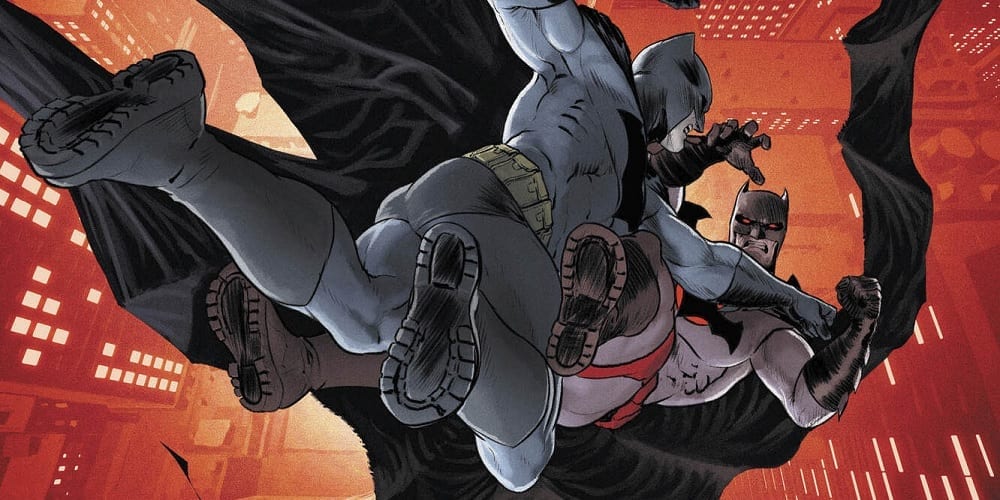
Thomas Wayne has masterminded all the misfortunes and tragedies to befall his son over the last three-and-a-half years of Batman comics. What, precisely, was his motivation, though? Was it all, as he claims in Batman #84, out this week from DC Comics, to try and save Bruce? Was he attempting to spare his son the misery and loneliness he knows? Or was there something else driving his mission?

Batman #84

The Writing

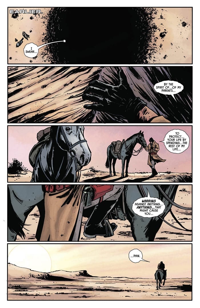
Most of the issue is, in effect, merely a recap of the events that led Thomas Wayne to this point. Batman #84 begins with him crawling out of the pit after defeating Bruce back in Batman #73. As he does, he utters an inverse, parodic version of Bruce’s own now-famous vow.

From there, we move scene by scene, all the way back to Bruce’s childhood. In the process, we watch as Thomas endures tragedy after tragedy. Bruce, Alfred, Selina, Martha…one before another, he loses them. True, this issue slices through the tension of the book’s climax to provide exposition. However, it’s a welcome interjection, given the context it provides.

Batman #84 is a dissection of how Thomas became the twisted and vengeful crime fighter he is now. More precisely, though, it’s about why he takes the actions he does. When he asks whether it’s possible “to be happy and be Batman,” the answer he unequivocally finds is “no.” To him, the Batman’s war on crime brings only pain and suffering. Hence, why he’s made it his mission to stop Bruce from being Batman at any cost. We’re left to question, though, his true motivations behind that seemingly-altruistic sentiment.

Thomas claims he’s only trying to protect Bruce. He wants his son to avoid his own fate; as he puts it, “Take off the mask. Marry the girl. Settle into a life of warmth and peace.” In effect, though, it could be as much about control as it is about genuine concern. Thomas’s pain at learning what his son becomes is too much for him, and so he sets out to stop Bruce from becoming Batman for his own sake, not for Bruce’s.

Based on what we see in Batman #84, one could argue that it wasn’t being Batman that brought Thomas Wayne misery; he was already consumed by misery long before he donned the cape and cowl. Thomas Wayne’s experience of being Batman is pain and unhappiness, and so he believes that to be Batman is pain and unhappiness. Bruce presents the antithesis: that one can be Batman and still find happiness despite the trauma and pain that it entails.

Batman #84

The Artwork

The artwork by Jorge Fornes is nice and stylish. Although the book is, in essence, a clip show that traverses an expansive number of locations and settings, the artwork manages to maintain a sense of tonal consistency.

There’s plenty of dynamism in how Fornes frames the figures in Batman #84. We have close-ups honed on the characters’ faces, interspersed with wide, dramatic shots that feel pulled right from the pages of a dark western book. All throughout, though, the images rely on that theme of repetition that’s been a hallmark of the book over these last 84 issues, which keeps things cohesive.

The line work is bold and thick, yet not overbearing. Despite the heavier lines, the inks in Batman #84 still retain a sense of crispness, which compliments the skill of the artists. We see it especially in the intense detailing in the backgrounds, which really ground the reader in the world of the book.

The colors by artist Jordie Bellaire are similarly impressive. Despite crossing numerous palettes for the different moments in the book, the work retains a consistently shadowy, moody feel. This serves to highlight the dark tone of the tragedy unfolding on the page.

Batman #84

Final Thoughts

One could see Batman #84 being a controversial choice for the penultimate issue of a long-running story. That said, the book very effectively frames the underlying theme of writer Tom King’s run. It has a cinematic flair to it, and it’s great stuff, overall.

Monkeys Fighting Robots Youtube

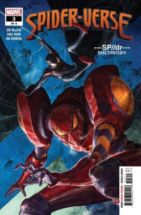
Return To The Spider-Verse In Marvel Comics’ SPIDER-VERSE #3 (Exclusive Preview)

marvel comics spider-verse #3 exclusive preview

Spider-Verse #3 hits your local comic book store December 11th, but thanks to Marvel Comics, Monkeys Fighting Robots has an exclusive three-page preview for you.

About the issue:
Peni Parker, A.K.A. SP//dr is back! The corruption of the Spider-Verse has reached Earth-14512 and Peni is in deep trouble. Can Miles Morales help Peni defeat an all-new villainous incarnation?!

Spider-Verse #3 is by writer Jed MacKay and artist Dike Ruan, with colors by Ian Herring and letters by Joe Sabino. The cover is by Dave Rapoza.

The issue #3 preview below brings Peni Parker into the mix, one of the featured Spider-People from the Spider-Man: Into the Spider-Verse animated film, along with her robotic SP//dr suit.

MFR critic Ben Snyder calls Spider-Verseessential,” further stating “fans of anything Spider-Man or Verse related will surely not be disappointed.”

Check out the Spider-Verse #3 preview below:


Are you reading Marvel Comics’ Spider-Verse series? Sound off in the comments!

Monkeys Fighting Robots Youtube

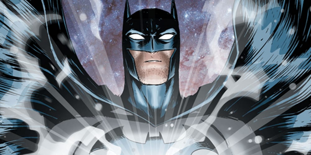
BATMAN UNIVERSE #6 Concludes The Series In A Grand Manner

Brian Michael Bendis’ first solo outing of The Dark Knight, Batman Universe comes to its dramatic close with colorful fights, a universe without Batman, and an iconic homage in this Wednesday’s Batman Universe #6!

Interior art by artist Nick Derington, colorist Dave Stewart, letterer ALW’s Troy Peteri

Batman Universe #6 was originally published in Batman Giant #13 and #14 exclusive to Walmart. Check out our review of the first issue to see if Batman Universe is a tale you’d like in your universe!

Before going into the details of Batman Universe #6’s story, let’s mention something about the last five issues. As a long time fan of Batman who has read a multitude of Bat-centric stories, the last five issues of Batman Universe have been part of one of the best Batman stories in recent years. That statement out of the way, Batman Universe #6 continues this greatness, ending what may be one of the greatest Batman mini-series of all time. Let’s get into why issue six is so great.

Story

Batman Universe #6 accomplices what every good ending should—it wraps up all loose ends in a satisfying manner. No thread feels unspooled, no door left open, but most importantly, Bendis doesn’t leave the story open for a sequel. Granted, a sequel could happen, but Batman Universe #6 isn’t written to bait for one. Instead, Bendis makes the mini-series a self-contained one and done story. This format works out for the best, especially for someone just wanting to read one story.

There are a few cases where Bendis’ knack of heavy word usage (dubbed “Bendis Speak”) shines through and bogs down the gorgeous art. But, this heavy word usage comes with the writer’s territory, especially when it comes to detective stories. Bendis does use the dense wording to his advantage in the credit page, as the page has a nine bubbled dialogue from Batman.

At first, that amount of dialogue bubbles on one page may scare you, but Bendis and artist Nick Derington use this moment to great effect. Derington uses a single page with the credits adorned on the top while Bendis has Batman recite the last five issues as a recap page for readers. This is due to Batman recording his adventure thus for into his armor’s recording device. When starting said recap page, I thought to myself, “great a long-winded Bendis Speak,” but once the dialogue finished I knew It was worth writing about, due to how smart of a page it was.

Interior art by artist Nick Derington, colorist Dave Stewart, letterer ALW’s Troy Peteri

Art

The duo of Derington on art and Dave Stewart’s colors for Batman Universe may be the Batman dream team of the years. Derington’s lines are simple, easy to follow, yet elegant in its execution. Each panel complements each other, while the double-page spreads are used to their max potential with the Green Lantern Battle, and a trip through time being immensely awesome. The scope seen during the Green Lantern (GL) vs. Vandal Savage is huge, with multiple GL’s flying around fighting Savage and scuba gear, jetpack ninjas.

During the latter of the issue, Savage and Batman ensue in epic fisticuffs that transports them through various defining moments of the DC Universe. During the two page spread, Derington gives each moment its own panel as the duo can be seen in the background. But, Derington’s beauty doesn’t stop at just double pages, as he makes even the simplest moment look gorgeous in its presentation. Derington’s art is amplified by the flamboyant colors Stewart brings to issue six.

Stewart keeps Batman a few shades darker than all the environments and characters surrounding him to help build a great contrasting color scheme while making him stand out. That is until Batman is in the White Lantern suit that’s damn near blinding. Stewart mixes in a fair amount of bright-colored pages that never seem too bright. Instead, these images brightness comes from the shades of colors Stewart uses that greatly complement the manner Batman is colored.

The abundance of dialogue seen throughout Batman Universe #6 is immense. Luckily, ALW’s Troy Peteri’s lettering helps a great deal in the bubble dense areas but doesn’t save it in the smaller panels. This isn’t due to Peteri’s lettering, as he had the hard job of fitting in a multitude of words into small panels. When there’s breathing room on the page/panel, Peteri’s lettering is excellent with his ability to make the art visible while still guiding the reader’s eyes.

Interior art by artist Nick Derington, colorist Dave Stewart, letterer ALW’s Troy Peteri

A Huge Batman Universe Out There

The creative team of Batman Universe is a reader’s dream for a Batman mini-series. Aside from some heavy dialogue cluttering the gorgeous art, Batman Universe is a must-read for any fan of Batman, or soon to be fan.

Memorable Quote: “I’m Batman.” – Batman

I mean, it doesn’t get much more memorable than that! Plus, the art portrayed on this page is gorgeous, and I hope they release it as a poster.

Dear Reader

The first few issues of Batman Universe had me thinking that it’ll end up being one of my favorite Batman mini-series. After the release of the final issue, I can say, “yes, it is.” But we’d love to hear from you. Let us know what you think below!

Monkeys Fighting Robots Youtube

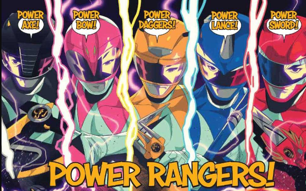
MIGHTY MORPHIN’ POWER RANGERS/TEENAGE MUTANT NINJA TURTLES #1 – Long Name, Huge Crossover

The youth of the 90s will rejoice this Wednesday, as two of the most beloved franchises meet for the first time in comics history from BOOM! Studios (in partnership with IDW and Nickelodeon) in Mighty Morphin’ Power Rangers/Teenage Mutant Ninja Turtles #1!

Cowabunga, that’s a long title! Since Mighty Morphin’ Power Rangers/Teenage Mutant Ninja Turtles #1 is a mouth full, we’ll shorten it to MMPR/TMNT #1.

Interior art by Artist Simone Di Meo, Colorist Walter Baiamonte and Igor Monti, Letterer Ed Dukeshir

A Shelltastic Story

We’ve seen the Mighty Morphin’ Power Rangers team-up with the Justice League, and the Teenage Mutant Ninja Turtles team-up with Batman, and the GhostBusters, so the logical next step is the Mighty Morphin’ Power Rangers teaming up with the Teenage Mutant Ninja Turtles! It’s crazy, you never truly understand how long of a name both those teams have until you type them out multiple times in the same sentence! Long names aside MMPR/TMNT #1’s premise isn’t overly complicated but works well for getting the two teams to meet up.

Green Power Ranger, Tommy Oliver, joins the Foot Clan for unknown reasons, this brings him face-to-face with the TMNTs. Once Tommy activates his Morpher, the other Rangers can locate their long lost partner and go to investigate. Once there, the inevitable clash of the heroic teams occurs in grand fashion. You know, the usual miscommunication between two hero teams leads to a huge fight that ends when said teams realize if they had asked questions first, they would’ve noticed they were on the same side. The way comic characters usually meet each other.

Writer Ryan Parrott has worked on Power Ranger comics before, and it shows in MMPR/TMNT #1. Parrott portrays the characters perfectly with no personality acting out of place, with this skill carrying over to the Turtles as well. This doesn’t mean readers who’ve never read or watched the shows before won’t enjoy MMPR/TMNT #1. Instead of jumping right into the inevitable meet-up, Parrott spends the beginning pages setting up said meeting, while introducing readers to the teams’ personalities, and world.

Interior art by Artist Simone Di Meo, Colorist Walter Baiamonte and Igor Monti, Letterer Ed Dukeshire

Mighty Morphin’ Art

Both the Rangers and Turtles are known for their bombastic fighting, MMPR/TMNT #1 encapsulates this liveliness near perfectly. Due to the energy artist Simone Di Meo brings to the drawing table. Di Meo draws each character with chaotic fluidity that looks near identical to their television counterparts. This rings true during the double-page spread when each team square up and shout their team motto. Di Meo is able to showcase the Rangers and Turtles on this page mid-jump with such ferocity that they nearly jump off the page.

The fluidity isn’t just limited to the action, as during the somber moments Di Meo adds in varying panels that help keep the pace fast and engaging. These moments are aided by the vibrant colors of Walter Baiamonte and Igor Monti. The duo’s colors breath life into the world and characters with energetic, bright colors that mirror the television shows. These lively colors are gorgeous and match the tone of MMPR/TMNT #1; they do become a problem at one point. During a few fights, especially the opening fight, the bright colors are too bright.

During the fight between the Power Rangers and Apocalyptopus, the deadly villain feels a few shades too bright, which ends up becoming a strain on the viewer’s eyes. Proceeding this, each Ranger use their “Power” move which clutters the page with a multitude of colors, that like Apocalyptopus feels like too much at once. Understandably the Power Rangers “Power” move should be bright and flashy, but here it’s just too much going on.

Another aspect in MMPR/TMNT #1 that mirrors their television counterparts is Ed Dukeshire lettering. At times Dukeshire changes the font to a bold colored text, shouting what the characters are saying, much like they would on their shows. This occurs when a team yells their motto or when announcing their attacks. This sort of lettering change makes a huge difference in how each moment is read, making the issue that much more fun.

Interior art by Artist Simone Di Meo, Colorist Walter Baiamonte and Igor Monti, Letterer Ed Dukeshir

Mighty Morphin’ Power Rangers/Teenage Mutant Ninja Turtles Conclusion

MMPR/TMNT #1 is an excellent start to a crossover that surprisingly has never happened in the comic book medium. Newcomers and long-time fans of both franchises will go head over shell for MMPR/TMNT #1.

Memorable Quote: “The green dude, how does he play a flute through a metal faceplate?” – Donatello

I’ve asked myself that many times, Donatello!

Side Note: I love the villain name, Apocalyptopus! I mean, that maybe one of the best names of the year!

Dear Reader in a Half Shelf

If you want to learn more about MMPR/TMNT check out BOOM! Studios press release, or keep tuned in the future months to us for more reviews!

Monkeys Fighting Robots Youtube

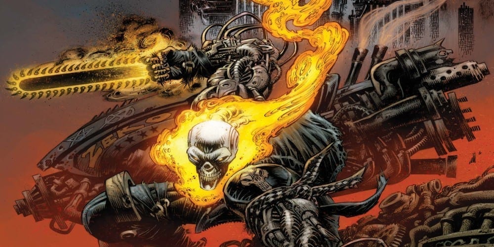
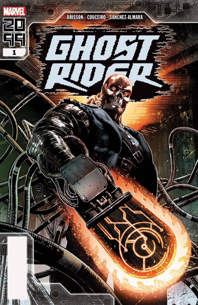
Review: GHOST RIDER 2099 #1 Stalls On The First Ride

Ghost Rider 2099

The future is here with Ghost Rider 2099 #1 from Ed Brisson, Damien Couceiro, Dono Sanchez-Almara, and VC’s Joe Carmagna. Does this new spirit of vengeance take the reader on a wild ride or does it find a way to break down at the start?

Summary

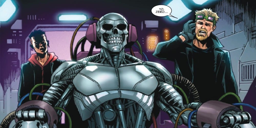
SPIRIT OF VENGEANCE OVERDRIVE! It’s the city that never stops! Welcome to Transverse City, where everything’s for sale—if you’re fast enough to take it! Kenshiro “Zero” Cochrane was just your average keyboard cowboy until he shocked with the wrong people and got murdered—life’s a glitch, ain’t it? Now, with a second chance from a higher power and an advanced weaponized automaton, Zero will punish those who have spilled innocent blood!

Ghost Rider 2099

Writing

The biggest fault of this issue is it seems to bite off more than it can chew in just the first issue. Writer Ed Brisson establishes the origins of the new Ghost Rider, has him find out who betrayed him, and make a big leap towards taking his revenge all in a single issue. It all happens so fast, there is very little time to stop and appreciate what is happening.

Further evidence of showing this issue trying too hard comes from the introduction of Kylie, Zero’s girlfriend. When a gang comes and incapacitates Ghost Rider, Kylie ends up dispatching the introducers without breaking a sweat. It’s kind of hard to rally behind how epic a hero is when his superpowerless significant other has to step up to save them on their very first outing.

Ghost Rider 2099

Artwork

The art by Damien Couceiro definitely helps to cement the idea this issue takes place in the future. Everything has a high tech feel to it but at the same time the little details of graffiti and filthy scatters about helps to seal the look of a cyberpunk future. There also is a great difference in style between the real world and what Zero experiences when he enters the cybernetic interface to show just the difference between the two settings

The colorwork by Dono Sanchez-Almara helps to add to the technological atmosphere present through the issue. Thanks to proper coloring, the technology looks more futuristic and the mystical elements surrounding Ghost Rider look unnature. It is the ideal mixture to showcase with a comic featuring a possessed cyborg.

Ghost Rider

The lettering by VC’s Joe Carmanga isn’t as up to its usual standard of excellence. Here, the lettering actually becomes distracting and doesn’t help with the story. In once scene, the lettering is even used for censoring violence. It’s an instance where the lettering is more a distraction than aiding in the flow of the story.

Conclusion

Ghost Rider 2099 #1 can basically be summoned up as “meh” which is a crime in itself. A series featuring a haunted cyborg wielding a flaming chainsaw should be the epidemy of epic. The very essences of the future Marvel 2099 are built around cyberpunk elements this issue touches on. Sadly at the end of the day, the issue is just not a fun ride.

Monkeys Fighting Robots Youtube

Review: MARAUDERS #3 Is Devilishly Devious

Marauders #3
Marauders #3 Credit: Marvel Comics

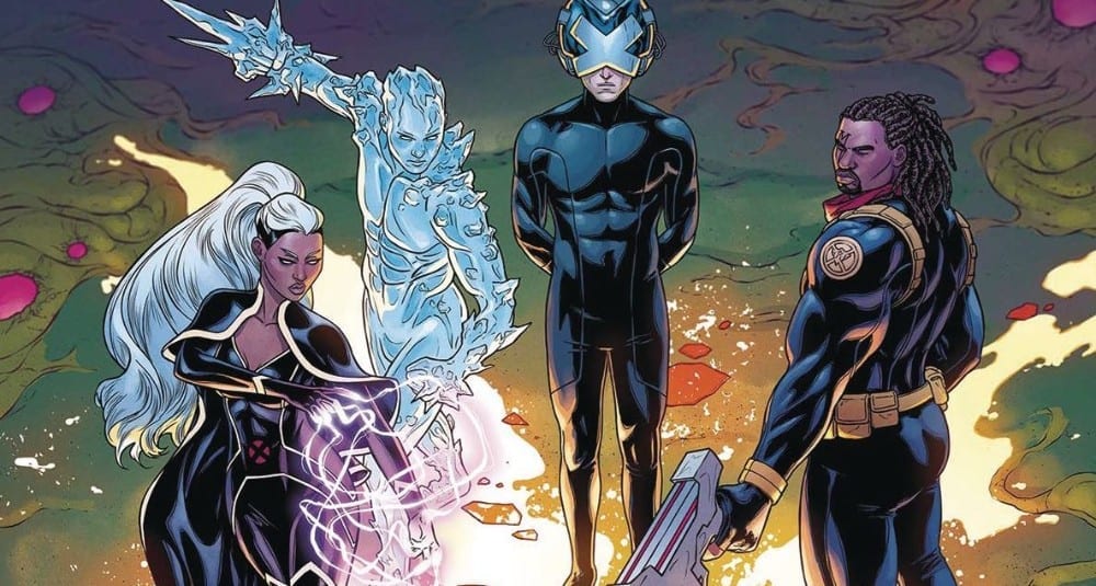
Continuing the World building in the new Dawn of X event from Marvel Comics, Marauders #3 examines one of it’s central cast and lays the groundwork for future confrontation.

The Red Queen has taken her throne and all is well within the Hellfire Trading Company. Or is it? What secret plans did Sebastian Shaw have for the company and, more importantly, the Red seat? In this new world of redemption and second chances, can Shaw find peace with his newly resurrected son? 

If you think he can, then you don’t know Shaw very well at all.

Marauders #3 Art
Marauders #3 Credit: Marvel Comics

Writing the Villains

The new X-Men world is built like a fantasy series with castles and ‘houses’, Ladies and Lords ruling over every aspect of Krakoan life. Like any popular fantasy world, take for example Game of Thrones, there are obvious heroes, obvious villains, and those who dwell in the grey areas. Luckily for Gerry Duggan, he has plenty of both in his cast.

This issue of Marauders is about setting up the villains in the Hellfire Trading Company and, of course, it isn’t difficult to guess who that is going to be: Sebastian Shaw. Duggan, however, refuses to let it be so clear cut and within these pages he invites you to get to know the scheming man and his lofty aspirations.

Duggan hops back in time and shows what was happening elsewhere as Emma Frost was setting up Katy Pryde as the Red Queen. This storytelling approach is a favourite of Jonathan Hickman so it’s not surprising to see other writers in the mix adopting it. It is a technique that works well, especially as Duggan is clearly sowing the seeds of future destruction. By the end of this issue, the reader has seen the two faces of the Hellfire Trading Company, and can see the trouble just over the horizon.

Marauders #3
Marauders #3 Credit: Marvel Comics

The Art of Pantomime

Within the art there is a lot of flamboyance and posturing. Sebastian Shaw is a larger than life, Sunday afternoon movie villain and suits the Pirate mantle perfectly. Penciler Michele Bandini understands this and gives the character a real sense of presence on the page. If he isn’t dominating the scene, then the layouts revolve around him. 

Strong, heavy black lines have been inked over the pencils for the characters but a more delicate approach has been taken with the backgrounds. This makes the characters stand out, increasing their presence. Elisabetta D’Amico’s inks are designed to bring out the cast and create a theatrical environment. 

The garish colors from Federico Blee is the final ingredient needed to complete the pantomime that is Shaw’s story so far. He plays the villain so majestically, so obviously, and the creative team pick this out, exaggerating his actions, playing to his strengths.

Cory Petit has the hardest role in the creative team, trying to make the lettering match the theatrical style of the art. The speeches are broken down into numerous word balloons and then placed across the pages like a string of lights down a high-street. The short bursts of speech reflects the pantomime aspect of the narrative by producing a conversational tone. There is a playful back and forth between the cast giving the entire comic a lighter atmosphere than some of the other X-Men titles.

However, there is still a darkness brewing below the surface, one that each of the creative team hint at in their own way. 

Marauders #3 Cover
Marauders #3 Credit: Marvel Comics

Conclusion

Duggan and Co. are having enormous fun with these characters, creating a larger than life cast of entertainers. That sense of enjoyment is passed onto the reader making this a thoroughly satisfying read, especially in the midst of the other, more serious, X-Men comics currently on the shelf.

As this is part of something greater, the whole Dawn of X shenanigans, it does feel at times like there is more going on than what you are reading. However, this doesn’t hinder the narrative, or the enjoyment, of Marauders. So far, each issue has been both a singular read and a part of a larger adventure. You can read them in isolation or within the bigger frame work of the Marauders, or even the Dawn of X itself.

Monkeys Fighting Robots Youtube