Home Blog Page 378

MIGHTY MORPHIN’ POWER RANGERS/TEENAGE MUTANT NINJA TURTLES #1 – Long Name, Huge Crossover

The youth of the 90s will rejoice this Wednesday, as two of the most beloved franchises meet for the first time in comics history from BOOM! Studios (in partnership with IDW and Nickelodeon) in Mighty Morphin’ Power Rangers/Teenage Mutant Ninja Turtles #1!

Cowabunga, that’s a long title! Since Mighty Morphin’ Power Rangers/Teenage Mutant Ninja Turtles #1 is a mouth full, we’ll shorten it to MMPR/TMNT #1.

Interior art by Artist Simone Di Meo, Colorist Walter Baiamonte and Igor Monti, Letterer Ed Dukeshir

A Shelltastic Story

We’ve seen the Mighty Morphin’ Power Rangers team-up with the Justice League, and the Teenage Mutant Ninja Turtles team-up with Batman, and the GhostBusters, so the logical next step is the Mighty Morphin’ Power Rangers teaming up with the Teenage Mutant Ninja Turtles! It’s crazy, you never truly understand how long of a name both those teams have until you type them out multiple times in the same sentence! Long names aside MMPR/TMNT #1’s premise isn’t overly complicated but works well for getting the two teams to meet up.

Green Power Ranger, Tommy Oliver, joins the Foot Clan for unknown reasons, this brings him face-to-face with the TMNTs. Once Tommy activates his Morpher, the other Rangers can locate their long lost partner and go to investigate. Once there, the inevitable clash of the heroic teams occurs in grand fashion. You know, the usual miscommunication between two hero teams leads to a huge fight that ends when said teams realize if they had asked questions first, they would’ve noticed they were on the same side. The way comic characters usually meet each other.

Writer Ryan Parrott has worked on Power Ranger comics before, and it shows in MMPR/TMNT #1. Parrott portrays the characters perfectly with no personality acting out of place, with this skill carrying over to the Turtles as well. This doesn’t mean readers who’ve never read or watched the shows before won’t enjoy MMPR/TMNT #1. Instead of jumping right into the inevitable meet-up, Parrott spends the beginning pages setting up said meeting, while introducing readers to the teams’ personalities, and world.

Interior art by Artist Simone Di Meo, Colorist Walter Baiamonte and Igor Monti, Letterer Ed Dukeshire

Mighty Morphin’ Art

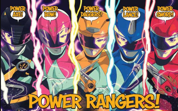
Both the Rangers and Turtles are known for their bombastic fighting, MMPR/TMNT #1 encapsulates this liveliness near perfectly. Due to the energy artist Simone Di Meo brings to the drawing table. Di Meo draws each character with chaotic fluidity that looks near identical to their television counterparts. This rings true during the double-page spread when each team square up and shout their team motto. Di Meo is able to showcase the Rangers and Turtles on this page mid-jump with such ferocity that they nearly jump off the page.

The fluidity isn’t just limited to the action, as during the somber moments Di Meo adds in varying panels that help keep the pace fast and engaging. These moments are aided by the vibrant colors of Walter Baiamonte and Igor Monti. The duo’s colors breath life into the world and characters with energetic, bright colors that mirror the television shows. These lively colors are gorgeous and match the tone of MMPR/TMNT #1; they do become a problem at one point. During a few fights, especially the opening fight, the bright colors are too bright.

During the fight between the Power Rangers and Apocalyptopus, the deadly villain feels a few shades too bright, which ends up becoming a strain on the viewer’s eyes. Proceeding this, each Ranger use their “Power” move which clutters the page with a multitude of colors, that like Apocalyptopus feels like too much at once. Understandably the Power Rangers “Power” move should be bright and flashy, but here it’s just too much going on.

Another aspect in MMPR/TMNT #1 that mirrors their television counterparts is Ed Dukeshire lettering. At times Dukeshire changes the font to a bold colored text, shouting what the characters are saying, much like they would on their shows. This occurs when a team yells their motto or when announcing their attacks. This sort of lettering change makes a huge difference in how each moment is read, making the issue that much more fun.

Interior art by Artist Simone Di Meo, Colorist Walter Baiamonte and Igor Monti, Letterer Ed Dukeshir

Mighty Morphin’ Power Rangers/Teenage Mutant Ninja Turtles Conclusion

MMPR/TMNT #1 is an excellent start to a crossover that surprisingly has never happened in the comic book medium. Newcomers and long-time fans of both franchises will go head over shell for MMPR/TMNT #1.

Memorable Quote: “The green dude, how does he play a flute through a metal faceplate?” – Donatello

I’ve asked myself that many times, Donatello!

Side Note: I love the villain name, Apocalyptopus! I mean, that maybe one of the best names of the year!

Dear Reader in a Half Shelf

If you want to learn more about MMPR/TMNT check out BOOM! Studios press release, or keep tuned in the future months to us for more reviews!

Monkeys Fighting Robots Youtube

Review: GHOST RIDER 2099 #1 Stalls On The First Ride

Ghost Rider 2099

The future is here with Ghost Rider 2099 #1 from Ed Brisson, Damien Couceiro, Dono Sanchez-Almara, and VC’s Joe Carmagna. Does this new spirit of vengeance take the reader on a wild ride or does it find a way to break down at the start?

Summary

SPIRIT OF VENGEANCE OVERDRIVE! It’s the city that never stops! Welcome to Transverse City, where everything’s for sale—if you’re fast enough to take it! Kenshiro “Zero” Cochrane was just your average keyboard cowboy until he shocked with the wrong people and got murdered—life’s a glitch, ain’t it? Now, with a second chance from a higher power and an advanced weaponized automaton, Zero will punish those who have spilled innocent blood!

Ghost Rider 2099

Writing

The biggest fault of this issue is it seems to bite off more than it can chew in just the first issue. Writer Ed Brisson establishes the origins of the new Ghost Rider, has him find out who betrayed him, and make a big leap towards taking his revenge all in a single issue. It all happens so fast, there is very little time to stop and appreciate what is happening.

Further evidence of showing this issue trying too hard comes from the introduction of Kylie, Zero’s girlfriend. When a gang comes and incapacitates Ghost Rider, Kylie ends up dispatching the introducers without breaking a sweat. It’s kind of hard to rally behind how epic a hero is when his superpowerless significant other has to step up to save them on their very first outing.

Ghost Rider 2099

Artwork

The art by Damien Couceiro definitely helps to cement the idea this issue takes place in the future. Everything has a high tech feel to it but at the same time the little details of graffiti and filthy scatters about helps to seal the look of a cyberpunk future. There also is a great difference in style between the real world and what Zero experiences when he enters the cybernetic interface to show just the difference between the two settings

The colorwork by Dono Sanchez-Almara helps to add to the technological atmosphere present through the issue. Thanks to proper coloring, the technology looks more futuristic and the mystical elements surrounding Ghost Rider look unnature. It is the ideal mixture to showcase with a comic featuring a possessed cyborg.

Ghost Rider

The lettering by VC’s Joe Carmanga isn’t as up to its usual standard of excellence. Here, the lettering actually becomes distracting and doesn’t help with the story. In once scene, the lettering is even used for censoring violence. It’s an instance where the lettering is more a distraction than aiding in the flow of the story.

Conclusion

Ghost Rider 2099 #1 can basically be summoned up as “meh” which is a crime in itself. A series featuring a haunted cyborg wielding a flaming chainsaw should be the epidemy of epic. The very essences of the future Marvel 2099 are built around cyberpunk elements this issue touches on. Sadly at the end of the day, the issue is just not a fun ride.

Monkeys Fighting Robots Youtube

Review: MARAUDERS #3 Is Devilishly Devious

Marauders #3
Marauders #3 Credit: Marvel Comics

Continuing the World building in the new Dawn of X event from Marvel Comics, Marauders #3 examines one of it’s central cast and lays the groundwork for future confrontation.

The Red Queen has taken her throne and all is well within the Hellfire Trading Company. Or is it? What secret plans did Sebastian Shaw have for the company and, more importantly, the Red seat? In this new world of redemption and second chances, can Shaw find peace with his newly resurrected son? 

If you think he can, then you don’t know Shaw very well at all.

Marauders #3 Art
Marauders #3 Credit: Marvel Comics

Writing the Villains

The new X-Men world is built like a fantasy series with castles and ‘houses’, Ladies and Lords ruling over every aspect of Krakoan life. Like any popular fantasy world, take for example Game of Thrones, there are obvious heroes, obvious villains, and those who dwell in the grey areas. Luckily for Gerry Duggan, he has plenty of both in his cast.

This issue of Marauders is about setting up the villains in the Hellfire Trading Company and, of course, it isn’t difficult to guess who that is going to be: Sebastian Shaw. Duggan, however, refuses to let it be so clear cut and within these pages he invites you to get to know the scheming man and his lofty aspirations.

Duggan hops back in time and shows what was happening elsewhere as Emma Frost was setting up Katy Pryde as the Red Queen. This storytelling approach is a favourite of Jonathan Hickman so it’s not surprising to see other writers in the mix adopting it. It is a technique that works well, especially as Duggan is clearly sowing the seeds of future destruction. By the end of this issue, the reader has seen the two faces of the Hellfire Trading Company, and can see the trouble just over the horizon.

Marauders #3
Marauders #3 Credit: Marvel Comics

The Art of Pantomime

Within the art there is a lot of flamboyance and posturing. Sebastian Shaw is a larger than life, Sunday afternoon movie villain and suits the Pirate mantle perfectly. Penciler Michele Bandini understands this and gives the character a real sense of presence on the page. If he isn’t dominating the scene, then the layouts revolve around him. 

Strong, heavy black lines have been inked over the pencils for the characters but a more delicate approach has been taken with the backgrounds. This makes the characters stand out, increasing their presence. Elisabetta D’Amico’s inks are designed to bring out the cast and create a theatrical environment. 

The garish colors from Federico Blee is the final ingredient needed to complete the pantomime that is Shaw’s story so far. He plays the villain so majestically, so obviously, and the creative team pick this out, exaggerating his actions, playing to his strengths.

Cory Petit has the hardest role in the creative team, trying to make the lettering match the theatrical style of the art. The speeches are broken down into numerous word balloons and then placed across the pages like a string of lights down a high-street. The short bursts of speech reflects the pantomime aspect of the narrative by producing a conversational tone. There is a playful back and forth between the cast giving the entire comic a lighter atmosphere than some of the other X-Men titles.

However, there is still a darkness brewing below the surface, one that each of the creative team hint at in their own way. 

Marauders #3 Cover
Marauders #3 Credit: Marvel Comics

Conclusion

Duggan and Co. are having enormous fun with these characters, creating a larger than life cast of entertainers. That sense of enjoyment is passed onto the reader making this a thoroughly satisfying read, especially in the midst of the other, more serious, X-Men comics currently on the shelf.

As this is part of something greater, the whole Dawn of X shenanigans, it does feel at times like there is more going on than what you are reading. However, this doesn’t hinder the narrative, or the enjoyment, of Marauders. So far, each issue has been both a singular read and a part of a larger adventure. You can read them in isolation or within the bigger frame work of the Marauders, or even the Dawn of X itself.

Monkeys Fighting Robots Youtube

Review: The Tides of War are Turning in RED SONJA #11

Red Sonja #11

It’s true: Dragan may have taken Hyrkania. However, Sonja and her remaining band of allies have one last, desperate trick up their sleeve in Red Sonja #11, out this week from Dynamite Entertainment.

Hyrkania is a vast grasslands separated from the rest of the Zamoran Empire by the Vilayet Sea. The only safe passage for Dragan’s forces: a single bridge, which is now under control of Sonja’s forces. This issue sets up a climactic showdown between the emperor and the rebel queen to close out the second arc of writer Mark Russel’s story.

Red Sonja #11

The Writing

Russell continues to weave a complex and very dynamic narrative here. The storytelling in Red Sonja #11 clearly foreshadows several coming reversals of fate for our protagonist, as well as for Dragan. Both lay plans, but we readers see factors that threaten to undermine them.

The issue offers plenty of intrigue, but in terms of action, it primarily follows the characters planning and strategizing. It feels like this issue is setting up several major turns as the story culminates in our next issue. As a result, this book is not quite as engaging in isolation as previous chapters. This is natural in sequential storytelling, as some issues will need to serve primarily to setup subsequent events.

Another minor sticking point, though, is there are a number of typos sprinkled throughout the book. For instance, Prince Cyril refers to the Vilayet Sea as the “Vilayet Se,” while Sonja at one point describes gears that “can only greased” rather than ones that “can only be greased.” While it’s not a major problem, it does suggest a lack of attention to detail.

Overall, the writing in Red Sonja #11 is good, but not a high point for the series. One of Russell’s greatest strengths is generally how he balances story elements. He’s very skilled and weaving humor and drama, and action and exposition, with no resulting tonal clash. We don’t get as much of that here; it can be forgiven, though, because it feel like this chapter sets up something great right around the corner.

Red Sonja #11Red Sonja #11

The Artwork

In the past, one observation I’ve made on multiple occasions is that artist Mirko Colak’s figures are not always particularly expressive. They can sometimes feel rather static and lifeless; here, though, we see much more notably-animated and expressive character designs, which helps deepen the immersion in the story.

Colak provides solid artwork overall for Red Sonja #11. In addition to the livelier figure illustrations, he still hits the story beats effectively, dividing pages into varied, yet clean and focused sequences. It’s a meat-and-potatoes approach, but it works well alongside the writing.

The only major sticking point is that, despite more nuance in the characters, the backgrounds throughout seem to fall off the priority list. We don’t see much interesting use of scenery; instead, we see characters tending to find themselves floating in voids, without any evident motivation based on the dramatic tone of the scene.

Colorist Dearbhla Kelly offers more of the soft, yet vibrant colors that have become a defining characteristic of the book’s aesthetic. While not overly adventurous in this issue, it will be exciting to see what she brings to the table with the climax of this arc.

Red Sonja #11

Final Thoughts

Red Sonja #11 is a respectable entry in Ruussell’s narrative. It’s not the most thrilling on its own, but it ratchets up the tension and sets up for what may a fantastic payoff in our next book.

Monkeys Fighting Robots Youtube

Review: 20XX #1 – Are You Down With The New Sickness?

There’s a new sickness going around, but it’s pretty cool if it doesn’t kill you. 20XX, out this week from Image Comics, touches on a realistic future that we should really work harder to avoid.

First up we have a newcomer to comics, Lauren Keely writing this story, and another first for Jonathan Luna working in black & white. Luna also handles the lettering, design, and helps Keely with the scripts.

If you’ve been paying any attention to the news you know how frightened the medical science community is getting about the overuse of antibiotics. Bacteria evolves just like any other organism except it happens faster for them. Antibiotics will eventually create “super bugs” that will be immune and resistant to the treatments medicine has come up with.

I highly doubt these “super bugs” will give anyone telekinetic powers, but we can hope. Most likely they will just kill us all and pave the way for a new dominant species on Earth. Here we get a fictionalized look at what we have to look forward to with adaptive super bacteria.

I was initially pretty bummed to see that the book is black & white after such a great cover, but after The Walking Dead‘s exit from store shelves, the industry needs another colorless ongoing to take over. While I love color in comics, this gives Luna more time with the characters and line-work detail. 20XX has all the elements to be the successor: a sickness, death, evil, a fight to survive, and a fight for more than survival. People need something to live for or what is the point of surviving?

There are so many of aspects of this story that will relate to readers everywhere. Everyone all over the globe has to deal with sickness and death. In some countries it has become much easier to deal with dire situations, but for others, and one in particular, it can be a death sentence of a different breed.

In that particular country, society as a whole outcasts the sick, diseased, and disabled, because those people need a little help and there’s no profit in helping people. The victims in 20XX are treated the same way: outcast, shunned, and forgotten. If you can’t make someone money they don’t care about you.

As soon as the main character catches the illness, we see immediately how serious it is and how frightened it makes people. Just before she falls ill, she is on her way to meet her boss for a promotion. After she survives and her sickness is explained to her, she calls her boss only to find out that promotion was given to someone else and her old job has been filled as well. She went from promoted to jobless in a matter of a few days, and unfortunately, this has become the reality for many people. Hopefully there haven’t been any situations exactly like this, but we put up with a system that punishes you for being human.

What she becomes after surviving the illness is something that is treated with contempt. It makes you different so obviously they are immediately treated like garbage. Many humans cannot wrap their minds around anything that is different, and many of them don’t even try to understand. Art can open our eyes and teach us countless lessons. 20XX is a story with humanity in mind, and hopefully it will give us some clues on how to save it.

Stories like this always end up being less about what is happening and more about how the characters handle the situations. This is about human nature, and what people resort to when they are mistreated and cast aside. In desperate times we resort to desperate measures. What would you do to survive?

What did you think of 20XX #1? Do you feel like this could be a successor to The Walking Dead? Let us know in the comments below.


Monkeys Fighting Robots Youtube

Review: DIE #10 – Devious Dictation; Dangerous Deception

Planning and plotting are the themes of the day as the dictator flexes her words in Die #10, out this week from Image Comics.

Back for another chapter from the world of Die is author Kieron Gillen, artist Stephanie Hans, and letterer Clayton Cowles. This is a gorgeous work of art in your hands; cherish it.

With Die #10 Gillen reminds us that this is still an RPG and there are rules for everything. The depths of this story leads me to believe that Gillen sat down and has played through this game several times with several people and has taken all the best ideas that every player has come up with. Gillen has created rules for this world and then figured out a way for each character to exploit those rules.

He also adds an essay at the end discussing the issue along with additions and tips for the Die RPG. Give your dungeon master some Die trades for Christmas and watch their creativity take off.

Hans is creating some incredible works of art for this book. The trades for Die could be easily mistaken for an art book. Her style works so well for fantasy and even better for such a dark fantasy as this. Fully painted and beautiful color shows the time and planning that goes into each issue. Hans changes up the style for the flashbacks so it’s always obvious when we are being shown past events.

Cowles’s work is very easy to read, and since this issue was mostly planning and setting up for the next phase, there was not much action, no huge battle scenes that would necessitate any large lettering to be done.

In this chapter we get a look at what Ash is planning, but we still don’t know how she plans to execute it. Plans don’t tend to workout so well in Die.

In previous issues we have seen some of the history from the other characters, but this is the dictator’s chapter. It would appear some kind of marking or glyph over the left eye is an attribute of dictators. In a battle of words their eyes glow and “spells” seam to spill out of them.

Gillen and Hans have created a real masterpiece. Any panel from any issue would be perfect in a frame to hang on the wall of any fantasy fan’s home. The depths that Gillen has gone to creating such an extensive and original world is inspiring. Even based on something that has been around for decades, he has created original characters with creative twists.

Die is the dark universe to Dungeons & Dragons. Every character has to deal with some terrible aspect of their powers that was not explained to them very well or at all. In that sense it’s like the original Jumanji with Robin Williams. Everything sounds good at first, but once you get into the fine print, you should probably start running.

This book just basks in the beauty of Hans’s work. Die deserves all the accolades and recognition. Not only is it a great story to read but you can get some friends together and play through your own version of it. There are not many other books that can say that.

After reading a reference to King Arthur in Die #10, I can’t help but wonder if some of his research for Die also spawned the creation of Once & Future. I am still fairly new to Gillen’s work, but it appears that history is always an important aspect of his stories. He was probably the kid listening to the teacher in history class and imagining what it would be like if Genghis Khan also had dragons.

If you love beautiful artwork, add this book to your pull list. If you love an amazing fantasy story, add this book to your pull list. If you like something fantastical that still pulls elements from history and literature, add this book to your pull list. If you’re stubborn you don’t have to, but it would be cooler if you did.

What did you think of Die #10? Have you tried playing the RPG yet? How cool is this artwork? Let us know in the comments below.

Monkeys Fighting Robots Youtube

I’d Buy That For A Dollar: EAGLE #1 (September 1986)

I'd Buy That For A Dollar

Welcome to ‘I’d Buy That For A Dollar’ a column where I will be exploring the weird and wonderful world of dollar bin diving. The only rule is each and every comic is purchased for one dollar (or less!).

This week’s book is Eagle #1 from Crystal Comics. The story is pretty awesome: Richard Eagle is a vigilante/ninja who is also kind of a private detective. Oh and he mystical/occult powers too. After his friend, another private eye named Colt (great name!) is murdered by a ninja cult, Eagle starts an investigation; and it all leads to Lord Kagami, a villainous demonic cult leader out to destroy Eagle.

Like I said, pretty good stuff. And the thing also looks cool as hell! So let’s jump right into the issue!

Eagle #1
Created by:  Neil D. Vokes and Rich Rankin
Script by: Jack Herman
Pencils by:  Neil D. Vokes
Inks by: Rich Rankin
Letters by: Gary FieldsEagle

Ok, that’s one cool looking cover. It has a huge manga vibe (that blue background with speed lines) and Richard Eagle also looks A LOT like Bruce Lee, which is also very cool. All in all, a cover that does grab your attention.

Eagle

This title page is awesome. I love all the shapes made by the layout; it even has a Will Eisner vibe. The poster on the wall being used for credits is a very cool touch. And the title, ‘Night of 1000 Ninjas’ is just pure 80s goodness. You have to be totally in at this point.

Eagle

This double-page spread is one of my favorite things in the book. Love the composition and the use of black with all those ninjas (the swords look awesome!). It’s actually an effective image because you totally feel how cornered Eagle is.

Eagle

I really dig this image. The splashing rain and lines give it a totally 80s manga feel.

Eagle

Another great full-page layout. This is from a mystical vision scene and it has a strong Doctor Strange Dikito era vibe. Those circles make for a great floating effect.

Eagle

I love this fight. It moves fast and again those speed lines! Also, all these pages have some great lettering.

I usually talk about the ads in these books, but being an indie book, Eagle has very few ads. But it does have two very cool things at the end. Let’s check those out.

First is this cool pin-up credited to Matt Wagner (Grendel/Mage).

Eagle

And then there’s this. It’s the petition to get Jack Kirby’s original art back to him from Marvel Comics and the petition was started by The Comics Journal. You see a lot of these in random comics from around 1983. It’s neat to see how so many indie publishers were behind this.

Eagle

Eagle #1 has been one of the most fun books I’ve dug out of a dollar bin and I’ll definitely be on the lookout for more in the future.


You can find great dollar bins at almost every local comic shop. So find a shop, ask a comic clerk and start bin diving!

Got your own awesome dollar bin finds? Toss them at me! 
Send emails to manny@monkeysfightingrobots.com
Follow me on Instagram: _idbuythatforadollar_
Tweet at me: @MannyG1138

Monkeys Fighting Robots Youtube

Review: THE DREAMING #16; Deprogramming the Imagination

the dreaming dc comics exclusive preview

Writer Si Spurrier marches ever closer to the end of his stellar run on The Dreaming, and issue #16 brings forth answers to some of the most troubling mysteries the story has had to offer so far. Fantastic dialogue and sharp as always plotting are only slightly marred by this issue’s exposition-laden delivery and the disappointing break from Bilquis Evely’s incredible artwork.

Dora is finally put face to face with the person who tried to unmake her, only he isn’t quite what she was expecting. As it turns out, this man is more connected to her and the Dreaming itself then anyone could have guessed, and his plans for the realm have fallen out of his control and into absolute chaos!the dreaming dc comics exclusive preview

Si Spurrier has done a stellar job at replicating the menagerie of writing styles needed for a proper Sandman story in his 16-issue tenure on The Dreaming thus far. This issue actually trades a bit of that variety for a more journalistic approach to unveiling the story’s major mysteries. The twists this issue put forth are fantastically brilliant, and take the story and concept of Sandman to places even Neil Gaiman himself would have a tough time imagining. The mysticism mixed with science this issue uses is rarely seen or done so well, and it puts the larger pieces of this puzzling story together in a way that is duly shocking and engrossing. A minor gripe could be made due to the exposition-laden approach at telling this specific point of the story, but at the same time it’s difficult to imagine any other way to approach such revelations. The way this issue fits in with the larger story brings serious anticipation not just to the rest of his work on The Dreaming, but on the future of his work for the Sandman Universe as a whole.the dreaming dc comics exclusive preview

In keeping with Sandman tradition, The Dreaming plays host to a multitude of artistic talents. Unfortunately, the lead talent behind the series’ visuals is the incomparable Bilquis Evely, whose art is next to impossible to try and follow up. This becomes a bit of an issue in this chapter. This is not to put down Marguerite Sauvage’s efforts in this issue at all; she still provides work that’s emotionally engaging and detailed enough to stand well enough on its own. It’s just that Evely’s art is so identifiable and detailed that it stands on its own in a completely different caliber, so her absence is felt. Still, the art provided by Sauvage does well for this issue. The fantastic visuals of the realm of the Dreaming are largely absent here, instead mostly taking place in a sterile hospital room. Thus, most of the art is focused on character and facial detail. The work in this regard is still superb. Everything from Dora’s raging internal struggle to her would-be destroyer’s cascading emotional journey are created in strong believable penciling. Enviornmental detail is not much of a worry here due to this issue’s subject matter, but it’s solid when it does arise. The color palette is a notably off choice, however. The panels all appear to be sort of washed out, with only a sort of semblance of its hue really reaching the page. This very well could be a choice based upon what is actually happening in this issue’s story, but it is something to make note of. In the end this is still a very well-drawn issue, even if it does lack Evely’s impeccable hand.the dreaming dc comics exclusive preview

Simon Bowland’s lettering pulls a bit of a neat trick as well. His normal comic font is tilted with emotion and attitude in its usual entertaining way. However, it also uses another much more plain font for the dialogue of Dora’s un-maker. Staying away from spoilers, it’s a simple but still useful touch to separate the dialogue of character who are from characters who were.

The Dreaming #16 is a damn engrossing issue that delivers brilliantly clever twists and takes the story of Sandman into uncharted territory. The utility of the human imagination, for all its flaws and wonders, is explored in a manner that is both chilling and strangely uplifting as this series continues. Despite the “not quite as superb” artwork this issue displays as well as some comparatively safe writing compared to other Dreaming or Sandman issues, #16 is possibly the most important chapter to this series’ plot in the entirety of Si Spurrier’s run. With only three issues left of his run before G. Willow Wilson makes her series debut, be sure to pick this one up at your local comic shop before this saga ends.

Monkeys Fighting Robots Youtube

WONDER WOMAN: COME BACK TO ME #6 Wraps Up This Quest

WONDER WOMAN: COME BACK TO ME #6, out this Wednesday from DC Comics, concludes the epic and slightly crazy quest that Wonder Woman has found herself a part of. And it is every bit the explosive ending we’ve all been looking forward to.

Looks like Wonder Woman is about to face off against a bunch of enemies…again.

***SPOILER WARNING***

Just a friendly reminder before we dive into this review: Wonder Woman Come Back to Me is a series that has already been in print once before. It originally ran as part of the Justice League/Wonder Woman Giant series but is now being compiled into one single series for the sake of the fans (and collectors).

Wonder Woman has been thrown from one adventure to the next during her time in Wonder Woman: Come Back to Me, but the journey is about to end. Wonder Woman: Come Back to Me #6 concludes the series, bringing fans the ending we’ve all been looking forward to. But does it live up to our expectations?

Yeah…Diana might just be a little bit mad.

Wonder Woman: Come Back to Me #6 was in many ways exactly the sort of conclusion fans could expect from this series. After all, Wonder Woman is not unused to space, nor is she afraid to go to drastic measures to save her friends.

However, this issue does bring about it a few twists before it allows the series to conclude. You’d think that the authors, Amanda Conner and Jimmy Palmiotti, would be done upping the ante in this plot. And you’d think wrong. They have one more big bad they need to throw Diana’s way.

But Diana works best under pressure. If anything, she’s more likely to find more allies when facing a greater foe. So her following actions are not surprising to any of her fans, though that doesn’t diminish her willingness to sacrifice any.

All things considered, this was an amusing issue to read. Yes, it got a little sappy at times, especially towards the end. But that tends to happen when a character comes back from the dead (because of time travel shenanigans).

Enter the new big bads of the series.

Wonder Woman: Come Back to Me #6 faced some art style changes, but given how the plot had originally occurred within a couple of different series, that’s not too surprising. Tom Derenick (pencils/inks), Hi-Fi (colors), and Travis Lanham (letters) were all brought on for this two-part issue, and they had a bit of fun here.

Diana’s fights are epic and dramatic – as all of her fights should be. Fans of the character might notice something off during the final fight – but that was done with intent, as Diana is up to something sneaky. It’s brilliant that the artwork was able to leave hints such as that.

The other highlight would have to be the way in which power was represented in this issue. There were some very strong beings presented here. But they had to be believable and something that Diana could potentially be both threatened by and capable of taking out. That’s a fine line to tread. But they did a decent job with these final two antagonists.

And so, even more, fighting begins.


Wonder Woman: Come Back to Me was an interesting and fun series, on the whole. It doesn’t require any readers to know what’s going on in Diana’s current plot, and really just wants to tell a dynamic story about a beloved DC character. And who can blame them there? The series did end up pretty out there (literally) in the end, but it takes a lot to challenge a character as powerful as Wonder Woman.

Monkeys Fighting Robots Youtube

Allies of the Past in WEB OF BLACK WIDOW #4

WEB OF BLACK WIDOW #4, out this Wednesday from Marvel Comics brings us back to a Black Widow on the quest for truth. And maybe a bit of revenge. But when somebody is out there committing murders with her face, what else is Natasha supposed to do?

You can probably guess who Black Widow is about to face, based on this cover alone.

***SPOILER WARNING***

Natasha has been working hard at hunting down the person using her face to kill people from her past. But that means that the Black Widow must also face the past she left behind – and all of the allies and enemies she’s made along the way.

Web of Black Widow #4 brings us perhaps the most iconic partner from Black Widow’s many runs: the one and only Hawkeye. Clint Barton has consistently found a way to make his way into Natasha’s stories. But this time it feels different. And that’s all thanks to the mess of a web that has been woven for her.

Natasha is not looking good, but she’s seen worse…

Tracking down the events of one’s past is always easier when you have complete memories. Unfortunately, that is something Natasha is lacking. Perhaps that is the reason she’s been having so much difficulty here. Well, that and the fact that her allies keep getting in her way.

Jody Houser has woven an intricate web in which to trap Black Widow in. Web of Black Widow #4 once again played around with the past and the present; unraveling Natasha’s story one element at a time. This tactic has been used to a brilliant extent in this series, building intrigue and providing a grounding all at the same time.

The other constant in this series? Each issue has brought Black Widow up against an enemy and an ally of her past. The ally is probably the more notable element here, given that it’s Clint Barton we’re talking about here.

The events that follow are dramatic and deeply emotional, thanks to the combined past of these two heroes. Neither wants to be fighting the other, but they’re both too stubborn to stop or to back down. And talking is simply out of the question. Quippy banter and comebacks are acceptable, of course.

That looks like one of Hawkeye’s arrows, doesn’t it?

Web of Black Widow #4 brought with it some clever artistic scenes. The bouncing in perspectives has lent well to a creative form of storytelling in itself, but it also results in some visually striking panels.

The fighting in this issue was exceptional, showing a dramatic sense of movement and impact. And it wasn’t afraid to draw or show a bit of blood either – which fits with Black Widow, don’t you think?

Stephen Mooney (pencils/inks), Triona Farrell (colors) and VC’s Cory Petit (letters) did an excellent job with this issue, all things considered. Natasha is looking driven and stubborn, which is about par for the course. And the colors for each panel are brilliant, giving us a clear distinction with nearly every time jump (there are exceptions but with intent). And the lettering was simple and understated.

Talk about an unexpected cameo!

Web of Black Widow #4 is the second to last issue in the series. And that means that it’s time to up the ante. This issue brings with it a lot of drama and revelations, but the story isn’t quite over yet. Fans will be left wondering what sort of price Natasha will have to pay when this is all said and done.

Monkeys Fighting Robots Youtube