

BOOM! Studios like to have a horror comic on their roster and their new title The Red Mother definitely fits that bill. It features survivor guilt, unnerving sequences, and redefines the notion of ‘Seeing Red’.
In the current climate of uncertainty and a growing fear in society, horror comics have plenty of real world issues to draw on and manipulate. The best horror comments on the world around it, as can be seen by the changing face of the Dracula story, and this years offerings are no different. The Red Mother feeds off the fear in society creating an uncertain world populated by self inflicted insular people.

Raising the Red
While planning a romantic get-away, Daisy and Luke are attacked in the street by an unseen assailant. Luke is dragged into the darkness and Daisy’s eye is torn from her head.
Her recovery isn’t easy, especially with the strange, new visions she is experiencing where she literally sees red.
Jeremy Haun (The Beauty published by Image Comics) is no stranger to horror and this opening issue sets the tone perfectly. Haun layers the narrative like building blocks, laying character development on top of action, on top of mystery. He sets the scene for future issues and manages to hook the reader straight into the story.
A disturbing opening throws shadows across the rest of the comic. It creates an uncomfortable atmosphere for the reader from the very beginning, meaning that you are constantly staring into the shadows, waiting for something unspeakable to come out. But Haun is more interested in creating suspense than using cheap jump scare tactics. Very little is shown or explained this early on which makes the moments where something supernatural occurs that much more upsetting.
There is one moment which is especially creepy. It is created by preying on a growing fear of crowded places, of being lost in a sea of unrecognisable people. A horde of nameless faces march towards us as the nervousness builds up inside, turning to fear and then to panic. Daisy experiences such a feeling and, within that moment, Haun produces one of the creepiest scenes in comics this year.

Drawing Blood
Some comics adopt a style that is either realistic or expressive, depending on the emphasis they want to put on the narrative. With The Red Mother Danny Luckert (Haunted) is in the unique position of being able to do both in the same comic without it looking unnatural.
For the most part, while telling Daisy’s story, Luckert produces a tangible world using fine line work and detailed sets for the characters to inhabit. He builds up the realism, giving the reader a world they can identify with. The mundane elements of Daisy’s life is reflected through the use of abstract panel transitions or a series of seemingly unrelated actions: snapshots of life continuing despite the horror that the central character has suffered.
Into this are, for the most part brief, moments designed to unnerve the reader and distort the world view. These panels are distinguished mostly by their coloring, also provided by the artist, as they are soaked entirely in red. This is where the mystery and the visual horror occurs, standing out on the page like a beacon.
Creating realistic scenes in comics can be difficult, the very nature of the format is a constant reminder to the reader that it is merely a representation of reality. There are, however, a number of things that the creators can do to make it feel more real: one of those things is to produce realistic speech patterns and rhythms.
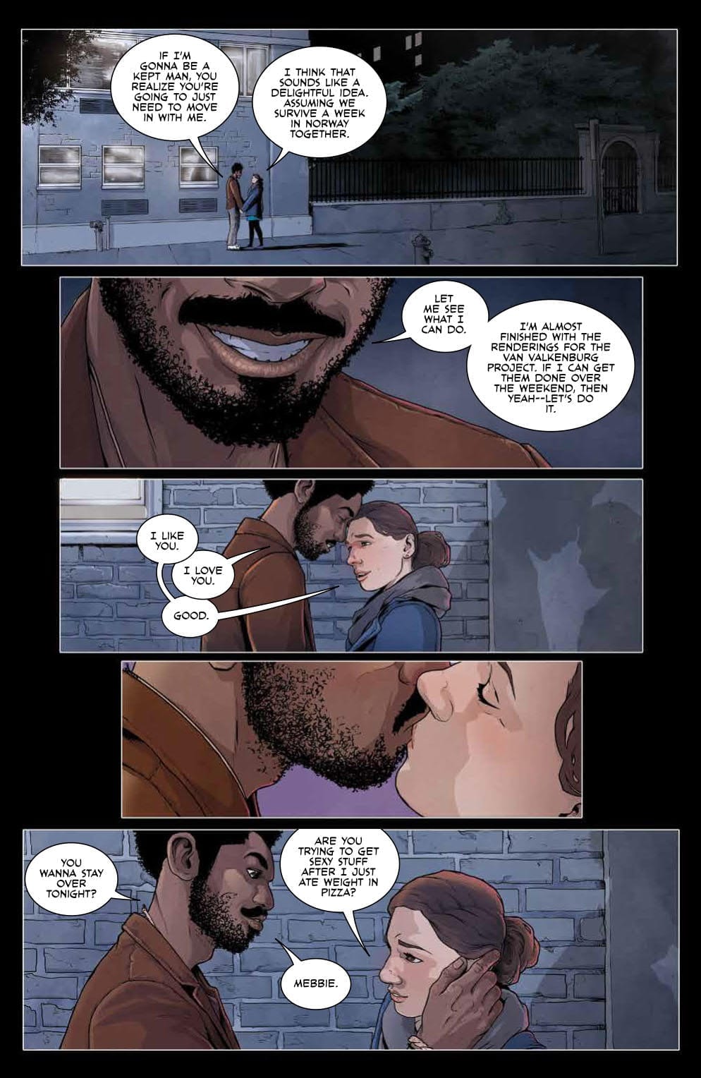
Ed Dukeshire (the list of his work is endless, but check out Once and Future) constructs a flow of dialogue through his speech balloons that feels natural. A series of small balloons, linked by touch, gives the speaker a tempo, producing a beat within the panel and then further across the page.
There are also a lot of overlapping speech balloons as characters interrupt or console each other. Not only does this change the pacing of a scene but it also says something about the characters and their relationships.
Conclusion
Introductions to stories can be difficult and different genres have their own obstacles to overcome. Horror comics have to make a decision early on as to the type of horror they are going to portray. The visual design and opening scene of Winnebago Graveyard , for example, instantly sets the tone for the rest of the story.
In a similar way Haun does the same with The Red Mother. The disturbing elements are distinctive and separate from the real world with firm, visual walls between the two. The insinuation is that these walls will break down and this is the hook that pulls the reader in.
BOOM! Studios may not put out many horror titles but the ones that they do publish are always of an impressive standard. Based on this opening salvo, The Red Mother with it’s compelling characters and top notch storytelling throughout, will join the highly praised ranks of other horror titles like The Empty Man and Angel.