Home Blog Page 349

GOTHAM CITY MONSTERS #6 Settles for the Status Quo

Gotham City Monsters #6 Cover

Gotham City Monsters #6, written by Steve Orlando, with art by Amancay Nahuelpan, colors by Trish Mulvihill and letters by Tom Napolitano, is the end to a series with great potential. At times, this series promised to be something more than your average monster comic. It developed complicated stakes and suggested there would be reverberating consequences. But, as the series came to its conclusion, it settled for less. Spoilers will follow!

Writing

Orlando’s plot, despite the necessary monster fight of the last issue, was complex up until this point. The villain of the story, Lord Melmoth, claimed to be saving the Multiverse through his bloody actions. While he may have seemed like he was crazy, his mention of a blue voice in a previous issue, belonging to Dr. Manhattan, suggested he knew more than the other characters. The tension between his evil deeds and the greater good, was swept to the wayside for the finale.

The few moments that seemed to create any lasting influence from this series were quickly cut short. When Killer Croc seemed to betray the group, it was explained away as him pretending. When Melmoth is defeated and imprisoned, the Multiverse suddenly no longer seems to be in danger. So while much of Orlando’s plot in the previous issues suggested a complex ending, the ending was actually anything but. And perhaps Orlando should allow the reader to decide if it’s “A Fitting End,” rather than stating that on the final page.

Art

Nahuelpan’s art certainly counterbalances some of the struggles of the writing. With gory detail, Nahuelpan depicts monster fights. And though much of the comic is centered around bloody splash pages, Nahuelpan winds down the action beautifully. Instead of teeth flying through the air, we get characters set against a sunset in an empty graveyard. And as we return to Monstertown, each moment begins quietly in such a way that makes us feel like we have returned home. From silhouettes to wet mops, Nahuelpan focuses on the details in these final scenes. It brings us back to the basics and helps uncomplicate the ending.

Coloring

Mulvihill’s coloring strikes an interesting balance. While some moments seem uneven, with bright reds looking out of place in the context, other moments are given great subtlety. The final moments of the comic are where Mulvihill truly finds her pace. The somber yet cozy atmosphere of Monstertown is given its weight through Mulvihill’s work. The sunsets and shadows create a kind of dark warmth that continues through the final pages. It’s like receiving a nice send-off as the series comes to a close.

Lettering

Napolitano goes all-out with this final issue. It seems like every word balloon or sound effect is written in a completely new way. Each sound is given a different treatment and therefore sounds different in the reader’s mind. Though at times, the results are a little distracting, finding it hard to keep track of what each font means in terms of sound, it still creates a brilliant visual soundscape. And regardless of effect, the lettering does a lot to make the comic feel fun.


Ultimately, this series had more potential than it cashed in on. The complexity of the stakes and the promise of lasting implications were abandoned. It certainly makes for an entertaining read. The only problem is, it seemed like it had the power to be more than just entertaining. Pick up your copy of Gotham City Monsters #6, February 12th, at a comic book shop near you!

Monkeys Fighting Robots Youtube

ALL THIS TOO SHALL PASS Explores Superheroes In A World Bent On Its Own Destruction

kickstarter comic all this too shall pass

All This Too Shall Pass is a new comic on Kickstarter that asks the question, “What does it mean to save the world in an era of climate change?”

The campaign launched today (2/12) from writer Mark O. Stack. Art on the comic is being handled by a series of cartoonists: Brett Marcus Cook, Cait Zellers, Ravi Teixeira, and Beth Barnett.

O. Stack calls the series “an exploration of a world where superheroes struggle with what it means to save a world that seems bent on its own destruction and how we might be able to find hope in spite of it all.” The story is told in a series of vignettes in different time periods, with each vignette handled by a different artist.

This is O. Stack’s second Kickstarter campaign, having successfully funded and fulfilled his first one last year. All This Too Shall Pass is currently seeking to raise $5,300 for production, and shipping (you can see a full funding breakdown on the campaign page).

The campaign offers a plethora of rewards for backers, including digital and physical copies of the comic, as well as additional comics and graphic novellas. There is also a $75 reward tier that will get three backers drawn into the comic for a cameo appearance.

Take a look at some pages from All This Too Shall Pass below:

kickstarter comic all this too shall pass“Not just a meditation on the feelings of despair or hopelessness that one might feel in this current climate crisis, All This Too Shall Pass is looking to offer readers an earnest expression of what hope in the face of this insurmountable fight might look like.”

kickstarter comic all this too shall pass

kickstarter comic all this too shall pass

You can learn more about the project
and back the campaign by clicking here.

Monkeys Fighting Robots Youtube

HAWKMAN #21 Gives the Villain Center Stage to Wreak Havoc

Hawkman #21 Cover

Hawkman #21, written by Robert Venditti, with pencils by Fernando Pasarin, inks by Oclair Albert and Wade Von Grawbadger, colors by Jeromy Cox and letters by Rob Leigh, continues the quest of our swashbuckling space heroes. Giving Sky Tyrant the center stage, the creative team provides us with a villain with the luck of a hero. More than just a leftover from Year of the Villain, this series takes the implications of that event seriously. With the stakes reaching a fever pitch, the story entertains and looks to be doing that for many more issues.

Writing

Venditti provides an interesting plot, that acts out almost like a series of object quests. With the cast of characters growing steadily, with Hawkwoman, Adam Strange, and the Atom joining the ranks, Venditti creates a team dynamic naturally. Without forcing instant connections, and adding in well-earned laughs, the team comes together to save Hawkman from himself. And though villains are often set up to fail, Sky Tyrant is of a different breed. Coming from Earth 3, where the roles of villains and heroes are swapped, Sky Tyrant is used to winning. And Venditti doesn’t shy away from giving this villain some power.

Art

Pasarin, Albert, and Grawbadger’s art creates a thematic symmetry throughout the issue. We see many page layouts set up so that characters like Adam Strange or the Atom alternate with Hawkman. Even though he’s wreaking havoc as Sky Tyrant, we get the impression that the characters are moving towards him. They are trying to get closer to him to keep him safe, even though that’s putting themselves in danger. It’s their placement on the page in relation to Sky Tyrant that shows us their empathy for Hawkman.

Coloring

Cox’s coloring often varies and a lot, but always for meaningful reasons. At one point, the alien planet is bright, almost neon, yet a page later the same landscape is dull greens and browns. Similarly, Cox colors characters like Adam Strange and Hawkwoman brightly. Yet when we see Sky Tyrant, he’s dull and grey. It’s a visual representation of the sickness coursing through Hawkman’s veins. As the issue progresses, the planet looks more and more mundane and earthly, until Sky Tyrant leaves. The Year of the Villain is not just affecting the infected, but everyone and everything touched by the infected.

Lettering

Leigh provides a minimalist approach to the lettering that still creates a lot of fun. Instead of covering every page with wildly different styles of lettering, Leigh gives most lines the same treatment. Only Sky Tyrant stands out as having a different voice. And while many of the sound effects appear different, they are given similar colors to create an overarching style. The sound of rumbling shakes. The sounds made by Atom growing back to normal size grow alongside him. It’s a fun lettering style that manages never to be a distraction.


This issue takes on the repercussions of something like DC Comics’ Year of the Villain. Instead of quickly tying up loose ends, we see Sky Tyrant and Hawkman duke it out for control. This series continues to be a pleasure to read, and surely will for many more issues. Pick up Hawkman #21 on February 12th at a comic book shop near you!

Monkeys Fighting Robots Youtube

SABAN’S GO GO POWER RANGERS #29 Continues To Bring Us Full Circle

Cover by Eleonora Carlini

Out this week from BOOM! Studios and Hasbro, Saban’s Go Go Power Rangers, continues our countdown to the series slated end.

Moving back to the main points of “Necessary Evil” after issue 28’s deep dive into Rita Repulsa, Saban’s Go Go Power Rangers #29 takes us right back to action. Tommy has taken the role of the leader on the team, but it doesn’t seem to be going all that well.

Monster designs still on point.

Saban’s Go Go Power Rangers #29 shows us a rough start for Tommy. As he attempts to lead the Rangers against another Zedd monster, he makes a call that doesn’t work out. Jason steps in, and the Rangers succeed, but Tommy is left with remorse after almost getting Billy hurt.

It seems like the remainder of Saban’s Go Go Power Rangers will be about tieing up the beginning of “Necessary Evil” and leading us into where we started with Mighty Morphin Power Rangers # 40. As writer Ryan Parrott confirmed, issue #32 will be the final one for this series., though Mighty Morphin will continue after.

What Saban’s Go Go Power Rangers # 29 accomplishes well is bringing us back into the same vibes as earlier issues of “Necessary Evil.” This has been a story arc with a heavy theme of change. Though it feels like we’ve become adjusted to that change in Mighty Morphin where it’s become the new normal for that series, Go Go’s exploration of how these changes came to be put us right back in that mindset of “things are different now.”

Tommy’s awkward transition to becoming the leader helps bring us back into this mindset. It truly feels alien, especially given how much focus this series has had on the team without him.

It’s nice to see Tommy not starting off as the perfect leader. It gives more weight to the change over in the team.

This sense of change is important for where the rest of this issue takes us from there. We’ve started to come full circle as we begin to reach points now that was past tense for Mighty Morphin.

Saban’s Go Go Power Rangers features a lot that will be missed once the series concludes. I, for one, will miss the art in this series particularly. Since the beginning, character designs have always had a more cartoonish style to them that pair well with the context of the series. For this arc, Francesco Mortarino has done a spectacular job bringing these scenes to life.

When it comes to the fight scenes, every panel is a spectacle. The Rangers are constantly drawn in motion, with every action having a purpose. From extinguishing Putty Patrols to taking on classic “Monsters of the week,” every page resembles the classic T.V series with insane detail.

This full pagers have so much to them. Every time I look at it, I notice something new. Like how Trini put a dagger in that Putty’s Z

Adding to this, Raul Angulo’s colors continue to impress. There’re a variety of settings this issue takes place in, some dull and some lively. While there’s a lot of grey at the beginning of this issue, we move onto areas like the Command Center and the Ernie’s Juice Bar, and we see the pallets and backgrounds really shine and vary.

Ed Dukeshire handles the lettering again and continues doing right by it. With a series that has as much history to it, memorable voices and characters, it’s important to try to represent this in dialogue. Zedd specifically comes to mind here. His dialogue contains a lot of bold emphasis on the specific words resembling his speech tendencies. It reads how late actor Robert Axelrod spoke as the character.

With only three issues remaining, the send-off for Saban’s Go Go Power Rangers feels closer and closer. Excited as I am for the finale, there’s a lot with this series that is going to be missed. Issue 29 does a fair job prepping us for the future, though I will note, with how much we already know from Mighty Morphin Power Rangers taking place further in time, the catch up we’re getting while nice, doesn’t feel quite as important based on this issue alone.

Having us be put in a place where we accept that events of the past have already occurred without seeing them, and then going back to show them to us much later on feels more like bonus information. While still enjoyable to read, there is notably less of a hook.

The pull of seeing this through to the end helps. While obviously I still want to see the inception of the Omega Rangers and see how Rocky Adam and Aisha are introduced, I’m just hoping there’s at least one more interesting note to pull us into the finale.

I have faith Parrott will not disappoint in the end. I look forward to seeing what is in store for us moving forward and am very eager to see what is coming for Power Rangers after the completion of “Necessary Evil.”


Monkeys Fighting Robots Youtube

Review: Alfred’s Requiem in BATMAN: PENNYWORTH RIP

Batman: Pennyworth RIP

Batman: Pennyworth RIP, out this week from DC Comics, takes on one of the biggest questions of Tom King’s recent run on Batman: is Alfred really gone for good?

I’ve heard it said that, in comics, no one’s ever truly dead unless they’re “Uncle Ben dead.” A character can always come back unless that individual’s death proves indispensable to a major character’s motivation. Of course, with the return of Thomas Wayne, it’s apparent that even this rule can be broken.

I expect we’ll see Alfred Pennyworth sometime in the future. Regardless, DC felt the need to give Bruce’s surrogate father a fitting, if less-than-optimistic sendoff.

Batman: Pennyworth RIP Page 1

The Writing

Detective Comics writer Peter J. Tomasi and new Batman head James Tynion IV share writing duties for Batman: Pennyworth RIP. The pair manage to craft a fairly-cohesive narrative that mostly delivers on the emotional impact of the situation.

We see each member of the Bat Family relay their best memories of Alfred, with the main story serving as a framing device. We see each character manage their grief at Alfred’s loss in a different manner. For some, it’s anger, while others are colder and more detached. In every case, though, there’s a note of definite tension, laying the groundwork for further conflict in ongoing Bat titles.

The book is dialogue-dense, with each character recalling their best memories of Alfred. While there are some touching points, it doesn’t always deliver on the emotional impact for which the writers were going. At the same time, the wordiness takes a toll on the book’s pacing throughout. The result is that some of the characters’ interactions feel somewhat hollow, even histrionic at points, like Damian’s exit after sharing his tale.

More than anything, Batman: Pennyworth RIP underscores Alfred’s role as the glue that held this combative clan together. He was the cohesive element that mitigated the worst dynamics of the Bat Family’s disparate and testy relationships. With him gone, though, the members immediately begin to pull apart.

Probably the book’s greatest strength is what it means for the characters going forward. Their individual traumas and personalities grind against one another, and old wounds open…this time, though, there’s no Alfred to tend to them. It doesn’t bode well for the future of the family.

BP_RIP Page 2

BP_RIP Page 3

The Artwork

DC emptied the benches calling on artists for Batman: Pennyworth RIP. The book credits a team of ten different artists and colorists who contributed pages. As a result, each of the different vignettes has a unique style and aesthetic, and these tend to complement the stories well.

The pages in the main story are very stylish, nailing the mood of the book. Character designs within the framing story are sharp and angular, and there’s a definite sense of gloom hanging over these scenes that suits the tone.

Some of the pages feel a bit cluttered in the side stories, and don’t land the story beat every time, though. The pages feel very busy at points, packed with panels and speech bubbles, which slows the pace. It likely would have been more effective to stretch this book to 64 pages, rather than the 48 allotted.

The colors also play a major role in selling the mood of the piece. Our main story is streaked with icy blues, highlighting the depressive emotional tone. In contrast, our flashback sequences are brought to life with more vivid, earthy tones.

BP_RIP Page 4

Final Thoughts

Batman: Pennyworth RIP may not be the definitive sendoff for Alfred that DC was hoping for. That said, it’s entertaining and, at times, even touching. It’s worth picking up if you’re a Bat Family aficionado.

Monkeys Fighting Robots Youtube

Snyder, Capullo Reunite For DARK NIGHTS: DEATH METAL

Dark Nights Death Metal

We’ve gotten hints for a while now that Scott Snyder and Greg Capullo had some kind of followup cooking to their hit series Dark Nights: Metal. Now, DC Comics has made it official with the announcement of Dark Nights: Death Metal.

Dark Nights Death Metal

The new six-issue series will debut this May. Check out the official announcement below, along with issue #1 covers by Capullo, Francesco Mattina, and Stanley “Artgerm” Lau. You can also click over to DC’s blog for more preview artwork.

Scott Snyder and Greg Capullo Take a Curtain Call

for a Bigger, Louder, and Faster Sequel to their Headbanging 2017 Series

BURBANK, CA (February 12, 2020) – DC will give readers what they want this summer—bigger, louder, faster, and “metal-er“—as the publisher announced its plans for Dark Nights: Death Metal, the sequel to the smash-hit 2017-18 series Dark Nights: Metal, which brought widespread changes to the DC universe and introduced fans to the Dark Multiverse and a runaway-hit villain, the Batman Who Laughs.

Dark Nights Death Metal

A new Dark Nights: Death Metal series means an encore for the original team of hardcore headbangers: the bestselling team of writer Scott Snyder and artist Greg Capullo, along with inker Jonathan Glapion and colorist FCO Plascencia. Issue #1 of this six-issue miniseries hits comic book stores and online retailers on May 13, 2020. The series will also include several “Metalverse” one-shots throughout the summer months, expanding the vast world created by the Death Metal storyline.

“I’ve been waiting to do this story since we finished Dark Nights: Metal,” said Snyder. “As much as it was a complete event, we left some threads hanging there for sure. I’d hoped that if people liked the first series enough, we’d have a chance to set up something bigger, and that’s our plan for Death Metal.”

“For all of us, Dark Nights: Death Metal is about the fun factor,” adds Capullo. “Comics should be fun, bombastic, and over-the-top. This series is going to be exciting and jam-packed with great ‘metal-esque’ moments that will make fans lose their minds when they see them.”

This new series spins out of the events of Scott Snyder’s Justice League run and the Year of the Villain: Hell Arisen miniseries by James Tynion IV. The Earth has been consumed by Dark Multiverse energy, having been conquered by the Batman Who Laughs and his evil lieutenants, corrupted versions of Shazam, Donna Troy, Supergirl, Blue Beetle, Hawkman, and Commissioner Jim Gordon. Some heroes, like Wonder Woman and the Flash, have made compromises as they negotiate to keep humanity alive in this hell-born landscape. Others, like Batman, are part of an underground resistance looking to take back control of their world. Superman is imprisoned, cursed to literally power Earth’s sun for eternity.

But a mysterious figure provides Wonder Woman with vital information she might be able to use to rally Earth’s remaining heroes to resist the Batman Who Laughs. Can the Justice League break away from the Dark Multiverse and defeat Perpetua?

Dark Nights: Metal was an absolute game-changer for DC,” said DC SVP and editor-in-chief Bob Harras. “It was a crazy roller-coaster ride that gave us not only the Batman Who Laughs, but a story that was so crazy over-the-top, it kept our readers on the edge of their seats with every issue, and I expect Scott, Greg, FCO, and Jonathan will tell a story with even higher stakes, and definitely more Joker dragons!”

Dark Nights: Death Metal is a six-issue monthly series with issues #1-3 shipping in May, June, and July, then resuming in September, October, and November. Issue #1 will be available in comic book stores and participating online retailers on Wednesday, May 13, 2020.

Monkeys Fighting Robots Youtube

Review: Clark Is Branded A Political Opportunist In SUPERMAN #20

Clark Kent’s life as a reporter/superhero has become more intertwined than ever since revealing his identity to the public. Within the pages of SUPERMAN #20, available in comic book stores on Wednesday, February 12th, readers get a look into how the world of mass media perceives this combined identity. Unfortunately, some are reluctant to give Superman the benefit of the doubt. A particularly cynical reporter at the Daily Star claims it’s unfair to leverage his status as a hero in his reporting work, despite his fellow employees’ insistence of the contrary. But when it’s revealed Superman recently claimed the title of Earth’s Representative in the United Planets, media professionals everywhere want answers.

Story

The reporters at the Daily Star are spending their time adapting to the new status quo of reporting in Metropolis, one in which Clark breaks stories as a star reporter and as Superman. A few people are uncomfortable with him straddling these roles, but for the most part the reporters realize that he spends just as much time saving the world as he does reporting. We even hear a personal story from one woman which recounts a time the hero save her and refused to break the story so other media outlets would have the chance to on their own.

But while this discussion is taking place, Superman attempts to keep the peace on a distance planet. Mongul has attacked the United Planets peace meeting, and the Man of Steel is doing all he can to keep the peace lest war breaks out in the cosmos.

Despite Clark’s fight for peace, a number of accusations from the Star fly his way after video footage is released of his diplomatic activities on behalf of Earth. The reporters believe this to be a prime example of Clark using his dual status as hero and reporter to garner political clout. Ultimately, they question why he deemed himself the ambassador for Earth despite not being elected to the position.

Writer Brian Michael Bendis does a wonderful job of positing unexpected troubles in the life of Clark after revealing his identify. We would naturally expect every villain in the galaxy to attack his loved ones, but Bendis surprises us by showing the political ramifications instead.

Artwork

The artwork in this issue to top-notch, presenting readers highly detailed panels of both the scenes in the newsroom and at the United Planets gathering. Ivan Reis, Joe Prado, and Oclair Albert’s penciling and ink work, combined with Alex Sinclair and Jeremiah Skipper’s coloring and Dave Sharpe’s lettering, present a seamless story that shows both the epic battle with Mongul and the chaos in the Star’s newsroom. We see the team is equally able to depict the average news office just as well as an alien planet with multiple alien beings.

Comic Covers

Main Cover

Reis, Prado, and Sinclair’s main cover features Clark in the clutches of Mongul, who’s the catalyst for the destruction of the United Planets peace talk.

Variant Cover

Brian Hitch and Sinclair’s variant cover gives readers a god-like depiction of Clark, showing how many of those in the newsroom, and society as a whole, now see the once clumsy reporter.

Conclusion

SUPERMAN #20 throws in an interesting new wrench in Clark’s life. Despite the lack of hurtles facing him after the initial identity reveal, it seems our hero failed to consider the politics of the whole ordeal.

Do you think the public as a whole will turn against Superman? Let us know in the comments below!

Monkeys Fighting Robots Youtube

Review: RAI #4 The Threatening Stakes From All Around

Rai #4 cover

Rai #4 out this week from Valiant Entertainment continues the story of the titular cyborg ronin. With a piece of the AI Father’s backups insight, everyone moves in for war. As if tensions were not high already, it looks like Rai is about to clash with an old friend and reoccurring enemies.

Recap

Rai and his “older brother” Raijin are on a quest to eliminate the Offspring, backup units of Father to prevent his rise to power. Along the way, Rai deals with how this journey affects those closest to him. People try to reach out to him, but this leaves Rai vulnerable to threats from Bloodfather. With an army of devout followers at Father’s feet approaching at every turn, the stakes begin to grow more desperate.

Rai #4 Writing

The Eternal Warrior revitalized
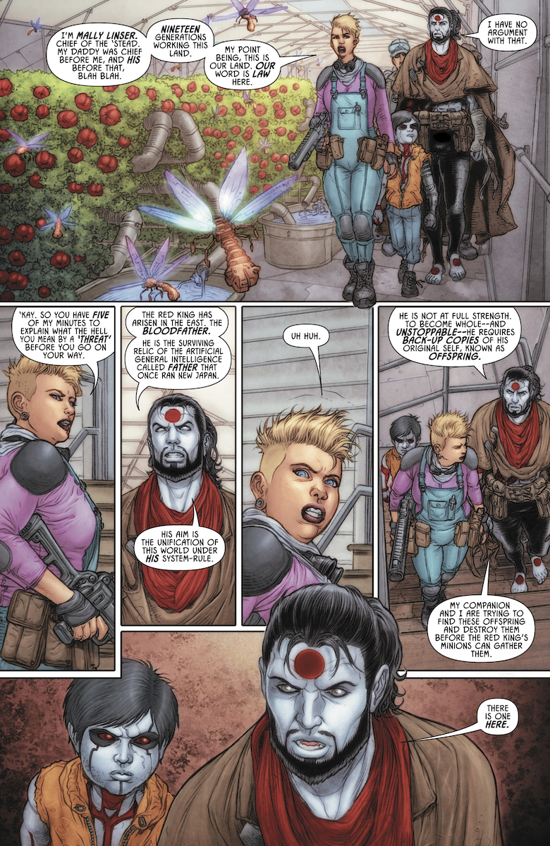
Rai #4 has the positronic brothers at a very difficult impasse. As Dan Abnett continues to point out, not everyone is happy with how New Japan is on the surface. The farming village the brothers arrive at, Hope Springs, holds it against Rai for allowing it to fall in the first place. But they make the most of it with the tech they salvage in order to make fertile soil. Which is why Gilad the Eternal Warrior and his geomancer ward take up residence there. After Fallen World left them in a difficult place, it’s nice to see them leave for what they believe is better. Unfortunately, with his vitality restored and his new home possibly compromised, Gilad doesn’t take well to their presence.

Every character who has a chance, Gilad included, points out Rai’s flaws when it comes to thinking in the long run. Gilad, in particular, sees Rai’s intense feelings when it comes to the threat of Father. He sees Rai’s quest as guilt for not being able to finish off Father, so much that Rai seems to take it out on Raijin for not complying. Even Raijin thinks that Rai’s fears might be unfounded when their objective is found.

At the same time, Raijin points out to the Geomancer Karana that despite his faults, the situation is not entirely Rai’s fault. Necessities like the fight against Father are short-term. It’s also why Gilad and Karana chose to leave the Green sanctuary, they were not necessary, and they hated the Green’s ways. Much like how Gilad hates the way Rai is doing things with both Raijin and finding the Offspring. But in the end, all of them aren’t that different, which is what makes the clash between Gilad and Rai so ugly. Gilad, much like Rai, is trying to balance his task with his humanity, but they both have trouble when something compromises those tasks. The attack on the village by Bloodfather’s forces might just make things worse.

The possibilities and tensions in Rai #4

Rai #4 Artwork

Continuing from previous issues Juan José Ryp’s penciling continues to give detail to the rustic but natural world of the future. Every wrinkle and expression feels alive in contrast to the smooth and faceless grunts of Father’s forces. The coloring by Andrew Dalhouse helps differentiate the more natural from technological. Even the wings of mechanical bugs give off radiance to show this. Situations like that play express a message that the natural can co-exist with technology. Unfortunately, the contrasting soldiers against the fields show the threat they pose to the world. In that way, it’s impossible not to get behind Rai when it comes down to it.

Dave Sharpe’s lettering, however, works best in Raijin’s diagrams that come before the main stories. Otherwise, they follow the standard and well-balanced flow of going between speech bubbles. The onomatopoeias meanwhile are diverse but are primarily stock images for the occasional punch and gunfire. A few wordmarks, however, illustrate some storytelling. For example, a blow by Gilad shows a wordmark that has no filling to illustrate Rai being knocked outside.

Prepare For War in Rai #4

Rai #4 brings up some extreme tension that proves Matt Sardo’s comparison of Dan Abnett’s epic with Game of Thrones right. Got anything to say about this issue? Leave your thoughts in the comment.

Monkeys Fighting Robots Youtube

Review: A Deal is Struck in THE DOLLHOUSE FAMILY #4


Mike Carey and Peter Gross’ “The Dollhouse Family” has been one of the most exciting and harrowing comics to read over these past few months. This fourth issue is a prime example of why that is. “The Dollhouse Family” #4 is a chapter built with mounting haunted house and cosmic horror that still manages to create fantastic character storytelling. The work of Peter Gross and artist Vince Locke once again lure in the reader with pitch-perfect visuals to make yet another superb chapter in this DC horror comic.

“Alice’s worst nightmare has come true: the Dollhouse has returned…and if it can’t have her, it’ll settle for her daughter! And as horrible as her prior experiences with the House have been, they’re nothing compared to what it’s been able to come up with after 20 years of waiting…”

Writing & Plot

Writer M.R. Carey’s perfect balance of mysterious intelligent horror and relatable character building is on full blast in “The Dollhouse Family” #4. The tragedy of the prior issue is met with the reuniting of a key past character in Alice’s life. Meanwhile, the story of the Dollhouse’s origin is wrapped up in a harrowing and sinister manner. Carey’s flawless ability to flit between these two storylines is once again brilliant, as the two timelines complement each other wonderfully. The sense of passing time from the origin tale to watching Alice grow up presses the agelessness of the terror at this story’s core. Despite the well-orchestrated horror, this series is truly held up by its compelling character drama. Alice’s story has always been interesting, but since her becoming an adult and a mother, it has taken on a whole new level of intimate complexity. Watching Alice attempt to protect her daughter from the Dollhouse’s temptations while maintaining that mother-daughter relationship despite her own traumatizing past is one of the best elements of this series. Truthfully, this human element is what makes this horror story, and any horror story really, so memorable.

Art Direction

The expert layout and panel direction of Peter Gross combined with Vince Locke‘s distinct style creates the perfect slow-burn mystery-horror of “The Dollhouse Family” #4. There’s an almost cinematic manner in which Gross’ layouts direct the reader along, often laying panels in the foreground or adding artistic flairs that ignore convention. This has been a normal practice for the series so far and is one of the reasons that tension is so effective. The other is of course the penciling of Vince Locke with the colors of Cris Peter. The visual aesthetic of this series is character-focused and off-putting in all the right ways. The characters are given proper expression during the quiet scenes that ground this series, while also setting up the horror-drenched sequences. The style and color palette are so special in this classic Vertigo way where they are somewhat naturalistic but also just off-kilter enough to demonstrate that something is amiss with this world. The images of monstruous or haunting figures are always a shock upon the turn of a page, and they contrast brilliantly with those quiet moments.

“The Dollhouse Family” #4 is the climax of this brilliantly spooky and intelligent mini-series, with heartfelt character moments and terrifying twists galore. M.R. Carey’s intricate but careful plotting excels yet again, while the art team of Peter Gross, Vince Locke, and Cris Peter maintain the comic’s original and foreboding atmosphere. Be sure to keep reading this excellent outing when issue #4 comes out on 2/12!

Monkeys Fighting Robots Youtube

DRAGON AGE: BLUE WRAITH #2 – A Tale of Agents and Relics

DRAGON AGE: BLUE WRAITH #2, out February 19th from Dark Horse Comics, continues the tale full of legend and magic. Grim is the setting for this issue, as characters seek to complete their own quests, be it revenge, capturing a relic, or freeing loved ones.

***SPOILER WARNING***

And here’s a sneak peek at the cover for Dragon Age: Blue Wraith #3.

Fans of the Dragon Age video games likely have made a note of this series and with good reason. This series has brought back the infamous Blue Wraith, along with several other fan favorites from other comic series.

That means there’s a lot of fun – and drama – to be had here. After all, the events that occur in Dragon Age can be grim, as characters fight for their lives and freedom left and right. Dragon Age: Blue Wraith is a series that touches upon concepts such as revenge and desperation, in ways that wholly suit the franchise we love so much.

The Plot

It currently feels like there are several plots winding around one another in Dragon Age: Blue Wraith #2. While there’s little doubt that they’ll all eventually come together, it is doing an excellent job of showing complex storytelling. It’s also a strong reminder of how much can be happening at any given moment in the world of Dragon Age.

Nunzio DeFilippis and Christina Weir were the authors involved in this issue, and it’s thanks to them that we’ve been handed such a complex story. There are so many characters involved, each with their own goal and desire.

It’s really no surprise then that this is a fast-paced issue. There’s no room for downtime here, as there’s seemingly always something happening. Thankfully, while there is a lot of information passed to the reader, it never once feels like an info-dump. Instead, it reads as something more organic, thanks to the use of flashbacks and character conversations.

What is shocking is how intense the plot has gotten, and so quickly. There’s really no avoiding the stakes at hand, or what certain characters have had to do in order to get to this point. When you think about it, that is one of the many reasons fans have been drawn to this franchise in the first place. So it’s appropriate to see it here.

The Art

Dragon Age: Blue Wraith #2 is full of dramatic artwork, fight scenes, and magic. It makes for an all-around feast for the eyes. You can tell that the artists really enjoyed portraying some of these scenes, as it feels like a lot of attention has been paid to the details.

Magic is a fickle thing, lending towards flash and brilliant scenes, while also sometimes being more difficult to portray. But that balance has been struck here. There are a few scenes in particular that really stand out here — one of which being an example of how the Blue Wraith got his nickname.

Fernando Heinz Furukawa’s lines are ideal for this series. Their style is on point with the series as a whole, especially in regards to the different races portrayed and the magic they carry. Meanwhile, Michael Atiyeh’s colors are truly striking. They made excellent use of the white space available to really make certain scenes and expressions pop. Finally, Nate Piekos (of Blambot) did a fantastic job with the lettering. They’re so simple and understated that for a moment, you could forget that the balloons are even present.

In Conclusion

Dragon Age: Blue Wraith #2 was an enthralling read. This was an issue that wasn’t afraid to show the darker side of conflicts. The pacing makes it easy to stay invested in this series, while also making it impossible to predict what will happen next. One thing is certain; it will be interesting to see how the series wraps up, given that there’s only one issue left.

Monkeys Fighting Robots Youtube