Suicide Squad #3, written by Tom Taylor, with art by Bruno Redondo, colors by Adriano Lucas and letters by Wes Abbott, continues to play things close to the chest. With every answer, we get ten more questions. And with this creative team on its A-game, this no-holds-barred series continues to be a wild ride.
Writing
Taylor likes to keep the readers in the dark as much as possible. It’s a brilliant approach for an espionage-thriller. In past projects, Taylor has worked out of continuity. This gave him the license to kill off or maim characters left, right and center. Essentially, he was able to imbue his stories with real stakes as the “but they’ll never kill Superman” logic no longer applied. When moving to a project like Suicide Squad you would expect him to be limited in changes to continuity. Thank God that’s not the case. Each new issue, something new happens that you didn’t think DC would let him do. It’s wonderful.
Art
Though Redondo’s style is very naturalistic, he occasionally takes the “Kevin Maguire” approach in this issue. Especially when things are heating up and a lesser comic would fight the “cheesiness” only to make it worse, Redondo gives the characters wild expressions. Their over-expressive faces in otherwise tense scenes assures us this creative team doesn’t take itself too seriously. Redondo knows the Squad is as goofy as it is deadly, and balances those two aspects of Task Force X with precision.
Coloring
Lucas’ colors continue to be nothing but fun. While his Tarantino-esque color palette from previous issues still finds its place here and there, much of the issue takes a darker tone. And in each dim scene, Lucas seems to make any excuse to make the scene gorgeous. When the Squad is talking in a sewer over a dead body, the sewer walls are lined with red lights. And so the entire scene is set in a red glow. It’s great to see that Lucas can have fun, not only with neon yellows, but in the darker scenes too.
Lettering
Abbott’s lettering for Suicide Squad #3 is simple but brilliant. The slightest variations in the size of characters’ lines immediately establishes the power dynamics of a scene. When Lok speaks to a soldier, the soldier’s lines are written smaller. Of course, Abbott shows us the soldier’s feeling that he isn’t allowed to talk. Abbott’s sound effects are also lots of fun. They often take the form of whatever is making the noise. The sound effects that accompany a wound look like blood gushing out. The sound effects that go along with electricity look like lightning bolts. The lettering becomes a part of the art throughout the issue.
I’m calling it. This may be the best book of the year. And it’s only February. If Taylor and company continue to fire on all cylinders, we are in for a wild and magnificent ride. They know when to keep their readers in the dark, and even when they provide answers they know how to keep us asking questions. Pick up your copy of Suicide Squad #3 on February 26th at a comic book shop near you.
Sooner or later the inevitable replacement of the old gritty Constantine with a “new-age” version had to happen, it just seemed to happen sooner in this weeks’ John Constantine Hellblazer #4, from DC Comics.
Art by Matias Bergara. Colors by Jordie Bellaire.
CONSTANTINE ATTITUDE
During the previous arc (reviews here), writer, Simon Spurrier took Constantine back to his roots with horror and the good ol’ Constantine attitude. For the second arc, Spurrier drops the horror, ramps up the attitude and introduces one of Constantine’s worst fear; a gentleman, scholar, clean-living, vegan acolyte of love—Tommy Willowtree. That’s how DC Comics bills Willowtree, citing him as someone that Constantine will instantly hate. That he does. But damn, hate was never this fun.
Continuing the trend of bringing Hellblazer and Constantine to their roots, Spurrier has him don his original outfit. Granted this doesn’t last long, nonetheless, the outfit looks dapper. But, as fun as Constantine is by himself, he always plays off others better, which Spurrier excels at. The moments between Constantine and Vestibulan are great, yet when Willowtree is introduced you know Constantine will be more insufferable than usual. By the end, you’ll be wanting more issues with the duo. But, sadly as everyone knows, anyone close to Constantine doesn’t last long.
Spurrier uses Willowtree as a plot device to showcase the vast difference between the old way and the new way. This is seen as a continuation of the previous arcs threads of “finding a home for Constantine in the modern world” (thanks Darryll). Yet, instead of battling a gang and a hobo he is against one that idolizes him to the point of wanting to be him. Willowtree essentially is Constantine, yet a newer version that’s not such a bastard. Plus, he wants to help and learn more from the person he idolizes.
Art by Matias Bergara. Colors by Jordie Bellaire.
BASTARDLY PERFECT ART
Matias Bergara has a stylized art that can be identified in a lineup. This art works perfectly with the story Spurrier sets out to tell. Bergara is able to easily switch between the genres presented while looking elegant the entire way. The panel placement and pacing that he employs work perfectly, helping tell the story needing to be told. This can be seen when Constantine leaves his place and runs into what they dub Turd-Goblin. During the page before the reveal, Bergara uses a mix of varied sized panels that pick up the speed towards the end.
Then, BAM, the next page Constantine and the reader are introduced to the ugly Turd-Goblin. The use of small panels to quicken the speed and a full silent page to reveal the monster is delightfully done. Pacing aside, Bergara’s art looks amazing in motion. In the few moments action occurs he makes sure said element pops off the page, giving a chaotic feeling. All this while being able to nail the comedic timing of every moment perfectly.
There’s been a beautiful storm happening in the color scene lately, and that’s Jordie Bellaire. She’s been around for a few years, yet it seems in the last few you can just about see her name everywhere. Much like Bergara, she is able to adapt to different genres. The combination of her colors and Bergara’s art is beyond words with their beautiful execution. For most of the issue, she keeps the colors bright and vibrant, matching the tone. But, when the time calls for darker shades she equally excels.
There are a few moments where Bellaire drops the background color and relies on white. During these, she is able to make the characters pop even harder during the panel. In Hellblazer #4 she is able to make the landscapes so gorgeous you want to visit everywhere they go. When the sun shines, she makes damn well sure you know it.
Art by Matias Bergara. Colors by Jordie Bellaire. Lettering by Aditya Bidikar
THE MAGIC IN WORDS
There’s a lot to love in Hellblazer #4. It seems every creator attached is in complete sync with one another. The same can be said in Aditya Bidikar’s lettering. Throughout the issue, Bidikar bolds the important words, giving each bubble a pop that helps read what is happening. Better yet, when Constantine whispers or speaks quietly he letters what he says in a smaller font. During these moments he never makes them too small, just enough to know he is whispering.
As great as the lettering is, there is but one minor gripe. Very minor. When Vestibulan talks/texts and the phone isn’t visible Bidikar letters it with a rounded edge. Yet when the phone is visible and you are reading the text it is a hard angle. The difference between the two look weird, especially when the panels are next to each other. Alas, for such a great issue a blemish such as this is small.
Art by Matias Bergara. Colors by Jordie Bellaire.
OPPOSITES ATTRACT
It would be easy to single out multiple pages in Hellblazer #4 and talk about how amazing the art is in various facets. Yet, here we’ll quickly focus on Willowtree’s confusions to Constantine in a car (seen below).
Art by Matias Bergara. Colors by Jordie Bellaire. Lettering by Aditya Bidikar
Bergara’s scene direction makes what could’ve been a visually word-heavy, boring page into an intelligent one that shows everyone’s reaction. In the establishing panel, he showcases everyone involved, then moves into Willowtree’s speech. By having Constantine watch Willowtree’s speech in the mirror he is able to show his noncaring attitude for the “Evil is at large” speech; thus reinforcing the difference between the two. Following this is the reaction shared between Constantine & Noah who seem to be getting along cheerfully.
Between the blocking, pace, reactions, and Bidikar ‘s word placement said page turns out wonderful. Each page in Hellblazer #4 reads as such and deserves a Panel Breakdown.
A BLOODY FANTASTIC ISSUE
Everything about Hellblazer #4 is fantastic. It reads differently than the previous issues, yet it’s a great genre detour that gives the reader a breather. Even if you aren’t caught up on DC Comics’ newest Hellblazer it’s worth reading. Granted you should be reading the new relaunch as it is great, but the beginning of the second arc shows that the first wasn’t just rookies luck. Plus the last few pages and cliffhanger are immensely hilarious and ends the issue on a high note.
Memorable Quote: “Pun magic. You do fucking pun magic.” – John Constantine.
Hey, I love puns and think that pun magic sounds awesome! Granted I suck at Puns, nonetheless, Zatanna has backward speaking magic, what’s wrong with Puns?
Side Note: I absolutely love the team behind Hellblazer #4. Bergara’s art was what originally drew me into Spurrier’s CODA last year. The duo is a dream team in the comic scene, yet aided by Bellaire and Bidikar they’re a force to reckon with.
NEW LOOK, SAME BASTARDLY MAN
What have you thought of Hellblazer #4’s different vibes from the recent issues?
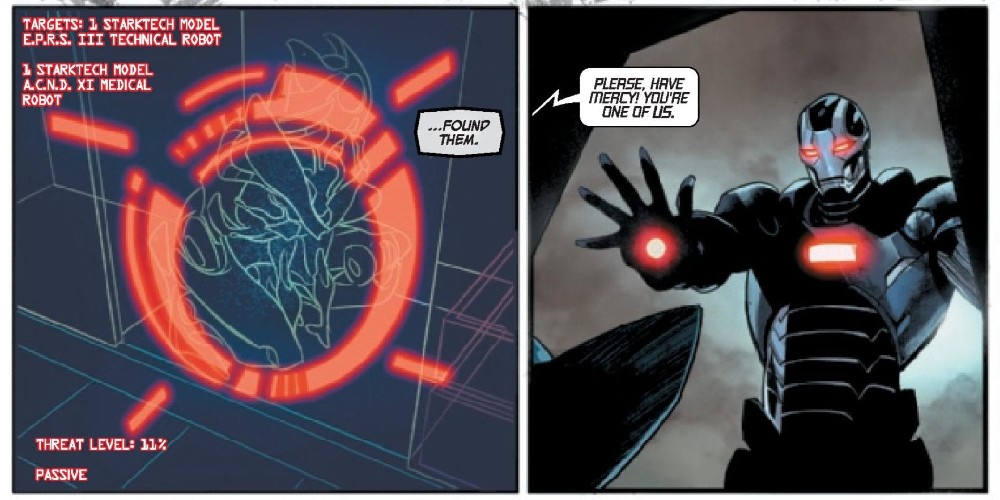
Leviathan is an organization that’s been apart of DC for a while. While it first started as a rebel group of Assassins lead by Talia Al Ghul, Bendis turned it into something a bit bigger. Using an old antihero as the new mysterious face of the organization, Leviathan became a dangerous spy organization that destroyed the major spy organizations of the world. Argus and the DEO were left in ruins as their leaders were imprisoned. A small group of detective superheroes quickly uncovered the plot and exposed Leviathan as former Manhunter, Mark Shaw. With his plan exposed, Leviathan retreats to do battle another day. Is that day today?
**Some Spoilers Below**
Story:
After being exposed by Lois Lane, Leviathan regroups as he prepares for his next big plan. He commands his troops to continue their work across the globe. In America, a man named Kingsley Jacob releases Steve Trevor from prison. He offers him a position in a group that will take down Leviathan, but they’ll need some help. Steve Trevor begins heading across the country and recruits people for this new spy organization. He recruits Director Bones of the DEO first before getting Green Arrow, Talia Al Ghul, Question, and Manhunter. Together the team forms into the super-spy organization, Checkmate.
When picking up this story, I was hoping we’d get more action and spy antics to excite readers. This ended up being a slow build-up to that potential action. While it is interesting to see these organizations grow in the long run, as a single issue, it’s incredibly dull. The action sequences are very sparse, with only a page of quick punches making them up. This issue is strictly set up Checkmate to take on Leviathan.
Speaking of Checkmate, this team doesn’t make a whole lot of sense. Steve Trevor and Director Bones make sense. They have faced espionage in the past and are just out of the spotlight to go undetected. Then we have Green Arrow and Question, two who tend to work solo. They’ve obviously worked with teams in the past, but working for a secret organization seems a bit far fetched. Then we have Lois Lane, probably the most out-there of the whole group. Other than being the wife of Superman, she brings nothing to the table except her father’s last words. Honestly, this team was only made because they’re B-listers that was in the previous story. I want to be proven wrong as we move forward, but Bendis is going to need to do a lot.
Art:
I know some enjoyed the look of Event Leviathan and will love the look of this book. This reviewer isn’t one of those people. It’s okay, and Alex Maleev does a decent job of carrying all fronts of art. It fits the story, being dark and gritty as the world of super spies tends to be. The best-looking part of the book is Leviathan, both the organization and the leader. They look like a true force to be reckoned with, and honestly, I can’t imagine them without Maleev’s style.
Conclusion:
While there will be fans of this issue, especially those who loved Event Leviathan, those seeking a more action-packed story should look elsewhere. Unlike the previous story, there’s no great mystery for us to get invested in. Aside from the big cliffhanger at the end, most of this story is incredibly dull and a chore to get through. This is the first part of a grander story, and I hope that it’ll be more exciting. Leviathan is an interesting villain but isn’t sort of an exciting story. Here’s hoping Bendis can turn it around into something we can all get behind.
Writer N.K. Jemisin and artist Jamal Campbell return to the City Enduring with “Far Sector” #4. This uses sharp, attitude-filled dialogue and intelligent political parallels to offer commentary on the intense events of the prior issue, while building the behind-the-curtain tension for both the City Enduring and Sojourner herself.
“With the so-called Peace Division firing upon the protesters it’s meant to protect, new Green Lantern Jo Mullein devises a novel solution to bring the chaos to a close-one that causes the rookie Lantern to run afoul of the City Enduring’s leadership council. Meanwhile, we learn more about Jo’s recruitment into the Green Lantern Corps, and the nature of her mysterious and unique power ring.”
Writing & Plot
N.K. Jemisin‘s scripts in “Far Sector” are full of naturalistic but personality-filled and distinctive dialogue and narration. Jo Mullein’s dialogue and inner-narrative speech are completely honed to a recognizable and distinctive manner of delivery. The other characters are given their own distinct diction in their dialogue as well, making reading the often lengthy sequences of conversation and debate (mostly the latter) in issue #4 a pleasant trip at least. The plot here takes its time to dissect the decisions made by the council and its security force in the last issue by using obvious parallels to our own reality. The struggle Jo faces as a galactic peacekeeper against a planetary police force is a compelling one that’s layered with poignant and relevant moral arguments. It’s a consistently engaging plot to dive into from issue to issue, whether it focuses on action or interpersonal relationships or planetary politics.
Art Direction
There isn’t much to say about Jamal Campbell‘s absolutely astonishing artwork in “Far Sector” #4 that hasn’t already been said. The massive variety of character designs that inhabit the crisp futurism of the City Enduring is a feast for the eyes from month to month. Campbell’s colors once again arrive in a slew of sci-fi neons and digital hues that are a wonder to behold, making this one of the most gorgeous comics on stands right now. The lettering from Deron Bennett utilizes a soft but clean and bold font that changes in subtle ways depending on the character speaking and the manner they speak in. It’s a simple yet highly effective choice that guides the reading experience along flawlessly.
“Far Sector” #4 is yet another great issue in one of the best comics DC is putting on stands right now. N.K. Jemisin’s poignant and compelling scripts work hand in hand with Jamal Campbell’s gorgeous futuristic art to bring out one of the sharpest comics in recent memory. Be sure to grab a copy of this chapter on 2/26!
JUSTICE LEAGUE DARK #20 hits comic book stores on Wednesday, February 26th, and readers will find that our heroes’ past actions have spawned devastating consequences. The Justice League’s Dark rewriting of the rules of magic back in WONDER WOMAN & JUSTICE LEAGUE DARK: THE WITCHING HOUR has left the primal forces of nature imbalanced. And it looks like The Green is already wrecking havoc across the country.
Story
In an unexpected turn of events, the citizens of Los Angeles find themselves in the midst of a most unusual fungal outbreak. Hundreds of spores have begun sprouting from the heads of people, leading them to behave erratically. We can sense the panic spreading like a swarm of bees, especially when a man climbs to the top of a building and explodes.
Watching the horror unfold, Animal Man, a person steeped in the animal power of The Red, reaches out to Detective Chimp and the rest of Justice League Dark to assist in the crisis. They soon learn that the forces of nature are all out of whack due to their very actions.
Ram V and James Tynion IV’s script paces wonderfully, guiding readers through this horrific outbreak and the subsequent panic and response from our heroes.
Artwork
The artwork is both chilling and awe-inspiring. Kyle Hotz’s penciling and ink work offers readers surreal looks at a city infested with a fungus of sci-fi proportions, with grotesque illustrations of the fungi in the middle of an otherwise normal metropolis. Fco Plascencia’s coloring works well with this via effective uses of earthy colors for the creatures in the midst of the city’s bland landscape. In addition, Rob Leigh’s lettering does a great job of differentiating between each characters’ dialogue, helping readers follow the action across the ever-changing landscape.
Comic Covers
Main Cover
Guillem March’s main cover artwork depicts Animal Man front and center, standing over the corpses of his fallen teammates. This shows readers how much the rest of the team will depend upon him in the coming conflict.
Variant Cover
Clayton Crain’s variant cover features Wonder Woman, Zatanna, and Detective Chimp, giving us a close look at three of the team’s most pivotal members.
Conclusion
JUSTICE LEAGUE DARK #20 introduces a new threat unlike the Justice League Dark team has ever seen. And after reading this issue, we can’t wait to see where the story heads next.
Do you think of heroes can bring balance back to the forces of nature? Let us know in the comments below!
BOOKS OF MAGIC #17, available in comic book stores on Wednesday, February 26th, shows readers the full extent of future Timothy Hunter’s unsettling power. Ms. Rose and Detective Celia Culpepper, while attempting to track the Tim of the present time, notice a rift in reality that attempts to form in their office. They quickly realize that the rift was Tim, so they decide to enter the breach. But do they know what they’re jumping into?
Story
Tim is at a loss, both literally and figuratively. He’s been wandering a frozen wasteland for what feels like weeks, trying to stay alive while avoiding his future self; the doppelganger wants to enter Tim’s reality, and the book of magic in the boy’s possession is the key. Knowing this, Tim considers using it to escape from the dimension.
However, he soon finds what would happen if the book fell into the older Tim’s hands. And it’s a risk the young wizard finds he’s unwilling to take.
Kat Howard’s writing shows a side of Tim readers aren’t used to, focusing on his selflessness instead of the usual attention to his recklessness. His refusal to endanger his friends connects us with the character at our deepest understanding of integrity. It reminds us that even those who are less than perfect can become moral exemplars.
Artwork
Tom Fowler’s penciling and ink work, Marissa Louise’s coloring, and Todd Klein’s lettering walk readers through the unsettling nature of the narrative’s alternate reality. The snow-capped landscapes and buildings and highly detailed magical effects show the many possibilities in this dimension. A variety of lettering styles interspersed throughout these scenes to add to the dynamic nature of the story’s events.
Comic Cover
Kai Carpenter’s cover depicts Tim slowly sinking into a tar-like substance, with multiple hands trying to grasp him. This represents the multiple parties attempting to control the young wizard’s destiny.
Conclusion
BOOKS OF MAGIC #17 takes readers on a journey through Tim’s war with himself (quite literally). Only time will tell if he’s able to prevent his monstrous alter-ego from harming his loved ones.
Where do you think has landed himself? Let us know in the comments below!
Leigh Whannell is just showing off at this point because he directs The Invisible Man masterfully. Since arriving on the scene with his friend James Wan with their breakout hit Saw in 2004, Whannell has been a force to be reckoned with in the horror genre. His most recent hit was 2018’s Upgrade, but now he has returned to set the bar very high for the rest of the year with his new film, The Invisible Man. His highly skilled camera work combined with a solid script, haunting score, and a game-changing performance by Elisabeth Moss makes this film a must-see.
The Universal Classic Monsters have made a triumphant return with The Invisible Man. A reboot of the hit 1933 film, and a contemporary adaptation of H.G. Wells novel of the same name. Directed and written by Whannell, the film stars Oliver Jackson-Cohen, Storm Reid, Aldis Hodge, Harriet Dyer, Michael Dorman, and Elisabeth Moss. In the film, Cecilia Kass’s (Moss) life finally seems like it is going to change for the better after her abusive ex takes his own life. However, Adrian’s (Jackson-Cohen) demise is an elaborate hoax to continue tormenting Cecilia and make her life miserable, as he has mastered a way to be invisible.
Oliver Jackson-Cohen as Adrian in The Invisible Man
Moss is mesmerizing in her role as this distraught, broken woman who just wants to have some control in her life. She portrays her character in a way that immediately captures your attention from the opening scene. Cecilia has tried to put her best foot forward through it all, but she finally manages to escape her toxic relationship with Adrian. The breakdown of this woman is all made abundantly clear through Moss’s tears and facial expressions. While we don’t see Adrian for most of the film due to his John Cena status for most of the run time, it becomes clear that the secondary antagonist is those who don’t believe Cecilia’s claims.
Whannell’s script is a bit questionable towards the end as several things become illogical in one way or another, but overall it still is very well written. Only other issues were the fact that the other characters outside of Moss’s, even Adrian, felt underdeveloped and uninteresting. Aside from that, Whannell makes empty spaces horrifying multiple times in this script, as Cecilia wanders her surroundings unable to spot her stalker who is right in front of her at one point or another. In the original film, the invisible man himself was the one audiences spent the most time with. Whannell flips it allowing a modern touch that suits today’s climate, as this film plays out from the victims POV.
Elisabeth Moss as Cecilia in The Invisible Man
Aside from Moss, her co-stars deliver in their roles as well despite not being as important or interesting as the character of Cecilia. The Invisible Man cast gives it their all throughout this tense, fast-paced rollercoaster. Still, the performance that will receive the most attention will be from Moss. She shines with her expressive versatility, emotional depth, and her ability to fully embody the fractured nature of Cecilia, who does manage to get the last laugh in the end against Adrian.
As mentioned above, Whannell’s directing is on another level with The Invisible Man. He has previously directed Insidious: Chapter 3 and Upgrade, both films got him a lot of attention for his directing. This time around, he has crafted a film that is very atmospheric, suspenseful and shocking on multiple occasions. It turns out the trailers were misdirecting on purpose because there a few twists and jaw-dropping moments no one will see coming. Whannell’s direction is only heightened by a gut-wrenching score from Benjamin Wallfisch. The score boosts the dread and unknown that Cecilia faces in each scene as she searches for, or is preyed upon by her invisible assailant.
Elisabeth Moss as Cecilia in The Invisible Man
The Invisible Man is a great achievement for sci-fi horror and a nice return for Universal Monsters. Despite the script becoming a bit clunky in the middle, Moss’s performance and Whannell’s masterful direction are enough to keep this film afloat. The Invisible Man is the first solid mainstream horror film of the year.
A team from the 90s has returned in Force Works 2020 #1 thanks to Matthew Rosenberg, Juanan Ramirez, Federico Blee, and VC’s Clayton Cowles. Is this revival beneficial to the 2020 event or it an unnecessary reboot?
The eruption of a violent robot revolution threatens all manner of biological life! Teetering on the precipice of extinction, there’s only one man with enough tactical skill, killer instinct and ruthless leadership to lead the rebellion: War Machine!
Writing
Unlike Machine Man 2020 #1, this issue feels necessary and adds to the world surrounding the 2020 event. It showcases how other parts of the world are being affected by the robot revolution and why a specially designed team to counter these factors is needed. The later reveal in the issue showcases a threat which is ideal to the 2020 event and has echoes to the Ultron Agenda storyline from Tony Stark: Iron Man.
Matthew Rosenberg sets up some great banter between the different team members. The dialogue between War Machine and U.S. Agent who have history and have been former teammates seems spot on. It’s the type of fellowship and bonding between allies you want to see between heroes when they appear in a team series together.
Artwork
The art team hits the ground running in a fantastic opening scene with incredibly detailed art as a nuclear bomb goes off. The scene is highly detailed and memorable is just the start of an issue of top-quality visuals thanks to Juanan Ramirez on pencils and inks and Federico Blee on the colorwork.
The lettering by VC’s Clayton Cowles offers the ideal aspect of the first issue of a team series. Each character gets an introduction box when they first appear in the issue. Though many of these characters are very recognizable, the intros have a bit of commentary to them and add to the entertainment of the issue.
Conclusion
Force Works 2020 #1 is a perfect installment in the 2020 storyline. It offers detailed artwork and great banter between the members of the squad. It is a shame the team is only a mini-series as they work well together. It would be thrilling to see them tackle more adventures in the future.
STAR #2, out this Wednesday from Marvel Comics continues the story of reporter turned villain. Ripley, aka Star, is making the most of her miniseries, though perhaps not in the way she had expected.
Star #2 brings a Marvel hero into the mix for a dynamic new team up.
***SPOILER WARNING***
Power consumes. It attracts unwanted attention. Even those who earn it will find themselves struggling to keep it.
That is the path that Star, aka Ripley Ryan, is facing. She was once a reporter, back in the day. But after a series of events caused her to feel weak and powerless, she decided to do whatever it took to never feel that way again.
Now she’s a villain, one who happens to be bonded with the Reality Stone. The real question is; will she learn to control it? Or will she run out of time, as heroes and villains alike seek to take the power she has found.
Now THAT is a team up worth talking about! Courtesy of Star #2.
The Writing
Star #2 takes the Captain Marvel alumni to unexpected places, pushing her character to new limits in an ironic twist of fate. To make matters more complicated for this villainess, she’s surrounded by allies and enemies alike – and she doesn’t even know the depth of it. Not yet.
Kelly Thompson is at the helm of this project, which is appropriate since she’s the creator of this unique character. We may be only two issues into this miniseries, but there have already been so many surprises thrown our way. It’s making for a thrilling read.
The inclusion of Scarlet Witch in this plot has actually gone a long way in adding both tension and grounding. After all, it makes complete sense that she would take umbrage with the Reality Stone being misused.
Let’s be clear on one thing. Ripley is not a hero. This arc is not a redemption tale. That being said, there is something oddly compelling about her story. In fact, the more we learn about her and her past, the easier it is to see her side of things. Seeing and agreeing with are two very different things, after all.
The final twist/revelation at the end of the issue is another element of this plot that is proving to make total sense. It’s also going to up the ante in the next issue, of that there is no doubt. After all, this group is not known for pulling punches.
It looks like she’s getting the hang of summoning weapons in Star #2.
The Artwork
There’s a lot to love about the artwork from Star #2. For one thing, there’s a lot of action and dramatic poses. That’s always a plus in any series, especially when you have two characters with interesting designs (Scarlet Witch and Star).
Javier Pina and Filipe Andrade were the lead artists for this issue. Their portrayal of Star’s power and Scarlet Witch’s magic was, simply put, phenomenal. It was dramatic and dangerous, yet also showing both the commonalities and differences between the two.
Jesus Aburtov took charge of the colors, and it was exactly what this issue needed. His use of vibrant colors posed against darker backdrops and dangerous creatures really made the scenes pop. Another highlight of this issue was the choice to mute the colors for the flashbacks. It was evocative and distinct.
Finally, VC’s Clayton Cowles was the letterer for Star #2, and that was the final touch for the artwork. His work perfectly carried the writing, balancing out the artwork and plot to make one cohesive piece.
In Conclusion
Star #2 was a thrilling read, one that put two unlikely characters together. Yet the more we see of these two, the more interesting their interactions become. It’s impossible not to look forward to seeing what will happen next, for it’s looking like it’ll be cataclysmic.
BATGIRL #44, out this Wednesday from DC Comics, continues the dramatic tale of magical realities and fairytale plots. This is a plot that turns subtext into text, forcing emotions and fears to the surface.
Batgirl versus a dragon powered by emotions in Batgirl #44.
***SPOILER WARNING***
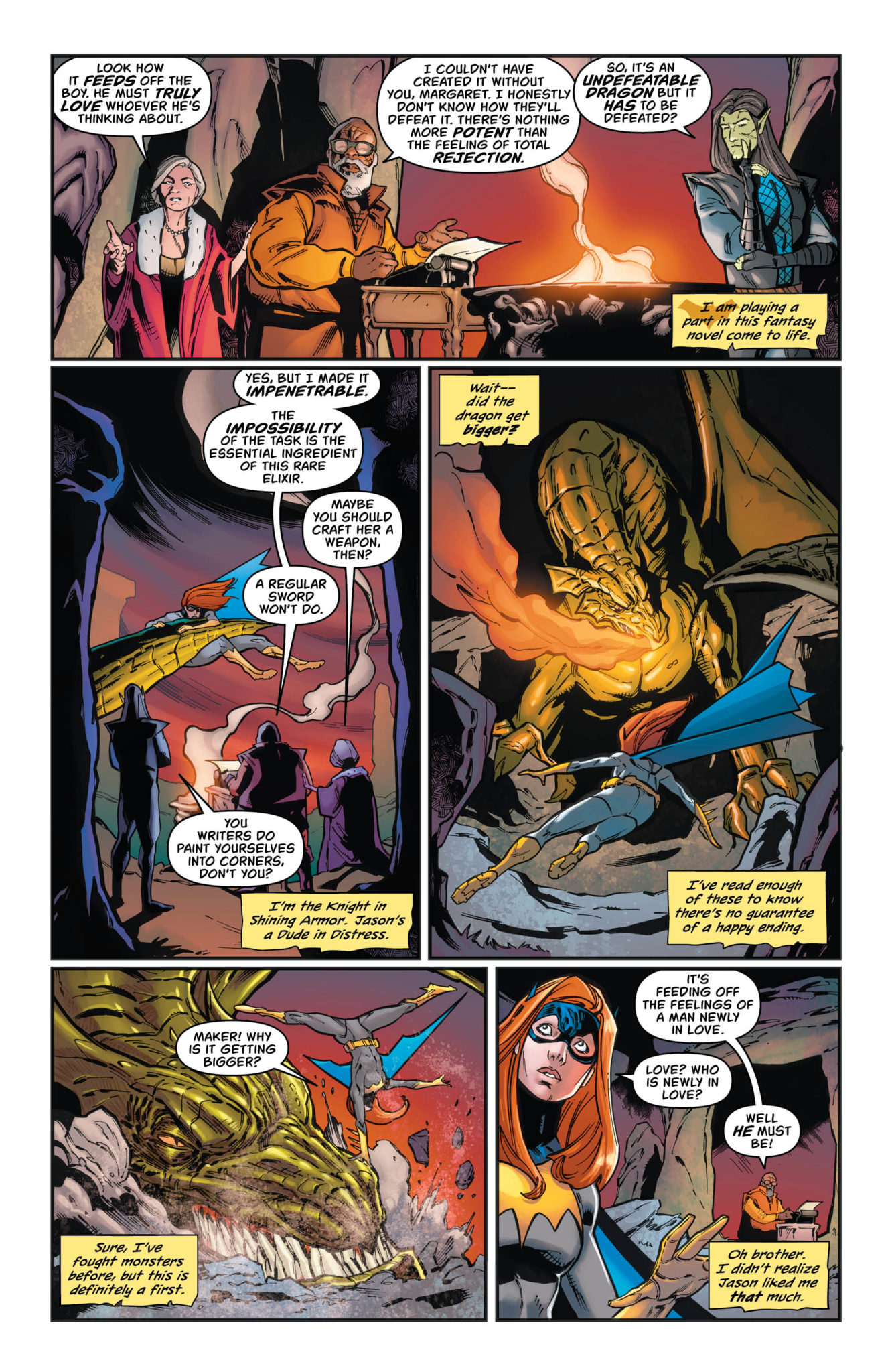
Last we saw, Batgirl was battling a dragon fueled by fear and love – literally. It’s probably not what you expected to hear, but to be fair, Barbara is probably feeling the same level of surprise right about now.
The real question is; what is more surprising? That Batgirl is fighting a literal dragon, or that she is slowly falling for Jason? A man who has stood up against her family and her superhero persona? The fact that this plot arc forces both surprises together is really icing on the cake.
Batgirl looks like she means business on this alternate cover of Batgirl #44.
The Writing
Batgirl #41 is one of those issues unafraid to truly dive headfirst into the plot. Here Cecil Castellucci has forced her characters to verbalize all of their hopes and fears, all as a way to stand a chance against their newest antagonist.
It’s a surprising way of handling things, yet it is quite clever. The intentional parallels between Batgirl and Jason’s confessions were endearing and poignant. They were so full of emotion, especially of fear. Specifically, the fear the comes with new love; the fear of rejection and potential pain.
It’s something the series has been dancing around a lot lately, so it’s actually quite refreshing to see it spoken about so openly. It’s not something you see in comics every day, so appreciate this moment while it lasts.
There were several more twists that occurred after the dramatic heart-to-heart that culminated during the battle. One of these twists made thematic sense for everything that has just occurred. It felt right. The other? Well, that’s the beginning of a whole new set of adventures for Batgirl, from the looks of it.
And so the battle begins (or rather, continues) in Batgirl #44.
The Artwork
The artwork in Batgirl #44 took full advantage of what it had available. After all, it really isn’t exactly common to see Batgirl battle a dragon. Least of all a dragon powered by such strong emotions. The scenes that followed were dramatic, as one would hope and expect to see when a fire breathing dragon has entered the fray.
The colors for this issue were phenomenal, using a balance between vibrant colors and dark backgrounds. It was everything you’d expect to find in epic fantasy, with a touch of Batgirl’s classic color palette.
Batgirl #44 was illustrated by Cian Tormey, with colors provided by Chris Sotomayor, and lettering by Andworld Design. Together they’ve created us a world that is both fantastical (literally) and very much grounded in Barbara’s world.
A battle for love…without proper planning.
In Conclusion
Batgirl #44 was a highly entertaining read, one that was unafraid to address the elephant in the room: the budding relationship between Barbara and Jason. All while moving the plot forward and setting up for a whole new complication for our besotted heroine.


")