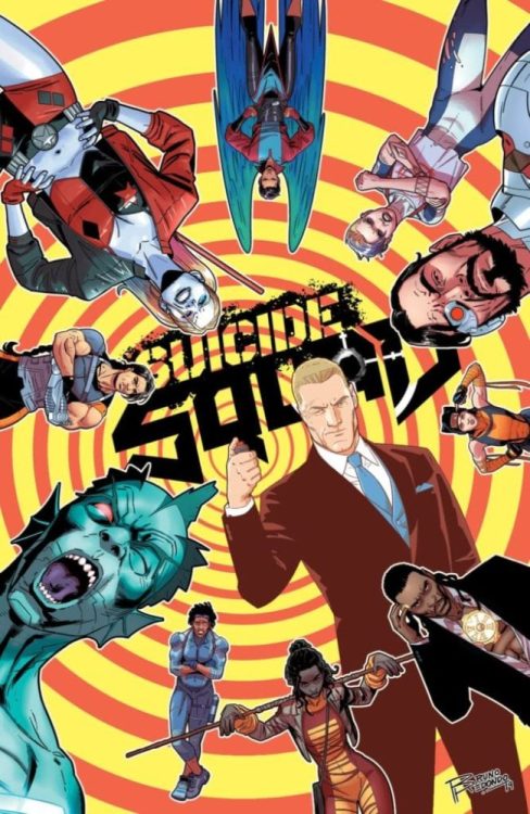
Written by Tom Taylor, with art by Bruno Redondo, colors by Adriano Lucas, and letters by Wes Abbott, Suicide Squad #2 takes confusing turns in the best way. This creative team brings the Squad back to its espionage roots by giving us half a story. Proving they can do fun with the best of them, the creative team goes dark and treacherous now. Somehow, it’s still a blast.

Writing
Taylor knows how to tell a story. Holding his cards close to the chest, readers get the impression that this story of backdoor dealings is happening between the panels. In the gutters and in between pages, whispers and nods are exchanged. We only see what they want us to see. But the Suicide Squad, after all, is meant to be an undercover government group, so Taylor’s approach is magnificently fitting. It allows the reader to feel like they are a part of the story, piecing together what’s really going on.
Art
Redondo’s art plays a huge role in initiating this shift in tone. Early in the issue, someone’s head blows up in the team’s face. While this might seem like a dark turn, there was plenty of blood and gore in the previous issue. Exploding bodies played for laughs. But it’s Floyd Lawton (Deadshot) who tips us off that this is something else. Redondo draws him with his face covered in specks of blood, pupils like pin pricks. It takes a lot to rattle Floyd, but the opening moments of this issue do, so we know we’re in for hell!

Coloring
Lucas’ colors fight the change of tone with dazzling results. The violence is still accompanied by neon yellows and bright purples and reds. We still get the impression that these scenes would fit comfortably in a Tarantino flick. But the tug-of-war that goes on between writer and colorist here is beautiful. It makes it so that the “we’re getting serious now” chapter doesn’t take itself too seriously. The undiluted fun doesn’t stop just because the stakes are ramped up for the Squad. No somber cloud insists on making note of the maturation of the plot. It’s still going to be a joyride.
Lettering
If we were to draw sides, with who’s been designated the “fun” team and who’s been designated the “let’s get serious” team, Abbott firmly stakes his claim on the fun side. From the first bloodied title page, to the last deafening sound effect, Abbott goes big. And because Abbott has so much fun on the page, even with simple datelines, his pulling back becomes noticeable. In the final moments of the issue, the speech bubbles are drawn small. The silence around the characters feels unending. And so the weight of the events of the issue are given room to be driven home for the reader.
It’s hard not to go on and on about this issue. It’s just freaking brilliant, with a creative team that actively works to balance each other’s approaches. There is so much to love. Hopefully, we’ll be seeing a lot more of this run and this creative team. If we are, rest assured, the Squad is in good hands. Pick up Suicide Squad #2 today at a local comic shop near you.


