QUANTUM & WOODY #2, out this Wednesday from Valiant Comics is a chaos fueled and highly entertaining read, as Quantum and Woody face off against the infamous Doctor Toilet (pronounced ‘Twah-Ley’).
Quantum & Woody #2 is showcasing the differing personalities of these two characters, is it not?
***SPOILER WARNING***
Quantum & Woody, the dynamic and highly chaotic duo, are back for a miniseries, and they’re about to make the most of it. As if these two didn’t have enough energy to keep a series going, two more characters are about to join the fray.
Enter Doctor Toilet (though if you pronounce it as anything other than ‘Twah-Lay’ you’ll risk being scolded), and The Apprehension. These two couldn’t be bigger polar opposites if they tried. But they’re sure to keep our heroes (er, want to be heroes?) busy.
An ally is about to make her appearance in Quantum & Woody #2.
The Writing
With Christopher Hastings at the helm of this project, you just know that he’s having a blast. The writing in Quantum & Woody #2 pretty much gives it away. This is a fast-paced read, with something hectic always occurring on the pages.
It fits the duo well, actually. Quantum & Woody are not the type that can sit still. Unfortunately, they tend to go about problem solving in different ways…thus their hero missions tend to get a bit disorganized. On the bright side, that makes it all the more entertaining for us readers.
Quantum & Woody #2 is an issue full of wit and frenzied action. The banter, the pacing, and the introduction of new characters are all enough to keep the plot up in the air. Meanwhile, there’s something oddly compelling about The Apprehension and her character design.
For a brief moment the humor contained within this issue surpassed the foreshadowing. But it all came back down to reality quickly enough, leaving readers with one more reason to be concerned about ulterior motives and potential betrayals.
Quantum & Woody…looking more comical than dramatic. Yeah, that holds for these two brothers.
The Artwork
Quantum & Woody #2 had a bit of a hectic plot to keep up with – one that made plenty of demands on the artists. The panels in this issue are full to the brim of action, characters rushing to and fro, and lots of other entertaining other shocking elements.
Ryan Browne was the lead artist for this issue, and he really ran with some of the concepts provided. Doctor Toilet’s antics, in particular, lent really well to some…creative and hilarious scenes. But even without his inclusion, this issue would have been a lot of fun.
Ruth Redmond was the colorist, and his work really made the artwork pop. That introductory scene is a real eye-catcher! The bright colors really sold several of the scenes, while also leaving room for The Apprehension to look dramatic (and competent).
Finally, Hassan Otsmane-Elhaou was the letterer, and once again we’re left with the impression that they had a lot of fun with this issue. There were plenty of sound effects to go around, as well as carefully placed exclamations that made a scene all the more amusing.
In Conclusion
Quantum & Woody #2 was a highly entertaining read, one that will keep readers enthralled from beginning to end. The frenzied action nicely complements the sometimes desperate feeling we get from our heroes, as they try to become something greater.
The conclusion and foreshadowing of this issue is going to be more than enough to keep fans eagerly looking forward to Quantum & Woody #3.
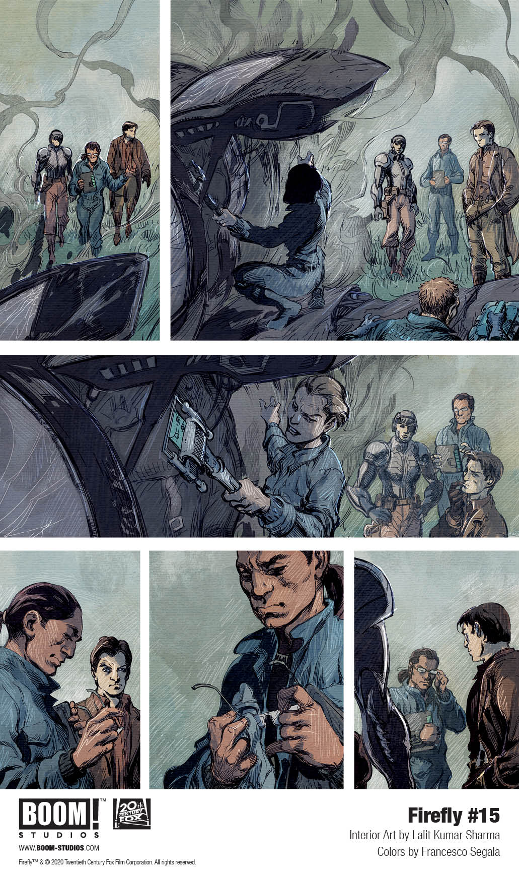
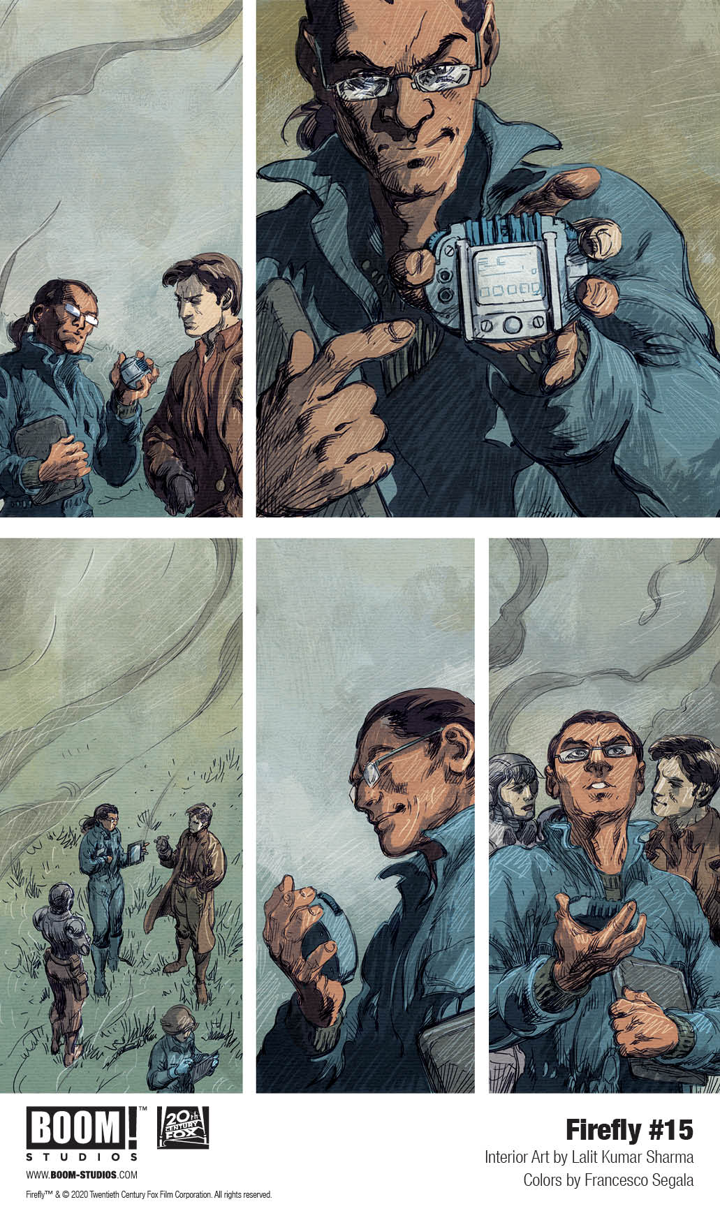
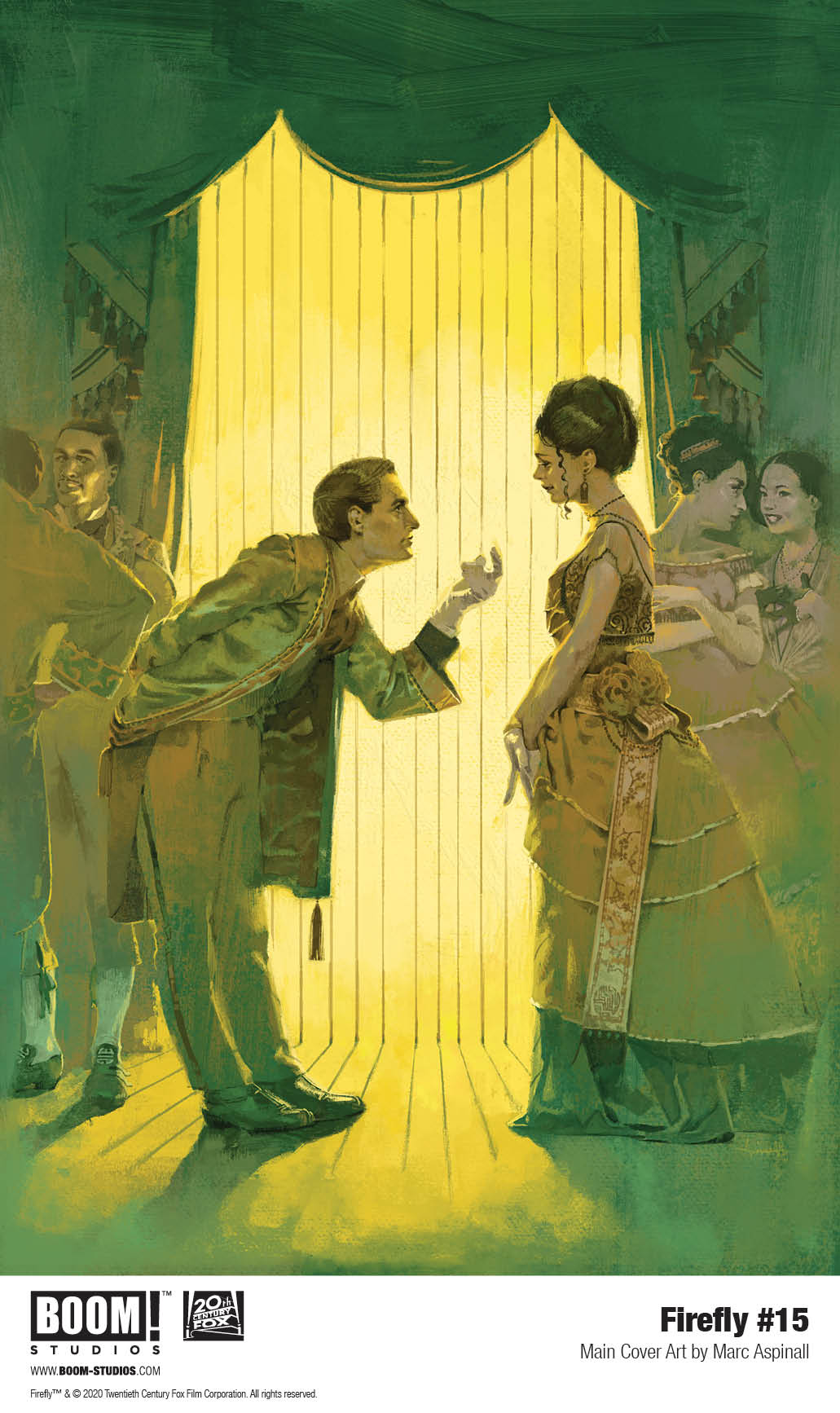
Firefly #15 hits your local comic book store March 18th, but thanks to BOOM! Studios, Monkeys Fighting Robots has an exclusive three-page preview for you.
About the issue: A Browncoat at heart, Sheriff Mal Reynolds does have to admit that there might be one single perk to a government job: actually having the time to court Inara Serra, now that he doesn’t have to worry about things like dodging the government. But something’s fishy with the Blue Sun executives who have taken up residence in Mal’s sector…will investigating it mean walking away from Inara?
Firefly #15 is by writer Greg Pak and artist Lalit Kumar Sharma, with colors by Francesco Segala, and letters by Jim Campbell. The main cover is by Marc Aspinall, with variants by George Kamboudais, Daniel Warren Johnson, and more. Firefly series creator Joss Whedon serves as a story consultant.
Created by Whedon and set 500 years in the future in the wake of a universal civil war, FIREFLY centers on the crew of Serenity, a small transport spaceship that doesn’t have a planet to call home. Captain Malcolm “Mal” Reynolds, a defeated soldier who opposed the unification of the planets by the totalitarian governed Alliance, will undertake any job — legal or not — to stay afloat and keep his crew fed. Thrust together by necessity but staying together out of loyalty, these disparate men and women are seeking adventure and the good life, but face constant challenges on the new frontier, such as avoiding capture by the Alliance, and evading the dangers you find on the fringes of the universe.
Check out the Firefly #15 preview below:
Are you reading Firefly? Who’s your favorite Browncoat? Sound off in the comments!
Available now, Firefly: Legacy Edition Book One collects previously released Serenity comics for the first time under one cover in a new value-priced format as Mal & the crew ride again in these official sequels to the critically acclaimed Firefly television series and Serenity film.
Livio Ramondelli has created one of the surprise-best comics of recent months with his all-robot cast in “The Kill Lock.” This third issue offers more of the fantastic characterization and thoughtful plotting in conjunction with foreboding artistic detail seen so far, and makes this comic one of the most anticipated series from month to month.
“Continuing their search for a cure by seeking out one of the Kill Lock’s creators, the bots bound by it find themselves on a world that was decimated by one of their own. Meanwhile, the group’s most dangerous member, the Artisan, decides it’s time he takes over the education of their youngest, the Kid.”
Writing & Plot
The true wonder of “The Kill Lock” has been the distinct humanization of each of the four main characters. The dialogue amongst them is completely distinct based on each one, and this is also based on each of their backstories. The flaws and personalities of these robots makes them endearing characters each in their own way. Even the serial killer of the group, who absolutely deserves his punishment, is oddly likable with his joyously sociopathic attitude. This issue focused primarily on the past actions of The Wraith as a warrior, as well as the tragic circumstances leading to The Kid being given the Kill Lock. There is more criticism of the society that created these machines in this chapter, making this issue more grand in scale while still maintaining the personal and quiet atmosphere. The growing complexity of the characters themselves and their story together keeps this comic deeply compelling from chapter to chapter.
Art Direction
The gorgeously grimy and dark visuals of “The Kill Lock” are here to stay with the arrival of issue three, as they’ve become this series’ prime aesthetic for the story being told. The used future setting in conjunction with the desperate plot have created the perfect world for this sort of art, and vice versa. The individual designs of the characters are original yet somewhat familiar in terms of robot design, but they have humanity and range despite their steel facias. The environment this time around is a planet decimated by a one-sided war, and so the air is gray and full of ash. This desolate and sad setting is another perfect stage for the story of these characters to continue on, especially given the tragic backstories given in the plot. Livio Ramondelli is a master of his specific craft, and the atmosphere he creates sells every moment of the story he tells.
“The Kill Lock” #3 is another stellar issue in one of the best comics running at this time. The story progresses not just in terms of forward plot, but in the stories of the characters that are divulged by Ramondelli in this chapter. The artistic vision of Livio Ramondelli continues to pull the reader into the desolate worlds the story inhabits and makes this cast of criminal machines relatable in a way that’s a testament to the power of the comic medium. Be sure to grab this issue and the two before it at your local comic shop on 2/26!
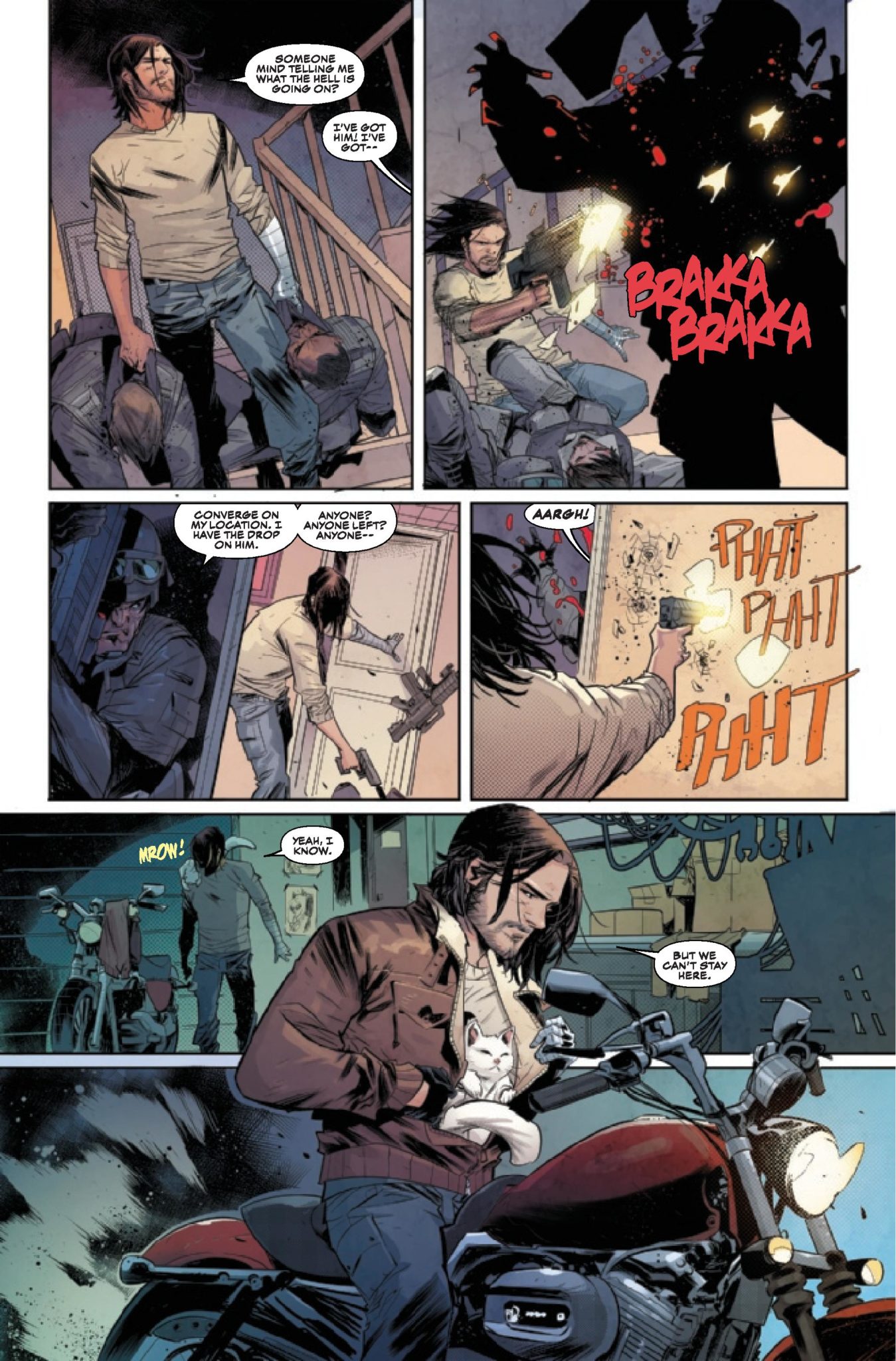
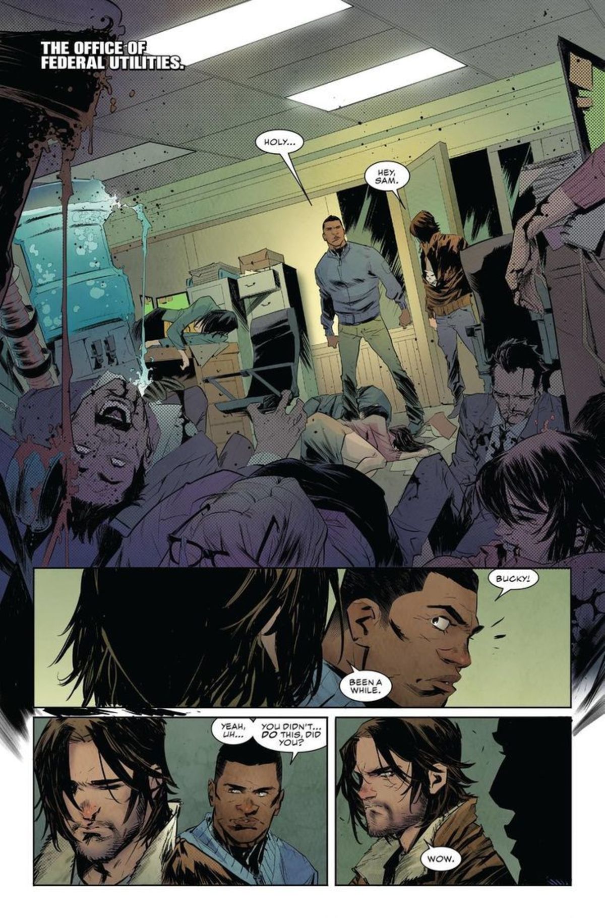
We’ll have to wait a while beforeThe Falcon and the Winter Soldier premieres, but Marvel Comics’ Falcon & The Winter Soldier #1 is sure to whet your appetite. On sale February 26, the opening installment of writer Derek Landy’s miniseries pays tribute to the fan-favorite dynamic of the Marvel Cinematic Universe’s Sam Wilson and Bucky Barnes. It also sets both heroes down a rabbit hole into an investigation of a Hydra revival. The stakes couldn’t be higher, and, by the end of the issue, Landy leaves us begging for more.
From the start, it’s clear Bucky Barnes is trying to escape his past.
Falcon & Winter Soldier #1
Writer: Derek Landy
Artist: Federico Vicentini
Color Artist: Matt Milla
Letterer: VC’s Joe Caramagna
In a good buddy cop story, the main characters have to be drastically different. Right away, Landy and the art team contrast Sam Wilson with Bucky Barnes. The first scene shows us that Bucky is trying to live a peaceful life at his house in Indiana. This idyllic scene is quickly ruined by the arrival of armed men. Letterer Caramagna accentuates this intrusion; he uses red to heighten the utter violence in the “Brakka, Brakka” sound effect of the goons’ bullets. Of course, Bucky defends himself, and he single-handedly defeats the mysterious squad.
Landy and the art team pay tribute to Bucky’s classic MCU fight scenes.
Landy then shifts to New York City, where Sam Wilson is chasing an investigative lead as Falcon. By simply showing us Wilson in this urban setting, Landy inherently points out the unique attributes of the two former Captain Americas. Plus, their clothing further sets them apart. Whereas Bucky wears unremarkable civilian clothes, Sam dons his colorful Falcon costume. Artist Federico Vicentini and color artist Matt Milla combine to show the sun reflecting off of the bright black-and-red outfit. Before the characters have even spoken to each other, Landy establishes their disparities.
Sam Wilson stays true to his superhero roots.
Naturally, the duo also differ ideologically. When Sam’s investigation leads him to a crime scene with dead bodies, he assumes Bucky is responsible because of his past as the Winter Soldier. Likewise, when Sam and Bucky fight a new antagonist, they get into an argument when Bucky tries to shoot their foe. While Bucky is accustomed to killing people, Sam firmly believes in a Steve Rogers-like moral code. Given that Sam and Bucky are investigating a resurgence of Hydra, they’ll have to iron out their moral conflicts if they hope to stop the infamous terrorist organization.
Though the first issue sets the series up to be an action thriller, Landy includes a few raw emotional moments in the story. Bucky and Sam go to see Veronica Eden, Bucky’s handler. Here, Landy and the art team depict her grief utter grief when Bucky tells her some heartbreaking news: all of her colleagues are dead. Bucky and Sam are hunting the then-unseen villain who killed them all. When Bucky delivers this awful news, Vicentini uses jagged lines for the background to convey Eden’s profound shock. Similarly, a few panels later, Milla shades in Eden’s face to complement the story’s cold, dreadful mood feeling as Eden processes this tragedy. This scene packs some powerful emotional weight, which makes Landy’s story more well-rounded.
When it comes to the relationship between Sam and Bucky, Landy hits a few of the same notes that we saw in the MCU. But he also adds enough twists to make it fresh; he leans away from the comedy and into a genuine clash, which has the potential for a more satisfying exploration of both characters. Along with plenty of thrilling action, Landy and the art team crafted a winning recipe with the opening installment of this series.
What’d you think of Falcon & Winter Soldier #1? Where do you hope to see the story go from here?
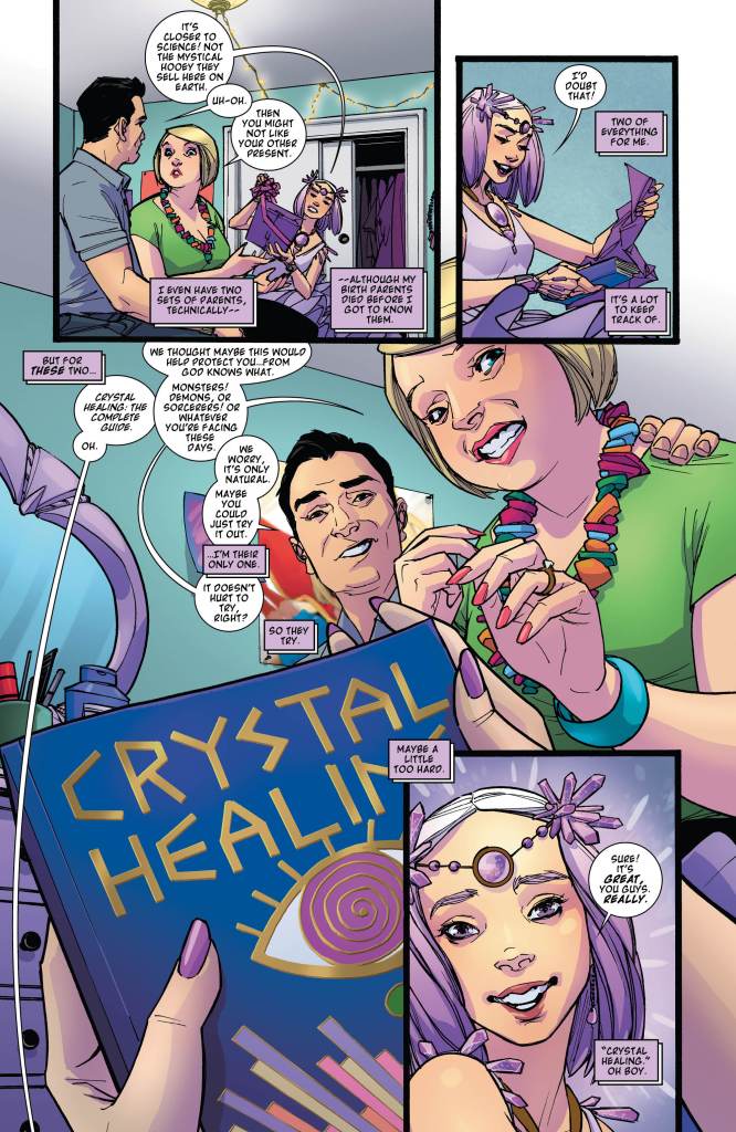
DC Comics recently (re)introduced Princess of The Gemworld sets out to enlist allies as she searches for her lost Kingdom in this weeks, Amethyst #1.
Art by Amy Reeder. Letters by Gabriela Downie
Amethyst was introduced into DC Comics’ newest continuity during the first arc of Young Justice in 2019 (Review). About a year later we see her in her own six-issue mini-series under the Wonder Comics imprint. Wonder Comics has given us a few wonderful series with Amethyst #1 seeming to follow suit. Albeit with a few bumps along the way.
GROWING PAINS WITH AMETHYST
Within the first few pages, Amy Winston (The Princess of Gemworld/Amethyst) gives the reader a quick background lesson. Who she is, the worlds she inhabits, her backstory, and that it’s her birthday. By doing this writer, Amy Reeder sets the story up where you don’t need to read Young Justice or the original series. Instead, she can go right into setting the plot of the six-issue mini-series.
Amethyst #1’s pace is consistent for the most part, with Reeder only dishing out details when needed. Therefore she keeps the readers invested with inklings of larger, darker happenings in the background. Furthermore, she shows Amethyst trying to stand on her own for the first time. This mirrors many teenager’s transitions to a life of their own following their birthday. Although she is still growing in the character department, you sense that she realizes she has to become independent from those that helped in her Kingdom. Becoming your own person is a hard feat, yet trying to find a whole Kingdom while trying to recruit others is even harder.
One problem that happens during a few moments in Amethyst #1 is the number of words in a single page/bubble. Nonetheless, it isn’t rampant, yet when it occurs it kills momentum. Towards the end of Amethyst #1, Reeder teases who might be behind everything. Hopefully, this is a bait and switch or a small part of the larger picture, as it seems easy to guess.
Art by Amy Reeder. Letters by Gabriela Downie
CRYSTALIZED ART
Reeder wears many hats for Amethyst #1 with her handling art and colors as well. Some of the pages presented benefit from this multiple workload, as Reeder plays around with paneling. One such page stands out where Reeder breaks page structure and forces the reader to read in a U shape. To clarify, Reeder begins with a vertical panel as Amethyst falls from the previous page. Usually, the next panel would be the top right, yet Reeder makes it the bottom right. She does this by having the next panel overlap the previous. The reason being, to show Amethyst climbing up the structure.
Reeder’s page structure is great throughout Amethyst #1, yet that page alone stands out. As Amethyst falls and rises so does the reader’s eyes. The natural movement of the reader’s eyes is amazing while making you feel as if you climbed the obstacle with her. Yet, not all pages are crystal clear. In some cases, Reeder’s panels become clustered with objects/people. These are far and few in between, but when they occur Amethyst #1’s pace takes a hit.
Color is a big factor in Gemworld with each of the twelve Kingdoms based on a different gem/crystal. Amethysts are violet-colored crystals; Reeder makes this well known. The Kingdom -albeit broken- is colored as such, so is Amethyst herself. The one other Kingdom that is showcased follows this trend. Nonetheless, Reeder never puts too much of the color on the page, as she adds varying shades of it and lighting effects. By using multiple layers to color each crystal, Reeder is able to make them shine in brilliant ways.
Art by Amy Reeder. Letters by Gabriela Downie
A HELPING EYE
Helping Reeder with Amethyst #1 is Gabriela Downie on letters. Downie helps declutter some of the heavier worded areas, which feels quite needed in those moments. Yet, during the more abstract pages/panels is were Downie’s lettering shines. Within the “up/down” page, Downie is essential in helping guide the reader’s eyes. This can be seen when the lettering overlaps the previous panel, helping guide where to go.
Another great moment occurs during the double-page spread where Amethyst regales her history. During this, Reeder includes multiple panels that tell Amethyst’s story, amazing visuals aside, some may find it hard to follow. Alas, Downie’s lettering elegantly takes your eyes and guides to amazingly through the double-page.
A GEMWORLD IN DANGER
Amethyst’s start isn’t crystal clear, yet there is a lot to love. By the end of the first issue, you can see how much love, time and effort the team put in. As it’s only a six-issue mini-series it’s exciting to see what the team has in store.
Fun Fact: Following Reeder on Twitter has been a blast as she’s been chronicling her work on Amethyst. The amount of detailing she has gone into for the gem/crystal visuals has been fascinating.
Amy Reeder’s crystal process. Via Twitter, @amyreeder
VISITOR OF GEMWORLD
How do you feel with the recent introduction to Amethyst’s world? Let us know down below.
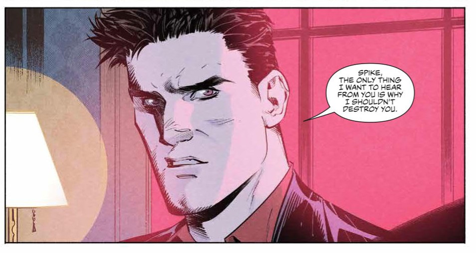
The Hellmouth Crossover has finished and Angel is free to return to L.A. to be reunited with his crew. Unfortunately, while he’s been gone another vampire has moved in on his patch, making like the hero but with a much better sense of humour.
In the latest issue of Angel from BOOM! Studios, Angel is joined by Spike, in title and practise. The last few issues have seen the infamous chaos bringer working with Fred and Gunn and now Spike has got his feet under the table. There is the obvious tension between the two vampires when Angel returns from his crossover trip but can they put their differences aside to fight the good fight? For the sake of a good story, let’s hope not.
Laying out the characters
Issue 9 of Angel (and now Spike) introduces a TV favourite character into BOOM!s Buffyverse: Kate Lockley. The detective is trying to help a reluctant youth when they are attacked by a supernatural creature. With no-where else to turn, and with a little nudging, Kate turns to Angel Investigations for help.
As with previous issues of Angel, artist Gleb Melnikov creates an intense atmosphere that sets the reader on edge. It is darker in tone, both visually and narratively, than it’s sister title Buffy. It also draws you into the story with the characters and then traps you with a sense of fear. Melnikov’s artwork builds tension and Roman Titov’s colors creates an all encompassing, nerve wracking mood.
The artwork, and layout designs, also create some outstanding, and often subtle, storytelling. Take page 5 of the most recent issue as an example.
Angel #9 Credit: BOOM! Studios
Angel has just returned home and discovered that his crew have been working with Spike. The page is the start of an argument between the two vampires with the two humans as focal points, trapped in between.
Not only does this page set the scene of this sequence in the comic but it also gives the readers a quick recap of the characters, realigning the status quo after the long Hellmouth Crossover.
The page is broken down into four tall, thin panels with a fifth panel taking up a third of the page at the bottom. The first panel in the sequence is the scene setter. It is a view of Angel’s Office/Home seen from above. The darkness outside lets the reader know that it is set at night but also reminds the reader of the danger that the outside world represents. L.A. is not a safe place and the encroaching darkness is a metaphor for this.
The speech in this opening panel is also scene setting. With lettering provided by Ed Dukeshire, the speech sums up the last few issues for the reader: Angel has been away and Spike has moved in. This single panel sets the scene beautifully; location and plot.
Angel #9 Panel Detail Credit: BOOM! Studios
Studious Fred
The next three panels do something similar but with the emphasis on particular characters instead of setting. Panels two to four each feature a portrait of a central character, in fact the three characters that have been carrying the story while Angel has been away. First is Fred, then Gunn, then the cause of the problems himself, Spike.
What makes these panels so interesting is that Melnikov packs them with character, combining imagery with the expertly selected dialogue by Bryan Edward Hill to create a sense of who the cast member is and where they have come from.
Fred is slightly dishevelled. Her recent past has been hard on her, throwing her out of her comfort zone and being hunted by demons and lawyers. However, she holds a warm, comforting drink in her hands. There is still an element of the homely young woman that Fred wants to be. Her personality is further enhanced by the background; a shelving unit packed with books. Fred is educated, smart.
Over the top of this is Angel’s explanation of where he has been in the last few weeks, but his words are easily attributable to Fred. “I was in Hell,” Angel says, a fair description of Fred’s life since she was introduced.
Angel #9 Panel Detail Credit: BOOM! Studios
Moody Gunn
Melnikov does the same character breakdown for Gunn in panel three. Charles is depicted with a sombre face, downcast, and with none of the comforting trapping that share Fred’s panel. There is a clock in the background, ticking away time, but to what? The clock could represent a schedule, a plan of action slowly unraveling. Is this representative of Gunn’s wait for his moment to strike out at Angel? Gunn is a vampire killer, protecting the innocence on the street, this is indicated by the speech overlaid on this panel.
“Protecting you from people like him,” This is spoken by Angel but could so easily have come from Gunn. Menikov reminds readers of Gunn’s mission, his fight against that which he now works for. As with Fred, Gunn’s past and a large part of his personality is on show in that single panel.
Angel #9 Panel Detail Credit: BOOM! Studios
The Vampires Two
When it comes to Spike the imagery and representation is more straightforward, just like the vampire himself. He is depicted with an indifferent face, as if he couldn’t care less about the confrontational nature of Angel. His arms are crossed and standoffish.
His speech is sarcastic and flippant. It is important that Spike speaks for himself at this moment. It asserts his authority over the situation, over Angel. Although Spike has become part of the group, he is not really part of the group. He is still an individual, working towards his own ends, whatever they may be.
The relationship between the two vampires is cemented in the final panel of the page. A third of the page is given over to a head shot of Angel, framed between the interior white light and the ominous red light from outside. The lighting illustrates the two forces within the vampire with a soul; the good and the evil, the opposing sides that make him who he is.
Down the centre of the panel you have his stern face. Always serious, always brooding. His speech is succinct and straight to the point. This final panel on the page is the very essence of who Angel is.
As you finish reading the panel, taking in Angel’s personality, you contrast him against the other cast members. The page can be taken as a whole entity, like a roll call or character sheet from a role playing game. Melnikov uses the page to set the scene, highlight the conflict between two of the characters, but also sums up the personalities of Angel’s team. Succinctly and extremely effectively.
Each of the panels is steeped in character and these five panels contain so much storytelling, so much personality. This condensed page allows Hill and Melnikov to focus more of the comic on the plot and the introduction of Kate Lockley. The pace of the comic overall is fast, with building tension and action covering many pages but this is only possible because Melnikov is able to successfully pack so much into this single page.
It’s pages like this that make reading comics so exciting.
Kipo And The Age of Wonderbeasts is an animated series from Dreamworks that premiered on Netflix in January and features the voice acting of Karen Fukuhara (The Boys), Sterling K. Brown (This Is Us), and legendary musician Joan Jett to name a few. Creating the soundscape for this fantastical world is composer Daniel Rojas.
Fukuhara is the voice of Kipo Oak, a young girl traversing the world in search of her people. Kipo lives in an underground city, but when she’s forced to flee, the young girl faces a trip across a strange, post-apocalyptic surface ruled by “mutes,” animals that have not only physically been mutated but are also sentient. The show’s creator, Radford Sechrist, compared the series to The Wizard of Oz, “but instead of ruby slippers [Kipo] has Converse on.”
PopAxiom spent some time talking with Daniel about his career as a musician, his diverse tastes in music, and scoring for Kipo and the Age of Wonderbeasts.
Musical Family
Daniel is Costa Rican, and his musical journey began before he was even born. “My parents are both musicians, so I’ve been in the world of music for most of my life. My parents are classical musicians, and I got an early start because of that.”
Without hesitation, Daniel says, “I wanted to pursue music in high school. It’s what I wanted to do for life.” Daniel pursued this path with a “… jazz degree in college …”
After the education, the young composer “… moved out to L.A. to pursue film and television scoring.”
City Of Angels
Daniel arrived in L.A. with a degree and a lifetime of musical experience. It was time to put it all to work. “I started off with ads. It’s such a short form, and there are so many of them. There’s rarely any story. It’s hard to develop in 30 seconds or a minute. It’s good practice.”
After a “couple years” of scoring ads, Daniel began doing short films which helped “… to train more on the storytelling aspect. I was also an assistant to several composers, for instance, I worked for Klaus Badelt, and I worked some time at Han Zimmer’s Remote Control.”
Rising through L.A.’s competitive creative market saw Daniel “… bounce around doing all kinds of things. Little tech jobs; orchestration; programming.”
Kipo Came Calling
Daniel’s agent came across a potential new gig for Daniel. “Dreamworks was looking for someone who was not just a traditional composer but also a songwriter and song producer because of the style of music that they had in mind.”
Working his way through L.A. afforded Daniel a wide range of musical elements to work in and around. “During the time I’d been scoring, I also had a double-life doing a lot of song sessions and song production. My agent thought I would be a good fit for the show based on the description of what they were looking for.”
Outside of some basic information, Daniel says making the right demo for Dreamworks involved slight moments of doubt. “When I was putting together the demo for Dreamworks, I didn’t know much about the project. I was thinking to myself, ‘Man, my demos are all over the place.’
The final version included “… a couple beats, a rock tune, some pop songs, a couple more folky sounding things, and some score cues.”
Dream Fit
As it happens, Daniel sent over the demo and “… that was what they were looking for. It was the right fit at the right time.”
Dreamworks was creating a dynamic show with beautiful animation, lovable characters, and a robust soundtrack. “They wanted to have one person to do the songs and score so that it would be cohesive. It was challenging, but we worked to get there.”
Daniel teases, “We want to release the score, but nothing has been set.”
Kipo is a cartoon for all ages. “That was the goal to have a larger appeal and not just kids.”
Scoring for live-action film and television is challenging enough. Doing the same for animation is a whole different [wonder] beast. “When I was working on the songs, I was working with the animatics, which are basically storyboards. The script was still changing, so revisions were being sent to me.”
Wrapping Up
Of his musical tastes, Daniel says, “It’s all over the place.” He continues, “I was classically trained early, so I was a pretty nerdy conservatory kid. But then I got into jazz in high school; Coltrane, Miles, Barker … all the jazz guys. I went to college in North Texas to study jazz.”
Daniel’s music interests don’t stop there. “I’ve always liked all kinds of music. Hip hop, rock, pop music, etc.”
In the age of remakes, what would Daniel love to be a part of? “I’m really excited about Space Jam and … the sequel. But Hans Zimmer is doing it according to IMDB, so I’m out of the picture on that one.” Daniel laughs.
Kipo is out on Netflix with a 10-episode season. So, what’s coming next from Daniel? “At the moment, I’m pitching for another animated show that I can’t really talk about. There’s talk of more Kipo. In the next month or so, I’ll be working on a live-action feature film.”
Did you watch Kipo and the Age of the Wonderbeasts?
Thanks to Daniel Rojas and Impact24 PR for making this interview possible.
Want to read more interviews like this? CLICK HERE.
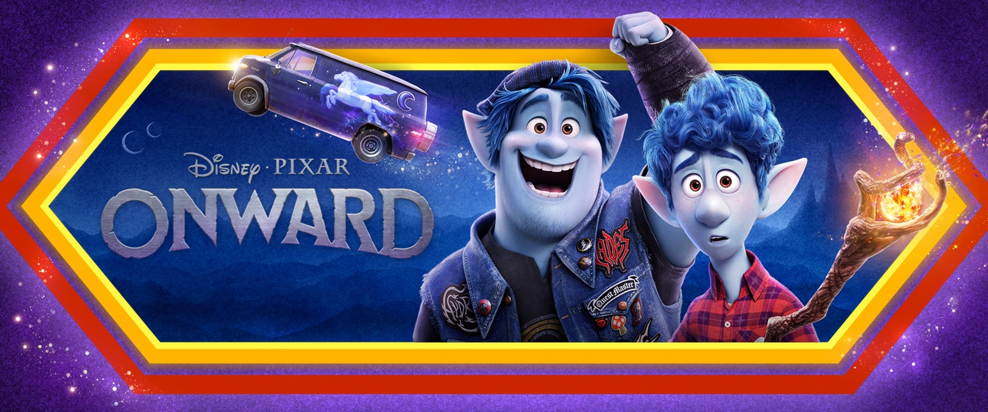
Monkeys Fighting Robots and Pixar have teamed up to bring you a special screening of ONWARD!
The screening will be held in Tampa on Tuesday, March 3.
AMC West Shore 14
210 Westshore Plaza
Tampa FL 33609
The contest is straightforward to enter:
• Join our newsletter
• Like Monkeys Fighting Robots on Facebook
• Follow Monkeys Fighting Robots on Instagram
• Comment on this post below.
Good luck! Winners will be chosen at random on February 28, at 3 PM EST.
When teenage elf brothers Ian and Barley Lightfoot (voices of Tom Holland and Chris Pratt) get an unexpected opportunity to spend one more day with their late dad, they embark on an extraordinary quest aboard Barley’s epic van Guinevere. Like any good quest, their journey is filled with magic spells, cryptic maps, impossible obstacles and unimaginable discoveries. But when the boys’ fearless mom Laurel (voice of Julia Louis-Dreyfus) realizes her sons are missing, she teams up with a part-lion, part-bat, part-scorpion, former warrior – aka The Manticore (voice of Octavia Spencer) – and heads off to find them. Perilous curses aside, this one magical day could mean more than any of them ever dreamed. Directed by Dan Scanlon and produced by Kori Rae, Disney and Pixar’s “Onward” opens in U.S. theaters on March 6, 2020.
Rules
NO PURCHASE NECESSARY. Limit 1 admit-two passes per person. This film is not yet rated. Must be 13 years of age or older to win passes. Employees of all promotional partners and their agencies are not eligible. Void where prohibited. Entries must be received by 2:59 PM, February 28, 2020, to be eligible to receive a pass. Winners will be contacted via e-mail to receive their pass. Sponsors not responsible for incomplete, lost, late or misdirected entries or for failure to receive entries due to transmission or technical failures of any kind. SEATING IS LIMITED, SO ARRIVE EARLY. PASS DOES NOT GUARANTEE A SEAT AT THE SCREENING. Refer to screening pass for further restrictions. ONE ENTRY PER PERSON.
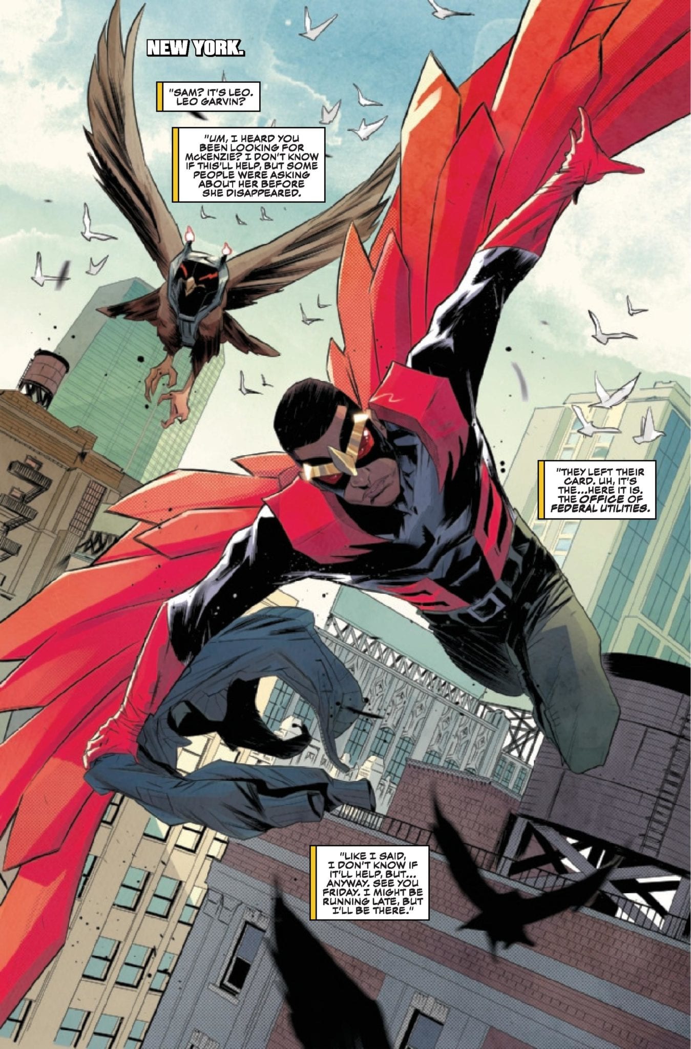
Falcon & Winter Soldier #1 (of 3) out this week from Marvel Comics, sets up the mystery with amazing art Federico Vicentini. Check out the six-page preview.
The book is written by Derek Landy, with art by Vicentini, Matt Milla handles colors, and letters by Joe Caramagna. Dan Mora and David Curiel worked on the cover.
About Falcon & Winter Soldier #1 (of 3): An office of dead government agents. A gifted new killer. Two ex-Captain Americas…
When a dramatic attempt on the life of Bucky Barnes reunites him with Sam Wilson, the two old friends are plunged headlong into a race to uncover the new leader of Hydra before a mass casualty event announces the terror group’s resurgence to the world. The clock is ticking…
Will you give Falcon & Winter Soldier a chance? Give us your thoughts in the comment section below or on social media.
Enjoy the Falcon & Winter Soldier #1 preview.
Joe Simon and Jack Kirby created Bucky Barnes, and he first appeared in Captain America Comics #1 from March 1941, published by Timely Comics. Ed Brubaker and Steve Epting crafted Winter Soldier, and he first appeared in Captain America #1 from January 2005.
According to Wikipedia, Sam Wilson, aka the Falcon, was the first mainstream African-American superhero in mainstream comic books. Stan Lee and artist Gene Colan created the character, and he first appeared in Captain America #117 from September 1969.
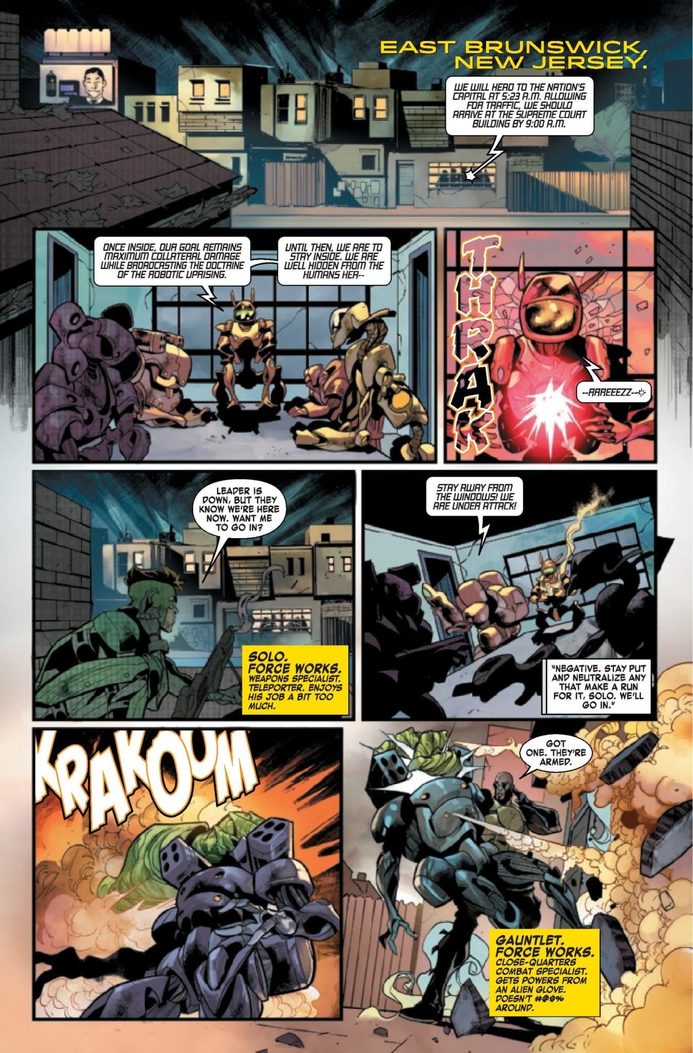
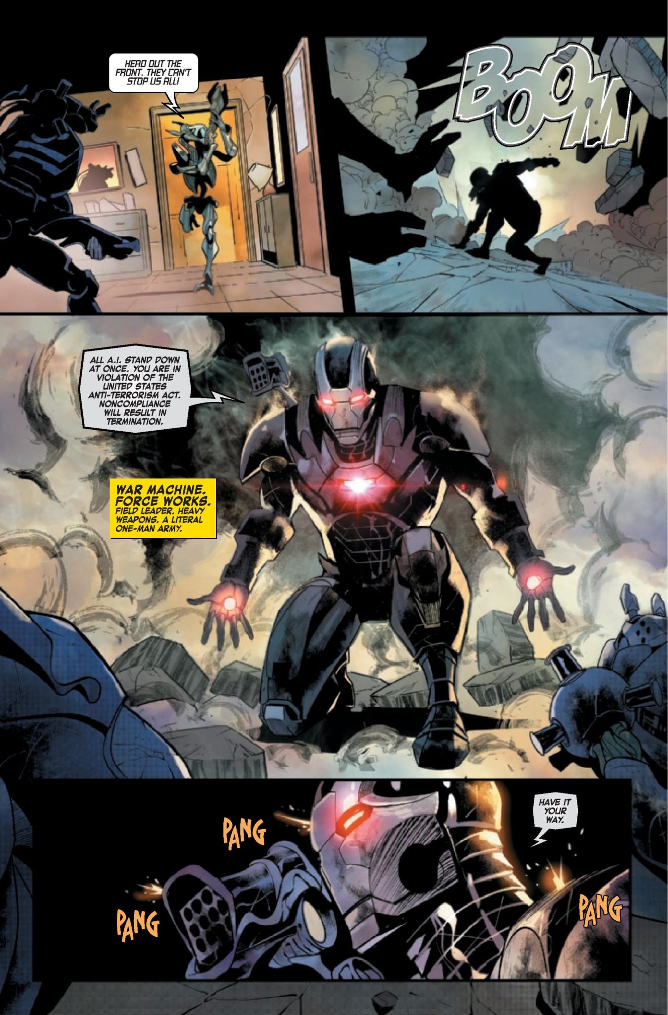
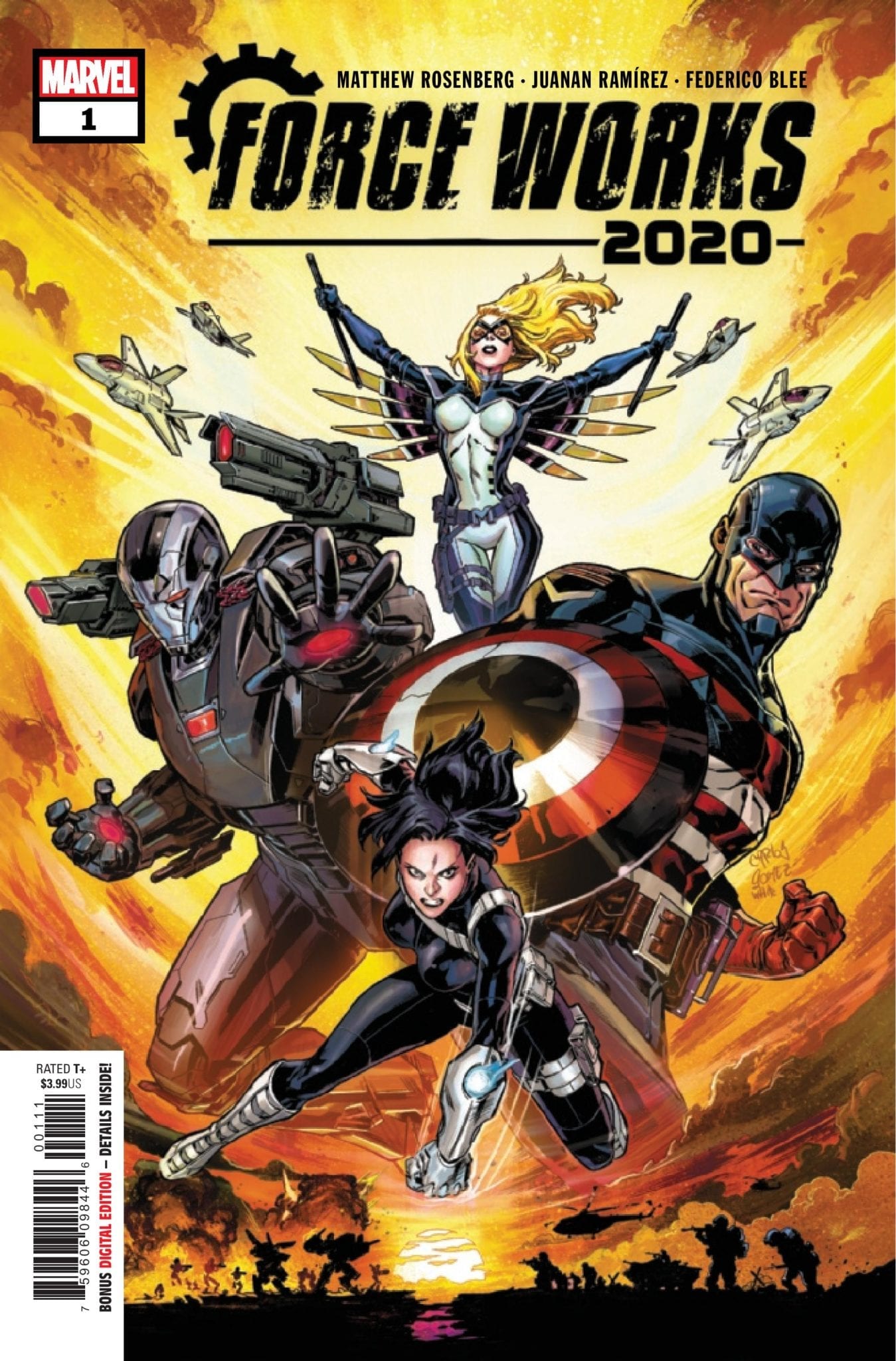
War Machine has his hands full this week in Force Works 2020 #1, out February 26, Marvel Comics sent us a four-page preview for you to check out.
The three-issue mini-series is written by Matthew Rosenberg, with art by Juanan Ramírez, Federico Blee dropped some colors, and you will read Clayton Cowles’ letters.
About the book: The eruption of a violent robot revolution threatens all manner of biological life! Teetering on the precipice of extinction, there’s only one man with enough tactical skill, killer instinct, and ruthless leadership to lead the rebellion: War Machine! Join War Machine and his elite paramilitary squad (U.S.Agent, Mockingbird, and Quake) in the final crusade for humanity’s fate!
Are you reading Iron Man 2020, what do you think of the story arc so far? Give us your thoughts in the comment section below or on social media.
Enjoy the Force Works 2020 #1 preview.
David Michelinie and John Byrne created James Rupert “Rhodey” Rhodes, with his first appearance in Iron Man #118 from January 1979. Rhodes became War Machine in Iron Man #282 back in July 1992. Len Kaminski and Kevin Hopgood created the War Machine Armor.
David Michelinie and artist Marc Silvestri created Solo, and he first appeared in Web of Spider-Man #19 from October 1986.
Dan Slott, Stefano Caselli, and Eric Powell created Joseph Green, aka the Gauntlet. He first appeared in She-Hulk #100