Home Blog Page 336

Review: Dynamite’s JAMES BOND #4 Finds Terrorists In The Art World

James Bond #4, Richardson Cover

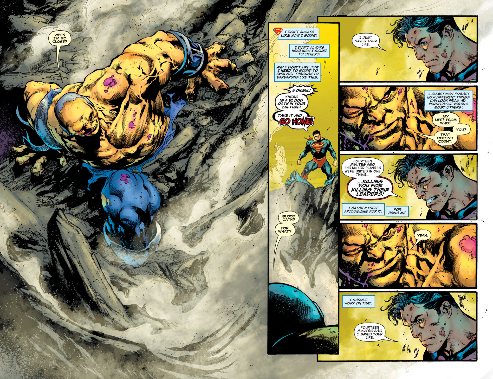
Dynamite’s JAMES BOND #4 out this week, kicks off a new mission for the world’s greatest super-spy as he tracks down eco-terrorists that hide their secret plans in counterfeit art. It turns out Bond is not the only agent on the hunt. Will he get the plans first? Let’s find out.

Summary

JAMES BOND #4 begins a new arc for the titular super spy by Vita Ayala and Danny Lore. It’s a relatively complete story that nicely sets up what’s to come in future issues. The progression of the plot holds very true to the spirit of a standard James Bond adventure. However, a few missteps keep this book from elevating above just ‘good’.

Cover

Afua Richardson has crafted an elegant cover for this issue. Bond’s pose is emblematic of his character as portrayed on screen. Bond is refined and arrogant, with just the right hint of charm. Richardson expertly paints the supporting character of Brandy Keys as both attractive and dangerous.

Oddly, the lighting comes in at angles that don’t fit the character poses. For example, there’s a star-like light source just above Brandy’s left shoulder that creates a yellow/orange glow projecting down and to the right. Brandy is in between the light and James, yet the light hits James’ entire left side. It’s a nitpick, but there appear to be several light sources that repeat the same problem multiple times on one cover. It’s enough to lessen what would be an otherwise great cover.

Writing

Ayala and Lore have put together an excellent mystery for James Bond to solve, requiring guile over shootouts. Ayala and Lore really did their homework researching Shakespeare and Brodeur to give this story a degree of authenticity in dealing (no pun intended) with the art world. There’s also a great setup with the main villain that may not be a villain at all, keeping the door open for more mystery-solving in the issues to come.

Where the story struggles is matching some of the dialog to the action that’s happening in the panels. For example, there’s a scene where Bond is engaging with some flirtatious banter with M’s secretary (Miss Money Penny?), and their banter ends when two men leave M’s office. The dialog midway through that conversation doesn’t at all match what’s happening and is confusing in context. It’s the type of mismatch that makes you have to go back and read it again a few times, yet you still wind up saying to yourself, “What? Huh? I don’t get it”.

There’s another scene where James Bond is taking a smoke break outside while eavesdropping on two henchmen. Bond flicks away his finished cigarette, and that somehow alerts the henchman that he’s a person of interest. Again, “What? Huh? I don’t get it.” You get the feeling Bond was supposed to have said or done something in that panel that creates the tip-off, but there’s nothing there. Overall, you get a distinct impression of a disconnect between writer and artist.

Coloring

The coloring by Roshan Kurichiyanil is very muted and bland. There are several panels, and even a few pages, where the skin tone of the characters matches the wall in the background. Kurichiyanil’s coloring choices give the entire book a sepia saturation that keeps the dark scenes from getting lost in shadow, but on the whole, nothing pops, and the reader has to lean exclusively on the inks for visual interest. Otherwise, the characters almost look like they are part of the furniture.

James Bond #4, Color Sample

Lettering

Ariana Maher nailed the lettering in this issue. It’s especially difficult to carry on an enactment of Othello in the background when a Bond story is happening in the foreground. Maher keeps the multiple dialog streams clear for the reader.

Pencils/Inks

Erica D’Urso does a good job constructing the world of Bond. The social events look opulent and high class. The bad guys look dangerous, and the heroes look suave and sophisticated.

That said, there are three areas (One small, one medium, and one large) where the art sticks out like a sore thumb, and not in a good way.

The small issue is regarding Brandy’s hands. In several panels, the hands appear very thick and over-sized. In some cases, her hands are bigger than her face and as thick as animal paws. It’s a small issue, but it looks so out of place on Brandy’s thin, statuesque frame that it becomes a distraction. Work on matching the hands to the frame.

The medium issue is with the fight scenes. The action sometimes doesn’t make sense in how they flow. In one case, a henchman is standing between Bond and a table with a coffee machine on it. The henchman swings and punches Bond, pushing him back. In the very next panel, Bond grabs the coffee machine and throws it at the henchman several feet away. How did Bond get past the henchman to get at the coffee machine? How was the henchman standing between Bond and the table in one panel and instantly standing several feet away in the next? The fights are dynamic, but the movements defy logic. It will help if the fight scenes are choreographed first before drawing takes place.

The largest issue is a design choice for one specific character, Miss Masters, the new tech scientist on Q’s team. It’s unclear if this was D’Urso’s choice or if the character was drawn according to the writers’ specifications. No scientist with any credibility would ever enter a lab environment wearing high heels and a micro mini cocktail dress. A weapons lab is a hazardous environment, and every lab abides by a standard set of rules for clothes to wear for safety reasons. D’Urso introduces what could be an interesting character and de-legitimizes her all at the same time. By her design, Miss Masters says “I don’t know what I’m doing, and my peers won’t take me seriously, but I look cool.” Design the characters to match what they’re doing.

Conclusion

JAMES BOND #4 is a good story with plenty of mystery that keeps the reader wondering what will happen next. That’s the goal of any good story. If the creative team can work to improve the structural flaws, this has a chance of becoming a keeper.

Monkeys Fighting Robots Youtube

Review: An Inheritance of Ghosts in THE DOLLHOUSE FAMILY #5

M.R. Carey and Peter Gross’ “The Dollhouse Family” has been a pleasant surprise of horror/mystery, with the latter of these two making up the bulk of issue #5. The unflinching terror of previous issues is replaced with a curious investigation that clears up much of the history behind the Dollhouse, and still makes for a terrifically eerie read.

“The Dollhouse has taken away another piece of Alice’s soul…but this time she’s not running away. This time she’s going to uncover the secret of the House’s terrible birth…and use that knowledge to destroy it once and for all!”

Writing & Plot

M.R. Carey‘s careful and tight plotting is explored at its most thorough in the pages of “The Dollhouse Family” #5. This issue sets Alice on a journey to rescue her daughter from the clutches of the Dollhouse by finding out about the devilish toy’s past. Even with the investigative nature of this issue, Carey still plays his plot close to the chest. There’s just enough information given to answer a few questions, but still so much kept away to further drag the audience into the story’s murky depths. Horror fans needn’t be put off by this chapter’s more mystery guided tone. There’s still plenty of eerie atmosphere to keep the comic’s tome on track, along with one of the most memorable and gross revelations I’ve ever seen in the medium. The effort put into the pacing and maintaining of the story’s consistently top-notch narrative style promise that this series’ finale will be one to remember.

Art Direction

The visual guidance of Peter Gross‘ layouts in conjunction with Vince Locke‘s art continues to make “The Dollhouse Family” one of the most distinctive comics on shelves going into its 5th issue. Gross’ time developing the art for classic Vertigo comics has made him a pro at unconventional panel structures, and while this issue is more by the book than some of its predecessors it still offers great direction in a mystery-oriented chapter. The art itself is once again brought to life by Sandman alumn Vince Locke with colors by Cris Peter. These visuals again work perfectly for the kind of story being told here, presenting a grainy and unrefined style to a mythos covered in dark shadows. The work of the art team does a brilliant job of matching Carey’s quiet methodical pacing and sense of artistic, character-focused storytelling.

“The Dollhouse Family” #5 is a carefully placed chapter offering investigation into the plot’s many mysteries and turning up with engaging and disturbing revelations. M.R. Carey’s character-centric and winding plot maintains its careful pacing and never gets itself into boggy exposition. The artistic direction of Peter Gross and Vince Locke stays pitch-perfect for the kind of mysterious horror story being told here. Be sure to go out and pick up a copy when it hits shelves on 3/11!

Monkeys Fighting Robots Youtube

Review: Bloodshot #7 – New Artwork, New Antagonists

Bloodshot #7 cover

Bloodshot #7 is where Tim Seeley’s run enters a new arc. Perhaps the most significant change comes from the new artists of Marc Laming and Jason Masters. But is it enough to change this bittersweet series into something better? Bloodshot #0 certainly says that, so why not this?

Recap

Bloodshot has a problematic past. In his old life with Project Rising Spirit, he captured psychics (psiots) without his knowledge. One of them is Eidolon who was eventually sold to Black Bar, a black-ops army dedicated to containing threats. Bloodshot just happens to be one of their targets. Fortunately, Bloodshot gets help from disbarred soldiers, The Burned to help him out. Deciding to take responsibility, he goes out to rescue Eidolon from Black Bar and her initial captors, The Last Flesh.

Bloodshot #7 Writing

Tim Seeley’s Bloodshot might have a fresh coat of paint, but it’s mostly the same story. Yet one that addresses a couple of concerns regarding the Burned. As stated previously, the Burned are soldiers left behind to die. Bloodshot and his new ward Eidolon, however, willingly left their sanctions. Because by all accounts, they were objectified as weapons by these groups, not betrayed. They stick out like sore thumbs with the Burned. Something that ironically helps drive the Black Bar conflict forward thanks to communications between parties.

When looking for cover, it’s nice to see how resourceful Eidolon is. Making use of an area’s security measures to ward off pursuers and creatively demonstrating her powers. As it turns out, before she even met Bloodshot, Eidolon was already making her own way of escape. It’s nice to see her getting some layers other than her relationship with Bloodshot. Who by a couple of accounts still feels like the brooding soldier with his considerations of locking himself away.Bloodshot #7 setting

Bloodshot #7 Art

Goodbye pin-ups hello cinematicsThe main attraction of Bloodshot #7 is the new artwork courtesy of Marc Laming and Jason Masters. Doing away with the pin-up focus artwork comes widescreen cinematic action. The movement between panels feel more natural, like a camera switching from one perspective to another. Despite any misgivings about this series merely advertising the Bloodshot movie, Laming and Masters can at least make it look like a good one.

Valiant regular colorist Andrew Dalhouse uses his coloration to better effect thanks to the simpler character designs. Unfortunately, the backgrounds and settings in Bloodshot #7 could be better. The large amount of black shading for the rocky areas could have blends of different color shades. Eidolon’s black shirt in particular almost looks like it’s part of the background for this. Everything else from technology and power surges provides just the right amount of context. The Burned’s leader displaying himself with a red hologram meanwhile indicates the threat he is.

Dave Sharpe, another Valiant regular, continues to provide simple yet effective word balloons. Enough to describe what’s going on without feeling disorienting. His yellow and orange onomatopoeias even describe the firefights between people. The darker the shade, the more imminent the threat. Other onomatopoeias get an appropriate color code where red involves Bloodshot in some way. The ones that don’t match meanwhile indicate that an outside force is influencing events.

If You Wanna Start Get Bloodshot #7

Bloodshot #7 is arguably a better jumping on point than the first issue. Despite missing a few details from previous issues, readers get enough to tell what happened before. Not to mention the action doesn’t feel as over the top as everything before. It’s an overall improvement that Seeley is going to have to catch up to.

What do you think? Should this be where readers should start in anticipation for the Bloodshot movie? Leave your thoughts in the comments.

Monkeys Fighting Robots Youtube

Reivew: Rai #5 – A Battle Best Accompanied With Last Issue

Rai #5 cover

Rai #5 shows the conflict brewing from the last issue becoming bittersweet. This run isn’t even finished with its arc, and now the reader gets a first look into the effects of war.

Recap

In the last issue, the cyborg ronin Rai and Raijin find an inactive piece of an Offspring. The Offspring are essentially backups for the central AI of New Japan that controlled everyone’s lives, Father. Rai not wanting to take chances of Father returning to full power wants to destroy it. Unfortunately, the offspring piece is crucial to a terraformer a farming colony uses to fertilize their fields. Gilad the Eternal Warrior having his vitality restored thanks in part to this terraformer and not liking Rai’s attitude threatens him. Only for an army of Father’s followers to move in destroying everything in their path.

Rai #5 Writing

Rai #5 displays the threat of Bloodfather in full view. This extends to his soldiers who he outfits with nanoware derived from Father’s host Bloodshot. As it turns out, despite how the last issue showed, these troopers show doubts in destroying the farms; they are actually not in control of their actions. Father actually controls them through commands issued by the nanotech. Something that his host Bloodshot spent a lifetime avoiding. Anything that isn’t his, the Red King would rather destroy as this represents alternatives to his rule.

Dan Abnett shows a high amount of expertise in continuity with Rai #5. Something that, unfortunately, is fully appreciated best by people following Valiant. For newcomers it’s still good, but a little background knowledge is necessary for Abnett’s epic. Because readers just can’t forget or ignore crucial details like the way Rai goes about his quest. If they do, they lose what makes a long-running story great. Every piece counts, no matter how little.

Raid #5 Art

Brutality in Rai
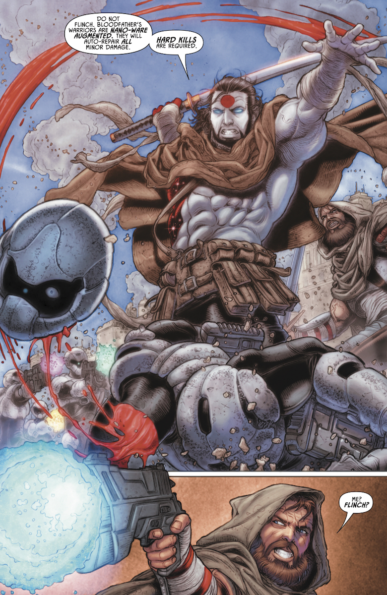
Juan Jose Ryp continues to provide his rustic yet highly detailed artwork in Rai #5. This makes the battles feel tense with expressions that display the severity. Not even the Red King’s troops are exempt from this when an eye can be seen through a visor.

Andrew Dalhouse’s colors provide just the right amount of shading, lighting, and color blending for this issue to feel realistic. Even the science fiction bright aesthetics show how dangerous an object is to someone. Whether it is a blast from a gun or the blade of Rai’s katana, bright means blight. Meanwhile, some of Gilad’s battle scenes get red with bloodlust.

Dave Sharpe’s lettering feels very fluid and in place with every panel in Rai #5. When he’s not making too many special effects onomatopoeias, the issue feels free of distractions. When they do happen, Sharpe makes the sounds stand out by displaying the effects the action has on something instead of the action itself. The laser guns don’t make sounds themselves, but blowing through the head of a farmer does. But it does get confusing to a reader when they see a similar act a page later. In some very specific circumstances like when Gilad cries out, Sharpe even displays how word balloons can’t contain his rage by making the word bigger.

Catch Up Before Rai #5

Rai #5 is a reminder for all the drama that readers can see in short bursts, there is a bigger story. Every piece counts, but some work best as a double feature. Put this together with Rai #4 for a decent mini-arc.

Monkeys Fighting Robots Youtube

Review: RONIN ISLAND #11 — Who’s The Real Enemy?

RONIN ISLAND #11, available in stores on Wednesday, March 11th, sets the stage for the conclusion to this brilliant saga. The islanders find themselves on the defensive as the nefarious Shogun’s forces edge closer to their home. Hana and Kenichi are the first to rush after them, but can they prevent an invasion by themselves? Will they have to sacrifice the ideals of the Island to do so?

Story

The story opens with Hana and Kenichi in hot pursuit of the Shogun’s enemy ship, knowing it could return with the rest of the army. The two take a boat and pretend to capsize it, only to use it as a shield against the soldiers’ arrows in a brilliant tactical maneuver.

Back on the island, Elder Jin and the Island have declared full-out war against the Shogun’s men. They’ve become so fervent in their aggression that they’ve refused to grant mercy even to the soldiers they’ve subdued. After subduing the Shogun’s soldiers, Hana pleads with Jin to stop a planned execution of the captured men.

Writer Greg Pak’s storytelling continues to amaze, ramping up in intensity as we near the conclusion of his RONIN ISLAND saga. Readers will contemplate the ethics of war as they witness Hana plead to save those refugees who once sought to destroy her own people.

Artwork

Giannis Milonogiannis’s penciling and ink work, Irma Kniivila’s coloring, and Simon Bowland’s lettering worked extremely well together in this issue. The simple yet elegant lines makes it easy for readers to follow the events while maintaining a sense of relatability; its quite remarkable how well each character can portray a variety of complex emotions. We also loved the cool coloring used for Hana and Kenichi’s fight in the ocean, which served as a nice contrast to the warm colors of the fire-based attacks. And the lettering, instead of distracting readers from the illustrations, blends in with each panel as if it were a part of the landscape itself.

Comic Covers

Main Cover

Milonogiannis and Msassyk’s main cover illustration features Hana and Kenichi. We’re emboldened by their warrior stances in front of the Island backdrop, solidifying their roles as its true protectors.

Preorder Cover

Ethan Young’s preorder cover depicts a bleak view of the Island in ruins, leading readers to wonder if this is the land’s ultimate fate.

Conclusion

RONIN ISLAND #11 was an intense and enjoyable read; we can’t wait to see how the team wraps up this brilliant story in the next issue.

Do you think the Island will have enough strength to take on an army of the Shogun’s soldiers and Byonin? Let us know in the comments below!

Monkeys Fighting Robots Youtube

HAWKMAN #22 Settles Into the Tropes to Prepare for More

Hawkman 22 by Venditti for DC Comics (featuring Hawkwoman)

Hawkman #22, written by Robert Venditti, with pencils by Fernando Pasarin, inks by Oclair Albert and Wade Von Grawbadger, colors by Jeromy Cox, and letters by Rob Leigh, puts our villain in a cage. You’ll never guess what happens next. The series takes a turn for the predictable, but that might not be a bad thing. And it’s looking like it might just be setting up the status quo for the next issue to challenge.

Writing

Venditti has been using a lot of tropes in this series so far. Most notably, Hawkman has been on a series of event quests, looking for a giant McGuffin at the end of a proverbial treasure map. But for a character like Carter Hall, this approach brings him back to his roots. The Indiana Jones-esque archeologist/adventurer gets the Indiana Jones treatment. While much of this issue leans into these tropes, with bad guys talking through cell bars and heroes being lured into traps, the conclusion to the issue sets up a shift in the series. With the next chapter shuffling Hawkwoman into the spotlight, we may be in for a very different series in the next few issues. And Venditti’s approach to this issue may merely be giving us a jumping-off point, to see just how far he’s going to take things.

Art

Pasarin, Albert, and Von Grawbadger establish the sinister tone to this issue in all the ways we’re familiar with. We see a “helpless” Sky Tyrant give a wicked grin as someone comes to help him. We see intermittent flashes of a character reading about the dangers of an artifact as another character reaches towards it. It’s the comfortable storytelling techniques that we’ve come to know and love. Yet Pasarin, Albert, and Von Grawbadger’s treatment of Hawkwoman is the defining factor of this issue. She is no damsel in distress, and the few times that she is incapacitated, we never get the feeling she’s truly helpless. It’s because of the “cliche” techniques that we see why Shiera stands out. She refuses to be set in a mold.

Coloring

If you needed gloom and doom, look no further than Cox’s color scheme. The sheer normalcy of some of Hawkwoman and Sky Tyrant’s conversations is just chilling. It’s as though Cox is trying to convince us Sky Tyrant truly isn’t anything to worry about. Going just from the visual cues, it’s hard to argue the point. The colors make him seem weak and powerless. Yet when Sky Tyrant seems to get the upper hand, the clouds roll in. Everything is set in a reddish glow. His reign of terror begins fast and with a vengeance.

Lettering

Leigh’s lettering is one of the things that consistently reminds us of who we are dealing with. While Sky Tyrant has Hawkman’s consciousness on lockdown, the readers still get to hear Carter’s attempts to regain control. While the lettering for Carter’s dialogue is clearly set in a lighter font, to show it happens only in Sky Tyrant/Hawkman’s head, Leigh positions the word balloons to all come from the same mouth. Though Hawkman’s consciousness is talking, his words lead to Sky Tyrant’s body. This continuously reminds us that it matters what happens to Sky Tyrant. If we lose him, we lose Carter too.


Hawkman#22 is clearly working towards something big in the weeks to come. While this issue is relatively simple, it provides a backdrop for the following issues to play against. We seem to be getting one last glimpse of cliche superhero dramas, before stepping into new worlds with Hawkwoman as our guide. Pick up Hawkman #22 on March 11th at a comic book shop near you!

Monkeys Fighting Robots Youtube

SUPERMAN #21 Balances Space Fights with Office Politics

Superman 21 by Bendis, for DC Comics featuring Lois Lane

Brian Michael Bendis is making his case with each new issue of Superman for Clark Kent’s reveal. In Superman #21, written by Bendis, pencilled by Ivan Reis, with inks by Joe Prado and Oclair Albert, colors by Alex Sinclair, and letters by David Sharpe, we see more of the fallout of Clark’s decision. And right when things start seeming too complicated with planetary politics, the creative team brings us back to Lois Lane. With this issue being told on two fronts, we get to see what the space battles are causing on Earth.

Writing

Bendis makes one brilliant choice right out of the gate. As Superman flies around space, fighting Mongul and trying to keep the peace between planets, Bendis focuses back in on Lois Lane. While much of what Superman does in this issue seems too large to relate to, Lois’ life provides the way in. We see her deal with Daily Star reporters and begin to come to terms with how her life is changing. It gives us a real-time, down to earth example of how the Man of Steel’s actions is affecting life on earth.

Art

Reis, Prado, and Albert cement the concept of the dual-front issue with their framing. We cycle back and forth between Lois and Clark. Yet nearly every time we see Clark, he seems far away. He’s placed in a large panel, with alien planets and galaxies all around him. It gives us a sense of the magnitude of his actions. But when we return to Lois, everything is more intimate. We get lots of close-ups of her face and reactions, but she’s also set in smaller, more confined spaces. She’s not in any less danger; the stakes aren’t any lower. We just get the sense that for Clark, the dangers are huge and ethereal. Lois is dealing with the nitty-gritty, up close and personal.

Coloring

Sinclair’s colors are downright beautiful. Each space panel is a dance of lights. With alien beams converging on Superman, and bright orange fires blowing across the black sky, the results are gorgeous. The neon colors and bright panels help create the juxtaposition between our two storylines. When we return to earth, we get familiar, darker colors. It both grounds the story and gives us a sense of a closer, more personal danger.

Lettering

Sharpe’s lettering shows us that Superman is on the ropes. In a very uncharacteristic way, Superman’s dialogue is often written in large, colorful fonts. The un-phase-able man is desperate for once. Lois, however, remains unphased. Her dialogue is often written in short spurts, as she maneuvers her way through conversations easily. After all,
Lois is a journalist and a pro. Only as she closes the door to her apartment does she begin to talk to herself in a smaller font. Rambling a little as she lets her guard down. In all of this, we see Clark and Lois’ game faces, and how they take opposite approaches to the task at hand.


This issue could have easily been unapproachable. With Superman hosting alien peace talks, at a certain point, it feels hard to connect. But the creative team included responses from Lois and Earth, giving readers a bridge into the story. The stakes are high, but they’re also personal. We see with each new issue how Superman has been redefined as a character. Pick up Superman #21 on March 11th at a comic book shop near you!

Monkeys Fighting Robots Youtube

NEBULA #2: Turning Over A New Leaf

NEBULA #2 out this Wednesday from Marvel Comics, provides fans something we’ve been craving ever since Firefly ended. A gritty space Western full of drama and danger. With a dash of Nebula’s violence, naturally.

Jen Bartel’s cover of Nebula #2 makes our leading lady look stunning and dramatic in battle.

***SPOILER WARNING***

Nebula #2 is part of a five-issue miniseries focusing on the one and only Nebula. Only, things are going quite as she planned, are they? She had wanted to get her hands on a powerful weapon, in order to finally get the edge in a fight to prove her superiority.

Now she’s stuck on a planet in the middle of a desert and is basically reenacting the alien version of a classic Western. Okay, there are several twists, not least of which being the alien terrain and tech…and Nebula’s penchant for violence.

A peek at the creative team involved for Nebula #2.

The Writing

Vita Ayala has written a highly entertaining issue with Nebula #2. This is a version of the character we rarely get to see, though admittedly there are a few extenuating circumstances allowing for it. Still, it’s refreshing to see nonetheless.

It’s also so extremely satisfying to see something so gritty and real. Nebula has never felt so human. The flashbacks add surprising insight, even without context (a fact that makes sense, given the current plot). Meanwhile, the current actions she’s taking are fascinating, and something we didn’t know we needed to see.

This may be only a miniseries, but the elements introduced here are enough to leave us hoping that it would last longer. It’s not just Nebula herself and all of the changes that have been happening to her. It’s the setting and the secondary characters as well.

In a way, it almost feels like a whole new series. We know it won’t last…but there’s still this lingering hope that it somehow will, despite all of the odds.

Good thing she can do her own repairs, huh?

The Art

Working on Nebula #2 is a seriously impressive creative team. Claire Roe was the least artist, with Mike Spicer providing the colors, and VC’s Travis Lanham doing the lettering. As an added bonus, Jen Bartel is the artist responsible for that brilliant cover, a fact that fans of hers would probably have been able to immediately tell.

There’s plenty to enjoy from this issue. Starting with the flashbacks, which raise so many questions about Nebula’s past. The color palette for these scenes is simply striking, with lots of soft purples to indicate a transition.

It’s a strong juxtaposition to the desert setting, to say the least. Let us not forget the fight scenes, which are highly entertaining – and yes, they are full of the violence we know and love from Nebula. Though there’s an extra element in the way her fights are portrayed, courtesy of one of her latest changes.

Naturally, things were going too well, trouble had to come find them.

In Conclusion

Nebula #2 was a highly entertaining read, one that combined Nebula’s quest with a Western feel, and to a delightful effect. This is a combination we didn’t know we needed, but now that we have it, we can’t get enough of it.

Monkeys Fighting Robots Youtube

DECORUM #1 Begins A Tale of Assassins and Runners

DECORUM #1, out this Wednesday from Image Comics, is the start of an all-new series. One as full of assassins as danger and chaos. This is a series to check out if you’ve been seeking something bright yet gritty.

Decorum #1 features the polite assassin herself, and the girl about to get wrapped up in this mess.

***SPOILER WARNING***

What do you picture, when you think of assassins? Odds are pretty good that whatever you’re picturing, it’s not what you’re about to get in Decorum. This a tale of assassins, yes. In particular, it’s about one assassin.

A rather polite one. So we would strongly urge against breaking any rules or etiquette while she’s around. Unless you’re her target, in which case there’s really no hope for you anyway, so do whatever you feel compelled to do. Because odds are good it’ll be the last thing you do.

Decorum is a brand new series written by Jonathan Hickman. On the visual side of things, you’ll find Mike Huddleston as the artist, and Rus Wooton as the letterer. Together they’ve gone above and beyond in portraying a poised and dangerous assassin.

This alternate of Decorum #1 hints at some of the variety in artwork that can be found inside the pages.

The Writing

Decorum #1 is one of the strongest examples of creative storytelling you’ll find this year. There are so many clever little moments strewn about this issue, from the introduction itself to the multiple forms of storytelling used.

All of it combined into a dramatic introduction to the series. In many ways, this issue felt like it carried with it multiple stories. There are elements and connections yet to be fully revealed to the readers. Yet it’s intriguing, all the same, leaving us eager to see how it all fits into the greater picture.

The first several pages are mostly visual in storytelling, which was an interesting choice. But it also allowed the artists to really shine, while giving us scenes full of movement and action. Meanwhile, the next page was quite a dramatic change, as we dive more heavily into the written word in order to set the scene.

That, as they say, was only the beginning. There is so much to this issue, but that shouldn’t be any surprise, given that this issue is a whopping fifty-six pages. Imagine how much a creative team can do with that time, and you’ll have a good idea of what you’re in for here.

There are many moments that catch and demand attention in this issue, but it’s perhaps the conclusion that really sells it. That will leave readers wondering what happens next, with this polite assassin and the girl who was just trying to get paid.

This cover for Decorum #1 is as vibrant and alive as the characters within…well, minus her targets.

The Art

Decorum #1 is as unique in the visual department as the writing. The transitions are dramatic, with each element feeling well and truly distinct. There are two major settings in this single issue, and both show off Huddleston’s style, but in different ways.

There’s a lot to appreciate here. The color palette is high on that list, changing dramatically depending on the setting, events, and mood of what is occurring within the main plot. The character designs are another highlight, being both gritty in some cases, yet without a doubt futuristic.

Even the simpler pages show off a high level of design and planning. These pages are further highlight by Wooton’s lettering, which is very carefully placed, enhancing the scenes and making the most of it.

Decorum #1 features strange and brilliant artwork, as you can tell thanks to this full cover.

In Conclusion

Decorum #1 was a fascinating and brilliant start to a new series. It isn’t at all what you would expect, but that is what makes it so brilliant. There’s no telling what this delightful killer is going to do next, but we’re looking forward to finding out.

Monkeys Fighting Robots Youtube

Review: THE TERRIFICS #26 And The Fall Of Simon Stagg

Simon Stagg, billionaire industrialist and constant thorn in the collective foot of most DC Comics heroes, is the focus of THE TERRIFICS #26. Available in comic book stores on Wednesday, March 11,th this issue features the recent corporate and technological collaboration between Stagg Industries and Terrifictech, the brainchild of Michael Holt and The Terrifics. Both companies have pooled their knowledge and finances to create “the world’s cleanest, fastest, and most reliable public transportation system!” On the surface things seem to be going swell, but Stagg is harboring a dark secret that could upend the city itself.

Story

The issue kicks off with an extremely aggrieved Stagg alone in his office. The seemingly untouchable businessman just received news from a doctor that he has pancreatic cancer. Fearful and losing hope fast, Stagg contemplates how he will break the news to his wife, Sapphire.

But at that very moment Stagg hears a voice calling to him from the hallway. Believing it to be one of his employees, he storms into the hallway only to discover demon-like creatures starring at him from the darkness. They offer him a gift that he most wants right now: time.

Unfortunately, the nefarious nature of the deal undoubtedly comes with a price. And the Terrifics will soon find its effects erupting right under their noses.

Writer Gene Luen Yang’s narrative embodies the fear and desperation most often plaguing those of us who have received unbearable news. Though few of us have been approached by demons, it’s easy for us to sympathize with Stagg’s circumstance. This makes him that much more of a complicated “villain.”

Artwork

Sergio Davila’s penciling, along with Vicente Cifuentes’s ink work, craft highly detailed figures that embody the realizations of a fully technological cityscape that border on the fantastic. The high-speed transportation system and other forms of technology are emboldened by solid cool hues to give the landscape a futuristic vibe, all thanks to Protobunker’s coloring. However, Tom Napolitano’s lettering is the icing on the cake, using rapid successions of onomatopoeia lettering interspersed between the characters’ dialogue, creating just enough chaos to speed the narrative forward.

Comic Cover

Dan Mora’s cover, featuring the team of heroes drilling into the dirt of the earth, offers a perfect contrast to the highly sanitized future vision the opening pages offer. It suggests that no matter how much we progress, there may still be something lurking deep under the surface.

Conclusion

THE TERRIFICS #26 is a high-speed thriller that shows both how far our society has progressed and how deep our fears continue to take root in our psyches. A flurry of demonic machinations and technological prowess combine for a highly entertaining issue.

Do you think the Terrifics will be able to help Stagg? Let us know in the comments below!

Monkeys Fighting Robots Youtube