ICE CREAM MAN #20 hits comic book stores on Wednesday, August 5th, bringing readers along on a journey to new levels of horror. This issue ironically markets itself toward “kids,” which means it will be safe for anything but that demographic. It seems the nefarious Ice Cream Man has invited readers into the home of his family. But is this kid-friendly setting all it appears to be?
Story
Readers are brought to a scene that may seem familiar to some—an overheard father telling his children a bedtime story. All seems well, that is until we notice someone pricking their finger while cutting carrots for their “kidzz.” And to make matters worse, we find that the father is none other than the Ice Cream Man.
If this wasn’t shocking enough, we are treated to a few of the stories in Ice Cream Man’s book. These stories are told much like our favorite Dr. Seuss tales—only with more blood. And that person cutting carrots? It turns out she’s the children’s mother. What possible connection could the Ice Cream Man have with this family?
Writer W. Maxwell Prince’s narrative unsettles us in a way few comics can. We are simultaneously repulsed and intrigued by the Ice Cream Man’s antics.
Artwork
Martín Morazzo’s penciling and ink work, Chris O’Halloran’s coloring, and Good Old Neon’s lettering provided readers with stunning illustrations. The drawings depicted in each of the children’s stories in Ice Cream Man’s book remind us of the Seuss, Roald Dahl, and Mary Pope Osborne stories we loved as children. The styling to the characters, from their smiling faces to their colorful adornments, serve their purpose by functioning as a direct juxtaposition to the bleak, colorless panels that warp them into horrors. And the spacing of the word balloons adds to the unsettling nature of the story, compelling the reader to slow down and take in each unnerving detail.
Conclusion
ICE CREAM MAN #20, like the series’ previous issues, continues to upend readers’ expectations. Just when we thought the Ice Cream Man couldn’t get worse, he targets kids! We’re anxious to see what comes of this thrilling story.
What did you like about this “kids” issue? Let us know in the comments below!
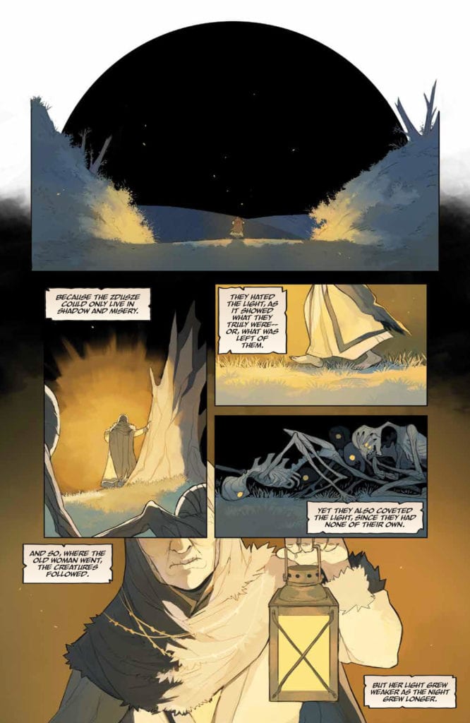
JIM HENSON’S STORYTELLER – GHOSTS #4, available from BOOM! Studios on August 5th, is a Slavic tale of death, loss, love and the power of a promise. Ver’s story and art is worthy of the most heartfelt entries from any anthology series such as The Twilight Zone or Amazing Stories.
Cover Art
Michael Walsh’s cover latches on to the dread of those things that wait just behind you in the dark. The Old Woman, the stories main protagonist, hangs on to her lantern as tightly as she hangs on to life itself. All the while, Weles, the Slavic grim reaper, watches and waits for the opportunity to strike. Walsh’s cover is anxiously haunting.
Writing
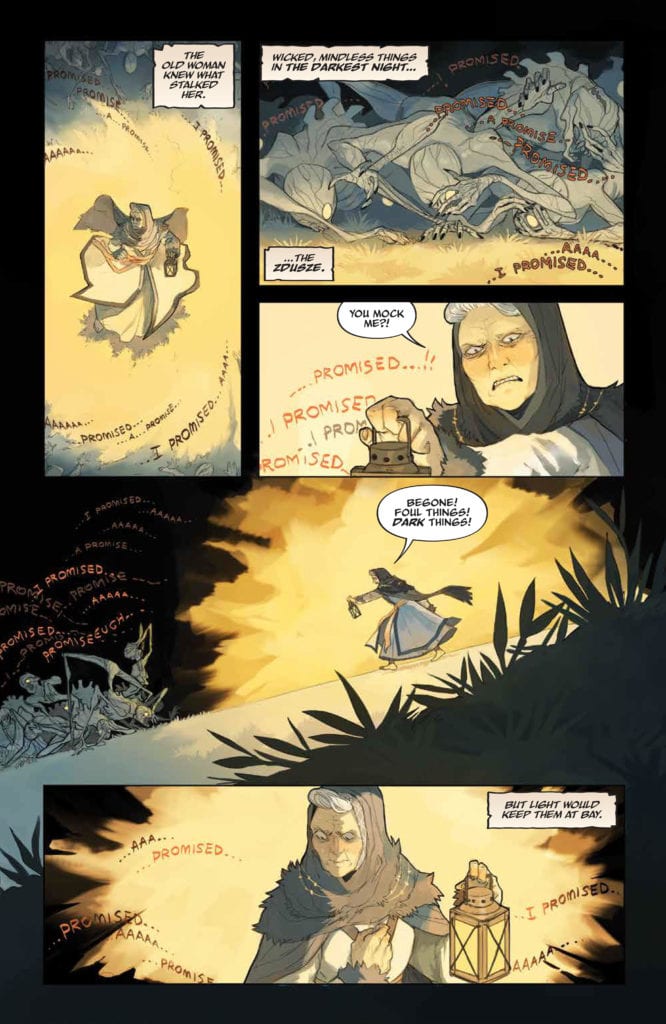
Ver’s story follows an Old Woman fighting to make her way home in the dark to keep a promise to her family. During her journey, she’s accosted by all manner of demons and even the god of Death from Slavic mythology trying to prevent her return. Her only mode of protection is a single lamp that keeps those that live in the dark at bay.
Once she reaches her destination, the true nature of her journey is revealed and it resonates deeply with anyone who’s ever felt the painful loss of a loved one. I can’t express how powerfully this story tugs on the emotional heart strings in a way that honors those last goodbyes. Moving and poignant work her from Ver.
Pencils/Inks
Ver’s artwork stands out for its clean lines and mildly realistic. Although the story is squarely centered on the emotional pain of loss, the demonic zdusze are truly something out of a nightmare. Mis-shapen Anatomy, grotesque crawling movements, and eyes that stare without seeing. It’s horrifying in exactly the way you expect to see the horrid things coming for you in the dark.
Likewise, Weles and his henchman are terrifying but in a completely different way. Ver created a mystical god that is as terrifying and cruel as it is majestic. Ver’s designs for Weles and its henchmen look right at home as god you’d find on ancient tableaus in ancient houses of worship. Ver has demonstrated a mastery of horror characters in this art.
Coloring
This entire tale rests on the clash between darkness and light. Ver used the splashes of yellow against pitch black to surround the Old Woman in a lonely glow that shrinks as she approaches the house. You can feel the tension build as the light and color shrinks to the size of a flickering candle on the verge of going out. It’s an excellent example of coloring restraint that heightens the tension rather than diminishing it.
Lettering
Jim Campbell’s lettering stands out for its depiction of whispers emanating sourcelessly from the dark. In several panels the Old Woman hears echoes and continuations of her own thoughts coming from the pursuing zdusze. Those words flow through the dark in precisely the way you would imagine the dark itself mocking your escape. The whispers look great and add to the tone despair and fear.
Conclusion
JIM HENSON’S STORYTELLER – GHOSTS #4, available from BOOM! Studios on August 5th, is a haunting, sometimes heart breaking, tale that reminds you a promise to a loved one can overcome the fear of the dark and even Death itself. Highly recommended.
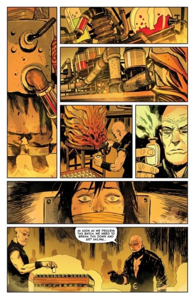
REAVER #10, available from Image Comics on August 5th, finally brings Essen and Rekala face-to-face with the mysterious Stagger and the plan he has for all those stolen children. Justin Jordan’s story is doesn’t waste any time getting to the heart of the mystery, and Niko Henrichon’s art sets every panel on fire, literally and figuratively. To see how we got this far, check out our review of the previous issue here.
Cover Art
Becky Cloonan’s cover is a bit of a bait-n-switch but not in an unsatisfying way. Featuring the scowling face of Stagger’s lieutenant, scarred and pumped up from the dose, Cloonan’s cover hints at the big battle scene at the end of the issue, and it’s a doozy.
Writing
Justin Jordan’s story gets right to the point answering all the lingering questions since the first issue of the arc. Where have all the children gone? Why were they stolen? Who is this mysterious Stagger? Without spoilers, all these questions are answered in efficient short order, and it’s all done in the context of an issue that’s almost entirely one continuous fight scene. Essen has embraced his inner berserker to glorious effect, and Rekala is… well… Rekala at her best.
Jordan does throw in a cliffhanger curve ball with the reveal of Stagger that begs a whole list of brand new questions. The ending builds a huge level amount of “What the…?!?!” energy to set up the final issue. I’m curious to see how Stagger’s revealed identity pays off in the run’s conclusion. Stay tuned for that review.
Pencils/Inks
You can tell Niko Henrichon is just having fun at this point. Essen is laughing AND on fire while he punches an evil henchman’s jaw completely off his face. Rekala, easily the breakout character of 2020, shows a surprising few moments of compassion once she finds the children, than quickly shifts into skineater mayhem once the villains go on the offensive.
Most of these scenes are accomplished with dynamic motion in the panels, a keen understanding of gore that makes sense for the battle without being gratuitous, and an understanding of how to reflect emotion through the faces of characters that more often let their blades do the talking. Henrichon exhibits herculean execution by drawing an engaging comic that’s almost all battle, and it’s done really well.
Coloring
Henrichon’s coloring is pure, dramatic mood in this issue. Prior issues were excellent demonstrations in the use of yellows to show firelight for lighting and shadows that punch up the emotion. In this issue, the use of yellows, particularly in the “harvesting room,” cast a sickly veneer on the whole scene that amps up the gruesomeness of the children’s plight. Henrichon’s coloring doesn’t just amplify mood. It changes the entire tone of the scene to great effect.
Lettering
Clayton Cowles’ minimal amount of lettering in this issue is clean and concise. The only sound effect of note is a body “CRASH”-ing through a wooden door that looks great. Otherwise, the dialog placement is excellent, and Cowles’ lettering keeps you moving through a briskly paced issue.
Conclusion
REAVER #10, available from Image Comics on August 5th, answers all the right questions while opening the door for many more; all through the lens of of brutal, non-stop action. I’m eagerly anticipating how this run will end in the next issue.
Marvel Comics releases the second issue of the Empyre tie-in series Empyre: X-Men #2 August 05. Writers Gerry Duggan, Ben Percy, and Leah Williams are joined by artist Lucas Werneck, colorist Nolan Woodard, and letterer VC’s Clayton Cowles as they continue to explore the multi-sided conflict between the X-Men, Hordeculture, the Cotati, and a bunch of mutant zombies.
Writing
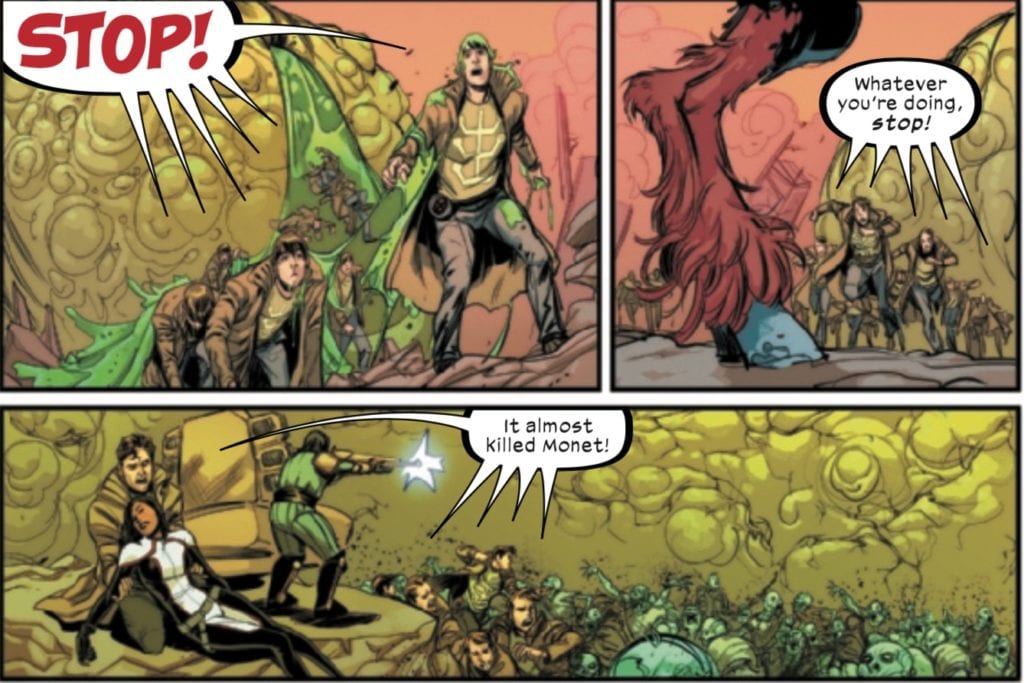
The writers do a good job of making this a really crazy, fun issue! It’s big, bombastic, and all over the place, mostly due to the multiple factions fighting on Genosha, but that’s part of its charm. While it looked like the zombies might become a bigger threat than the Cotati in issue #1, the Cotati reassert themselves and escalate their threat in this issue.
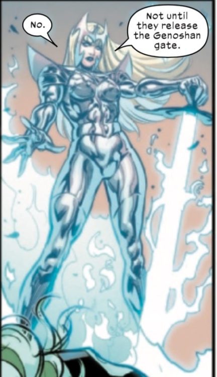
Magik continues to demonstrate what a badass she is across all of the X-books as she takes center stage in this issue, asserting her place as the Krakoan war captain and summoning a number of psychics to Genosha by issue’s end. One wonders if this will lead to a conflict with Magneto, who was very specific with Warren that their squad was to remain small. Could this possibly lead to Magneto’s return to Genosha by the series’ end and a reunion between him and Wanda Maximoff (whose fate is still unknown)?
Art
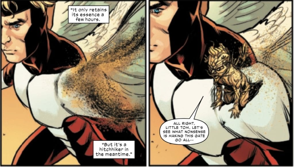
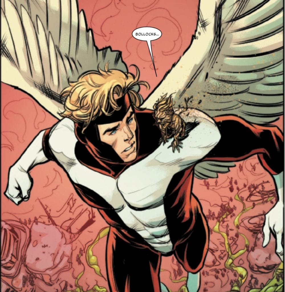
One of more creative sequences in this issue is Black Tom’s appearance on Angel’s shoulder. Werneck does a good job not only drawing the assembly of Tom’s avatar, and the comedic subtlety of the scene is captured well.
The combination of Werneck’s design for Black Tom and Warren’s look of surprise and confusion might make Tom’s involvement the standout part of what is, overall, a very humorous, quippy issue.
Coloring
Woodard, of course, deserves credit not only for making this a beautiful issue, but for some of the effects that make this issue work so well. In the above scene, he utilizes the blacks and browns of Black Tom’s avatar to maximize the effect of his self-assembly. The black and brown is well done, with the colors lacking any line work, seeming to have just been speckled on the page.
Woodard’s colors also stand out when he draws Magik’s armor, in particular the shiny, metallic, supernatural look (which I think is part of the effect of Warren being on the other side of an energy barrier).
Either way, it comes on the end of Magik’s escalating badassery throughout this issue.
Lettering
There are plenty of opportunities for Cowles’s letters to shine in this issue. I’m used to their usually being at least one prose page in any of the X-titles, a trend this issue ignores (probably a good idea in a visual medium). At no point does the text overwhelm the page, and the lettering serves as the perfect complement to what is an action-filled story.
One neat bit of lettering on Cowles’s part is his dialogue for Multiple Man.
Portraying the simultaneous voices of Madrox’s copies is a nice touch and a nice accentuation of his powers, in an issue where the character serves no real function other than to be a background member of the team.
Conclusion
Empyre: X-Men #2 is a fun, action-filled issue that has a lot going on, and for the most part, all of the different factions in this issue are balanced well. The Cotati threat escalates, as does the X-Men’s response to the crisis on Genosha. The Scarlet Witch’s fate remains unknown, but hopefully will be resolved by the end of the series, but Magik begins to suspect that someone, quote, “took a big old magical $@#% here.” It will be interesting to see if this affects the characters’ interactions in other books like Strange Academy (probably not).
What did you think of Empyre: X-Men #2? Tell us in the comments below!
On August 04, DC Comics released Death Metal: Legends of the Dark Knights #1, a one-shot tie-in to its ongoing Dark Nights: Death Metal event. This issue features six short stories of the origins of some of Death Metal‘s zany Batmen, including Batmanhattan, B. Rex, the Robin King, Castle Bat, Batmobeast, and of course, Baby Batman. The writers, including Scott Snyder, James Tynion IV, Joshua Williamson, Peter Tomasi, Garth Ennis, and others are joined by superstar artists and colorists like Tony S. Daniel, Chris Sotomayor, Jöelle Jones, Daniel Warren Johnson (who writes and draws the Batmobeast tale), and many more.
While the original Dark Nights Metal event gave us a bunch of one-shots showing us the crazy, tragic origins of the first team of Dark Knights, this issue dials the zaniness up to eleven!
Writing
Each of the writers spins a unique tale about each of the Dark Nights. Space doesn’t allow for an analysis of every story in this issue. You will find out about B. Rex and Batmobeast, among others, but the standouts (because of their importance of the Dark Nights: Death Metal story) are the ones featuring “the Darkest Knight” (Batmanhattan) and the Robin King.
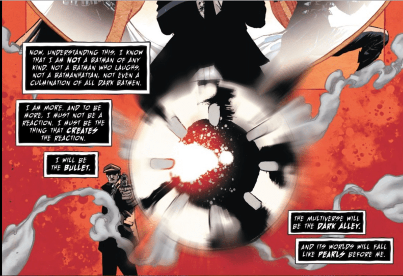
Joined by Tony S. Daniel on art, Snyder, Tynion, and Williamson’s story takes place in the mind of the Batman Who Laughs during the surgery to transfer his brain into Batmanhattan during issue #2 of Dark Nights: Death Metal. Several DC’s at times disparate narrative threads come together in this story, as the Batman Who Laughs’ personal history collides with a Dark Multiverse version of Rebirth’s The Button and a version Batman who tried to harvest its residual energy signature. We find out how the Batman Who Laughs killed that Batman, and what he intends to do with that power.
One also sees what appears to be another Snyder homage to Grant Morrison. In Dark Nights: Metal, Snyder builts his story off of FinalCrisis, and Morrison’s Batman run with references to Barbatos. In this story, Snyder and co. seem to be playing with Morrison’s idea of “the bullet” and how the idea of the bullet ends up creating Batman. Snyder returns to this idea with the Batman Who Laughs, noting that Batman is ultimately a reactionary force, reacting to the bullet. The Batman Who Laughs (now the Darkest Knight) determines to do more than react to the bullet. He will BECOME the bullet that creates a new multiverse and destroys the gods that stand in his way, like Perpetua.
The “hole in things” will indeed be Batman-shaped.
Art
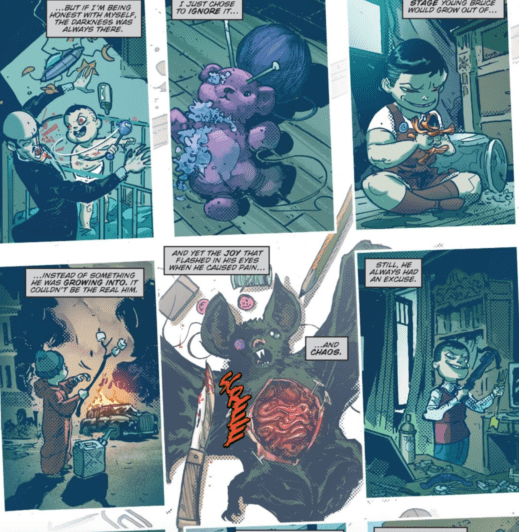
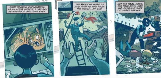
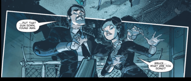
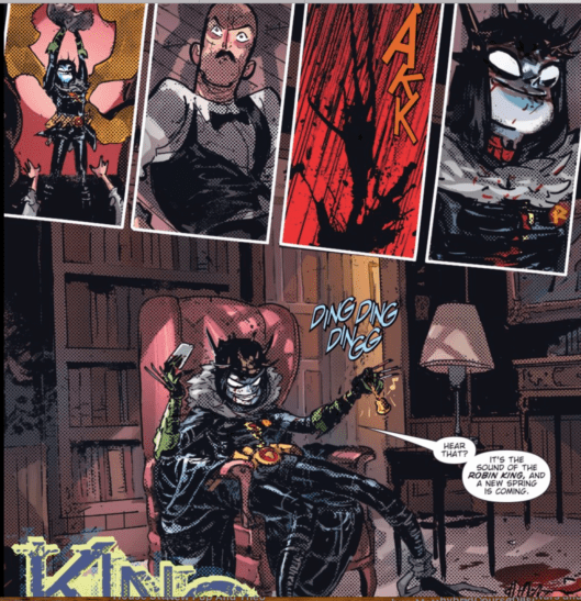
Peter Tomasi (writer) and Riley Rossmo’s (artist) story about the Robin King is unique largely because of its art style. Joined by colorist Ivan Plascencia, they tell the story of a young Bruce Wayne, a sadistic child who enjoys inflicting pain and who ultimately kills his parents, Jim Gordon, and finally Alfred, becoming the Robin King.
Young Bruce is drawn like an evil little rascal or a demonic Dennis the Menace. Rossmo and Plascencia give the readers a glimpse into some of the evil actions of this boy, while Rob Leigh’s letters narrate Alfred’s regret at not having been honest about just how evil little Bruce actually is.
This story is unsettling because of the cartoony character design mixed with the brutal evil and horror portrayed in its pages. There is a Child’s Play quality to this juxtaposition between the innocence of childhood and demonic evil.
At other times, some of the character design and coloring is reminiscent of some Tim Burton’s gothic horror aesthetic, in both the depiction of characters’ fear and in the image of the Robin King’s final form.
There’s a spindly look to the Robin King in that final image that may remind some of Jack Skellington.
Conclusion
Critics of this series will probably complain about the continued bastardization of the Watchmen characters by DC, and they might not be wrong. Doomsday Clock, for all of its faults, attempted to be a spiritual sequel to Moore and Gibbons original work, providing commentary about Watchmen‘s influence on comics and superheroes, infusing them with realism and despair, and musing about how comics and superheroes might influence the world of Watchmen, infusing its world with hope.
Flash Forward, and now Death Metal, are different animals, in part being used to “fix” DC continuity and bring Doomsday Clock into continuity. While I think the Dark Multiverse “Button” explanation works, the more DC uses the Watchmen characters; the cheaper those uses are going to become.
Besides that reservation, this was a fun issue! Some of the Batmen in this event are a little silly, but that’s ok. Every once in a while, it’s nice to be reminded that comic book stories can be silly and well-written at the same time.
What do you think of Snyder and company’s Death Metal event so far? Is it a worthy successor to Dark Nights Metal? To Doomsday Clock? Tell us in the comments below!
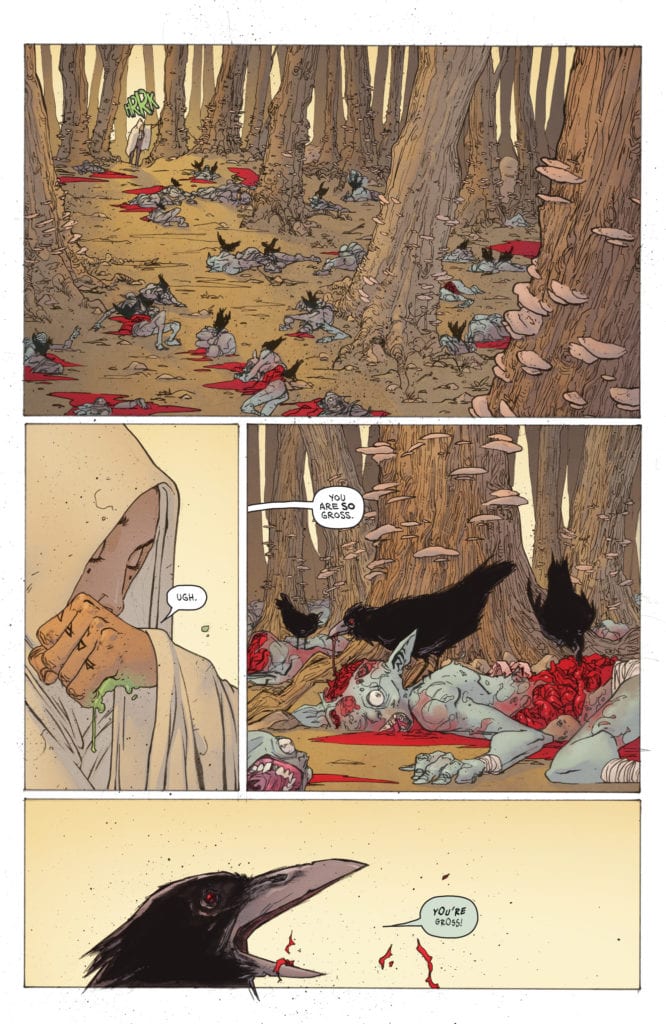
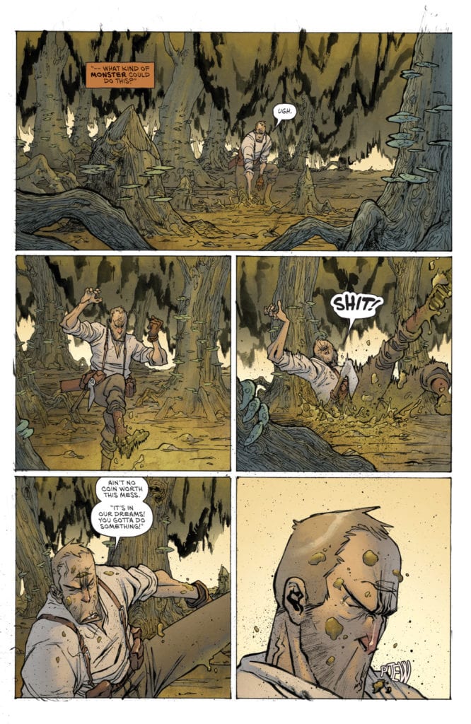
GRIT #2 hits your local comic book store August 26th, but thanks to Scout Comics, Monkeys Fighting Robots has an exclusive five-page preview for you.
The 3-issue series is about a cranky old monster hunter and the short-tempered witch who sure wishes he would stop slaughtering stuff. It’s what the creators are calling “Southern-fried sword and sorcery.”
About issue #2: When a mysterious wanderer comes across a mound of slaughtered goblins, she wants answers, and all signs point to Old Man Barrow. Unfortunately for him, she decides to mount her interrogation while he’s knee deep in the swamp, hunting a dream hag. If there’s one thing Barrow hates more than a witch, it’s two witches. Things ain’t looking pretty for our hero, y’all.
GRIT #2 is by writer Brian Wickman and artist Kevin Castaniero, with colors by Simon Gough, and letters by Micah Myers.
In his review of GRIT #1, MFR critic Gabe Hernandez called the story “BONKERS” and said the comic is “both rustic and dripping with fantasy gore.”
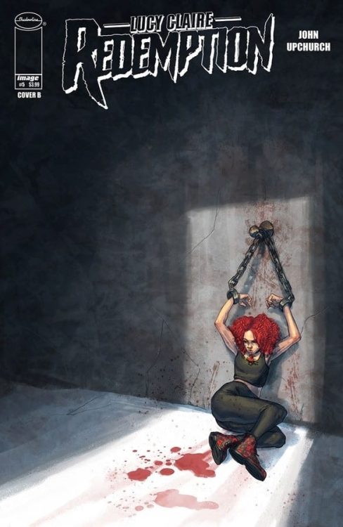
Lucy's past is catching up to her in Lucy Claire: Redemption #5.
LUCY CLAIRE: REDEMPTION #5, available this Wednesday from Image Comics, is about to up the ante for this werewolf hunting group – and their conflicted leader.
Lucy’s past is catching up to her in Lucy Claire: Redemption #5.
***SPOILER WARNING***
Lucy Claire: Redemption is one of those series that deserves more attention for the feats it is pulling off. John Upchurch is the writer and artist for the entire series, an act that is certainly a labor of love.
Once upon a time, Lucy Claire was a famous werewolf hunter. That’s all in the past now, or at least, it almost was. Now she’s been pulled to the forefront of another war, as wolves come crawling out of the dark.
As does her past. There’s a reason Lucy lived in a state of disgrace, and why she let herself fall so low. Now readers are about to learn the full truth and all of the complications that come with it.
It’s safe to say that Lucy is not in a good place in Lucy Claire: Redemption #5.
The Writing
Lucy Claire: Redemption #5 is a harrowing read, for a variety of reasons. The issue starts off with Lucy in a rough predicament, one that might be upsetting for some This scene is made even more intense by the implications of who is involved.
From there the issue moves rapidly forward, which is both good and bad. Bad, because there are still so many questions left unanswered. Good, because we’re back to seeing Lucy in a state where she can hold herself up – and she’s willing to fight with everything she has.
It’s this balance that made the issue so intense and intriguing. The hints of the past, along with references to what could be. Upchurch has made no effort to hold the reader’s hands through this journey, yet that in itself has proven to be the right move. The careful unveiling of the past has only increased emotional investment, rather than decreasing it.
One thing is certain: there’s a fight brewing on the horizon. It’s impossible not to detect that fact, just like it’ll be impossible to avoid rooting for Lucy and her side of this impending war.
The Art
As mentioned above, John Upchurch was responsible for all of the artwork in Lucy Claire: Redemption #5. It’s still an incredibly impressive feat, even five issues in. The series has such a distinct look and feel, and it has truly heightened the story to all-new levels.
This is an issue full of rapidly transitioning scenes, yet it wasn’t difficult to follow what was happening. In fact, almost all of the focus goes towards what is being said (and what is being left unsaid). Something Upchurch encouraged by creative panel usage.
The fight scene that inevitability follows is worth seeing as well, if for no other reason than having the satisfaction of knowing it happened. It’s a fast-moving fight, making it all feel more realistic because of it. This is a brutal fight, with no room for pretty moves or fancy dodges. It suits this world in more ways than one.
Conclusion
Lucy Claire: Redemption #5 is another intense addition to this series, one that does not feel inclined to pull its punches. Thankfully, it also is starting to let readers get a glimpse into Lucy’s past – and hinting at what she’ll do to get her future (and family) back).
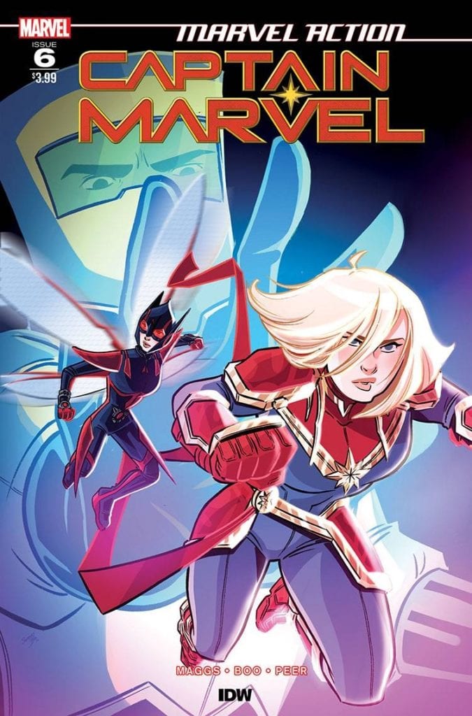
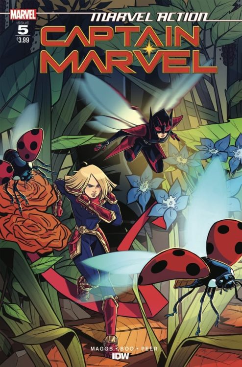
Carol Danvers is taking a different sort of flight in Marvel Action: Captain Marvel #6.
MARVEL ACTION: CAPTAIN MARVEL #6, available this Wednesday from IDW continues this bite-size adventure following Captain Marvel and the Unstoppable Wasp.
Carol Danvers is taking a different sort of flight in Marvel Action: Captain Marvel #6.
***SPOILER WARNING***
The last few issues of Marvel Action: Captain Marvel have focused on the dynamic duo that is Captain Marvel and the Unstoppable Wasp (aka Nadia). Well, they’re actually a relatively new dynamic duo. But they’re clearly still having a ton of fun while saving the day.
It’s also been a bit of a learning experience. After all, Carol Danvers isn’t used to getting shrunk. Or being told that her powers are too unsafe to use. On the bright side, it’s interesting to know that she is potentially too powerful when in her tiny form, thanks to the physics of the Pym Particles (not that Carol saw it that way).
These two heroines are going to have to put their heads together in order to stop the latest villainous plan from A.I.M. Granted, it’s a bit hard to take any plan titled ‘Operation Roadkill.’ Even if said plan involves the squashing (literally) of the toughest Avengers out there.
Captain Marvel and The Unstoppable Wasp have shrunk down in Marvel Action: Captain Marvel #6
The Writing
Sam Maggs really does know how to write a fun and charming plot. Marvel Action: Captain Marvel #6 is a fun adventure, giving both Captain Marvel and the Unstoppable Wasp a chance to shine, and show off the differences in their abilities.
It’s also so painfully refreshing to see a series avoid taking itself too seriously. Even the characters involved make fun of ‘Operation Roadkill’ and all of the implications (despite the threat it carries). It really is just a bit of fun.
Conveniently placed items make it even easier for our girls to save the day. One could argue that it’s too perfect…but since it results with Tony getting a hot pink car it kind of evens out. At least, on the humor scale.
This issue wraps up this latest adventure, though it does hint at more Marvel Action: Captain Marvel adventures in the future. So far, each arc has consisted of three action (and fun) filled issues, a trend that is not likely to be broken.
The Art
Marvel Action: Captain Marvel #6 had a great team of artists backing up such a fun and quirky plot. Sweeney Boo (pencils, inks), Brittany Peer (colors), and Christa Miesner (design and letters) were the three dominant artists on this team, and they had a little bit of fun with this issue.
Then again, how often is one allowed to design the most absurd replacement car ever for Tony Stark? Hard to avoid having a bit of fun with that whole mess. Then there are other fun elements, such as a teeny tiny Carol Danvers, complete with a pout – and a costume redesign.
The colors are as bright and bubbly as the characters within. Considering we’re talking about Nadia, that’s actually saying something. Obviously, Nadia’s inclusion also meant that there was plenty of room to play with scale. That’s something the artists did with gusto.
Conclusion
Marvel Action: Captain Marvel #6 was a fun diversion from the real world. You can tell that this is a series designed for all audiences – including younger generations. As such, it’s pretty casual, yet full of iconic and funny moments.
This issue wraps up the latest plot arc. Though it does give the impression that there will be more adventures to come. Until then!
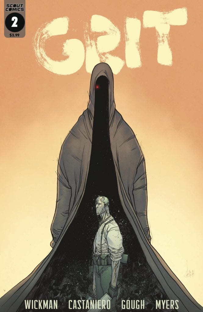
GRIT #2, available on August 26th from Scout Comics, introduces witches and herbomancers to Barrow’s current assignment, as he learns his last battle isn’t over just yet. Written by Brian Wickman and drawn by Kevin Castaniero, this issue picks up right where issue #1 left off (read our review here) and replaces the gore-soaked action with stellar character development without losing a lick of style or tone.
Castaniero’s cover style from the first issue to this one emphasizes an expert grasp on single-point perspective that packs a punch. Barrow is standing unflinchingly before the towering specter of the issue’s cliffhanger antagonist. That’s right, you don’t get to the big bad until the end, but it’s quite an entrance.
Writing
Wickman’s story, as noted, swaps out all-out gore action with backstory and character introductions. Through the clever use of a Bog Mother, you get an brief but effective setup for Barrow’s origins. Ari the Herbomancer comes in to save the day, but not before giving you plenty of foul-mouthed language and impressively organic dialog that tells you exactly where the story is going.
I liked Barrow and the world Wickman & Castaniero built in the first issue. This entry takes that development even further, and it’s thorough entertainment on every single panel. There’s a scene involving a “little birdie” that caught me off guard in a highly amusing way.
Pencils/Inks
Castaniero’s art is stylistic, and it suits Wickman’s world to a T. The swamps are sufficiently slimy and muddy. The Bog Mother’s design is familiar and unique at the same time, reminiscent of Meg Mucklebones from Legend (1985) but still wholly unique for this setting.
There’s a Mike Mignola quality to Castaniero’s art that gives each character an exaggerated anatomy during certain sequences, particularly with the use of long face, long limbs and sloping shoulders. It’s this style choice that infuse the characters with a plasticity that makes their movements and gestures more dynamic.
Coloring
Simon Gough’s coloring builds on his ability to infuse the issue with so much brown and yet keep the surroundings and characters distinctive. Everything is covered with the muck and mire of Southern woods after a heavy rain. Barrow and Ari are clothed in simple farmers clothes, and the overcast skies are absent any hint of bright color. In any other hands, the issue would be largely drab and dull, but Gough finds the right combination of hues to keep the woods alive.
Lettering
Micah Myers lettering makes excellent use of color to delineate dialog between the humans and otherwordly beings. Specifically, the Bog Mother’s dialog uses a dark ash fill but the effective use of bright yellow for the letters and bubble borders makes her dialog pop. Overall, the lettering placement is very unobtrusive so as to let the character art breathe, and it’s very well done.
Conclusion
GRIT #2 adds in character development and story to breathe new layers of life into this Southern High Fantasy world. Wickman’s story shifts multiple gears from last issue without losing any of the spark, and Castaniero’s art blends with the story perfectly. I’m eagerly anticipating the next issue.
Role playing games have, on occasion, been the source for works of fiction, take the George R. R. Martin line of books Wild Cards as an example. A series of books that first appeared in 1987 and new releases are still coming out. Dungeons and Dragons is growing in popularity again and feeding back into geek culture: Kieron Gillen and Stephanie Hans’ Die from Image comics is a modern, dark fantasy set firmly in the world of D&D.
It will come as no surprise, then, that another popular role playing game would make it’s leap into the realms of comic book storytelling. Vault Comics newest title, Vampire The Masquerade, takes the complex hierarchical vampire society from the game and imposes it onto a very modern world. The comic features the start of two tales, each featuring a female lead from a different caste of vampire.
Vampire The Masquerade #1 Credit: Vault Comics
Feeding Frenzy
Vampire The Masquerade, the game, was created in 1991 by Mart Rein-Hagan and was set amongst a society of undead, all struggling to survive in the modern world. One of the main premises behind the role playing game was that the vampires were working behind the scenes, hidden from society. It switched the players from being hunters of evil creatures to often misunderstood demons, scratching out an existence. Ultimately it’s Anne Rice’s Vampire Chronicles in game form.
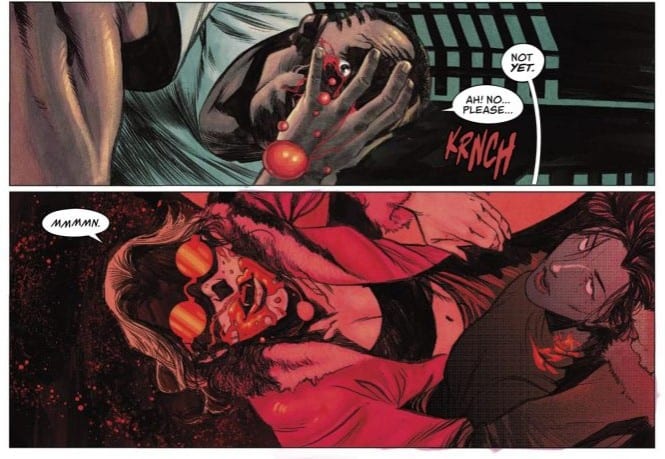
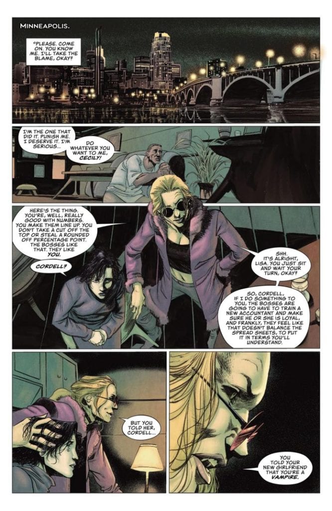
In the main feature of the comic, Winter’s Teeth, Tim Seeley and Devmalya Pramanik introduce the readers to Cecily, a violent vampire enforcer. She is shown to be a cruel, almost heartless, monster in her opening scene but Seeley and Pramanik also manage to make her sympathetic. Maybe this is because they dress her in a Duran Duran t-shirt; a reference to a band that has been linked with a number of modern vampire tales.
The musical theme is carried through the scene with Cecily singing a traditional German song that became popular in America in the early 19th Century. This reference infers the timelessness of the vampire, hinting at her age, whereas the Duran Duran reference indicates that she is still a part of modern society. Whereas some vampires are removed from the modern world, Cecily is shown to take an interest in it.
As the story progresses Seeley uses Cecily to lead the reader into the world of Vampire The Masquerade. Through her the complex society of the undead is revealed and with it the indications that a clan war is on the horizon. This is where Seeley digs deep into the myths of the role playing game and draws out elements gamers will find familiar. This does not, however, impede the storytelling. Seeley is clever enough to weave the game elements into the fabric of his story without them standing out like a punk rock patch on a 17th Century courtesan dress.
Vampire The Masquerade #1 Credit: Vault Comics
Vampire Tropes
Stories involving Vampires go through waves of popularity, with each crest containing a mass of unoriginal undead tales and a few experimental genre twisters. The success of each often depends on the audience it is aimed at. Twilight for example was extremely popular for a short time, de-fanging the vampire and turning the demon into a cute puppy for teenage girls. But there have always been more violent, horror focused alternatives, especially in comics books. Titles like 30 Days of Night and American Vampire are more fierce with an emphasis on the bestial nature of the undead beast.
With Pramanik’s visuals, Vampire The Masquerade falls somewhere between the two extremes. He mixes the precise outlines of characters with scratchy, pitch black shadows that devour the scenery like the bloodthirsty creatures he draws. There is an eloquence to the cast that is bathed in violence and abstract horror. Some of the panels capture the sublime beauty that made Bram Stoker’s original novel, Dracula, such a classic.
As you move through the story you begin to get a sense of what it is to be one of these lost creatures of the night. This is the comics greatest strength and is more impressive than the story itself. The emotional impact outweighs the blend of vampire mythologies that form the basis of The Masquerade’s role playing attraction. Here, Seeley and Pramanik are more concerned with telling an engaging story than they are feeding fans of the game franchise.
Vampire The Masquerade #1 Credit: Vault Comics
The Anarch Tales
The second tale in the comic is written by Tini Howard and Blake Howard and focuses on the outcasts of the Vampire Society. A group of misfits, led by Colleen Pendergrass, etch out a living, sourcing blood wherever they can get it. Colleen was part of an abusive relationship before being sired by her husband, itself an act of abuse, and continues to live in such a world. Her husband, Mitch, is tellingly introduced to the reader in his canine form. There is no subtlety in the characterisation in this chapter of the comic.
This element of the comic starts off like an episode of What We Do In The Shadows but without the humour. The Howard’s introduce an array of creatures, each a deformed stereotype but, just like the preceding story, there is a charm to the way the tale is told. Surprisingly, the cliches don’t grate and the intrigue inherent in the story doesn’t allow you to question what you are reading.
Nathan Gooden’s freer art style gives the pages a lot of momentum. The story feels as though it has a fast pace even though not a lot actually happens. His characters have a clear definition but the setting is more of an emotional construct; an idea of a place as opposed to an actual location. Above all else Gooden’s design has a much needed element of fun.
Linking the two stories together is the color work by Addison Duke and the lettering by Andworld Design. Both of these elements are consistent throughout the comic helping to create a single believable world for the characters to inhabit. Duke darkens the backgrounds but uses brighter, solid colors to make the characters pop from the page. He gives them an otherworldly appearance in a murky, realistic landscape. Andworld Design gives the vampires presence on the page, with subtle alterations to the text to emphasise verbal inflections. The lettering enforces the powerful nature of the vampires by placing their speech balloons over those of the humans.
Vampire The Masquerade #1 Credit: Vault Comics
Conclusion
Vampires seem to be making a bit of a comeback, at least in comic books. Later this year Image releases Dracula, Motherf**ker by Alex De Campi and Erica Henderson which is a more experimental take on the vampire genre. Vampire The Masquerade is a more traditional vision of the undead and plays into the history and mythology of vampirism. Just like the role playing game, it draws inspiration from many places; movies, novels, folklore.
The two tales contain elements of the role playing that will be recognisable to those familiar with it but in neither does this hamper the storytelling. Ultimately this feels like an excuse by Vault to tell some modern vampire tales and the creators do a good job. A title like this does have a limited appeal. If you have no interest in vampires then this comic isn’t for you as it doesn’t offer much beyond the thirst for drinking of blood. However, if you enjoy a bit of horror, and like grown up vampire stories, then Vampire The Masquerade should be right up your street.