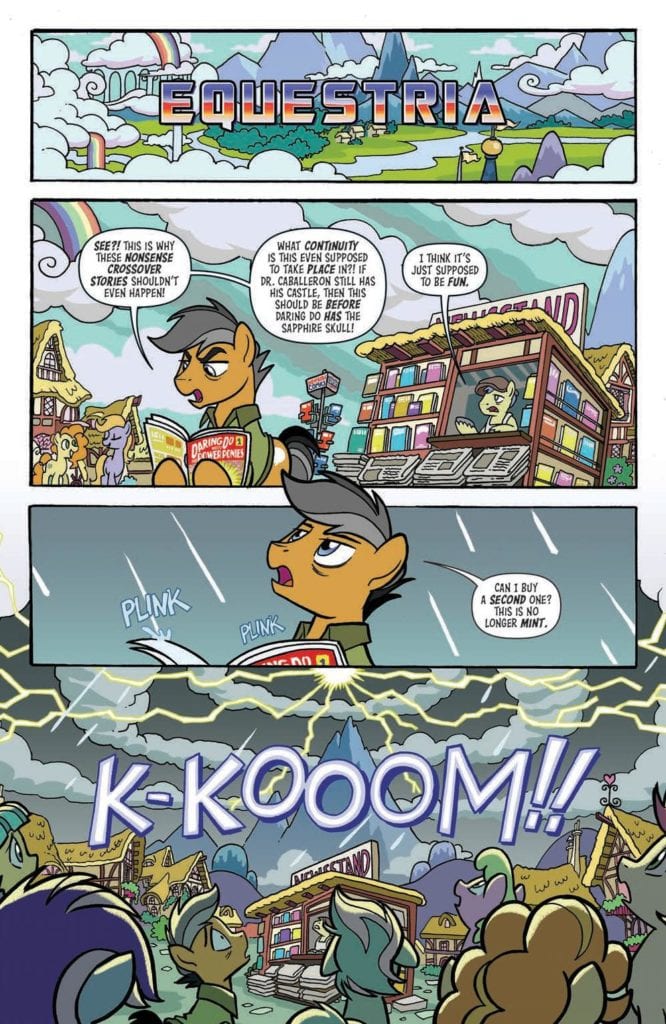
My Little Pony/Transformers #1 by James Asmus, Ian Flynn, Tony Flees, Jake M. Wood, Jake Lawrence, Luis Antonio Delgado, and Neil Uyetake brings two of the biggest franchises together for an entertaining experience. The prospect alone makes for an intriguing read, as one of the most recognizable Sci-Fi series crosses over with one of the most popular Fantasy series in recent years. Luckily for the fans, the issue is more than worth the purchase price.
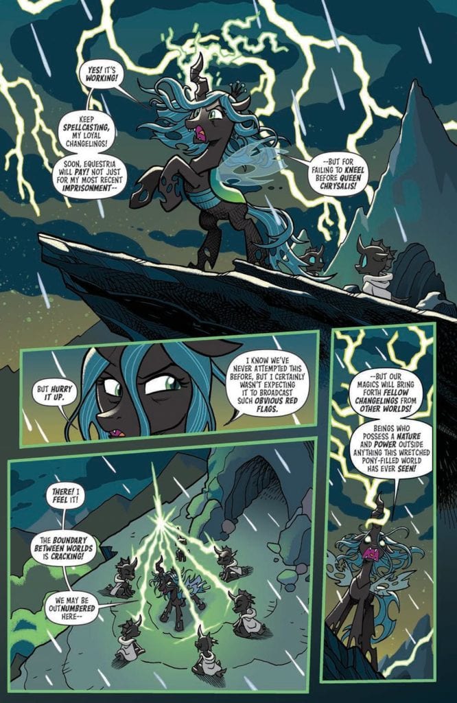
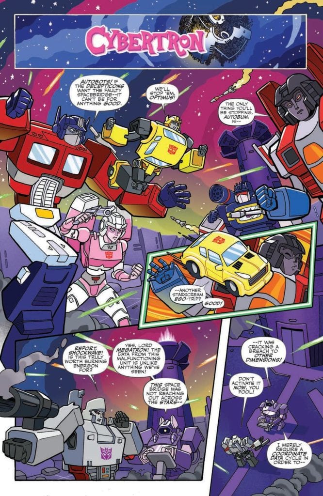
When Queen Chrysalis casts a spell looking for more changelings, she accidentally interferes with a malfunctioning Spacebridge! What’s this mean for our favorite fillies? There are suddenly a bunch of Autobots and Decepticons in Equestria!
Writing
The issue offers two stories from different writers. The first one, “Transformation is Magic” by James Asmus makes it a point to set up the entire mini-series and let the reader know not to take the story too seriously. Just enjoy the fun of it. The many winks and nods in this story are very welcomed and are genuinely hilarious. Making sure comedy lands in comics is no easy task but Asmus manages to pull it off.
The second story, “Shine like a Diamond” by Ian Flynn focused on how the characters from the two franchises will interact with one another. Here, Rarity and Arcee have to team up to defeat Starscream. Though one would think a more flamboyant Autobot like Tracks would fit with Rarity, the story conveys the pair finds a way to work together for their goal. The story works well and sells the idea this mini-series is worth checking out.
Artwork
The artwork by Tony Fleecs and Jack Lawerence well with each of the stories they are helping to tell. With Tony Fleecs his artwork helps to present the more comedic aspect and deliver the jokes of the first story. Meanwhile, Lawrence’s work offers a sharp look for Arcee as she fights with Rarity offering back up.
The coloring by Tony Fleecs and Luis Antonio Delgado compliments the pencils and inks they are working with. Tony Fleecs’ color finds a way to accentuate both the magical and scientific effects as the Autobots are drawn to Cybertron thanks to the spell of Queen Chrysalis. With Delgado’s work it’s impressive how the sharper color of the Transformers is mixed seamlessly with the softer colors of the Ponies without it coming off as distracting.
The lettering work by Jake M. Wood and Neil Uyetake conveys a powerful auditory aspect to the issue. The work by Wood offers fantastic placement of word bubbles resulting in perfect delivery of the jokes being told. Meanwhile, the lettering by Uyetake works to compliment the action scene as Rarity and Arcee take on Starscream with sound effects adding to the flow of the panels.
Conclusion
From the very beginning of the issue, My Little Pony/Transformers #1 makes it clear fans are supposed to have fun with this series. Luckily there is plenty of fun to be had in the issue between the comedy and how well the characters interact with each other. It will be amusing to see the other ponies and Transformers interact with each other in the other three issues of the mini-series.
Playing at drive-ins across the United States and in homes later this year is the supernatural thriller Followed, which takes viewers on a terrifying ride that’ll change the way you look at vloggers and elevators. Composer Jason Soudah took to the studio to layer the film with a soundscape designed to scare the pants off of viewers.
Followed is the story of DropTheMike, a controversial vlogger in the vein of Logan Paul or PewDiePie who goes missing while exploring a haunted hotel. Mike’s channel has surprised 50,000 subscribers by delivering mostly tasteless videos with the help of his crew. In this case, Mike is exploring the Hotel Lennox, the site of grisly murders that went unsolved. Urban myths claim the hotel is haunted; viewers are taken on a wild ride to learn the truth.
PopAxiom and Jason discussed making the music for Followed and his movie-like road to great opportunities.
Music Maker
Jason’s connection to music began as early as four or five years old when he “… started playing piano … One of my older cousins played piano, and she used to get all us grandkids together to put on shows for the family.”
A few years later, for reasons unknown to Jason, a now seven-year-old started “… writing rubbish songs. I just wanted to write my music from quite a young age.”
For Jason, creating music never stopped, and it “… lead to playing piano and keyboards in bands; learning the guitar.”
Like any kid of the past few decades, Jason “… grew up with movies like Star Wars and Back to the Future and score-driven films …” Naturally, he fell, “… in love with that kind of music.”
Possibilities
Jason played live shows with the band while flirting with scoring by creating “… music for small films and theatrical productions at college. But I still focused on becoming a singer/songwriter.”
Around 2006, the young musician’s skills as a pianist earned him work on “… an album with Sylvia Massy and Michael Ross …” Jason recalls them “… saying that my piano stuff should be in movies. But I didn’t know if I could do that because I could read music but not particularly well. They were quite encouraging to go into that world.”
Another spark setting Jason off in the direction of film scoring was an interview with legendary composer Hans Zimmer who discussed, “… how he uses technology to make music … I found that inspiring. It opened my mind to the idea that it’s possible to do it without classical training.”
Random Encounters
Jason continued to work as a singer, songwriter, and engineer.” I got introduced to people through ASCAP at music conferences. I got connected to Simon Greenway in London who specialized in film music. He told me about this place in LA called Remote Control.”
Little by little, these encouraging moments added up. One night, an old-school friend showed up watch Jason perform at a show. They rode home together. “I told him that I was craving playing the piano because I hadn’t played a real piano in a long time.
Jason’s friend answered, “Oh, you should come in, my girlfriend and I have a piano, and it’s all sound-proof.”
“So, I go into this very up-market London townhouse …” Jason says, “… At the end of this huge library, there’s a massive, nine-foot grand piano. So, I start playing.”
Perhaps feeling the room’s presence, Jason says, “I turn around, and there’s a studio space behind me with awards on the mantle. It turned out that my friend’s girlfriend was Michael Kamen’s daughter.”
To continue expanding his musical career, Jason and his wife moved to LA circa 2009. Jason was having a drink with a friend. “My friend brought a friend who was also from London. I told her I was a musician and interested in scoring. She started asking me some detailed questions, and I asked, ‘How come you know so much?’ She said her dad was a composer. Later that evening, she says, ‘My dad’s studio is just up the street if you guys want to check it out.'”
Jason was excited to see a studio. “I was expecting some small, garage studio, and we get there, and she points to half a block and says ‘This building’s my dad’s and this building …”
“We go in … and sit in this huge, red, dimly lit room with equipment everywhere. I said, ‘Who’s your dad?’ and she replies, ‘Hans Zimmer.'”
“It was like something was trying to tell me this [composing] is something I need to get into.” Jason thought and says, “As soon as I took the plunge into the film scoring world, it seems to me that everything started moving faster than it had.”
Intern To Assistant
Once Jason was able, Zoe Zimmer introduced the up-and-coming composer to the studio manager. Zoe made no promises but did offer little tips about keeping her dad happy. “… her dad doesn’t like cold Coca-Cola, so if you get one for him, get it straight from the cupboard. Little things like that, so I wouldn’t get fired right away.”
Jason was eager to dive into whatever work came at him at Remote Control. “My second morning there, I asked to go to Matthew Margeson’s room, a composer on campus. I thought it was about getting him lunch or something, but when I walked in, he had my resume. He interviewed me and hired me to be his assistant on a trial basis.”
Jason’s run as Matt’s intern assistant was short-lived. “Matt trained me on how to run a studio. I did that for about two months …” But it wasn’t the end for Jason “… Matt was able to hire me full-time. I worked for him for about three years as his assistant. Gradually, I got to the point where I was writing cues.”
Jason leaves no doubt, “That opportunity was so good, and I was determined to do my very best and make sure Zoe didn’t regret introducing me.”
During this time, Jason’s support system, his wife, had his back every step of the way. “For the first five weeks I wasn’t getting paid, and then, it’s not like studio assistants make a lot. There were nights I’d come home super-late or even days where I’d be sleeping in the studio. She’d bring me clothes and stuff like that. I couldn’t have done any of it without her.”
Working at Remote Control did involve things like “Panic attacks and sleepless nights and working on multiple projects at once.” But Jason says of this experience, “It’s great training. Any time that I’m in a stressful situation on a new project I can say ‘I’ve done this before and it’s going to be fine.'”
Jason adds, “It was a great experience being in that studio. There are so many people working hard, and we all learn from each other. I’ll be chit-chatting with someone in the car park, and they’ll say ‘Oh, I need some guitar on this,’ then I end up doing guitar for someone.”
About Followed
Getting the gig for Followed in 2018 involved “… another random meeting. I was in Venice Beach looking for a sushi restaurant. I ask a random woman, and she was English, so we got to chatting. She ended up inviting me to a Thanksgiving gathering she was having. We ended up chatting with Todd Klick, the writer of Followed. We became friends that night. He’s a huge Hans Zimmer fan and fan of music.”
Jason’s relationship with Klick, well, clicked. “He came by the studio and came by a few shows when I was still performing in LA. He introduced me to Antoine Le, the director, and Matthew Solomon, the lead producer. They came around my studio, and I played them an idea I had, which they liked.”
As Klick, Le, and Solomon neared the post-production phase of making Followed, and they called Jason. After watching a rough cut of the film, Jason, “… based the first idea on the Korean Elevator Game. For the main melody, I assigned notes on the piano a number and then followed the sequence of floors, which gave me the melody.”
The Korean Elevator Game goes by other names but mainly involves riding elevators in specific patterns. Jason explains, “In the game, when you freak out and want to come back, you’re supposed to do everything in reverse order. Later on, I had another idea for the sort of ‘friendship’ or ‘love’ theme. We called it the ‘Come Home Suite.’ Surprise, surprise, I a melody with those notes in the reverse order and put nicer chords under it to make it sweeter, which was Antoine’s favorite.”
Followed features a mix of music that includes a healthy dose of hip hop. “On a couple of tracks, I got teamed up with a rapper. He came in a performed on a couple of tracks.”
Jason doesn’t recall there being a lot of references to the music of other movies. He says, “Antoine wanted to feel the music, so I used a lot of sub-bass and low-end. So, sometimes the cue is barely audible, but you’ll feel this rumbling … something uneasy to make viewers feel on edge.”
Wrapping Up
The conversation turns to influences and Jason, those other artists who inform his creative DNA. “Definitely Hans Zimmer. Before I even had a window into his world, I was a big fan and continue to be. He’s always pushing boundaries with music and his work ethic. Also, his collaborative nature.”
Jason continues, “Michael Jackson was a big influence. Engineer Bruce Swedien had a massive influence on me and his recording techniques. Dr. Dre and The Chronic. Mixing funk and hip-hop beats. Pharrel as well. I’m a huge fan of the Goo Goo Dolls and Paramore.”
When asked about getting his hands on a dream remake, Jason says, “I would love to have a go at Memento. I love the music, but that film was groundbreaking for me. The way the story was told. That would be one I’d love to have a go.”
Memento isn’t the only thing he’d like to do. “I’d love to do something like a Bourne film … action-thriller-mystery. I love the way John Powell had that cello, and bringing in what to me is British dance beats and middle-eastern drums. I love music that’s not stuck in one sonic palette.”
Followed is out in theaters and drive-ins. Fans can also request that the film gets released on a screen near you. “They’re talking about doing a sequel to Followed. I’m working with another group of filmmakers on a project called the Daugherty Gang based on a true story.
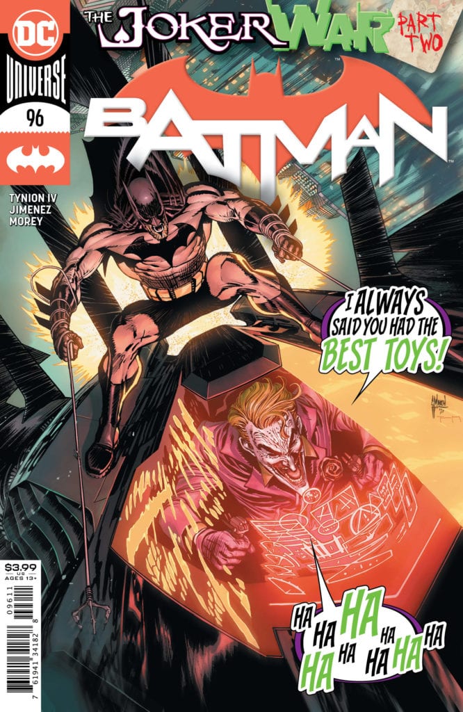
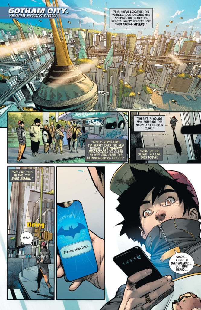
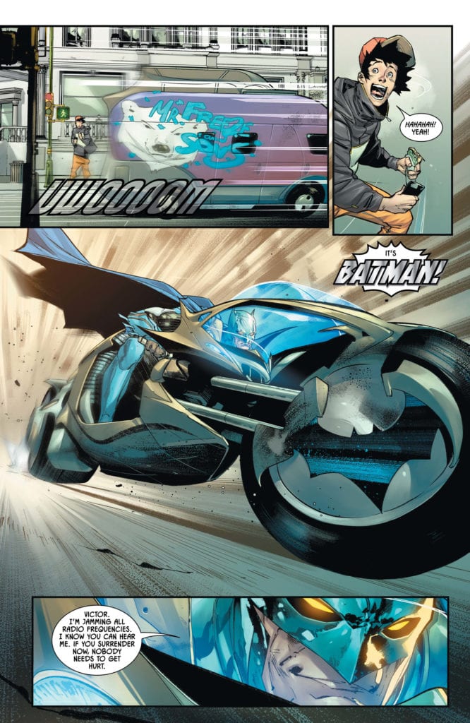
The Joker War is in full swing, and Batman is in dire straits. With Joker having the money and power to control Gotham, Bruce struggles to evade the clowns. He works his way to Wayne Tower, hoping for access to some of his technology. When he breaks in, he finds Punchline waiting for him. She reveals that she had poisoned Lucius Fox with Joker Toxin, and after a brief fight, she did the same to Batman. As he attempts to escape, Batman comes face to face with a Joker-themed Batwing, which fires upon. How will Batman overcome the odds stacked against him?
**Some Spoilers Below**
Story:
We open years from the present, where an older Batman is able to keep peace in Gotham. After taking down Mr. Freeze and his sons, he returns to the cave where Alfred greets him. They go back and forth, but before they leave the cave, Alfred snaps his own neck. It turns out this is a nightmare he was having over the past three days. After the explosion at Wayne Tower, Harley found an unconscious Batman, leaving clowns to run the streets. She explains that Joker and Punchline have created a new Joker Toxin that has to work through his system.
I’m not sure whether or not Tynion IV meant to turn this story into a horror story, but it proves very effective. The horrible scenes of the clowns invading and dream sequences send shivers down my spine. It also was able to accomplish something I’ve actually been enjoying this dive into Bruce’s psyche post-Alfred. The idea of the snapped-neck Alfred has begun to spread through his mind, even imagining his parents with them. While I had my own issues with Tom King’s run, I did like the potential of this plotline and love how Tynion IV is putting it in the center of the character development for Bruce.
The only real downside is that this story definitely had some pacing issues. This is mostly due to the fact most of the action in this story was told through flashbacks. When comics follow this sort of story-telling, we end up with not accomplishing month. If we cut out the flashbacks and dream sequences, that would be half of the comic. Now obviously, this will be smoothed out as we keep moving forward in the comic, but as it stands, it’s offputting.
Art:
Jorge Jimenez is the artist for the Batman issues of Joker War, and his style definitely fits. As I mentioned before, this story is played like a horror movie, and his style matches it. With his illustrations, we get teased into this brighter story, only to be shaken by the dark world we actually are in. While the snapped necks and Joker grins are terrifying, they don’t compare to a terrifying callback to The Dark Knight Movies. Tomeu Morey brings these pages to the next level with excellent creepy colorwork. It’s just a perfect look for a disturbing story in Gotham.
Conclusion:
Overall, it’s a decent chapter in the Joker War saga. With creepy imagery and the ominous foreshadowing of the Joker’s plan, it gets this reviewer excited. This war is clearly going to change things up for Batman, as the nightmares are getting worse. The biggest issue is just the slight pacing issues from the flashbacks and dream sequences. Even then, it doesn’t detract from the overall story. The art team provides an iconic look for this arc and will be talked about for years to come. It might not have been as strong as the opening or the build-up, but this helps flesh out the Joker War fantastically.
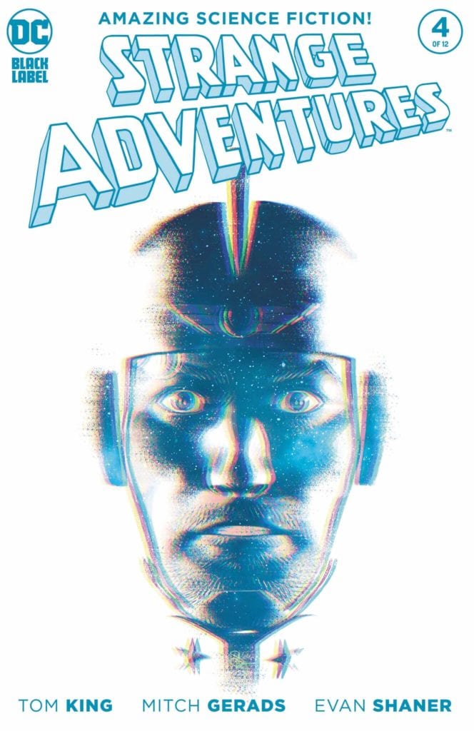
I hesitate to call DC Comics’ Strange Adventures #4 boring. That obviously has some negative implications, which aren’t true of this issue. It is boring though. It’s impersonal and bleak. But that’s because this creative team, writer Tom King, artists Mitch Gerads and Evan “Doc” Shaner, and letterer Clayton Cowles, are making a statement: Sometimes the truth isn’t entertaining. Sometimes doing the right thing isn’t very frilly — it’s just right. This creative team sacrifices nothing in the department of the quality they put forward in Strange Adventures, they just allow the story to slow down and remind us what true life can be like. There are a few minor spoilers, so please read this incredible issue before diving in!
Mr. Terrific: A Slow Train Coming
Writing
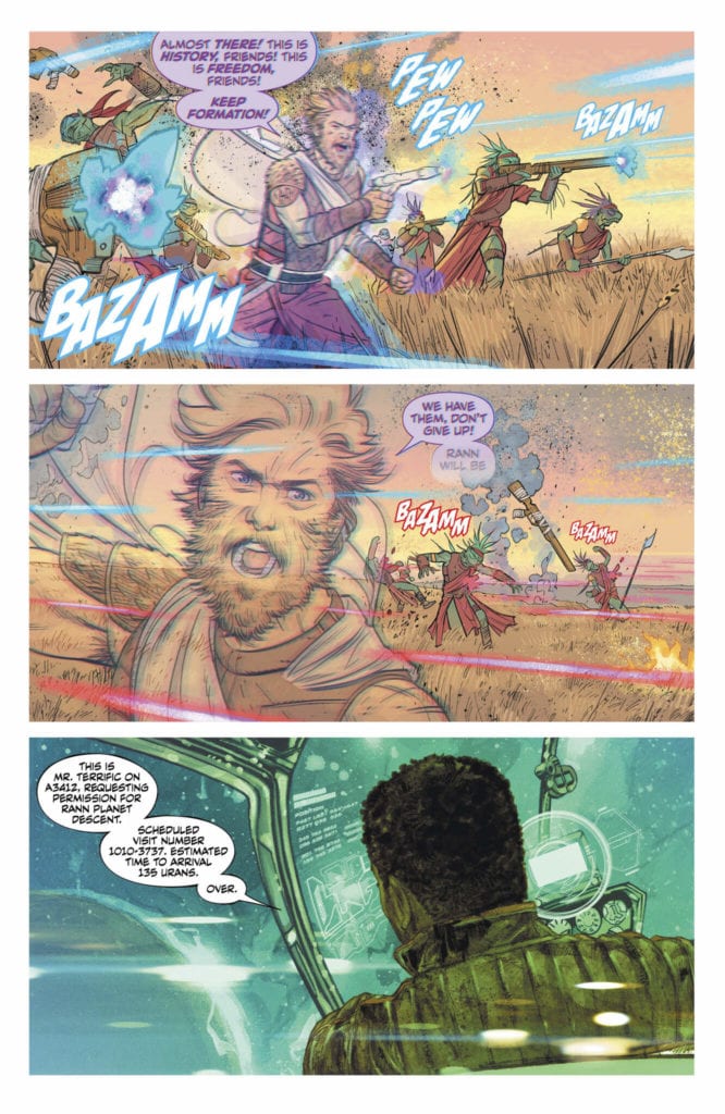
King doesn’t try and spice up the Terrific scenes of this comic too much. There are moments that really stand out. Moments that make you wish you could be best friends with Michael Holt. But the thing that’s so incredible about Mr. Terrific is his unflinching commitment to the truth. So what do we see of his stay on Rann? We see him pouring over alien documents. We see him interview Rannian officials. Sure, he gets a little punchy at the end (in a very badass way) but most of this issue he’s just researching.
Terrific has become a whole new entity in these pages. He’s a force of nature: slow but unstoppable. His complete commitment to his research may not be a source of much action, but it allows us to see what a great choice he is to look into Adam Strange. He doesn’t take no for an answer; when he hits dead ends he breaks right through them. He is a slow train coming, and he’s gaining on Adam inch by inch.
Art
Gerads does an incredible job of making everything on Rann seem unclear. For one thing, we hear over Terrific’s ship’s radio that there will be a landing party waiting for him on arrival. But Gerads zooms out to show us one person standing in a wide-open space. It immediately makes us distrust the Rannians. And Gerads zooming out for the panel pulls us away from the details and makes the moment feel impersonal. In fact, most of these scenes feel impersonal. Terrific looks small on the page, and we rarely get close-ups of his face. With one notable exception.
When Terrific is brought before the Rannians for asking to see Pykkt files, he gets slapped by Sardath. We then see Terrific’s face up close, unobscured, for the first time. But he doesn’t quite look angry. His nonchalance as he slaps Sardath back stops us from worrying. We know, from his face, that Terrific has learned as much as he will from the Rannians. He doesn’t mind burning this particular bridge.
Coloring
Gerads’ colors tell us all about what’s going on under Rann’s surface. For one thing, many of the scenes are colored using lots of whites. When Terrific lands his ship, the landing area is white and vast. It gives the implication that there are no obstacles to Terrific’s search. But as the scenes progress, Gerads plays with reflections and glares a lot. Bright whites that gleam off of the surface of every panel. It’s as though the Rannians have turned on the lights. “We have nothing to hide,” they’re saying. But in so doing, they’re shining the light in Terrific’s eyes. Their transparency is just an illusion, designed to blind Terrific even more to the truth. But as we see Terrific put down a group of armed Rannians in a cool blue-hued room, we know he’s undeterred, and unstoppable.
Lettering
Cowles has taken an about-face in this issue. Previously, Cowles almost never included sound effects in his scenes with Gerads’ art. But in this issue, we get plenty large, cartoony letters surrounding Terrific. It feels out of place, until you realize Terrific is entering Adam’s world. This is the world of a space adventurer, the world of cartoon lettering. It still looks alien, when placed side by side with Mr. Terrific. But it should. Terrific is not welcome on Rann, and the lettering working out of joint with his character, which is always reserved, seems to almost be telling him to go home. With every big red letter, we’re reminded Terrific isn’t on his home turf, and this planet rebels at the thought of him sticking around.
Adam Strange: Alien at Home
Writing
King’s chapters from Adam’s book Strange Adventures take a moving turn in this issue. We get the sense that Adam was actually baring his heart when he wrote these pages. It’s uncharacteristically sincere. It’s the story of him being sent home by the zeta beam, while the Pykkt war is still in full swing. While he’s home he goes to friends in the Justice League and asks for help. But they refuse to bring him back to Rann. They don’t want to get involved. With this, King complicates our interpretation of Adam’s actions.
Sure, we can see how he completely dehumanizes the Pykkt people. They are invaders, and for that reason alone they deserve to die, no questions asked. But the Justice League treat Rann with similar reasoning. Rann isn’t Earth, that’s all the Justice League needs to know to not care. Even with Adam begging for the fate of his people, they seem unmoved. Suddenly, it’s hard not to see Adam’s heart in this. It’s hard to see him as less than human. Even if he is hiding some awful things.
Art
When Shaner first shows us Adam on Rann, he looks majestic. His beard blowing in the wind, in alien armour as he charges across a battlefield. But when we see him again, back on Earth, he looks small. Seeing him so suddenly in his civilian clothes, with his beard shaved and now slowly growing back, he looks a little pathetic in comparison. It’s also worth noting, that most of his panels with Superman and Green Lantern, he’s beneath them. They are literally looking down at him. It’s an isolating experience, and the moments where he does rise up, are moments of him rejecting their input. They are moments of him going off alone.
So when we see him waiting for the zeta beam a second time, he’s all alone in a field. He looks resigned. The beard Adam had on Rann is back, but it means something else now. He hadn’t shaved his beard the first time around because he’d been hiking through the desert to save Alanna. This time, he’s been on Earth. He’s had access to a mirror and a razer. He just didn’t care. So what was once a badge of honor, a mark of his perseverance, has now become a sign of his resignation. But once he gets to Rann, it’s Alanna who is looking up to him this time. She’s the one who restores his hope and gets him fighting again.
Coloring
When Shaner is showing us Rann, in the pages of Adam’s book Strange Adventures, his coloration is intoxicating. The landscapes, with deep browns and hues of purple, make you want to dive right into the page. But when Adam is back on Earth, everything has a simplicity to it. An unattractive simplicity. It’s the same simplicity that we hear in Hal’s reasoning for staying out of the fight, or Clark’s explanation for why he can’t take Adam home to Rann. Everything is a little too black and white for these characters, they can’t see the colors in between. They haven’t seen the colors Adam has. So when the zeta beam reappears, the colors are hypnotic and beautiful. You feel pulled toward the page. But what Adam finds once on Rann is the same simplicity. Brown field, white bones. Until Alanna shows up. Then the skies become a glorious dance of red and purple again.
Lettering
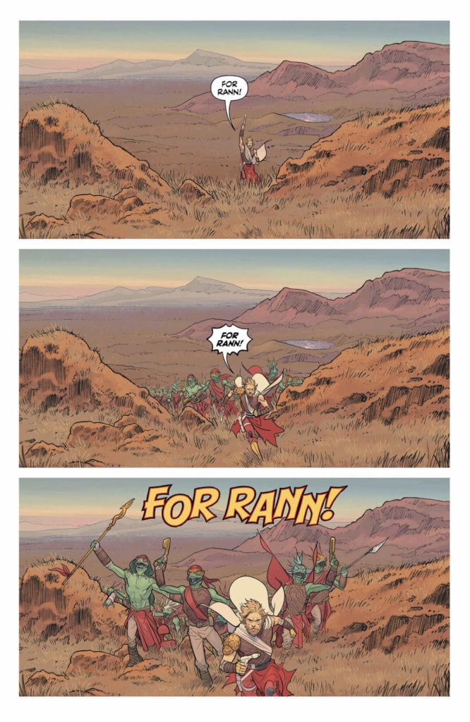
Cowles has completely switched his treatment of each storyline. While Terrific is surrounded by bright sound effects, Adam can’t find them anywhere. The explosions and battlecries before he gets beamed back to Earth are full of flair, but his time in bars and on the moon are nearly silent. It gives us a sense of Adam’s loss of meaning. Just as sound effects teach us how to feel, by how they appear on the page, Adam doesn’t know how to feel about being “home.” He feels so alone and so devoid of emotion. And when he arrives on Rann his feelings carry over at first. We only see the small yellow “Craw, craw, craw” of the buzzards. And he barely says anything once he’s arrived. Once Alanna delivers a rousing monologue to him, he responds shortly “For Rann.” It’s small, and doesn’t fly far from his mouth. It gives us a sense that he just squeaked it out. But it feels all the more sincere for it.
Strange Adventures always delivers. That’s because every page, every panel, is pregnant with meaning. The most “boring” issues aren’t just boring because the creative team ran out of things to say, but because they’re rhapsodizing about the nature of truth and entertainment. There are layers upon layers of meaning in the most innocuous scenes. King, Gerads, Shaner and Cowles are hitting it out of the park with every issue. Pick up DC Comics’ Strange Adventures #4 from your local comic shop August 4th, and prepare to love being bored.
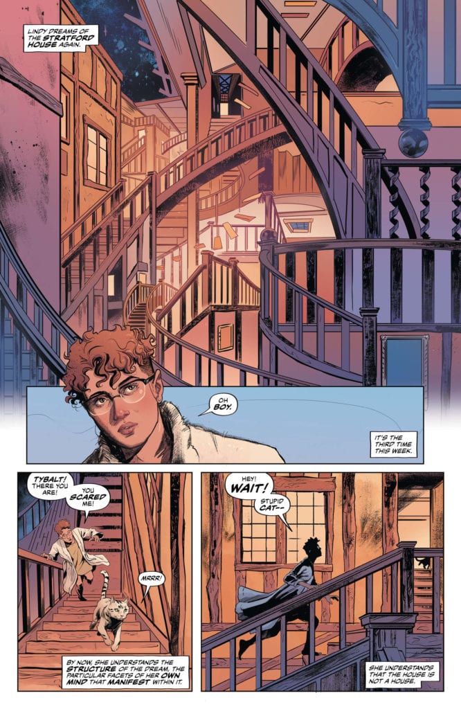
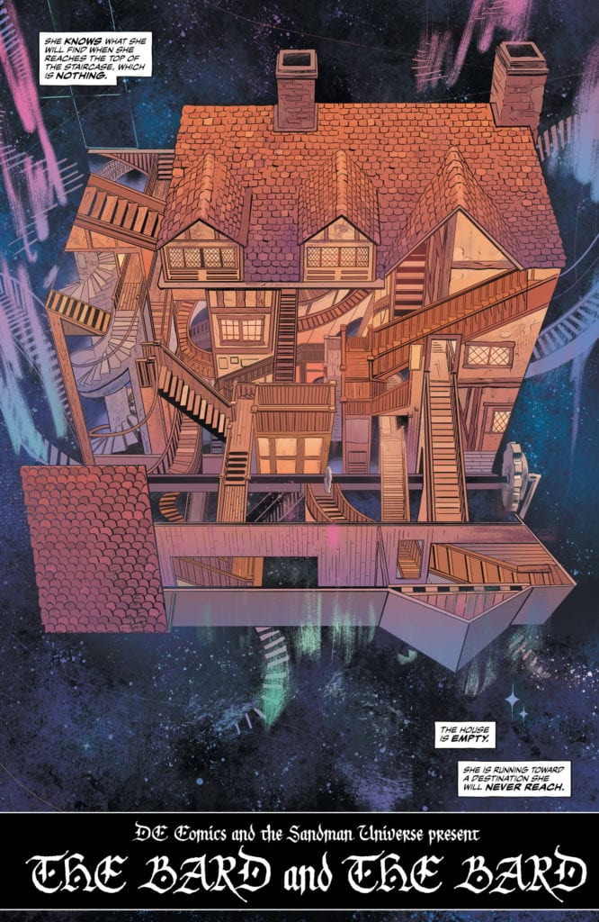
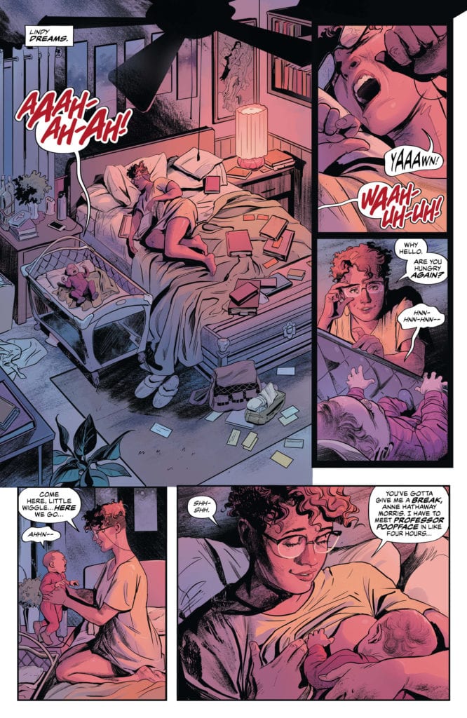
The newest chapter of the Sandman Universe is here, with “The Dreaming: The Waking Hours” #1 from writer G. Willow Wilson (Invisible Kingdom, Cairo) and artist Nick Robles (Euthanauts). With the help of returning co-creators Mat Lopes and Simon Bowland on colors and letters respectively, this first issue of a new Sandman story is a compellingly written and character-focused opening with incredible artwork that is sure to please both old fans and newcomers alike.
“One of Dream’s heaviest responsibilities is the creation of nightmares-the beings that haunt our sleep and turn our thoughts toward darkness. In the form of Ruin, the nightmare of catastrophic failure, Dream was certain he’d built his next masterpiece…but Ruin can’t help but live up to his name, sending every situation into a spiral of unexpected consequences. Unfortunately, Shakespearean scholar (and exhausted new mother) Lindy has dreamed of Ruin…and in the process, she’s delivered him unto the waking world!”
Writing & Plot
Writer G. Willow Wilson has the unenviable job in “The Dreaming: The Waking Hours” #1 of both following up Si Spurrier’s stellar The Dreaming run that ended earlier this year, as well as adding to the legacy of Neil Gaiman’s original Sandman. It seems from this first issue however that she is very much up to the task. This is a well-focused issue that bears down on its characters and their struggles, while also reiterating the lore of the Sandman Universe without ever wading into needless exposition. Both protagonists, the struggling intellectual single-mother Lindy and struggling young nightmare Ruin, are instantly compelling and easy to relate to as characters, and both for totally different reasons. Willow’s blending of a simple, character-driven plot and fantastic dialogue sensibilities keep this an easily enjoyable read that still has all the mystery and fantasy needed in a Sandman tale. The only issue I ever had with Spurrier’s work on The Dreaming was his reliance on the original Sandman for his plot. Being well-versed in Gaiman’s original work didn’t make this a personal issue for myself, but it could easily have been overwhelming for anyone stepping into this universe for the first time. Wilson’s work here improves upon that aspect with a plot that is easy to follow and compelling for readers with little-to-no Sandman knowledge but filled with enough references and easter eggs for classic fans (such as myself) to be satisfied. The succinct, compelling script here make for a fantastic start to this new chapter in the Sandman Universe.
Art Direction
As imposing a position as Wilson has, artist Nick Robles has massive shoes to fill as well. Robles steps in after the Eisner-nominated phenom Bilquis Evely’s work on The Dreaming for this first issue of “The Dreaming: The Waking Hours.” Fortunately, Robles proves more than ready for this task. “The Waking Hours” looks every bit as stunning as its predecessor, in terms of character design, direction, and the necessary fantastical visualizations. Robles’s animations on each character are stunning, bringing each of them to life with blossoming vibrancy. His detailed environments, from Lindy’s cramped apartment to the mazes crafted in The Dreaming, are immaculate in their construction. Robles is such a fitting successor to Evely not just for his unique talent, but also because his style is strikingly similar to the prior artist. This is in no way a detraction from his talent, it’s very much a compliment. Robles’s ability to match the style of one of the best artists currently in the industry while maintaining his own visual mark makes him one of the most promising new artists in comics. This all being said, Robles is helped out by returning Dreaming colorist Mat Lopes, who also colored Evely’s pencils on the prior series. The matching aesthetic of both the former series and “Waking Hours” is primarily owed to his outstanding work, with one of the most expansive palates seen in recent comics. There’s a considerable detailed finesse in his work as well, with carefully selected shades revolving around specific characters and the context of their scenes. Also returning is letterer Simon Bowland, whose expressive and character-specific fonts give this comic the proper Sandman reading experience as has been done for decades now. Visually, “The Waking Hours” is almost as good as it gets in the world of comics.
“The Dreaming: The Waking Hours” #1 is a focused and brilliantly interesting start to this new saga in the Sandman Universe. G. Willow Wilson’s script is full of thoughtful character writing and intelligent but easy-to-follow fantasy. The visual work of Nick Robles and Mat Lopes is some of the best done in the whole of Sandman’s history, and a fitting continuation of the prior series’s aesthetic. This comic is an easy recommendation to both veteran Sandman fans and new readers alike. Be sure to grab this debut issue when it arrives at your local comic shop on 8/4!
Fantomex takes center stage in Giant-Size X-Men – Fantomex #1, on sale from Marvel Comics this week. Writer Jonathan Hickman and artist Rod Reis, with letterer VC’s Ariana Maher, weave a tale, looking at the history of the character and a previously unknown relationship.
To speak of Hickman as “writer” and Reis as “artist” doesn’t quite tell the full story. Comic artists might appreciate that the two men are credited as working on “story and words” and “story and art.” I don’t know if Hickman, as Head of X, is planning on starting a new trend of acknowledging that the artist is as much a storyteller as the writer, but it’s a nice sentiment.
Writing or “Story and Words”
For readers hoping to find out the details of how Fantomex got his own body back from Xavier, who thought that that pre-Hickman plot point would be explored in any way, this story is not for you.
What Hickman creates instead is a historical, cyclical narrative with some cool cameos and references to previous stories, all while exploring a relationship set up in the opening pages of the issue.
It isn’t a bad story, and it is a more personal story for the title character than the Nightcrawler and Magneto issues were, but it is unclear how this might fit into his larger Krakoan narrative. Or is this just Hickman’s chance to writer individual character stories that don’t fit into that narrative? Given the high concept nature of “the World,” which Fantomex attempts to break into multiple times throughout the issue, a sci-fi writer like Hickman may have simply wanted to play around with the idea.
Art & Colors or “Story and Art”
Reis’s art is beautiful in this issue. Given Fantomex’s multiple break-ins to the World, Reis is able to make each one of those encounters look unique. Not only is Reis’s character work on normal characters gorgeous in this issue, but the continually reimagined threats in the world are given unique designs, ranging from cartoony to monstrous, while the environment of the World is rendered increasingly abstract and esoteric.
Again, one wonders if Hickman and Reis just wanted to tell a story that takes advantage of the sometimes zany and high concept sci-fi nature of the World. While the plot of the story could be a little hard to follow at times, the art makes up for it.
Lettering
Maher does a good job lettering the story. The lettering doesn’t overwhelm the page and supplements Reis’s art perfectly. In one scene, when two characters are upside down, Maher’s letters add to the visual effect, complementing and accenting the scene well.
Unlike a lot of the X-titles, this issue lacks any propose pages, and even the character intro page at the beginning is pretty sparse on details. This might’ve been the one issue where an expositional prose page might’ve come in handy, but Hickman, Reis, and Maher tell a very visual story, a rare feature in the Dawn of X.
Conclusion
As with most of these Giant-Size issues, I keep expecting to see character stories that focus on how the title character is adjusting to the new post-Krakoa world and maybe even addressing any lingering plot points about the transition between the pre-Hickman X-era and the current one. The purpose that these one-shots serve to the overarching narrative is unclear still, but Hickman does play a long game, and details that one thinks they can ignore early on sometimes pay big dividends.
What did you think of Giant-Size X-Men – Fantomex #1? Tell us in the comments below!
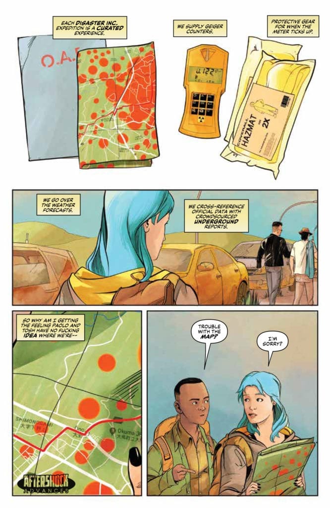
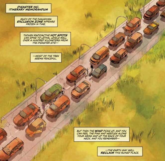
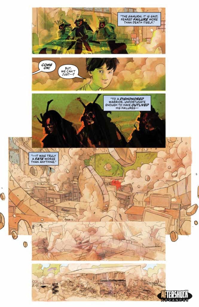
All good holidays should contain an element of learning and Disaster Inc #2, released from AfterShock Comics this week, is no different. Where the first issue introduced the characters, the second takes a look at the larger world that the underground holiday makers are entering. Expect excitement and danger as warriors from history start to catch up with the tourists of today.
Disaster Inc #2 Credit: AfterShock Comics
Entering Fukushima
Joe Harris opens the second issue of the series with a story within a story. Flashback sequences set the scene before returning the reader to the group of Danger Tourists. These scenes are cleverly crafted to explain several elements of the narrative in one enjoyable cut away segment. The recent past merges with ancient history to inform the present. It’s as if there is a single, direct line running through time like the blade of a samurai sword.
The youthful innocence of the Fukushima children is contrasted against the ancient warrior cast and the self centred, thrill seekers of the present. Harris is able to comment on elements of modern society through the characters he has created. They are archetypes of the modern world and, like the cast of a good slasher movie, there are a few the audience are just waiting to be knocked off.
This second issue of Disaster Inc is as steadily paced as the first issue with a strong flow of plot and character development. For each ‘cannon fodder’ member of the party there is another that Harris is slowly fleshing out, creating layers to their personalities, such as the Disaster Inc employee Amorina. She has a history briefly hinted at and a healthy paranoia which creates a larger mystery in the narrative. The writer deliberately shows the reader the other characters through Armorina’s eyes so that they all appear to be hiding something.
As the narrative progresses, the sense of danger increases and the comic draws the reader forward expectantly. Recurring visuals and plot elements build up the overall story with a tension and excitement that was promised in the first issue. Harris knows exactly how much to feed the reader to keep them interested without stuffing it down their throat. This is similar to AfterShock Comics other horror themed title Bad Reception. They both share an obsession with horror tropes but also a devotion to great characters.
Disaster Inc #2 Credit: AfterShock Comics
Drawing Disaster
One of the most noticeable elements of this comic is Sebastian Piriz’ delicate line work and light coloring. For a horror based comic it is surprisingly bright. The majority of the action takes place during the daylight with a backdrop of clear blue skies. Piriz uses the light to pick out all of the details of the characters and their surroundings. It is only when danger looms that shadows creep in and darkness is allowed to prevail.
By creating such an open, inviting world, Piriz is able to control the atmosphere and the readers expectations. The landscape of Disaster Inc is eerie but natural, a curiosity to be wary off but not feared. It is only when the colors become more expressionist and the supernatural element is present that a sense of threat takes over. As with Harris’ pacing of the plot, the artwork draws you in under an air of safety before trapping you in a dangerous place.
Whereas the plot and art pull and push the reader through various states of fear and wonder, it is the lettering by Carlos M Mangual that adds the emotion to the comic. Mangual uses a number of clear, easy to interpret techniques to express the reactions of the characters to each other and the situations they are in.
Tense conversations are punctuated with split or stacked word balloons. These break the speeches up into pointed remarks rather than exposition overloads. There is a natural flow of conversation with plenty of back and forth. It is through Mangual’s lettering that the humour is brought out of the script and also the fear of the central cast.
Disaster Inc #2 Credit: AfterShock Comics
Conclusion
Disaster Inc is a very modern horror. It has a visual style that seems to contradict classic horror comics, lacking the eerie shadows and swathes of darkness, instead opting for a clearer, cleaner aesthetic. It owes more of a debt to a movie like Midsommar by Ari Aster than it does Tales from the Crypt or the Tomb of Dracula. There is a beauty to the visuals that belies the menace within the narrative. When the violence comes it will feel more shocking as a stark contrast to the bright, clear images Piriz has been feeding the reader.
The concept is fascinating, especially as there are such organisations that provide the kind of service offered in Disaster Inc. This adds to the modernity of the work, especially as the cast are a collection of twenty first century stereotypes. We can see the real world and it’s population reflected in the faces of the characters on the page. Harris is showing us the horrors that we, as a race, have created both physically and spiritually. What happens when we disrespect the past and make a sport of tragedy? Disaster Inc deals with such questions and ideas; ideas that are very relevant to the modern world.
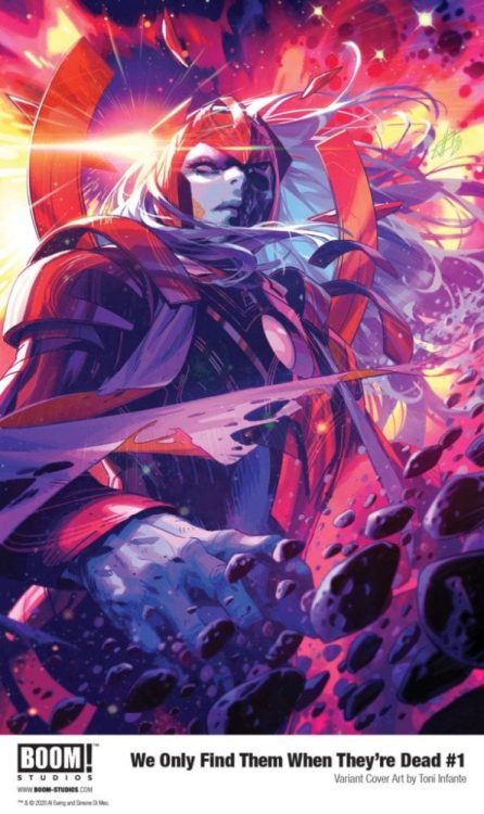
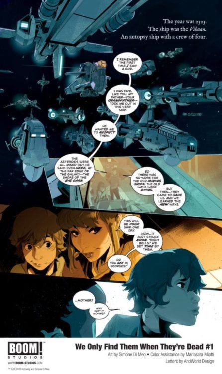
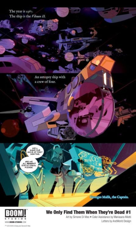
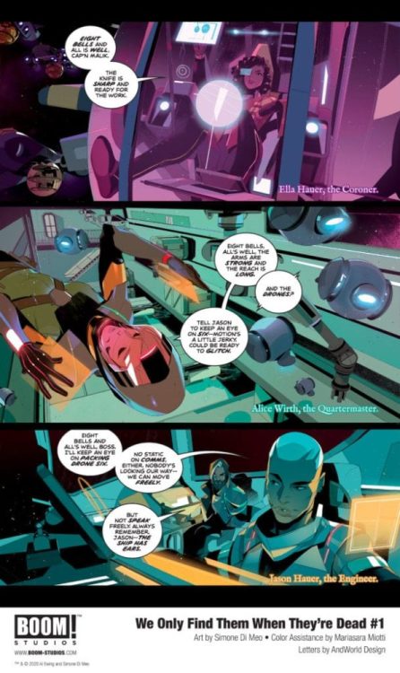
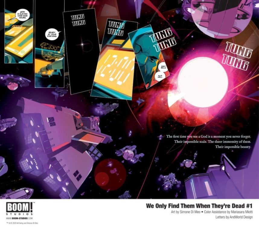
What happens when the interstellar Gold Rush of the future relies on the corpses of gigantic space gods? BOOM! Studios has just such a story for you in their early preview of WE ONLY FIND THEM WHEN THEY’RE DEAD #1, available through retailers on September 2nd.
Written by Al Ewing and drawn bu Simone Di Meo, WE ONLY FIND THEM WHEN THEY’RE DEAD #1 follows “Captain Malik and the crew of the Vihaan II [as they] harvest resources from the giant corpses of alien gods found on the edge of human space. While other autopsy ships race to salvage the meat, minerals, and metals that sustain the human race, Malik sees an opportunity to finally break free from this system by being the first to find a living god.”
You can check out a collection of preview pages and get the full synopsis in BOOM!’s official press release below.
Are you interested in sci-fi comics? Does this new title from BOOM! interest you? Let us know what you think in the Comments section, and please share this post on social media using the links below.
Your First Look at WE ONLY FIND THEM
WHEN THEY’RE DEAD #1
From BOOM! Studios “A thing to provoke awe, fear, and wonder.” – Kieron Gillen, ‘Once & Future’
“Sign me the hell up.” – Jason Aaron, ‘Thor’
LOS ANGELES, CA (August 3, 2020) – BOOM! Studios today revealed a first look at WE ONLY FIND THEM WHEN THEY’RE DEAD #1, a new sci-fi epic from Al Ewing (Immortal Hulk), Simone Di Meo (Mighty Morphin Power Rangers) with color assistance by Mariasara Miotti and letters by AndWorld Design, about one man’s unrelenting quest throughout space to discover the truth—no matter where it takes him. Available in stores September 2, 2020.
Captain Malik and the crew of the Vihaan II harvest resources from the giant corpses of alien gods found on the edge of human space. While other autopsy ships race to salvage the meat, minerals, and metals that sustain the human race, Malik sees an opportunity to finally break free from this system by being the first to find a living god. But Malik’s obsession with the gods will push his crew into danger at the darkest reaches of space—unless the rogue agent on their trail can stop them first…
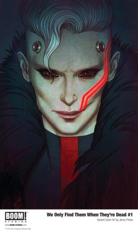
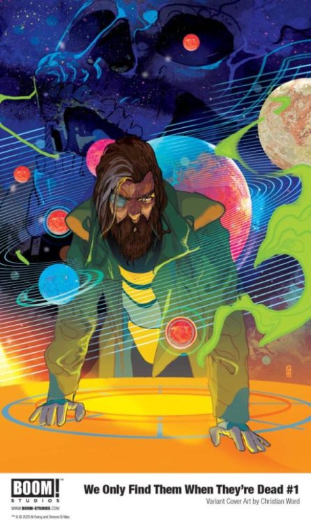
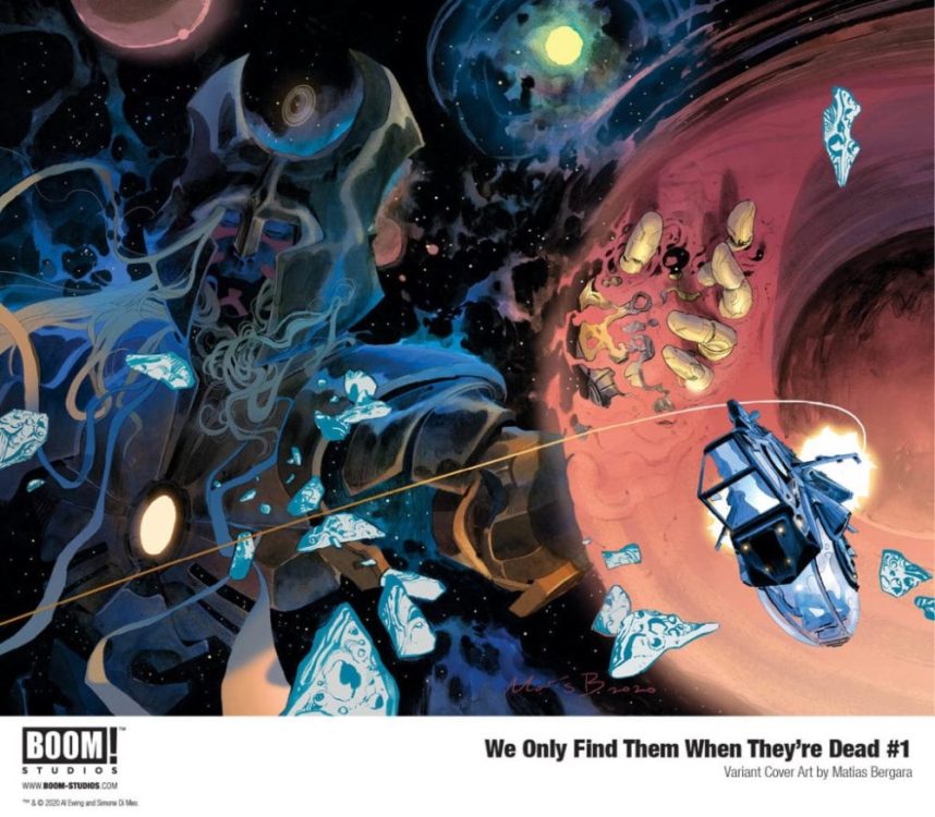
WE ONLY FIND THEM WHEN THEY’RE DEAD #1 features main cover art by series artist Simone Di Meo (Mighty Morphin Power Rangers) and variant covers by fan favorite artists Toni Infante (Mega Man: Fully Charged, The Red Mother), Christian Ward (Invisible Kingdom), Matías Bergara (Coda), and Jenny Frison (Something is Killing the Children).
WE ONLY FIND THEM WHEN THEY’RE DEAD is the latest release from BOOM! Studios’ eponymous imprint, home to critically acclaimed original series, including Once & Future by Kieron Gillen and Dan Mora; Something is Killing the Children by James Tynion IV and Werther Dell’Edera; Faithless by Brian Azzarello and Maria Llovet; The Red Mother by Jeremy Haun and Danny Luckert; Alienated by Simon Spurrier and Chris Wildgoose; King of Nowhere by W. Maxwell Prince and Tyler Jenkins; Wynd by James Tynion IV and Michael Dialynas; and Seven Secrets by Tom Taylor and Daniele Di Nicuolo. The imprint also publishes popular licensed properties including Joss Whedon’s Firefly from Greg Pak and Dan McDaid; Buffy the Vampire Slayer from Jordie Bellaire and David López; Angel from Bryan Edward Hill and Gleb Melnikov; and Mighty Morphin Power Rangers from Ryan Parrott and Daniele Di Nicuolo.
Print copies of WE ONLY FIND THEM WHEN THEY’RE DEAD #1 will be available on September 2, 2020 exclusively at local comic book shops (use comicshoplocator.com to find the one nearest you) or at the BOOM! Studios webstore. Digital copies can be purchased from content providers like comiXology, iBooks, Google Play, and Madefire.
For continuing news on WE ONLY FIND THEM WHEN THEY’RE DEAD and more from BOOM! Studios, stay tuned to www.boom-studios.com and follow @boomstudios on Twitter.
Netflix has no shortage of hit series and movies on its streaming platform, and in 2018, The Kissing Booth became one of its most viewed movies thanks, in part, to cinematographer Anastas Michos.
The Kissing Booth and The Kissing Booth 2 are fun, energetic teen romantic comedies that tell the story of Elle Evans (Joey King) as she navigates life during high school with lifelong best friend Lee Flynn (Joel Courtney). Their friendship becomes strained when Elle and Lee’s older brother Noah (Jacob Elordi), a senior, start falling for each other. That is in the first movie anyway. A sequel, The Kissing Booth 2, released on Netflix on July 24, 2020, and there may be more on the way.
PopAxiom spoke with Anastas about his career as a camera operator turned cinematographer.
Defining Emotion
Anastas is a first-generation American, born to a Greek father and Russian mother. Movies weren’t a focus initially for him. “It was not until my late teens or early 20s,” he said, “that I thought about the people who made movies, and there must be a way for me to do so.”
Fortunately for Anastas, his immediate community yielded the first step toward a life in showbiz. “I had a next-door neighbor who was a documentarian. I was a young man of 22 years old, and he needed help pulling cables.” The rest, as they say, is history.
Soon after, Anastas got involved with a television station as an editor and camera person shooting news stories. “I enjoyed that kind of storytelling,” he said.
Anastas elaborates on the knowledge gained from his experience as a newsman. “That kind of practice of shooting your own story, editing it, and getting it on air was great training for ultimately narrative type of work.”
Anastas made a friend early on, Garrett Brown, the inventor of the steadicam. “He became a mentor.” Anastas learned to operate the steadicam and co designed some aspects of the skycam and segued his way into feature films first as camera operator and then as a Director of Photography.
Anastas’ filmmaking education was heavily “hands-on.” “A lot of it was reading, and a lot of it was looking at films. I didn’t go the traditional film school route, but that is not to say I wasn’t surrounded by huge mentors that I could emulate and who took me under their wing.”
Having an interest and passion in a subject is important, but understanding a craft on as many levels as possible is essential. “I read every book that anybody ever wrote about film,” said Anastas, “and because of that, I had a background in the knowledge and theory, not just the practical.”
Anastas didn’t limit his education to just the camera or cinematography. He read books on directing, writing, editing; the entire process. “I think to be a cinematographer, you need to be a filmmaker, and to be a filmmaker, you have to understand the juxtaposition of images.”
Making movies for Anastas is much like music for him in that they are both “defining emotion over time.”
About The Kissing Booth
Perusing Anastas’ filmography reveals an eclectic body of work. He’s worked on projects like Eddie Murphy: Raw, Man on the Moon with Jim Carrey, Mona Lisa Smile with Julia Roberts, ABC’s hit TV show Quantico, and the terrifying Purge film franchise (The First Purge, The Purge: Election Year). How did he become part of the team for The Kissing Booth? “I was in South Africa, shooting a movie called The Empty Man. It’s a very dark film. One of the things that affect me as a filmmaker is the subject material. You go to work every day dealing with dark subjects … it affects you.”
For Anastas, “If you’re not affected emotionally, then it means that you’re not connected emotionally.”
In Africa, Anastas met up with an old friend. “Michele Weisler, a producer I have known for many years, happened to be in South Africa,” said Anastas. “We had dinner and she mentioned this teen movie that she was doing. I thought ‘Oh, my God, a romantic comedy, how great is that? Sign me up!’”
Michelle didn’t believe Anastas at first, but he insisted and met the director, Vince Marcello, “… in Cape Town, where we had the closest version to Thanksgiving Dinner that we could. We got along very well. Our sensibilities were the same. Our humor was the same.”
Anastas read the script for The Kissing Booth and chatted with Vince, who then offered him the gig.
Pucker Up
After a short Christmas hiatus, Anastas went back to South Africa to shoot “this little film” [The Kissing Booth]. “We had two cents to rub together, and we put out a sweet movie. Little did we know it would become this international phenomenon,” he said.
The Kissing Booth is one of Netflix’s most-watched movies on the platform, alongside hits like Birdbox with Sandra Bullock and Extraction with Chris Hemsworth. “One might dismiss films of that kind as cake-walks,” said Anastas, “but Vince and I had the same sensibilities, and if you’re invested in it, you raise the work to the level of everything else you do.”
Anastas admits teen rom-coms are not his genre, but as filmmakers, the job entails telling a story. Anastas attributes the success of The Kissing Booth to that fundamental fact. “That’s why I think it’s so popular because it holds up as storytelling.”
Anastas’ career put him behind the camera for many franchise films such as The First Purge and Texas Chainsaw (2013). What is the mindset going into sequels? “To some degree, there’s always a desire to change things up. But they are franchises for a reason. People respond to the first one in a certain way. Rather than change for change’s sake, I think what Vince and I did was ask ‘What worked?’ and how can we improve that?”
City Lights
Anastas is a veteran in the film industry with a few decades under his belt operating cameras. He discusses two critical changes over time. The first is obvious “… technology …” but Anastas brings up another key factor. “The environment has changed. When I was growing up, cities were not orange. We had white streetlights. When you came out of warm incandescent indoor lighting into that white light, everything shifts blue,” he said.
However, the seldom discussed technology of city lighting evolved. “The advent of sodium vapor light changed the color of our cities to orange. If you look at a map of the world, you’ll see that most of it is orange lights.”
The evolution continues, and new technologies change. “Now, LA has gone to LED lighting, which is now cold. So, you try to shoot a classic, noir scene outside, WITH blue or green fluorescent light coming out of the industrial windows gives the lack of orange contrast gives it a different look.”
Anastas brings up another factor that affects the way cinematographers create. “It’s also cultural. If you look at a film from Mexico or Brazil, they hit the United States with a color palette that we’re not used to, this orange-y, gold with a lot of green in the blacks. If you look at a film that came out of China in the the early 2000s, Crouching Tiger, Hidden Dragon or Raise the Red Lantern for example, the sudden reds contrasting against pale whites, and the golden and the golden ambers in the practical lights created a palette that we had not seen.
Wrapping Up
Coming up as a camera operator, Anastas worked under many supremely talented cinematographers who he credits as being part of his creative DNA. “Sven Nykvist (Sleepless In Seattle, Cries, and Whispers), Haskell Wexler (61*, Bound For Glory), Philippe Rousselot (The Nice Guys, Sherlock Holmes), and John Seale (The English Patient, Mad Max: Fury Road) are some of the DPs I have worked with.”
Anastas draws on those past working relationships as a DP today. “Every situation is a complex puzzle that needs to be solved to make things look a certain way and be consistent.”
Even with decades of experience, Anastas continues to seek new challenges to push his creativity to new places. “I’d love to do a boat movie. I’ve never done something like that before; something shot on the water. That would be a fun challenge. A western would be a challenge in a completely different way.”
The Kissing Booth 2 is out now on Netflix, and a third installment is set to come out in 2021. So, what’s next for Anastas? “There’s a film by the name of The Empty Man directed by David Prior with James Badge Dale. It’s a very dark story which is part of the Boom! Studios comic book franchise.”
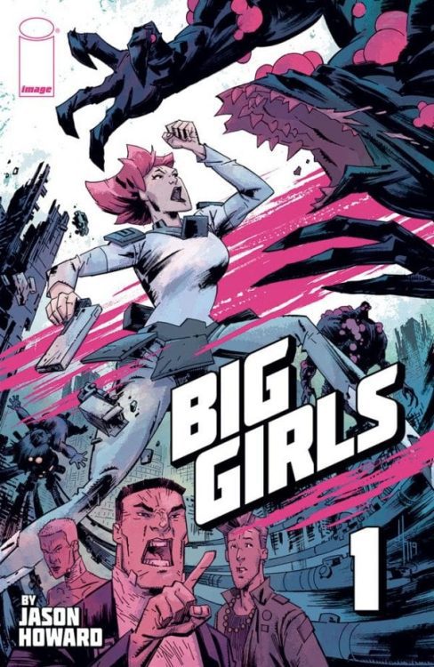
BIG GIRLS #1 hits your local comic book shop on August 12, but thanks to Image Comics, Monkeys Fighting Robots was able to chat with the artist and writer of the series, Jason Howard.
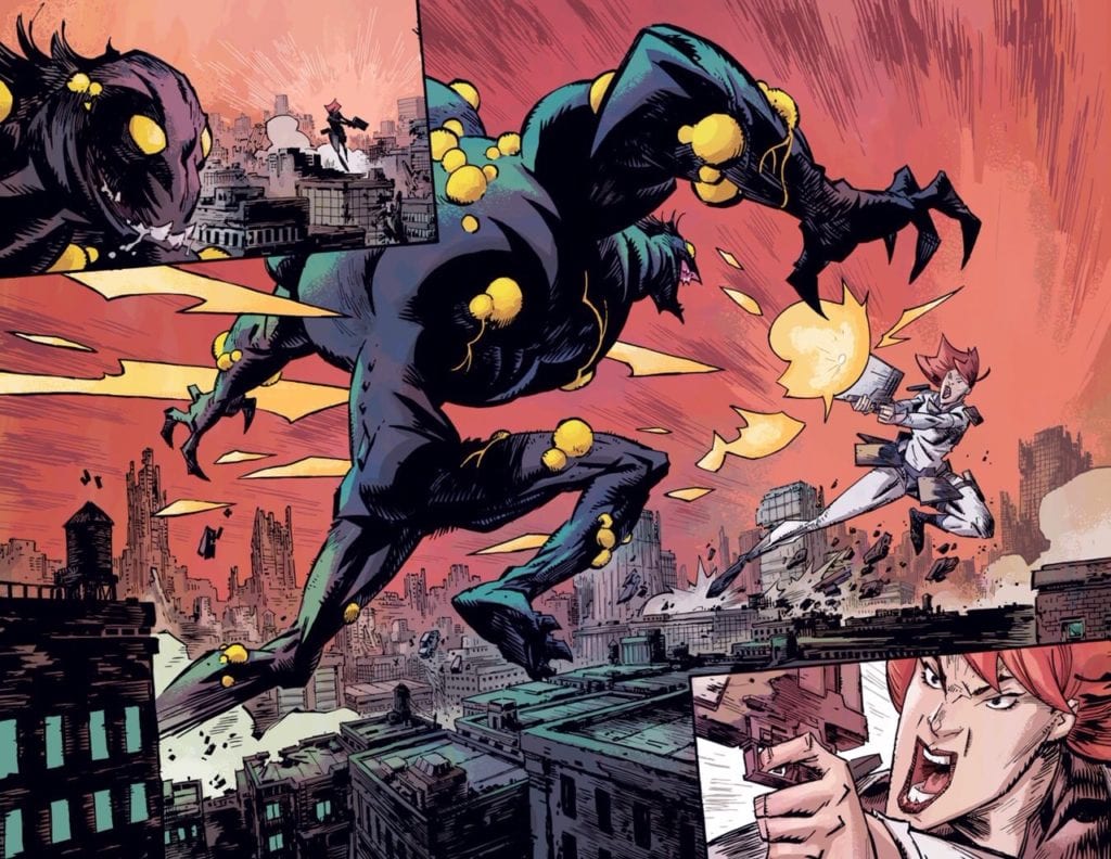
About the book: When men become giant monsters hellbent on destroying the world, only girls can stop them—BIG GIRLS. Meet Ember—she writes poetry, loves to read, and she’s a 300-foot-tall full-time monster killer! She and the other big girls are all that stand in the way of our world’s complete annihilation!
MFR: In the first two pages, you establish the back story of BIG GIRLS, how much world-building was involved to flush out the story and characters?
HOWARD:Quite a bit. I developed the whole backstory and how the world became as it is. Early drafts had more of this backstory, but I cut most of it as the story I wanted to tell was not HOW the world became this way, but rather to use the setting to explore a character living in this kind of world. As the series continues, more of the history might be touched on, but just like real people don’t always know the reasons how or why the world is the way it is, the characters in Big Girls don’t necessarily know everything.
MFR: What was the process like creating the monsters of the BIG GIRLS Universe?
HOWARD:A tried several directions for the look of the monsters, so the process was mostly a lot of sketching and then swearing when things didn’t turn out right away. Eventually, I swore my way to a look I was happy with from a design place and would be something fun to draw. My goal was to find a look that contrasted against the design of the Big Girls. So while the Girls’ uniforms are based on square shapes, the monsters’ design theme is a circle. Keep it simple!!
MFR: BIG GIRLS is a book that the reader can go as deep as you want with thematic elements and meaning. How do you balance keeping the book genuine with a message and not becoming too preachy?
HOWARD:I don’t know. For me, it’s been about balancing my artist and writer sides. As an artist, I really just want to draw cool stuff! So giant women battling monsters and huge destruction satisfies that. But from a story place, I want to have a little more meat and meaning, so asking questions about some of the bigger issues in the world satisfies that. I try to bring it all together in a satisfying way, and my hope is that a reader can enjoy both parts of the story. But ultimately, this is a comic book first and my intent to entertain!
MFR: I have twins that a little over two-years-old. After reading page 11 of the first issue, I wanted to punch you in the face, not really, but you made me angry. When you set up a compelling scene like that, do you think about the reader’s emotional impact?
HOWARD:Sorry… It was a tough scene to write. I do think about the readers, but my main concern is with the characters’ emotional impact. I hope readers connect with the story, but if I second guess story choices too much, I don’t think I would be able to write honestly. Some of my favorite stories have bad things happen to characters, and the appeal to me is not that a bad thing happened, but how those characters react and the journey those big events set them on.
MFR: When you deal with large scale characters, how does that change your panel design?
HOWARD:That was a big appeal of this idea for me as an artist and a fun aspect of drawing the book. Trying to find a way to use the size of the characters to make events feel big is something I try to bring to each page. It affects the panel design because I want every page to be a double-page splash! I didn’t do that, but I do try to use my big panels and splash pages in a way that takes advantage of the characters’ size.
MFR: I didn’t realize how much I would notice the sky in BIG GIRLS #1, the blue sky transitioning to a red/orange sunset worked really well. Can you talk about the color palette for the first issue?
HOWARD:Thanks. Color design is something I’ve always felt is important; I’m glad it worked for you. Color is a big part of storytelling, and it can really create a sense of place and mood. For example, when the colors shifted to the red/orange scheme, I wanted to show two things. First, to give a sense that some time had passed since the events previously in the issue. Second, because we are moving into an action scene, I wanted a color combination that felt more dynamic and energetic. I dislike the dull, ‘realistic’ coloring that is sometimes used in comics. I much prefer coloring that prioritizes design, mood, and storytelling.
MFR: My favorite page from the first issue is the double-page spread battle scene; there is movement and emotion. What techniques did you use to make that happen?
HOWARD:I wanted that spread to represent the visual hook of the series, a giant soldier woman fighting a giant monster in a ruined city. So capturing the energy of their fight and scale was my priority. And if you like that spread, just wait for issue 2!
MFR: There are so many options fighting for our entertainment attention, how important is it to hook the reader with the first issue?
HOWARD:Pretty important!! Let’s be honest; if no one buys the book it will make it hard for me to continue telling this story. 🙂 As a life long comic book fan I feel a responsibility to do the best work I can, I think this is a series that has a lot of surprises and will be an exciting, entertaining book. Probably everyone should just cancel their Netflix today! Big Girls has you covered!
MFR: Your panel design goes back and forth with white borders and full-bleed. What message are you trying to convey with the white space?
HOWARD:Often, it’s more about the visual impact that the bleeds can have. Really I just try to have fun with the layouts, and I like to use white space to make things pop, and the bleeds to give the impression of density or things “too big for the page.” Or I might use them if a location changes within a page, anything to help the reader feel like they are in a different place.
MFR: Godzilla is mentioned in the marketing material for BIG GIRLS #1, what is your first memory of Godzilla and how much of an impact did it have on you?
HOWARD:Godzilla has always been a favorite, but what I really loved was big robot animated shows like Voltron, Transformers, Robotech, and Evangelion. While there may not be giant robots in Big Girls, those visuals and ideas are built into the stuff that I find to be cool, and a definite influence on the series.
MFR: Thank you for your time and best of luck with BIG GIRLS #1.
Will you add BIG GIRLS to your pull list? Comment below with your thoughts.