

With new comics slowly returning to the shelves of shops that can stock them, Aftershock Comics have a couple of new number ones to get people back into the hobby. With Disaster Inc. written by Joe Harris and art by Sebastian Piriz, a national disaster zone becomes the holiday park for rich adventurers and environmental activists.
With an array of covers hosting magical samurai intent on destruction, the comic promises to mix a hefty piece of mysticism into the ‘underground holiday gone wrong’ scenario. In an interview with The Hollywood Report, Harris cited that Akira Kurosawa movies, Samurai stories, and illegal bungee jump parties as inspiration for his story. This gives you some idea of what to expect from the 22 pages on offer.
Booking A Place
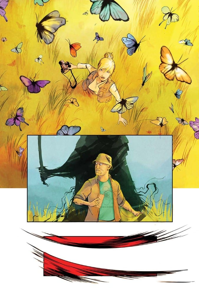
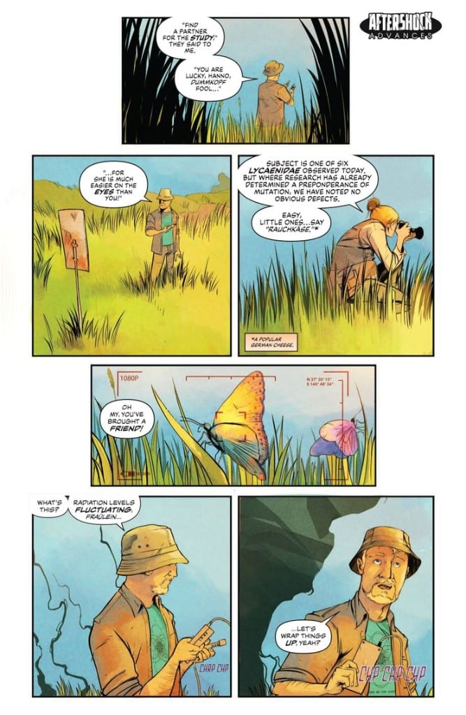
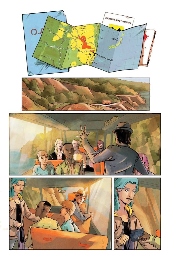
The Fukushima Daiichi Disaster forms the backdrop for Harris’ supernatural thriller. He teases out information about the disaster, setting up the back story in the same way a movie builds the character of the killer in a slasher movie. The site and history of the disaster acts like character for the reader to get to know, a concept that Harris plays into throughout the story. A collection of news reports, spoken legends, and documents shape this mysterious character. Each reference illustrates a little bit more, hinting at things to come.
In front of all of this, acting as the main focus for the reader, is the introductory plot of a modern horror. A group of people are gathered together to enter an unknown and potentially hostile environment. The characters all have their own backstories, some of which Harris lets the reader in on from the very beginning through the use of ‘background checks’. The narration for this issue comes from the central character, Amorina, who is also the assistant to the owner of Disaster Inc. Through her role in the company, she has access to all of the ‘holiday makers’ backgrounds and Harris’ uses this as a framework to introduce each traveller.
This works well as a narrative framing device and Harris uses it brilliantly to give the reader some important information without spoiling the plot. It also allows the writer to introduce a rogue element into the narrative in the form of Melody. Melody isn’t on the Disaster Inc. books so Amorina doesn’t know anything about her; in turn the readers don’t get to know anything about her.
Step by Step
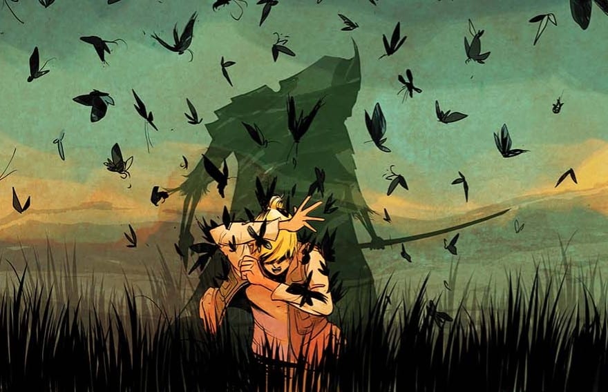
Disaster Inc. has a very steady pacing that slowly lowers the reader into the story. There is a beautiful yet horrific opening that sets the scene, introducing the location and supernatural element. The narration then turns to Amorina and the gathering of the Disaster Inc. customers. What follows is a melee of character introductions that immediately create different tensions within the group. This first issue sets up the potential personality conflicts and friendships perfectly. By the end the reader already has a sense of who people are and what they are potentially willing to do in a crisis situation.
By setting up the story in this manner, Harris is making a statement about the themes of his story. All of the supernatural and disaster elements are making up the background, the foundation of the plot, but the true nitty-gritty falls to the characters. Going into a story where it, inevitably, is going to end in disaster, the reader has to have a connection with the characters. Harris has created a group who are identifiable and that the reader can empathise with. There are traditional narrative heroes and villains within the group which becomes apparent as additional members are added. Harris makes you root for Amorina but leaves everyone else a bit of mystery about them.
Drawing Danger
For the opening issue, Sebastian Piriz keeps the artwork fairly straightforward. He uses thin, descriptive inked lines to establish the characters within the panel while allowing the color to create the beautiful background visuals. He employs a watercolor style to create a very naturalistic look. The open aired country scenes have an unoccupied feel to them, as if nature rules the landscape.
The characters themselves include more vivid colors but only a few, signature traits to differentiate them from each other and their environment. Amorina has distinctive green hair making her a focus on most of the pages, cementing her place as the central character. Other characters, however, have distinctive features separating them from the rest of the cast. Toshiro, the Japanese guide, for example has jet black hair which matches the leather jacket and dark sunglasses that he seems to wear at all times.
Carlos M. Mangual threads the speech and caption boxes throughout Piriz’s artwork maintaining a steady balance between the two. The placement of the speech acts as a leader, drawing the reader across the page highlighting elements of the visuals. Mangual uses the same font for all of the speech but creates differences in speech patterns by breaking the sentences up. Instead of using large balloons, Mangual separates the speech into smaller, easier to digest, nuggets of speech. It is the way that he then links these balloons and makes them interact on the page, that creates personality and a voice.
There is one moment where Mangual places one of Paolo’s speeches between Amorina’s with a long, sweeping connector underneath. Mangual could have used two separate balloons but by presenting it like this the reader understands that Paolo is the type of person to talk over other people while Amorina is persistent in sounding out her thoughts and ideas. She will have her say.
Conclusions
Disaster Inc. has a wonderful set up. The artwork creates scenes of beauty but Piriz demonstrates that he can produce disturbing and unsettling images also. There is a groundwork for horrific things on display in this first issue. The narrative focuses on the characters, drawing the reader in, while setting up an intriguing mystery/adventure
This comic does the one thing that first issues should do: it leaves you wanting more. More of the story, more of the characters, and more of the history leading to the creation of Disaster Inc. Joe Harris has created a fascinating collection of travellers and one hell of an intriguing world for them to explore. The second issue cannot come quick enough.