

All good holidays should contain an element of learning and Disaster Inc #2, released from AfterShock Comics this week, is no different. Where the first issue introduced the characters, the second takes a look at the larger world that the underground holiday makers are entering. Expect excitement and danger as warriors from history start to catch up with the tourists of today.
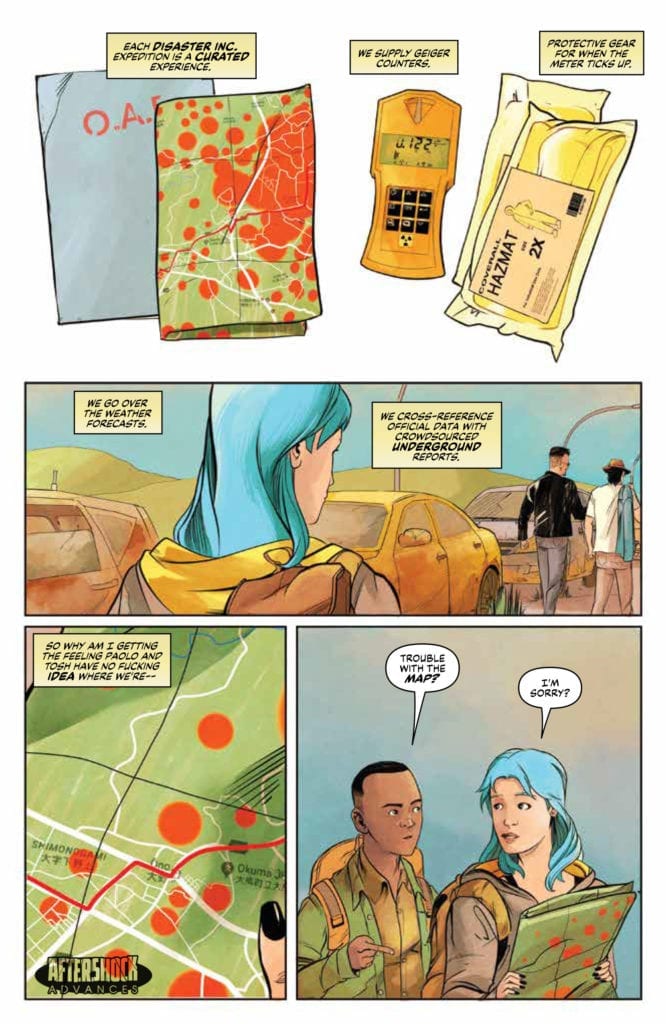
Entering Fukushima
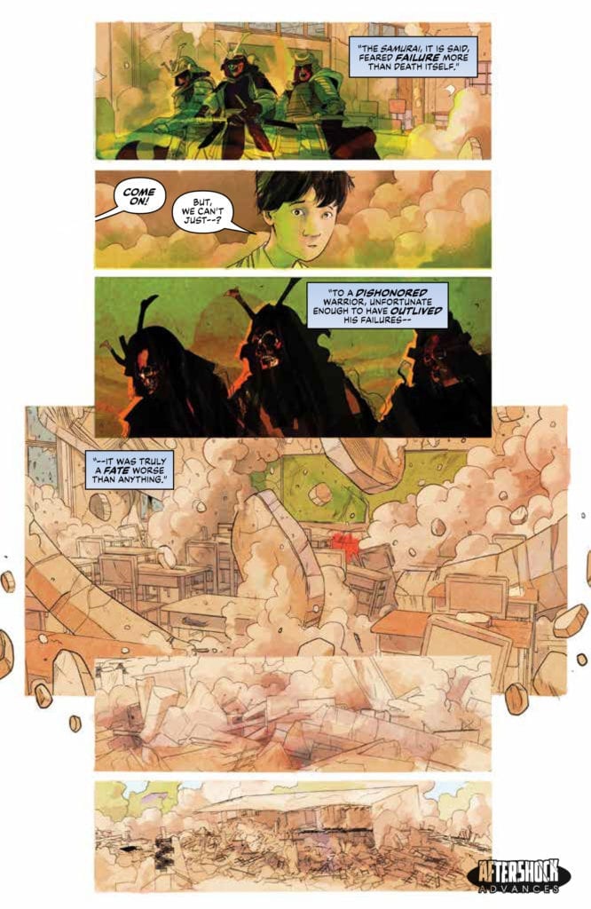
Joe Harris opens the second issue of the series with a story within a story. Flashback sequences set the scene before returning the reader to the group of Danger Tourists. These scenes are cleverly crafted to explain several elements of the narrative in one enjoyable cut away segment. The recent past merges with ancient history to inform the present. It’s as if there is a single, direct line running through time like the blade of a samurai sword.
The youthful innocence of the Fukushima children is contrasted against the ancient warrior cast and the self centred, thrill seekers of the present. Harris is able to comment on elements of modern society through the characters he has created. They are archetypes of the modern world and, like the cast of a good slasher movie, there are a few the audience are just waiting to be knocked off.
This second issue of Disaster Inc is as steadily paced as the first issue with a strong flow of plot and character development. For each ‘cannon fodder’ member of the party there is another that Harris is slowly fleshing out, creating layers to their personalities, such as the Disaster Inc employee Amorina. She has a history briefly hinted at and a healthy paranoia which creates a larger mystery in the narrative. The writer deliberately shows the reader the other characters through Armorina’s eyes so that they all appear to be hiding something.
As the narrative progresses, the sense of danger increases and the comic draws the reader forward expectantly. Recurring visuals and plot elements build up the overall story with a tension and excitement that was promised in the first issue. Harris knows exactly how much to feed the reader to keep them interested without stuffing it down their throat. This is similar to AfterShock Comics other horror themed title Bad Reception. They both share an obsession with horror tropes but also a devotion to great characters.
Drawing Disaster
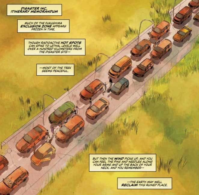
One of the most noticeable elements of this comic is Sebastian Piriz’ delicate line work and light coloring. For a horror based comic it is surprisingly bright. The majority of the action takes place during the daylight with a backdrop of clear blue skies. Piriz uses the light to pick out all of the details of the characters and their surroundings. It is only when danger looms that shadows creep in and darkness is allowed to prevail.
By creating such an open, inviting world, Piriz is able to control the atmosphere and the readers expectations. The landscape of Disaster Inc is eerie but natural, a curiosity to be wary off but not feared. It is only when the colors become more expressionist and the supernatural element is present that a sense of threat takes over. As with Harris’ pacing of the plot, the artwork draws you in under an air of safety before trapping you in a dangerous place.
Whereas the plot and art pull and push the reader through various states of fear and wonder, it is the lettering by Carlos M Mangual that adds the emotion to the comic. Mangual uses a number of clear, easy to interpret techniques to express the reactions of the characters to each other and the situations they are in.
Tense conversations are punctuated with split or stacked word balloons. These break the speeches up into pointed remarks rather than exposition overloads. There is a natural flow of conversation with plenty of back and forth. It is through Mangual’s lettering that the humour is brought out of the script and also the fear of the central cast.
Conclusion
Disaster Inc is a very modern horror. It has a visual style that seems to contradict classic horror comics, lacking the eerie shadows and swathes of darkness, instead opting for a clearer, cleaner aesthetic. It owes more of a debt to a movie like Midsommar by Ari Aster than it does Tales from the Crypt or the Tomb of Dracula. There is a beauty to the visuals that belies the menace within the narrative. When the violence comes it will feel more shocking as a stark contrast to the bright, clear images Piriz has been feeding the reader.
The concept is fascinating, especially as there are such organisations that provide the kind of service offered in Disaster Inc. This adds to the modernity of the work, especially as the cast are a collection of twenty first century stereotypes. We can see the real world and it’s population reflected in the faces of the characters on the page. Harris is showing us the horrors that we, as a race, have created both physically and spiritually. What happens when we disrespect the past and make a sport of tragedy? Disaster Inc deals with such questions and ideas; ideas that are very relevant to the modern world.