Home Blog Page 388

Review: TALES FROM THE DARK MULTIVERSE: BLACKEST NIGHT #1 is Darker than the Original

The Blackest Night Grows Even Darker!

When the Dark Multiverse was revealed in Dark Knights: Metal, it intrigued me. A second multiverse where things went wrong instead of right? The possibilities are endless! When the series Tales of the Dark Multiverse was announced, I was super excited to see them! We first got a dark version of Knightfall that saw Azrael go entirely off the deep end, becoming a venom powered Batman. We then saw Lois Lane take the role of the Eradicator in the Death of Superman, bringing an Injustice style of order to the world. Now we have a darker take on one of the darkest Green Lantern stories in DC’s history: Blackest Night. How much darker can the night get?

Dark Multiverse Blackest Night #1 cover

**Some Spoilers Below**

Story:

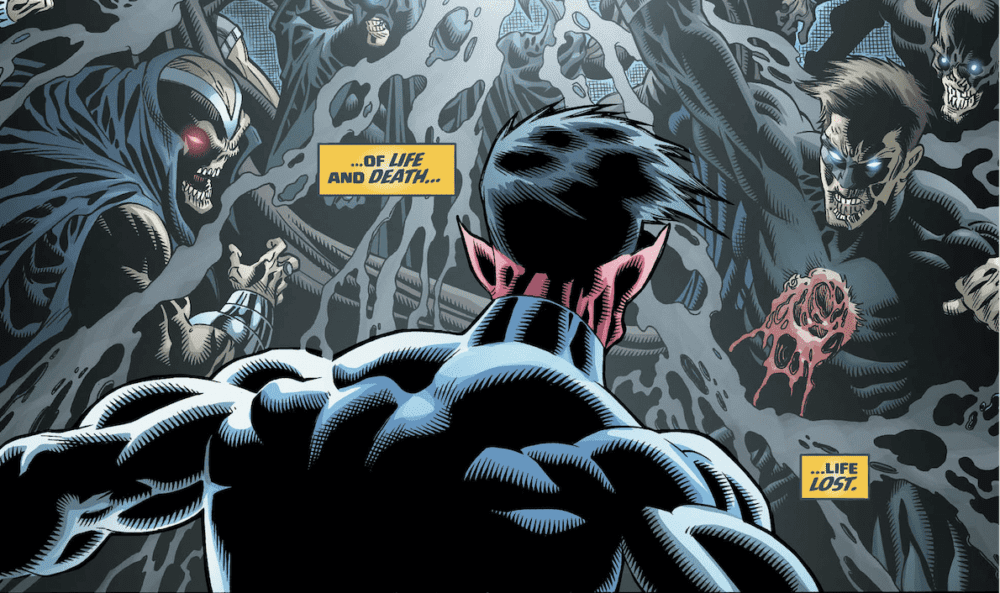
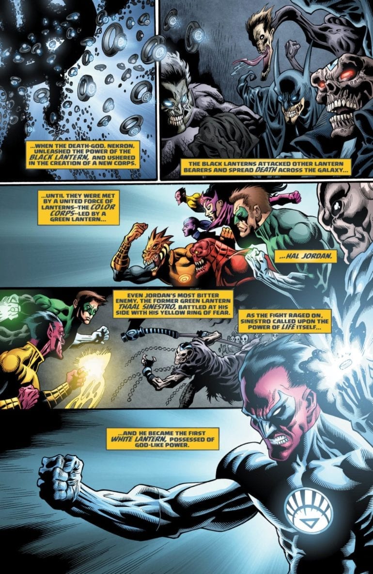
Starting from the climax of Blackest Night, we instantly see where things have gone wrong. Where in our universe Sinestro shared the power of the White Lantern to overpower Nekron, he doesn’t in this universe. Without that necessary back up, the death god killed the white entity, allowing the Black Lanterns to overtake the universe.

A few weeks later, we see a pair of survivors fighting to stay alive in San Francisco. Lobo was able to stave off the infection due to his Czarnian biology, while Dove is immune to the infection. Before they are torn apart by Black Lantern Titans, Sinestro arrives wielding both a black and white ring. He disables the zombified heroes and approaches the survivors with a plan to save the universe.

Tales from the Dark Multiverse Blackest Night 1 p1

This is honestly the best issue or Tale of the Dark Multiverse yet. We have tons of cool action sequences and terrifying concepts, as seen with previous issues, but we also get great character moments. The small gripe the series has is that while it is cool to see such massive changes to the stories we know and love, to make them work, some of the characters have to make huge changes, such as Lois Lane becoming incredibly hateful of the League in the last issue. In this one, you can see a natural progression of character development. Lobo is still that darkly humorous bounty hunter, Dove that hopeful hero, and even Sinestro is still his stuck up self. It felt like this was supposed to be an alternate ending to the story instead of a What If. It’s a shame this came after Halloween because this is a damn near perfect horror story.
Tales from the Dark Multiverse Blackest Night 1 p2

Art:

While I do enjoy the story and think it’s the best that has been put out, I have to say that the artwork is just okay. It’s not terrible, but at the same time, it isn’t anything to write home about. In defense of the team, they do make some pretty gnarly designs that encapsulate the horror of Blackest Night. The best piece done in the issue is definitely when the team goes to Apokolips to find the New Gods as Black Lanterns. They’re as terrifying as they sound, and I think it shows they tried. It’s hard to compare this team to Ivan Reis in the original story, but their art fits just enough.

Tales from the Dark Multiverse Blackest Night 1 p3

Conclusion:

Overall, this was a great tale from the dark side. Blackest Night was already a terrifying story, and this creative team took it a step further. We have grand action sequences and horrific imagery that captures the feel of the original story. The art might not be on the same level as the original tale, but it does the job and give us terrifying designs to new the Black Lanterns. I can only hope Infinite Crisis will live up to this Tale from the Dark Multiverse.

Monkeys Fighting Robots Youtube

Review: Early Festive Frolics In DOCTOR WHO 13th DOCTOR HOLIDAY SPECIAL

Doctor Who Holiday Special
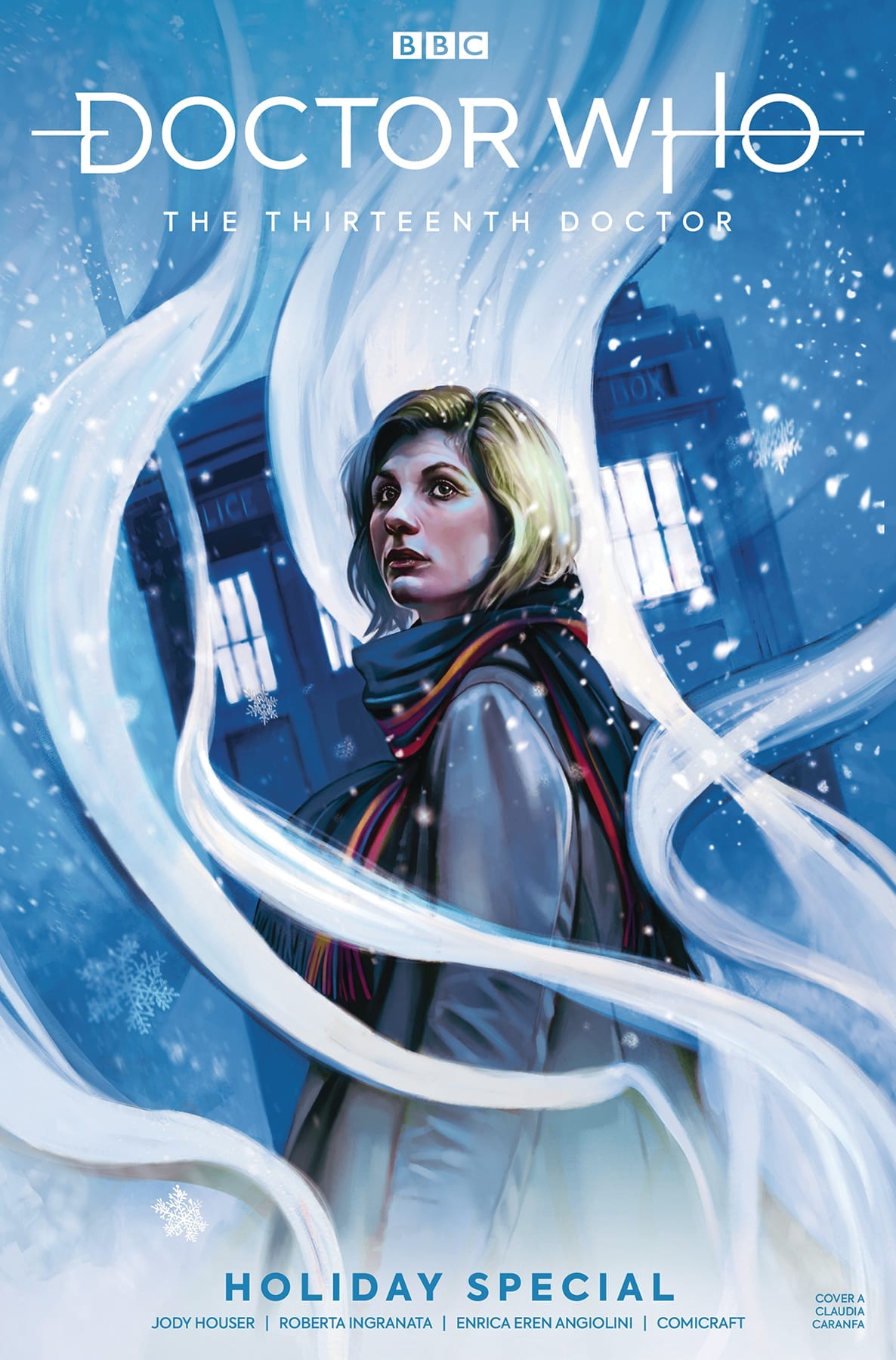
Doctor Who The Thirteenth Doctor Holiday Special Credit: Titan Comics

Following on from the tradition started by Nu-Who since it’s return in 2005, Titan Comics are releasing the first part of their 13th Doctor Holiday Special this week. Along with the companions from last years successful series, Ryan, Yasmin, and Graham, The Doctor returns with a visit to a festive, little town where not all is as it seems.

After a year of writing the monthly comics, Jody Houser is more than comfortable with the characters and the tone of Jodie Whittaker’s take on the famous Time Lord. Without a second wasted, she throws the cast into a festive story, packed with the kind of adventure you’d expect from the longest running science fiction series. 

Doctor Who Cover Art
Doctor Who The Thirteenth Doctor Holiday Special Credit: Titan Comics

A Festive Doctor

While planning a festive adventure it becomes apparent that not is all as it should be in the TARDIS. Someone has been altering the Doctor’s memories, and the memories of her companions. But more disturbing is that the TARDIS herself appears to have been tampered with. 

Houser uses this mystery as the jumping off point for the Holiday madcap adventure. There is nothing more exciting than a festive mystery and the 13th Doctor is perfectly matched for this kind of caper. Houser draws on the fun elements of the 11th T.V. series, something that she did a number of times in her first year on the comic. She is able to draw out a whimsical idea and make it believable within the confines of a Doctor Who story. The secret to her success is that she never ventures too far away from the human drama at the heart of the 13th Doctor. 

The opening of this issue, for example, portrays a family deciding on what to do for the holidays. A mundane situation made otherworldly by the location. However, Houser keeps the narrative tightly structured around what these four characters do and their interactions with each other even after they enter an alien world. The plot itself hinges on the Doctor’s concern for her ‘family’ and the potential harm that has been done to them.

The characterisations of the central cast are perfect replicas of their television counterparts. If you have read any of the 13th Doctor comics this year this will come as no surprise. It is one of the most striking elements of the comic. Al Ewing got Matt Smith’s incarnation spot on and Houser captures the energy and wonder of Jodie Whittaker. The conversations are a joy to read with humorous banter flowing across the pages.

Doctor Who Sugar Plums
Doctor Who The Thirteenth Doctor Holiday Special Credit: Titan Comics

Dreams of Festive Villages

Roberta Ingranata uses soft lines which creates a dreamlike quality to a lot of the artwork throughout this comic. The delicate touch, coupled with expressive facial and body gestures, makes the comic easily accessible; the visuals are comforting and easy to follow. This approach opens up the audience for the comic, pulling in ardent fans or first time readers. 

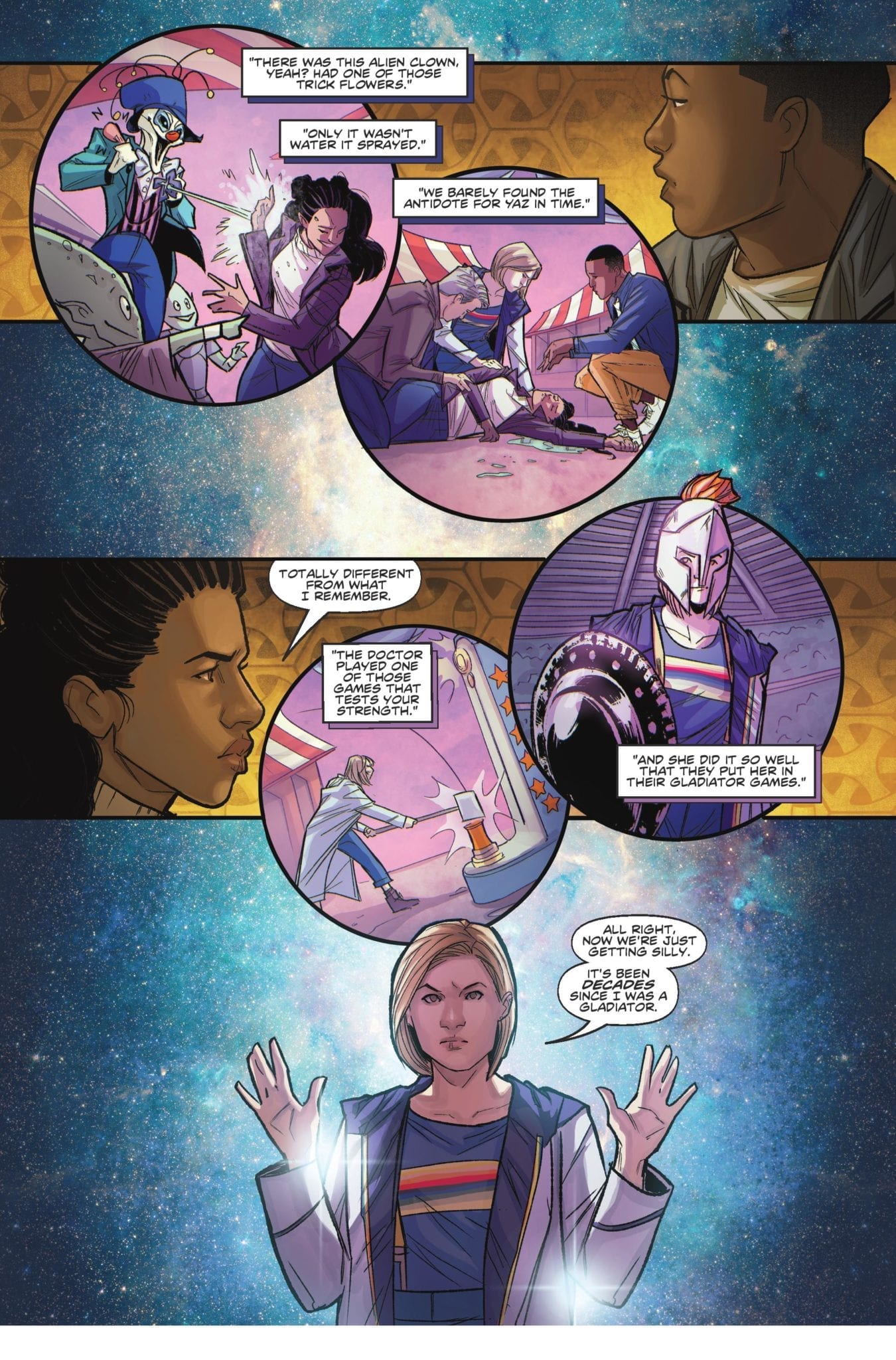
Ingranata’s layouts are also easy to follow. The transition from the present time to flashback memories is instantly recognisable on the page because of the change in panel shape. Memories tumble across the page inside circular panels, often with a different color scheme provided by Enrica Eren Angiolini, reminiscent of the visions of sugar-plums from Clement Clarke Moore’s festive poem Twas The Night Before Christmas.
This is not the first subtle reference to Christmas and as the story progresses neither the writer or artists resist the urge to sprinkle the comic with a touch of festive magic. The overall feel of the comic is one of Christmas wonder, with an element of mystery. Reading this is like snuggling up in front of a fire to watch an old TV movie that you only ever see at Christmas, but that you know inside and out.

The punchy script has a rhythm to it. The vocal beats have been provided by the small, broken speech balloons placed almost poetically across the page. With the magical visual style that this issue of Doctor Who has it is difficult to integrate the lettering but Richard Starkings and Sarah Hedrick do an outstanding job. By spacing the text out into several balloons, spreading the speech around the panels, it allows the artwork to shine through.

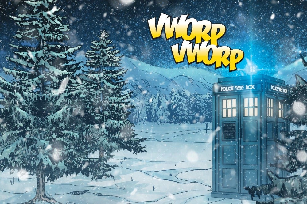
The sound effects are almost the opposite, in that they jump out of the page at you. They are bold and have an old school comic vibe to them, however they work just as successfully as the speech. There is a jovial element to this comic that the sound effects pick up and run with. There is something warm and cosy about the bubbly, bright yellow sound of the TARDIS arriving next to a tiny Christmas village.  

Doctor Who Holiday Special
Doctor Who The Thirteenth Doctor Holiday Special Credit: Titan Comics

Conclusion

The story is new but it feels old. The artwork is very modern but familiar and warming. The Doctor is, especially as portrayed here, the perfect holiday hero; she is full of wonder and excitement but there is a serious side, glimpsed briefly just beneath the surface. 

Jody Houser has embraced the Holiday Special tradition and crafted a warmhearted, exciting adventure with, surprisingly, cute Toy Soldiers as the creature of the week. The artwork is magical with a strong sense of humour but still manages to great some moments of tension squeezed in there.

This comic is a great addition to the Doctor Who methos and, just like Christmas, the second part can’t come soon enough.


Monkeys Fighting Robots Youtube

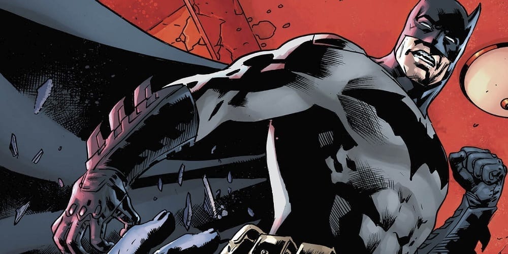
Review: Cannibals & Cops in THE BATMAN’S GRAVE #2

The Batman's Grave #2

We saw Bruce uncover the culprit behind a gruesome murder in our first issue. Now, with The Batman’s Grave #2, out this week from DC Comics, he has to survive the encounter…and avoid being taken out by a distrustful Gotham PD in the process.

Batman's Grave #2

The Writing

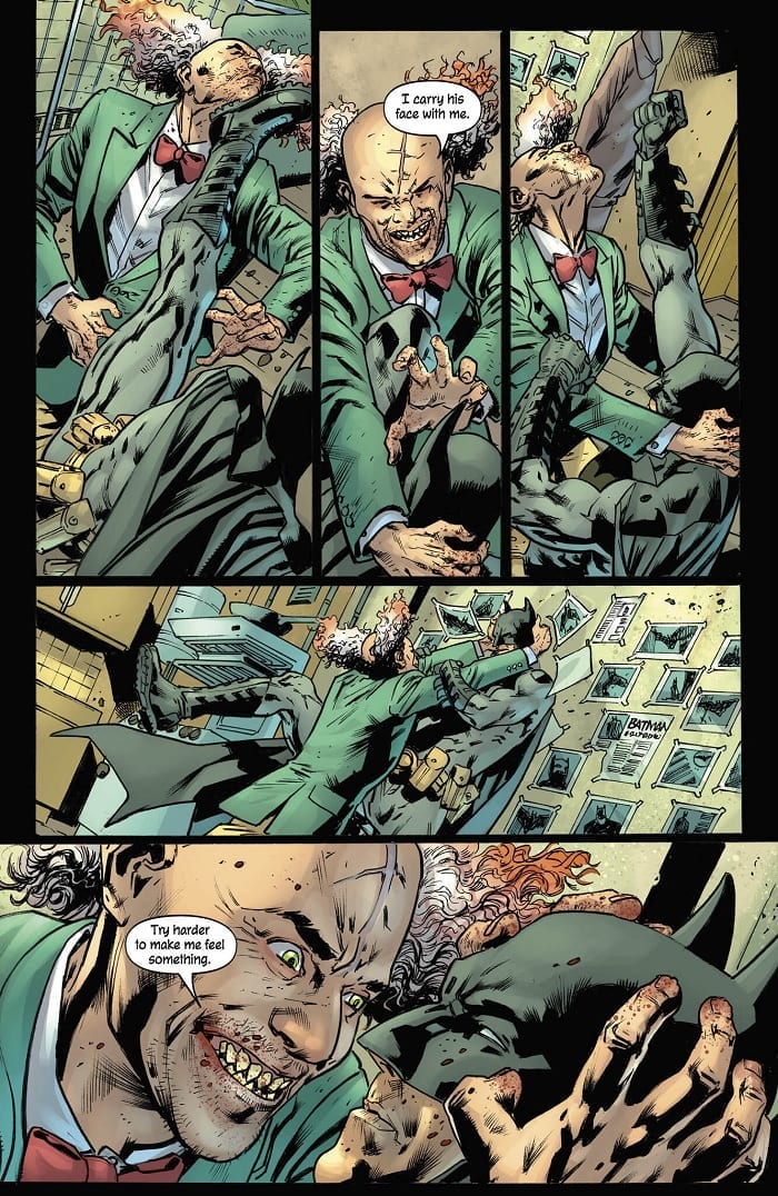
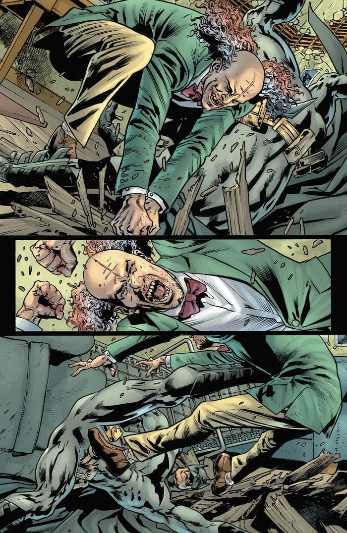
An extended fight sequence between Bruce and the murderer he discovered in our last issue occupies the book’s first half. Writer Warren Ellis offers minimal dialogue or exposition here, instead keeping the reader’s attention fixated on the blow-by-blow action. At the book’s midpoint, though, the story pivots to become a heavily dialogue-centric thriller tale.

The Batman’s Grave #2 offers engaging storytelling and an intriguing premise. Ellis manages to forge a unique persona and voice for our three central figures (Bruce, Alfred, and Jim Gordon). Each feels like a distinct and fully-fleshed out character in his own right. This can be undercut at some points, though, by inconsistency in the dialogue.

The characters’ stilted and stiff dialogue was perhaps my main objection to the first issue. While it’s better in The Batman’s Grave #2, the quality of the lines vary throughout. Occasional, awkwardly-worded statements jump out to the reader, interrupting the otherwise smooth flow. For instance, a sentence like “In the meantime, I will have a quiet word with the troops about not thinking about shooting you on sight,” could have been shortened considerably and achieved a greater effect as a result.

Alfred continues his intellectual sparring match with Bruce through the second half of the book. However, it still feels like an afterthought; an under-baked element that doesn’t quite land as intended. Rather than a genuine critique, it reads as rather sophomoric and reductive, presenting offhand observations as serious commentary.

Those issues aside, Ellis’s writing is solid overall. One feels the plot unfold slowly and methodically in these early issues, while maintaining a sense of tension throughout the book.

Batman's Grave #2

Batman's Grave #2

The Artwork

Artist Bryan Hitch provides some engaging and highly-dynamic work for The Batman’s Grave #2. Keeping the reader’s interest through a multipage, blow-by-blow fight sequence isn’t easy; however, he creates an impressive continuity of motion that manages to hold one’s attention. The work draws the reader’s eye fluidly across the page from one panel to the next.

As mentioned in discussing our first issue, Hitch’s artwork is richly-detailed. He allows readers to really immerse themselves in this world, attending to even the smallest background elements.

Of course, some facets of the work are more hit-or-miss. For instance, Hitch uses a lot of close-cropped and off-center images during the fight sequence in The Batman’s Grave #2. The effect is disorienting, but one gets the sense this was a deliberate move to underscoresthe chaos of the fight. As a side effect, though, some panels simply feel uncomposed and oddly-framed.

Alex Sinclair’s colors are a real visual treat here. Sickly green tones dominate the book’s first half, underscoring the twisted nature of the case at hand. Sinclair opts for a bright gold as a dominant tone for the book’s second half; an interesting choice, given it’s a night sequence. The effect works, though, giving the viewer an impression of the blinding lights of the Gotham skyline.

Batman's Grave #2

Final Thoughts

The Batman’s Grave #2 continues on from the first issue, improving on key shortcomings in that first book, without dropping the ball in any other departments. Although the dialogue could use some polish, the intriguing narrative and excellent artwork make it worth picking up.

Monkeys Fighting Robots Youtube

Review: Philip Sevy’s TRIAGE #3 is an Emotional Trip into Sci-Fi & Psyche

If you’re into weird, character-driven sci-fi and are not reading Philip Sevy’s Triage, you’re doing it wrong. Sevy’s five-part series features some of the most visually interesting world building on comic book shelves today, and the way it reinvents the popular comic trope of the same character alternate universes is simply astounding. Issue Three if the miniseries is on shelves today, and if the cover alone doesn’t sell you on buying a copy, allow us to give it a shot.

THE STORY

Issue Two ended with our trio of heroes in a pretty tough spot. Evie, the “real world” part of the three, has reluctantly brought her girlfriend, Tab, into a dangerous, cross-world hunt, by bringing the titanic ally powered Hunter into her world. Orbit, from a universe very similar to the superhero worlds of Marvel and DC, has tried to go to-to-to with the assassin, and ended up getting her ass handed to her. Their heroes only option is to teleport to the homeworld of the third of their third counterpart, Marco. It is a cruel and harsh post-apocalyptic landscape, and as we’ll find out in this issue, the land itself isn’t even half the danger.

THE WRITING

Once again, Philip Sevy rocks the character development in a story that is, ironically, about three alternate-universe versions of the same person. We get a little bit of backstory on Orbit, which explains to us why she’s so cocky, and we meet some of the people that matter the most to Marco. In an especially exciting turn of events, Tab ends up being teleported to Marco’s world along with the trio, and it is fascinating to watch a character deal with the knowledge that they’re not the main character in the story in which they find themselves. Combine that with Evie’s conviction that she doesn’t belong at the center of a story and you get one hell of a tense relationship dynamic.

This issue is a lot more emotional than it is action-packed, which is not a bad thing for a character builder as good as Sevy. However, one thing about this comic that did stand out was just how much internal monologue there was on each page. That’s not to say that the dialogue Sevy writes for inside his character’s brains is bad, just that it’s a little distracting from what’s going on. When the reader’s eye is so focused on reading all that info, it’s possible to forget about the (breathtaking) landscape images that Sevy provides of Marco’s world.

THE ART

What’s ironic about this is that Sevy already does such an incredible job conveying his characters emotions in the way he draws a page. Sevy uses facial expressions like Mike Mignola uses ancient statues in a graveyard: they populate the page to set a mood, not just to fill in the image of what’s happening in a scene. Characters faces appear outside of dialogue scenes, giving readers the pain they’re going through. It’s a useful storytelling tool that can’t work anywhere outside a comic book, proving that Sevy doesn’t just know his characters and his sci-fi, he knows his medium.

THE LETTERING

The only component of this book’s pages that doesn’t have Philip Sevy’s name on it is the lettering by Frank Cvetkovic, but that doesn’t mean that Cvetkovic’s work isn’t seamless. Cvetkovic can convey sound and emotion in his work without distracting from the page at all. A character’s screams look just as in-place as weird alien technology or a superhero outfit. With so many different types of textual information that make up this story, from dialogue to thought boxes to digital messages, this is an impressive feat.

OVERALL THOUGHTS

Triage shows absolutely no sign of slowing down after issue three, but that doesn’t mean what’s going to happen next is at all predictable. It is a pull-no-punches, logic-challenging tour de force across a weird universe that you can’t help but get sucked into. The only thing that matches how much a reader will feel for these characters is how dangerous their situation is getting. If that sounds like your kind of entertainment but you haven’t started this series yet, we can’t recommend Triage #3 enough. But we’ll warn you: just like Evie, Orbit, and Marco are linked when they travel, we think picking up this issue will have Triage #1 and #2 coming to your collection as well.

For more reviews like this, follow us on Twitter. And for all the best comic book reviews, discussion, and news, stay tuned to Monkeys Fighting Robots.

Monkeys Fighting Robots Youtube

Review: X-MEN #2 – Long Lost Lovers Reunited

It is a match made in Terra as the X-Men are stuck in the middle of love in X-Men #2, out this week from Marvel.

Jonathan Hickman continues to lead X-Men into a future filled with terribly accurate representations of humanity.  When reading House of X/Powers of X some might say that Hickman writes humans in a very unfavorable light, but then you turn on the TV or open up Facebook, and it’s just too painfully accurate.

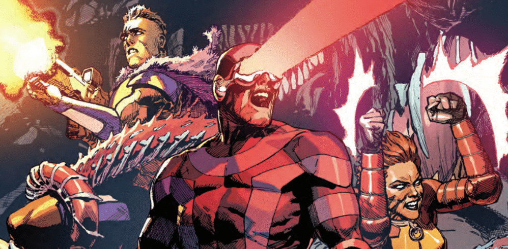
Leinil Francis Yu takes us on a gorgeous journey through Arakko with three members of the Summers family. The island of monsters is beautifully designed with thick foliage that hinders the ability of the X-Men to travel quickly. As the family slices their way through, they discuss how the island reminds them of Hawaii, so the pressure is on Yu to deliver an amazing landscape and he nails it.

Gerry Alanguilan inks Yu’s pencils and preserves his style for the finished product. The inks stay thin to keep all of Yu’s detail easily visible. They are a dynamic duo and work extremely well together.

Sunny Gho is the king of colors and steals the show once again. With all the tech, magic, and monsters, there is no shortage of light sources throughout this issue and Gho does a masterful job of illuminating the pages. Every gun blast, explosion, and eye beam lights up the surrounding environment showing that these artists have taken their time to make this island as alive in our minds as it is in theirs. Gho is truly a Jedi of color.

Clayton Cowles’s work is always easy on the eyes. His letters have nice soft edges and rounded corners which gives the appearance of a calm narrator. His word bubbles never cause me to squint or put any extra stress on my eyes, which is something that can be taken for granted, especially if this is the 3rd or 4th book you’re reading in a sitting.

X-Men #2 begins with news that another island has appeared 100 miles to the southwest of Krakoa, and Krakoa is hauling dirt towards it. The other island, Arakko, is populated with monsters and Scott, Cable, and Rachel are headed to make sure there’s no danger to them and their sentient home.

We’re introduced to a Summoner and to a few of the monsters populating Arakko, and after a pretty hilarious interaction, the High Summoner explains why Krakoa sought out Arakko and the long lost lovers embrace after so much time apart.

The unification of the two islands shows the yin and the yang, where Krakoa is paradise Arakko is hell, one is life and the other death, one was thought to be safety, the other danger. I have a feeling the island has many more surprises in store for the X-Men now that they are joined together.

Reeling after the events of X-Force #1, the X-Men, and all mutants, are on edge, Krakoa is on lock-down, but no one can control what the island itself does. In a time of sorrow and sadness, Krakoa shows the mutants that shutting themselves off is not the answer. There will always be set-backs of violence and jealousy as long as humans are living and breathing.

Will Arakko be an ally or an enemy? What will Apocalypse do after what has happened to Xavier? Can the High Summoner be trusted?

Stay tuned for X-Men #3. Same X time. Same X channel.

What did you think of X-Men #2? Did you love the family bickering as much as I did? Let us know in the comments below.


Monkeys Fighting Robots Youtube

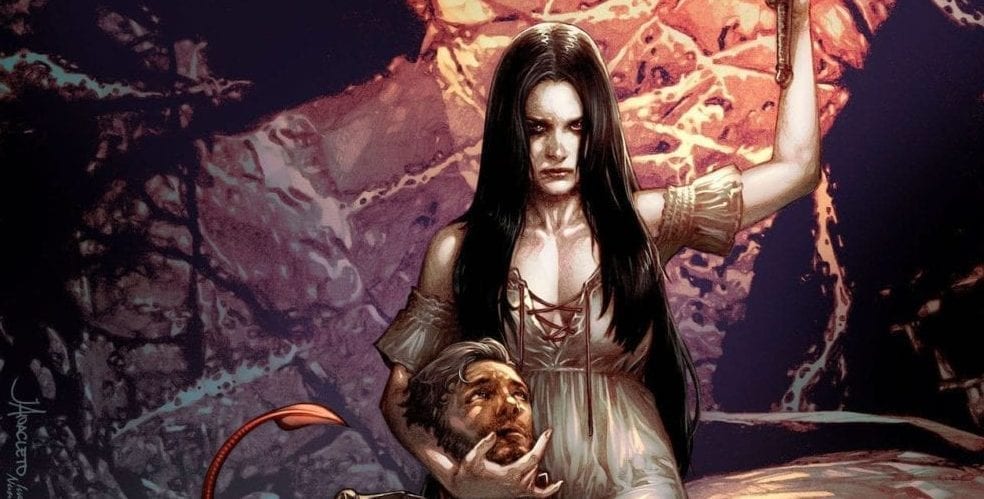
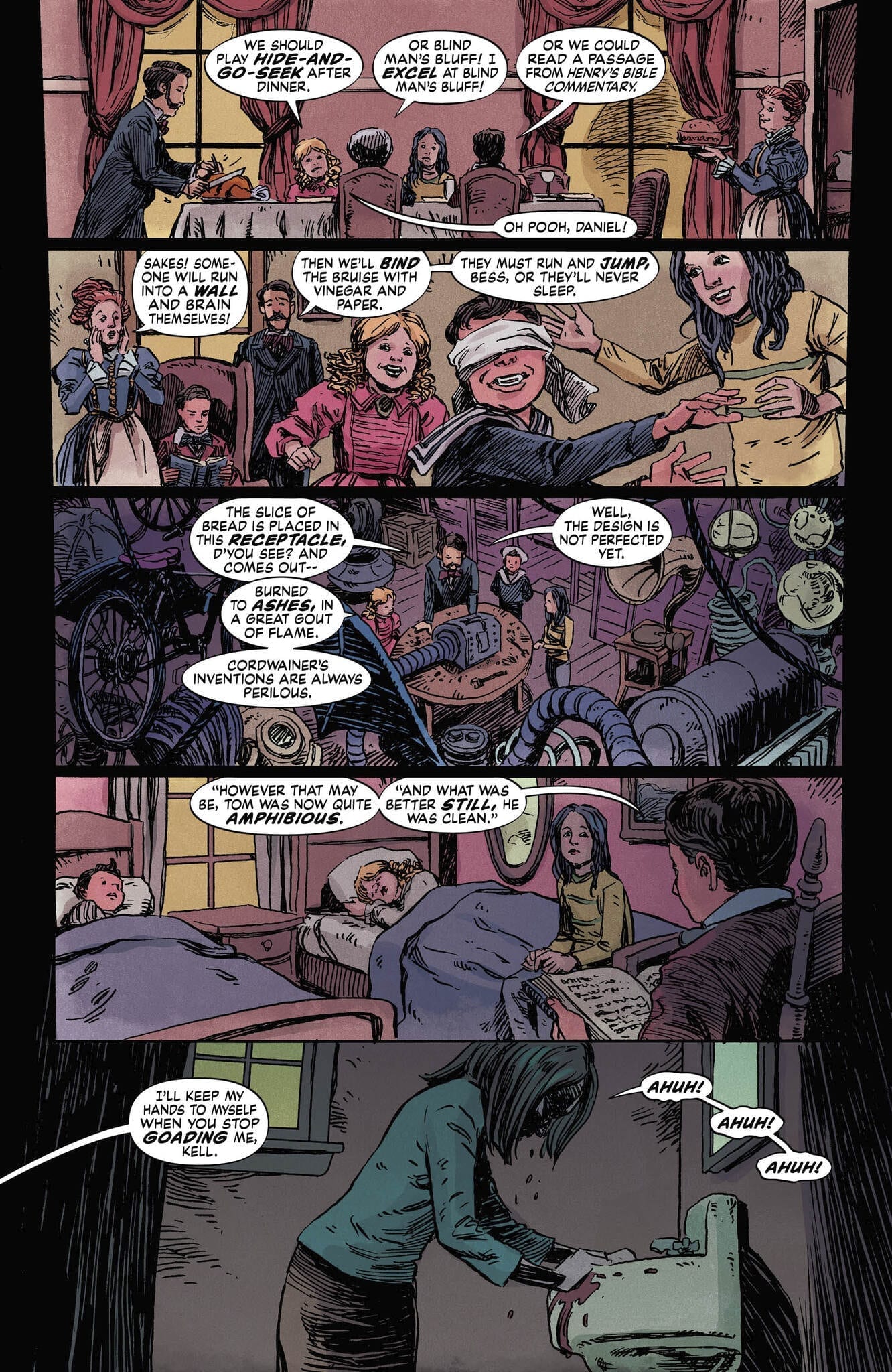
Review: Old Magic and Sinister Deeds Abound In THE DOLLHOUSE FAMILY #1

Vertigo veterans Mike Carey and Peter Gross (Lucifer, The Unwritten) come together once again to deliver “The Dollhouse Family” #1, the spooky and delightfully interesting start of a six issue mini-series on Joe Hill’s “Hill House Comics” imprint at DC.

On her sixth birthday, little Alice Dealy receives a massive and ornate antique dollhouse from a distant relative. It doesn’t take long for her to realize that the little dollhouse family inside is very real indeed. The five members of the doll family are sweet and happy, and invite Alice for games and tea. Meanwhile, Alice’s own real family begins to fall apart, and the house itself makes Alice a sinister offer to fix it all – for a price. After all, such is the way of magic. All young Alice has to do is accept.

Highly accomplished longtime writer M.R. Carey (aka Mike Carey) brings his usual amount of expertise and nuance to this project. The writing in this debut issue of “Dollhouse” is a brilliant balance of interweaving plot threads and vastly different styles of dialogue. Anyone who has read any of Carey’s work knows how fantastic he is at juggling multiple voices and building a puzzle piece by piece with a story. This issue proves he likely isn’t going to lose his touch anytime soon. The central plot with Alice, her family, and the dollhouse is a mysterious and emotionally painful journey to witness. The revelations about the house are a strange joy that contrasts directly with the disintegrating home life going on around Alice. Without getting into spoilers, there’s also an immensely intriguing subplot that teases how large this story could be in scope, but it never feels boggy or unnecessary. Carey’s dialogue swings from standard British English with slang to the high-class pomp of Victorian speech, and even to more mystic and vague moments. Every bit of the writing here is airtight and entirely enjoyable to read.

While Peter Gross provides the layouts for “Dollhouse,” the actual art work goes to fellow Vertigo veteran Vince Locke (Sandman). Gross’s layouts give the issue a fantastic sense of pacing and easy-to-follow flow from page to page and panel to panel, often with some original design choices thrown in for atmosphere. Locke’s penciling gives the book its pitch perfect creepy aesthetic, however. “Dollhouse” may be a part of DC’s Black Label, but it has the soul of an early 90’s Vertigo title. The sort of unpolished penciling with thick line work and purposefully messy shading help give the comic its strange and unsettling elements and aid the plot itself. This is reinforced by Chris Peters’ very classic styled coloring. The colors in this issue all have a sort of muted vibrancy to them that casts a light shadow over everything in the book, while still being a gorgeous set of colors to look at. There’s a definite mastery of the nuances in this book, as would be expected from a team of longtime professionals.

Speaking of veterans, there are few more practiced hands at lettering than Todd Klein. Klein displays just what great lettering can do for the reading experience of a comic of this caliber. Characters and scenarios are given their own fonts based on the context of what is happening in a scene. The choice and frequency of bold words keeps the eyes drawn to each and every bubble and box, improving the pacing of the sentences themselves. There’s one particular font choice for a mysterious supporting character (no spoilers) that mirrors the font used by the likes of Dream of the Endless or Lucifer Morningstar, and seeing it increases the importance of a passage tenfold. Fantastic work by a legend in the medium.

“The Dollhouse Family #1” is a brilliant and wholly engrossing start to what’s sure to be a fantastic mini-series. M.R. Carey brings his usual near-unmatched plotting and dialogue variety, while Peter Gross and the art team bring the story to life in an atmospherically perfect manner. If you’re a fan of suspense and mystery with a supernatural edge, or just of great comics in general, be sure to put this on your pull list come 11-13.

Monkeys Fighting Robots Youtube

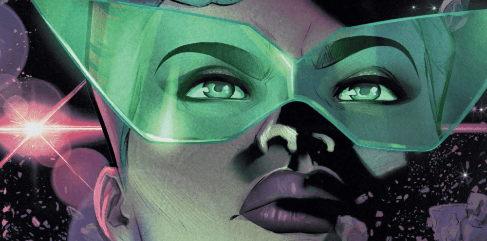
Review: A New Green Lantern Takes Flight in FAR SECTOR #1

Accomplished Sci-Fi and fantasy writer N.K. Jemisin teams up with artist Jamal Campbell to try her hand at the comics medium with Far Sector. While this first issue has a couple small flaws typical to #1’s, the creative team still pull of an impeccably drawn and enticingly written space murder-mystery that’s also a welcome addition to Green Lantern lore.

Newly appointed Green Lantern Sojourner “Jo” Mullein has been placed in charge of keeping the peace of The City Enduring, a massive metropolitan planet home to three separate races that were once at war. To reach peace, these three societies stripped themselves of all emotion, and there has been no violence on the planet for 500 years – until now. A sudden and brutal murder on Enduring will put Mullein’s skills as a detective and a Lantern Corps member to the test, especially as it becomes more clear that no one on this planet can be trusted.

As expected, Jemisin has a confident and effective style on display while building the world, characters and plot of Far Sector. She has created a clever scenario with this story where the characters clearly know much more than the reader, and it’s a brilliant way to build intrigue. This concept seems obvious, but it’s easy to see how being lost in exposition can kill the interest in a story. However, Jemisin handles the information surrounding Mullein and this otherworldly society with a deft hand; she gives just enough info to keep the reader engaged, but holds back just enough to keep the story engrossing. Mullein herself is a cool treat as a character. She’s given a confident noir-ish personality with composed professionalism, but also a level of uncertainty that keeps her just barely off balance. She knows what she’s doing, but she is still a relative novice. The overall premise and plot is somewhat familiar feeling – the opening pages parallel Grant Morrison’s Final Crisis if you’re familiar – but there’s just enough originality to keep it fresh. The dialogue is a mix of formal character interactions (lots of alien bureaucrats) and Mullein’s cool-headed internal narration. There’s quite a bit being thrown around here, but it manages to stay interesting to take in.

As well written the prose here is, this issue does use a considerable amount of exposition blurbs to inform the reader of the plot. This issue is scene after scene of Jemisin using Mullein to explain the history of City Enduring, the relationships of the three races, as well as her own thoughts on the murder case at hand. While the writing itself makes this all mostly worthwhile, it’s pretty likely passages will take more than one pass to fully comprehend. Also, the issue’s final page doesn’t feel like a clean transition to the next issue. It’s a tense final page moment, but just a bit too sudden an end for a month long wait to see what happens next.

A great sci-fi comic needs stellar art in order to enrapture its audience. Fortunately for Far Sector, Jamal Campbell is here to draw this new creation into life. There’s a pristine beauty that Campbell’s digitized style brings to this kind of Utopian alien world. Soft colors wrap around futuristic structures, and hues bathe entire sequences with a realistic effect. Character facial expressions are given proper attention without ever being distracting or over the top. If there was one critique to be had, it would be the kind of “sameness” a lot of the characters have regarding their design and facial structure. It can be a bit hard to tell characters apart from one another. This may be attributed to the purposeful Utopia the plot describes, but it is something to make note of.

Deron Bennett’s lettering here plays it pretty safe, but is still sharp and focused as far as lettering goes. There’s an interesting choice made with a kind of softer font, but it works with the tone of the world created in the comic itself. Tense moments and arguments are highlighted and bolded to the exact amount that seems necessary for the scene playing out. Overall, completely professional work here.

“Far Sector #1” is an enticing opening to a murder mystery that’s sure to bring plot twists, unexpected dangers and revelations about this new member of the Green Lantern Corps. N.K. Jemisin’s writing is confident and maintains a sense of mystery, even if it does get a little bloated with exposition at times. Jamal Campbell’s art provides a stunning setting with believable character expressions that completely sells the mood of the issue. Far Sector is looks like it could shape up to be a great new addition to Gerard Way’s Young Animal imprint, as well as to DC’s Green Lantern mythos. Pick it up at your local comic shop on 11/13.


Monkeys Fighting Robots Youtube

RUNAWAYS #27 Brings Us A New Team Leader?

RUNAWAYS #27, out this Wednesday from Marvel comics, brings us once again to a changing team. Is it time to have a new leader for the Runaways? Or is there something much more sinister happening behind the scenes?

The Runaways are looking a bit…different than usual.

***SPOILER WARNING***

Runaways #27 is an interesting read. Here we are facing change, once again. But most of the team seems incapable of seeing that. Woven throughout these pages are individual concerns, humorous moments, and relationship dynamics. All in a day’s work for this team.

A fun arm. That seems safe. Right?

The Runaways are still at Doc Justice’s mansion, and that means that they’re slowly being subsumed into his world. Or not so slowly, as the case may be. The Runaways are no strangers to change, but this seems dramatic even for them.

And that is leaving readers feeling like the other shoe is about to drop at any moment. After all, it isn’t exactly normal to see things going well for the Runaways for any length of time. And there’s just something…off about this Doc Justice and his assistant.

Adding to an already complex situation are several other concerns. Such as what is going on with Gibb and how Gert fits into the larger picture these days. It seems that each character has been given their own subplot to work through, and it’s Gert’s turn to be a bit more on the vocal side of things.

Molly is digging Chase’s new armor. Nico? Not so much.

Rainbow Rowell has done an outstanding job sowing the seeds of something larger here. It’s clear to the readers that there’s something not right about this situation. But it’s impossible to put our fingers on what it is – though there are plenty of theories out there.

While there was obvious and subtle tension weaving in and out of these pages, there were also moments for comic relief. What was striking about these comical moments is that they can also be construed as commentary. It would seem that the creative team behind Runaways has some opinions about the costumes women in comics have been forced to wear in the past. Honestly, it was refreshing to see this subject openly discussed amongst characters in that world.

Runaways #27 may have seemed like a calmer issue on the whole, but it also felt like it’s building up towards something larger. Each character is dealing with their own emotions and reactions to the changes around them. And while they have been overwhelmingly excited about that fact, that just means when the truth hits, it’s going to hit hard.

And here’s a look at what has been going on, and what creative team is involved for this latest issue.

As per usual, Runaways #27 boasts a large creative team. First, Kris Anka is working on the pencils for the artwork. Anka also provided some of the inkings, alongside Walden Wong. Dee Cunniffe and Jim Campbell provided the coloring for this issue, while VC’s Joe Caramagna did the lettering.

Together they’ve created another vibrant issue. And they had a lot to tackle in this issue, as most of the characters faced at least one costume change (with a few exceptions). As mentioned above, the costume changes resulted in some commentary, and thus these outfits had to be extreme and noteworthy.

The final costume designs our characters went with were actually quite striking. Karolina’s design is perhaps the best one of the bunch, but there’s something to be said about all of them. But once again, all of these changes are leaving us wondering what’s going to happen next.

Runaways #27 was an issue full of foreshadowing events. Though it was perhaps just a bit more relaxing than its predecessor (oh Runways #26, how you broke our hearts and freaked us out). Rowell’s commentary allowed for some lighter moments in what was otherwise an issue dedicated to building up a plot.

Monkeys Fighting Robots Youtube

Review: BATTLEPUG #3 Features Disruptions In The Balance

BATTLEPUG #3 cover artwork

BATTLEPUG #2 left the last Kinmundian in dire straits; the Queen of the Northland Elves overwhelmed him with Jofel’s forces and, adding insult to injury, convinced Sprinkles to leave with an other-worldly, giant human. Crushed in both body and soul, the Kinmundian must somehow find the strength to defeat the evil Queen all alone, lest she continue terrorizing the realm. Elsewhere, Bryony and the rest of the group continue to track their friend through the countryside, leading to an unfortunate confrontation with the Nobody’s Ponies, a group of horse thieves intent on murdering the entire group.

Can both groups use their connections to the mystical Balance to defeat their foes, or will these events cause a disruption in the world’s forces unlike any before? Find out when BATTEPUG #3 hits stores on Wednesday, November 13th.

Story

The Nobody’s Ponies have no intention of letting anyone pass through their woods unscathed, especially a group of mages. Their prowess in stomping is nothing to brush aside. Sasha, the Immortal, leads the charge against the lead Pony wearing her impenetrable armor in hopes of alleviating the threat. But the hero acted too soon; another thief snuck up on her partner, Ladora, threatening to chomp her head off.

But in this moment of felt powerlessness, Bryony’s mage abilities erupt in a powerful display. A mass of vines entangle the Ponies before any harm can be done, squeezing the life out of them. The rage the girl expresses toward those who would harm her mother is unparalleled. We feel the anger of Bryony at anyone who would harm our loved ones. And it’s a this moment that the young mage pushes past self-defense and seeks vengeance, claiming the Balance would be on her side as well.

Back in the Northland, the Kinmundian faces torture at the hands (or candy canes) of Jofel while the Queen explains her master plan (as villains often do). We learn her ultimate quest is the seek a power beyond the Balance led her to the giant boy, a being said to come from another reality. In exchange for Sprinkles, he grants the Queen a mystical amulet that could grant her far greater powers.

Writer Mike Norton is ramping up the Queen’s powers in these gut-wrenching ways. But with the incredible might of Bryony and the other warriors, it looks like the coming conflict will be earth-shattering.

Artwork

Norton’s penciling and inking, Allen Passalaqua’s coloring, and the lettering from CRANK! work together beautifully in BATTLEPUG #3. Norton’s ability to craft illustrations that are fantastical distortions of the real world gives readers the impression that this world could theoretically exist in a parallel universe alongside our own. Passalaqua aides in this effort by featuring bright, wild colors alongside the lush greens and icy blues found throughout the story’s setting. And CRANK!’s lettering uses fonts that appear to be handwritten; it’s almost as if the dialogue were taken from one of the character’s journals, adding to the story’s immersive effects.

Comic Covers

Cover A

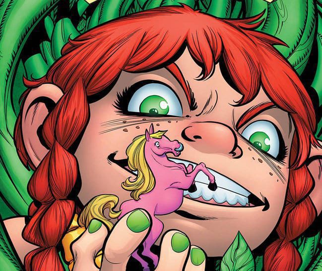
Norton and Passalaqua’s main cover for the book places all the focus on Bryony; she’s pictured in a mass of her own vines holding a miniature version of the Nobody’s Ponies boss, representing her power over them.

Cover B

Jason Shawn Alexander and Luis Nct’s variant cover hearkens back to the original two characters in this series—the Kinmundian and Sprinkles. The use of pastel colors gives the illustration an almost historic look.

Conclusion

BATTLEPUG #3 unveils many of the mysteries we saw in issue #2, but opens up another batch of unanswered questions. We’re excited to learn more about the Queen and Bryony’s powers.

What do you think the Kinmundian’s chances of survival are at this point? Let us know in the comments below!

Monkeys Fighting Robots Youtube

FAMILY TREE #1 – A Twisted and Knotted Tale Begins

FAMILY TREE #1 is the first in a brand new series by Image Comics, out this Wednesday. The series blends fantasy, horror, and family drama all into one twisted form. This series is going to be perfect for those looking for something unusual.

A striking cover for a brand new series.

***SPOILER WARNING***

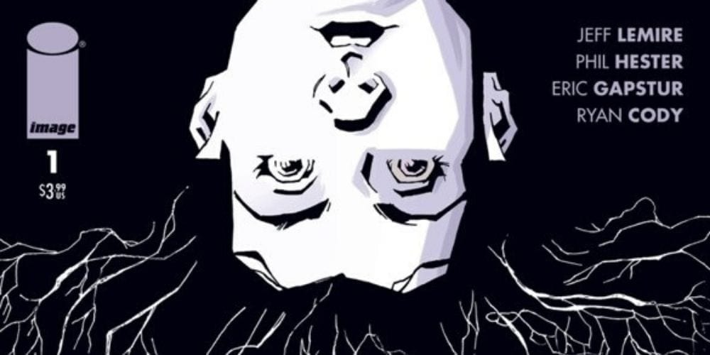
Family Tree #1 launches a new series from the minds of Jeff Lemire, Phil Hester, Eric Gapstur, and Ryan Cody. This series merges together the mundane and the horrifying. The family dramas and the grotesque. And in doing so, it’s creating something entirely new along the way.

When the day first started, Loretta’s biggest concern was her dull job as a grocery store clerk. Or perhaps she was once again worried about her son, and what trouble he might be getting up to this time. She certainly wasn’t prepared for the new dangers that were about to pop up in her life.

That may sound like the beginning of any old tale, but Family Tree is different. It’s a true Cronenberg horror – the fear of losing control over what happens to our very own bodies. And that means Loretta is about to lose control over her life – and quite possibly her family.

A gloomy start to Family Tree. That’s not at all foreboding.

Family Tree #1 was a subtle beginning to what is sure to be one of the more horrifying series on the shelves. But that’s just going to make it more painful in the long run. You see, now we have time to get to know the family. And possibly even start liking them. Now we’re invested in their welfare. And that means we’re going to care about what happens to them. And whether or not they turn into a tree, as pictured on the cover of this issue.

Jeff Lemire really knew how to weave a fascinating introduction into this world. It is full of the mundane drama, the family issues, the troubled teenager, the quiet daughter, the works. But it takes all of that and throws it off the deep end.

And there are plenty of little tidbits for readers to pick up on. Not to mention a new mystery introduced at the conclusion of this issue. All in all, this issue did an outstanding job of grabbing onto our attention and refusing to let go.

Nothing is quite what it seems here.

The artistic team behind Family Tree #1 knew what they were doing. They knew how to capture the mundane, this quiet and boring little town. But they also knew how to weave in the horror elements as needed. The steady growth of the unusual is not something that can be ignored, as we’ve been clearly shown here.

Phil Hester, Eric Gapstur, and Ryan Cody all played a hand in making this series what it is. The dramatic shading went a long way in foreshadowing the darker events down the road. Overall, the tone was finely balanced between something commonplace and something…more. It will be exciting to see how they push the horror elements in later issues.

And that does not look good! Nope, not one bit.

Family Tree #1 proved to be an intense and unexpected introduction to a series that will likely prove to get even more interesting with time. The groundwork has been carefully laid out, and now it is time to see it all get torn apart.

Monkeys Fighting Robots Youtube