Home Blog Page 349

Silence Is Golden: The Wordless Panel

Heartbeat #3 cover
Heartbeat #3 Credit: BOOM! Studios

They say that ‘Silence is golden’.

It is also a powerful tool for creating drama and expressing emotion.

Imagine, you are watching a larger than life action movie at the cinema. Everything is explosions and noise. Then suddenly, all of the sound disappears, no incidental music, no speech, nothing exploding. As a member of the audience you are forced to focus 100% on the images passing across the screen, the information they relay are undisturbed by anything else. Your attention is honed, fixated on a world where less is suddenly more.

This is a clever technique for grabbing the audience’s attention and is also something used to great effect in comic books. There have been a few examples from the last month which have used ‘silence’ in magnificent ways.

Heartbeat #3 Page 2
Heartbeat #3 Credit: BOOM! Studios

Quiet Heart Break

My first example juxtaposes panels of silence against conversational panels to enhance the interaction of the characters and illustrate emotional connections.

In issue 3 of Heartbeat, published by BOOM! Studios and written/drawn by Maria Llovet, the opening sequence has two of the central characters reminisce about their past and their friend who died in a previous issue.

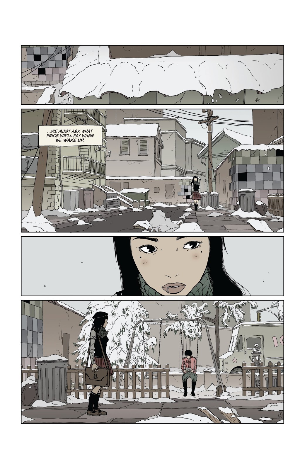
From the moment that Eva first sees Mack in the playground the reader instantly knows that there is distance in the relationship. On the final panel of page 2 (see above), Eva is standing in the foreground looking across the panel to Mack in the background. There is a van passing behind them and previous panels have established they are on an inner city street, however the panel is left without sound effects; no noise of any kind. 

The lack of sound helps to establish the mood, as much as the pale colouring  or the blanket of snow. There is no communication between the two characters and you get the impression that Eva is waiting, building up courage to talk to her friend. The entire lack of sound establishes Eva’s fixation on Mack. Her place in the foreground makes her the centre of attention and we assimilate everything else in the image in relation to her, therefore the lack of sound insinuates a focus, in this case Eva’s undivided attention on Mack in the background. 

As the scene progresses the two characters have an awkward conversation about their childhood. Llovet breaks up the back and forth, often not showing the speaker in the panel, instead the lettering by Andworld Design uses an inverted tail on the speech balloons giving the scene a broken, disjointed look. This coldness between the characters is emphasised on page 5 (below) when the conversation is broken with a silent panel.

Heartbeat #3 page 5
Heartbeat #3 Credit: BOOM! Studios

The top three panels in the stack build the tension between Eva and Mack. It starts with a view of the photo of them as children, followed by an angry shot of Mack and then a pleading shot of Eva. Each panel has dialogue that helps to read the image. The fourth panel however lacks dialogue. As it is the only panel on the page that doesn’t have any text, it stands out, draws your eye. The intensity of Mack’s stare is enhanced by the silence, it illustrates the waves of emotion flowing through him. It’s not just anger, like in the previous panel where the letterer gives the speech punch by bolding one of the words. It is also not just the nostalgia and sense of loss that the first panel on this page represents. 

That silent stare draws the reader into Mack’s mind, taking a moment to contemplate the characters next actions. It creates a significant pause in the narrative flow, after drawing your attention in the first place. You start this page knowing that this panel is important and when you get to it you are forced to read more into the image that Llovet is giving you.

This idea of making the reader focus on the imagery by drawing your attention to it by removing any other stimuli, is used to greater effect on the next page. In this sequence of five stacked panels, Llovet has created a rhythm with the speech. The panels with speech are the quick beats while the two silent panels are slower as you take in the image, rather than the words. The beat for the page is quick, slow, quick, slow, quick. A threat followed by a moment of contemplation. The start of an appeal followed by an abstract cut away and finished with a change to the conversation.

Heartbeat #3 page 6
Heartbeat #3 Credit: BOOM! Studios

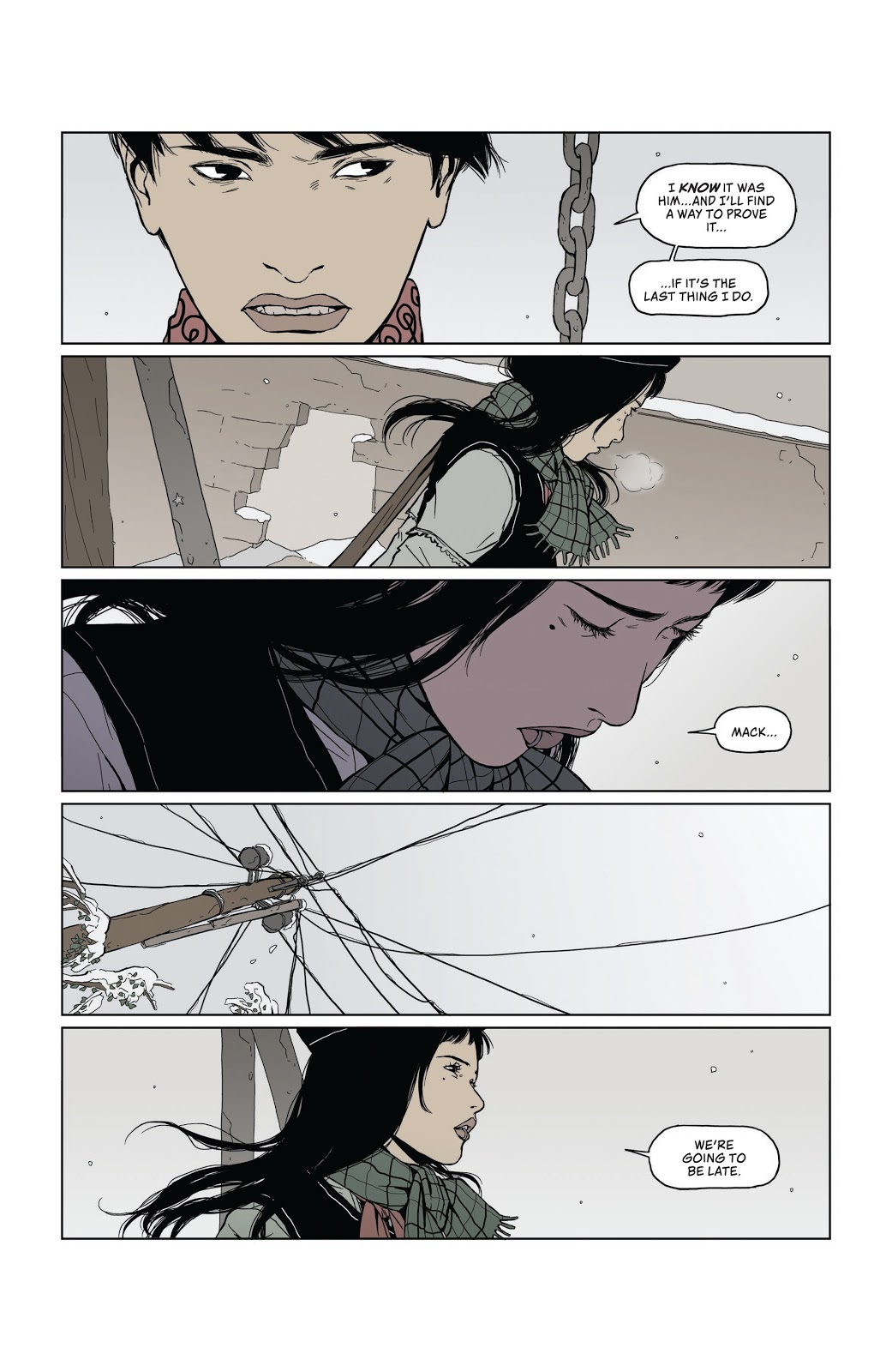
In these quiet panels you are forced to look closer at the images. The lack of speech gives you the impression that there is something else you should be looking at. In panel two Eva is half turned away, not entirely closed off to what Mack is saying, just as there is a hole in the wall behind her, a sign that the barrier between them isn’t completely built. It’s a small hope in a cold scene. 

Panel four serves a similar purpose. The silence draws your attention to the network of telephone wires strung out across the street. In a scene where two characters are having trouble communicating with each other, the Phone lines can be seen as an image of hope. The lines of communication are still there, they haven’t been severed completely. Although there is silence at the moment it does not mean that they are entirely cut off. 

Llovet uses silent panels to emphasise something within the image, whether it is as straightforward as illustrating a strong emotional reaction or something more abstract, like a metaphor for communication. Heartbeat is an emotional narrative that combines quick beats with slow, contemplative moments. The silent panel allows Llovet to stop the narrative flow, for a brief time, and focus the reader on the image she is presenting.

Criminal #12
Criminal #12 Credit: Image Comics

Soundless Action

Ed Brubaker and Sean Phillips use silence in a slightly different way in the final issue of Criminal, released by Image Comics in January 2020. In the final part to the Cruel Summer story-line, there are two extended scenes where there is no speech, and in one case not even the voice over that runs heavily throughout the Criminal series.

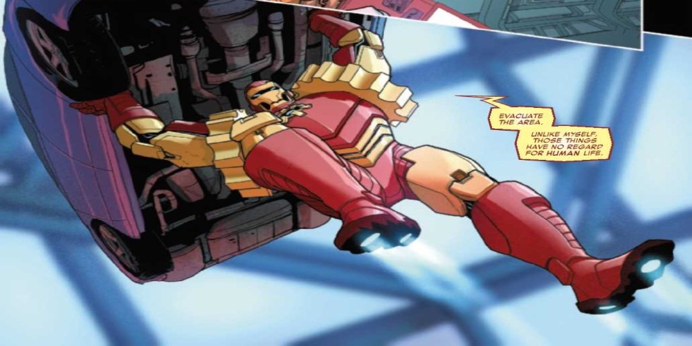
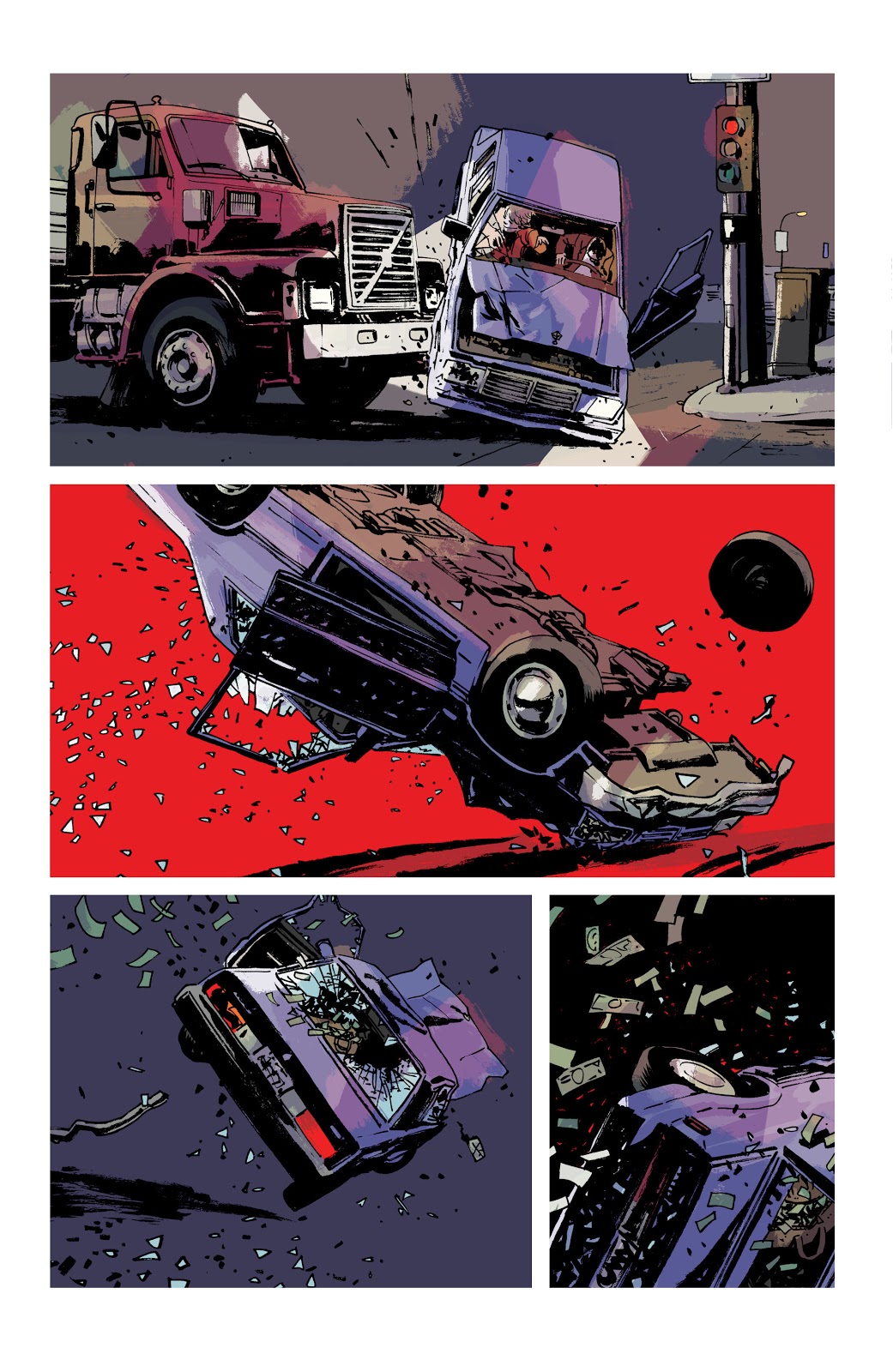
The first, a three page sequence, is one of the more explosive moments in the comic, if not the run itself. After forcibly being taken from a Motel room she was sharing with Teeg, the central character in the story, Jane fights with her kidnapper. The struggle ends badly and, as Teeg watches helplessly as the car Jane is in is side swiped by a lorry and flipped over, and over (see image above). 

Throughout the comic, up to that point, there is a lot of text: speech balloons and Caption Boxes. The dialogue is mixed with pulp fiction prose that tells the story, with the visuals adding additional context. Fairly standard, although superbly executed. The car accident changes the dynamic between the text and the art. The reader is suddenly confronted with a distinct and deliberate soundless vacuum. You become riveted to the accident as it plays out, in slow motion, before your eyes. Without sound effects or a monologue of any kind, you are forced to look, really hard, at the car as it is crushed beneath the lorry. 

In the second panel on page 10, the background falls away and is replaced with a solid block of red. This strong, visual image tells the reader everything they need to know about the occupants in the car. No sound is necessary, in fact the lack of any noise makes the moment more upsetting. The image implies the fate of the driver and his victim; you imagine characters distress, cries of pain, and like any good horror, Brubaker and Phillips make you imagine their horrific fate. Less is more.

Criminal #12
Criminal #12 Credit: Image Comics

The silence on these few pages enhances the traumatic incident. There is even a moment at the bottom of page 12 (see above) where a character screams, soundlessly, into the air. It’s a powerful image, and a powerful sequence, that stands out in the narrative because it lacks the one thing that Brubaker and Phillips are known for: the pulpy voice over.

Page 14 (image below) of this issue uses the lack of speech in another way, different from the examples I have already mentioned. The narrative caption boxes are back and there are even some speech balloons but the balloons are empty. 

A few weeks have passed since the car crash incident and Teeg is grieving. He is at a Bar-B-Que with his friends but mentally, he is somewhere else. The captions inform the reader that Teeg has been affected badly but it is the empty speech balloons that really get the message across. Here is a situation where a number of characters share a page but the creators want you to focus solely on one of them. 

Criminal #12
Criminal #12 Credit: Image Comics

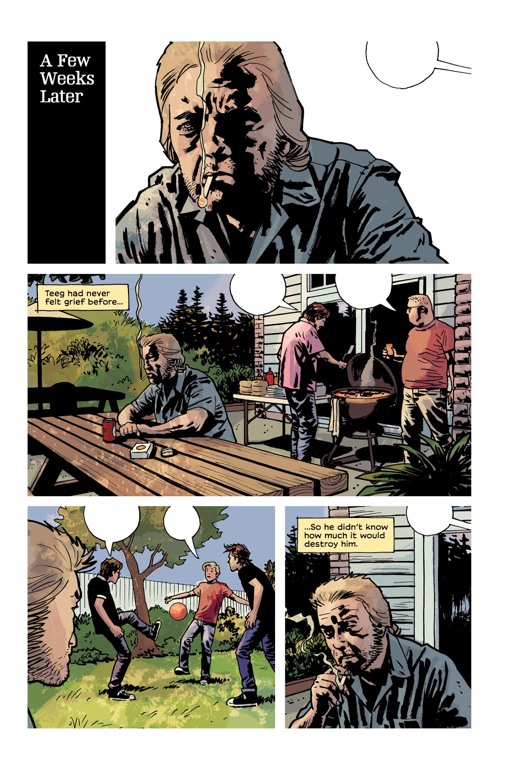
As you move from panel to panel, you become as detached from the surroundings as Teeg because there is something missing. This page could have been drawn with no speech balloons and still had some effect. However, it is those empty balloons, hanging in the air, that really make this page so wonderful. You want to be a part of the BBQ, playing football with the young boys but you’re uncontrollably locked out. If this page, with its depiction of life just out of reach, isn’t a perfect representation of a character suffering from depression, I don’t know what is. 

Teeg feels as though he has lost everything and this page of art both illustrates that he hasn’t but also that he is too detached to realise it. 

The partial silence, the switching off of sound, enhances the narrative voice and distances the central character further and further away. The third panel, in the centre of the page, has Teeg sharing space equally with two of his friends yet the impression is that he couldn’t be more alone. It is a masterpiece of imagery and a heartbreaking page.

Better Left Unsaid

Comics don’t have actual sound but they do have a lot of speech and a lot of sound effects. Some comics are packed with a collection of strange onomatopoeic words or conversations long enough to keep Quentin Tarantino happy. However, just like film, sometimes silences are louder than the noise. A well placed soundless panel or sequence can really attune the audience, forcing the reader to concentrate on exactly what the creators want you to see. They can slow down the story, break the narrative flow, or even enhance the emotional punch of a moment.

Silence is indeed golden and is also a wonderful tool for any comic creator to keep in their box. 

There are a number of comics out there that use this technique, and I didn’t even talk about Black Bolt!  Why not let us know in the comments below of any good examples that you find.

Monkeys Fighting Robots Youtube

‘Generation One’: A New DC Timeline?

generation zero dc comics

After months of online rumor and speculation, DC’s plans for the future are finally starting to take shape. First we had the key story in Wonder Woman #750, establishing Diana as the DCU’s first costumed superhero. Then came the announcement of Generation Zero for this year’s Free Comic Book Day. Now, the publisher has unveiled the next piece of the puzzle.

Generation One: Age Of Mysteries, arriving in May, is the first in a series of one-shots that appear to establish a new (or newly clarified) DC timeline. We’ve heard rumblings of something called “5G,” which could end up being the fifth book (Generation Five) from this new series; for now, there seem to still be more questions than answers.

generation one

Check out the press release below:

DC PRESENTS GENERATION ONE: AGE OF MYSTERIES

The Charge Towards DC’s Future Continues!

Series of Five One-Shot Comics Spotlight DC’s Super Hero Heritage, While Revealing Secrets that Will Shape its Future!

BURBANK, CA (February 13, 2020) – The path to DC’s future continues to unfold in Generation One: Age of Mysteries! On sale in May, Generation One: Age of Mysteries is the first of five oversized Prestige format one-shots, each detailing a different age in DC’s storied, super heroic legacy!

Generation One: Age of Mysteries follows DC’s Generation Zero: Gods Among Us, in stores on Free Comic Book Day 2020.

“The Generation series of specials are built to bring the new DC timeline to life,” said DC Publisher Dan DiDio. “With Generation One: Age of Mysteries and every subsequent volume we’ll be shining a spotlight on the 80-plus-year publishing history of the DC universe while charting the course for the bright future of DC’s characters. All of our greatest stories and events will create the backdrop and context for the great new adventures we have planned. Everything counts, and we guarantee there’ll be surprises along the way!”

Readers of Generation One: Age of Mysteries will witness firsthand major events from throughout the history of the DC universe as seen through the eyes of characters like Wonder Woman, Lucius Fox, Alfred Pennyworth, Green Lantern (Alan Scott), The Spectre (Jim Corrigan), Mister Terrific (Terry Sloane), and others. The series of one-shots will also expose secrets from DC’s history, such as:

  • What was the previously undocumented “big bang” of the Age of Mysteries?
  • Which character truly ushers in the dawn of Super Heroes, inspiring all the rest?
  • What was the real reason behind the Justice Society of America’s retirement?
  • Which Golden Age hero will become history’s greatest villain?
  • What contentious alliance kept the Wayne family dynasty alive after Thomas and Martha’s deaths?
  • Who are the new, never-seen-before wildcards that will be instrumental in fashioning DC’s push to the future?

These five books will have all the answers to these questions, setting up DC’s boldest storylines ever while laying the groundwork for more excitement to come. The five Generation issues will feature a who’s who of creative talent, with an overarching story by Brian Michael Bendis, Dan Jurgens, Andy Schmidt, Robert Venditti, and Joshua Williamson, illustrated by artists including Doug Mahnke, Bryan Hitch, Mikel Janín, Ivan Reis, David Marquez, and more.

Generation One: Age of Mysteries is scripted by Andy Schmidt, with lead art by Doug Mahnke. Each of DC’s Generation one-shots will feature a cover by Jim Cheung and a variant cover by Gary Frank. Generation Two: Age of the Metahuman, Generation Three: Age of Crisis, Generation Four: Age of Rebirth and Generation Five: Age of Tomorrow will follow monthly after Generation One: Age of Mysteries.

Generation One: Age of Mysteries is a 48-page, Prestige format one-shot on sale at comic book stores and participating online retailers on May 27, 2020.

Monkeys Fighting Robots Youtube

Review: THE FLASH #88 Reveals the Origin To The Next Big Villain

The Flash #88

The Newest Flash Villain Revealed!

During the final battle of The Flash War, we got a tease of a big bad that was coming. This threat has been teased in the background in every other story with Commander Cold. The villain known as Paradox appears to be the next big threat for the Flash series as we approach the 750th issue. 

As Rogues’ Reign came to a close, Barry gets a surprise visitor in the Future Flash. This character searches for the now late Commander Cold and learns of his death. He proceeds to disintegrate in front of his past self as he warns of the impending threat of Paradox. This leaves both the reader and the Flash with a single question. Who is Paradox?

**Some Spoilers Below**

Story:

We open our story during The Flash Year One, where a father spends time with his family. This man is a professor who has been studying the time stream and has theorized about the changes made. One night, his lab is struck by lightning, and he sees the multiverse as a whole. A few days later, during the final battle with Barry and King Turtle, the man is teleported away. It turns out Flash’s connection to the Speed Force triggered the man’s ability to travel into it. He spends what appears to be years in there, and the man turns into the villain, Paradox.

Flash 88 p1

This origin story for the next big bad really isn’t anything new. It’s your standard obsessed scientist plot that has been in comics since it began. Usually, there’s a gimmick that goes with this to add a nice twist to it. Right now, the only gimmick he has is his travels change him into a monster, and even then, that isn’t too original. You can find three villains just like him in this comic run alone!

This is a prelude to the next big arc of the Flash, so I wouldn’t be surprised if they add to it once the story starts. The lab we see has references to Doomsday Clock and several crises. This means he could provide more connections to the history of the DC Universe than any other character. But references to better stories don’t make a great stand-alone issue. It just makes me want to read those better comics! As it stands alone, however, there isn’t enough new to really enjoy this one.

Flash 88 p2

Art:

Howard Porter returns and gives us a fantastic looking issue. His past stories during this run gave us great visuals, especially in terms of projecting powers during action sequences. With Paradox, we have a terrifying design and a cool looking set of meta abilities. The professor’s change into his more monstrous form was a highlight. We see him change little by little before getting the reveal as he returns home. I genuinely hope we get to keep Porter in the illustrator’s seat for the upcoming arc. This issue alone proves he’s more than capable of delivering fantastic visuals for The Flash Age.

Flash 88 p3

Conclusion:

The Flash Age is now coming, but their prelude isn’t quite up to snuff. The origin story of Paradox is not particularly original, and this story is probably going to suffer for it. When the Flash Age finally arrives in March, Paradox is going to need to pull some big moves to catch readers’ attention. Porter and the rest of the Art team pull their weight on this issue. They provide a visual feast for the eyes that makes each page better than the last. With the coming storyline, we can only hope that this character can only match the art given by the end.

Monkeys Fighting Robots Youtube

The Irredeemable Ant-Man: Who Is The Worst Ant-Man?

The Irredeemable Ant-Man Eric O'Grady

The Irredeemable Ant-Man, who deserves that title the most? OG Ant-Man Hank Pym, who created Ultron and punched his wife. The reformed thief Scott Lang who stole the suit in the first place. Or how about the namesake of this article Eric O’Grady? I mean the guy is a lying scumbag who sleeps around. That’s what we’re here to find out from the gutters.

Irredeemable Ant-Man #1

Are you sure Hank doesn't have dissociative identity disorder?Hank Pym’s legacy as Ant-Man has a lot more cons than it does pros. Sure he’s one of the founding members of the Avengers, but he’s got some mental problems. Recent comics have diagnosed him with bipolar disorder. Which, if medical research implies, seems to be the mixed type. Unfortunately it’s backed by his suicide contemplation way back in the original West Coast Avengers comics. Not to mention how his guise of Yellowjacket shows signs of mania and depression.

Because of this condition, Hank has done some very questionable things. As Yellowjacket, he kidnapped Janet Van Dyne before marrying her and created killer robots. One of those robots’ minds is based on Hank’s. Ultron takes all of the worst aspects of Hank into him as one of the Avenger’s worst enemies. It’s why the Ant-Man movies lean more into humor but with the more relatable Scott Lang. Even the comics Hank Pym doesn’t seem like The Irredeemable Ant-Man, just a guy who needs therapy.

The Not-So-Irredeemable Ant-Man

Scott Lang is a former electrician and thief trying to support his daughter, Cassie. While Scott did steal the Ant-Man suit, it was out of good intentions. He was trying to save a doctor who could operate on his daughter. Hank even lets Scott keep the suit. Afterward, Scott does whatever he can to lawfully get by. He’s a pretty regular guy who hops jobs. A few times, he even starts his own business in electronics or security. The only time Scott slips from this is when Cassie is at stake like in Secret Empire. So despite all of his faults and bad luck, Scott’s anything but The Irredeemable Ant-Man.

The Name Maker

Eric O’Grady is a total scumbag of a human being. He’s not evil, but he’s barely even close to being good. Man, where should people even begin when it comes to this guy? Starting small, all Eric does is try to get by at life as easily as possible. The only reason he joined SHIELD was that he thought college was boring. But Eric messes that up and gets his friend killed. So he steals the prototype Ant-Man suit his friend was killed in and proceeded to sleep with that friend’s girlfriend. It only gets worse.

Eric goes out as Ant-Man fumbling about and wanting to get famous as a superhero. Yet his only heroic moments happen by accident. Even then, rather than do the moral thing, Eric prefers to elevate himself. For example, he stops a robbery but prefers to pawn off the goods rather than return them. Probably the most despicable comes from how Eric uses the suit to stalk, peep, and convince women to date him. That includes when he’s in a relationship. But even then, Eric is a man-child who still tries his hardest to be good when he has the chance. Unfortunately, after a heroic sacrifice just gets him more scorn, he goes back to crime as Black Ant. Okay this is technically an android that took his identity, but he’s still most likely The Irredeemable Ant-Man

Irredeemable Ant-Man and One-Time Wasp
Hold up; guys were not done.

Late Entry!

Ultimate Ant-Man is The Irredeemable Ant-ManSorry guys seems I forgot a contender. This time it’s the Ultimate Universe Hank Pym. Unlike the mainline Hank or Eric, this man is an abusive sociopath. While the primary Hank hit Janet in frustration (in what was supposed to be an accident), this one tried to murder her. All over his insecurities surrounding Janet’s friendship with Captain America. First, he sprays Janet with insecticide and then proceeds to try and smother her in ants. Sure he felt terrible, afterward, but it doesn’t change his inner rage. When the Wasp is devoured in the reviled series Ultimatum, Hank returns the favor to her murderer in gruesome fashion. Well, it looks like The Irredeemable Ant-Man has a solid contender.

And The Irredeemable Ant-Man Is…

All things in consideration, deciding who is The Irredeemable Ant-Man is tough. Except for Scott, he’s a pretty decent guy even before Paul Rudd’s portrayal. The mainline Hank can at least let the worst things about himself come from mental illness. But Eric and Ultimate Hank are bad in some of their own corners. Eric never regrets any of his actions unless they inconvenience him. Yet he still dares to call out some of the worst supervillains on their actions. Ultimate Hank meanwhile is quite clearly insane, sure he takes medication and makes a heroic sacrifice at the end of his life, but no one will ever or even should forgive him. Eric meanwhile does make a truly noble sacrifice only for his efforts to be undone by a doppelganger.

Objectively speaking, Ultimate Hank Pym is clearly The Irredeemable Ant-Man. From attempted murder to aggravated murder, the crimes register as Level VIII in crime severity. Sorry, Eric, but it looks like you lose your title, we still like to laugh at you though.

What do you think? Comment below with your thoughts.

Monkeys Fighting Robots Youtube

AfterShock Exclusive Preview: DARK ARK: AFTER THE FLOOD #3

AfterShock Exclusive Preview: DARK ARK: AFTER THE FLOOD #3

Dark Ark: After The Flood #3 hits your local comic book store on February 26, but thanks to AfterShock Comics, Monkeys Fighting Robots has an exclusive four-page preview for you.

The book is written by Cullen Bunn, with art by Jesus Hervas, Juancho! ‘s colors, Dave Sharpe is the letterer, Juan Doe worked on the cover, John J. Hill designed the logo, Charles Pritchett worked production, and Mike Marts is the editor.

About Dark Ark: After The Flood #3:
Khalee struggles to control the monsters that have come to the new world. She struggles to fulfill the wishes of her demonic masters. She struggles to keep her family together. And she struggles to hold onto her own humanity. And among these struggles, one of her father’s old enemies rises to torment her.

From writer Cullen Bunn (UNHOLY GRAIL, BROTHERS DRACUL, WITCH HAMMER, Deadpool, Venom) and artist Juan Doe (ANIMOSITY: THE RISE, AMERICAN MONSTER, WORLD READER) comes an even more sinister tale of biblical proportions!

Are you reading Dark Ark: After The Flood? Comment below with your thoughts on the series.

Check out the preview below.


AfterShock Comics launched in 2015, and is described as a “hybrid comic book company combining the creative edge of an independent comic book publisher with the strengths and experience of a traditional powerhouse.” The publisher won the New Publisher of the Year Diamond Gem Award in 2017.

Monkeys Fighting Robots Youtube

Exclusive Preview: DAREDEVIL #18 Is On The Hunt

Exclusive Preview: DAREDEVIL #18 The Owl Takes Flight

Daredevil #18 hist you local comic book shop on February 19, but thanks to Marvel Comics, Monkeys Fighting Robots has an exclusive four-page preview for you.

The book is written by Chip Zdarsky, with art by Jorge Fornés, Nolan Woodard dropped some color on the page, and you are reading Clayton Cowles’s letters. Julian Totino Tedesco worked on the cover featured below.

About Daredevil #18:
TARGET: DAREDEVIL!
The war in Hell’s Kitchen builds as Owl takes his stab at Wilson Fisk, formerly the Kingpin of Crime – now Mayor of New York! Matt must come to terms with what Daredevil truly means. And he better do it soon, as a new and deadly foe makes a decisive return…

Are you reading Zdarsky’s run on Daredevil? Comment below with your thoughts.

“Writer Chip Zdarsky does an excellent job of portraying class struggle in the poorer sections of large cities. Using this fictional version of Hell’s Kitchen, he captures what it looks like when a few corrupt individuals hold all of the power—and what it looks like when that same power is given back to the people.” – Corey Patterson talking about Daredevil #17.

Stan Lee, artist Bill Everett, and Jack Kirby created Daredevil, with his first appearance in Daredevil #1, April 1964.

Monkeys Fighting Robots Youtube

GWEN STACY #1 Fills A 47-Year-Old Void In Our Friendly Neighborhood Hearts

Wonderful Cover by Adam Hughes

Dropping this week from Marvel Comics, we have a brand new series as Gwen Stacy #1 takes us WAY back to the past!

Gwen Stacy #1 shows us exactly what it wants to be right from the start. Do you miss the old Gwen Stacy? You’re in luck! This Limited Series is dedicated entirely to giving us more Gwen!

Gwen Stacy #1 takes us back to Gwen’s school years at Standard High. The book starts us off with classic high school story trends from the blockhead-jock to the quiet weird nerd. The opening pages of this comic bring home the time and themes it was aiming for.

Great first page for the issue. Takes us right into the setting with two familiar faces.

For those who are familiar with Gwen from the past, there’s a lot to be excited about in a story like this. For someone like me who started reading comics only a couple years ago, there’s actually still a lot to be excited about.

There are a good number of people who started their interest in Gwen Stacy with the introduction of Spider-Gwen, now known as Ghost-Spider. It was the same for me even. I always knew who Gwen Stacy was, as her death is probably among the most well known in comics (With Thomas and Martha Wayne likely being the most well known) and liked what I had known about her character from other media.

While Spider-Gwen is what really drew me into the character, who is admittedly very different from the Gwen of old, this series gives me, and others like me, an opportunity to really get to know Gwen for the first time. With it taking place before she was even introduced in Amazing Spider-Man #31 , it makes for an excellent place to start reading about Gwen Stacy and the life she lived.

Gwen Stacy #1 does a solid job of bringing a new reader into Gwen’s life, without spending too much time on it. From the first couple of pages, we learn that Gwen is smart, beautiful, and best of all, fierce!

Not exactly a pie to the face but man if this slapstick humor doesn’t get me every time.

Christos Gage brings us right into Gwen’s world, going through what seems like a daily routine for her, introducing the reader to multiple characters that depending on your history with Spider-Man and comics, in general, may seem very familiar. What follows is a thrilling set up to what is potentially the plot for the remaining issues.

Previous Spider-Man artist Todd Nauck draws Gwen’s world to life. What he’s put together feels Archie-like and suits the setting and theme of the story. Coupled with Rachelle Rosenberg’s colors, this bustling 1960’s setting is bursting with life and vibrant panels.

VC’s Joe Caramagna handles the lettering which reads fluently, and aides in the execution of a few jokes within the comic that would be lesser without. Overall the dialogue in this issue is fun and easy to get into.

My favorite part of Gwen Stacy #1 is easily the “Gabbing with Gwen” at the end of the issue. Editor Nick Lowe discusses the inception of this comic and the passion put into it that will leave any reader moved and more than interested in following this to the end.

Gwen Stacy #1 is off to a great start with all the contents of this issue being a celebration of the character. Looking forward to more Gwen, and diving deeper into this interesting teenage-mystery-drama direction the story is taking.

Monkeys Fighting Robots Youtube

Review: TALES FROM HARROW COUNTY #3 – One Ought Not Meddle in Goblin Affairs


The sequel series to the phenomenal comic story Harrow County sees its third chapter in “Tales From Harrow County: Death’s Choir” #3. This issue is much more simple in its scope, but still offers plenty of its trademark eerie atmosphere and charming humor to keep fans engaged.

“Still under suspicion by the townsfolk she has sworn to protect, Bernice continues to track down the source of the ghostly song that raises the dead. But just as she gets closer to the truth, she must contend with a new threat: a vicious banshee called forth by the choir.”

Writing & Plot

“Tales From Harrow County” #3 is simpler in terms of plot than the previous issues. Writer Cullen Bunn focuses entirely on the cause of the choir and the rising dead rather than any of the interpersonal relationships that have been investigated in the prior two issues. That being said, this is still a tight and exciting issue in terms of story and dialogue. It’s also quite funny, as the inclusion of Priscilla’s family of hobgoblins makes for one of the most laughable scenes in all of Harrow County. This doesn’t detract from the horror though. This issue is a steady build of backwoods suspense and mystery as Hattie comes closer to the source of the choir. There are lengthy sequences with little to no dialogue as the mystery is quietly investigated and rooted out. The ending is sure to make the wait for this mini-series’ finale a major test of patience.

Art Direction

All the praise that has been said for Naomi Franquiz‘s work on Tales From Harrow County” can be repeated once again for her work on issue #3. The woodland and small-town detail really wrap the reader in this world’s backwoods-supernatural environment. This touch is especially needed in this issue, as it is much more focused on the hauntings and activities of the County haints. Sequences where Franquiz has full command of the storytelling in dialogue-free panels are blessed with her deep colors and shadows. The character detail is once again superb, draping characters in doubt, fear, and melancholy amidst the uncertain times the cast lives in. The artistic vision of Priscilla and her hobgoblin family is a clever one, even if it’s based on co-creator Tyler Crook’s original drawings. They walk the perfect line between ugly and adorable, while also being expressive and relatable in a unique manner. Franquiz may pull from Crook’s art in the original series, but she manages to bring her own style into the visual storytelling of this comic series.

Series co-creator Tyler Crook‘s creative hand returns to letter “Death’s Choir,” and it’s an artistic touch that would be sorely missed had be not returned. The normal dialogue lettering has a somewhat Golden Age lettering aesthetic to match the era the story takes place in. Once again as well, the lettering for non-human characters’ dialogue is delivered in a distinct way for each haint. Priscilla and her family’s words for example are presented in a wavy, vaguely musical manner that sells the rhythmic difference in the hobgoblins’ spoken words.

“Tales From Harrow County: Death’s Choir” #3 is a simple but engaging and climactic chapter in this sequel mini-series. Cullen Bunn hones in on the source of Harrow’s newest problem and how Hattie may approach fixing it with what limited help she has. The combination of suspense and humor is brought to life by Naomi Franquiz’s consistently character-centric and atmospheric visual style that keeps the Harrow County aesthetic alive and well. If you were a fan if the first series, then be sure to keep pick this series up when issue #3 hits shelves on 2/12!

Monkeys Fighting Robots Youtube

Review: IRON MAN 2020 #2 Shows The Robots Making Their Move

Iron Man 2020

With the new leader revealed, the Robot Rebellion stages a heist in Iron Man 2020 #2 thanks to Dan Slott, Christos Gage, Pete Woods, and VC’s Joe Caramagna. Does the scheme go off without a hitch or is this plan destined to fail?

Summary

“The Rebel Compliance” All is well. The Robot Rebellion has been dealt with. Humanity is perfectly safe. You may all thank Arno Stark, the Iron Man of 2020. Don’t you feel better now? Machine Man is NOT coming to kill you and everyone you love.

Iron Man 2020

Writing

The area of grey in the way they operate between Arno Stark and Mark-1 becomes apparent in this issue. Despite how Mark-1 is leading the Robot Revolution, which has been shown to be willing to have a disregard for human life, Arno at times seems more villainous. He is shown to have a disregard for the parents he cloned back to life (hinting he has created countermeasures if needed against them) and reprograms Jocasta, a former Avenger into a mindless servant. This is wrong and it makes it hard to accept he is the new Iron Man when he is willing to do whatever it takes to get results.

Dan Slott and Christos Gape do make sure to insert a bit of humor now and then to detract from how these robots are gathering with the intent to destroy all of humanity. Special shoutout to former Fantastic Four helper H.E.R.B.I.E. who is shown to be willing to drop a bad pun if necessary during a battle. Still, the issue gives off the vibe Arno may conquer the Robot Rebellion sooner than later. Unless of course, Mark-1 has an ace up his sleeve.

Iron Man 2020

Artwork

With Pete Woods once again handling both art and color, this book is at a very high level of quality. The holographic effect work helps to nail the futurist and inhuman look in the headquarters of the Robot Rebellion. Also, the way Jocasta is drawn after being presented as reprogrammed and under Arno’s control showcases a sense of peace, as if helping to show its better for her to be under his control. This just adds more evidence to the idea Arno Stark is not a good guy.

The lettering by VC’s Joe Caramanga is key to showing the emotional state of a lot of the characters. As many of the individuals shown in the comic are robots and lack facial expression, it’s up to proper lettering to illustrate the distress and excitement the robots are giving off.

Iron Man 2020

Conclusion

Iron Man 2020 #2 has the robots on the move already but it leaves one to ask where will they go next? This is only the second issue of this 18 issue event and it already seems like the rebellion may be winding down. Hopefully, things will expand more in Machine Man 2020 #1 but for now, it feels like this event is on borrowed time.

Monkeys Fighting Robots Youtube

Review: BANG! #1 is James Bond but Much, Much Weirder

Bang #1 Dark Horse Comics

One of the most notable things about Daniel Craig’s tenure as James Bond is the linear storytelling aspect of the films. While other Bond flicks would call back to each other (the recurring villain of Blofeld being the prime example), the stories were mostly one-off adventures. Stringing then along into one tale, took some serious plot examinations. You’d have to explain a lot of inconsistent plot elements, the biggest of which being: why does this one character keep entirely changing his appearance? Enter Dark Horse’s latest spy thriller, BANG!

BANG! uses James Bond lore as a plot device, stringing together a series of seemingly inconsistent adventures all about one appearance-altering, forever-young superspy. That spy is THOMAS CORD. Cord is an agent of MI-X, the hyper secret British Intelligence Community tasked with taking down Goldmaze, a cult turned globe-spanning spy ring. Goldmaze believes that the reality around them is fictional, and is willing to commit acts of terror and crime worldwide to discover the truth. Can Thomas Cord defeat Goldmaze while at the same time discovering the truth behind his own memories that seem to belong to someone else? What does speculative fiction writer PHILLIP VERVE have to do with the Goldmaze conspiracy? And most importantly, should you pick up the first issue of this weird spy thriller?


THE STORY

If you’re a massive fan of the James Bond franchise, as writer Matt Kindt clearly is, then you should absolutely add BANG! to your pull list. Kindt writes the trippy, conspiracy-ridden world of Thomas Cord to be action-packed and mysterious, breaking down all the best parts of the film franchise and reassembling them into a well-paced, meta sci-fi action-adventure. This book was just plain exciting to read, dragging nowhere and asking interesting questions that will keep the pages flying through your hands. Not every comic can pull off a title that’s just a loud onomatopoeia, but BANG! makes it look easy.

If there’s one piece of the pilot that could’ve been a bit better, it’s the main character. Thomas Cord begins the story questioning who he is, wrestling with memories that aren’t his and starting to doubt the reality around him. Of course, that’s a thrilling conflict to have in a story, but it requires a character that’s at least a little defined. It was hard to empathize with Cord’s struggle when we know so little about him. This said, there are plenty of other characters to carry the pilot to its explosive conclusion, including a writer who (may?) hop between realities and a brilliant Goldmaze double-agent, so it’s easy to forgive a protagonist who’s not 100% engaging.

THE ART & COLORING

Even if you’re not a James Bond fan, you should pick this book up just for the team of artist Wilfredo Torres and colorist Nayoung Kim. Their imagery is psychedelic and fluid, like watching a John Wick fight scene on LSD. But don’t think that what they’re doing is just set dressing, some cool colors on an otherwise ordinary spy plot. Their work shakes the reader out of their own reality, making them question (in a good way!) what they’re looking at. In Torres and Kim’s art, we see the ideal way to build a great mystery in comics; they keep the reader’s focus on what really matters to get the plot details in, but throw in enough strangeness to point to larger secrets. If you’re a comic creator, pick up this book as a great lesson in the craft.

And in case you are the aforementioned James Bond devotee, don’t think that the art in this book will let you down. Torres and Kim have used the same tie-dye patterns that made the old James Bond posters so fun and woven them on top of a story that’s equally as mind-melting.  If you ever find yourself thinking of modern spy-fiction as a little too grim and gritty, let this book change your mind.

THE LETTERING

If we haven’t already convinced you, BANG! is kind of a head trip of a story. So, it’s important to have elements of the book ground you in what you’re reading. The lion’s share of that burden goes to letterer Nate Piekos. Piekos’s letters are clear and simple, a welcome contrast to the weird imagery swirling around it. At the same time, Piekos does an exemplary job of letting those images breathe, giving his speech bubbles positions that allow the viewer to be untroubled by the text, even on especially wordy pages.

OVERALL THOUGHTS

BANG! #1 is an excellent pilot to what might be one of the best non-cape comics this year. It isn’t afraid to ask big questions or let the reader be in a place of not understanding for a while. With snappy pacing and artwork that will completely remove you from the real world, BANG! #1 is a smart buy for fans of weird fiction, artists like Mike Allred and Tradd Moore, and of course, the James Bond franchise. If that sounds like you, pick up a copy on February 19th, then let us know your thoughts by following us on Twitter. We’ll be back to talk about Issue #2, so be sure to keep your eye on Monkeys Fighting Robots.

Monkeys Fighting Robots Youtube