Home Blog Page 302

Review: Monsters Race to The Prize In RED SONJA: AGE OF CHAOS #4

Red Sonja Age of Chaos #4, Parillo cover

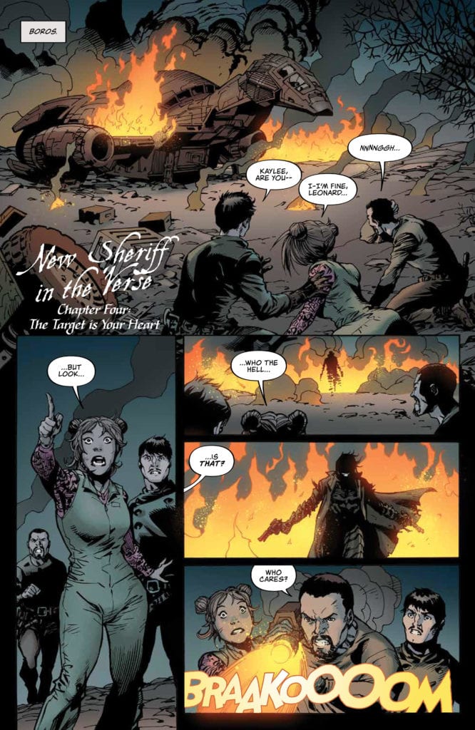
RED SONJA: AGE OF CHAOS #4, available from Dynamite on June 17th, follows Red Sonja and the day-walking vampire, Chastity, as they search for a way to resurrect Kulan Gath. Erik Burnham’s story and Jonathan Lau’s art deliver a tale of monsters and wizards competing to be the first to find the source of Gath’s power.

Cover Art

Lucio Parillo’s art consistently excels with the collection of Dynamite’s female heroes. Chaos takes center stage on the cover as the titular character. Parillo’s attention to life-like anatomy is outstanding, and his use of deep shadow for dramatic effect takes the cover to a grand artistic level.

Writing

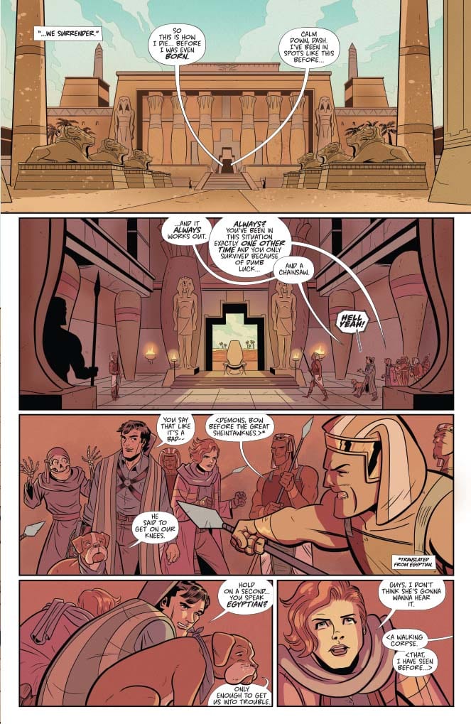
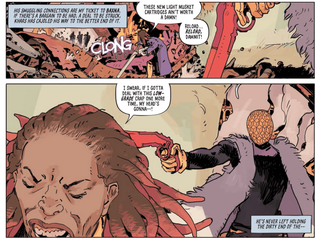
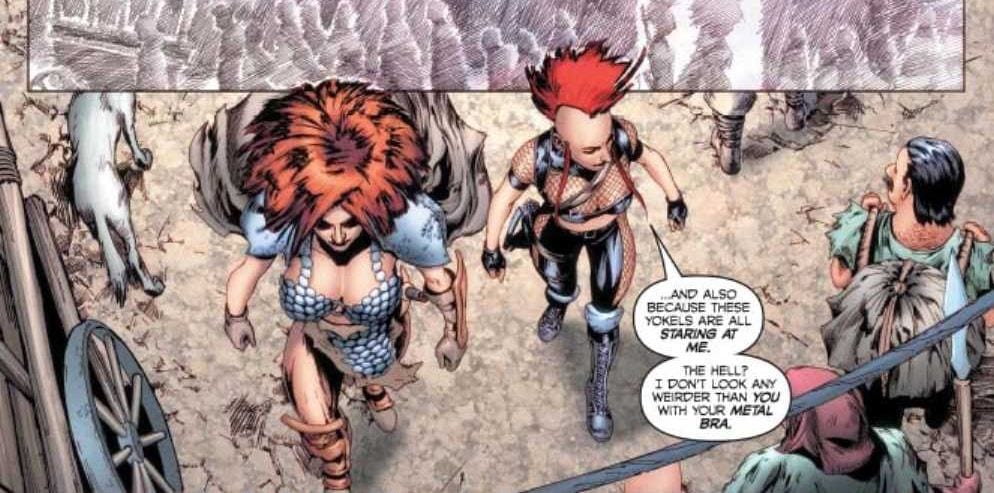
Let’s take roll call: Red Sonja (warrior), Chastity (day-walker, punk rock vampire), Evil Ernie (magic-wielding zombie), Purgatori (winged, vampire goddess), Jade (vampire sorceress). Whew! That’s a lot of characters to juggle for one issue, and that doesn’t include the assorted sorcerers, warriors, and townsfolk they meet along the way.

With all those characters to pack into one issue, Burnham deftly keeps all the threads moving in the right direction. Red Sonja and Chastity’s journey takes up the lion’s share of the story, with a battle between Evil Ernie and Purgatori taking up a close second. With all that story going on, I never felt lost or confused about who was doing what.

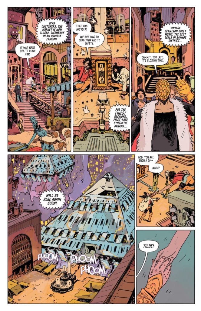
Most of the vampire characters were transported from other times and locations to Red Sonja’s setting, and Burnham took the time to give each character, especially Chastity, a fish-out-of-water moment without overplaying it. The story was amusing, exciting, and engaging. Of all the Red Sonja books out this week, this is the easily the best of the bunch.

Pencils/Inks

Jonathan Lau’s artwork is the top highlight of this issue and of all the books reviewed this week. The characters, costumes, and backgrounds are rendered in fine-grained detail that looks closer to the type of work you find in a graphic novel that’s been poured over for months.

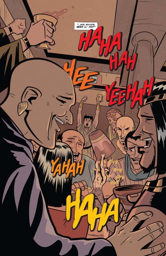
The fight scene between Purgatori and Evil Ernie is face-paced and explosive. I was riveted with every single panel as the two monsters traded escalating attacks with a mix of brute strength and magical blasts. This issue is worth the purchase for Lau’s artwork alone.

Last but not least, Lau made an artistic change to Red Sonja that I don’t think I’ve ever seen before. Usually, Red Sonja is drawn with a long, full-bodied head of hair. Here, Lau changed it up to give Red Sonja a rude bushel of hair, almost akin to a lion’s mane. It makes all the sense in the world for a barbarian warrior who wanders the wastelands to have hair that looks that way, and it gives her status as a warrior a bit more credibility. It’s amazing to see a seemingly innocuous change generate a completely fresh take on a character.

Red Sonja Age of Chaos #4, art sample

Favorite Panel/Page: The battle between Purgatori and Evil Ernie steals the show for this issue, and page 19 is the best panel of the entire scene. It’s a full tier panel where (No Spoilers) one character deals a “death” blow to the other, effectively eliminating some of the competition…albeit temporarily.

Coloring

Andrew Dalhouse’s coloring is a perfect match for Lau’s art style, particularly with the execution of red. Red Sonja has a red lion’s mane, Chastity has a red mohawk, Purgatori is, well, all red, so it would have been easy enough to select an acceptable red tone and leave it at that. To Dalhouse’s credit, if you look closely, even the color selection between Red Sonja’s hair and Chastity’s hair is subtly different to give each character a little bit of distinction. It’s that kind of attention to detail that makes this book the winner of the week.

Lettering

Similar to Burnham’s fine work juggling multiple plot threads, Carlos M. Mangual’s lettering does an equally great job finding a way to keep multiple voices in multiple languages easy to read. You have English dialog, native tongue translations in the town Red Sonja and Chastity are visiting, the voice of a disembodied ghost head, mystical zombie voices, a talking smiley face lapel pin, and a screeching wyvern. Lots of voices. All of them made clear and distinctive with the artistic use of word bubble borders, fill colors, and custom fonts—fantastic work by Mangual.

Conclusion

RED SONJA: AGE OF CHAOS #4, out this week, is a masterclass in ensemble storytelling combined with next-level art. The entire creative team brought their A-Game with this issue, I highly recommended.

Monkeys Fighting Robots Youtube

Review: Ash Visits The Source In DEATH TO THE ARMY OF DARKNESS #3

Death to Army of Darkness #3, Oliver cover

DEATH TO THE ARMY OF DARKNESS #3, available from Dynamite on June 17th, transports Team Ash back to ancient Egypt on a mission to destroy the Deadite source. Writer Ryan Parrott and Artist Jacob Edgar craft a tale of hi-jinks in the desert that pits Ash against plagues of semi-Biblical proportions.

How Did We Get Here?

If you’re new to this story, Team Ash is technically a collection of alternate Ash’s with distinctively different looks and personalities. Rather than acting as a hive mind, they’re all Ash in name only, with original Ash, unsurprisingly, the most reckless and somehow most indestructible of the bunch. Ryan Parrot’s story plops Team Ash right in the heart of ancient Egypt, looking for the Deadite source to destroy it.

Cover Art

Ben Oliver’s cover captures the spirit of Ash in all the right ways. Bruce Campbell (aka The Chin) is known for his instantly recognizable facial expressions, so to capture just such an expression in a nearly photo-realistic way is quite a treat for Evil Dead fans. The composition is goofy to the point of slapstick, which suits the subject matter just fine.

Writing

In Parrott’s story, the team encounters an Egyptian Queen who’s suspicious of the team’s intentions and a Deadite Lord who challenges the team to defeat a mini version of the Ten Plagues. Does Ash survive? Of course he does, but the fun is in the journey, not the destination.

And that’s the big positive of this issue. It’s all about fun. Listening to Ash argue with other versions of himself as a bizarre form of split personality, personified. Watching “mini” Ash wrestle a deadly cobra into submission. There’s no scenario that’s too outlandish in Parrott’s writing, and as long as you don’t try to make sense of it, you’ll have a great time going along for the ride.

Pencils/Inks

Jacob Edgar’s art juxtaposes nicely with Parrott’s story. Team Ash is always running towards, or away from danger, so nearly every panel is packed with action poses, and dynamic camera angles to build anticipation for the next scene. In addition, Ash’s signature outfit has been updated to suit the Egyptian setting, but it hasn’t changed so much that the spirit of Ash doesn’t shine through.

The one minor area that doesn’t quite land is the rendering of Ash’s face. As noted in the critique of the cover art, Bruce Campbell’s face is so distinctive; it becomes part of the roles he plays. To have Ash drawn in such a way that makes him look, to be honest, generic, and nothing like Bruce Campbell, was distracting. It would have been less distracting if the character, as drawn, was at least a reasonable facsimile of the titular actor.

Coloring

Kike J. Diaz’s coloring works from a certain point of view. The issue is almost entirely bathed in earth tones, so it worked to immerse the reader in the constant, baking heat of the Egyptian desert. That said, there’s so much earth tone, it tended to make the book bland in a few spots. There were a few opportunities that should have been taken to switch up the palette, particularly when the team was indoors, to break up the monotony.

Death to the Army of Darkness #3, color sample

Lettering

Hassan Otsmane-Elhaou’s lettering is top-notch here. Not simply because the effects integrate organically on every panel, but because they mimic sounds perfectly from the films. I’ve seen Army of Darkness more times than I care to remember, and I know precisely what mini Ash sounds like when he’s screaming or laughing. Otsmane-Elhaou’s rendition of those same sound effects nails it and adds that extra layer of authenticity to this issue.

Death to the Army of Darkness #3, lettering sample

Conclusion

DEATH TO THE ARMY OF DARKNESS #3, available from Dynamite on June 17th, is exactly the kind of gonzo, crazy, horror-comedy antics you expect from Army of Darkness. The writing is silly fun, the art is strong overall, and the source material is treated with respect (Always a plus when it comes to adaptations). This book gets 4 out of 5 “Hail To The King, Baby”‘s.

Monkeys Fighting Robots Youtube

ANT-MAN #5: How To Root For Marvel’s Little Guys

Ant-Man #5 cover

Out this week, hopefully in your local comic book shop, Ant-Man #5 is the final issue to a hidden gem of Marvel Comics. With all of Marvel’s biggest series like Immortal Hulk, Venom, or X-Men, it’s easy to lose track. But if anybody needs a break from the long-running series, this series encapsulates the fun times. With times being a little difficult, a little absurdity can go a long way.

Recap

This Ant-Man series follows Scott Lang trying to reconnect with his daughter Cassie (Stinger) through superheroism. In a series of misadventures where Cassie shows up her father, the supervillain Macrothrax steals her insect communication helmet.

Ant-Man #5 Story

Scott can’t catch a break with the Avengers and his daughter not taking him seriously. However, in Ant-Man #5, Zeb Wells goes out of his way to show how both he and Cassie develop. Scott wants to be the hero his daughter can admire, while Cassie wants her dad to see her as a hero. To that end, Cassie wants to clean up the mess from her stolen helmet even if it means going in alone. Scott meanwhile demonstrates his greatest strength by actually listening to the people he speaks with. This includes the ants Scott cares for, with other insects noticing. While everyone else treats Scott as a joke, these insects give Ant-Man some much-needed help. All in the most absurd way possible, any specifics would be spoilers.

Artwork

Dylan Burnett displays impressive transitions of conflict through his artwork in Ant-Man #5. In the first pages, things look pretty mundane until a glimpse of the absurd pops up. Yet it the colors by Mike Spicer that really bring this feeling out to the point of having the giant bugs match the color of the weather services. One page even has the Langs feeling small in comparison to the bugs by looking cartoonishly simple. Their bodies practically look like sticks, unlike their heads. The designs of the bugs meanwhile are between looking scary (with their many small eyes) or endearing (with their expressively big eyes). Interestingly enough, the insectoid Macrothrax resembles Ultron with Cassie’s helmet.

VC’s Cory Petit’s lettering even brings this similarity full circle with Macrothrax’s spiteful dialogue. While this does make him threatening, the way he speaks like “Your father has dim Brain” allows for amusing banter Cassie does to mock him. The numerous wordmarks in Ant-Man #5 meanwhile feel expressive, especially the sounds the numerous insects make. With so many sounds going on at once, it ties into the importance of communication and listening and allowing for Scott, Cassie, and the bugs to effectively work together.

Ant-Man #5 Is A Fun Time

Ant-Man #5 ends a run that features some absurd parts of the Marvel Universe. With Scott and Cassie Lang likely making more appearances in the MCU, now’s a good time to get acquainted. Otherwise, people can miss out on some fun times especially if you take the time to listen to others.

Monkeys Fighting Robots Youtube

Review: SUPERMAN #22—The Consequences Of Our Actions

SUPERMAN #22, on sale in comic book stores on Wednesday, June 17th, wraps up the thrilling United Planets arc from writer Brian Michael Bendis. While Clark fights off Mongul at the outer edges of Earth’s atmosphere, Lois engages in her own fight of sorts with a government agent. Ever since Clark revealed his identity, things have been even more chaotic on Earth. But if Big Blue can’t defeat Mongul in time, there won’t be an Earth left to save.

Story

The final battle between Kal-El and Mongul has come, and the fate of Earth lies in the balance. Despite encountering numerous big baddies over the years (he recalls Lex Luthor and Brainiac in his mind), Clark describes a sense of knowing this specific villain would always come back to punish him and humanity. But rather than give into despair over the futility of their endless fights, our hero turns his desire to enact the United Planets into a righteous rage. Mongul should count himself lucky; few beings have seen Krypton’s Last Son unleash his true fury.

Unbeknownst to Clark, Lois Lane is fighting a battle all her own back in Metropolis. Agent Chase from an unnamed government organization is plaguing her with questions regarding Clark’s supposed claim to be Earth’s “king.”

Bendis’s writing is fast-paced, direct, and immensely impacful. The determination of Clark and Lois is an encouraging quality for both of these heroic characters. But can they abate the consequences of Clark’s recent actions?

Artwork

Kevin Macguire’s penciling and ink work, Alex Sinclair’s s coloring, and Dave Sharpe’s lettering came together in a masterful way for this arc’s concluding chapter. The intense fight scenes are full of brightly colored balls of fire, helping readers imagine the heat on their own faces. Each character is highly detailed and provide a good sense of movement. What’s more, the speech and thought bubbles frame each scene beautifully.

Conclusion

SUPERMAN #22 was an exciting wrap-up to the United Planets arc, even though it may have been somewhat rushed. It leaves open plenty of room to explore the consequences of Clark’s actions in the issues to come.

Did you enjoy the conclusion to this arc? Let us know in the comments below!

Monkeys Fighting Robots Youtube

Review: TARTARUS #3 Builds its World in Magnificent Ways

Having three issues in a row be absolute gems of storytelling, and visual beauty is a feat to behold, however, the team behind Image Comics Tartarus #3 makes it look easy.

Tartarus #3 isn’t scheduled to be released until June 17th. That in mind, it’s been a while between the previous issues. Take a look at our reviews of issues one and two to refresh yourself. Or, if you haven’t picked them up, support your LCS and grab them!

TARTARUS #3 – STORY

After three issues of amazing storytelling, it’s hard to say anything that hasn’t been before. Nonetheless, one of the greatest things to note is writer Johnnie Christmas’ constant fantastic pacing. Tartarus can seem quite busy at times; even three issues in the plot has a lot to say. Yet, Christmas never wastes a page, even when it comes to ones that seem trivial. Each page matters for the story Christmas sets out to tell, and he makes sure the dialogue matters as well.

This may end badly
Johnnie Christmas, Jack T. Cole, Jim Campbell

Christmas continues to trickle backgrounds, and new story beats throughout that fall into place organically. The way he is able to make the story flow ever so smoothly makes the heavy amounts of story and the dense world feel not so heavy. The world and characters of Tartarus feel complex with multiple layers throughout, yet the writing never makes you feel overwhelmed. At times some stories can feel so heavy with all the information that it’s a struggle to read. Nevertheless, this never occurs with Christmas’ writing, or how he progresses the plot.

THE DESIGN OF IT ALL

The designs of the characters and the landscapes seen in the previous issues have been remarkable. The same can be said of Tartarus #3 with Tilda and the remaining crew on the Tartarus colony. Much like the other planets/cities the series has visited, Jack T. Cole sets the design of this one apart. The colony is explained as “a deadly mining colony on an ocean planetoid at the ass-end of space.” This definition bodes well with the designs we’ve seen. It also appears to be a sort of hub that includes varying people. By looking at the vast array of different people and creatures, this seems to ring true. Not only that, but the cluttered buildings that are sometimes in shambles, yet has no breathing room between them shows overpopulation.

Cole’s background art leans heavily into this as well. Streets are packed with background characters as well as buildings that are so close they almost melt into each other. Yet another aspect of the planet that makes it feel like different cultures combined are Cole’s colors. Cole continues with the 80’s science fiction palette, yet different parts of the colony tend to change colors. One location favors browns while others revolve around blue, green, purple, among other colors. These changes of colors in locations never feel off, but they bring the backgrounds to life.

Need a hand?
Johnnie Christmas, Jack T. Cole, Jim Campbell

THE IMPACT OF LETTERS

Much like the rest of the team, letterer Jim Campbell continues to astound in the third issue. Aside from his usual ability to make sure nothing is covered, there are two other elements that really stand out. First are the sound effects. As important as sound effects can be, sometimes they are overdone and don’t match the tone. This isn’t a problem in Tartarus #3, as Campbell’s sound effects never feel too jarring or out of place. Nonetheless, the other amazing element Campbell uses sparingly, but to great effect.

During a scene when a character yells “Aaahhhgg!”, Campbell starts it off small, then grows during the “h” and back to normal with the “g.” Making it sort of look like “aaaHHHgg”. Although that may not seem like much, by making the size wave, he is able to give that much more emotion. Now you’ll read it with a higher emphasis in the middle, thus hitting that much harder. This little trick made a huge impact.

TARTARUS #3 CONCLUSION

Three issues in and Tartarus continues to astound with how great every element is. Having your first three issues feel this amazing is hard to do. Not only has the team crammed detail after detail throughout, but they make it feel as they’re never giving too much. That is one of Tartarus’ skills; it has an epic to tell, yet the pacing and world-building never feel too much. Instead, we are treated to a fantastically paced story that is oozing with an imagination that draws you in.

Monkeys Fighting Robots Youtube

History Is Catching Up In DRYAD #3

The Glass family is about to be torn apart by history in Dryad #3.

DRYAD #3, out July 8th from Oni Press, continues to merge science fiction and fantasy into something new, all while telling us the story of one family, and how their past has finally caught up with them.

The Glass family is about to be torn apart by history in Dryad #3.

***SPOILER WARNING***

The Glass family has quite the secret – one that is exploding out into the forefront in Dryad #3. What started out as a casual fantasy series has rapidly turned into a genre-blending tale as more technology is introduced by the moment.

From the start we knew that Morgan and Yale were on the run from something – we just didn’t know what. Well, after reading this issue, fans will have a slightly better idea of the where, but not the why. Not yet, at any rate.


The Writing

Dryad #3 is as lush as an adventure as the previous two issues, but it has raised so many more questions along the way. Morgan and Yale’s past may have been revealed, but not enough to explain their reasoning. Not to us, and certainly not to their children.

Kurtis Wiebe has done a brilliant job of creating and developing this world. It’s only been a short period of time, but already elements of it are clicking into place. The revelations made in this issue suddenly explained so many little moments before now. It makes you wonder what else will be revealed in later issues.

The Glass family is, simply put, fascinating. The journey of the parents raises a lot of questions, obviously. And with it come questions about how the teenagers will react. It’ll be interesting to see how much of these plot points are developed in future issues.

This has quickly become a world that readers are going to want to learn more about. It went from being something we’ve seen a hundred times before – to something totally different, but in a way that also made complete sense. The stability of the world helps to make it feel even richer and more fascinating, leaving fans eager for more.


The Art

The artwork inside Dryad #3 is something truly to behold. The plot and setting are a fantastic blend of genres, then none of it would be possible without the artwork to support it. This is a fantasy world infused with science fiction elements – or is it the other way around?

Justin Osterling was the lead artist for this issue, and their lines are incredible. They’ve created this unique fusion of elements and then fleshed out the world with characters to bring it to life. There’s so much to look at from this issue, from the current events to the flashbacks, to that surreal world created later on. All of it insists on the reader’s attention.

Meg Casey provided the colors, and wow do they ever pop in this issue. The world is vibrant and oh so very colorful. It’s interesting, because the colors are incredibly bright, yet they match both the fantasy and science fiction themes. That must have been a hard balance to find.

Last, but certainly not least, there’s the letting, provided by Jim Campbell. Campbell’s work is a masterpiece, as always. Everything from the subtle moments to the major swings (and sound effects) was so carefully placed.

The Glass children are in for a whole new world in Dryad #4.

Conclusion

Dryad #3 is one of those thrilling issues that leaves you eager to get your hands on the next part of the tale. This is quickly turning into a world much more complex than we could have ever predicted, and yet we can’t get enough of it.

Monkeys Fighting Robots Youtube

How One Family Fights To Stay Together In FAMILY TREE #6

Darcy is taking point on this cover of Family Tree #6.

FAMILY TREE #6, out this Wednesday from Image Comics, continues the thrilling and horrifying tale full of family drama and surprising evolution. This groundbreaking story is far from over.

Darcy is taking point on this cover of Family Tree #6.

***SPOILER WARNING***

Family Tree is a series unlike any other. It merges family drama with horror, nature with humanity. It’s proof that sometimes the most haunting elements of a story are the parts almost too subtle to catch. Until it’s too late.

Created by Jeff Lemire, Phil Hester, Eric Gapstur, Ryan Cody, Steve Wands, Will Dennis, Family Tree is absolutely a series that will get under your skin (pun intended). It’s dark and chilling, with the stakes feeling higher than ever.

Why do the stakes feel so high? Because the series has gone above and beyond in making sure that we care about this family. It’s impossible not to hope for their survival, even as they face incalculable odds.


The Writing

Family Tree #6 starts it’s a tale in the past – finally answering the questions about what happened to Darcy. Granted, it doesn’t answer all of them. We still don’t know the cause of all of this, but knowing that would take away some of the horrors.

The inevitable conclusion to Darcy’s tale foreshadows what is currently happening to Grandpa Judd. Last we saw, he was not doing well, though admittedly he’s proving to be a tougher character than anticipated.

Even then, there are more answers being provided. Slowly, the full story is being made clear. You’d think that would help to tone down the horrifying elements, but instead, it is merely reinforcing this feeling of the inevitable.

One thing is certain, there is still more to be explained about this family and their journey. They must still come together once again, and there is still at least one more major fight on the horizon – and that’s if they’re lucky.


The Art

Once again the artwork behind Family Tree #6 is gritty and intense, providing the perfect backbone for this series. The style itself is oddly organic, so much so that it lends very nicely to the concept of arbors and Arborists.

There’s a dramatic transition within this issue when the past catches up with the present. It creates a stark contrast, one that was certainly intentional. The vibrant green hue is shocking and evocative, especially as it seems to only occur in that brightness around the antagonists of the series. There’s something to be said about that.

Visually speaking, this issue did not pull any punches. There’s no doubt to be had about the state of Judd’s health, or what will likely happen to him if he doesn’t get help, and soon. Yet that just adds to the impact, as well as the concern for the future.

Beauty and horror collide on the cover of Family Tree #7.

Conclusion

Family Tree #6 takes a different turn from the rest of the series, providing insight and answers – all while raising more along the way. There’s no doubt that this series is just as chilling as ever, especially as the family drama goes up a few notches.

Monkeys Fighting Robots Youtube

The Insanity Continues in LUDOCRATS #2

A chaotic journey is about to unfold in Ludocrats #2.

LUDOCRATS #2, out this Wednesday from Image Comics continues the fantastically insane tale of Aristocrats and absurdism. It’s a vibrant tale full of characters who hate predictability and logic.

A chaotic journey is about to unfold in Ludocrats #2.

***SPOILER WARNING***

Ludocrats is a series as unique as it is vibrant. That is to say; exceptionally. If you’re craving something new and totally different, this is the series for you. Especially if you like chaos, absurd references, quirky moments of humor, and slightly insane characters.

The series is only going to be five issues long, but there’s no doubt that it is going to have all o the fun possible before it concludes. It may also make a few messes along the way…or is that the characters doing that…


The Writing

Kieron Gillen and Jim Rossignol are the two minds behind Ludocrats #2, and it’s safe to say that this isn’t quite like anything they’re known for writing. That actually made the journey more fun, rather than less.

The sheer amount of absurdity and chaos within these pages is borderline overwhelming, while still being entirely entertaining. And perhaps a little bit messy, but that’s really the natural result of a party. Or breaking into a prison that also happens to be a giant creature.

There’s no doubt about the creativity behind this series, though it’s good to remember that this is not a series you should try to predict. Predictability went right out the window, alongside a sense of decency (looking at you, Otto).

This is an issue full of on-point comedic timing, inane references, and several hilarious twists. Who knows what the following three issues will bring with them?


The Art

As you might imagine, the artwork behind Ludocrats #2 is every bit as chaotic and vibrant as the plot itself. Jeff Stokely was the lead artist for this issue, working alongside Tamra Bonvillain for the colors, and Clayton Cowles for the lettering.

It must have taken a fair bit of work to keep up with the writing for this issue, yet the creative team did a splendid job of doing so. In fact, they arguably went above and beyond at several points. The creature/monster in particular is especially eye-catching, though there are plenty of smaller elements worth looking into as well.

The bold colors support Stokely’s lines, which portray characters that are up for quite the adventure. They’re constantly moving, arguing, or otherwise finding ways to express their passion. It’s highly entertaining.

Larger than life characters can be found within Ludocrats #2.

Conclusion

Ludocrats #2 is every bit the issue fans could have hoped for, living up to the promises made by the first issue. No, it went farther than those promises, diving fully into a world of absurdity and amusement, all for the sake of its readers.

Monkeys Fighting Robots Youtube

The End of An Era In QUANTUM & WOODY #4

Something is up with Quantum on this cover of Quantum & Woody #4.

QUANTUM & WOODY #4, available for purchase on July 8th from Valiant Entertainment, concludes another hilarious and entertaining run from this dynamic duo. It is time for the truth to come out – and for enemies to be defeated.

Something is up with Quantum on this cover of Quantum & Woody #4.

***SPOILER WARNING***

Quantum & Woody got their latest chance courtesy of Christopher Hastings and Ryan Browne, who have been at the helm of this new series. If you’re looking for an infusion of humor and chaos in your life – this is the series for you.

The series follows Quantum and Woody, two unlikely brothers who couldn’t be more different. Well, with the exception of their current condition. Which also the reason why they have to stay in each other’s lives, no matter how much they drive each other insane.

The series is energetic, full of banter, quips, and sibling rivalry. Okay, there’s also a decent amount of chaos, and some show of powers as well. Given who we’re talking about though, that much should have been obvious.

Recently, Woody has taken up a new trick, or more accurately, he’s been faking one. That has resulted in no end of pain and chaos, especially for his brother, Quantum. You see, when one fakes having powers, it tends to affect those around you. Who would have thought?

These two brothers are off on an adventure (of sorts) in Quantum & Woody #4.

The Writing

As the final issue of the series, Quantum & Woody #4 has a lot to wrap up and very little time to do so. After all, Woody’s tricks have yet to be outted, not to mention there are several resolutions needed. Courtesy of said tricks, naturally.

There’s honestly a lot of satisfaction to be found in this issue, despite the sadness that comes with a hilarious series coming to an end. The creators did an excellent job wrapping up all the major plot points – something that even more impressive than usual, given that they lost an issue. But it’s more than that as well.

There were subplots directly addressed this time around, such as what Woody has been up to, and what Quantum has been trying to do. It all went somewhere here, making it all worth the read. The added chaos that naturally ensued was simply one more reason to be entertained in the process.

Seeing the conclusion of this miniseries, it’s hard not to want more. The dynamic between these two brothers has always been entertaining, but it felt like they were on the precipice of something new. Hopefully, in time, fans will be given a chance to see what could have been.

Infinite punches to the face?

The Art

The artwork behind Quantum & Woody #4 is as vibrant and chaotic as the characters themselves. There’s something eye-catching in every single panel, making sure that your eyes are always busy when looking at these pages.

It’s actually quite appropriate, given who the series is focused on. It’s not like either Quantum or Woody are very good at sitting still for long. Or keeping themselves out of trouble. The added dose of quirkiness truly fits the theme of the day.

The vibrant colors, the art style, and every little detail that went into this issue resulted in a lot of moving parts. Yet that is exactly what this series needed. Though some scenes took that to an all-new extreme (such as the battle itself). All of it made for a highly entertaining experience.


Conclusion

Quantum & Woody #4 was a fun, intense, and crazy issue. These two brothers went through a lot in less than thirty pages, and it’s enough to leave fans eager for more. There’s no telling what adventures (or messes) these two could potentially get into next time. Here’s hoping it’ll be just as amusing as this latest round.


Note:

Quantum & Woody was originally intended to be a five-issue miniseries, but unfortunately, it has been cut an issue short. That has more to do with the events going on, and the unsurprising drop of sales that would come with that. It sincerely doesn’t have anything to do with the quality of the series, which is still worth checking out. Perhaps now more than ever.

Monkeys Fighting Robots Youtube

Using One’s Resources For Good In FIREFLY #16

Heavy times are in store for the crew in Firefly #16.

FIREFLY #16, out this Wednesday from Boom! Studios continues Mal’s crazy scheme, showing what good a man like him can do when he actually has access to resources. However, in this universe, nothing is ever that easy for Malcolm Reynolds.

Heavy times are in store for the crew in Firefly #16.

***SPOILER WARNING***

The famous series that Joss Whedon created continues in comic book form, telling us more about the characters we love – and all of the crazy adventures they’re getting up to. These days, the crew is facing an entirely different set of circumstances.

You see, through a strange series of events, Malcolm Reynolds has gone legit. Well, mostly. This is Mal we’re talking about. Yes, it is every bit as strange as it sounds, and it will almost certainly come crumbling down on Mal’s head (along with the rest of the crew).

Firefly #16 features a fan favorite from the crew.

The Writing

Greg Pak has turned Firefly back into a series that cannot be predicted. Other than assuming that Mal is going to run into trouble of course, that part is simply inevitable. Firefly #16 proves how fans can still be surprised, even when Mal has taken a whole new path in life.

Don’t worry, plenty of our beloved characters have stayed the same, despite these changes. In fact, this issue did an excellent job of proving exactly that (you can probably even take a guess at which character once again showed their true colors here).

This plot has been a bit confusing for some fans, what with the changes already discussed. And yet there was something so incredibly satisfying about this issue. Probably because, even though he’s in a new job, Mal is still poking at the top dogs. He just can’t leave it alone, especially when people are suffering.

The fact that he was able to use his resources to do so only made that all the more satisfying. Yet there’s no denying the danger on the horizon. A threat we’ve been waiting for, as something was bound to happen. In a way, that too is quite satisfying to see come full circle.

Firefly #16: New Sheriff in the ‘Verse.

The Art

Firefly #16 was bold and stylized, presenting the characters we love, but being unafraid to take a few risks here and there. That being said, there are absolutely certain scenes and images that stole the show. Such as the dramatic scene involving Kalee, or just how smug Mal manages to look in this issue.

Ramon Bachs was the lead artist for this issue, so give them all the credit for the expressions, especially those on Mal’s face. The scenes bounce from mundane to dramatic at a moment’s notice, showing an understanding in holding our interest.

Likewise, the colors, provided by Joana Lafuente, are intense and bright. Brighter than they would have been in the TV series, yet that feels perfectly natural here. The inclusion of vibrant reds and golds feels like a throwback at times. Then there are those lovely backgrounds, which cannot be ignored.

Finally, there’s Jim Campbell, who provided the lettering. Once again he went for a more understated look, but that’s exactly what this series needed. After all, the issue needed to focus on the looming threat, something Campbell made certain of.

Looks like Jayne was ready for a fight in Firefly #16.

Conclusion

Firefly #16 may be bringing us a crew that has changed dramatically from the time of the television series, and yet it still feels familiar at the same time. Little details like Mal’s smug face or his tendency to get into trouble remind us of all the reasons why we loved the series, to begin with.

Yet this series is somehow still finding ways to surprise us, courtesy of all the dramatic changes they’ve been facing in recent months. Who’s to say how long this new bit of luck will hold.

Monkeys Fighting Robots Youtube