Home Blog Page 224

How The Times Have Changed in DRYAD #7

A dynamic cover for Dryad #7, one that hints to the past and the future.

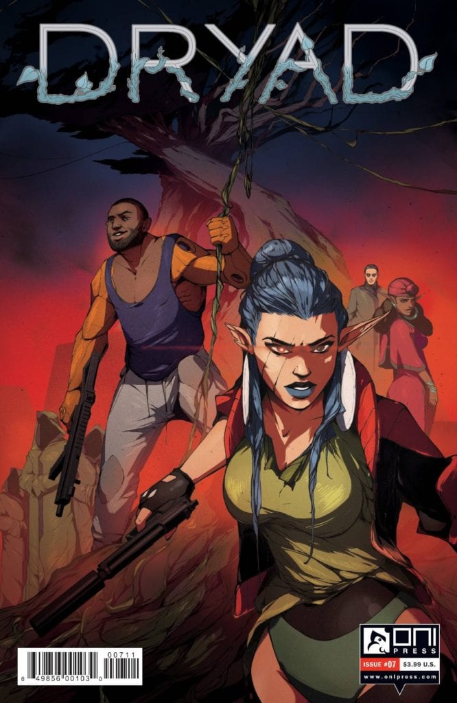
DRYAD #7, available December 2 from ONI Press, brings with it even more changes for one family — and the reasons why they have stuck together for so long. This is a world full of magic and technology, and there are bound to be some cracks in the merger.

A dynamic cover for Dryad #7, one that hints to the past and the future.

Once upon a time, the Glass family had known a peaceful and relatively quiet life out in what was, essentially, the middle of nowhere. Now they’ve been picked up and dropped off into the middle of a bustling city — and a growing conflict.

Each issue has steadily reviewed and taken apart everything this family had known, or rather, believed to be true. The family, the world, everything. It’s all changing, with very few exceptions. That is the setting for which Dryad #7 takes off.

The Writing

Dryad #7 is a rich and complex issue, from the very first page, right up until the conclusion. Kurtis Wiebe has clearly put in so much effort into this story, and yet there are countless questions still waiting to be answered.

This entire series has been genre-breaking on more than one level. First, it combined science fiction and fantasy elements into one world. Now, there’s a strong infusion of family drama, and just a dash of spy thrillers on top of everything else.

It makes for a fascinating world, if nothing else. While the wait for the next issue, and hopefully more answers, is likely to feel long, at least there are details worth pouring over from this issue. Such as the family history, the implications made, and the city itself.

All things considered, Dryad #7 is an issue that sits heavy. That was likely intentional, given everything that was revealed or hinted at. Still, it’s difficult to predict what the fallout will be, given the various directions and forms that can be taken.

The Art

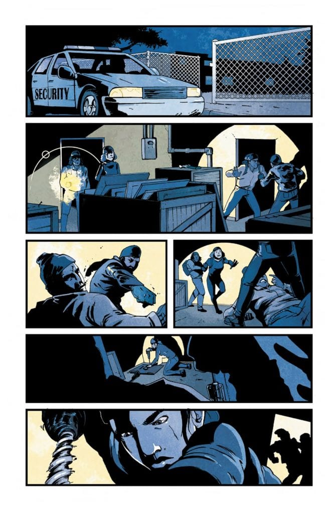
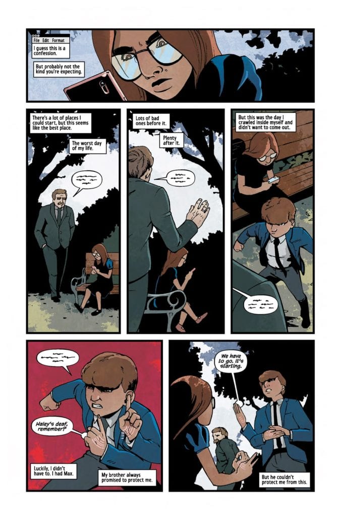
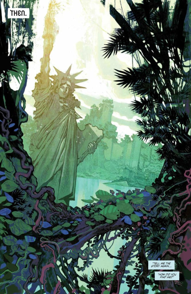
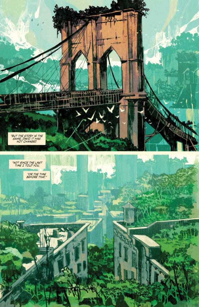
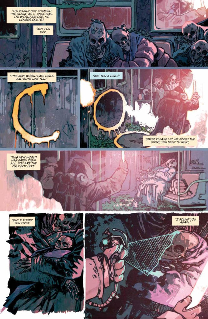
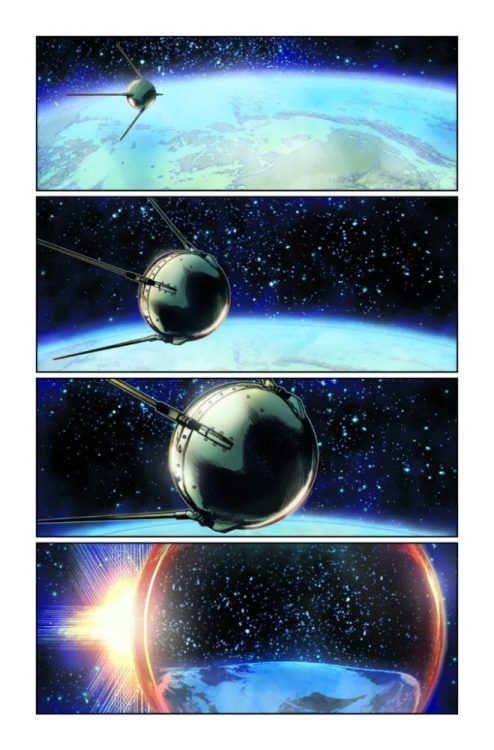
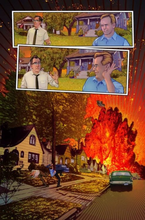
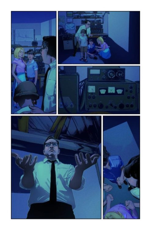
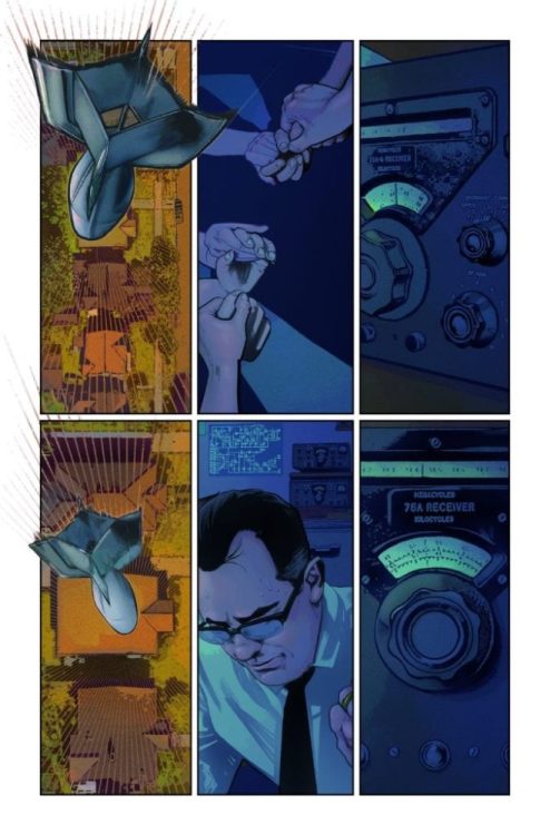
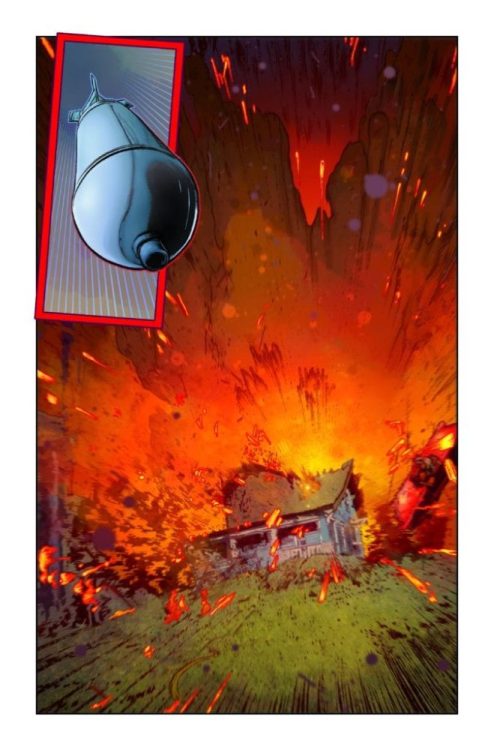
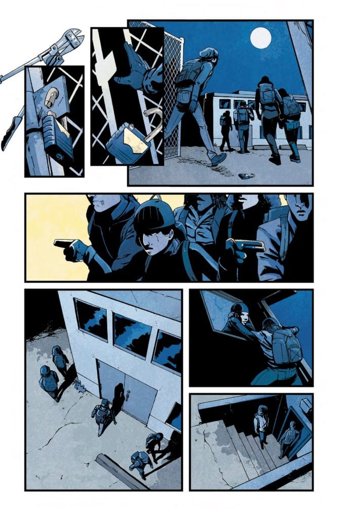
Dryad #7 is a striking issue, that much is certain. The characters are still a strong highlight to the series, but there are so many more details to enjoy as well. The vibrant backdrops, the blending of organic and tech, the magic, all of it.

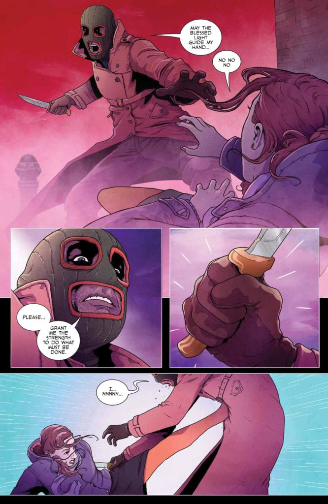
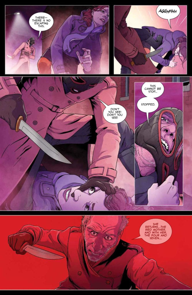
Justin Barcelo is the lead artist, and it is through Bacelo’s work that the past and present collide. The flashbacks are especially noteworthy here, being both dramatic and shockingly…endearing. Something that will make more sense when context is provided. that’s a promise.

Francesco Segala’s colors are to die for. The strong use of blue and green hues on some pages really do set the scene and the tone. It’s a color palette that lends well both to technology, and to magic. Meanwhile, the reds, pinks, and purples of the other dominant pages speak to emotional turmoil and family drama.

Jim Campbell letters the issue, and it is here where many nuances appear. The upheaval of the twins, their bond, the feel of motion and impact, all of it comes out through the lettering.

Conclusion

Dryad #7 is a moving issue, there is no argument in that. It is a fascinating issue, that answers questions in one hand, and raises more with the other. With each page it feels like the tale is getting more complex, and possibly much darker as well. Only time will tell how the Glass family fares from all of this.

Monkeys Fighting Robots Youtube

The Vessel Is Being Readied In RED MOTHER #10

RED MOTHER #10, available tomorrow from BOOM! Studios, is changing Daisy’s life — again. Her life has been far from easy these past several issues, and it looks like her story isn’t quite over yet.

***SPOILER WARNING***

spoilers ahead

The psychological thriller continues in Red Mother #10. Daisy McDonough’s entire life was turned upside down on one fateful night. She lost her eye and her boyfriend all in one fell swoop. While she still doesn’t have answers from that night, there was a moment where it seemed like her life was on the upswing again.

Something dark and twisted has made its way into Daisy’s life — something that anybody from the outside could have easily warned her was an illusion — and it seems unlikely that whatever it is would be willing to let go so easily.

This entire series has been full of suspenseful moments and graphic horror, all of which combine to heighten the tale — and the concern for one targeted woman.

Things are about to be set in motion in Red Mother #10.

The Writing

In many ways, Red Mother #10 reads completely differently from the rest of the series. Don’t be mistaken — it is still haunting and disturbing. It simply feels like much of the horror is out in the open, which actually makes it more terrifying, rather than less.

Jeremy Haun did a fantastic job of building up the suspense in this issue. Even the most seemingly normal and benign moments seemed like they were liable to tip the scale at any moment. It was…alarming.

As were many other changes throughout this issue, for that matter. Yes, Daisy is still fighting. If anything, she’s gotten better on that front. But there are many other elements that have gotten darker. Some of them make sense, even without explanation. While others feel like they’re setting up for some sort of dramatic reveal. Granted, that probably isn’t a reveal that Daisy is going to enjoy all that much.

This issue officially flips the series. Before it had felt like a combination of horror and suspense. Now it’s firmly in the world of horror, and the creature hidden by the darkness doesn’t feel so compelled to hide anymore.

Who do you think he’s talking to?

The Art

As dark as the plot gets within Red Mother #10, the artwork is there every step of the way. It’s bold, creepy, and admittedly even gory at times. All of which is thematically appropriate, given everything that is happening.

In fact, there are a few scenes that will make you stop cold. Take the cover (also by Haun!), for example. That is a break from the norm – and yet that simple (yet disturbing) image of an eyeball speaks volumes about what is about to happen. Especially to those who have been following along.

Danny Luckert is the lead artist for this entire series, providing both the lines and the colors. His characters are nuanced, being capable of great pain, and deception. Meanwhile, the colors are dominated by bold hues, such as the bloody impression left by a specific shade of red.

Ed Dukeshire is the letterer, and this is another area in which the artwork shines. The sound of breaking can practically be felt — jumping straight from the pages and into the reader’s nervous system. It adds to the book’s alarming nature in the best of ways.

It all fades to red…

Conclusion

Red Mother #10 is in all likelihood setting the scene for a dark confrontation. Perhaps the final confrontation. That part may be more difficult to predict, yet it is going to make for a fascinating read nonetheless.

Monkeys Fighting Robots Youtube

How Dustin Leads In STRANGER THINGS: SCIENCE CAMP #3

STRANGER THINGS: SCIENCE CAMP #3, available November 25th from Dark Horse, brings fans back to the solo story of Dustin, and how he was totally the cool kid at Science Camp — all while something sinister is happening in the background, of course.

If there’s one thing that Stranger Things: Science Camp has managed to prove, it is that Dustin is actually quite a personable and likable character. In fact, if you put him in a room (or camp) full of like-minded kids, odds are good that he’ll be liked by most of them.

Ironically, this also explains how he came back from camp with a girlfriend — even if most of his friends thought she was imaginary at first. The tale is also going a long way in showing off the skills (and determination) that Dustin learned from his time in Stranger Things.

Stranger Things: Science Camp #3 is the second-to-last issue of the series, and that means the adventure is about to get a whole lot more dramatic. The strange figure lurking in the shadows is going to become a problem again, and one can only hope that the case of the missing counselors will come up as well.

The Writing

Stranger Things: Science Camp #3 is the perfect balance of charming and spooky. In short, it feels just like a Stranger Things story should. Written by Jody Houser, the series first started off feeling almost casual and fun. But it has quickly taken on a darker edge.

It almost makes readers wonder why Dustin didn’t bring up this story to his friends when he got back home. Especially given the role he’s presumably going to play in the resolution (Dustin has learned better than to sit back and watch as horrors unfold). Perhaps he didn’t want to brag, or didn’t believe his friends would think the tale true? After all, they thought his girlfriend was fake for a few minutes there.

Either way, the events that are unfolding in this tale are quickly becoming more interesting with time. Anybody feel confident enough to begin making guesses on who the mysterious stranger is? With only one issue left, we’re almost at the big reveal.

Dustin’s character is every bit as endearing as always, while some of the secondary characters (girlfriend included) are getting a bit more fleshed out. Finally! Fans get to learn just a little bit more about her. It does raise the question, will we be seeing her again in future seasons of the show?

The Art

Stranger Things: Science Camp #3 could be an advertisement for an 80s camp — it is that spot on. Every little detail looks like it came straight from the decade the series is set in, and that in itself is an impressive feat. Throw in the camp elements, and you’ve got something else entirely.

Edgar Salazar (pencils) and Keith Champagne (inks) worked hard together to bring that vision to life, that much is clear. The cabins, clothes, and every other little detail really do read as a blend of the time and location, while the characters look exactly as they did in the show (with a few stylistic changes, of course).

Marissa Louise’s colors bring it all together, colors that could happily read as being from the 80s, or from a camp that is having trouble keeping up with the times. Except for the scenes portraying the horror elements, of course — those are appropriately swathed in dark colors.

The lettering for this issue was provided by Nate Piekos, and it is yet another example of work well done. The screams and sound effects feel real, while the story carefully unfolds around Dustin and the camp.

Conclusion

Stranger Things: Science Camp #3 continued Dustin’s solo story. Showing how much he has grown and learned, thanks to his friends (and the circumstances he’s already gone through). It hints strongly towards the young man Dustin will one day become. While also having a bit of fun and drama along the way.

Monkeys Fighting Robots Youtube

PANTOMIME #1 Offers A Special Reading Experience

Pantomime #1, out now from Mad Cave Studios, is the first issue of a crime miniseries about a group of deaf teens who get in over their heads when they foolishly steal from the wrong person.

Writing

Christopher Sebela gives us a beautiful, engaging story from start to finish. The story’s pace never feels dragged out. Everything flows naturally and elegantly. Sebela throws the reader right into the action with two silent pages, which essentially tell us what this miniseries is about. The heist sequences are thrilling and well-thought-out. The ending surprises the reader and keeps them guessing what will happen next to this loveable group of kids. Each main character has their own voice, strengths & weaknesses, and the thing they excel at. It was also a great, realistic touch to see how these kids slowly get addicted to the adrenaline boosts these heists give them. The characters Sebela created together with the artists are so believable and three-dimensional; the reader can’t help but feel a genuine, strong connection to them. Art

David Stoll‘s fantastic art and the story fit like a glove. The characters are instantly recognizable. Each character has their own head shape, their own unique features. The panels’ backgrounds can be too empty at times, but it still works here because Stoll chooses to focus more on the acting, which looks great. The reader can understand very quickly how the characters feel at each moment. The art looks realistic, but it still manages to come off as stylish and unique. But most importantly, the way Stoll overcomes the challenge of showing the characters speaking in sign language without splitting the pages into too many panels is simply brilliant. He draws the movements in a way that isn’t distracting or confusing to the reader. With his incredible work on this first issue, Stoll leaves the reader amazed and wanting more.

Coloring

The coloring by Dearbhla Kelly pairs swimmingly with Stoll’s art. Kelly captures Haley’s (the main character and narrator) point of view brilliantly. When she wants the reader to feel sad for Haley, Kelly uses dark and cold colors to set the grim mood. But, when she wants the reader to fall in love with the special needs academy and the new dynamics between those funky kids, Kelly uses bright and warm color tones, which allow the reader to take a look at the world through Haley’s eyes. It makes us feel exactly how Haley feels while she’s narrating the story. More specifically, there is a double-page spread where Haley tells the reader about each group member and their backstory. To distinguish each character, Kelly colors the panels in a monochromatic palette, and the specific character is colored in different, contrasting colors. It’s a smart choice that effectively smoothes out the reading experience.

Lettering

Justin Birch cleverly chooses a font with both uppercase and lowercase letters, making Pantomime #1 feel a lot more modern and fresh. Birch carefully places his balloons and caption boxes in an order that is easy to follow. He also usually makes the spoken dialogue indecipherable, which puts the reader in the same shoes as the deaf kids. It helps us understand their inner world a bit more. His choice to pull the balloon tails all the way to the kids’ hands when they speak in sign language works well here and never confuses the reader.

Conclusion

You can tell this comic is close to the hearts of everyone involved. Each creator, in almost perfect harmony, beautifully complements and compliments the various elements of this comic. Pantomime #1 is a perfect example of why representation matters—a perfect example of how it can make for one of the most unique reading experiences of 2020.
Highly recommended to anyone interested in viewing the world through a fresh, different lens.

Monkeys Fighting Robots Youtube

ORIGINS #1 Focuses Too Much On Plot To Create Any Real Connection

Origins #1, out this week from Boom! Studios is a “biopunk sci-fi tale that explores what happens to our planet in a post-human world, and the impact of Mother Nature on the tech our disappearance will eventually leave behind.”

spoilers ahead

Writing

The issue opens with establishing panels of the world where the story is taking place. It’s the real world, but something has changed. While we’re glancing at this strange, new world, a conversation occurs between an adult and a child, Chloe and David respectively. Chloe tells David the story of how she found him; The flashback playing out in front of the reader. Chloe finds a dead boy at an abandoned train and uses futuristic technology to bring the child back to life. When David lets out his first cry, Chloe swears to protect the child at all costs until he’s ready to return to his legacy. “Your past is your future,” she announces. This opening sequence works well. It keeps the reader immersed and curious about the world and the two main characters. Unfortunately, everything following this sequence is where it all goes downhill.

The story then jumps forward in time to the present, and the reader gets a page and a half-filled again with establishing panels. Taking place over four pages, the establishing panels at the start were more than enough for the reader to understand the look and the feel of the world where the characters are living in. So, the choice to focus on this world once again made the story feel a little dragged out.

In addition, the ending doesn’t have any real cliffhanger. Except for a one-page fight scene against a flying dinosaur, this issue doesn’t offer anything exciting enough to justify the anticlimactic ending.
But most importantly, Chapman focuses too much on plot and exposition to create any real connection between the reader and David. The reader doesn’t get enough time to learn about David’s motivations. To learn about his fears and how he feels to be the “chosen one.” We virtually know nothing about David.

Chapman created a rich world despite everything mentioned before, which still manages to ignite enough interest in the reader, making them curious to see where Chapman will take the story next.

Art

Origins #1 has the artwork of Judas artist, Jakub Rebelka. Rebelka draws his backgrounds and locations in great detail. The unique panel borders make the pages look animalistic and energetic. His costume designs fit in well with the post-apocalyptic atmosphere. There’s no denying that Rebelka’s art is good and effective. But, it can feel a bit uninspired at times. David’s face looks inconsistent, especially as an adult, and the acting looks too subtle to capture how the characters truly feel.

Coloring

The colorwork by Patricio Delpeche is arguably the best part of Origins #1. Delpeche offers a great use of monochromatic palettes, which helped to immerse the reader in the story right from the start. It gives the pages a grim look that works here with the story’s biopunk, dark themes. He uses the light sources at his disposal cleverly. Everything looks and feels surreal and realistic at the same time.

Lettering

As for Jim Campbell’s lettering, it’s great. Campbell seems to understand the post-apocalyptic vibes perfectly. He chooses to place his balloons without a stroke, which works well here. The balloon tales are a joy to look at. What sometimes doesn’t work are the sound effects. Specifically, where the flying dinosaur appears, the sound effect’s font and design don’t seem to match the dinosaur’s prehistoric, spooky look. Campbell is well known for his great lettering work, but it feels like there weren’t enough opportunities for him in the script to show the reader how amazing his work can be.

Conclusion

Origins #1 certainly shows it has the potential to be great. Despite a dull story, the creative team still manages to create a rich world that keeps the readers engaged. The art looks great, but the script doesn’t offer the art team enough chances to shine. Recommended for hardcore fans of futuristic, post-apocalyptic tales like the Planet of the Apes franchise.

Monkeys Fighting Robots Youtube

Review: Rhythm in HELLBOY & THE BPRD: THE SEVEN WIVES CLUB

HELLBOY & THE BPRD THE SEVEN WIVES CLUB

Written by Mike Mignola, with art and colors by Adam Hughes and letters by Clem Robins, Dark Horse’s Hellboy & The BPRD: The Seven Wives Club is more like a work of music than a comic. Mignola’s script, Hughes’ art, and Robins’ lettering all work harmoniously to create a clear visual rhythm.

Writing

Mignola sets the pace of this script brilliantly. As we open, Hellboy and Agent Raskin learn about the story of the Seven Wives Club. This section is very text-heavy. It requires that the reader spend time on these pages, making the reader feel as though these moments are slow and take time. But when Hellboy and Raskin go to investigate, Mignola pulls back. Only what’s absolutely necessary is written on the page. This quickens the pace, but it also makes us feel like we’re being pulled into danger against our will. We want to spend more time on these pages because the danger exists in pages further on. Mignola won’t let us. With our hearts in our throats, Mignola shoves us through each door and down each hallway. His minimalistic dialogue in his spookiest pages makes for a terrifying increase in tension.

HELLBOY & THE BPRD THE SEVEN WIVES CLUB Hughes Mignola Dark Horse

Art

Hughes is joyously experimental with his page layouts. In the first few pages, as we begin to piece together the evidence of what’s happened, Hughes superimposes panels on the rest of the page. They have thick white borders, making them almost look like photographs. As Hellboy collects each hint, the panels begin to look like pictures on an evidence board. But the page doesn’t stay that organized.

When the script comes to its “shit hits the fan” moment, the page layout immediately responds. Panels look like they’re falling off the page, and the world looks like it’s falling apart. Interestingly, in the midst of the chaos, we still get some right angles. Sometimes they’re moments of order being restored, like Raskin beginning to piece together how to stop these ghouls. But at other times, it’s a nightmarish eye of the storm: the villain smiling and stretching out his hands. Either way, these moments are highlighted by their order in the chaos, and their image sticks with you.

Hellboy Hughes Mignola Dark Horse

Coloring

Hughes’ coloring underlines the seductive nature of evil. After all, this is a story about many people who keep seeming to be drawn to the same man. In the opening moments, Hughes colors everything in a very warm palette. Hellboy is a deep red; everything else is almost in an orange glow. It’s autumnal and calming. But when Hellboy and Raskin begin their investigation, everything becomes a little grayer. It’s not just that the lights are off, things begin to look devoid of life. Yet there are moments of brilliant color that show up suddenly in the midst of the grey. They’re not moments of life, though. It’s the ghosts, the skeletons, the power emanating off of corpses. And frankly, it’s all gorgeous. Hughes shows us why all these people, living in a grey world, would be drawn to something bright and fantastic even if it is a corpse.

Lettering

Robins really leans into the rhythm Mignola has created. In any other script, it would make sense to divide up a character’s dialogue. Large chunks of text aren’t easy to read, and our eyes don’t like seeing them. But in a Hellboy script, Robins knows it’s important that we take our time on these pages. They are the calm before the storm. And so every monologue about what happened to the Seven Wives Club is shown in one long chunk of text. But when Hellboy, Raskin, and Ford enter the school, Robins makes a point of showing how little they say. Their tails to their word balloons are long, and they reach out, with dead space all around them. It makes each line of dialogue feel like it’s cutting through the silence, just as the word balloon cuts through the scene.


Dark Horse’s Hellboy & the BPRD: The Seven Wives Club is another hit from Mignola, Hughes, and Robins, the same team that brought us the brilliant Hellboy: Krampusnacht. It reads like a song. The story’s rhythm is clear as day on the page, and this brilliant creative team balances terror and mystery with ease. Pick up The Seven Wives Club one-shot, out from Dark Horse November 11th! And check out my and Matt Sardo’s interview with Adam Hughes on the project here!

Monkeys Fighting Robots Youtube

Review: TASKMASTER #1 – Captures The Tone Of An MCU Film

marvel comics exclusive preview taskmaster #1

TASKMASTER #1, out this Wednesday from Marvel Comics, is the first issue of a 5-issue miniseries by writer Jed MacKay, artist Alessandro Vitti, colorist Guru-eFX, and letterer Joe Caramagna.

About the issue:
TASKMASTER HAS MURDERED MARIA HILL! Or at least that’s what the whole world thinks. Now the greatest spies in the business are hunting him down and won’t stop until Taskmaster is dead or clears his own name!

marvel comics exclusive preview taskmaster #1

Writing

In a nutshell, what Jed MacKay set out to do with this book, he accomplished because TASKMASTER #1 is a whole lot of fun. It never drags out or feels boring. There is flawless chemistry between the main characters. The dialogue flows naturally. The action sequences and the funny banter manage to keep the readers engaged throughout the entire story and even get a smile out of them. Everything about this comic reads and feels like an MCU movie, which works well here.

However, MacKay’s greatest accomplishment is he makes the reader care about the supervillain and sometimes antihero, Taskmaster. By letting the reader get a glimpse into Taskmaster’s mind and his thoughts, we understand who he is. Taskmaster never comes off here as evil or malevolent. He just does what he does best to keep a roof over his head. The readers can understand and respect him for that.

Art

There’s no better match to MacKay’s fun story than Vitti’s vibrant art. Everything about his artwork just feels so energetic and full of life. The acting looks incredible, the faces are well-detailed, and the angles and shot types Vitti chose to get a laugh or astonish the reader hit the mark each time.

Though his clever use of layouts to manipulate the reader’s feelings is highly remarkable. The chase scenes’ layouts are chaotic and alive, everything an action sequence should aspire to be, and the dialogue scenes are orderly and efficient; They calm the reader down and make them focus more on what’s being said, without pulling back on the details and hurting the artwork’s quality.

marvel comics exclusive preview taskmaster #1

Coloring

Guru-eFX’s coloring work is realistic in the best way possible, but it still manages to make the art pop and complement it. More specifically, the lights are colored beautifully. Whenever someone shoots a gun, it looks like real gunfire. Whenever the sun is shining in the background, you almost feel dazzled by how bright it is. Incredible work here from Guru-eFX.

Lettering

Back in the day, there was an understanding that truly great lettering should go unnoticed. To this day, some people still believe it. But, with this comic, Joe Caramagna brilliantly proves them wrong. Caramgna doesn’t shy away and uses every chance he’s got to design some colorful, lavish sound effects and captions, making the artwork and coloring work look all the more alive and fun.

Conclusion

If you’re looking to read a comic book that beautifully captures an MCU movie’s tone, TASKMASTER #1 is the perfect book for you. The story is a hilarious adventure tale featuring one of the most likable portrayals of Taskmaster, and the artwork elevates the energetic writing. Highly recommended.

Monkeys Fighting Robots Youtube

How History Repeats Itself in CHAMPIONS #2

CHAMPIONS #2, available Wednesday from Marvel Comics, continues to show the increasingly dark aftermath of Kamala’s Law. A law put in place to stop underage superheroes, a turn of events eerily similar to another event in Marvel’s past.

The creative team behind this poignant issue.

The fallout from Outlawed is still going strong, as C.R.A.D.L.E. agents continue to gain more power. Much like the events that unfolded during the Superhuman Registration Act, this series is quickly proving the willingness to discuss the worst that humanity has to offer.

All while putting it in stark contrast against the best of humanity. Those that stand up and fight. That speak when others can not. It’s a subject that Marvel has covered before, and they will almost certainly cover again.

Champions #2 dives back into this complicated and dark world, portraying many a young hero’s positions and struggles. Not just the Champions themselves, but all young – with and without powers.

There are plenty of opinions to be found within Champions #2.

The Writing

Champions #2 is a powerful issue that will hit home for a lot of readers. The events that unfold here are not romanticized, nor does Eve L. Ewing pull any punches. The story here is raw and painful, as it should be.

Each of the Champions is on the cusp of something. They have been from the moment Outlawed occurred. They have to decide which side of the law they’re on – and more importantly, they have to live with that decision. That is the unavoidable truth that Ewing brought to bear within these pages.

Champions #2 is an issue with no fear. This is an issue that tackles intense and diverse subjects, forcing subtext into text. All while discussing ethics, morality, history, and many modern events as well.

It isn’t just that Kamala’s Law is painfully similar to the Superhuman Registration Act. There are similarities there, of course. But what goes on in this arc will feel familiar for other reasons. Many readers will have personally experienced or know someone who has experienced some of what occurs.

It adds a certain sense of weight, and yet it does feel perfectly at home within the Marvel Universe. After all, Marvel has always proven how willing they are to tackle and discuss current events and world problems.

There are passionate arguments to both sides of the issue.

The Art

The artwork inside Champions #2 is as complex as the plot itself, portraying various scenes and characters. All of whom are finding their own way to cope, or otherwise going through a massive amount of emotion and conflict of their own.

Impressively, all of this is clear as day on the pages. Each of the Champions has picked their side more or less, and the determination shines through their eyes. Yet one can see that the decision is anything but easy, for some of them.

Simone Di Meo and Bob Quinn were the lead artists for this issue, working alongside Federico Blee for colors, and VC’s Clayton Cowles for letters. All of which work together in a way that is ideal for the Champions.

The colors are bold, and the lighting is truly a spectacular sight to behold. It added a sense of drama and gravitas – as if there wasn’t already enough of that. Combined with the hundreds of other little details, it will leave an impression.

Meanwhile, the younger heroes have a decision they need to make.

Conclusion

Champions #2 is a hard-hitting read, as it was meant to be. Once again, readers are being presented with an arc that has a moral to the story, and with it comes an infinite level of complexity.

If you’re not actively reading The Magnificent Ms. Marvel and Miles Morales: Spider-Man, then you are potentially missing out on some of this story. Both series have been tackling the fallout of Outlawed, and with excellent reason.

Monkeys Fighting Robots Youtube

AfterShock Announcement: The Cold War Goes White Hot In NUCLEAR FAMILY

AfterShock Comics is delivering an alternate US history where America and the USSR really do drop the bomb. NUCLEAR FAMILY, available from AfterShock on February 24th, 2021, is a fresh take on the Philip K. Dick short story Breakfast at Twilight where a 1950’s-era family deals with the fallout of nuclear war.

Written by Stephanie Phillips and illustrated by Tony Shasteen, AfterShock describes the comic as “Cold War-era science fiction at its most timely and terrifying.” You can check out a selection of exclusive preview images and read the full AfterShock press release below.

Are you a Philip K. Dick fan? What other Dick stories would you like to see adapted into comics? Let us know what you think in the Comments section, and please share this post on social media using the links below.

Nuclear Family #1 / $4.99 / 32 pages / Color / On Sale 02.24.2021

Writer: Stephanie Phillips

Artist: Tony Shasteen

Colorist: JD Mettler

Letterer: Troy Peteri

Cover: Tony Shasteen with JD Mettler

Incentive cover: Tony Harris

America, 1957. Elvis dominates the airwaves and apple pie is served after every meal. But, with the dark cloud of nuclear holocaust looming, Korean War vet Tim McClean’s major concern is taking care of his family in the atomic age.

When the first bomb does drop on an unexpecting Midwest city, Tim and his family find
themselves plunged into a strange new world, where what’s left of the Unites States has gone underground while continuing to wage war on Russia with unthinkable tactics.

Based on Philip K. Dick’s short story Breakfast at Twilight, NUCLEAR FAMILY is written by
Stephanie Phillips (Butcher of Paris, Heavy Metal, ARTEMIS AND THE ASSASSIN, RED ATLANTIS) and illustrated by Tony Shasteen (Star Trek). It is Cold War era science fiction at its most timely and terrifying.

STEPHANIE PHILLIPS ON WHAT THE BOOK IS ABOUT AND WHY SHE IS EXCITED FOR IT TO COME OUT:

“The story is about a family that seems like the ideal nuclear family in the 1950s. But, when an unexpected nuclear attack happens on US soil, they find themselves propelled into an alternate future where the US has fled into underground bunkers in an unending nuclear war. The family struggles with this grim outlook of their future, while also trying to find a way home.”

STEPHANIE PHILLIPS ON HER APPROACH TO THE STORY:

“This story is really a collaboration with artist Tony Shasteen. We have tried to create a really weird vision for this nuclear future that is unlike anything that we have seen in apocalyptic fiction to this point. We pulled a lot of inspiration from Philip K. Dick and The Twilight Zone to try to imagine what could have been for the United States if the Cold War didn’t remain cold.”

STEPHANIE PHILLIPS ON HER FAVORITE CHARACTER AND WHY:

“The family that this story is about, the McCleans, have a teenaged daughter named Robin and I really enjoy writing her. She’s sharp and witty, but also at that stage where she wants to be rebellious against her parents. Being thrown into this alternate future, Robin has no choice but to trust her parents and cooperate with them in a way that I think most teenagers are not really enthused about.” 

STEPHANIE PHILLIPS ON WORKING WITH COMIC PUBLISHERS, INLCUDING AFTERSHOCK:

“It’s an exciting time to be in comics and AfterShock is definitely at the forefront.”

STEPHANIE PHILLIPS ON 3 REASONS WHY COMIC FANS SHOULD PICK UP THIS BOOK:

  1. Tony Shasteen’s art. Tony could draw an entire book of walls and I would buy it. Tony has created this alternate reality in such a beautiful and unique way, that I can’t wait for readers to see it. 

  2. This story blends fiction and history to create a “what if?” scenario about the events of the Cold War.

  3. We really tried to create family tension to see how this family reacts to unreal and horrific scenarios. It’s really interesting to see this family of four change as they are put through these trials.

Monkeys Fighting Robots Youtube

Review: DUNGEONS & DRAGONS: AT THE SPINE OF THE WORLD #1 Delivers The Goods!

D&D At The Spine Of The World #1, Coccolo cover

DUNGEONS & DRAGONS: AT THE SPINE OF THE WORLD #1, available from IDW Publishing on November 11th, starts a new campaign to hunt for magical plants that will save a town from wintry starvation. Writers Aimee Garcia and AJ Mendez assume the role of dungeon masters to set up a standard but enjoyable D&D adventure straight from the pages of Icons of the Realm: Icewind Dale.

Cover Art

Martin Coccolo’s art and Katrina Mae Hao’s colors make for an exciting cover. The barbarian and the archer (Saarvin – another nod to the source material) run to escape the remorhaz, and Hao’s choice to mute the beast’s coloring keeps focus on the heroes and amplifies the difference between the background and foreground. The coloring works well to give the already excellent painting greater depth.

Writing

Garcia and Mendez’s story is standard fare for a sword and sorcery adventure. Characters are introduced in rapid order with their roles clearly defined. Each introduction is matched with a dangerous conflict so characters can showcase their skills, and the quest is made clear without too much complication or fluff.

Garcia and Mendez push to do better than a standard campaign through the sub-plot, hinting at an unseen villain mining dangerous gems for an as yet unrevealed purpose. Overall, this is much better than the average campaign, and it’s refreshing to see writers pay proper respect to the source material.

Pencils/Inks

Coccolo’s artwork is outstanding in this issue for one reason above all others. Everything feels like it’s in constant motion. This is an energetic book from start to finish, and Coccolo plays up the energy and speed in every panel. Dog crews race through blasting blizzard winds. Party members are fighting off dangerous beasts and drunken townsfolk with a bone to pick.

You barely have time to take a breath before you’re off to the next leg of the campaign, but the art never looks sloppy or feels rushed. Coccolo put the time in to make the art high quality and cinematic, and it makes this first issue visually satisfying.

Coloring

Hao’s color work on the internal pages is just as expert and beautiful as the cover art. Colors on every page and well-balanced between the characters, their costumes, and the backgrounds. In particular, the glowing effect on the malignant gems coming from the mine is really well done and adds strong visual interest.

Lettering

Neil Uyetake’s lettering is clean, clear, and well-paced. The kerning and leading make this issue exceptionally easy to read, and although there are no sound effects of any kind in the book, it didn’t detract from the story in any way. A great example of “less is more.”

Conclusion

DUNGEONS & DRAGONS: AT THE SPINE OF THE WORLD #1, available from IDW Publishing on November 11th, delivers the goods on a rock-solid D&D story. The writing holds up against the best dungeon masters, and the art is captivating. I highly recommend this book.

Monkeys Fighting Robots Youtube