Home Blog Page 223

Review: IRON MAN #3 Spirals Into Depression

Iron Man #3, Ross cover

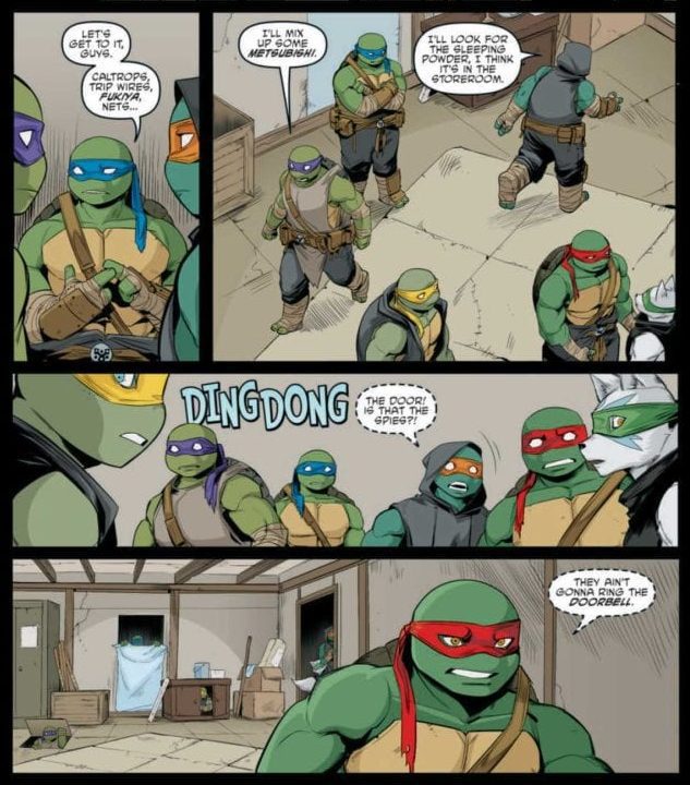
IRON MAN #3, available from Marvel Comics on November 11th, finds Tony Stark spiraling into deeper levels of despair, struggling to define himself as a hero, and finally meeting this series’ big bad. Written by Christopher Cantwell, this issue continues the existential angst of Iron Man #1 and Iron Man #2 before giving Stark a cold shock of superhero reality.

Cover Art

Once again, Alex Ross delivers a gorgeous cover. Iron Man flies high against the backdrop of the cityscape to escape a fiery death. It’s an exciting and gorgeous cover.

Writing

The overarching theme that comes through when reading Cantwell’s story so far is, “Tony Stark can’t catch a break.” He’s continually jumped by a cavalcade of serious and semi-serious villains from the Iron Rogue’s Gallery, which has potential as a build-up to Korvac’s reveal in the final pages. However, Cantwell takes it further.

Iron Man #3, writing sample

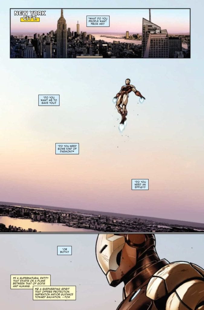
Not only does Iron Man get beat up by returning villains, but he gets roasted by the civilians he saves, and once again, from Hellcat. Cantwell is hammering it down with a sledgehammer that no matter how much Iron Man does to save people or how badly he gets injured in the process of said saving, everyone is dogmatically disappointed and annoyed with Iron Man. Any hint of hero worship or gratitude for Iron Man’s heroics is stripped away with a little extra salt for the wound.

Iron Man #3, writing sample 2

To be fair, this is structurally much better than the previous issue, but Stark’s constant self-doubt and the world’s non-stop Iron Man bashing make the story depressing. Readers want someone or something to root for, but here, even Iron Man doesn’t want to root for himself.

Pencils/Inks

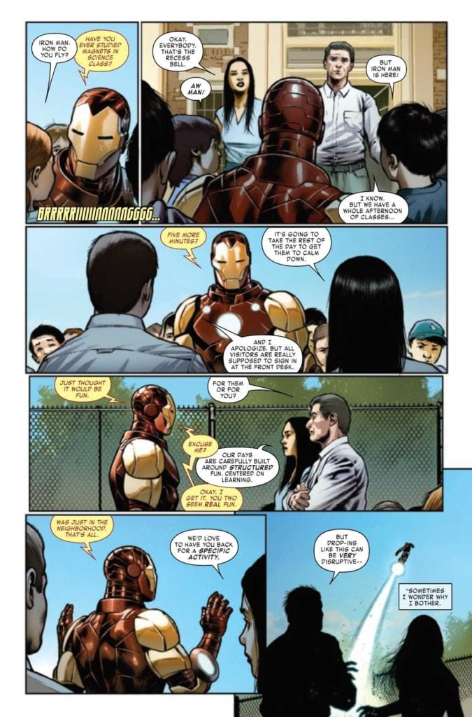
CAFU’s art is the standout for this series. Similar enough to Alex Ross’ hyper-realistic style but distinctive enough to be picked out on sight, CAFU creates a visual story that’s good enough for live-action without removing any of the fantastical elements you can only pull off in a comic.

Where CAFU’s art really shines is in angle choices between mundane conversation and action scenes. When characters are talking in everyday surroundings, the panel angles are flat, straight, and unremarkable. When Iron Man is called into action, CAFU chooses unique angles to amplify the sense of movement and action. Again, CAFU’s art saves this series.

Coloring

Frank D’Amata’s color work compliments CAFU nicely with a matte veneer covering all the surroundings and characters, giving them a dreamy glow that adds a fantasy feel to the art. The hues are rich and deep, and every panel looks like a museum-quality painting.

Lettering

VC’s Joe Caramagna lays down some excellent lettering in this issue. There’s quite a lot of wordy conversations going on, and so Caramagna keeps the dialog well-integrated into the art and easy to read. As noted in the previous issue, Caramagna makes a visually pleasing choice to match the sound effect border colors to the power source, complimenting the art in an almost symmetrical way that looks great in the panel.

Conclusion

IRON MAN #3, available from Marvel Comics on November 11th, takes Iron Man further down the rabbit hole of self-loathing before dealing with the biggest blow of all from the series’ main villain. The art is gorgeous on all fronts, but the story’s constant Iron Man bashing borders on sadistic. Read at your own risk.

Monkeys Fighting Robots Youtube

Review: TEENAGE MUTANT NINJA TURTLES #111 And Why Relationships Are Hard

TEENAGE MUTANT NINJA TURTLES #111, available in stores on Wednesday, November 11th, turns the tables on the Mutanimals. After weeks of infiltration attempts into the Turtles’ home, our heroes decided to set traps to stop them in their tracks. What unfolds is much like the tale of Kevin McAllister in Home Alone: someone defending their home from intruders with humiliating pranks.

Story

Sophie Campbell dives right into the high-paced narrative from the opening pages, showing the Turtles and their allies debate the merits of allowing spies to enter their home. This gives readers information they need from the get-go, which allows for character development. And what better opportunity for character development than the unexpected arrival of a familiar face (and not the intruders they were expecting)?

Seeing the downtrodden look on Sally’s face speaks volumes. Raphael’s rejection of her wish to help appears to have broken something in their relationship. This introduces the theme of rejection into the issue, which continues when Mona Lisa faces a difficult conversation with her parents.

The tension builds between the Turtles and their adversaries, but relationships seem to be suffering in midst of it all. Readers will find out what costs each character is willing to pay to achieve their goals.

Artwork

Jodi Nishijima’s penciling and ink work, Ronda Pattison’s coloring, and Shawn Lee’s lettering craft scenes that fit perfectly for this stealth-themed issue. The Turtles and their allies’ forms are drawn with sleek borders that allow them to mesh well with their surroundings. These panels contain darker shades to allow our heroes to mask themselves in shadows as their adversaries advance.

It was also great seeing the lettering capture the speech volume of each character. The smaller text for those speaking more quietly was particularly effective.

Conclusion

TEENAGE MUTANT NINJA TURTLES #111’s characters express the emotions, reactions, and experiences that reflect the real world with stunning clarity. We were engaged from the beginning to the end.

What do you think the Mutanimals’ goal is? Let us know in the comments below!

Monkeys Fighting Robots Youtube

Review: Vader Faces His Past Demons In STAR WARS: DARTH VADER #7

STAR WARS: DARTH VADER #7, available in comic book stores on Wednesday, November 11th, takes readers on one of Darth Vader’s most grueling journeys in Star Wars canon. After failing to comply with Emperor Palpatine’s orders, the Sith Lord experiences tremendous punishment on the planet of Mustafar. Longtime fans will remember this as the lava planet on which Vader nearly perished at the hands of Obi-Wan Kenobi.

Story

Vader finds himself in an eerily similar situation as the aftermath of his fight with Obi-Wan years ago. Most of his limbs are severed, and the heated planet surface makes it almost unbearable to touch. But in a feat of willpower fans love in the character, Vader crawls his way to the Sith Temple erected years ago.

Writer Greg Pak does a brilliant job of narrating our protagonist’s journey, both across the planet and through his memories. Readers witness events from Vader’s past — specifically those from Star Wars: Episode III – Revenge of the Sith — that retell his murder of the Jedi. This coupling of guilt from his past and anger at his present condition makes for a dynamic character. We can’t wait to see more of Vader’s internal struggle as he progresses through the saga fans know so well.

The story continues to amp up in intensity, complete with a Sith assassin and a mysterious voice communicating to Vader psychically. And readers will be stunned to learn identities.

Artwork

Raffaele Ienco’s penciling and ink work, Neeraj Menon’s coloring, and VC’s Joe Caramagna’s lettering provided us with high-quality illustrations worthy of the film franchise. The dark black shading on Vader’s suit are complemented beautifully by the fiery reds of Mustafar’s landscapes. What’s more, the lettering fits in well with each panel, using fonts of similar style to their surroundings.

Conclusion

STAR WARS: DARTH VADER #7 shoots and scores, especially for longtime Star Wars fans. Vader’s internal struggle engages readers on a new level.

Who do you think the mysterious voice belongs to? Let us know in the comments below!

Monkeys Fighting Robots Youtube

INTERVIEW: Actor Carmela Zumbado As A Human Robot In The Wall Of Mexico

Legendary actor Esai Morales (Ozark, NYPD Blue) is the patriarch of a bizarre family living just south of the US border in The Wall Of Mexico, a film directed by Zachary Colter and Magdalena Zyzak with surreal, mythical, and geopolitical themes flowing through its runtime.

Don (Jackson Rathbone) is the new handyman at the Arista’s large home, a Mexican-American family with a well that some believe may have unique properties. Don’s job is mostly unremarkable until he meets Tania (Marisol Sacramento and Carmela Zumbado’s Ximena. Don’s captivated by the alluring women, but his whole world begins to crumble as the need to build a wall arises.

PopAxiom spoke with Carmela Zumbado about becoming an actor and playing the cold, almost alien Ximena in The Wall Of Mexico.

East To West

Carmela is originally from Miami, Florida, and grew up just slightly north in Weston. She lives out in Los Angeles but was visiting her father back on the east coast. “My sister and I are driving back to LA, so it’s a good time to chat with people on the phone.”

Carmela’s road to becoming an on-screen entertainer began at an early age. “My sisters and I were always performing for our family members. We did dance shows and talent shows. We were always in love with performing. We did theatre in high school.”

“We decided to make careers out of it,” Carmela says of herself and her acting siblings. “We built up several small credits in Florida, and Georgia then made the move to Los Angeles. Things took off from there.”

carmela zumbado-wall of mexico-film-actor

About The Wall Of Mexico

Carmela’s young career includes appearances on My Crazy Ex-Girlfriend, The Magicians, and the hit Netflix series You. “My agent sent me the script,” says of her introduction to The Wall Of Mexico, “and I thought it was so cool and refreshing to read.”

The Wall Of Mexico is a film that knows what it wants to be from start to finish. “It breaks a lot of stereotypes and commonalities that we see portrayed by Latin people in TV and film. It was an artful script, and I loved reading it and the characters.”

The next stupid involved a “read with Marisol,” Carmela says, then declares, “they loved us.”

Carmela’s voice and energy through the phone are vibrant. She’s the type of person who is happy to feel a range of emotions. However, Ximena Arista could not be more different. How did Ximena come to be? “We talked a lot about Ximena’s backstory, what she did prior to the film; a lot of lounging around and doing cocaine while contemplating different philosophical theories.”

The Aristas are a wealthy family. “Because of her wealth, she was able to receive a solid education and traveled to Europe and received an extensive world-view by observing different cultures.”

“She reminds me of a cyborg,” Carmela says with a laugh, “who operates on the basics of logic and isn’t motivated by emotion.”

Carmela discussed her character of Ximena a lot with co-director and writer Zachary Cotler, “She’s not what you normally see represented as a Latin woman in TV and film.”

Carmela explains, “A lot of times I get auditions for roles that’s just the stereotypical Latina woman, sexy, and a bombshell or a cartel wife.” However, Ximena, though portrayed by the stunning Carmela, is “none of those things. She doesn’t lead with her sexuality. She has no sense of awareness of her presence sexually or interested in other people sexually.”

Mentions of robots and cyborgs come up repeatedly when talking with Carmela about her character in The Wall Of Mexico. “Thinking of her as a robot leads to her eccentricities and some of the nuances that came up naturally.”

The Wall Of Mexico is a mysterious film that centers around possibly magical water. “You can formulate your thoughts. It’s not very on-the-nose. The movie doesn’t tell you what to think.”

“We knew. But it’s also kind of whatever you surmount it to be. Reality is whatever truth you make it to be.”

wall of mexico-interview-actor

Wrapping Up

Carmela’s life-long love with entertainment is deeply rooted in her family. “I’m inspired by all of my family members and my ancestors. I’m lucky that my father’s mother was able to leave behind some very old family photos and mementos of our culture. She was from Colombia and moved to Cuba to marry my grandfather. They’ve always bestowed upon my sisters and me different relics of family history. I’m so inspired by being able to honor those who came before me. I think art is a beautiful way to do that.”

Carmela’s only 22 deep into her IMDB credits. What does she want to do next? “I’d like to do anything funny or a period piece where I get to travel back in time. Or a musical; I would pick West Side Story, but they already got that in production.” She laughs, “I did not get that role!”

The Wall Of Mexico is available digitally on Amazon. What’s next for Carmela? “Next up, I got to film a Christmas movie that’ll be out in December. It’s called White Elephant. It’s a romantic-comedy Christmas movie.”

Is Wall Of Mexico on your watch list?

Thanks to Carmela Zumbado and October Coast
for making this interview possible.

Read more interviews HERE!

Monkeys Fighting Robots Youtube

Outlaws And Heroes In THE MAGNIFICENT MS. MARVEL #16

THE MAGNIFICENT MS. MARVEL #16, available today from Marvel Comics is a tale that goes hand and hand with Champions #2. The effects of Outlawed are still going strong, with Kamala’s Law gaining more traction and power.

So it begins; C.R.A.D.L.E. is making aggressive uses of the power granted to it (The Magnificent Ms. Marvel #16).

The events of The Magnificent Ms. Marvel #16 are deeply ingrained in the events of Outlawed and Champions. Kamala’s entire world has been rocked, first with her injury, next with the creation of a law using her name, and now all of this.

When you put it in that light, everything that has occurred, and will occur, is deeply personal to Ms. Marvel. After all, it’s her mild-mannered alter ego whose name is being used to create all of this change — change that she does not agree with.

It makes for a complex and raw read, as Kamala tries to find a way through this, while staying true to herself. Yet if there is anybody that can do it, it is Kamala Khan.

It’s almost a relief to see a lawyer speaking up here (The Magnificent Ms. Marvel #16).

The Writing

The Magnificent Ms. Marvel #16 is a powerful read, much like the previous issue was (as well as Champions #2, also out today). Written by Saladin Ahmed, this is an issue that tackles both sides.

Amazingly, Kamala’s struggle is still relatable, despite how it sometimes feels larger than life. It just goes to show how personable her character is, and how close to home some of these events truly are. All of which was surely designed with intent.

While Kamala invariably ends up dealing with C.R.A.D.L.E. and their actions, this issue also sticks true to her core as well. There are family problems to be balanced and dealt with, not to mention her friends and their reactions to what has happened.

It makes the issue feel so very…human. Especially when balanced out with a quick moment of humor, and plenty of action (thanks to Amulet for that bit). All of which really was just setting the scene for a cliffhanger of an ending.

Amulet is back on the scene! (The Magnificent Ms. Marvel #16)

The Art

The artwork within The Magnificent Ms. Marvel #16 feels like coming home, in many ways. Yet it also portrays several scenes that have never come across her pages before. It makes for an exciting visual affair.

Minkyu Jung was the lead artist here and is responsible for portraying everything from the massive moments and fights to the little details. The creature Kamala fought looks like something from a legend, and with good reason. Meanwhile, there is plenty of nuances to be found in the expressions and reactions of each and every character shown.

The colors were provided by Ian Herring, who did a fantastic job. A bold use of color really allowed certain scenes to pop, while more muted tones set the scene in other ways. It made for a starkly contrasted issue, yet one that worked well.

VC’s Joe Caramagna’s lettering is absolutely superb in The Magnificent Ms. Marvel #16. You can practically hear the crunches, the sighs, and the turmoil, and that is thanks largely in part to the placement and orientation provided by Caramagna.

A new adventure awaits Ms. Marvel, it would seem. (The Magnificent Ms. Marvel #16)

Conclusion

The Magnificent Ms. Marvel #16 is an intense and complicated read. Kamala is naturally going through a lot right now, and yet she’s still keeping up the good fight. This issue is made all the better by another appearance from Amulet, and a few other surprises along the way.

Monkeys Fighting Robots Youtube

INTERVIEW: Catching up With COPRA And Michel Fiffe

Copra

Michel Fiffe’s COPRA recently saw a run of single issues published by Images Comics, something that deviated from the original run’s self-published process. But now, as Copra gets ready to begin the epic ‘Ochizon Saga’, the book is returning to its self-published roots (via Fiffe’s Etsy) and also to it’s original ‘legacy’ numbering, with the simultaneous release of issues #38 and #39. With all that looming, Michel was cool enough to chat with us about this momentous occasion and also share an exclusive image too! Read on and make sure you read and support Copra!


Monkeys Fighting Robots: Ok, so why two issues at once?
Michel Fiffe: Beats just getting one comic in your mailbox! Also saves on shipping costs.
MFR: Speaking of the issues, they are the start of something pretty big for the Copra crew. Give our readers a hint of what’s in store in issues #38 & #39.
Fiffe: It’s the climax of the larger story that I’ve been working towards for years. Imagine the horror and absurdity of humans holding their own against alien demi-gods. Big action, deep characters, and everything in between.
MFR: So these two issues are going back to self-published. What made you make this decision to have Image Comics publish only the collections? Did the pandemic and the chaos comics distribution go through have any bearing on your decision? 
Fiffe: It had some bearing, yeah. I didn’t like being at the complete mercy of several institutions. Not my style, not when I can normally get these comics to readers quicker than anyone else. I wanted more control.
MFR: Did it have any effect on the storyline itself?
Fiffe: Zero percent. Even when I stopped self-publishing and went to Image, the story continued seamlessly.
MFR: A lot of creators took the self-published route in 2020. Whether it was through Etsy, Kickstarter, Patreon, etc. Why do you think so many creators found success taking this route?Copra
Fiffe: Maybe it’s because we have a direct line to the folks who actually read and enjoy our work? If you don’t mind the paperwork, cut the middleman out!
MFR: So what was the process for these issues? What’s the path from conception to publishing on these single issues? 
Fiffe: What starts as scribbles on a scrap sheet of paper and ends up as a comic is beyond me… but I’ve tried to map it all out. There’s a “How To” segment of essays going over every detail over at my Patreon. It’s a lot to chew on.
MFR: What do you hope readers get out of this more direct publishing? 
Fiffe: A direct engagement with me, which is an aspect I’ve always enjoyed as both creator and a reader. Plus, you’ll get the stories almost as soon as they leave my drafting table.
MFR: What sort of schedule can fans expect now for Copra going forward?
Fiffe: I’m juggling a few other projects now, so the COPRA schedule will remain unpredictable but consistent. I’m far from done with the series.
MFR: Where can comic fans find your work these days?
Fiffe: Get to the socials, and look me up and I’ll be yakking about what I’m working on. 
MFR: And what’s ahead for you in 2021? What are your hopes, plans and expectations for the new year? 
Fiffe: Non-stop activity. More comics, more art, more COPRA.Copra


Monkeys Fighting Robots Youtube

Review: MISKATONIC #1 Where The FBI Face Lovecraftian Horrors

AfterShock Exclusive Preview: MISKATONIC #1

With Lovecraft Country making news, both positive and negative, on the internet it will come as no surprise that H.P. Lovecraft’s work is the inspiration behind AfterShcok Comics‘ new title Miskatonic. The television series is set in the 1950’s with a real world location which was the influence for many of Lovecraft’s stories, whereas Mark Sable and Giorgio Pontrelli’s comic mostly has a fictional setting but is comprised of real events and features prominent historical characters.

The story opens with the bombing of a ‘blue blood’ in Innsmouth, in the Miskatonic Valley, which allows newly appointed director of the FBI, J Edgar Hoover, the opportunity to reassign Agent Miranda Keller. Agent Keller is a dedicated worker with an impressive record but she does not fit into Hoover’s vision for the future of the Bureau, a “muscular extension of American Justice. Or as Miranda put’s it, “masculine”.

Miskatonic #1, preview p7
Miskatonic #1 Credit: AfterShock Comics

Real World Interactions

Miskatonic is a mystery story steeped in American history, visual and textual. One of the exciting things about the range of comics that AfterShock have been putting out is the obvious passion of the creators. Several of the titles have links to real world events which result in hours lost down internet rabbit holes researching the background to the story. And just as Stephanie Phillips’ Descendent had me reading around government conspiracies and the Lindbergh Baby, Miskatonic had me Googling “Plain Words” and anarchistic bombers. My search history will need to be expunged.

The merging of historical facts and creative plot is seamless to the point that it is believable that Agent Keller was a real person and her treatment by the infamous Hoover is a recreation of real events. It’s not until approximately a third of the way in that anything unnatural rears its head by which point Sable and Pontrelli have totally absorbed you into their world. The Lovecraftian locations are so commonplace these days that you forget they aren’t real places and Pontrelli draws the 1920’s Massachusetts’ townships as if from direct reference. The setting has the substance of reality and this is enhanced by the color work by Pippa Bowman.

The shift from the grey and washed out greens of Washington DC to the dusty Ochre of Innsmouth is subtle but symbolises a shift in tone. This is heightened by the contrast between Agent Keller and her surroundings. Bowman dresses Keller in salmon colored clothes from the moment she reaches Innsmouth. From the respectable dress suit to the bed clothes that she wears, Agent Keller stands out from the background in every panel she’s in. This contrast reaffirms many of the themes inherent in the comic. The difference between the City, or a cultured locale, and the country; the conspiratorial nature of Truth against implied reality; and even natural versus supernatural. A simple application of color draws the reader’s attention to these aspects of the narrative as they play out in the plot.

Miskatonic
Miskatonic #1 Credit: AfterShock Comics

Drawing from History

Pontrelli’s fine line work combined with his detailed backgrounds creates both an absorbing page of story and an historically accurate setting. As a reader you become immersed in the narrative and the setting equally, with each aspect feeding the reading of the other. There is a definable tension on the page between the interloper, Keller, and the locals and locale. Tom Malone, the agent in Innsmouth, acts as a link between the two worlds but Sable introduces just as much tension in his relationship with Keller, thereby forming an atmosphere of unease on every page.

Subtleties in the script are brought out through Thomas Mauer’s lettering with his occasional, yet impactful, use of boldface. Elements of the characters are accentuated through the speech and the patterns that Mauer creates. It all flows so effortlessly across the page you barely notice it but the nudges are there, informing your subconscious and allowing you to have a fully rounded experience. If nothing else, the combination of inked lines, color, and letters are satisfying to read, making this a worthwhile comic before even attempting to pick apart the narrative.

Miskatonic
Miskatonic #1 Credit: AfterShock Comics

Conclusion

As an introduction to a series, Miskatonic is superb. It effortlessly melds Lovecraftian Law with historical events to create a costume drama that is as representative of our modern era’s desperate conspiracy theories as it is the fear mongering of the early 1920’s. The uneasy political backdrops of both times worm their way into Sable’s story creating a narrative tension reflected through the visual aspects of the page.

The comic is intriguing, fascinating, and opens up a world of truths, half truths, and fictions that you will be desperate to pick apart. In today’s comic industry it is not enough to provide ten minutes of entertainment, there has to be an acknowledgement of the wider world in which the comic is situated. Whether it is science-fiction, biographical, or superhero in nature, nothing exists in a vacuum. Miskatonic is very aware of itself, it’s setting, and the fictional elements it is layering over historical fact. As long as the comic can retain this commitment to a para-textual narrative, Miskatonic will be a title worth following through to the end.

Monkeys Fighting Robots Youtube

Review: SONIC THE HEDGEHOG #34 Is Surprisingly Slow

Sonic The Hedgehog

Sonic The Hedgehog #34 out this week from IDW Publishing is slowly moving the plot forward with the new arc. With Rogue’s crew on one side and Sonic and Tails on the other, both teams continue their mission to help repair Omega. The issue is brought together thanks to Evan Stanely (writer and artist), Reggie Graham (colorwork), and Shawn Lee (lettering).

Summary

It’s off to the races with Cream, Cheese, Amy, and Rouge! They have to keep up their winning streak or surrender Cheese to Clutch’s evil… clutches!

Sonic The Hedgehog

Writing

With the story split between the two teams (and Shadow doing his own sleuthing), you’d think there would be more twice the action. Instead, more time is spent moving the plot forward than having fight scenes. This seems odd considering Shadow was overpowered in the previous issue by an unknown assailant and there was a good chance the fight could have continued. Still, it is a new arc so it’s not all gonna be explosions and chase scenes.

Writer Evan Stanely does take the time to showcase Shadow’s efforts to get to the bottom of what is going on in the resort and discovers Clutch is evil. Really? The shady guy who was shown in a room full of covered furniture with dim lighting who was trying to manipulate Rogue can’t be trusted? How shocking. Seriously though, there is a lack of subtlety here, but hopefully, more about Clutch and his plan will be revealed in the next issue.

Sonic The Hedgehog

Artwork

With Evan Stanely providing story and artwork, many moments resonate astonishingly well in this issue. One of the best occurs with a montage showcasing Cheese advancing through the races as Shadow continues his investigation. The side by side comparison of these frames acts as a montage moving the story forward and showing a passage of time in just a few frames on the same page.

The colorwork by Reggie Graham continues to highlight the difference between each of the settings. From the bright colors used in the resort to the hushed tones used in the Clutch’s secret room, the use of color helps the reader understand they have moved to a different setting without being told directly. Also, it helps the newly introduced character to stand out more.

Sonic The Hedgehog

The lettering work by Shawn Lee provides the right auditory aspects to the story. From the Chao races to the sound effects as Sonic kicks some garbage, the important actions are labeled with the right amount of sound for the situation. Also, the use of the word “Scuff” to show someone getting pushed was amusing.

Conclusion

Sonic The Hedgehog #34 is still early in its new arc but does manage to be entertaining thanks to the art. The action will increase moving forward judging by the cliffhanger at the end of the issue. For now, fans can enjoy some more lighthearted moments before Sonic and his friends find themselves having to face off against some army of rampaging robots somewhere down the line.

Monkeys Fighting Robots Youtube

Review: REDFORK & The Horror Brought To Impoverished Hills

The best horror is most effective when it focuses its energies on the stories of the characters and victims within the story first, and the scares second. This is why Redfork, a 6-issue mini-series from writer Alex Paknadel and artist Nil Vendrell and published by TKO Studios, is one of the most frightening and outstanding horror comics published in recent memory. This is a comic that empathizes with the near-inescapable living nightmare of people living in poverty conditions and forced by higher forces both societal and, in here at least, supernatural, to give up their very bodies to just be able to survive. With colors by Giulia Brusco and letters from Ryan Ferrier, Redfork is a story about the lives of people just trying to get by, all while being seduced and betrayed by powers that could care less.

“Ex-con Noah McGlade returns to his coal-mining hometown to find it blighted by opioid abuse and economic decline. But there’s something even darker draining the very life from this town, and as Noah digs deeper he unearths a dormant horror that threatens to consume what little he has left to live for.”

Writing & Plot

While writer Alex Paknadel does craft a seriously frightening supernatural horror experience with Redfork, the reason it turns out to be so effective is because of the attention paid to the human characters within the story. Noah’s introduction makes him the sort of person your average member of society would avoid or scorn; he’s a convict with a past inclination for violence and drug abuse. Hell, almost everyone in the town of Redfork is stuck to some harmful vice that allows them to temporarily escape the pain of having no money and no way out. Paknadel does an incredible job of writing a town full of people with no hope that are just trying to get by. They are all written with sympathy, and not the sneer of superiority that many would cast upon these people if they passed them in the street. This is a book that is very aware not only of the torment of cyclical poverty but also of the very people that take advantage of those who have no means of surviving without those who prey upon their labor. Mining is one of the most dangerous and parasitic professions in the history of industry, sending hundreds of people to their deaths with little more than a shrug in response from their employers. Paknadell does not shy away from the cruel indifference shown by the wealthy company owner of the Redfork mine, and her ability to see the people in this town as little more than means to an end.

The very reality that Redfork represents is already its own brand of horror by itself. This is why fact that the comic’s supernatural element is so unnerving is also so impressive. There are two villains in this story, an earthly one and an unnatural one. Both of them torment the population of Redfork in different ways; the first keeps them in the only lifestyle they can afford to know while barely hiding her disdain for them, while the second offers them miraculous wonders and appears to actively care for them as human beings. Before they’ve realized it however, their lives are torn asunder by something they could scarcely understand. This sort of meta-commentary makes what was already a politically-charged horror and turns it into one of the most effective political metaphors I’ve ever seen in a comic. The commentary on our own political system never comes off as preachy, rather like a poetic series of interpretable observations from the characters in the story. The presentation of the story itself is delivered with piano wire-like tension and impeccable pacing, keeping the reader strung along with a combination of fantastic character writing and an increasingly eerie tale of terror. This script is a tasty gore-soaked casserole of body-horror, character-drama, and societal commentary all delivered with a skill seldom seen in any medium.

Art Direction

Carrying the tension and atmosphere of Redfork is the stellar visual approach of artist Nil Vendrell. He, along with colorist Giulia Brusco, craft a visual storytelling experience that drops bloody breadcrumbs of horror while maintaining a simultaneous focus on the plight of the people living in Redfork. Vendrell continually builds curiosity and tension from page to page by showing only small glimpses and flashes of the growing threat in this small forgotten town, presenting the major scares like the best classic horror films. Vendrell understands the need to create a focus on the cast of people and their condition just as well as Paknadel does, and so just as much effort foes into the directing and panel layouts of Noah’s experiences with the other people in his hometown. There’s a visual sense of alienation and bleak hopelessness that is telegraphed in the framing of characters, and this effect rolls right into the direction of the horror atmosphere when the scary stuff starts dropping. The phenomenal pacing in this story pays off in a huge way with the late-stage reveals after so much meticulous plotting. A common issue among horror stories is that once the big bad is revealed all the tension sot of fizzles out. Luckily that’s not so with Redfork; this story stays intense and frightening from start to finish.

Giulia Brusco creates a hazy, coal dust-covered color experience for this comic that oozes with an unnerving atmosphere. There’s a constant darkness in every panel as if the color palette was tossed down a mineshaft and brought back up for use. These dark and drab tones are so prevalent that the sudden bits of fleshy gore and otherworldly lights punctuate the pages with shock and urgency. There’s a rather symbolic use of daylight and nighttime in here as well, but getting into that would be getting into some spoiler territory. The letters from Ryan Ferrier use a sharp, angular font that I’ve noticed becoming more common in horror comics. It’s a great choice that is well-executed, with Ferrier using tonal changes and effects that stay in the speech balloons rather than taking up space within the panel. The visual work on this horror story is a spectacular display of atmospheric and character-oriented storytelling.

Redfork is one of the most effective comics I’ve read this year. Not only is it a superb horror story, but it’s a thoughtful and empathetic examination of the lives of the impoverished working class and how they are taken advantage of by predators both supernatural and very real. Alex Paknadel constructs his most brilliant script yet, weaving a terrifying and intimate tale of terror and woe. The art of penciller Nil Vendril and colorist Giulia Brusco composes a blackened environment that sets the story’s taut pacing while offering stellar character-focused visual narrative-work. Redfork is without a doubt one of the best horror comics I’ve gotten to read, so please head over to TKO Studios and grab yourself a copy.


Monkeys Fighting Robots Youtube

Review: FATMAN Offers Bizarre Take On Santa Claus

Fatman is as ridiculous as its synopsis indicates, but commits to its narrative in hopes that the audience will take it seriously. Santa Claus is not as Jolly as rumors claimed, he is an alcoholic who just angered the wrong child this Christmas. Fatman might find itself on the yearly holiday season must watch list, but for all the wrong reasons because the film is so absurd. A new guilty pleasure has arrived and it’s offering one of the most unique takes on this legendary holiday icon. 

There’s an instant feeling of intrigue when you take Santa and alter him from the kid-friendly persona many are familiar with. The red suit is gone, random outbursts of joy cease to exist, and the task of gifting children around the world can be life-threatening. Fatman intends to be a dark comedy, but most of its jokes fall flat, or just aren’t very funny. The humor in this comes from the narrative, which is over the top insanity. Directed and written by Eshom and Ian Nelms, the film stars Mel Gibson, Walton Goggins, Marianne Baptiste, and Chance Hurstfield. Fatman follows Santa who must battle an assassin sent to kill him after a 12-year-old boy received a lump of coal in his stocking. 

Mel Gibson as Santa in Fatman

Billy (Hurstfield) is 12, spoiled, rich, and still is not satisfied because Santa has gifted him with a lump of coal this year. He terrorizes his household while his father travels the world with his girlfriends. Gibson stars as Santa, but he is unpleasant, void of joy, and doesn’t want to be alive it seems. No one in Fatman seems to acknowledge that he is the man that annually breaks into everyone’s house to leave gifts. After receiving a lump of coal, Billy hires a hitman played by Goggins to takeout the drunk Santa. The hitman agrees without hesitation because he has been miserable for years since Santa never gave him the gift he always wanted. The Nelms brothers do an awful job with these characters because audiences will not care for a single person in this film.

Fatman comes off like it was just made out of boredom, but this take on Santa is quite refreshing. The film’s comedic moments come from how awful it gets, and it even incorporates action elements, which felt out of place at times. There is no sense of development for anyone, Santa is still an angry boomer by the end, and Billy is still spoiled rotten. The Nelms brothers do a great job showing off how aging children can affect Santa with their bad behaviors. This is causing a decline in Santa’s business, so military assistance is requested. Also, despite having minimal likable characters, there is Ruth (Baptiste), who is Mrs. Claus and she is the only person worth caring for.

Walton Goggins as Skinny Man in Fatman

Everyone delivers as far as performances are concerned in this absurd outing. Gibson is great as a miserable Santa and Goggins eats up every scene as the hitman. He comes off intimidating to every character he interacts with and delivers his lines in a menacing voice. Hurstfield makes Billy as unlikable as possible, so if that’s what the filmmakers wanted then he was fantastic. He captures Billy’s disdain for Santa and wonderfully demonstrates how twisted this child can be. Baptiste is amazing as Ruth, she will have viewers wishing they had a friend or spouse like her around. Despite everyone being so naughty, she is always there to brighten the mood and Baptiste does a great job as Mrs. Claus.

The direction in this film is adequate, but Fatman is oddly paced at times. It drags on with these hollow characters, but you’ll find yourself wanting to see how this film wraps because of the solid performances. The cinematography assists the gritty vibe Fatman gives off from start to finish. It will be interesting to see what happens to this film overtime because it could become a guilty pleasure for many to watch around this time of year. However, there is little chance this grows to cult status or anything close because as a film, it is bad to the bone.

Mel Gibson as Santa Claus in Fatman

At its core, Fatman is about a disgruntled grownup searching for Santa’s address while Santa tries to save his business. It is an over the top, half baked film that has little to offer anyone that watches it. A holiday film that exists just to exercise a fresh take but will leave no lasting impact. Fatman has a special place on the list of Holiday films, and that is at the very bottom. 

Monkeys Fighting Robots Youtube