Red Mother Volume 1 from Boom! Studios is out now, by writer Jeremy Haun, illustrator Danny Luckert, and letterer Ed Dukeshire. In it, a woman suffers a trauma that leads to a Lovecraft-esque encounter.
Red Mother Volume 1 Story
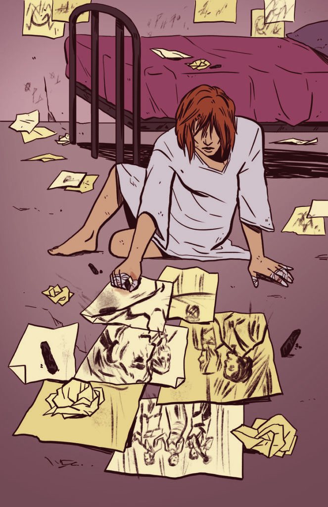
Trauma is at the heart of Red Mother, one that may just give a new definition to the phrase “seeing red.” The main character Daisy, lost both her boyfriend and her right eye to an otherworldly encounter. After losing a significant portion of her life, she goes through different forms of therapy. These treatments try to rationalize everything that’s happening to her, including seeing out where her eye used to be. Anyone familiar with these symptoms will likely try to find as much comfort as Daisy does. That is until they see the terrifying horror from the titular antagonist. What is this Red Mother’s motive, and what does a smiling figure have to do with it?
Art
Luckert inserts Red Mother Volume 1 with plenty of foreshadowing imagery. At the beginning of each chapter, the titular queen is forming without her right eye. The color red has a history incomics for signifying danger and its use throughout this trade reinforces that perception. Only Daisy isn’t letting her anger get the best of her despite the above phrase’s meaning. Rather seeing the world in red out of her missing eye has a dual meaning, one of frustration at not finding the answers she needs and a seductive calling towards Daisy. Given how frequently it appears and the fact that barely anyone reacts to Daisy’s panic with enough concern, it forces the reader to question who is trustworthy among Daisy’s peers.
Dukeshire uses lettering as he sees fit throughout Red Mother Volume 1. It’s very uniform, never going out of panel. Even the word marks that would shift out of normally seen boundaries are perfectly contained. In this case, it matches with the panels by Luckert. Everything seems fine and uniform like it’s all going according to the Red Mother’s design. Nothing that Daisy or any of her friends or potential helpers do seem to reach one another. It’s a transitional sense of isolation to a feeling of helplessness.
Get Hooked On Red Mother Volume 1
Red Mother Volume 1 is a puzzle that readers are encouraged to solve alongside the main character. With all of the back and forth moments where the reader feels the need to empathize with a woman in need, they emotionally invest in a great story—one where they might be compelled to seek out the next issue.
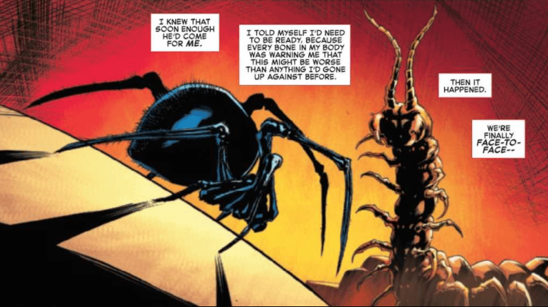
In The Amazing Spider-Man #52, out now from Marvel Comics, the confrontation between Spider-Man and Kindred has arrived — a battle that has been set up over dozens of issues.
About the Book:
We all knew this day would come. As his friends rampage through the city streets after being infested with sin by the demon Kindred, Spider-Man makes his way to once and for all end the wicked demon. But is Spider-Man powerful enough to stop the magical foe?
The Amazing Spider-Man #52 Story
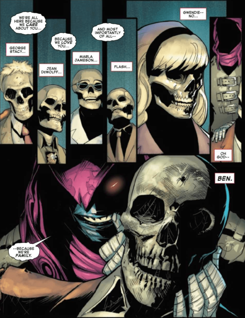
Nick Spencer’s long story finally reaches its climax in The Amazing Spider-Man #52, and it is easy to feel excited as the two foes clash. Spencer’s writing has done a remarkable job of building up to this moment, and it begins to pay off in this issue. Kindred is further characterized in this issue through some horrendous actions that cross a line many villains will not even go past. Kindred is vicious in the issue and maniacally toys with Peter’s emotions, making sense given the recent revelation about the character’s identity. In addition to the malevolent characterization of Kindred, this issue also features a shocking ending that leaves readers dying to purchase the next issue. Spencer is a master of writing serialized fiction and always knows how to make an ending leave the readers wanting more. Nearly every issue contains an example of this, and The Amazing Spider-Man #52 is one of the clearest cases.
Art
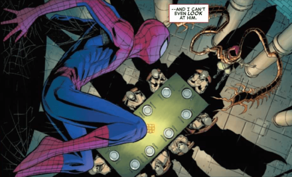
The art of Patrick Gleason is stunning in The Amazing Spider-Man #52. His spectacular forms bring the monumental battle between Kindred and Spider-Man to life and make the conflict feel truly epic. A wonderful part of the issue is that we can see more of the designs of Spider-Man’s friends while they are possessed. We had seen them on covers of issues, and we were able to see Silk in The Amazing Spider-Man #51, but we never saw drastic changes in most of the spider-powered heroes. That changes in this issue, where we see freakish versions of them all, and it is an utter delight.
Edgar Delgado’s coloring in The Amazing Spider-Man #52 is astounding. He uses a dark palette for the climactic battle, which perfectly fits the conflict’s tone and setting. As the setting changes in the issue, the palette does as well but can still retain the dark tone. Also, the backgrounds of many panels often have pleasant gradients that showcase Delgado’s talents exceptionally well.
The Amazing Spider-Man #52 has some brilliant lettering that adds to the work as a whole, thanks to VC’s Joe Caramagna. During the fight between Kindred and Spider-Man, sound effects are large, bold, and brightly colored, which does wonders to add to the battle’s intensity. The issue also features an uncommon use of lettering: as a means of censoring. The bold text overlaps an important action in the issue, which is a fantastic way to allow the reader to imagine the horrific image behind it. The lettering choice is similar to how the suspense in a horror tale is often more terrifying than the reveal, and it works phenomenally in the issue.
Conclusion
The Amazing Spider-Man #52 features the confrontation that Nick Spencer has been building towards for the entire series, and it does not disappoint. The art and coloring are astonishing, and the lettering considerably enhances the story. The ending is yet another brilliant cliffhanger that will leave you clambering to read the next issue.
I open with this disclaimer because it highlights one of the major difficulties with Comics Studies: a lack of clear definition. The discussion surrounding what Comics are and what Comics Studies means is such a contentious one that much of the Comics discussion has to start with it, thus eating into the larger conversation or analysis. And the outcomes are never substantial enough to be carried forward to the next project as a given. Instead, each new chapter of discourse has to start the argument again.
For example, in Bart Beaty’s book Comics Versus Art, he argues comics to be considered alongside a High Art form. Throughout his book, he highlights a problem inherent with this approach to viewing comics, in that by trying to define comics, more often than not, it removes comics from the high art discussion. It creates a contradiction. To include the history and recognizable aspects of the Comic form, you instinctively draw attention to the mass production and consumer aims of the early years of comics, which become synonymous with modern mainstream comics. This then limits your ability to hold them up against works of Art. Beaty reflects aspects of each world, the High Art World and the Comics World, and links these together in a collection of different ways. Still, he cannot convince us that the two Worlds will ever function as one without conflict or resistance if indeed they want to.
This kind of thing happens across all of comics scholarship: with each new definition, the investigation’s inherent bias removes some aspect of the Comic World from the table. Coulton Waugh’s The Comics from 1947, for example, avoids all reference to aesthetics instead of focusing on form and content. Hillary Chute turns her attention to what she terms a Graphic Narrative to champion non-fiction within the Comics World, praising the form in literary terms but limiting her view of the medium*. In both examples, the writers are not dismissive of the full range of comics on offer but only reference the aspects of the Comic World that best suits their argument. They are not the only writers to do this; in fact, most writers of Comics Studies subjects will be guilty of this to a certain degree: it’s difficult not to be.
Comics Versus Art by Bart Beaty
Let’s talk about Scott McCloud because it would seem that no discussion on comics can exist without his influence. McCloud is seen as one of the forerunners of Comic Studies, with his book Understanding Comics being one of the first examples of taking the medium seriously. Many articles will cite his work as such. However, there are two elements of this interpretation of his book that are problematic; firstly, it is by far not the first discussion on Comics Studies, and secondly, McCloud’s work is just as biased towards his own arguments as anyone else. Just as Waugh and Chute have to ignore or spotlight aspects of the Comic World to make their arguments, so does McCloud. He creates a definition for Comics, which allows him to include a wide breadth of visual imagery and produce a long and involved history for the art form. This gives Comics the weight of tradition and links the form to famous works of Art that are already accepted in society as High Brow or culturally relevant. The argument then becomes, if those pieces of work are accepted as High, or at least worthwhile, Art and we can link them to modern comics, then modern comics must also be worthwhile to study.
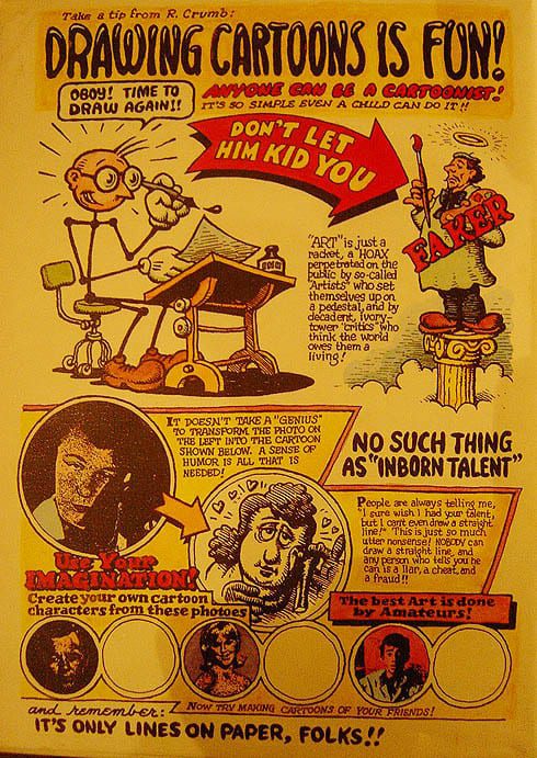
Not everyone would agree with this, including several cartoonists working within the industry. Robert Crumb was outspoken against Comics becoming part of a scholarly subject as can be seen in his 1969 comic strip ‘Drawing Cartoons is Fun’ which, as Beaty points out in chapter 3 of his book, visually attacked the idea by referring to Artists who ‘set themselves up on a pedestal’ and the dealers/promoters who are ‘pantywaist ivory-tower intellectuals.’ It becomes clear, especially when discussing comics with comics people, that there is no real desire to aim for the elitist heights of Fine Art or literature.
Drawing Comics is Fun, art page by Robert Crumb.
The importance of Comics Studies is not about the elevation of the Art form; it is about recognizing that there is an Art form there in the first place. Within Literary Studies, it is accepted that there are different degrees of the Novel. Some are seen as ‘worthwhile’ while others merely entertainment. The same is true in Film and Media Studies, and of course, fine arts like painting. There is an unspoken acceptance that some works of art will attain recognition and receive the capital ‘A’ while others will become a part of the general discourse, a way to help set the bar for excellence over the bland. The same is true of Comics, whatever definition of the form you decide on. Some comics will be printed, read, and discarded as nothing more than flights of entertaining fancy, while others will emerge out of the quagmire to be held aloft as fine examples of the medium. They will be remembered and studied for years to come, shining a light on Comics and what Comics can achieve.
Today, I believe that definitions of Comics are fed by the writer’s bias who, not from ill intent, wants to legitimize their own interpretations to champion their chosen texts. If this means focusing on a genre like Non-Fiction, or artistic process and style, then there is nothing wrong with this. As long as it is remembered that there is so much more involved, ranging from the pinnacle of Artistic achievement to the barrel scrapings of self-published propaganda. Comics are an art form unto themselves, difficult to define but easy to spot in a crowd**.
*In a later discussion in the pages of the PMLA journal, Chute defends her view of Comics and acknowledges that her essay Comics as Literature? Reading Graphic Narrative does focus on nonfiction as a point of analysis. However, she is not dismissing all other Comics or genres but instead using texts that illustrate the point she is making about Graphic Narrative and the reading as literature. I do not want to insinuate that her essay is narrow-minded because it is not, instead draw attention to it as an example of picking out of Comics what you need to prove a specific point.
**I have greatly simplified the argument in this article as the topic would require numerous studies, research, and discussions. However, as a place to start, and to make a point, a quick comparison of a few views highlights the road ahead, one that we can travel down or choose to ignore.
Doctor Who A Tale of Two Time Lords Credit: Titan Comics
Every Fan loves a good crossover, whether it involves a transporter accident and the meeting of characters from different generations or a multi-publisher Superhero Event story. The thrill of seeing different incarnations of characters interact is a joyous feeling that many people have experienced, especially in the Doctor Who franchise, where multiple Doctor stories have become a tradition among the various mediums. Starting way back in 1973 to celebrate the tenth anniversary of the television show, The Three Doctors saw William Hartnell, Patrick Troughton, and Jon Pertwee share the screen for the first Multi-Doctor Adventure.
The fascination with various incarnations of the Doctor meeting up and sharing adventures has never waned, and this year Titan Comics released the first crossover to feature the 13th Doctor, as portrayed by Jodie Whittaker in the show.
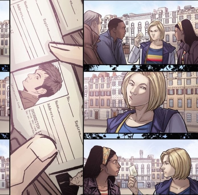
In the first arc of A Tale of Two Timelords: A Little Help From My Friends, the 13th Doctor stumbles across her past self, the 10th Doctor, who is currently stuck in the Swinging 60s. With Two Doctors come two villains, and for once, the Weeping Angels may not be the scariest creature wandering the street.
A Tale of Two Time Lords Volume 1, written by Jody Houser, drawn by Roberta Ingranata, and colored by Enrica Eren Angiolini, was released in October, and Monkeys Fighting Robots have been lucky enough to speak to the artists about the comic.
Doctor Who A Tale of Two Time Lords Credit: Titan Comics
Monkey Fighting Robots: Did having a successful first year on the comic make it easier to work on year 2, or was there greater pressure to be bigger and better?
Enrica Eren Angiolini: As far as I’m concerned, I felt much more pressure at the beginning of year one, since I was still very new to the world of Doctor Who. After the first few issues, that anxiety went away. The readers were always supportive, I know I have a great team on my side, and we all work really hard, so I was never stressed about Season 2.
Roberta Ingranata: There is always a bit of pressure; personally I always want to give my best, so the idea is to improve issue after issue!
MFR: With a creative team who have been working together for a while now, has the collaborative process changed much over time?
Angiolini: I wouldn’t say it has, no. We’ve always been close and very communicative: we began awesomely when Rachael Stott was on the pencils, and things didn’t change when Roberta joined in her place. We know we can rely on each other, and we work very well together.
Ingranata: It certainly got easier. Now we know each other better, it is easier to collaborate with each other!
MFR: The Thirteenth Doctor and her companions have had a bit more air time since you started on the comic, and the characters have had a chance to grow. Has this had an effect on the writing or art? Are there any changes that you’ve made as a reaction to the show?
Angiolini: Unfortunately, being based in Italy, I haven’t been able to watch Series 12 , as it is not yet available on any streaming platform in my country. I only watched the first few episodes released last year. I’m hoping that now that I’ll move back to the UK, I’ll be able to catch up. It’s a shame, because it’d be immensely helpful to be able to watch them, but I can only wait and hope.
Ingranata: Surely, they gave us many more references to work on, making our work easier. At first, there were few images online, now the internet offers many photos, gifs, and still images useful for creating pages!
MFR: In the new story, there are two Doctors to contend with. Was it difficult to merge the two different eras, and did you have to make any compromises to the storytelling to make it fit the style of both the 10th and 13th Doctor?
Angiolini: I think that the beauty of this arc comes exactly from the mix of themes and characters. There’s not really any particular element from one of the Doctors that clashes with the other; it all comes together as a crazy, fun adventure.
Ingranata: For me, it wasn’t very difficult; working on Jody’s stories is always simple. For me it was an honor to be able to design the Tenth Doctor; they are the two of my favourite Doctor’s, so seeing them together was wonderful!
Doctor Who A Tale of Two Time Lords Credit: Titan Comics
MFR: With two Doctors, four companions, and two popular ‘monsters,’ there is a lot going on. Do you have any favourite moments that you’re pleased you were able to get into the book? How much fun was it to play around in the background of one of the most popular Nu-Who story-lines?
Angiolini: Being able to contribute to such an epic arc was incredibly fun and a great treat! I think we have tons of brilliant moments scattered around these issues, but I just loved working on the two Doctors and their expressions, playing with their surroundings and switching from funky, fun vibes, to creepy and dangerous atmospheres.
Ingranata: Sure, to insert a new alien in the story was very nice; being able to draw an alien and invent it is fun and rewarding. Sure, when there are a lot of characters in a scene it’s hard to handle them, but it’s nice to be able to draw so many characters that I love.
MFR: The end of ‘A Little Help..’ has an amazing cliff hanger, one that equals some of the best classic episode endings, but there has been a long gap between the last issue and the next due in November. Did you get a break from the series or have you been working on it throughout the year?
Angiolini: We didn’t stop. The first 2 issues of this series were made back in Spring, then we worked on the 2 double issues of Time Lord Victorious, and then we finally took a couple-week break at the end of August/beginning of September, to then start working on the series once more. Breaks are very rare in comics: it takes about a month to make a full issue (from script to finished lettering), so taking breaks is often a privilege that many comic artists can’t afford unfortunately.
Ingranata: We have always worked around the numbers of Doctor Who!
MFR: And finally, what does the future hold for your Doctor? Is there anything you’re especially looking forward to, or is there something you really would like to do?
Angiolini: As a colourist it’s always a bit difficult to reply to these questions, as I have no idea where the story is going until I get a new script: we are very rarely -or never- involved in the planning of the plot, so I really don’t know what the future holds for us and the Doctor. The only thing I can say is that I hope we can continue to bring a smile on our readers’ faces and have fun while doing so!
Ingranata: I can’t spoil, but my dog has the name of a character who appeared in an episode of the twelfth season of Doctor Who, and I drew it just today on a page. For me it was an honour and a sign of destiny!
Thank you to Roberta Ingranata and Enrica Eren Angiolini for taking time out of their busy schedule to talk to us. Doctor Who: A Tale of Two Time Lords Volume 1 is available now from your local comic/book shop.
Outer Darkness/Chew is a crossover comic series by Image Comics published in a trade on September 9, 2020. The book is surprisingly appropriate for both series’ tones. Both series creator John Layman works with his co-creators Afu Chan (artist of Outer Darkness) and Rob Guillory (artist of Chew) for hijinks, with some assistance in lettering by Pat Brosseau.
Background
Outer Darkness is about the crew of Starship Charon, a USS Enterprise-like vessel that encounters the occult. This includes Cosmic Horrors, similar to Lovecraft monsters. Chew revolves around Tony Chu, a health investigator who gets psychic impressions of whatever he eats. This includes acts of cannibalism. Despite these horrifying premises, Layman turns them into black comedy for over-the-top jokes. So what happens when you put two spiritually similar series together?
Outer Darkness/Chew: Self-Awareness
Outer Darkness/Chew begins in a pretty typical circumstance for crossovers; one side needs help from the other. The Charon crew summons Tony (and John Colby) for help in a situation requiring his abilities. One would expect this to be possible through things like time travel since Layman is writing this. It isn’t, but anything specific would be spoilers like Colby does when he gathers intel about their situation. The Chew cast really steals the show thanks to their sense of awareness and quirky personalities, unlike the Outer Darkness crew, where despite the interesting setting, are mostly just played for gags. It’s nice to see characters like Outer Darkness’s Chief Exorcist Malachi Reno act accordingly to Colby’s smarmy dialogue with a punch to the groin. Because you can only do so much with Star Trek parodies, deaths of characters nobody really cares about, and an irresponsible captain getting away with it.
Art
The art shifts between Afu Chan and Rob Guillory display both the tone and attitude of the story. Chan’s style looks more serious with its detailed anatomy, expressiveness, and overall dark environments. It really displays a calm, if not an apathetic, aesthetic that gets occasionally interrupted by a sudden emotional scene, unlike Guillory’s more bright and cartoony aesthetic. In fact, the clever use of Tony and Colby’s transport into Outer Darkness perfectly foreshadows the background theme. This results in a change in art styles resembling going through drafts. It also demonstrates how, despite the change, Tony and Colby don’t really fit in. Outer Darkness is about one-time gags, unlike Chew’s propensity for things biting back, hence why the apathetic atmosphere in Outer Darkness threatens the Chew characters.
Layman and Pat Brosseau take turns in lettering in Outer Darkness/Chew. If past reviews are any indication, Brosseau does his timekeeping pace through the dialogue. Layman is more than likely the one doing the captions with self-referential humor. Each with styles that seem appropriate for the task at hand. Yellow and black captions for issue references and stylistic captions for a holographic England setting. This helps bring out the humor between the ensuing story.
Outer Darkness/Chew For Layman Fans
In all considerations, Outer Darkness/Chew represents something about John Layman. His self-awareness allows him to muster any trope or cliche and bring out the most absurd aspects. This allows him and his co-creators to break the rules of storytelling convention and play them to their beats. One that brings out the strengths and weaknesses of two series. It actually wouldn’t be a stretch to say that this series might’ve pushed for the development of Chew’s sequel Chu.
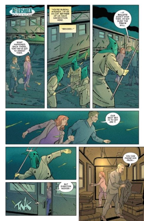
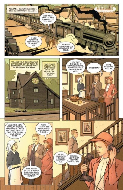
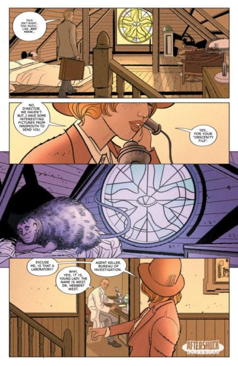
MISKATONIC #1 hit your local comic book shop yesterday, and issue two drops on December 16, but thanks to AfterShock Comics, Monkeys Fighting Robots has a four-page preview for our readers.
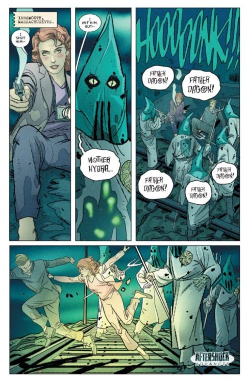
The book is written by Mark Sable, with art by Giorgio Pontrelli, Pippa Bowland drops some color, and you will read Thomas Mauer’s letter work. Jeremy Haun, with Nick Filardi worked on the main cover featured above, and Tony Harris created the incentive cover. About MISKATONIC #2: Miranda Keller has been sent to the Miskatonic Valley to investigate a series of killer bombings targeting the community’s elite. She’s convinced that radicals are to blame. But her partner, Tom Malone, a retired Brooklyn detective, sees connections to a supernatural event in his past that left him scarred and scared, leading the pair to an occult conspiracy that pits them against forces from beyond this world.
PREVIOUSLY – Miskatonic Valley holds many mysteries – cultists worshipping old gods, a doctor deadset on resurrecting the recently deceased, a house overrun by rats in the walls – but none more recent than a series of bombings targeting the Valley’s elite.
These horrors reach a breaking point when the brilliant, hard-nosed investigator Miranda Keller is sent to stop the bombings. To J. Edgar Hoover, there can be no other explanation than those responsible for similar actions during the Red Scare of the 1920s…but when Miranda digs too deep; she uncovers an unimaginable occult conspiracy, one that may cost Miranda her job – and her sanity.
From writer Mark Sable (WAR ON TERROR: GODKILLERS, Graveyard of Empires) and artist Giorgio Pontrelli (Dylan Dog), MISKATONIC is a mix of historical crime fiction and Lovecraftian-horror that dives deep into the American nightmare.
Did you read MISKATONIC #1 this week? Comment below with your thoughts.
ITHAQA #1-3 is the first part of a self-published series by writer Michael Watson, artist & co-creator Theresa Chiechi, and letterer Lucas Gattoni.
About the series:
In ITHAQA, filmmaker and conman Mookie Smitts discovers the horrible Eldritch Truth of the cosmos, as a moving picture he is struggling to produce in the 1920s accidentally uncovers a plot to destroy the Spacetime Continuum.
Writing
Watson’s non-linear approach to this story makes this comic feel truly mysterious and engaging. Each issue operates in the same manner. It opens and ends with a scene featuring one of the main characters talking to a detective after the event called “The End of Time” has already happened. The reader doesn’t know what this incident entailed or what its name means. But, it’s clear to us this incident has changed the main characters’ lives dramatically. The End of Time scarred them all forever- some in subtler ways than others. By setting up the mystery so well, Watson keeps the reader guessing. Conjuring up the theories as to what it all means becomes part of the fun.
This non-linear approach does make for anticlimactic endings. But, between the beginning and the end, we experience and learn many new things. So much so that the ending serves as some kind of breather from the panic and chaos taking place throughout each chapter.
Art
Chiechi’s artwork is gorgeous. The facial expressions are well-drawn, the colors manage to establish the mood well for the reader, and the artwork’s style has a Disney touch to it, which oddly works. But, her mastery of costume design is what’s truly admirable here. Anything the reader wants to know about a character’s personality, they can find out by looking at how this character dresses. Hazel, the group’s optimistic, gullible girl, almost always sports a red bucket hat, which seamlessly elevates her naiveness and makes her look like a child. The rebellious Margaret always dons a long, red skirt; The red so bold and courageous, it beautifully captures her toughness and stubbornness during these unforgiving times.
Chiechi’s artwork definitely succeeds in impressively embodying the spirits of the 1920s. But, where it doesn’t quite work are ITHAQA’s terrifying, supernatural sequences. When the time comes for Chiechi to outright scare the reader, it feels like Chiechi pulls her punches and doesn’t deliver on the real horrific images we’ve all been waiting to see.
Lettering
Gattoni’s lettering gives the creative team a crude nudge in the right direction in terms of tone and style, and then some. Except for a few odd balloon placements, Gattoni knows exactly how to further immerse the reader in the story’s world. It’s clear Gattoni had a lot of fun with designing the balloons, captions, and sound effects. Especially the balloons when a character casts spells in an unknown language; They look so otherworldly and chaotic; the reader almost feels like the spelling is being cast on them. Noteworthy work here from Gattoni.
Conclusion
It’s easy to forget ITHAQA was made during this last decade. Everything about this comic just sucks the reader into its world without ever breaking the ultimate spell, the suspension of disbelief. The mystery grows bigger and stronger with each chapter to a point where the reader can’t help but try to figure out for themselves what’s about to happen next. Strongly recommended for fans of Lovecraftian horror and stories about the days of the past.
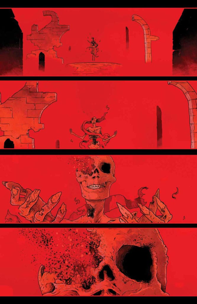
X OF SWORDS – STASIS #1 serves as the calm before the storm, as Krakoa’s champions make their way to the Starlight Citadel, and readers find out who the champions of Arakko are. We are also served another helping of tarot readings about the fates of the sword-wielders from Krakoa and discover that the person leading the forces of Arakko behind the Helm of Ameth is none other than Apocalypse’s long lost love Genesis (which if you read her dialogue up until that point, you can sort of figure it out before her face appears).
But despite all of those revelations, this piece really isn’t about those, but rather an obscure but important part of Hickman’s run that receives explanation here.
Fans may forget that Arakko was first mentioned all the way back in Powers of X #4 (so for better or worse, THIS is the story Hickman and company wanted to tell). Arakko first appears in the present day, however, in X-Men #2. If you’re like me, you might’ve found this story, taking place in Hickman’s second issue, to be a bit random. In fact, I was a bit put off by it and wondered why such an obtuse story was taking place so early in this new run, but I forgot that Hickman plays a very long game when he plans a run. In hindsight, when read as a whole, this series will probably hang together very well.
In X-Men #2, Cyclops and his children discovered another island heading toward Krakoa, which merged with it. They found Summoner on this island, revealed to be a piece of Arakko.
In Stasis, readers learn that Summoner had requested that Arakko give up a part of itself to fulfill his ruse, with the promise that it would ultimately lead to Arakko’s reunification with Krakoa.
Whatever game Saturnyne may be playing, and whatever the intentions of Arakko’s inhabitants to kill Krakoa’s inhabitants or those inhabitants’ intentions to defend themselves, Arakko and Krakoa are playing their own game, one which will most likely end with them being rejoined and the status quo of Krakoa altered in Hickman and company’s next phase of storytelling.
Project 45 #1 published last month, is the first comic from a new indie publisher Enigma Resolve created by founder Kal Mebane. It’s a throwback to the late 80s and early 90s sci-fi animation. Joining Kal is his co-writer Yelena Mebane, co-penciler Jay Hernandez, and inker Jake Isenberg. The comic is available on their website store in multiple formats, while Comixology and select comic stores have the full-color version.
Project 45 #1 The Setup
Kal and Yelena Mebane have Project 45 #1 go at their own pace. Like most military conflicts, the antagonists reveal themselves by attacking without warning, not unlike terrorists. After this attack is a transition to the military school of the main cast, a school favoring diplomacy no less, with the antagonists not favoring this, the reader might feel a little anxious about what’s coming. As they get to know POV character Carmen Ariez the reader can immediately sympathize with her rough start. Because for a school that specializes in diplomacy, the students don’t seem very welcoming. For all of her troubles, Carmen gets hit in the face with slime and is in a group with the school’s problem children.
The titular Project 45 all seem very rough around the edges with their record as underdogs and attitude problems. But then again, the best group Project 12 are elitists who, with subtle context, flaunt their status at Carmen. It’s tough not to empathize with her when she crawls up in a fetal position on her bed. That being said, Carmen and the rest of Project 45 may have the chance to prove to everyone when the antagonist targets one of their teammates.
The Extra Important Details
Kal Mebane’s best ability in Project 45 #1 is in the awe-inspiring artwork. Every scene in the issue evokes stylizations similar to 80s sci-fi anime like Mobile Suit Zeta Gundam. With so many character designs, settings, and intricate space backgrounds, it’s good to have Jay Hernandez backing him up. The opening scene of a pyramid spaceship is filled with an inner-city that looks like something out of 5555 Interstella. It not only looks good, but there was an entire culture of people thriving, which by the time the antagonist’s attack creates a sense of tragedy.
As the inker, Jake Isenberg has to bolden the significant plot points on characters because some of the backgrounds would be too distracting. Because Mebane’s colors give such intricate detail to galaxies and machinery is highly mesmerizing. Take a moon-sized base, so large and black the design is perfect for stealth in an already gigantic amount of space because it displays the need for these villain’s secrecy against the intergalactic military; despite how confidant some of the supporting villains sound, they’re still in a vulnerable state.
Lettering
As a letterer, Mebane is both creative and efficient, word balloons that sometimes get a red outline to display the volume of voice and wordmarks that look crafted for specific tasks. Almost none of those wordmarks they’re for the same action; save for instances like mechanical reactions to other actions, including a bionic arm adjusting for weapon mods or a cyborg reacting to a sneak attack. The ending wordmark, in particular, brings up similarities to a classic 80s neon sign to stay true to the influences of Project 45 #1.
Project 45 #1: A Rocky But Good Start
Project 45 #1 sets up what can become a tribute to several fan-favorite sci-fi shows. The aesthetics paint a universe ready for the readers’ pleasure, especially thanks to villains ready to ruin it all. With them coming for the underdog team of Project 45, anything can happen.
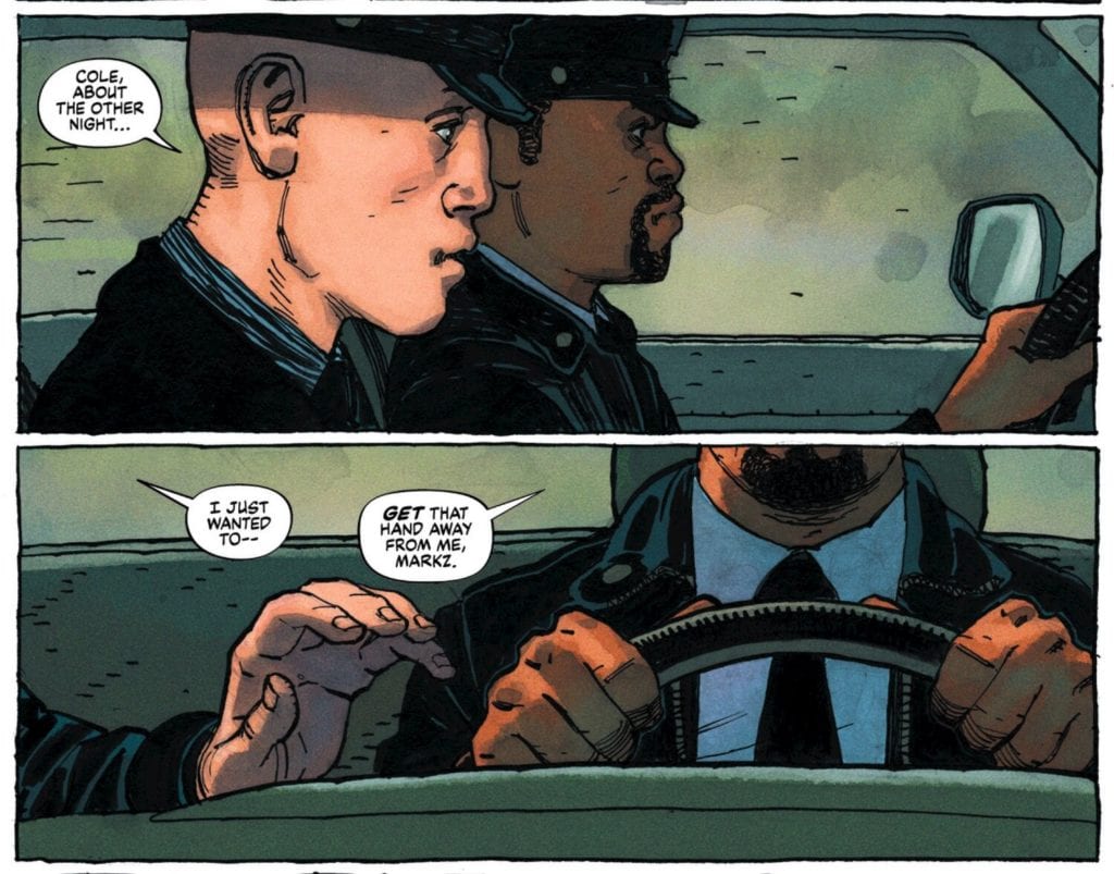
Written by Jeff Lemire and Tate Brombal, with art by Gabriel Hernandez Walta, colors by Jordie Bellaire and letters by Aditya Bidikar, Dark Horse’s Barbalien: Red Planet #1 doesn’t skirt the issue. Set during the AIDS crisis, we follow Mark Markz. Markz is both secretly a Martian and a closeted homosexual. Thanks to Markz’s shapeshifting powers, he works as a cop in the day and flies around as the vigilante Barbalien at night. Watching the gay rights movement gain momentum, Markz finds himself on the other side of the baton. This creative team creates a story that’s poignant and moving, but also gentle and empathetic.
Writing
Lemire and Brombal are clearly passionate about gay rights and angry at how the early days of the gay rights movement was full of police brutality. But Lemire and Brombal don’t let their passion get in the way of subtle storytelling. They empathetically step into the shoes of someone who feels caught in the middle. Barbalien, Mark Markz, is stuck between wanting to fit in and wanting to embrace who he is. He’s a gay cop, helping stop the gay rights movement.
Through the voice of the activist Miguel, Lemire and Brombal get the opportunity to voice how they feel about the injustice. Miguel rails against the system and the tragedy, and he does so powerfully. It’s on-the-nose, but it’s a rally. People don’t mince words in rallies. Meanwhile, on Mars, Lemire and Brombal set up blood types as being a sign of a Martian’s standing. This idea that blood could be clean or dirty perfectly sets up the prejudice we see on Earth in the AIDS crisis. So for every shout from the rooftops, Lemire and Brombal have a sly wink and a careful nudge.
Art
Walta makes us feel trapped. Using a 9-panel grid, Walta shows Markz’s usual routine. In the left hand column, we see Barbalien rescuing a child from a burning building. In the middle column, Office Mark Markz helps a woman who is being mugged and gets her home safe. The final column shows Markz at home, flipping through channels on TV. Because Walta sets this up in columns, instead of rows, it feels like we’re watching the same events being repeated. Even though we’re just following Barbalien into one burning building, Walta gives us the sense that these things are just part of Markz’s day-to-day. It might be a different kid or lady, but Markz is always helping, and coming home to a lonely house. Just as the page makes us go “hey, why are we watching this happen again?” we feel Markz’s own irritation at the redundancy of his life.
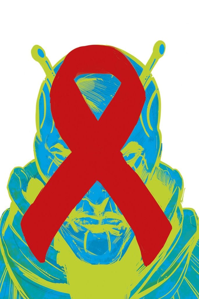
Coloring
Bellaire doesn’t want us to forget what this issue is really about. Like an AIDS ribbon, we see the color red pop up over and over. The protestors wear it and have it on their signs, Miguel wears red shoes, Barbalien has red skin. It becomes almost a haunting color. A color that represents more than just AIDS, it represents the blood of the gay rights movement. So when Office Mark Markz saves a woman in a red coat, being mugged in front of red graffiti, it’s as though he can’t get these people out of his head. When Markz finally leaves his lonely, blue apartment, he finds an underground club. The colors of his blue loneliness and the blood and sweat of the gay rights movement merge to create a beautiful purple. Markz brings his own pain to the table, and these new people he’s met bring theirs, and together they make something beautiful.
Lettering
Bidikar’s sound effects have subtle differences to them. This allows the issue to have a uniform feel, while also making sure each sound seems unique. A remote control doesn’t sound like a car screeching to a halt, but the overall style of the lettering remains the same. But Bidikar switches it up when lettering the Martians. Their words, even the sounds they make, are different. It’s interesting that we don’t see Barbalien talk in these scenes. It begs the question, how would Barbalien’s lines be lettered? Instead, we only have Barbalien’s lines on Earth to go by. They’re lettered the same as every other earthling. It again highlights how Markz is stuck between worlds, literally in this case. Markz is neither fully Martian nor fully human, he simply is.
Dark Horse’s Barbalien: Red Planet #1 has all the passion of a rally cry delivered with subtlety and finesse. Lemire, Brombal, Walta, Bellaire and Bidikar create a stunning first issue. Barbalien: Red Planet #1 is empathetic and beautiful. Pick it up, out from Dark Horse November 18th, at a comic shop near you!


 Luckert inserts Red Mother Volume 1 with plenty of foreshadowing imagery. At the beginning of each chapter, the titular queen is forming without her right eye. The color red has a history in comics for signifying danger and its use throughout this trade reinforces that perception. Only Daisy isn’t letting her anger get the best of her despite the above phrase’s meaning. Rather seeing the world in red out of her missing eye has a dual meaning, one of frustration at not finding the answers she needs and a seductive calling towards Daisy. Given how frequently it appears and the fact that barely anyone reacts to Daisy’s panic with enough concern, it forces the reader to question who is trustworthy among Daisy’s peers.
 Dukeshire uses lettering as he sees fit throughout Red Mother Volume 1. It’s very uniform, never going out of panel. Even the word marks that would shift out of normally seen boundaries are perfectly contained. In this case, it matches with the panels by Luckert. Everything seems fine and uniform like it’s all going according to the Red Mother’s design. Nothing that Daisy or any of her friends or potential helpers do seem to reach one another. It’s a transitional sense of isolation to a feeling of helplessness.


 Kal Mebane’s best ability in Project 45 #1 is in the awe-inspiring artwork. Every scene in the issue evokes stylizations similar to 80s sci-fi anime like Mobile Suit Zeta Gundam. With so many character designs, settings, and intricate space backgrounds, it’s good to have Jay Hernandez backing him up. The opening scene of a pyramid spaceship is filled with an inner-city that looks like something out of