

Pantomime #1, out now from Mad Cave Studios, is the first issue of a crime miniseries about a group of deaf teens who get in over their heads when they foolishly steal from the wrong person.
Writing
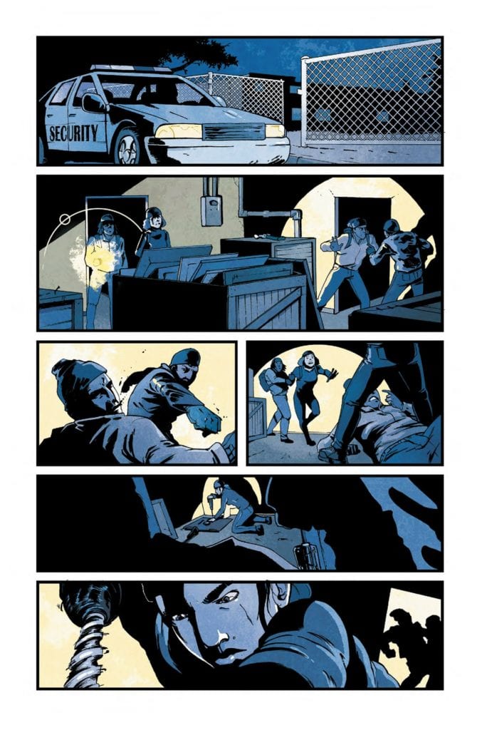
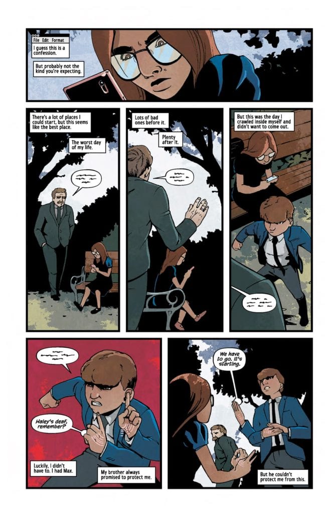
Christopher Sebela gives us a beautiful, engaging story from start to finish. The story’s pace never feels dragged out. Everything flows naturally and elegantly. Sebela throws the reader right into the action with two silent pages, which essentially tell us what this miniseries is about. The heist sequences are thrilling and well-thought-out. The ending surprises the reader and keeps them guessing what will happen next to this loveable group of kids. Each main character has their own voice, strengths & weaknesses, and the thing they excel at. It was also a great, realistic touch to see how these kids slowly get addicted to the adrenaline boosts these heists give them. The characters Sebela created together with the artists are so believable and three-dimensional; the reader can’t help but feel a genuine, strong connection to them. 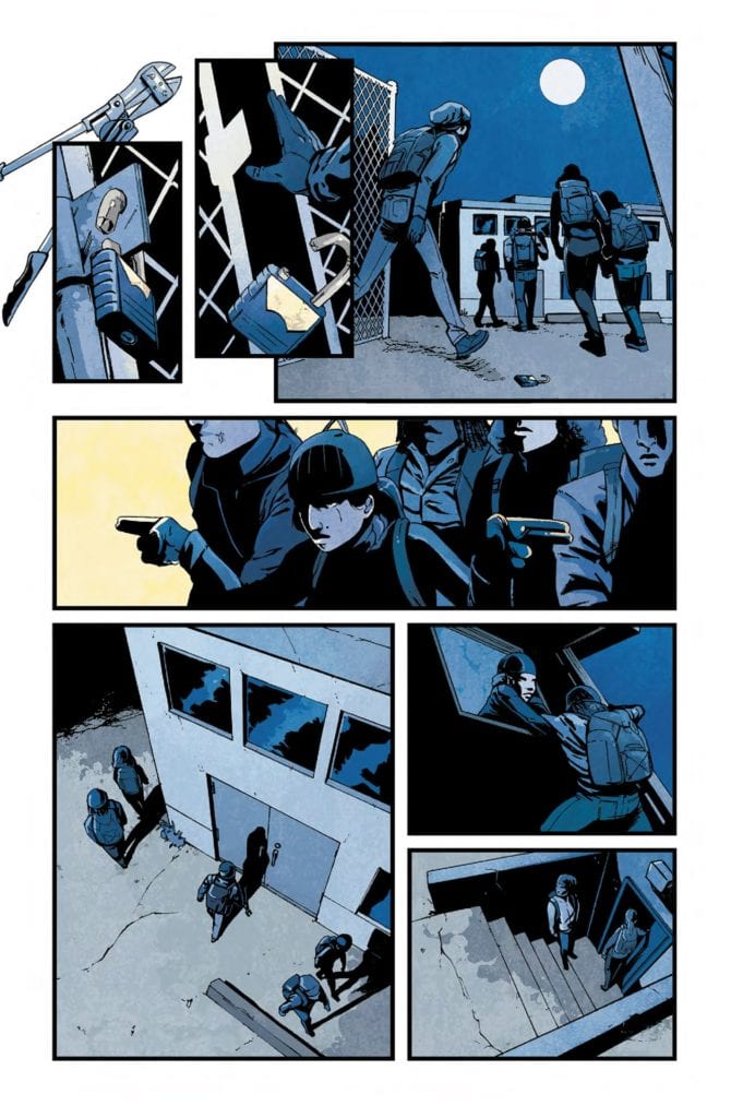 Art
Art
David Stoll‘s fantastic art and the story fit like a glove. The characters are instantly recognizable. Each character has their own head shape, their own unique features. The panels’ backgrounds can be too empty at times, but it still works here because Stoll chooses to focus more on the acting, which looks great. The reader can understand very quickly how the characters feel at each moment. The art looks realistic, but it still manages to come off as stylish and unique. But most importantly, the way Stoll overcomes the challenge of showing the characters speaking in sign language without splitting the pages into too many panels is simply brilliant. He draws the movements in a way that isn’t distracting or confusing to the reader. With his incredible work on this first issue, Stoll leaves the reader amazed and wanting more.
MFR ON YOUTUBE (latest video)
Help us reach 5K Subs!
Coloring
The coloring by Dearbhla Kelly pairs swimmingly with Stoll’s art. Kelly captures Haley’s (the main character and narrator) point of view brilliantly. When she wants the reader to feel sad for Haley, Kelly uses dark and cold colors to set the grim mood. But, when she wants the reader to fall in love with the special needs academy and the new dynamics between those funky kids, Kelly uses bright and warm color tones, which allow the reader to take a look at the world through Haley’s eyes. It makes us feel exactly how Haley feels while she’s narrating the story. More specifically, there is a double-page spread where Haley tells the reader about each group member and their backstory. To distinguish each character, Kelly colors the panels in a monochromatic palette, and the specific character is colored in different, contrasting colors. It’s a smart choice that effectively smoothes out the reading experience.
Lettering
Justin Birch cleverly chooses a font with both uppercase and lowercase letters, making Pantomime #1 feel a lot more modern and fresh. Birch carefully places his balloons and caption boxes in an order that is easy to follow. He also usually makes the spoken dialogue indecipherable, which puts the reader in the same shoes as the deaf kids. It helps us understand their inner world a bit more. His choice to pull the balloon tails all the way to the kids’ hands when they speak in sign language works well here and never confuses the reader.
Conclusion
You can tell this comic is close to the hearts of everyone involved. Each creator, in almost perfect harmony, beautifully complements and compliments the various elements of this comic. Pantomime #1 is a perfect example of why representation matters—a perfect example of how it can make for one of the most unique reading experiences of 2020.
Highly recommended to anyone interested in viewing the world through a fresh, different lens.