
Origins #1, out this week from Boom! Studios is a “biopunk sci-fi tale that explores what happens to our planet in a post-human world, and the impact of Mother Nature on the tech our disappearance will eventually leave behind.”

Writing
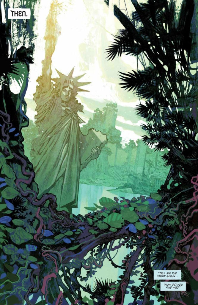
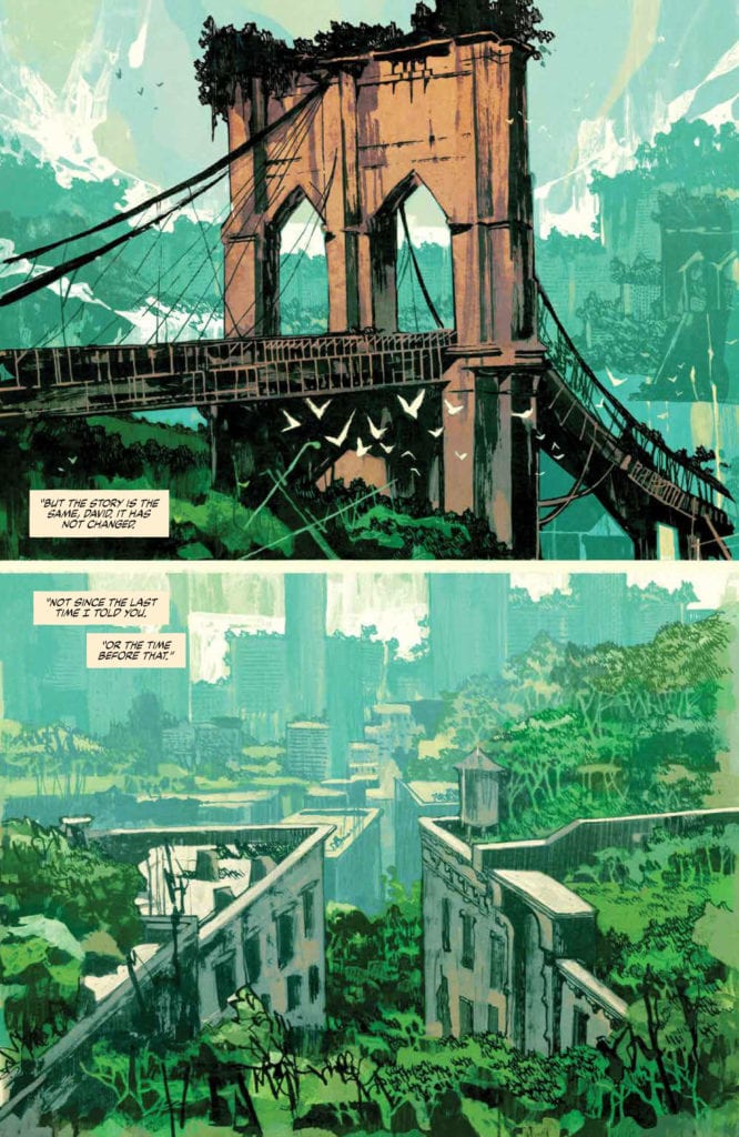
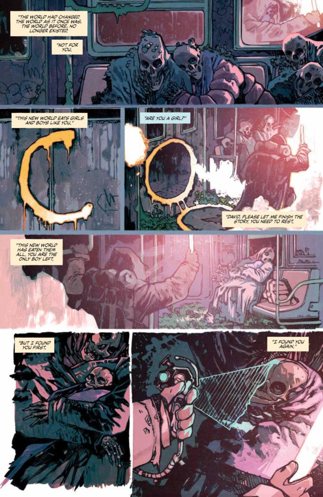
The issue opens with establishing panels of the world where the story is taking place. It’s the real world, but something has changed. While we’re glancing at this strange, new world, a conversation occurs between an adult and a child, Chloe and David respectively. Chloe tells David the story of how she found him; The flashback playing out in front of the reader. Chloe finds a dead boy at an abandoned train and uses futuristic technology to bring the child back to life. When David lets out his first cry, Chloe swears to protect the child at all costs until he’s ready to return to his legacy. “Your past is your future,” she announces. This opening sequence works well. It keeps the reader immersed and curious about the world and the two main characters. Unfortunately, everything following this sequence is where it all goes downhill.
The story then jumps forward in time to the present, and the reader gets a page and a half-filled again with establishing panels. Taking place over four pages, the establishing panels at the start were more than enough for the reader to understand the look and the feel of the world where the characters are living in. So, the choice to focus on this world once again made the story feel a little dragged out.
In addition, the ending doesn’t have any real cliffhanger. Except for a one-page fight scene against a flying dinosaur, this issue doesn’t offer anything exciting enough to justify the anticlimactic ending.
But most importantly, Chapman focuses too much on plot and exposition to create any real connection between the reader and David. The reader doesn’t get enough time to learn about David’s motivations. To learn about his fears and how he feels to be the “chosen one.” We virtually know nothing about David.
Chapman created a rich world despite everything mentioned before, which still manages to ignite enough interest in the reader, making them curious to see where Chapman will take the story next.
Art
Origins #1 has the artwork of Judas artist, Jakub Rebelka. Rebelka draws his backgrounds and locations in great detail. The unique panel borders make the pages look animalistic and energetic. His costume designs fit in well with the post-apocalyptic atmosphere. There’s no denying that Rebelka’s art is good and effective. But, it can feel a bit uninspired at times. David’s face looks inconsistent, especially as an adult, and the acting looks too subtle to capture how the characters truly feel.
Coloring
The colorwork by Patricio Delpeche is arguably the best part of Origins #1. Delpeche offers a great use of monochromatic palettes, which helped to immerse the reader in the story right from the start. It gives the pages a grim look that works here with the story’s biopunk, dark themes. He uses the light sources at his disposal cleverly. Everything looks and feels surreal and realistic at the same time.
Lettering
As for Jim Campbell’s lettering, it’s great. Campbell seems to understand the post-apocalyptic vibes perfectly. He chooses to place his balloons without a stroke, which works well here. The balloon tales are a joy to look at. What sometimes doesn’t work are the sound effects. Specifically, where the flying dinosaur appears, the sound effect’s font and design don’t seem to match the dinosaur’s prehistoric, spooky look. Campbell is well known for his great lettering work, but it feels like there weren’t enough opportunities for him in the script to show the reader how amazing his work can be.
Conclusion
Origins #1 certainly shows it has the potential to be great. Despite a dull story, the creative team still manages to create a rich world that keeps the readers engaged. The art looks great, but the script doesn’t offer the art team enough chances to shine. Recommended for hardcore fans of futuristic, post-apocalyptic tales like the Planet of the Apes franchise.