Home Blog Page 166

Review: GODZILLA: MONSTERS & PROTECTORS #1 Emerges With Promise

Godzilla

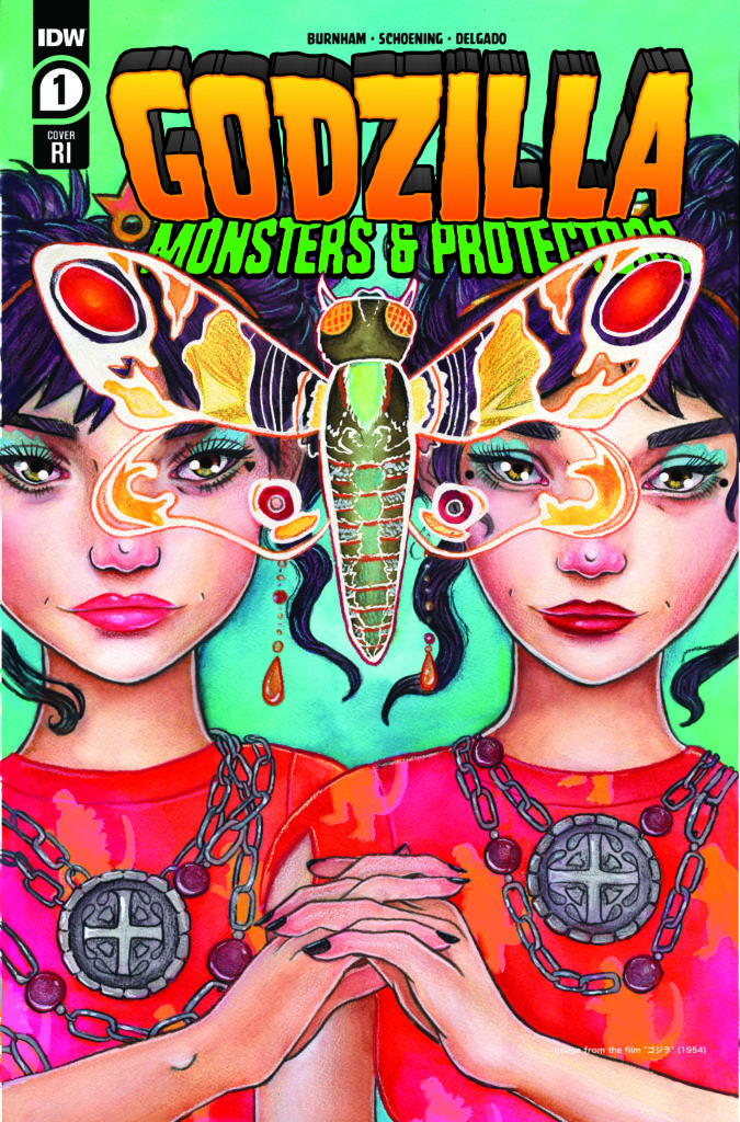
Godzilla: Monsters and Protectors #1 comes out this week from IDW Publishing and marks Godzilla’s return to the publisher. This new installment comes out on the release of the highly praised film, Godzilla vs. Kong and aims to be a promising series for young fans of the classic monster. The return of the King of the Monsters is brought to life thanks to Erik Burnham (writer), Dan Schoening (artist), Luis Antonio Delgado (colorwork), and Nathan Widick (lettering).

Summary

When a coldly single-minded businessman uses an untested element to create clean energy for a profit, he inadvertently awakens the beast from the deep–Godzilla! Sensing the harm the new energy poses to the planet, Godzilla attacks the heart of the problem–humankind!

Godzilla

Writing

From the very first page, it is apparent this series is obviously intended for a younger audience. The juvenile cast members standing in front of Godzilla on one of the covers should have made this obvious. Still, Godzilla has many roles throughout the years, such as being a hero of the Earth or an alpha predator meant to keep other monsters in line. This is the appeal of Godzilla, he is a character who has been used in many stories for many different audiences. One of his films, Godzilla’s Revenge (aka All Monsters Attack) featured a kid having adventures with Minya, Godzilla’s son. This is a long way of saying don’t dismiss this series just because it is for younger readers.

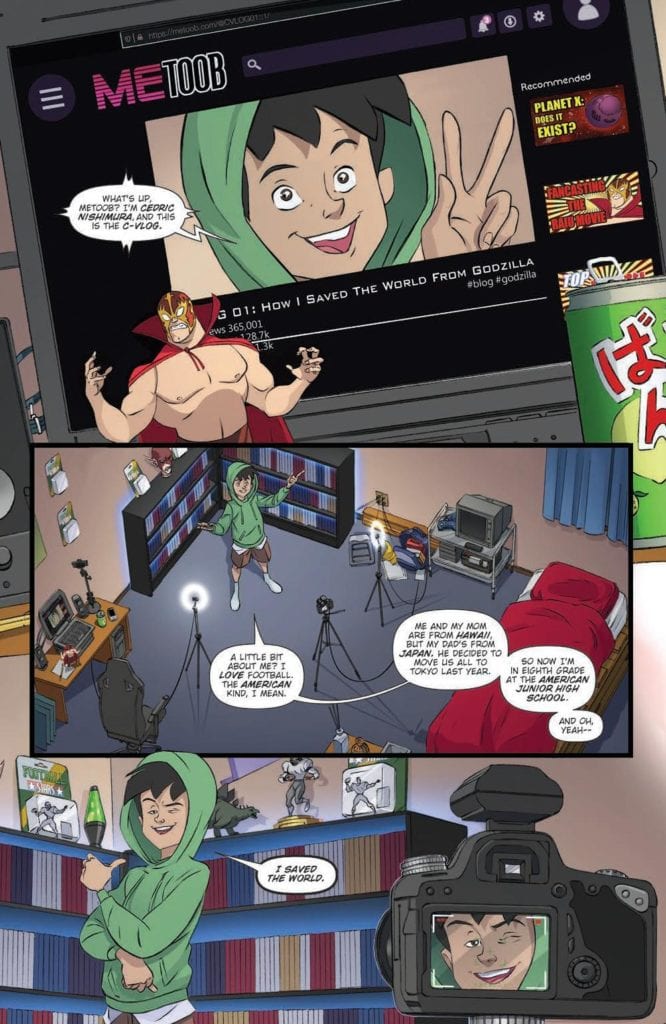
The story features an 8th grader named Cedric who insists he helped save the world from Godzilla. The King of the Monsters appears when a company tries an experimental power source and it upsets nature. It casts Godzilla as the Earth’s immune system, showing up to take down threats against the planet (much like in Legendary Entertainment’s Monsterverse). The story has an immediate feel of a Godzilla comic and is off to a good start introducing the world and the characters affected by Godzilla’s attack. Overall, the first issue has the making of a fantastic Godzilla story.

Godzilla

Artwork

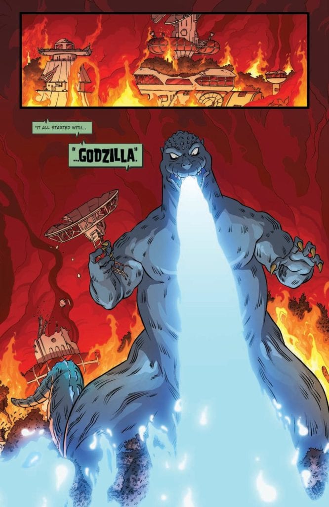
The art by Dan Schoening helps to make the book feel like it was meant for a younger audience. Instead of being presented as a being of nightmares and destruction, Godzilla is still recognizable but resembles versions of the character from the later Showa series. The carnage displayed through the artwork makes it abundantly clear this version of Godzilla may look softer but is just as destructive.

The coloring by Luis Antonio Delgado adds a vibrant element to the story. From Godzilla’s signature atomic blast to the destruction created in the wake of his advance, all of it has an eye-catching look. It is all thanks to the intense energy the colorwork provides to the issue.

Godzilla

The letter work by Nathan Widick adds a perfect audio aspect to the issue. The impressive sound effect work is able to perfectly capture the sound of Godzilla’s iconic roar. The use of letterboxes aids in helping direct the reader in a fantastic two-page art splash detailing Godzilla’s path of destruction. It is one of the best moments of the entire issue.

Conclusion

Godzilla: Monsters and Protectors #1 is not the ideal series for fans of more mature Godzilla stories but this is because it is intended for a different audience. The protagonist is young but the look and story of the comic make it feel like a standard Godzilla story. It may not be the ideal cup of tea for many in the Godzilla fandom, but please try to approach it without a dismissive tone. After all, everyone deserves to enjoy Kaiju.

Monkeys Fighting Robots Youtube

Review: Everybody Has An Extra Body In RAIN LIKE HAMMERS #4

Brandon Graham starts bringing together his endgame with “Rain Like Hammers” #4. This is undoubtedly the most audacious issue of this story yet, with the insane plot twists and threads all coming together like mind-bending clockwork. Graham’s surprising emotional core carries this issue along with his unexpectedly intelligent writing, clever humor, and unmistakable visual style, and makes the wait for this series’ finale an enormously difficult one.

“Supercriminal Brik Blok plans to steal a high-ranking aristocrat’s fingers and use them as keys to access the palace-world’s deepest sub-levels. Elsewhere, a detective working for the Immortals, and his sexy-sex robot assistant, are traveling across the solar system to investigate the strange happenings on Skycradle. SCI-FI FINGER BUTCHERY IN FULL COLOR!!”

Writing & Plot

Brandon Graham’s obfuscated and careful plotting in this tale starts to wrap itself up in “Rain Like Hammers” #4. The full scope of what each character represents and who they really are is shown in its entirety for the first time, with a series of  flashbacks and twists that are totally insane yet brilliantly put together. The generally loose and ever-changing rules this comic’s world has allows for such crazy twists – which involve clones, birthing oneself, and implanting consciousness into another body – to be totally reasonable in this universe. These moments also have a surprising amount of emotional resonance, as the buildup through what these main characters have gone through makes these revelations very satisfying. Graham’s trademark humor is still here, but it’s a bit more reserved going into the series finale. The story also finally gets a single antagonist in the form of a sexually charged detective (also the source of most if this issue’s humor), but while his addition is welcome, the story’s focus on the larger picture makes it clear that there has always been a more major, societal enemy in play here. I desperately look forward to how Graham decides to end this wickedly fun romp in the stars.

Art Direction

While it seems almost impossible, Brandon Graham’s visuals seem to reach new heights and complexities in “Rain Like Hammers” #4. The way Graham knits together this issue’s time and consciousness-jumping narrative, along with the seemingly enhanced animations and emotional details in the cast this time around makes this issue a true gem among uh… a bunch of other gems. Graham’s quirky designs for his characters and myriad alien beings will never get old, and he’s constantly coming up with new ones. His mixture of Seuss-ian and Moebius-esque architecture is an unmistakable sight to behold, with Skycradle’s cityscapes having a sort of abstract familiarity like it’s being seen in a strange dream. His panels here are an artfully inconsistent range of large and small sequential images that bleed together. His muted colors bounce all over the place, in a way that remains colorful and vivid but also deceptively bland (but in a meaningful way). This comic feels like a puzzle of visual storytelling, with the images in this plot unlocking the pieces of a massively meaningful plot with every turn of the page. This is incredible work, and possibly the best seen in this comic series so far.

“Rain Like Hammers” #4 is a daring and impressively mind-bending chapter in a series full of daring mind-benders. Brandon Graham’s writing is every bit as clever as usual, but now with the addition of a kind of plot-driven intelligence and foresight that is surprising even by this comic’s lofty standards. His art is as abstract and joyously weird as ever, but with an emotional detail I haven’t noticed since the debut chapter. This is a staggeringly good semi-final issue, so be sure to grab it when it hits shelves on 4-21!

Monkeys Fighting Robots Youtube

Where Friends Have Secreted Away in CATWOMAN #30

DC Comics’ CATWOMAN #30, on sale now, sends Selina Kyle on the hunt for an old friend, all while trying to rebuild a reputation and protect her part of the city. It’s no easy task, and one better left alone. But when has Catwoman ever turned away from a potential heist?

This alternative cover of Catwoman #30 hints at who she will be trying to save.

We all know that Catwoman does not have the cleanest past. She’s made deals with Joker, the Riddler, and countless other villains in her time as the best thief around. Yet she’s also spent her fair share of time trying to save the day.

Perhaps that is the reason why, in Catwoman #30, she can’t seem to turn her back on a friend in need. While the details are muddy, it is clear that Poison Ivy is in grave danger. Selina Kyle could walk from this danger, of course. But then again, this is exactly the sort of situation that wakes up her curiosity.

The cat is on the hunt in Catwoman #30.

Writing

Catwoman #30 continues to weave a complex tale, pulling together multiple plots to create something new and not entirely predictable. Written by Rav V, it’s getting more and more difficult to predict what the most significant threat might be.

This is an issue that simultaneously deals with the past and the present. Selina’s past is never far behind – it’s a bit of a running theme at the moment. Part of it stems from her attempt to re-establish her reputation, but the other part? That comes from something more profound. Those conflicted emotions that Batman’s presence brings to the forefront.

This tangled mixture is the background for this issue, setting the tone. It is off-putting and leaves the reader expecting something horrible to happen. The search for Poison Ivy only works to enhance that feeling of dread.

There are several twists within this issue, all of which feel like they’re setting the scene for future events. There are at least two significant arcs/threats to be dealt with at the moment, and once again, it’s hard to be certain how much Catwoman is aware of.

Pro-tip: clearing the room is usually not a good sign.

Artwork

As with the story, the artwork in Catwoman #30 is expansive. The scenery changes as quickly as a cat’s mood. Yet the tone tends to stay the same – a darker and foreboding sense emanates even from that very first panel and holds firm right up until the final few pages.

Fernando Blanco’s artwork manages to keep up with all of these transitions, and it does so flawlessly. One moment Selina is on the street; the next, she’s Catwoman leaping from building to building. And then the next? She’s all glammed up and ready to steal a few hearts. Perhaps literally, depending on her mood.

Many of these pages really did feel right at home in a series focused on the one and only Catwoman. Yet, there are certain scenes that stand out above the rest. Such as the moment that revealed where Poison Ivy had disappeared to. The change in art is subtle – but it does its job well, creating an intentionally jarring moment.

Jordie Bellaire’s colors helped to enhance that moment even further. The colors on those pages are drastically different than anything else in the issue. It makes that moment jump out at you. Meanwhile, most of the rest of the issue feels intentionally dark – almost brooding.

Tom Napolitano’s lettering is the final touch this issue needed. The highlight here is the sense of impact that comes with jumping from car to car at high speed.

What are the odds that the Riddler will answer all of her questions?

Conclusion

Catwoman #30 is an ambitious issue, one that has many threads weaving in and out of Selina Kyle’s life. It’s anyone’s guess which one is going to become the next big threat for this thief.

Monkeys Fighting Robots Youtube

Review: NIGHTWING #79 is the Sunny Day Before the Storm

Nightwing Taylor DC Comics

Dick Grayson has a pretty big fanbase. People love everything from his days as Robin to his time as a secret agent. Nightwing #79, from DC Comics, makes it clear that writer Tom Taylor, artist Bruno Redondo, colorist Adriano Lucas, and letterer Wes Abbott are some of Dick’s biggest fans. DC Comics’ Nightwing #79 is a fun, goofy, earnest celebration of all things Nightwing.

Writing

Taylor provides lots of laughs. But this issue is also full of heart. We see Dick dealing with the repercussions of the last issue. What can he do with his newfound wealth? His back and forth with Barbara about this conundrum is funny, but it’s punctuated by real moments of soul searching. Occasionally, Taylor wanders into the territory of patting himself on the back. Funny things happen and other characters comment on it. Sometimes, it’s hard not to see that as Taylor pointing out the joke he made. But these instances are also a sign of how enthusiastic Taylor is about this project. And these moments are quickly pushed aside when Taylor introduces real terror into the script. For every laugh, he makes us gasp. This sunny start to Taylor’s run on Nightwing is already showing the signs of taking darker turns.

Art

Redondo’s work in this issue is a love letter to the whole comic book medium. He shows a splash page of Dick Grayson through the years. He uses Ben Day dots to emulate the art styles of each era. Throughout the issue, Redondo is constantly playing with page layouts. At one point, Dick and Barbara sit and look at a statue as they talk. On the left hand side of the page, Redondo places the statue. On the right hand side, he places panel after panel of Dick and Barbara’s conversation. Not only does it make it so the statue exists outside of the same time frame, but he also makes it look as though Dick and Barbara are looking at the statue as they talk. On every page, Redondo experiments with space and time. It often feels as though characters can look from one panel to see the next. Nightwing #79 is easily some of Redondo’s best work!

Nightwing Taylor DC Comics

Coloring

In the splash page of Dick Grayson through the ages, Lucas is very specific with his coloring. The first image we see, of the Flying Graysons, mimics the four color printing method of old comics. The same can be said of the old images of him as Robin. But as we get into the Teen Titans era, Lucas makes things more colorful. There’s still the faded and flat look of an 80’s comic, but it’s not just primary colors anymore. And finally, as Nightwing runs off into the modern era, the colors look deep. The reds are vibrant, the blues are dark, and the coloring is used to show light sources and shadows. It’s a fantastic and subtle tour through comics’ history.

Nightwing Taylor DC Comics

Lettering

Abbott uses height to add a lot of tone to the dialogue. When a word balloon is shown low on the panel, it feels laid back or quiet. Barbara’s “You’re a billionaire now,” reads differently than Dick’s “Oh, right,” which is just underneath it. It almost seems like Dick is muttering that to himself. When he speaks up again, his word balloon is at a normal height. “Four slices, please.” Without the change in height, we lose some of the comedy of this moment. It would still be funny, but Abbott adds that layer of Dick almost talking to himself. Throughout the issue we get these little moments: Barbara quietly saying Dick’s name as he’s ranting or a father calming his son as they’re being mugged. Abbott’s levels can make a moment playful or heartbreaking. But, thanks to this approach, no moment ever feels flat.


DC Comics’ Nightwing #79 is a blast. It feels like a birthday party for Dick Grayson. This creative team is having lots of fun with this series. But, we’re also seeing a dark new chapter rear its head. Pick up Nightwing #79, out from DC Comics April 20th, at a comic shop near you!

Monkeys Fighting Robots Youtube

BOOM! Studios Exclusive First Look: PROCTOR VALLEY ROAD #3

boom! studios proctor valley road #3 exclusive preview

PROCTOR VALLEY ROAD #3 hits your local comic book store May 12th, but thanks to BOOM! Studios, Monkeys Fighting Robots has an exclusive five-page preview for you.

About the issue:
The girls are supposed to stay out of trouble…and away from the haunted stretch of Proctor Valley Road. But a stolen police car leads to the return of the Proctor Valley Bull and more danger than anyone could imagine…

PROCTOR VALLEY ROAD #3 is by writers Grant Morrison and Alex Child, and artist Naomi Franquiz, with colors by Tamra Bonvillain and letters by Jim Campbell. The main cover is by Franquiz, with three variants by Chris Wildgoose, Christian Ward, and James Harren, respectively.

MFR reviewer Justin Munday calls PROCTOR VALLEY ROADknife-sharp and wickedly funny,” and “a complete blast of an adolescent horror comic.

Check out the PROCTOR VALLEY ROAD #3 preview below:

boom! studios proctor valley road #3 exclusive preview

boom! studios proctor valley road #3 exclusive preview

boom! studios proctor valley road #3 exclusive preview

boom! studios proctor valley road #3 exclusive preview

boom! studios proctor valley road #3 exclusive preview

boom! studios proctor valley road #3 exclusive preview

boom! studios proctor valley road #3 exclusive preview

boom! studios proctor valley road #3 exclusive preview

boom! studios proctor valley road #3 exclusive preview


Are you reading PROCTOR VALLEY ROAD? Sound off in the comments!

Monkeys Fighting Robots Youtube

Review: ORPHAN AND THE FIVE BEASTS #2 and the Enemy of Discipline

Orphan and the Five Beasts #2 Cover

Orphan and the Five Beasts #2 from Dark Horse Comics comes out on April 21 to comic stores. James Stokoe builds off of the last issue’s events to present an even bigger conflict.

Orphan and the Five Beasts #2: A Bigger Direction

Stokoe gives a quick backstory, to issue villain Thunder Thighs, that gives a surprising amount of story depth. Instead of displaying Thunder Thighs as another evil warlord, his corruption came from something anyone can experience. Without going into spoilers, this once noble warrior is more memorable as a warning for future reference than simply someone to kill off.

The reader is left to wonder what lies ahead after Orphan and the Five Beasts #2. Not only does Orphan Mo have to face four more deadly combatants, but she’s in danger of going down Thunder Thigh’s path. While she has the discipline the Five Beasts lack from their master, does she have a future waiting for her?

One Person Does All Of This?

Stokoe is really proving himself to be a great artist in Orphan and the Five Beasts #2. The scale and grotesque imagery of Thunder Thighs displays the threat Orphan Mo faces. The reader empathizes with the much smaller Mo in her face off with Thunder Thighs. It’s what allows them to share Mo’s awareness of the area. A tall bell tower doesn’t just become a decoration, it becomes a point of strategy against Thighs’ mighty force. But that doesn’t stop surprise events from transpiring because Mo is doing everything to hide her attack plan from everyone, including the reader.

That earlier mentioned bell has a green and yellow coloring that looks like a point of safety. Unlike the red and orange coloring accompanying Thunder Thighs and his threat to smash and crush everything he touches.

The sound effects, meanwhile, display Thunder Thighs as something barely human. His laugh becomes so loud and powerful in battle, word balloons can’t contain them. So Orphan Mo must use spear fighting techniques that make noises just as loud to even hurt him.

Can You Get Orphan and the Five Beasts #2?

Orphan and the Five Beasts #2 continues to keep reader’s utmost attention in this absurd epic. With a display of characterization of a villain, he becomes more memorable than something that needs to be killed off. Because his story serves as a warning for the protagonist and for anyone else who may lose their way.

Monkeys Fighting Robots Youtube

Review: SAVAGE #3: The Crazy and the Normal of Teenage Life

Savage #3 Cover

Savage #3, from Valiant Entertainment, comes to comic stores on April 14. Max Bemis writes a teen trying to connect with people in his absurd life. Artist Nathan Stockman creates such strange creatures, with eye-catching colors by Triona Farrell, it’s hard not to chuckle at the weirdness. Hassan Otsmane-Elhaou as letterer embraces the insanity.

Savage #3: The Teens Are Not Alright

Our title character Kevin Sauvage is able to get away from the limelight, but he still has trouble balancing his life. On the one hand, he’s the freely living Savage, but on the other he’s ultimately lonely. The only contact he has are “covert” butlers who don’t even like him. It’s a tragic, if funny, way of looking at a wayward teen. Thankfully last issue’s guest character, Mei, is going down her own arc of finding values in Savage #3. Between these two odd teens, they might just get what they need.

Teen Life Is Strange

Stockman employs a number of strange designs in Savage #3. Kevin’s makeshift segway vehicle shows he’s trying to fit his modern life and island life together. Then there are the more surreal designed monsters showing up with colors by Farrell. The purple Geckopus with smaller insect winged yellow leopard geckos accompanying it are absurd enough to match Kevin’s mindset. Savage #3 lettering stars
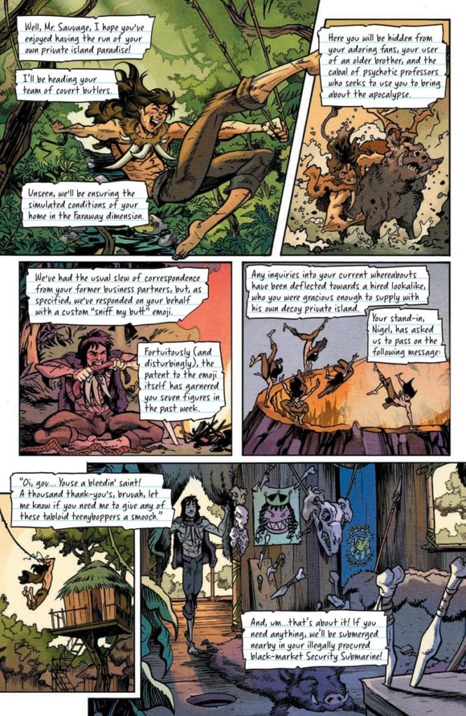
Thankfully, the way some characters speak through Otsmane-Elhaou’s lettering makes these situations feel normal. The first pages have a charming look with the paper-esque captions, showing the professional butler writing his log in an impersonal manner. It says a lot about his character and his relationship with Kevin. Kevin’s word balloons and the fonts in them warp to match his self-conscious interactions. It makes the more odd parts, like the Geckopus, a part of Kevin’s ordinary life.Now look at this.

Savage #3: Time To Resubscribe!

Savage #3 is a delight with its unapologetic absurdities. This issue captures the growing pains of adolescence. Best of all, these wild instances are treated as mundane in the Valiant Universe. No awkward teen shaming in this run.

Monkeys Fighting Robots Youtube

Review: Waging War Against Nazi Witches In COJACARU THE SKINNER #1

Horror comics icon Mike Mignola and writer Christopher Golden, along with artist Peter Bergting, colorist Michelle Madsen, and letterer Clem Robins bring us another turbulent paranormal tale from the Outerverse with Cojacaru The Skinner #1. Despite being bogged down by needless narration, this is still a sharply written and wickedly fast paced issue with engaging lore, intense and brutal action, and fantastically grim artwork that stands up to the Mignola name.

“Cojacaru the Skinner, the strange and enigmatic bane of Eastern European witches, has been dead many years. But from a bloodied French town in the throes of World War II, a plea for help carries across the winds of time. A desperate band of resistance soldiers and their white witch allies rest their fate in the hands of Cojacaru’s ghost. And when she answers their call, it will be heard near and far.”

Writing & Plot

Mike Mignola and Christopher Golden’s script for “Cojacaru The Skinner” #1 reads and feels much like many other Mignola comics. It’s full of its own lore and storytelling, using both narration and character dialogue to build both the rules of this world and the characters themselves. This shares a universe with Baltimore and Joe Golem, so many of the supernatural elements are already known to readers of this comic, but in true Mignola fashion there can never be enough magic and monsters. The concept of World War II soldiers fighting against Nazi aligned evil witch coven with the help of good witch covens and their ancient allies (as our titular is) is the type of Mignola-style paranormal goodness that I will never tire of.

What does get tiring here though is the unnecessarily bloated narration of the lieutenant of the allied soldiers charged with taking on these 3rd Reich sorceresses. Narration in the form of journal notes is nothing new in comics – especially in Mignola comics. Hell, I even think it works more often than not. However, after reading through these notes numerous times, it becomes clear that they don’t accomplish anything for the story that the artwork doesn’t handle on its own.

Luckily, it only sticks around for the first third or so of the comic, but it’s still a detractor. The script is mostly praiseworthy outside of this, with the stakes and terror being felt from the opening page. The mystery of who Cojacaru is, as well as her arrival on the battlefield, is full of weight and intrigue while not giving away much about the character herself. Outside of the narration issues, this is a wholly solid read and the exact kind of tale you’d expect from a Mignola book.

Art Direction

If a comic is going to have Mike Mignola’s name on the cover, then it has to look the part. Fortunately for Cocjacaru The Skinner #1, artist Peter Bergting is on hand to deliver the exact sort of creepy and unique design shared amongst the other Outerverse and Mignolaverse series. Bergting’s thick, heavy pencils and dense shadows fill out the designs of his characters both human and witch with an unsettling edge that sells this comic’s atmosphere.

His designs for the invading witches are a work of some level of body horror, with their wiry and gaunt designs meshing with their uncanny movements distorted facial features. The architecture of wartime Europe is highly detailed as well, and sets the tone for this comic as a desolate and bombed-out backdrop. Michelle Madsen’s colors work wonders here as well, with the drab color palette coming alive in tandem with Bergting’s pencils.

Her red skies and mottled buildings, as well as her colors on the human characters contrasting with the dead skin of the witches, plants the reader firmly in this comic’s atmosphere. The sudden flashes of magical lightning are a shocking contrast to the decay and death in most of the book, and really sell the power of Cojacaru’s importance and power. Letterer Clem Robins uses the same font found in basically every other Mignola comic, and I wouldn’t have it any other way. The visual work on this issue is up to par with just about every other comic I’ve read with Mignola’s name on the cover.


Cojacaru The Skinner #1 is a fast paced and engaging comic issue, with fantastic visuals and tons of lore to get into. The script may be a bit bogged down by needless narration, but it makes up for it in its pacing and carefully laid world building. The visuals from Peter Bergting and Michelle Madsen are grim, creepy, and brutal in just the way this story and any Mignola comic deserves. Be sure to grab this issue when it hits shelves on 4-21!

Monkeys Fighting Robots Youtube

THE FALCON AND THE WINTER SOLDIER – The Truth | TV Review

The Falcon and the Winter Soldier has reached its penultimate episode. It’s a case of the calm before the storm as the show resolves some of the storylines before the climax.

“The Truth” picks up where “The Whole World is Watching” left off with the new Captain America snapping and killing a man in public. The Falcon and the Winter Soldier have to fight the rage-fuelled super soldier and retrieve the shield from him. With the shield back in their procession, Sam has to consider whether he should become the next Captain America whilst the Flag Smashers prepare for their final move.

One of the biggest criticisms against the show has been its pacing. The later episodes have led to the show slowing to a crawl and “The Truth” was evidence of this. After the initial action scene, the episode focused on Sam’s personal journey. This took Sam to revisit Isaiah and helping his sister repair the family fishing boat. The aim of the episode was to show how Sam comes to a decision to take up the shield after giving it away earlier in the season. It was a shame the episode did it in such an uninteresting way.

The bulk of the episode took place in Sam’s hometown with Sam getting the neighbors to help his sister. The aim of these scenes was meant to show Sam’s normal life as he comes to his decision. But it wasn’t a thrilling way to get there. It wasn’t like Spider-Man 2 where the main character struggled to balance their personal and superhero lives and realize why he needs to take on the superhero mantle. This detour to Louisiana shows that The Falcon and the Winter Soldier didn’t have enough material to justify the six-episode run.

The other aspect of Sam’s choice was what it would mean to African Americans. When Sam visited Isaiah the older man warned that any black man who becomes Captain America would be nothing more than a government stooge. This was due to Isaiah’s experience.  But Sam as Captain America could also be seen as an inspiration for young black people. The episode was tapping into real-world issues with racial issues still being topical in the US and Isaiah did have a heart-breaking story because of the abuses he had suffered. But Isaiah stated that Captain America and the shield was a symbol of oppression which doesn’t work so well in the context of the MCU because Steve Rogers stood for real American values of democracy, freedom, and liberty. He rebelled against his own government to make sure those values were upheld.

The aim of the series has been to get Sam to don the shield and show two different versions of Captain America. Jack Walker’s version of Captain America was meant to be a personification of the worst aspect of America by being a government agent who only knows how to use force and had a ‘ends justify the means’ approach. He was more like The Comedian in Watchmen. Whilst Sam was more in the model of Steve Rogers. In the episode Sam does practice with the shield which led to a montage and this reminded me of the ‘Montage’ song from South Park.

The Falcon and the Winter Soldier did introduce story ideas but some still felt unresolved. Isaiah’s role in the series felt more like a lingering tread than actually servicing the plot and the MCU was leaving open the idea that Bucky could be forced back to the dark side.

This episode introduced Julia Louis-Dreyfus as Valentina Allegra de Fontaine. She only appeared for one scene, but she was a dominating force for it. It goes to show much more of a screen presence the VEEP star is. It leads to the question what is her role going to be in the MCU? She has the potential to be a wildcard like Kathryn Hahn as Agatha Harkness.

Despite its title, “The Truth” didn’t actually reveal any truth. This episode was a case of killing time before the final showdown.

Monkeys Fighting Robots Youtube

Comics Studies: DRACULA And The Changing Face Of The Comic Industry

“His face was a strong – a very strong – aquiline, with high bridge of the thin nose and peculiarly arched nostrils; with lofty domed forehead, and hair growing scantily round the temples, but profusely elsewhere. His eyebrows were very massive, almost meeting over the nose, and with bushy hair that seemed to curl in its own profusion. The mouth, so far as I could see it under the heavy moustache, was fixed and rather cruel-looking, with peculiarly sharp white teeth; these protruded over the lips, whose remarkable ruddiness showed astonishing vitality in a man of his years. For the rest, his ears were pale, and at the tops extremely pointed. The chin was broad and strong, and the cheeks firm though thin. The general effect was one of extraordinary pallor.”

(Bram, Stoker. Dracula Oxford : Oxford University Press, 2011)

The range of representations of Dracula: Prince of Darkness throughout comic book history is not just at the mercy of the creators’ whim but, in essence, reflects the trends of the larger industry. As the moods of the readers changed, swayed from one genre to another, the adaptation of a classic like Dracula moved with the audience. This is a phenomenon that can be seen in cinema as well as on the pages of comic books. From metaphor to monster and back again, Dracula embraces his historic legends and modern sensibilities in equal measure.

The following is an extract from The (Un)Official Handbook of the Universal Monster* that tracks the Prince of Darkness’ comic book legacy:

DraculaDraculaDraculaDracula

Conclusion

In the last 30 years, comics have featured a string of vampires. Whether in the mainstream or in self published work, the Vampire is still an allure for creators who want to use violence and bloodlust as a metaphor for elements of modern life. And Dracula often features as a character within these stories as the epitome of evil, love, or other emotional allegory. Whether this is in Buffy the Vampire Slayer, Marvel’s superhero comics, or one-shots like Dracula Motherf**cker, Alex De Campi’s psychedelic retelling published by Image Comics, the character still has the ability to be adapted to fit the need of the story.

With each new adaptation the character is changed with different aspects seeping into the audience’s subconscious, growing the legend. It is ironic that elements of Francis Ford Coppola’s movie that were ridiculed, such as Dracula walking during daylight, were taken directly from the original novel, however the strength of the movie and comic adaptations over the years have altered the audience’s perception of what the character is and can do. Vampires are instantly killed by sunlight. This has become the accepted truth.

Living in the shadows and on the fringes of popular culture, Dracula, as a character in comics, has never reached the literary heights of Stoker’s original striking figure. Used as a foil for modern superheroes to emphasize their modernity, or as a way to interject an inflated sense of importance into a horror comic, the Prince of Darkness is a fan favourite colloquialism for the horror genre. His appearances over the years have ranged from a hunched, goblin-esq creature to a sophisticated gentleman, but none of his visual representations have lifted him from the gutter. And maybe this is why Dracula will always have a home in comics, because Comics (with a capital C) is also struggling with this breakthrough from the gutter into the light; from mere entertainment into high art.


*A totally fictitious guide

Monkeys Fighting Robots Youtube