Home Blog Page 150

Review: Till Death Depicts Gerald’s Game Meets Home Alone Revenge Tale

Till Death puts Megan Fox back in the horror genre as a newly widowed spouse whose past comes back to haunt her. An interesting, yet familiar setup of events unfold that will keep you glued due to Fox’s performance. Till Death probably would have been more effective if it had drawn a majority of its inspiration from Home Alone because the Gerald’s Game angle drags for the most part. While not a completely satisfying watch, Till Death handles its revenge angle adequately enough, and the performances help keep the film alive.

Disloyalty will catch up to you at some point in your life and for Mark (Eoin Macken) and Emma (Megan Fox) that time has come. This cat and mouse game rooted in a marriage gone to hell offers some twists along the way, but most will be predictable for those paying close attention. Directed by S.K. Dale in his directional debut and written by Jason Carvey, Till Death stars Megan Fox, Eoin Macken, Callan Mulvey, Jack Roth, and Aml Ameen. After a romantic getaway at a secluded lakehouse, Emma wakes up handcuffed to her dead husband, Mark. When hired killers make their way to the lakehouse, Emma must fight them off to thwart her husband’s plans.

Megan Fox as Emma in Screen Media’s Till Death

Carvey’s script plays out like an offbeat Home Alone horror film with Stephen King’s inspiration at its center. Emma and Mark’s relationship has been on a downward spiral for quite a while and their latest anniversary is where Mark has decided to call it quits. While Fox is compelling in the role, Emma herself isn’t very likable, but her relationship troubles make her relatable. Emma is having an affair with Mark’s co-worker, Tom (Ameen). Mark, who is dealing with a career crisis, learns of this and decides to take Emma down with him for her disloyalty. As the film plays out, it’s apparent that Emma is disconnected from Mark and their marriage due to his own disloyalties in the past. Mark is a successful lawyer who helped Emma escape a very traumatic past that he will now make her present.

Till Death characterizes Emma as a detached, troubled, and haunted spouse who seems to be hesitant to leave Mark due to his controlling, hypocritical, and almost aggressive behavior. The progression of Emma as she battles these two hired killers and puts the troubled past behind her is entertaining enough, but a great chunk of this script is Emma dragging Mark’s body around the house searching for a way out. This period of body dragging is the film’s weakest aspect but it does allow Emma to finally get some lingering frustrations with Mark off her chest as she talks to his lifeless corpse. Had that Gerald’s Game angle played out longer, Till Death would have lost its way.


Megan Fox as Emma in Screen Media’s Till Death

Fox tremendously portrays this troubled woman who desperately wants out of her marriage. The disconnect between Mark and Emma is heard loud and clear through Emma’s unbothered attitude towards his sudden death. Mark had been dead to her for a while and Fox’s facial expression’s throughout the ordeal assist in making Emma’s feelings towards Mark very clear. Fear doesn’t seem to be registering in her mind until the killers arrive, which is bizarre considering she just woke up handcuffed to a dead man.

Till Death includes quite the color palette as well, visually it is gorgeous and enhances the romantic tones expressed early on along with the more horrific events that occur later. Dale’s directional debut isn’t a complete home run, since the film drags for quite a while. The boredom Emma feels while dragging Mark around the house will be felt as you watch her because of the pacing. The intensity and urgency are picked up once Emma is forced into defense mode. Still, the way Emma’s isolation in this winter weather is captured adds to the trapped feeling she feels throughout the film.

Eoin Macken as Mark in Screen Media’s Till Death

Revenge stories are nothing new at this point so Till Death isn’t an original, groundbreaking tale. Its unoriginality is apparent from start to finish and it does have its dull moments. This is just another run-of-the-mill dramatic horror film that is carried mostly by Fox’s performance. Till Death is a throwaway film that offers enough to be considered entertaining.

Monkeys Fighting Robots Youtube

Review: Therapy For The Guilty In THE WITCHER: WITCH’S LAMENT #2

Writer Bartosz Sztybor and artist Vanesa Del Rey, with colorist Jordie Bellaire, and letterer Aditya Bidikar return with another chapter in the life of Geralt of Rivia. The Witcher: Witch’s Lament #2 streamlines and capitalizes on the momentum set up by the prior issue. This comic contains a mixture of deeply personal inner conflict and tension-filled foreshadowing that keeps the pages turning in suspense. Albeit there are some shaky visuals, this comic is compelling enough to propel the series forward with tons of anticipation.

“Geralt’s rescue mission takes a turn when Giltine refuses his help. Drawn to the cult’s settlement, he finds himself an unwitting participant in one of their most sacred rituals.”

Writing & Plot

Bartosz Sztybor writes up a powerful script for The Witcher: Witch’s Lament #2. He has stripped away all of the plot and pacing inconsistencies of the first issue and replaced them with compelling character storytelling. This cult that Geralt’s quarry has run to brings up some great moral quandaries, both in this story and in his story as a whole. Geralt’s guilt over the things he is “forced” to do is placed front and center in this issue, while we watch other characters deal with their own issues. Sztybor crafts some of the best character studying we’ve gotten from The Witcher since The Wild Hunt. I noted in the last issue how the story felt like it was taking its own sidequest. In this issue this concept comes to fruition.

Witch’s Lament feels like a quest from the game series. What starts as a cut-and-dry bounty for Geralt turns into an insightful and cutting character dive. There’s a meaningful duel in the midst of a series of important conversations and investigation. I can even hear Doug Cockle’s (Geralt’s voice actor in the games) voice as I read the White Wolf’s dialogue. Huge credit to Sztybor for making this comic feel wholly authentic to every aspect that makes The Witcher RPG’s so engaging.

Art Direction

Unfortunately, I don’t have as much praise for the visual end of The Witcher: Witch’s Lament #2. The inconsistent yet effective pencils of the prior issue have become even more of the former this time around. While much of the character detail is still tight and detailed, there’s an unfortunate amount of muddled work here as well. It looks as though a portion of the panels were rushed through, leaving Geralt and much of the environment difficult to make out. It’s unfortunate too because there’s a lot to like in this issue as well. The flashback and dream sequences are handled with their own chaotic visual tone. This is mostly due to the coloring talents of Jordie Bellaire. The veteran colorist shades these moments in a varying single color that makes them stick out on the page and in my mind. His handling of the darkness in the environment and character tone is stellar as well.

Lettering & Design

Much of the panel design work, as seen above, is absolutely stunning. My favorite attempted trick here is the artistic lettering of certain steps in the cult’s “therapy” session. They show up as a banner made of sticks and mark where Geralt is in his mindset at the time. The problem is that it’s difficult to make out what these words are, so the effect escaped me up to a certain point. I am not sure if this was Del Rey’s pencils or Aditya Bidikar’s lettering that was responsible for these scenes. Regardless, it’s a great idea that required better execution. The rest of Bidikar’s lettering is fantastic though, using a sort of scratchy and wobbly font throughout the comic. It’s a unique choice that really sets the reader into the story’s tone. There’s a lot to enjoy about the visuals in this comic, but they’re put off by some inconsistent pencilling.

Verdict

The Witcher: Witch’s Lament #2 is a sharply written comic marred by rich but inconsistent visuals. Bartosz Sztybor’s script carries suspense and humanity, while bringing out what makes The Witcher so engaging regardless of medium. Vanesa Del Rey and Jordie Bellaire’s visuals tackle some great feats, but are marred by rushed inconsistency. If you’re a Witcher fan, be sure to grab this issue when it hits shelves on 6/30!

Monkeys Fighting Robots Youtube

LOKI – Lamentis | TV Review

After the exciting conclusion of ‘The Variant’, the third episode of Loki sees our favorite Norse trickster team up with an alternative version of himself.

The Variant, AKA Lady Loki, AKA Sylvie (Sophia Di Martino) has sent a lot of time reset charges across the points in time and she goes to TVA with the aim to kill the Time Keepers. Her plans are interrupted by Loki and the pair end up on the moon Lamentis-1 in 2077, the greatest apocalypse of all time. Loki and Sylvie have to find a way to recharge their TemPad before the moon is destroyed.

The end of ‘The Variant’ had a great cliffhanger because it looked like Sylvie had created numerous Nexus events which can lead to the destruction of reality. So ‘Lamentis’ was a left turn because it was a smaller scale episode. It focused on two characters trapped in a limited location with only their wits and skills to get out. ‘Lamentis’ was a character-focused episode on the two Lokis getting to know each other.

The episode aimed to show how the Lokis were both similar and different. Sylvie had a blunt force style: she liked to use her mind control powers and if that didn’t work just fight. Loki tried to avoid conflict so used disguises and trickery. This was showcased when the pair faced a gun-wielding woman and both failing. The pair ended up working well together when they had to infiltrate a train and during the final scene of the episode. The other difference was their objectives. Loki wanted to take over the TVA, whilst Sylvie was an anarchist: she wanted to destroy the order. She was like Rick from Rick and Morty because she hated governments and authority.

The way the Lokis were similar was they were always looking for ways to trick each other. In the episode Loki had the TemPad on his person and Sylvie was trying to find a way to get it off him. Both Lokis had an ego and due to their differences they bickered a lot, like many characters in the MCU.

When the Lokis were on the train they did have a heart-to-heart. Loki talked about how he was close to his mother and she taught him magic. Sylvie’s experience was different because she didn’t know her mother and she had to teach herself magic. However, as Loki said he revealed a lot about himself, but Sylvie didn’t reveal much about herself, so it led to the question, is she lying? The other tidbit during the train ride was Loki had been interested in men as well as women, making him the first opening LGBT character in the MCU.

Like WandaVisionLoki had a lot of mystery. The series already asked who are the Time Keepers and the origins of the multiverse. In ‘Lamentis’ Sylvie reveals information that TVA agents are variants who had past lives. This contradicts information that Mobius gave Loki because he said agents were created by the Time Keepers. Obviously someone was lying.

The reception for ‘Lamentis’ hasn’t been as positive as for the first two episodes. Some people on Twitter have said it felt like the series was padding things out. This was an issue that affected The Falcon and the Winter Soldier because that series felt like a movie stretched out from a six-hour run time. This episode of Loki was the shortest so far, it only lasted 36 minutes, excluding the credits.

The other criticism from the Twitterverse was ‘Lamentis’ was compared to a bad episode of Doctor Who. ‘Lamentis’ is far from a bad Doctor Who episode. The set up was like a Doctor Who episode because Loki was stranded on something that was about to be destroyed. Loki and Sylvie were wandering around a wasteland, the type of location Doctor Who would use to save money, and like the BBC show, Loki had some unsubtle political commentary. The relationship between Loki and Sylvie does echo the relationship between the Twelfth Doctor and Missy since they acted like frenemies who had to work together in a desperate move.

After all the world-building and intrigue of the first two episodes, ‘Lamentis’ was smaller in scope and continued with the show’s character development.

Monkeys Fighting Robots Youtube

Exclusive: Check Out These Insane RED ROOM #3 Variants By Johnny Desjardins and John Gallagher!

red room #3

RED ROOM #3 hits your local comic book store on July 28th, but Monkeys Fighting Robots has an exclusive first-look at two store-specific variant covers by Johnny Desjardins and John Gallagher!

The series is by cartoonist Ed Piskor and published by Fantagraphics. It’s an anthology comic about a “subculture of criminals who live-stream and patronize webcam murders for entertainment,” and it is NOT for the faint of heart.

About RED ROOM #3:
Levee Turks was an encryption software prodigy serving a life sentence for creating an online drug empire, until the FBI proposed a deal: infiltrate red rooms and help the FBI crack down on these deepest corners of the dark web. But Turks soon finds that prison might be a better fate… Another killer stand-alone issue of the all-new monthly series from the creator of Hip Hop Family Tree and X-Men: Grand Design! As seen on Piskor’s YouTube channel sensation, Cartoonist Kayfabe!

MFR writer Manny Gomez spoke with Piskor earlier this year about the new series. Gomez also gave the debut issue a perfect 5-star review, calling it “the gore-splattering, blood-dripping horror comic masterpiece you have been waiting for.

Check out both variant covers below!

Pharcyde Comics Exclusive Variant by Johnny Desjardins:

red room #3

Uncanny Knack Exclusive Variant by John Gallagher:

red room #3


Have you read RED ROOM yet? Sound off in the comments!

Monkeys Fighting Robots Youtube

Exclusive Preview: GIANT-SIZE AMAZING SPIDER-MAN: CHAMELEON CONSPIRACY #1

amazing spider-man chameleon conspiracy exclusive marvel comics preview

GIANT-SIZE AMAZING SPIDER-MAN: CHAMELEON CONSPIRACY #1 hits your local comic book store June 30th, but thanks to Marvel Comics, Monkeys Fighting Robots has an exclusive 4-page preview for you.

About the issue:
The epic conclusion of THE CHAMELEON CONSPIRACY! If you thought the end of “King’s Ransom” shook Spider-Man to the core, you better think again as this ending will level things up.

The issue is by writers Nick Spencer and Ed Brisson, and pencilers Marcelo Ferreira, Carlos Gómez, Zé Carlos, and Ig Guara. The team of inkers and colorists who worked on the issue are listed in the credits page below; the letters are by Joe Caramagna.

Marvel just announced this week that Spencer’s run on AMAZING SPIDER-MAN will come to a close this September with issue #74. The writer has been on the title for over three years, and he will be passing the title on to the writing team of Kelly Thompson, Saladin Ahmed, Cody Ziglar, Patrick Gleason, and Zeb Wells.

Check out the GIANT-SIZE AMAZING SPIDER-MAN: CHAMELEON CONSPIRACY #1 preview below:

amazing spider-man chameleon conspiracy exclusive marvel comics preview

amazing spider-man chameleon conspiracy exclusive marvel comics preview

amazing spider-man chameleon conspiracy exclusive marvel comics preview

amazing spider-man chameleon conspiracy exclusive marvel comics preview

amazing spider-man chameleon conspiracy exclusive marvel comics preview

amazing spider-man chameleon conspiracy exclusive marvel comics preview


Have you been reading Nick Spencer’s AMAZING SPIDER-MAN run? Who’s your favorite Spider-Man writer? Sound off in the comments!

Monkeys Fighting Robots Youtube

STRAY DOGS Is A Master Class In Upending Expectations

stray dogs image comics

I knew absolutely nothing about STRAY DOGS going into the first issue. I had seen the cover; that’s about it. But with the final issue out now, I can say that this series is not only my favorite comic of the year so far, but it’s one of the best comics I’ve read in recent memory.

Going into the series cold enhanced my experience, so if you want to have that same sense of wonder and surprise, stop reading this and go read STRAY DOGS first. I’m not going to talk about major spoilers, but I am going to talk about some general plot points and themes that made the story feel special to me.

stray dogs image comics

From writer Tony Fleecs and artist Trish Forstner (with colors by Brad Simpson and layouts by Tone Rodriguez), STRAY DOGS is about a group of dogs who are presented with the possibility that their owner is a serial killer. And so begins a classic murder mystery, right? Wrong! Because these investigators are dogs, complete with their species’ signature poor memory. So they’re constantly losing track of their investigation and questioning one another.

It sounds like a simple enough premise on paper, but it’s such a clever, unique, and jarring reading experience, and that’s largely due to Forstner’s art style.

Forstner draws in the style of a Don Bluth animated movie. The dogs are all wide-eyed and cartoony; it gives the comic a very wholesome and fun vibe. The art style draws you in — it’s warm, familiar, and inviting — and then BAM, you’re hit with a dark tale of murder and intrigue. Your brain isn’t sure how to process this juxtaposition, but it likes it.

stray dogs image comics

To put it as plainly as I can, STRAY DOGS is fucking brilliant. It’s Stray Bullets meets All Dogs Go To Heaven, and comic creators all over are kicking themselves that they didn’t think of it first.

The combination of charming art and gripping story aside, the choice to tell this story from the dogs’ perspective is an inspired one. It automatically creates a sense of tension and fear that something bad is going to happen to the main characters. We’re living in a time where, by and large, people care about the well-being of animals more than that of other humans. Think about how many times you’ve heard a variation of the phrase “I like my dog/cat/rodent more than people.” For Fleecs, Forstner, and company to take that idea and expand upon it like this really makes you reflect. I read a ton of crime comics, but I never realized how little I actually care about the human protagonists’ well-being until I read a crime comic starring dogs.

I could talk about this book all day: I could tell you about how each of the dogs has a wonderfully distinct voice and personality, or how the colors and lettering play into the contrast between the story and the art. But to fully appreciate all of that, you really need to experience it firsthand. All I’m here to do is invite you to pick up STRAY DOGS. It’s the dog-themed murder mystery you didn’t know you needed, but trust me, you need it so much.

Monkeys Fighting Robots Youtube

SHADOWMAN #3: How To Make Parallels Throughout A Plot

Shadowman #3 Cover

Shadowman #3 from Valiant Entertainment comes to comic stores on June 23. As writer Cullen Bunn’s plot intensifies, now is a good time to go over the title character’s magic system. With illustrations by Jon Davis-Hunt and coloring by Jordie Bellaire, the spirits tied to this magic never looked so menacing. The way letterer Clayton Cowles has these spirits speak adds another ghastly layer to them.

Shadowman #3 On Voodoo

Shadowman #3 plot in the details
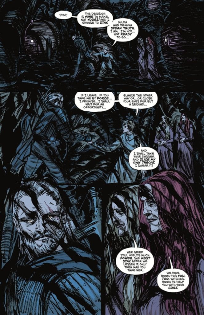
Shadowman #3 goes into Valiant’s take on Voodoo magic after briefly touching it prior. Interestingly enough, that’s why this issue connects to Bunn’s previous Voodoo series, Punk Mambo. In this case, it’s the ways the Loa interact with people. While previous issues of the series show healthier boundaries between the spirits, as Shadowman exemplifies, this issue goes into the more dangerous areas. In his brief time on screen, the issue’s antagonist, Pallbearer, shows how extreme these interactions can be. He’s driven by a need to dominate the Loa, who use mortals as playthings, functioning as a bigoted foil to Shadowman.

A Haunting Atmosphere

Don't forget the action
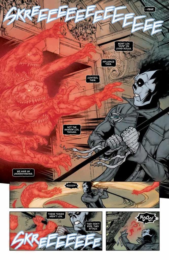
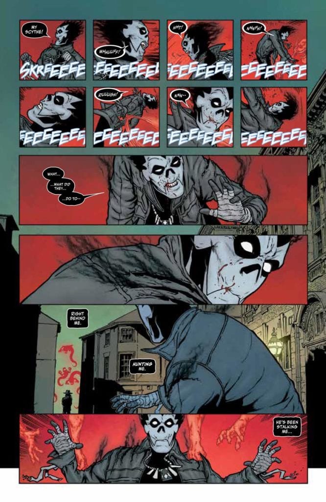
Davis-Hunt makes Shadowman #3 all about the spirits with their wild designs. The Pallbearer’s ghostly minions look threatening with their numbers as well as their sharp teeth. Their red glow by Bellaire and the way they attack a jellyfish-like Loa give them a pure predatory presence. But they pale in comparison to Jack’s companion, the demonic Shadow Loa, Bosou Koblamin, whose purple glow makes him look comforting.

The way the spirits stand out in the muted backgrounds makes their presence more pronounceable. The way regular people look so devoid of life in the setting of Barcelona, it’s like they’re already dead. Considering how one Loa rides a host, with ghastly designed word balloons from Cowles no less, it’s hard to tell if this atmosphere of the living dead is because of Pallbearer attacking or the Loa he wants to destroy.

Study Up In Shadowman #3

Shadowman #3 is a gripping look into a concept surrounding a greater arc. The way it’s presented makes it feel like something to remember at any time. Because if anyone goes into the next issue without context, they might be vulnerable to predatory forces.

Monkeys Fighting Robots Youtube

Review: SPAWN’S UNIVERSE #1 Overburdened By Excessive Exposition

Expository writing and overuse of caption narration weigh down an otherwise exciting introduction to Image Comics’ expanded Spawn universe. Available now, this giant 74-page comic has four stories written by Spawn creator Todd McFarlane.

Artists: Jim Cheung, Brett Booth, Steven Segovia, and Marcio Takara

Inkers: Adelso Corona, Todd McFarlane

Letterers: Tom Orzechowski, AndWorld Design

Colors: FCO Plascencia, Andrew Dalhouse, Peter Steigerwald

Since 1992, Spawn has captivated the attention of the hellspawn in all of us. Even the least comic-literate will recognize the badass red cape and sinister smile. It’s all thanks to McFarlane, the creator of the series. His inspired work notwithstanding, Spawn’s Universe #1 ain’t it. Unfortunately, it’s McFarlane’s writing that tanks the entire issue for me.

While I recognize the use of caption narration as a valid style choice, I think it’s overused in this book to the detriment of telling a visual story. The result is very distracting, and redundant captions overshadow the art. Often the caption states exactly what is shown in the art, like on page 30 when a new Spawn ally is both shown and described escaping chains and picking up guns. Why not simply let the art speak for itself?

Show, Don’t Tell

Moreover, on a character level, it doesn’t feel like we’re getting to know much of anything about the new and recurring cast. Fans of the series will recognize Medieval Spawn, Cogliostro, and Spawn himself, so there’s no work to be done for them. On the other hand, Gunslinger Spawn, a new hellspawn, doesn’t get much in the way of character. By that, I mean he gets some scenarios to showcase his abilities but nothing of his motivations.

Spawn
COGLIOSTRO’S CAT DEFENDS HIM FROM ENEMIES.

The only character with a sense of dimensionality is Jessica Priest, a familiar villain. Now known as She-Spawn, she gets a heartfelt confrontation with her family. This kind of emotional groundwork made her more intriguing than any of the other characters. But not all is lost for Spawn’s Universe.

Fortunately, the art almost makes up for such weak writing. Each illustrator adds their own stylistic flair to the four stories, but there is a thorough line of bombast and ruggedness. In my opinion, the standout was Jim Cheung’s work on the main story.

Cogliostro

Page thirty-two epitomizes Cheung’s unique contribution to the issue. Cheung’s scratchy line work and dramatic layout bring life to McFarlane’s expository captions. In the scene, Cogliostro has been kicked into a deep hole where he contrives to summon a new hellspawn called Plague Spawn. The background of the page is completely black, reflecting the darkness of the hole he’s in.

Cogliostro slumps in the middle of the hole, long grey hair flowing in front of him with inked shadows etched into every part of his clothing as if he’s made of darkness. Behind him are four inset panels outlined in red which close on him, shaving his face with a pointy piece of rock. By doing this, Cheung makes the reader like the camera closing in on an intimate, decisive moment. Furthermore, Cheung heightens the ominous tone by closing in on those few actions, assigning dramatic meaning to something as simple as a close shave.

From a lettering standpoint, Orzechowski and AndWorld Design do well in breaking up the exorbitant captions and long dialogue. However, the SFX often missed the mark. On multiple occasions, big blocky font was used that came across as flat instead of expressive. The blocky font didn’t complement the action, where a handwritten or bubble font might have better suited the action. For example, on page 13, there’s an explosion, and the word “boom” is written in blocky blue SFX next to it. Why choose such a cold color, first of all? Second, the blockiness of the letters reads flat where it could have emulated the feeling of an explosion.

Lastly, Plascencia, Dalhouse, and Steigerwald’s colors feel relatively consistent across the four stories. Characteristic of Spawn, the main color palette is comprised of red, green, and blue. Saturation of these colors seems dependent on the tone of the story. So, Medieval Spawn gets high saturation to reflect his theatrical heroic tone. On the flipside, Gunslinger Spawn gets muted colors and more white to reflect his isolation and the desolate landscape. The colors are another strength of the book, which, along with the pencils, kept me reading.

Honestly, I almost stopped reading Spawn’s Universe #1 a couple of times. Seventy-four pages of unnecessary exposition daunted me. But there was enough good in the book to keep me going. Maybe I wasn’t the intended audience.

Regardless, I could see myself returning to Spawn in the future out of curiosity because of this book. So I turn the question to old fans of Spawn: Has McFarlane’s writing style turned you off in the past? Or do you keep reading for the cool art and concept? Sound off, hellspawn!

Monkeys Fighting Robots Youtube

Review: IMOGEN OF THE WYRDING WAY – A Blend of Fantasy & Horror

Imogen Dark Horse Mignola

Dark Horse Comics’ Imogen of The Wyrding Way, a one shot in the Outerverse universe, shows how much potential fantasy has to be horrific. Like a scene from Pan’s LabyrinthImogen feels like it lives in the in-between. It could be dark or hopeful at any moment, and the reader is caught in the middle. Writers Mike Mignola and Christopher Golden, artist Peter Bergting, colorist Michelle Madsen, and letterer Clem Robins seem to love this middle ground. And they keep us there for as long as they can.

Imogen Dark Horse Mignola

Writing

From the first few pages, Mignola and Golden assure us horror lurks within. Vampires and hellfire abounds. But it’s swept away quickly to bring us back to a quiet morning in a sunny seaside landscape. So as our main character, Imogen, sets off on a mission, we have a feeling in our gut that it may go wrong. Of course, there wouldn’t be a story if it went off without a hitch. But Mignola and Golden keep us, and their characters, hopeful. The most terrifying element to this issue is how normal everything seems.

The omens of things going sour are sprinkled in through conversations with grumpy sailors and unusual things noticed on winter hikes. And when we finally see the terror, Mignola and Golden pull us away. They don’t show us the gruesome details, and in doing this, they make it all the more terrifying. We’re left to imagine just how bad things may have gotten. And through it all, we’re still somehow hoping we’ve read the hints wrong.

Art

Bergting certainly has the ability to create terrifying images. Even the cover to Imogen of the Wyrding Way has a quiet terror to it. But this issue doesn’t feel like a horror comic in its imagery. In the same way that Mignola and Golden keep us wondering if we’re reading a fantasy comic or a horror comic, Bergting keeps things light and joyful. The big trolls walking through the forest look as funny as they do foreboding.

The dark creatures we’re met with in the opening of the issue are dealt with quickly, and there’s a playfulness to the page as it happens. Bergting is frugal with his use of creepy imagery. His avoidance of darkness is what makes his subtle moments of horror strike so deep. His most terrifying images are silhouettes and outlines. He spares us the details, bringing us back to a lighter norm that we feel is tainted by the dark images we’ve conjured up in our minds.

Imogen Dark Horse Mignola

Coloring

Madsen starts us off on a dark note. We open on a scene that begins at night. As we enter a dark house, Madsen keeps everything a dark blue. The burst of light that Imogen uses to get out of their alive is short-lived and the next scene is dark but cast in an eerie green glow. This immediately tells us that these characters are surrounded by horror. But the next scene is a bright, sunny morning. It’s colored like something out of Tintin. And even as our character hike through a forest during the night, Madsen shows the color of their faces and clothes. Madsen brings us into a world of horror, but then lulls us into thinking it may have all gone away. Maybe there are only bright days ahead.

Lettering

Robins’ lettering is a masterclass in subtle differentiations. Robins follows a pretty straightforward style throughout. The font remains the same for the dialogue and the sound effects. Occasionally, a word balloon has warped edges as someone cries out. But when one character is panicking at what’s happening to them, Robins removes the spaces from between their words. “WHATDIDYOUDO?” they say in one word. The sound effects are identical for the most part. Whether it’s the “FFWOOOSHH” of fire or the “THWUMPP” of someone landing in snow, it’s the same block lettering. The one variation is devastating. And the “KRUNCH” of this moment stands out because it looks different from everything else. Robins uses variations to his style very rarely, so that they have more punch when they appear.


Dark Horse’s Imogen of the Wyrding Way is a relatively simple comic. Yet that’s part of what makes it so terrifying. It doesn’t try to horrify you with grisly images or ugly ghouls. No, it shows you just enough for you to connect the dots for yourself. It brilliantly blends fantasy and horror to make a subtle, slow terror. Pick up Imogen of the Wyrding Way, out from Dark Horse June 23rd, at a comic shop near you!

Monkeys Fighting Robots Youtube

Review: BLACK HAMMER REBORN #1 – Black Hammer is Back… Right!?

Black Hammer Lemire Dark Horse

Dark Horse Comics’ Black Hammer Reborn is more like the original Black Hammer than you’d think. In Black Hammer, writer Jeff Lemire and artist Dean Ormston introduced us to a bunch of heroes that were well past their heyday. Stuck on a farm together, the heroes of Spiral City were dealing more with being cooped up than with fighting supervillains. With Black Hammer Reborn #1, writer Jeff Lemire, artist Caitlin Yarsky, colorist Dave Stewart, and letterer Nate Piekos bring us back to that feeling of days gone by. Lucy Weber, the second person to take up the Black Hammer mantle, has put crimefighting behind her. But maybe she won’t be able to for much longer?

Writing

Without the burden of worldbuilding in this new series, Lemire can do whatever he wants. We know the characters, we know the world, he can just dive into the story. But interestingly, this issue is very normal. Just like the original Black Hammer seriesBlack Hammer Reborn is subtle and human. Lucy Weber isn’t out there punching baddies in tights, she’s raising a family. And just as we begin to think Lemire is repeating himself, he throws in some new elements. We learn about dark secrets and unpredictable sci-fi forces that threaten to blow up Lucy’s existence. In many ways, there’s not much to the script of this issue. We see Lucy with her family, at work, we see a flashback of her fighting a villain, but not much else. But to those familiar with Lemire’s work, there are clues sprinkled in, seeds being planted for where this series might go.

Black Hammer Lemire Dark Horse

Art

Yarsky’s art reminds us of who we’re dealing with. Lucy Weber was Black Hammer. She might be a mom or a corporate drone now, but she used to be a freaking superhero. And it’s in the drama and expressions that Yarsky shows us this. Lucy’s life is still big and bold, it’s just confined to a new stage. So, when her boss catches her looking up old articles on her computer, his self-righteous leer is that of a supervillain. When Lucy screams for her kids to come downstairs, the look on her face says she may as well be screaming at Anti-God himself. Her life is still full and colorful, it’s just different. Occasionally, moments feel melodramatic, even silly. But maybe these moments feel a little silly to Lucy too. After all, she’s saved the world. What wouldn’t feel silly after that?

Coloring

Not only do the flashback scenes look more vibrant, but they feel like they have a “Lucy” flavor to them that the modern scenes don’t have. As Black Hammer, Lucy’s costume is green and yellow. And when she fights a villain in a flashback, Stewart puts green and yellow everywhere. Yellow is the backdrop of a cop having his gun ripped away, green is the color emanating from the villain. These memories are Lucy’s and these moments were when she felt truly like herself. The modern day scenes feel a little drab in comparison. There’s not much green or yellow, mostly just blue and beige. But then Lucy begins to see things that remind her of her past, and the colors return. Stewart is showing us just how nostalgic Lucy is, even though she’s claiming not to be.

Lettering

Piekos also shows us the big difference between Lucy’s past and present. When she fought as Black Hammer, the fonts for dialogue were constantly changing size and style. There’s a rhythm and a playfulness to how Piekos writes these scenes. But her modern life is straightforward. Piekos rarely bolds worlds or has them jut out in a larger font. Except when Lucy is scolding her kids. It’s bittersweet that this is the only moment her voice shows expression. Sure, she has a simpler life now, but she only seems to come alive when she’s angry and tired of it all.


Dark Horse’s Black Hammer Reborn #1 is an interesting start to a new era. This creative team is easing us into the story to come. While we might not have much to go off of just yet, there are plenty of seeds planted that could lead in all kinds of directions. Pick up Black Hammer Reborn #1, out from Dark Horse June 23rd, at a comic shop near you!

Monkeys Fighting Robots Youtube