Home Blog Page 89

Review: DETECTIVE COMICS #1062 – Gotham Nocturne

From ever-rising mega-talent Ram V (These Savage Shores, Swamp Thing) and master of atmosphere Rafael Albuquerque (Black Beetle, Night Of The Ghoul) comes a Batman comic with a veneer of gothic horror in Detective Comics #1062. Featuring colors by Dave Stewart and lettering from Ariana Maher, this issue’s main story is Batman at its most mysterious and unnerving. With a stellar backup from The Dreaming writer Si Spurrier and artists Dani, with more Dave Stewart colors and Steve Wands on letters, this is a Bat-comic that poses haunting problems for Bruce and his allies – and the most genuinely dread-inducing thematic elements in a DC comic in years.

“Something is terribly wrong with Batman. No matter the tests Bruce takes, nor the numbers he counts, the greatest detective in the world can’t pin down the source of this creeping dread—of his own inner demons and a looming mortality. Meanwhile, real demons roam the shadows as an ancient melody haunts the Gotham night. Here now the curtains rise and as the eerie tune streams in…who is human, who is demon, who is to tell? As Batman investigates the songs and the demons of Gotham, he is forced to confront the oldest question…whether there has been a demon within him all along…and if so, what does it want…and why hasn’t it taken over yet?”
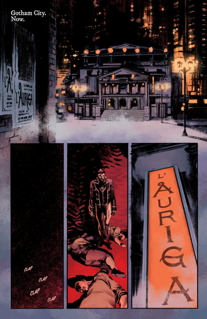
Writing & Plot

True to his form, Ram V pens an exciting and poetically rich script for the start of his run here in Detective Comics #1062. Loaded with symbolism and leaning into the evocative, gothic imagery of Gotham and the Batman story, Ram brings something ancient and foreboding into the life of the titular detective. Opening with a stirring opera sequence loaded with what is likely the most striking approach to discussing Bruce’s origin since the Morrison era, working through increasingly foreboding warnings about an approaching enemy, and ending on some genuinely interesting issues with long-term ramifications, this is the most fascinating single Bat-comic in years. Batman – Bruce, really – is getting older. While this has been dealt with in numerous out-of-continuity Batman comics, this is the first time it’s been discussed as a possibility in canon. This, Bruce’s denial of such a possibility, and the looming specter of a powerful evil encroaching on Gotham all make for a thematically loaded Batman comic. This new foe Ram has just teased for us so far is reminiscent of The Black Glove and The Court of Owls, but more alien and potentially far older. In fact, Ram seems to be pulling from concepts crafted in Morrison and Snyder & Capullo’s runs, but with his own stylistic flair. Make no mistake though, this is absolutely as Ram V comic. This first issue’s influences are felt in its plot and the construction of Batman’s new foes (so far anyways), but the sense of ethereal gothic horror on display is something Ram himself brings out in unique ways.

Si Spurrier’s script for backup story, “The Coda,” fits perfectly with the vision of Gotham that Ram has made for this new chapter of Detective Comics. The first of three parts, this story sees former police commissioner Jim Gordon returning to Gotham. Listless and feeling without purpose, Gordon accepts a job tracking down a woman’s lost son. The journey takes him back to the ruins of an abandoned Arkham Asylum, where more almost supernatural horrors appear to await. True to form, Spurrier’s writing is dense but thematically rich. His script consists mostly of Gordon’s internal narration via a journal he keeps. This gives the short story a definite noir aspect, but it’s muddled by Jim’s sense of purposelessness and the unusual horror-esque nature of what he uncovers while exploring the ruined asylum. Some may find Spurrier’s writing to be a bit much for a visual medium, but those who can appreciate his use of atmospheric and naturalistic prose within this dark mystery will no doubt be satisfied.
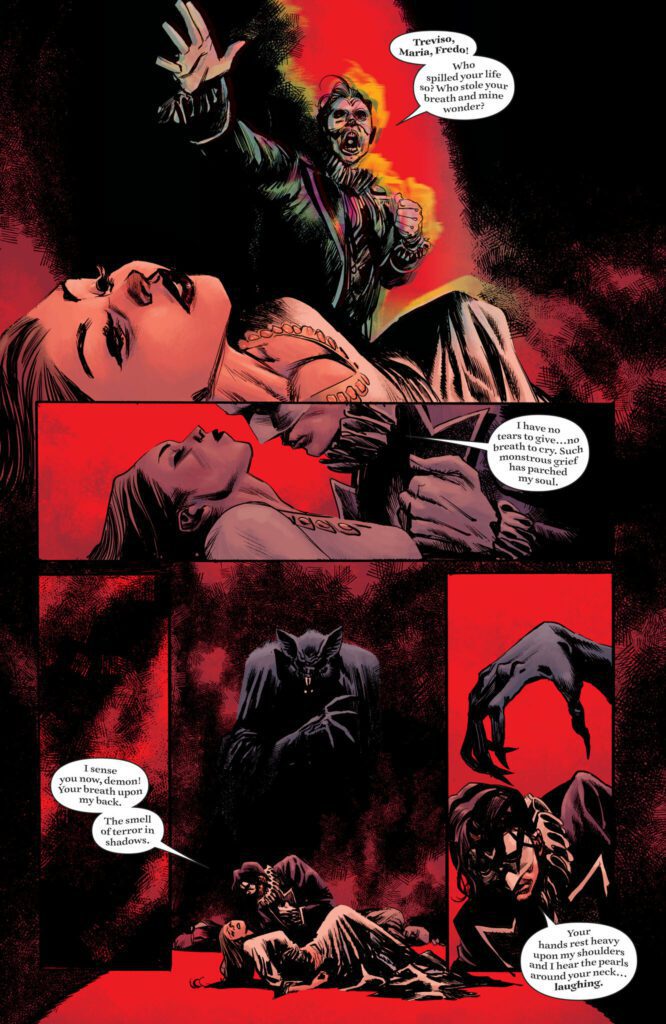
Art Direction

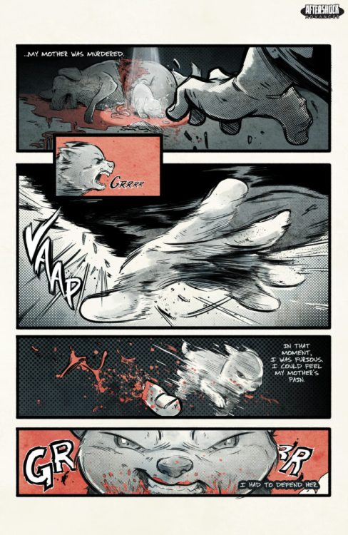
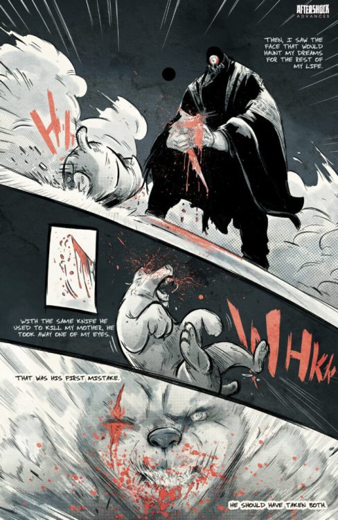
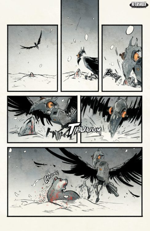
Crafting the visual experience for the most haunting and horror-influenced Batman comic in over a decade requires a master of atmospheric art. Fortunately, Rafael Albuquerque is the talent for the job in Detective Comics #1062. He pairs off with Ram V’s script in spectacular fashion, creating an ethereal gothic experience from the opening page and on. His opening sequence, an opera with a dark Victorian aesthetic and looming spectral bat, immediately sets the tone for the rest of the book’s looming dread. Albuquerque is already known for his talents in crafting horror comics, with his previous work with Scott Snyder on American Vampire and Night Of The Ghoul. Here, his horror elements are slightly more subdued to also do the work of being a Batman comic. His range in the book is immensely impressive, as his dead-inducing nightmare sequences trade blows with big superhero action with Batman fighting monsters, criminals, and meeting unexpected old foes. One unique and memorable scene was the introduction of Batman new encroaching foes as seen in their own home. This passage looks like something out of a science-fiction or fantasy comic, rather than a Batman book, and it sticks out due to Albuquerque’s stylized architecture and character design choices. There’s an almost mural-esque sense to how Albuquerque draws and constructs his sequences, and it matches the stage-play narrative device wonderfully.

Dave Stewart’s colors on both the main story and the backup are tonally perfect. The veteran colorist achieves similar aesthetics in both stories, but with different approaches. His work over Albuquerque’s pencils is enshrouded in shadow and ethereal, dreamlike haze. Even the moments that aren’t in Bruce’s head are covered in Gotham’s urban fog or take place in dimly lit rooms. Stewart’s atmospheric work is so dense it looks as though it could be cut by a knife, and it perfectly caps off the style needed for this story. The work on the backup drawn by Dani is similar, but noticeably brighter and more naturalistic. Without Batman’s potential internal struggles and visions of a great bat-demon, the story following Gordon allows for more conventional interior and street lighting. The unnatural effects still come into play of course – there’s a stirring scene with the dilapidated asylum looming in a white background. For the most part though, this story is handled with a more natural-looking approach than the directly horror-focused main story.

Speaking of Dani’s art, his work on “The Coda” is singularly impressive and wholly unique, managing to align with the aesthetic set in the main book but also with a different approach. Dani’s work isn’t as conventional or “clean” as Albuquerque’s, but instead utilizes a heavily cross-hatched and differently atmospheric style. There’s a classic Vertigo sense with Dani’s heavily penciled artwork, and coupled with his direction gives that ruined sense – for both a listless Jim Gordon and an abandoned asylum – to the story. The lettering from Ariana Maher in the main story and Steve Wands in the backup is inventive and brilliant. Both of their works are easily readable but shift dynamically with the story, altering how the reader perceives the words in perfect unison with the art. Maher’s work specifically, in the dreamlike sequences, takes on a wavering, musical quality that matches the scenes’ operatic setting. This is the most interesting lettering in a DC comic this year. Overall, this issue of Detective Comics is a staggeringly gorgeous comic, with nearly unmatched atmospheric work in the mainstream world.
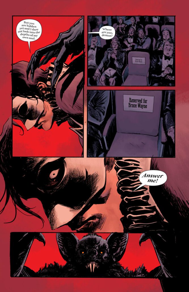
Verdict

Detective Comics #1062 is the beginning of a potential masterpiece. Ram V’s script is meticulous, haunting, and conceptually rich, adding some of the most intriguing new pieces of Batman lore since the Court of Owls. The visuals from Rafael Albuquerque and Dave Stewart are beautiful, foreboding, and carefully composed, making for some of the most memorable single panels in all of Batman comics. The backup story from Si Spurrier and Dani is a stellar cap to this brilliant new chapter in the story of Gotham’s Dark Knight, promising a gothic horror and mystery unlike any we’ve seen in a Batman comic in many years. If the rest of this run is as strong as this first issue, we could very well be looking at a Batman run in the same league as Snyder & Capullo’s and Morrison’s. Be sure to grab this incredible new issue when it hits shelves on July 26th!

Monkeys Fighting Robots Youtube

Get Your EXCLUSIVE First Look At Valiant’s BOOK OF SHADOWS #1 Retailer Variants

valiant book of shadows exclusive

BOOK OF SHADOWS #1 hits your local comic book store on July 27th, but thanks to Valiant Entertainment, Monkeys Fighting Robots has your first look at the book’s retailer-exclusive variant covers and where you can find them!

About the book:
Shadowman. Eternal Warrior. Punk Mambo. Doctor Mirage. The supernatural protectors of the Valiant Universe unite for the very first time to stand against a terrifying ancient threat: Exarch Fane. No one is safe as the fearsome foe has his cold hands on the Book of Shadows.

Book of Shadows is a blockbuster supernatural event that forms a brand-new team in the Valiant Universe… but will they be enough to stop Fane’s wrath?

The series is by writer Cullen Bunn, artist Vicente Cifuentes, colorist Nick Filardi, and letterer Dave Sharpe.

On the new villain Exarch Fane, Bunn says, “Exarch Fane is an ancient being from beyond the veil of life and death. He’s a warlord who dwells in a terrifying castle and surrounds himself with an army of the undead and worse. He even wields a sword forged from a black hole.

When you’ve got armaments and minions like that, when you’ve faced the Eternal Warrior in battle and survived, you get a little emboldened. Exarch Fane likes to talk, to both taunt and charm his enemies. He’d be a great dinner guest, except for his pesky habit of laying waste to worlds!

See the five retailer exclusive variant covers (and where you can order them) right here:

valiant book of shadows exclusive

As you can see from the graphic, the five variants are by artists Maria Llovet (Atomic Comics), JaCo Tartaruga (Awesome Minis & Autographs), Kyle Hotz & Dan Brown (Exchange Collectibles), Stephan Sharar & Brandi Blahnik (Coy’s Comics), and Nikolas Draper-Ivey (Bulletproof Comics).

And check out the first few pages of BOOK OF SHADOWS #1 below:

valiant book of shadows exclusive

valiant book of shadows exclusive

valiant book of shadows exclusive

valiant book of shadows exclusive

valiant book of shadows exclusive

valiant book of shadows exclusive

valiant book of shadows exclusive

valiant book of shadows exclusive

valiant book of shadows exclusive


Are you excited to see the first supernatural team in the Valiant Universe? Sound off in the comments!

Monkeys Fighting Robots Youtube

CRASHING #1: Read The First Five Pages!

CRASHING #1

CRASHING #1 hits your local comic book shop in September, but thanks to IDW, Monkeys Fighting Robots has the first five pages for you to read. The five-part miniseries is written by Matthew Klein, illustrated by Morgan Beem, Triona Farrell drops the colors, and you will read Hassan Otsmane-Elhaou’s letter work.

About CRASHING #1:
Less than ten years into her rehabilitation, recovering addict Rose Osler is one of a handful of doctors in the United States who specialize in treating “Powered individuals,” human beings imbued with a range of incredible—and according to some, fundamentally dangerous—superhuman attributes. Amid a sudden, rising wave of violence and chaos apparently provoked by these Powered citizens, Rose struggles to balance the ghosts of her past with the mounting pressure of her professional responsibilities, all while fighting to hold her strained marriage together and avoid the lure of getting high.

CRASHING #1 has three variant covers; Cover A by Morgan Beem, Cover B by Jorge Corona, and Cover C by Liana Kangas.

Enjoy the preview below.

Monkeys Fighting Robots Youtube

Review: SUPERMAN: SPACE AGE #1 – I Just Know the Future

Superman Allred Russell DC Comics

There’s something about the 60’s that feels perpetually relevant. The Civil Rights Movement, the Cold War, the brink of annihilation. None of it has really gone anywhere. We’ve just given these things new names. Writer Mark Russell, artist Michael “Spike” Allred, colorist Laura Allred, and letterer Dave Sharpe are firmly aware of the undying nature of the Silver Age. Together, they tease out the many echoes of the past we hear reverberating around us. Superman: Space Age #1 is for this age.

Superman Allred Russell DC comics

Writing

Russell’s script is as moving as it is funny. He vacillates from writing about death and war to writing about psychic poodles, all without skipping a beat. Superman: Space Age begins in a crumbling Fortress of Solitude. Kal-El’s captions calmly discuss the meaning of existence as his world falls to pieces around him. It’s a perfect way to set the mood and Russell’s writing stays in that place. As the Cold War seems to be getting out of control, characters discuss their chances of survival stoically. Global meltdown is simply one thing that might be in the cards for their futures. The whole script also fantastically plays with dramatic irony. We know characters like Bruce Wayne, Hal Jordan, and Lois Lane. We see their futures unfolding in familiar ways with fresh twists.

Some writers couldn’t get away with a script like this. There’s plenty of philosophizing, many punchy aphorisms, and lots of social commentary. It would all feel heavy-handed if it weren’t Russell penning these words. He finds ways to seamlessly meld discussions of hope, war, and wealth disparity into the story. He writes in parables and punchlines – all of which are full of meaning and depth. Superman: Space Age is as human as it is entertaining.

Art

Michael Allred honors the Silver Age of comics while staying completely modern in his visual language too. Circular panels show up on pages, playfully framing characters’ faces. Gutters tilt and swerve, giving each page its own unique personality. No page quite looks the same. At one point, Clark Kent and another character sit in the dark foreground of the page. We just see them from their shoulders up. They’re looking over at the panel behind them – a flashback that they’re discussing – like audience members in a play. Allred’s thick linework and characters are instantly recognizable, but his dynamism and variety are also on full display in Superman: Spage Age. He steps out of his style often to underline scenes of destruction or intimacy. He will zoom us in on a character’s face, showing us the thin wrinkles along their face, or draw explosions in scratchy lines that underscore the chaos of the moment.

Laura Allred’s colors look simply realistic at first glance. There doesn’t seem to be much of an emphasis on symbolism. But when you take a closer look, her colors have lots of meaning behind them. For one thing, the comic begins in a very blue place. Most of each page is shown in some shade of blue. It matches with Clark Kent’s blue-collar upbringing. It’s the color of his dad’s jeans, the color of the suit he wears to work at the Daily Planet, the color of the Fortress of Solitude. In this way, we get the feeling that Superman is a man who’s only half formed. Then, red begins to creep its way into the color palette slowly, until it frames a dramatic splash page that pushes Clark into becoming a full-blown hero. Allred’s work is subtle, but when you begin picking it apart it’s absolutely mesmerizing.

Lettering

Sharpe’s lettering is chock full of sound effects that you can just hear. The rumbling sound of a building is shown in big red letters that seem to crack at the edges, like the walls of the shaking room. The O’s in the “KAFOOOOOOOM” sound of an explosion grow as the word goes on, before shrinking again. You can hear the noise grow and then dissipate as you read it. Sharpe’s captions are just as brilliant as his sound effects. Clark’s look like they’ve been ripped out of a notebook and have a handwritten font to them. Bruce’s are in neat black boxes with white lettering. In these small choices we learn everything we need to about these characters. Clark is human, farm-grown, and humble. Bruce is driven, controlling, and brooding. Sharpe makes his most minute choices work brilliantly towards telling the story at large.

Verdict

Superman: Space Age isn’t about the 60’s. Well, it is. But it’s also about our uncertain times. It’s about our fears of impending annihilation. It’s about wealth, human rights, and hope. In all of these things, it’s a beautiful meditation on our visions of an unsettling future. Pick up Superman: Space Age #1 from DC Comics at a comic shop near you on July 26th. You don’t want to miss it!

Monkeys Fighting Robots Youtube

Review: Cosplay Heist in ROGUES’ GALLERY #1

For groups formed by shared passion for entertainment, fandoms can get pretty damn angry, huh? As fandoms have gotten bigger and bigger, outbursts of rage and frustration have only become more common. In Rogues’ Gallery #1 by writer Hannah Rose May, artist Justin Mason, colorist Triona Farrell, and letterer Hassan Otsmane-Elhaou, that rage spills offline into full-on physical violence. And actress Maisie Wade might have to become more like her onscreen counterpart to survive the night.

Maisie Wade has had enough. The actress has been playing fictional hero Red Rogue on TV for ten years, but after a contract dispute, finally decides to leave the part. The news is met with mixed reaction by a group of hardcore fans. Said fans are loudly frustrated with the direction the show has gone, often blaming Maisie as a primadonna actress who’s twisted the show to meet her vision. But the second she leaves the show, they pivot to blaming her for dooming it to cancellation. One member of the group, a young man named Kyle, had been using the show as a way to bond with a neglectful father. While he was initially wary of the group’s increasing talk of violence against the actress, an outburst from his dad pushes him to move the group into action. Their plan? To steal an original copy of the comic Red Rogue Down from the actress’ house. All so they can give it back to the “real fans.”

This first issue only features Maisie Wade in snippets taken from her TV show, or in quotes from the press. She stays somewhat mysterious, while the angry fans driven to violence take center stage. Many, many of their complaints will sound familiar to people who’ve spent any time in fan spaces. But to keep the group from just being a collection of angry talking points, Kyle gets the most focus to show how a lonely, isolated kid can get sucked into a group of angry fans. It’s a difficult tightrope to walk, both trying to ground Kyle as a more realistic kid in a shitty situation and having him instigate a violent raid of an actress’ house in an over-the-top parody of fan culture’s worst instincts.

Not to say that that obsessed fans turning to violence itself feels unbelievable. More that an actress forced to dress as the hero she plays, defending herself from fans dressed as villains, is a premise more grounded in metaphor than reality. It’s a metaphor focused on Maisie’s point-of-view, which makes it a surprising choice to start from the perspective of the fans. Part of it is probably to keep the book from feeling completely one-sided, especially in how the narrative uses Kyle. Which works. The choice of viewpoint gets the most out of authentic-feeling conversations between angry fans and a sympathetic eye towards Kyle’s escape into fiction. It’s in setting up the why, justifying why the kids would raid a house in full cosplay and delving into their plans, that it feels weakest. It’s a premise that feels immediately, emotionally true, and focusing on a more literal setup robs it of some of its power. The final page, however, promises more focus on Maisie. Which should help the premise really sing.

Justin Mason’s art helps bring out the grimy soul of the story being told, focusing on filthy environments, littered with empty cans and mysterious stains. Lots of angry gesturing and yelling pops up throughout, though the stand-out panel focuses on Kyle’s shadowed face, a slight smile showing through as he declares the need to teach Maisie wade a lesson. While this initial issue is more focused on conversation and scheming than high-octane action, a short sequence depicting the Red Rogue show demonstrates Mason’s considerable skill at drawing frantic fights. Backgrounds blur and blood arcs through the air.

Colorist Triona Farrell keeps with the grimy tone by focusing on dull greens, browns, and greys. That especially goes for Kyle’s room, completely dominated by shades of brown and rust-red. But the early sequence within the world of the show goes for a more psychedelic approach, with glowing green walls and explosions melting into rainbow prisms. It makes for great contrast, and how much this approach will return as Maisie begins to live out the life of her superhero character is yet to be seen.

It’s also in that initial sequence that Hassan Otsmane-Elhaou has the most fun with his lettering, each declaration of a fictional superhero name having its own fake logo, much the way more branding-focused cape comics used to (and still) do. Red Rogue is drawn in red bubble letters, while Worldguard is in a thinner, more florid font. There are other fun details throughout, like how quieter dialogue will be given a thinner, mixed-case font to contrast the classic all-caps style. Or how yelling is rendered in wavering, unstable lettering.

VERDICT

Despite a setup with a few stumbles, Rogues’ Gallery #1 is a promising start that looks to draw more from its premise as the series continues forward. It’s available now from comic shops near you, and well worth a look.

Monkeys Fighting Robots Youtube

Review: NOPE Brilliantly Explores Our Addiction To Spectacle

Academy Award-winning director Jordan Peele has returned with another thought-provoking film, Nope. A film that will undoubtedly be regarded as his most ambitious addition to his growing resume. Nope challenges humanity’s obsession with spectacle, while also serving as a commentary on Hollywood. Peele showcases his love for Summer blockbusters with his third outing and pays homage to Jaws.

Steven Spielberg sparked fear of water for many after his classic shark film was released in 1975. Peele has managed to tap into sparking fear of what lies above us when we gaze at the sky. If it wasn’t clear, Nope has solidified that Peele enjoys putting audiences through an uneasy experience. The kind that includes a few laughs along the way, but never loses the terror at its core. Nope stars Daniel Kaluuya, Keke Palmer, Steven Yeun, Keith David, Brandon Perea, and Michael Wincott. The film follows OJ (Kaluuya) and Emerald (Palmer) Haywood, a pair of ranch-owning siblings, as they attempt to capture evidence of a UFO.

OJ and Emerald come from a family that has a long history with Hollywood. Their horses are used for stunts, and their grandfather was part of the very first motion picture. After the demise of their father (David), OJ becomes desperate to secure finances for the ranch’s future. The script doesn’t explore the sibling dynamic the way I expected, but what it offers is enough to create an emotional investment in their progressions. Palmer and Kaluuya’s chemistry also amplifies their bond on screen. OJ is the stoic and introverted sibling, while Emerald serves as an extroverted and energetic character.

Peele and Kaluuya previously worked together for his directorial debut, Get Out. Kaluuya has shown his abilities as an actor in multiple projects, which makes the performance delivered in Nope that much better. OJ is written to be dry and shut off, Kaluuya brilliantly portrays the character in that regard. Emerald was the more energetic of the two, so Palmer can display a side that is more welcoming to audience members. Peele’s script includes a plot device related to the UFO causing power outages, and each time the power goes out viewers know they are about to get a suspenseful sequence.

Building suspense and tension seems to be one of Peele’s greatest strengths as a filmmaker. The night sequences in Nope are both visually striking and terrifying due to the stellar cinematography. A formula is established that helps build anticipation during the scenes involving OJ or any character gazing at the sky. Kaluuya is nailing it during these moments, especially during the final act that many will consider a love letter to Jaws. Yeun stars as Ricky Jupe, a former child star that exploits a tragedy for profit in his adulthood. Jupe deserved more screentime, but the time spent with the character establishes his importance.

Despite certain side characters being underwhelming, every performance is incredible. I just believe Palmer will be the one getting praised the most. Her work as Emerald showcases how far she has come as an actress. The line delivery combined with her facial expressions demonstrates Emerald’s personality wonderfully. Emerald is also someone most people can relate to, she doesn’t want to embrace her family business, she wants to create her legacy through various side gigs. Early in the film, OJ and Emerald are kicked off a project, which sparks them to investigate the UFO to profit off the shot.

That action is a profound example of how certain crew members are thrown aside, or discarded after years of service. Nope is drenched with nods to crew members that go overlooked during the filmmaking process. The film welcomes those that are looking for their moment to step out of the shadows but still acknowledges the desperation within that fuels people to chase their spectacle. The subtext featured within Nope is what makes Peele one of the best storytellers in the industry today. Every major death that occurs acts as a final statement about the lengths humans will go to seek fame and attention. 

Peele aims high with the direction on display, not everything comes together as neatly as expected, but he delivered a satisfying spectacle that should be experienced on the biggest screen possible. Moments of the story can be too vague or incoherent, so leaving room to interpret might become a hassle for certain viewers. The pacing was another highlight, sure the first two acts are slow, but Peele reels you in with another horrific opening sequence that sets the stage for what Nope has to offer. While the third act is the strongest, the previous two aren’t tiresome thanks to the performances and suspenseful sequences.

One scene, in particular, involving aliens will send chills down your spine, the pacing was amazing during this sequence. This also ends up serving as another nod to Jaws, which makes sense considering the twist that comes later in the story. The scene isn’t cut short, Peele spends time allowing the tension to build while Michael Abels’ score accompanies the unease that sets in. Abels’ score is almost a character itself, adding momentum while also securing the terror you feel throughout certain scenes. One piece titled “The Run” creates one of the best sequences in the film. A piece that highlights the stakes while relishing in the rewarding payoff.

Nope probably won’t be regarded as Peele’s strongest film, but I will say it is my favorite from him. This isn’t to say Get Out isn’t his best, but Nope just offered a more fun concept to experience. While the large scale does create problems with some of the logic and story details, Nope continues Peele’s impressive reign as a filmmaker and storyteller. This is a compelling film that appears straightforward, but Peele demonstrates that the trailers didn’t reveal all of the brilliance that is featured in Nope.

Monkeys Fighting Robots Youtube

Review: A.X.E. JUDGEMENT DAY #1 Sets The Tone For A Dangerous War

One of the biggest summer blockbusters debuts this week with Marvel’s Avengers X-Men Eternals Judgement Day #1. This book captures most of the heavy hitters in the Marvel universe in one giant tie-in. Kieron Gillen, who had been writing Eternals and is currently writing Immortal X-Men, is the architect for this event. He’s joined by Valerio Schiti on pencils, Marte Gracia on colors, and Clayton Cowles on letters.

WRITING

There should be some pressure on Kieron Gillen while writing this event. Gillen has the responsibility of handling many of Marvel’s most beloved comic book characters. The good news is that Gillen pulls off this issue without any hiccups. One of the biggest strengths in this book is its characterization. As Gillen sets up all his major players, we are able to see the voice that he gives them. Cyclops and Jean are being rational and reasonable. Tony Stark is being somewhat reckless (as was seen in Avengers vs. X-Men). Druig is being conniving and mischievous. Gillen sets the scene for the upcoming war flawlessly. The reasoning for the conflict also makes sense. The Eternals view mutants as Deviants that need to be dealt with. Gillen walks this line very finely. As readers we see where Druig is coming from, but we don’t agree with him or his actions. Gillen writes him as a cold villain for this issue and it works. The stakes are high, prisoners are taken and lives may be lost. This was a sizzling script from Kieron Gillen.

ART

The pencils by Valerio Schiti are amazing here. The line work is smooth and really allows the reader to get a nice clear view of the action on the page. There are iconic panels in this issue. Wolverine front and center with his claws popped, or Cyclops blasting an enemy are moments that should stick with you after you’re done reading. What Schiti does so wonderfully this issue is pour his heart onto the page. Each panel is meticulously drawn and set up perfectly. You’d be hard pressed to find better pencils in any book on the shelf this week.

The colors by Marte Gracia also knock it out of the park this issue. When Cyclops unleashes an optic blast, Gracia lights up the page with a bright red that demands your attention. Gracia also gives us a safe sense of security with his colors on Krakoa. Before there is any conflict, Gracia has clear skies and gorgeous sunsets. As the conflict begins, the background gets dark. Gracia also uses a dark and dull color palette almost anytime Druig is on a page. This signifies he’s the villain of the series. Gracia’s colors compliment Schiti’s pencils and allow the art to leap off the page.

Clayton Cowles is responsible for the letters this issue. Cowles uses sound effects well in this first issue, but I would have liked to see a little more. In such an action packed book, we get a couple of “BAMFS” and one “SNIKT.” This was a dialogue heavy issue though, and I understand that Cowles probably had a lot more to focus on. Cowles is a master at using his word bubbles and not bogging down a page. In Arbor Magna, several characters are talking at the same time, Cowles has his word balloon placement out of the way of all the characters and it’s easy to read as your eyes go from balloon to balloon.

CONCLUSION

A.X.E. Judgement Day #1 is a superb first issue that takes risks and has big payoffs. Kieron Gillen not only lives up to the hype for this event, but he exceeds it. The art is superb and is accompanied by a great crew that puts everything they have into this issue. Avengers X-Men Eternals Judgement Day #1 is out at a comic shop near you!

Monkeys Fighting Robots Youtube

Marvel Comics Exclusive Preview: VENOM #9

marvel comics exclusive preview venom

VENOM #9 hits your local comic book store on July 27th, but thanks to Marvel Comics, Monkeys Fighting Robots has an exclusive four-page preview for you!

About the issue:
Eddie Brock is still getting used to his place in the symbiote hive, and with new allies and familiar faces alike offering him advice along the way, Eddie remains as canny, wary and reckless as ever. Little does he know, his battle across the cosmos has only just begun, and KANG THE CONQUERER has a front-row seat for its first act!

The issue is by writer Al Ewing and artist Bryan Hitch, with inks by Andrew Currie, colors by Alex Sinclair, and letters by Clayton Cowles. The main cover is by Hitch and Sinclair, with the variant cover by Ryan Stegman and Marte Gracia.

Check out the VENOM #9 preview below:

marvel comics exclusive preview venom

marvel comics exclusive preview venom

marvel comics exclusive preview venom

marvel comics exclusive preview venom

marvel comics exclusive preview venom

marvel comics exclusive preview venom


Are you reading VENOM? Sound off in the comments!

Monkeys Fighting Robots Youtube

AfterShock Comics Exclusive Preview: SAMURAI DOGGY #1

aftershock comics exclusive preview samurai doggy

SAMURAI DOGGY #1 hits your local comic book store August 10th, but thanks to AfterShock Comics, Monkeys Fighting Robots has an exclusive six-page preview for you.

About the issue:
During the Fourth War of the Sun, a small dog named DOGGY experienced an irreparable trauma: his mother was brutally murdered, and his eight brothers, still puppies, were kidnapped by a mysterious man. To save them, Doggy fought bravely against the terrible killer, but all his efforts were in vain, and he was left for dead. What nobody imagined was that a technological vulture scavenging the region for corpses would be the one to rescue the dying dog from deaths scythe. 

Now, Doggy has become Samurai Doggy, and his only goal is to quench his thirst for revenge.

The series is by writer Chris Tex and artist/letterer Santtos. The main cover is by Santtos, and the incentive variant is by Juan Doe.

“A story of loss, revenge and the journey to defeat the greatest empire of machines and robots that has ever existed.”

Check out SAMURAI DOGGY #1 preview below:

aftershock comics exclusive preview samurai doggy

aftershock comics exclusive preview samurai doggy

aftershock comics exclusive preview samurai doggy

aftershock comics exclusive preview samurai doggy

aftershock comics exclusive preview samurai doggy

aftershock comics exclusive preview samurai doggy

aftershock comics exclusive preview samurai doggy

aftershock comics exclusive preview samurai doggy


Are you adding SAMURAI DOGGY to your pull list? Sound off in the comments!

Monkeys Fighting Robots Youtube

Review: DO A POWERBOMB #2 – Necromancers Love Wrestling

Ever-rising creator Daniel Warren Johnson (Beta-Ray Bill, Murder Falcon) returns to his ambitious creation of wrestling and sorcery with Do A Powerbomb #2. Featuring colors by Mike Spicer and lettering from Rus Wooton, this 2nd chapter isn’t as explosive as its predecessor but still packs plenty of punch, emotional weight, and a massive twist readers will be trying to wrap their heads around for weeks to come. With DWJ’s signature style of character writing and insane visuals, this is a fantastic comic that promises more radness yet to come.

“Lona Steelrose is brought to another dimension and given an opportunity that could change everything. Will she join the DEATHLYFE tournament?!”

Writing & Plot

Daniel Warren Johnson slows down *just* a bit to let his main players talk and make decisions in Do A Powerbomb #2. While the opening issue was a high-flying and dive-bombing issue of wrestling badassery and massive emotional trauma, this issue fully introduces the crux of the main plot. Necro the necromancer (it’s a DWJ comic, what’d you expect) offers Lona Steelrose a chance to bring her mother back to life by competing in his outer-dimensional wrestling tournament. The main problems here? One: It’s a tag-team tournament, and Lona doesn’t have a partner. Two: I don’t want to spoil a great bit, but let’s just say Necro is new to TV and takes it very seriously. The plot moves from here to Lona hunting down a possible partner and landing on an insane and potentially devastating twist that will have readers reeling right up to the next issue’s release. While this issue is a bot less action packed (there is still one brutal wrestling scene to be had), Johnson’s tight story construction and ever-impactful character writing keep this issue compelling. Necro is obviously meant to be our untrustworthy villain, but it’s difficult not to like him. He’s like if Skeletor were to be banished from Eternia and land at a Judas Priest concert and make that his whole aesthetic. Johnson’s even-toned writing that switches from absurd humor to heavy interpersonal moments has become a key aspect of his storytelling, and that is on full display in this 2nd chapter of Powerbomb.

Art Direction

 While he is a great writer, no one sees one of Daniel Warren Johnson’s comics on the stand and thinks about how well-written it must be. Do A Powerbomb #2 is, just like the rest of his work, a feat of artistic prowess and more of DWJ flexing just how damn good he is. His over-the-top designs and layouts coincide with his attention to detail to craft a comic that feels sweepingly epic yet intimate when it needs to be. Necro is a peak design for Johnson, with an aesthetic that is, once again, as likeable as he is obviously dastardly. He looks like if Vic Rattlehead and Randy Savage decided to hang out and went on a punk binge. Johnson’s entire cast is easy to identify with unique, signature designs that make them easy to identify in or out of wrestling garb. While we don’t get as much of that big wrestling action this time around, what we do get is still spectacularly choreographed and hits like a freight train. What’s so fantastic about Johnson’s art though is that his quiet conversations sequences are just as impressive as his huge action scenes. This is due in part to his careful animations and how he portrays emotion in his cast of characters. A big part of that visual experience though is his composition. Johnson perfectly mixes huge splash pages and larger panels with small panels that capture minute moments and features within a scene. This helps with the flow of action and with the weight of those heavy conversations that are had in this comic.

Colorist and frequent DWJ collaborator Mike Spicer is back to kill it on yet another comic. His rich, electrically powered tones perfectly capture the atmosphere of Powerbomb just like they do in all of Johnson’s other projects. At this rate, I couldn’t imagine anyone else filling in the Wonder Woman: Dead Earth artist’s pencils, as Spicer injects an unmatched energy in his work. The lettering from Rus Wooton has the same stylized hand-drawn aspect that the rest of the visual experience does. His fonts match the Johnson’s pencils and fluctuate based on character tone naturally. Overall, Powerbomb #2 is yet another artistic heavy-hitter from one of the best visual teams in the business.

Verdict

Do A Powerbomb #2 is an outstanding follow-up chapter that allows Johnson and his team to fully flex their talents in a show of weighty character scenes and kick-ass action. Daniel Warren Johnson pens an issue that mixes great humor, brutal wrestling action, and more impactful character storytelling in a fashion that has become his storytelling signature. His art, along with Mike Spicer’s colors, continues to melt faces as it explodes off the page with kinetic action, incredible detail, and thoughtful composition. Be sure to grab this new issue when it hits shelves on July 20th!


Monkeys Fighting Robots Youtube