Home Blog Page 88

Review: AQUAMAN ANDROMEDA BOOK 2 – Fear and Loathing Under the Sea

Writer Ram V (These Savage ShoresSwamp Thing) and artist Christian Ward (Invisible Kingdom, Blood-Stained Teeth) return to their voyage to the bottom of the ocean in Aquaman Andromeda Book 2. Featuring letters from Aditya Bidikar, this 2nd chapter builds upon the sense of unease that grew throughout the first book, while getting us closer to the human cast and their individual stories. With a measured, increasingly intense script and incredible visual work, this chapter continues to present a vision of DC’s ocean as only V and Ward on a Black Label comic can.

“When an underwater explosion rocks the crew of the Andromeda, Aquaman comes to their rescue, but the damage has already been done. The explosion has damaged the ship’s core and unleashed a sickness that will threaten everyone on board. But as tensions flare, Black Manta makes his move—it’s information he’s after, but what do ancient aliens have to do with Atlantis?”
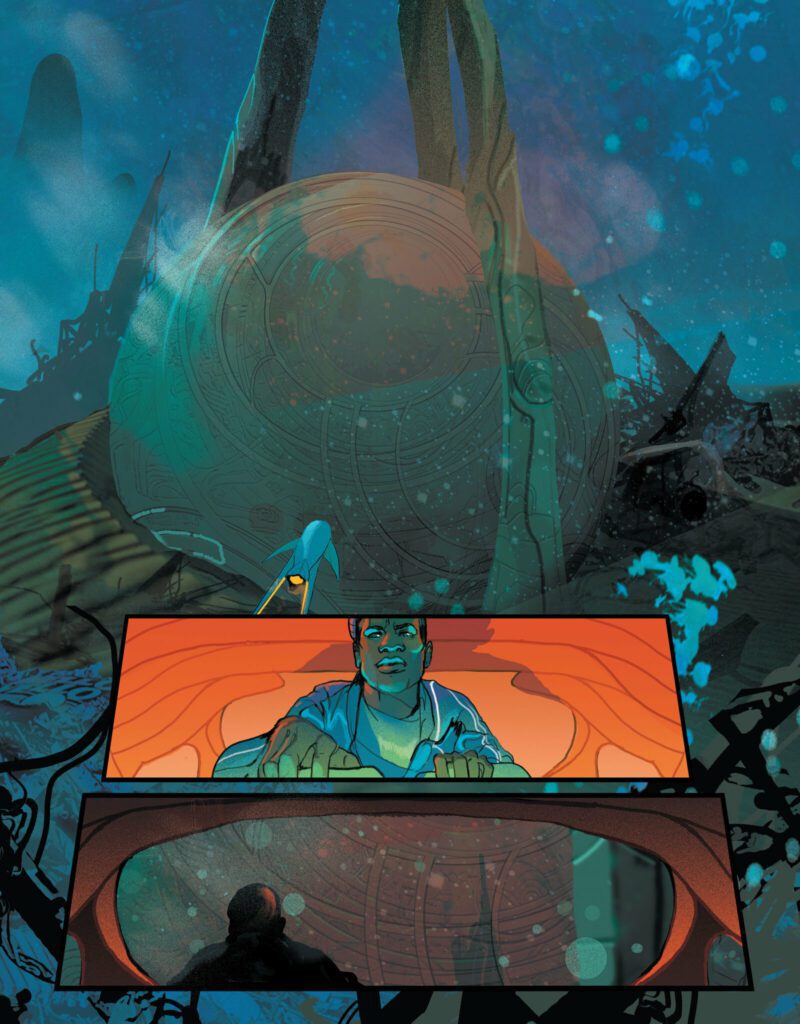
Writing & Plot

Ram V ups the sense of mystery and tension as our scientists reach the alien artifact on the ocean floor in Aquaman Andromeda #2. This chapter continues the trend of fascinating undersea cosmic horror, with a continual focus on character and a growing sense of mythical wonder. The science team makes it aboard the alien craft, only to be greeted by the structure’s insidious true secret – and absolute disaster. Isolated, sick, and effectively stuck, their problems worsen when it’s revealed they’ve been followed – not just by the King of the Sea, Aquaman himself, but Black Manta. Ram V digs a bit further into this Black Label story’s version of Aquaman, and Atlantis itself as a sort of unfathomable force on the sea floor. This is a chapter that is every bit as wonderous and awe inspiring as it is imposing.

As stellar a piece of myth-making and cosmic horror storytelling as Andromeda is, one of the major components to its success is how Ram still makes time to focus on the cast of characters. There are a couple sequences in this issue that focus on two members of the crew. They’re both flashbacks showing key moments in their lives that directly impact how they react to a major discovery (spoiler) later in the comic. These flashbacks fit naturally into the issue’s structure, lending context and background to the cast. Aquaman himself is still a mysterious, almost mythic figure in this story, and it is absolutely fascinating seeing this depiction of the King of Atlantis. Surprisingly, Black Manta’s portrayal is true to form with his in-continuity counterpart. This isn’t a negative by any means, as he is as intimidating as ever. Just based on how this comic has turned much of the Aquaman lore upside down, it’s reasonable to expect a more unconventional approach to the iconic aquatic supervillain. On the whole, this is an impeccably paced and fascinating script from Ram V, true to form for one of the most acclaimed writers in the industry at present.

Art Direction

All of this book’s murky horror atmosphere and visions of alien wonder in Aquaman Andromeda #2 are thanks to the visual talent of artist Christian Ward. The Invisible Kingdom artist crafts an experience that takes readers to the subaquatic darkness with incredible animations and wholly unique designs for the set pieces and technology encountered in this comic. Rarely does a comic book have the sense of motion that Andromeda does, with the liquid environments swirling past as the sub and the divers swim by. Ward’s design for Aquaman continues to be a delightfully eldritch departure from his classic look, while his adherence to Black Manta’s classic design still offers some new elements to behold. Never has the villain ever looked quite so menacing, with his iconic black helmet and red eyes creating a truly alien-feeling threat via Ward’s unique style. There’s a really cool moment where Manta switches on his Predator-like active camouflage while swimming and it looks *awesome. * Ward’s designs and visual approach to the undersea ruin of this mysterious ship still proves to be beautiful and ominous – if not flat out alive. One sequence in particular sees Ward crafting an unfathomable new terror from what almost looks like waves of light, and he still makes it into something serenely beautiful.

His sequencing and blocking carry the story’s pacing perfectly. The large panels give readers a view of the ocean and the ornate mysterious structure give way to carefully paid out smaller shots focusing on detail and character. The blocking here is mostly straight-forward, but pulled off in a manner that is so clean and thoughtful that it has to be appreciated. Aditya Bidikar’s lettering is stellar as always, with a rather simplistic approach to Andromeda’s text. His dialogue letters have a neat, contemporary style to them with bolds and italics that nail natural speech. The narration itself is again presented like a digital journal, with a cursor ahead of the plan type-face font. It’s simple, refined work from one of the best letterers in the business. Overall, this is yet again another immersive and gorgeous comic with a dense, threatening atmosphere.

Verdict

Aquaman Andromeda #2 is an engrossing continuation of this Black Label superhero comic turned cosmic mystery/horror. Ram V’s script once again mixes unnerving and unique concepts with intimate character storytelling to craft a script that is deeply engaging in every aspect. The visuals from Christian Ward suck the readers down into the deep with wondrous and creepy approach to design, murky yet stunning colors, and effortless sequencing. Be sure to grab this newest chapter when it hits shelves on August 2nd!


Monkeys Fighting Robots Youtube

Review: WILD CARDS: DRAWING OF THE CARDS #1 Resurrects a 35 Year Old Story

Wild Cards
Wild Cards: The Drawing of the Cards #1 Credit: Marvel Comics

In the 1980s, George R.R. Martin, Melinda M Snodgrass, and a collection of others, indulged themselves in a two year campaign of the role playing game Superworld. This gave birth to the Wild Cards series of books: anthologies of stories set within a shared universe and written by some of the best science fiction writers.

The premise is simple: an alien virus is released into the public and affects different people in different ways, rewriting their DNA. This leads to Jokers (survivors with crippling disfigurements), Deuces (people with mild, almost ineffectual abilities), and Aces (those with superhuman abilities), but 90% of those infected die. The series of books is set in an alternate timeline which diverges from our own history in the 1940s.

The book series is extremely popular, numbering 29 published works as of July 2022, and a collection of short stories published on various online sites. The concept has been optioned for movies and television series, although none have so far reached production, and there have already been two comic mini-series in 1990 and 2008.

With such a wealth of talent, engaging narratives, and an ever expanding universe, it is not surprising that Marvel would snap up the rights and get in on the action. And by bringing in seasoned writer Paul Cornell to adapt stories from the first novel, the new Wild Cards: Drawing of the Cards comic is more of a loving homage to the series than a quick cash grab by the publisher.

Wild Cards
Wild Cards: Drawing of the Cards #1 Credit: Marvel Comics

Stories Old…

If you’ve read any of the Wild Card books, the basic story premise will be known to you, and more than likely you will have read the first book from which much of this new comic is sourced. For those who are brand new to the franchise, welcome aboard and you will not be disappointed.

On the planet Takis, one of the warring houses turns their attention towards Earth in order to test their new biological weapon. Humans are genetically identical to the Takisians so make the perfect test subjects, and there are so many unknowing test subjects running around. Not everyone within the family agree with the mass slaughter for research purposes but ‘Doctor Tachyon’ (as he becomes known) is a lone voice amongst his peers so the Wild Card virus is sent on its way.

Meanwhile, on Earth, Robert Tomlin has returned from the war a fly-boy hero with a nickname to match: Jet Boy. But his life is no bed of roses and life back home has moved on without him. As he is attempting to adjust to one change in circumstances, another is hurtling towards the Earth on a crash course with history.

The opening issue of Wild Cards is pure superhero origin indulgence. The script by Cornell is witty, knowingly pompous which reflects the arrogance of the alien Takisians, and occasionally moving. The contrast between the dandy aliens and the world weary humans is reflected both in the artwork and the tone set by Cornell’s script. Cornell is the perfect writer for this series, not only because he has written for the Wild Card series of books, but he also has an understanding of the modern comic industry. He has, in his time, managed to play around with some of the industries biggest superheroes, writing Wolverine and Action Comics, and each time he has challenged the normal superhero constraints, stretching the boundaries of the narratives in ways that readers don’t always suspect. This is at the heart of Wild Cards and this first issue is already beginning to demonstrate that not all superhero stories have to be the same.

Wild Cards
Wild Cards: Drawing of the Cards #1 Credit: Marvel Comics

…Artwork New

Although much of the narrative isn’t new, adapted as it is from the first Wild Cards book, the artwork is bright and fresh. Pencilled by Mike Hawthorne and inked by Adriano Di Benedetto, the characters are rendered with fine, deliberate lines. Each facial expression or stance is carefully etched into the panels to create clean and crisp images. This is especially true of the Takisians where the gleaming and opulent backgrounds take the reader back to the science fiction settings of the 1980s. The design work on the Takisians is a superb demonstration of the creators understanding of sci-fi history and modern comics. It melds the futuristic look of television shows like Star Trek with the extravagance allowed by comic book artwork, especially that favoured in superhero titles. Think the bridge of the Enterprise mixed with Superman’s Fortress of solitude and you have a good idea of the aesthetic the artists are going for.

This opulence is contrasted brilliantly with 1940s America. The most notable difference is the coloring, provided by Ruth Redmond, who switches from the cool blues and golds of the alien world to grimy browns and subdued lighting on the streets of New York. Redmond’s work is instrumental in creating the contrast inherent in Cornell’s script. The changing color palettes is an instant visual that readers can latch onto. As you turn the page, the tone of the narrative is instantly changed even before you begin to read.

The final piece of the majestic puzzle is provided by Cory Petit. On the surface, the lettering is standard mainstream comic fare. The word balloons are placed for ease of reading and for creating a narrative flow through the panels and pages. However, it is the subtlety within the lettering that makes it a great accompaniment to the rest of the artwork. Slight changes in font size emphasize a character muttering under their breath and a break in dialogue using conjoined word balloons creates a perfectly timed punchline. One of the best examples is when Jet Boy visits his girlfriend to find out their relationship no-longer exists. The moment is a bit of a cliché, but when Cory Petit squeezes the words “I’m Sorry” into a word balloon attached to the main speech, they create a tension, as if the sentiment is an afterthought, a phrase that needs to be spoken but doesn’t have the full weight of feeling behind it. A different layout of word balloons, for example two separate speeches, would create a different meaning and tone.

Wild Cards
Wild Cards: Drawing of the Cards #1 Credit: Marvel Comics

Ace or Joker?

Wild Cards is an excellent adaptation of the book. It captures the character and tone of the original stories while translating the text for a mainstream comic reader. If this had been produced for an independent publisher, the styling may have been different, but with Paul Cornell’s guidance and a team of superb creators, Wild Cards has the surface impression of being a Marvel comic without succumbing to being part of the Marvel Universe.

It is a little disappointing that there are no new stories within these pages, even a short text piece in the back pages would have been a welcome accompaniment. But this is a minor quibble with an otherwise excellent first issue. Readers new to Wild Cards will get the most out of the narrative, and older fans of the series can relish the visualization of a story that is now 35 years old. The design work and scripting are the highlights of this comic but everything works together to produce a comic worth picking up. And, hopefully, this mini-series proves to be a success so that a future series can expand the Wild Card universe into new, visual vistas.

Monkeys Fighting Robots Youtube

Review: THE DEADLIEST BOUQUET #1 Brings The Family Together

The Deadliest Bouquet
The Deadliest Bouquet #1 Cover Art Credit: Image Comics

Family life. Family drama. Family secrets. The Deadliest Bouquet #1, available in August from Image Comics, is an emotionally driven drama about grief, choices, and family relationships.

Set in North Jersey in 1998, The Deadliest Bouquet opens with a tragedy followed by a heated homecoming. Three sisters, Rose, Poppy, and Violet, all return to their childhood home and are forced to confront their past after their mother is murdered. Suspicious police detectives, concerned extended family members, and lowlifes in bars, all play second fiddle to the three central sisters. They are dynamic characters who lead the narrative with visual flair.

The Deadliest Bouquet
The Deadliest Bouquet #1 Interior Art Credit: Image Comics

Much of the story amounts to nothing more than a single room family drama. It has a knowingly beautiful pomposity that would fit snugly into an episode of Desperate Housewives, while also containing a certain visual dynamism that is unique to comic books. The characters are larger than life and the power play between the sisters and supporting cast is portrayed not only through the playful script but also the clever composition of the panels and pages. Rose, Poppy, and Violet fight for dominance on the page, sidelining the majority of the other characters, but occasionally the tense standoff between the sisters is broken by a well placed extra who suddenly draws the reader’s curiosity or attention.

Erica Schultz’ script is packed with mystery and tension. She slowly draws out the backstory, linking the present day with the characters’ histories. This allows artist Carola Broelli to use some wonderful transitions on the page, leaping back and forth in time. The shift from the present of the narrative to the past is obvious but not jarring; the story flows back and forth smoothly like a well oiled machine. The reader never becomes lost between the time periods, thanks in part to the color palettes used by Gab Contreras, and this allows the creators to control the secret at the heart of the story. The characters grow naturally before the readers eyes as the unravelling narrative gives context to the central characters lives and personalities.

The Deadliest Bouquet
The Deadliest Bouquet #1 Interior Art Credit: Image Comics

Broelli’s artwork is concise, with strong defining lines and shapes. There are no superfluous backgrounds or details. As is the way with comics, everything serves a purpose whether it’s simple scene setting or mood building. Broelli controls the reader using a minimal amount of information and her grasp of negative space really pays off. Moments of importance stand out on the page and Broelli showcases the strong female characters with striking images that break the rigid panels, making them the readers focus of attention.

One of the highlights of The Deadliest Bouquet is the lettering provided by writer Erica Schultz. The carefully concise script gives Schultz a lot of control over placement and composition for the speech balloons and caption boxes. The speech enhances the visuals while also providing pacing direction for the narrative. The timing for the arguments and punchlines to the jokes comes from the careful placed speech balloons, and throughout The Deadliest Bouquet, the timing is impeccable. Add to that the superb addition of symbols in the caption boxes, allowing for complex conversations to carry across pages and scenes like voice overs in a television show, and you have a wonderful example of lettering serving a narrative.

The Deadliest Bouquet
The Deadliest Bouquet character design: Rose

The Deadliest Bouquet is advertised as 90s nostalgia mixed with an espionage thriller, however that wasn’t my experience of this first issue. Perhaps because this was originally produced via Kickstarter as a single, 120 page, graphic novel, and lasting impressions may vary between readers. Reading this single, first issue, it is easy to overlook the historical setting as you get swept away by the family drama unfolding before you. Any nostalgia within the comic is background at best, unlike a certain Netflix television show that wears its historical setting like a mask to hide the disfigured narrative behind it. Schultz and Borelli are, at least in this first issue, more interested in telling a story than making their readers gush over memory lane.

The Deadliest Bouquet
The Deadliest Bouquet character design: Violet

As an opening issue to a series, The Deadliest Bouquet is a sure-fire hit. It is engaging, has natural and relatable characters, and uses the medium to great effect. The complexity of the comic is buried in the narrative and the artwork is deceivingly straightforward, drawing the reader into this dysfunctional family and the world they inhabit. If you missed the Kickstarter campaign, then this new release through Image Comics is the perfect way to catch up.

Monkeys Fighting Robots Youtube

Review: 20TH CENTURY MEN #1 – Diary of a Mass-Murder Machine

From writer Deniz Camp (Agent of WORLDE, Maxwell’s Demons) and artist Stipan Morian comes the most complex war story and piece of cultural critique since Apocalypse Now in 20th Century Men #1. Featuring letters from Aditya Bidikar, this insightful and hyper-intelligent fever-dream of a comic is not for the faint of heart or those who want a light read. The first of 6-issues, this opening chapter launches into an artistic vision of alternate historical timelines, superhero mythology, and the horrors of warfare that evokes a blend of Coppola’s aforementioned masterpiece, Watchmen, and Barry Windsor Smith’s Monsters. With a narration-laden yet fascinating script and wildly unpredictable visuals, this chapter is easily one of the most unforgettable pieces of the comics medium in recent years.

“At the end of the 20th century, superheroes, geniuses, madmen, and activists rush towards WWIII! A Soviet “iron” hero, a superpowered American president, an insane cyborg soldier, an Afghan woman hellbent on building a better life for her people—these strange yet familiar beings collide in a story that mixes history, politics, and comic book mythology into something totally new.”

Writing & Plot

Deniz Camp’s script is a difficult one to critically asses, because of the sort of narrative that 20th Century Men #1 sets up. Instead of a linear narrative, Camp gives readers snapshots of different important points in the life of our mechanical Soviet super soldier, as well as the world at large, to set up context for how the story got to where it is. Camp spends considerable time describing an alternate timeline version of Russia’s invasion of Afghanistan, this time with it spiraling into a true World War III. Camp swings from a haunting opening scene of a village in Vietnam turned human slaughterhouse to the war room arguments between Russian and Afghan politicians, and then to the origin story of a young Russian boy being chosen to become a weapon. These sorts of sequences and more are guided along by Camp’s almost fever dream-esque narrative structure combined with his fierce narration and brilliant, naturalistic dialogue. The narrative voice is of course from the perspective of Comrade Platonov, our central war machine. He’s a remarkable character in that, despite his fearsome appearance, he’s also devastatingly intelligent and complex. He understands what he is and what he does, but he is still allowed to be a man.

Camp’s alternate timeline version of WWIII and its players is the most compelling take on this specific genre of war story we’ve gotten in years. No one has gotten the notion of an international arms race with superhumans – and all of the political ramifications and poignant observations based on actual reality therein – since Moore did it in Watchmen. Granted, this script is much heavier and doesn’t *quite* have the grace of Moore’s careful pacing, but this is also structurally a very different monster. Watching America’s great superhuman – a smart mix of Captain America, Uncle Sam, and a little bit of Homelander – forcibly exert his wants and impulses in his new position (spoilers) hits maybe a bit too close to home. The mark of a great war story and political commentary piece is when the story acknowledges that the subject matter is a moral no man’s land. There is no right person here, there are only the button-pushers, the killers, and the ones trying to survive. Camp’s script is deeply complex and throws a lot at the reader, to the point where it may require multiple readings to grasp everything he’s trying to say. For those who put in the effort though, this is a powerful comic with multiple equally impressive elements all forming to tell one outstanding narrative.

Art Direction

While the writing is highly effective itself, the reason why 20th Century Men #1 will stay in your mind and when you close your eyes is the visual work of artist Stipan Morian. His unpredictable style switches from disturbing and macabre to oddly breathtaking and intimate from moment to moment. He does so by often completely changing his art style multiple times. His opening sequence is intentionally hazy, with characters and scenery look almost like illusions baking under the orange heat of the Vietnam jungle. This wavering nightmare vision then cuts over to the bleak cold of a child in Russia being collected to become a soldier, here with a wildly different art style. Morian shifts into a more “proper” and detailed style with a direct focus on character art. His character animations and ability to render human emotion in this comic is staggering. Morian crafts sequences that are touching and humanly intimate in one moment, aggressively intense in another, then absolutely horrifying in yet another. This book looks as though it’s drawn and colored by multiple artists, but it’s all Morian’s handiwork. He utilizes heavy crosshatching is a lot of his details that gives off hints of BWS, but again, he doesn’t stick with this. He sometimes shifts to a painted, almost digital-looking style that gives off light Frank Quietly elements. However, despite all these comparisons, Morian is a completely unique artist on his own. His blocking and page composition is just as impressive and dynamic as his art. He uses small panels over much larger spreads focusing on key details that keep scenes flowing and give them more context. His larger panels and spreads appear almost as dioramas, with scenes so striking they could be covers themselves.

Acclaimed letterer Aditya Bidikar some career-best work for 20th Century Men. His fonts are stellar, with a soft, hand-drawn dynamic style that remains easy to read but carries character tone perfectly. The real charm here is his SFX lettering. Some of it blends into the art so well it’s hard to tell if it’s Bidikar or part of Morian’s visuals. The letters punctuate scenes, adding that sense of audio that palpably increases the feel of the atmosphere and tension throughout the comic. Visually, this is a marvel of a work, with some of the most innovative and standout art in a comic this year.

Verdict

20th Century Men #1 is an intelligent, incisive, and disturbingly memorable take on war and superhero storytelling. Deniz Camp’s script may be a bit dense, but its striking sense of humanity and powerful thematic force make that complexity worthwhile. The visuals from Stepan Morian are unpredictable and immensely striking, with panels that will stay in readers’ minds long after they close the book. Be sure to grab this issue when it hits shelves on August 17th!


Monkeys Fighting Robots Youtube

Review: Dusky Decline in THE HOLLOWS

The Hollows is a comic about second chances. So it’s fitting that it’s getting another shot at the stands. Originally a mini-series from IDW, this oversized release from Image collects all four issues into a single package. Writer Chris Ryall, artist Sam Kieth, and letterer Robbie Robbins work together to tell a story of a post-apocalypse defined by hazy sadness, rather than anger or a relentless survival drive. And yes, there is the possibility of redemption. Just don’t expect it to come easy.

In the near-future, Tokyo has been ravaged by the aftereffects of a nuclear reactor meltdown. The most dangerous product of the disaster are the “hollows,” zombie-like irradiated humans who are drawn to suck the souls of the living. To escape the monstrous horde, the affluent have built cities atop giant trees while the poor are forced to fend for their own in a toxic wasteland. Inventor Craig Mayerick lives in one of those treetop cities, wracked with guilt and working tirelessly to fix the world below. But that doesn’t stop him from occasionally donning homemade wings and raiding the lower world for supplies to aid his family. When one of those supply runs ends in a crash landing, Mayerick suddenly finds himself having to rely on a poor group of survivors for his own survival.

If there’s one thing The Hollows has in abundance, it’s ideas. Ryall pulls together many disparate genre concepts, from an ethereal, almost supernatural take on zombies, to steampunk flight suits and a strange little mascot named Urp. There’s also a clear emotional through line with Mayerick coming to terms with his guilt and finding a way to atone for his past. The main problem is that the two don’t always align. With the details of the world left dreamy and unclear, Mayerick’s internal monologue often turns to explaining his emotions in each scene, as if to compensate.

But it’s the dreaminess that gels best with Kieth’s art, which uses pencils and watercolors to render a world that’s constantly dipping in and out of focus. Sometimes a character’s face will be drawn realistically through light pencil shading, but the very next panel they may take on cartoony outlines and simple dot eyes. Backgrounds are moody splashes of color, only showing background details where absolutely necessary. It makes for a fragile, lonely world. So the more conscious attempts at adding structure and explaining emotion, like when Mayerick’s wife points out his growth with “My husband does not talk about his experiences here, but he has made a profound change,” stick out from the more loose, freewheeling art. There’s undeniable moments of beauty. But with some unevenness getting there.

Robbie Robbins provides the lettering, and his slightly shaky balloon lettering fits Kieth’s intentionally loose hand, even opting to draw word balloons with outlines that don’t fully connect from end to end. Internal monologues are placed on backgrounds resembling torn scraps of paper, often color-coded to the narrator they come from. For example, Mayerick’s thoughts are backgrounded by the predominate brown of his flight suit, while survivor Lani thinks in the bright pink of her oversized sweater. The monologues stick out the most however, with a more stark, digital look in contrast to the textured, hand-drawn art.

VERDICT

The Hollows sticks out from other post-apocalyptic comics by presenting a hazy world of radioactive soul-suckers and steampunk flight suits that looks unlike anything else on the stands. While it can be overbearing in its narration, there’s still a world and characters here worth exploring. It’s out today from Image Comics, so make sure to seek it out.

Monkeys Fighting Robots Youtube

Marvel Comics Exclusive Preview: MOON KNIGHT #14

marvel comics exclusive preview moon knight

MOON KNIGHT #14 hits your local comic book store on August 3rd, but thanks to Marvel Comics, Monkeys Fighting Robots has an exclusive four-page preview for you!

About the issue:
The scars of Zodiac’s attack linger with the faithful of the Midnight Mission, but that doesn’t stop Moon Knight from picking an entirely new fight. A new arc begins as Moon Knight goes to war with the vampires of the Structure, but he finds it a battle on two fronts – one on the midnight streets, and the other within his own mind!

The issue is by writer Jed MacKay and artist Alessandro Cappuccio, with colors by Rachelle Rosenberg, and letters by Cory Petit. The main cover is by Stephen Segovia and Rachelle Rosenberg.

Check out the MOON KNIGHT #14 preview below:

marvel comics exclusive preview moon knight

marvel comics exclusive preview moon knight

marvel comics exclusive preview moon knight

marvel comics exclusive preview moon knight

marvel comics exclusive preview moon knight

marvel comics exclusive preview moon knight


Are you reading MOON KNIGHT? Sound off in the comments!

Monkeys Fighting Robots Youtube

Z2 Comics & Nothing More Announce NOTHING MORE: SPIRITS VOL. 1

Z2 COMICS & NOTHING MORE Weave a Decades-Spanning Tale of the Supernatural in New Graphic Novel, NOTHING MORE: SPIRITS VOL. I

Based on the upcoming album of the same name, the comic unites the band with writer Dan Watters and artist Christian Rosado for a cryptic tale of harmony and connection.

Preorder Now: https://z2comics.com/nothingmore

LOS ANGELES—Z2 Comics is proud to announce a collaboration with multi-GRAMMY nominated hard rock quartet NOTHING MORE for NOTHING MORE: SPIRITS VOL. I, a graphic novel that will dive deeper into the mystical narrative behind the band’s upcoming LP of the same name, due October 14 via Better Noise Music. Writer Dan Watters (LuciferSword of AzraelKing Diamond’s Abigail) and artist Christian Rosado join the band for a story that begins in 1952 and spans decades, driven by four disparate souls as their spirit selves search for a greater purpose. Their trajectories will weave throughout continents and neighboring lives, building off NOTHING MORE’s arcanic Spirits Test and Spirit Types—an original, personality system developed by lead singer Jonny Hawkins.

“The comic book focuses on four of the Spirit Types. As we were making the album, I came up with the concept for the Spirits Test. Imagine if the zodiac had a baby with the Myers-Briggs personality test, and that baby came out fascinated by cryptic iconography and metal music… that is this test,” Hawkins explains. “Each of us has a Spirit Type and this comic book is an artistic expression of how those Spirit Types come to life in a world very much like our own.”

Guitarist Mark Vollelunga proposed a deeper exploration to be revealed in the comic, debuting in late winter 2023.

“I set forth on this collaboration with Z2 Comics, and our manager, Will Hoffman, with the idea to expand the NOTHING MORE world and elaborate on what these Spirit Types mean; where they came from and why they exist. We wanted to write stories that invoke a sense of empathy and wonder, while maintaining a personal connection to NOTHING MORE songs,” Vollelunga continues.

Dan Watters is such a brilliant, captivating writer. Both of us shared inspiration from shows like The OA and Sense8; we wanted to accentuate the differences people express when something wrecks you… and even though these differences may seem polarizing, we still need each other. These differences force us to survive and grow. This story shows that great strength and mutual respect come to those who learn how to embrace one another.”

Started in 2003 by Hawkins and Vollelunga in San Antonio, Texas, NOTHING MORE has ascended to be one of the most respected hard rock outfits touring today, merging careening melodies with dynamic arrangements and pounding rhythms. Their 2017 breakthrough LP The Stories We Tell Ourselves garnered three GRAMMY nominations, cementing the group as one of the most ambitious and honed bands in their genre and beyond. The band will embark on a national tour from August to October alongside In This Moment.

NOTHING MORE’s songs have consistently challenged their audience to refuse a passive approach as they navigate life,” SPIRITS VOL. I editor Rantz Hoseley says. “Songs like ‘Tired of Winning’ dare the listener to not simply accept the life they are told awaits them, and to question assumptions fed to them by the powers that be. That outlook served as the backbone running through the core of the graphic novel. It’s a vital element that influenced every aspect of developing this book with the band, making it such a rewarding experience where we’ve all pushed each other to not simply create a ‘comic book,’ but to conjure a new mythos that, like the new album and the Spirits Test, can inspire the audience to become the best versions of themselves.”

Z2 Comics and NOTHING MORE present NOTHING MORE: SPIRITS VOL. I in hardcover, as well as oversized hardcover deluxe, and an oversized hardcover deluxe hand-signed edition. Ghonz provides cover art. NOTHING MORE will offer an exclusive softcover “Tour” edition with cover art courtesy Christian Rosado at store.nothingmore.net. Deluxe editions include an ornamental octahedron as well as four (4) Spirit Art Prints and Spirit Cards representing the eight (8) Spirit Types.

Preorder Today: https://z2comics.com/deesnider 

Download Nothing More: Spirits Vol. 1 Art: https://www.dropbox.com/sh/vjhtvcytnz1zu4f/AABm-eaT4e7laYsjx_8Yu17aa?dl=0

For More Information, Contact:
Sean Edgar: sedgar@z2comics.com


Monkeys Fighting Robots Youtube

AfterShock Comics Exclusive Preview: THE BROTHER OF ALL MEN #2

brother of all men aftershock comics exclusive preview

THE BROTHER OF ALL MEN #2 hits your local comic book store August 17th, but thanks to AfterShock Comics, Monkeys Fighting Robots has an exclusive four-page preview for you.

About the issue:
A descent into the weird history of so-called Canada. 

As the newest initiate of the cult, private eye GUY HORN is assigned to back-breaking labor alongside his blood-brother BASTIEN. As questions compound about the teachings of the enigmatic cult-leader BROTHER XII, Guys cover story is threatened and hes forced to do something rash.

The series is by writer Zac Thompson and artist Eoin Marron, with colors by Mark Englert, and letters by Hassan Otsmane-Elhaou. The main cover is by Marron.

Check out THE BROTHER OF ALL MEN #2 preview below:

brother of all men aftershock comics exclusive preview

brother of all men aftershock comics exclusive preview

brother of all men aftershock comics exclusive preview

brother of all men aftershock comics exclusive preview

brother of all men aftershock comics exclusive preview

brother of all men aftershock comics exclusive preview


Are you excited for BROTHER OF ALL MEN? Sound off in the comments!

Monkeys Fighting Robots Youtube

Review: DETECTIVE COMICS #1062 – Gotham Nocturne

From ever-rising mega-talent Ram V (These Savage Shores, Swamp Thing) and master of atmosphere Rafael Albuquerque (Black Beetle, Night Of The Ghoul) comes a Batman comic with a veneer of gothic horror in Detective Comics #1062. Featuring colors by Dave Stewart and lettering from Ariana Maher, this issue’s main story is Batman at its most mysterious and unnerving. With a stellar backup from The Dreaming writer Si Spurrier and artists Dani, with more Dave Stewart colors and Steve Wands on letters, this is a Bat-comic that poses haunting problems for Bruce and his allies – and the most genuinely dread-inducing thematic elements in a DC comic in years.

“Something is terribly wrong with Batman. No matter the tests Bruce takes, nor the numbers he counts, the greatest detective in the world can’t pin down the source of this creeping dread—of his own inner demons and a looming mortality. Meanwhile, real demons roam the shadows as an ancient melody haunts the Gotham night. Here now the curtains rise and as the eerie tune streams in…who is human, who is demon, who is to tell? As Batman investigates the songs and the demons of Gotham, he is forced to confront the oldest question…whether there has been a demon within him all along…and if so, what does it want…and why hasn’t it taken over yet?”

Writing & Plot

True to his form, Ram V pens an exciting and poetically rich script for the start of his run here in Detective Comics #1062. Loaded with symbolism and leaning into the evocative, gothic imagery of Gotham and the Batman story, Ram brings something ancient and foreboding into the life of the titular detective. Opening with a stirring opera sequence loaded with what is likely the most striking approach to discussing Bruce’s origin since the Morrison era, working through increasingly foreboding warnings about an approaching enemy, and ending on some genuinely interesting issues with long-term ramifications, this is the most fascinating single Bat-comic in years. Batman – Bruce, really – is getting older. While this has been dealt with in numerous out-of-continuity Batman comics, this is the first time it’s been discussed as a possibility in canon. This, Bruce’s denial of such a possibility, and the looming specter of a powerful evil encroaching on Gotham all make for a thematically loaded Batman comic. This new foe Ram has just teased for us so far is reminiscent of The Black Glove and The Court of Owls, but more alien and potentially far older. In fact, Ram seems to be pulling from concepts crafted in Morrison and Snyder & Capullo’s runs, but with his own stylistic flair. Make no mistake though, this is absolutely as Ram V comic. This first issue’s influences are felt in its plot and the construction of Batman’s new foes (so far anyways), but the sense of ethereal gothic horror on display is something Ram himself brings out in unique ways.

Si Spurrier’s script for backup story, “The Coda,” fits perfectly with the vision of Gotham that Ram has made for this new chapter of Detective Comics. The first of three parts, this story sees former police commissioner Jim Gordon returning to Gotham. Listless and feeling without purpose, Gordon accepts a job tracking down a woman’s lost son. The journey takes him back to the ruins of an abandoned Arkham Asylum, where more almost supernatural horrors appear to await. True to form, Spurrier’s writing is dense but thematically rich. His script consists mostly of Gordon’s internal narration via a journal he keeps. This gives the short story a definite noir aspect, but it’s muddled by Jim’s sense of purposelessness and the unusual horror-esque nature of what he uncovers while exploring the ruined asylum. Some may find Spurrier’s writing to be a bit much for a visual medium, but those who can appreciate his use of atmospheric and naturalistic prose within this dark mystery will no doubt be satisfied.

Art Direction

Crafting the visual experience for the most haunting and horror-influenced Batman comic in over a decade requires a master of atmospheric art. Fortunately, Rafael Albuquerque is the talent for the job in Detective Comics #1062. He pairs off with Ram V’s script in spectacular fashion, creating an ethereal gothic experience from the opening page and on. His opening sequence, an opera with a dark Victorian aesthetic and looming spectral bat, immediately sets the tone for the rest of the book’s looming dread. Albuquerque is already known for his talents in crafting horror comics, with his previous work with Scott Snyder on American Vampire and Night Of The Ghoul. Here, his horror elements are slightly more subdued to also do the work of being a Batman comic. His range in the book is immensely impressive, as his dead-inducing nightmare sequences trade blows with big superhero action with Batman fighting monsters, criminals, and meeting unexpected old foes. One unique and memorable scene was the introduction of Batman new encroaching foes as seen in their own home. This passage looks like something out of a science-fiction or fantasy comic, rather than a Batman book, and it sticks out due to Albuquerque’s stylized architecture and character design choices. There’s an almost mural-esque sense to how Albuquerque draws and constructs his sequences, and it matches the stage-play narrative device wonderfully.

Dave Stewart’s colors on both the main story and the backup are tonally perfect. The veteran colorist achieves similar aesthetics in both stories, but with different approaches. His work over Albuquerque’s pencils is enshrouded in shadow and ethereal, dreamlike haze. Even the moments that aren’t in Bruce’s head are covered in Gotham’s urban fog or take place in dimly lit rooms. Stewart’s atmospheric work is so dense it looks as though it could be cut by a knife, and it perfectly caps off the style needed for this story. The work on the backup drawn by Dani is similar, but noticeably brighter and more naturalistic. Without Batman’s potential internal struggles and visions of a great bat-demon, the story following Gordon allows for more conventional interior and street lighting. The unnatural effects still come into play of course – there’s a stirring scene with the dilapidated asylum looming in a white background. For the most part though, this story is handled with a more natural-looking approach than the directly horror-focused main story.

Speaking of Dani’s art, his work on “The Coda” is singularly impressive and wholly unique, managing to align with the aesthetic set in the main book but also with a different approach. Dani’s work isn’t as conventional or “clean” as Albuquerque’s, but instead utilizes a heavily cross-hatched and differently atmospheric style. There’s a classic Vertigo sense with Dani’s heavily penciled artwork, and coupled with his direction gives that ruined sense – for both a listless Jim Gordon and an abandoned asylum – to the story. The lettering from Ariana Maher in the main story and Steve Wands in the backup is inventive and brilliant. Both of their works are easily readable but shift dynamically with the story, altering how the reader perceives the words in perfect unison with the art. Maher’s work specifically, in the dreamlike sequences, takes on a wavering, musical quality that matches the scenes’ operatic setting. This is the most interesting lettering in a DC comic this year. Overall, this issue of Detective Comics is a staggeringly gorgeous comic, with nearly unmatched atmospheric work in the mainstream world.

Verdict

Detective Comics #1062 is the beginning of a potential masterpiece. Ram V’s script is meticulous, haunting, and conceptually rich, adding some of the most intriguing new pieces of Batman lore since the Court of Owls. The visuals from Rafael Albuquerque and Dave Stewart are beautiful, foreboding, and carefully composed, making for some of the most memorable single panels in all of Batman comics. The backup story from Si Spurrier and Dani is a stellar cap to this brilliant new chapter in the story of Gotham’s Dark Knight, promising a gothic horror and mystery unlike any we’ve seen in a Batman comic in many years. If the rest of this run is as strong as this first issue, we could very well be looking at a Batman run in the same league as Snyder & Capullo’s and Morrison’s. Be sure to grab this incredible new issue when it hits shelves on July 26th!

Monkeys Fighting Robots Youtube

Get Your EXCLUSIVE First Look At Valiant’s BOOK OF SHADOWS #1 Retailer Variants

valiant book of shadows exclusive

BOOK OF SHADOWS #1 hits your local comic book store on July 27th, but thanks to Valiant Entertainment, Monkeys Fighting Robots has your first look at the book’s retailer-exclusive variant covers and where you can find them!

About the book:
Shadowman. Eternal Warrior. Punk Mambo. Doctor Mirage. The supernatural protectors of the Valiant Universe unite for the very first time to stand against a terrifying ancient threat: Exarch Fane. No one is safe as the fearsome foe has his cold hands on the Book of Shadows.

Book of Shadows is a blockbuster supernatural event that forms a brand-new team in the Valiant Universe… but will they be enough to stop Fane’s wrath?

The series is by writer Cullen Bunn, artist Vicente Cifuentes, colorist Nick Filardi, and letterer Dave Sharpe.

On the new villain Exarch Fane, Bunn says, “Exarch Fane is an ancient being from beyond the veil of life and death. He’s a warlord who dwells in a terrifying castle and surrounds himself with an army of the undead and worse. He even wields a sword forged from a black hole.

When you’ve got armaments and minions like that, when you’ve faced the Eternal Warrior in battle and survived, you get a little emboldened. Exarch Fane likes to talk, to both taunt and charm his enemies. He’d be a great dinner guest, except for his pesky habit of laying waste to worlds!

See the five retailer exclusive variant covers (and where you can order them) right here:

valiant book of shadows exclusive

As you can see from the graphic, the five variants are by artists Maria Llovet (Atomic Comics), JaCo Tartaruga (Awesome Minis & Autographs), Kyle Hotz & Dan Brown (Exchange Collectibles), Stephan Sharar & Brandi Blahnik (Coy’s Comics), and Nikolas Draper-Ivey (Bulletproof Comics).

And check out the first few pages of BOOK OF SHADOWS #1 below:

valiant book of shadows exclusive

valiant book of shadows exclusive

valiant book of shadows exclusive

valiant book of shadows exclusive

valiant book of shadows exclusive

valiant book of shadows exclusive

valiant book of shadows exclusive

valiant book of shadows exclusive

valiant book of shadows exclusive


Are you excited to see the first supernatural team in the Valiant Universe? Sound off in the comments!

Monkeys Fighting Robots Youtube